• Home
  • Tools dropdown img
    • Spreadsheet Charts

      • ChartExpo for Google Sheets
      • ChartExpo for Microsoft Excel
    • Power BI Charts

      • Power BI Custom Visuals by ChartExpo
    • Word Cloud

  • Charts dropdown img
    • Chart Category

      • Bar Charts
      • Circle Graphs
      • Column Charts
      • Combo Charts
      • Comparison Charts
      • Line Graphs
      • PPC Charts
      • Sentiment Analysis Charts
      • Survey Charts
    • Chart Type

      • Box and Whisker Plot
      • Clustered Bar Chart
      • Clustered Column Chart
      • Comparison Bar Chart
      • Control Chart
      • CSAT Survey Bar Chart
      • CSAT Survey Chart
      • Dot Plot Chart
      • Double Bar Graph
      • Funnel Chart
      • Gauge Chart
      • Likert Scale Chart
      • Matrix Chart
      • Multi Axis Line Chart
      • Overlapping Bar Chart
      • Pareto Chart
      • Radar Chart
      • Radial Bar Chart
      • Sankey Diagram
      • Scatter Plot Chart
      • Slope Chart
      • Sunburst Chart
      • Tornado Chart
      • Waterfall Chart
      • Word Cloud
    • Google Sheets
      Microsoft Excel
  • Services
  • Pricing
  • Contact us
  • Blog
  • Support dropdown img
      • Gallery
      • Videos
      • Contact us
      • FAQs
      • Resources
    • Please feel free to contact us

      atsupport@chartexpo.com

Categories
All Data Visualizations Data Analytics Surveys
Add-ons/
  • Google Sheets
  • Microsoft Excel
  • Power BI
All Data Visualizations Data Analytics Surveys
Add-ons
  • Google Sheets
  • Microsoft Excel
  • Power BI

We use cookies

This website uses cookies to provide better user experience and user's session management.
By continuing visiting this website you consent the use of these cookies.

Ok

ChartExpo Survey


Home > Blog > Google Sheets

How to Use Google Spreadsheet for Insightful Results

How to use Google Spreadsheet?

Are you wondering how such a Google Spreadsheet can make a big difference in your everyday tasks? Google Sheets is used to organize, analyze, and share data when managing both personal budgets or collaborating with a team. Therefore, learning how to use Google Spreadsheet effectively is a game-changer.

Google Sheets is cloud-based and accessible from any device with an internet connection. This means you can access your data anywhere, anytime, without worrying about losing your work. This platform offers a wide range of features to suit your needs. From basic data entry and formatting to advanced calculations and data analysis.

How to Use Google Spreadsheet

So, how do you use Google Spreadsheets? First, you need to learn the basic key points. Then, know how to enter data, apply formulas, and create charts, and you’ll have a strong foundation. Later, you can dive deeper into Google Sheets features, such as real-time collaboration and data validation, to work more efficiently.

This blog will guide you through the essential tools and functions in Google Sheets. By the end, you’ll feel confident using this powerful tool to organize your data and collaborate seamlessly.

So, let’s get started and unlock the potential of Google Sheets!

Table of Contents:

  1. What is the Use of Google Sheets?
  2. What are the Basic terms of Google Sheets?
  3. How to Add Data to Google Sheets?
  4. How to Use Google Sheets Toolbar?
  5. How to Use Google Sheets Formulas?
  6. How to Create a New Spreadsheet in Google Sheets?
  7. How to Protect Your Data in Google Sheets?
  8. How to Hide Data in Google Sheets?
  9. How to Freeze Rows and Columns in Google Sheets?
  10. How to Filter Data in Google Sheets?
  11. How to Create a Drop-down List in Google Sheets?
  12. How to Wrap Text in Google Sheets?
  13. How to Setup and Use Google Sheets Offline?
  14. How to Use Google Spreadsheet for Quick Analysis?
  15. Wrap Up

First…

What is the Use of Google Sheets?

Definition: Google Sheets organizes, analyzes, and shares data. It enables you to create spreadsheets for different tasks, such as budgets, tracking expenses, managing projects, and conducting survey for market research. Spreadsheets allow multiple users to work on the same file simultaneously, making teamwork more efficient and seamless.

Google Sheets also supports advanced functions like; formulas, charts, and data filtering. This makes it a more powerful tool for both personal and professional use. It’s accessible from any device with internet access.

What are the Basic terms of Google Sheets?

Google Sheets is packed with useful features to help you manage, analyze, and interpret data effectively, making it a powerful tool for analyzing and interpreting data.

Here’s a breakdown of the key concepts:

  • Spreadsheet: The entire file containing your data has multiple sheets.
  • Cell: The smallest unit where data is entered, formed by the intersection of a row and column.
  • Row & column: Rows are horizontal lines (numbered), and columns are vertical (lettered). Together, they form a grid of cells.
  • Range: A selection of multiple cells, defined by the first and last cell (e.g., A1:B10).
  • Formula: A calculation you enter, starting with an equals sign (e.g., =A1+B1).
  • Function: Pre-built formulas that perform specific calculations, like SUM() or AVERAGE().
  • Chart: A visual representation of your data, such as bar charts or pie charts, to make trends easier to spot.
  • Sharing & add-ons: You can share your spreadsheet with others for collaboration and enhance your sheets with add-ons (extensions) for more features.

How to Add Data to Google Sheets?

Google Sheets offers a variety of options when you’re entering data.

Let’s walk through the process;

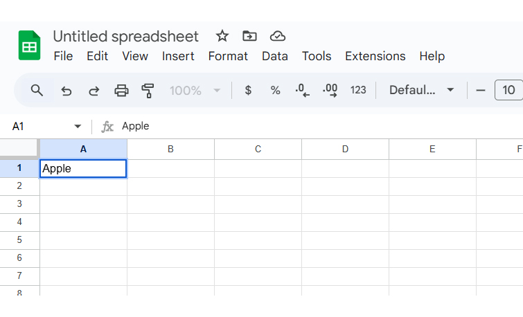
First, open a new spreadsheet; if you type your data, it will appear on the top-left cell. If you want to input the data anywhere else, click on any cell. A blue outline appears around it to show you’re active in that spot. Type your data, and it will be saved automatically in that cell.

Type Your Data for Learning How to Use Google Spreadsheet to Create Chart

Once you’ve finished entering data in a cell, you have a few options on what to do next:

  • Press Enter/Return – This saves the data and moves you down to the next row.
  • Press Tab– This moves you to the next cell to the right in the same row.
  • Arrow keys– Use the arrows to move to any adjacent cell.
  • Click any cell – You can jump directly to a new cell by clicking on it.

Typing everything manually is tedious, but you can save time by importing data:

  1. Copy-paste text or numbers directly into the sheet.
  2. Copy-paste HTML tables from websites.
  3. Import an existing spreadsheet (or use the IMPORTRANGE in Google Sheets to sync data across different sheets).
  4. Use the fill handle- to quickly fill adjacent cells with repeating or sequential data.

How to Use Google Sheets Toolbar?

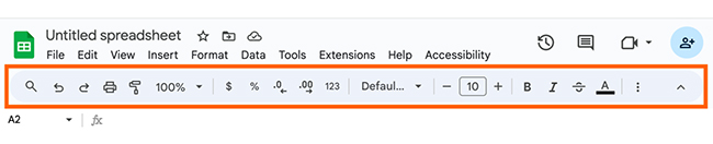
The Google Sheets toolbar has essential tools that allow you to easily format, edit, and organize your data. This toolbar gives you quick access to common features: You can change text styles, adjust cell sizes, and add charts.

Everything you need is just a click away. Therefore, getting familiar with the toolbar makes working in Sheets faster and more efficient.

See Toolbar Make Working in Sheets for Learning How to Use Google Spreadsheet to Create Chart

How to Use Google Sheets Formulas?

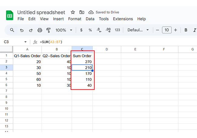
Google Sheets formulas make calculations quick and easy. First, enter your data into the sheet. Then, apply a formula to calculate results automatically.

For example, use the SUM formula to find the total of a group of numbers. Type `=SUM(A2:B6)` into a new cell to add up the values in cells A2 to B6.

Use SUM Formula to Find Total for Learning How to Use Google Spreadsheet to Create Chart

Press Enter, and the sum will appear.

Press Enter and Sum Appear for Learning How to Use Google Spreadsheet to Create Chart

How to Create a New Spreadsheet in Google Sheets?

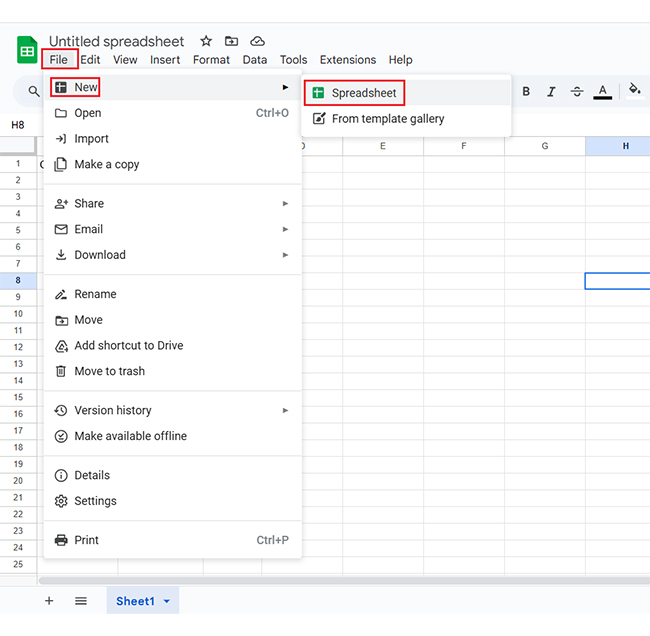
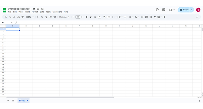
Creating a new spreadsheet in Google Sheets is quick and easy, and here’s how you can do it:

  1. First, head over to the top-left corner of your screen and click on File. From the drop-down menu, choose New.
Click File and Choose New for Learning How to Use Google Spreadsheet to Create Chart
  1. A fresh, blank spreadsheet will pop up – start entering data.
Blank Spreadsheet for Learning How to Use Google Spreadsheet to Create Chart

How to Protect Your Data in Google Sheets?

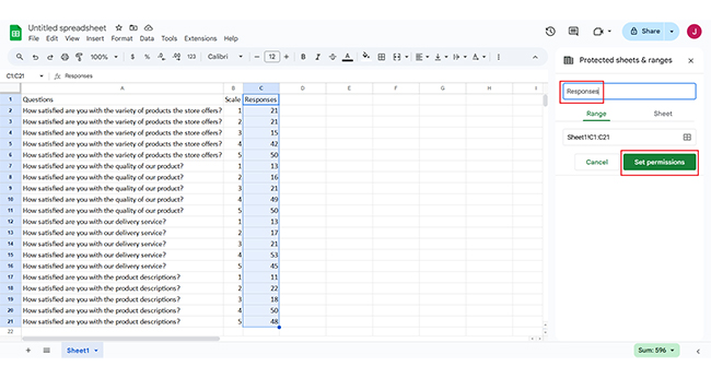
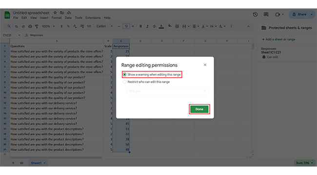
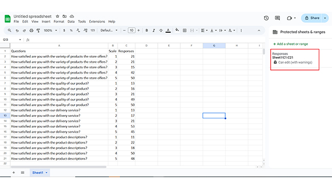
Here’s a quick way to protect the information you don’t want others to change.

  1. Firstly, highlight the data you want to secure. Next, click on Protect range on the menu.
Click on Protect Range for Learning How to Use Google Spreadsheet to Create Chart
  1. Then, give your range a custom name for easy reference. Then click on Set permissions to control who can edit it.
Click on Set Permissions for Learning How to Use Google Spreadsheet to Create Chart
  1. Finally, hit Done to lock it in place. No one can make changes unless you allow it.
Enter Done to Lock it in Place for Learning How to Use Google Spreadsheet to Create Chart
  1. Here’s your protected data in Google Sheets.
Protected Data in Google Sheets for Learning How to Use Google Spreadsheet to Create Chart

How to Hide Data in Google Sheets?

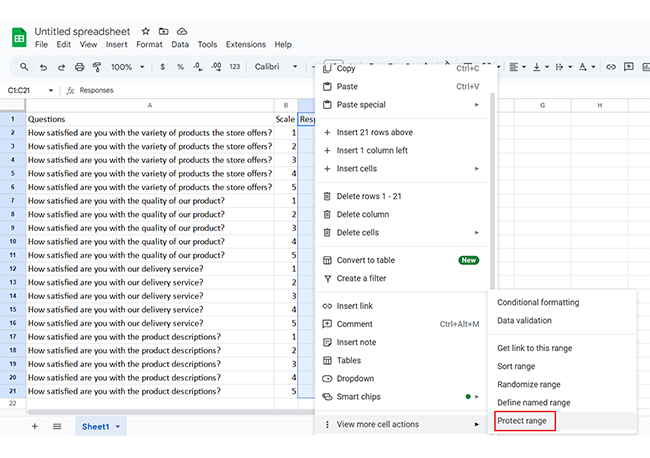
Here are a few ways to hide your data:

  • Hide rows or columns: Right-click on the row or column number (or letter) you want to hide. Then, click on hide row or hide column from the options.
  • Hide specific data: To hide specific data, select the cells you want to keep out of sight. Conditional formatting helps you make the text color blend with the background.
  • Protect your data: To keep others from seeing or editing your data, head to Data > Protected sheets and ranges and set your permissions.

How to Freeze Rows and Columns in Google Sheets?

Freezing rows and columns in Google Sheets is a great way to keep important information. Here’s how you can do it:

  1. Freeze rows: Click on the row number you want to freeze. Go to View > Freeze > Up to the current row. This will keep all your rows above that one locked in place.
  2. Freeze Columns: For columns, click the column letter you want to freeze. Then, go to View > Freeze > Up to the current column. This will freeze all columns to the left of the one you selected.

How to Filter Data in Google Sheets?

Google Sheets is super handy when you need to sort through large amounts of information. Here’s how you can quickly filter your data:

  • Select your data: Highlight the range or column you want to filter.
  • Enable the filter: Click on Data in the top menu and select Create a filter. This will add filter icons to your column headers.
  • Apply the filter: Click on the small filter icon (it looks like a funnel) in the column header. You can now sort the data or choose specific values from the drop-down.
  • Remove the filter: When done, click the filter icon again and select “Remove filter”.

How to Create a Drop-down List in Google Sheets?

Creating a drop-down list in Google Sheets is a great way to make data entry more organized and accurate. Here’s a simple step-by-step guide:

  1. Select the cell(s): Click on the cell or range where you want the drop-down list to appear.
  2. Open data validation: Go to the Data menu and choose “Data validation” from the options.
  3. Choose your list: In the Data validation window, under Criteria, select “List of items”. Then, type in your options, separated by commas (e.g., “Red, Blue, Green”).
  4. Set extra options: If you want the drop-down arrow to show in the cell for easier selection, check the “Show drop-down list in the cell” box.
  5. Save: Click “Done”, and your drop-down list is all set.

How to Wrap Text in Google Sheets?

Wrapping text is an essential, perfect solution, and here’s how you can do it:

  • Select the cells: Click on the cell or range of cells where you want to wrap the text.
  • Enable text wrapping: Go to the format menu, select “text wrapping”, and choose “Wrap”. This will make your text flow within the cell instead of overflowing.
  • Adjust row height (If needed): If your text is too long, you can adjust the row height. Drag the bottom border of the row to give it more space for the wrapped text.

How to Setup and Use Google Sheets Offline?

Need to work in Google Sheets without an internet connection? Here’s how you can do it:

  1. Use Google Chrome: Ensure you’re using Google Chrome. The offline mode works best in this browser.
  2. Turn on offline mode:
    • Open google sheets in chrome.
    • Go to File > Make available offline.
    • Alternatively, you can head to Google Drive, right-click the Sheets file, and select “Available offline”.
  1. Work offline: Once offline mode is set up, you can access and edit your Google Sheets anytime, even without the internet. Your changes will sync automatically once you’re back online.

How to Use Google Spreadsheet for Quick Analysis?

Are you looking for a quick and effective way to analyze your data in Google Sheets? ChartExpo is a fantastic tool that simplifies the process, making it easy to create charts in Google Sheets and take your spreadsheets to the next level.

With ChartExpo, you can easily create data visualizations perfect for analyzing surveys and customer feedback.

Your data stays safely stored in your spreadsheet, and you can access your charts in Google Sheets and Microsoft Excel.

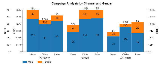
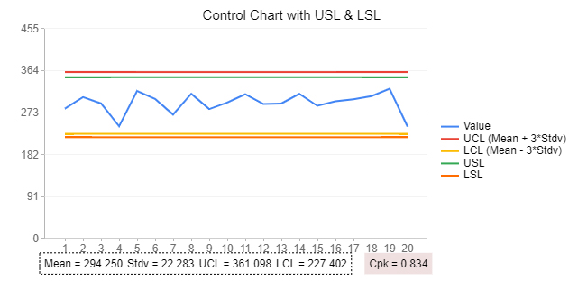
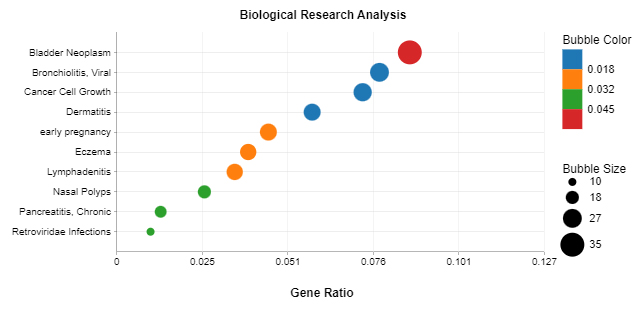
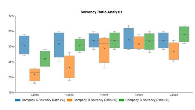
Below are some of the top types of charts and graphs created in Google Sheets using ChartExpo, showcasing its versatility and ease of use.

Sankey Chart

Sankey Chart for Learning How to Use Google Spreadsheet to Create Chart

Comparison Bar Chart

Comparison Bar Chart for Learning How to Use Google Spreadsheet to Create Chart

Clustered Stacked Bar Chart

Clustered Stacked Bar Chart for Learning How to Use Google Spreadsheet to Create Chart

Control Chart

Control Chart for Learning How to Use Google Spreadsheet to Create Chart

Dot Plot (ORA)

Dot Plot for Learning How to Use Google Spreadsheet to Create Chart

Box and Whisker Column Chart

Box and Whisker Column Chart for Learning How to Use Google Spreadsheet to Create Chart

Gauge Chart

Gauge Chart for Learning How to Use Google Spreadsheet to Create Chart

Multi-Axis Line Chart

Multi Axis Line Chart for Learning How to Use Google Spreadsheet to Create Chart

Progress Circle Chart

Progress Circle Chart for Learning How to Use Google Spreadsheet to Create Chart

Likert Scale Chart

Likert Scale Chart for Learning How to Use Google Spreadsheet to Create Chart

Let’s learn how to install ChartExpo in Google Sheets.

  1. To start using ChartExpo, download it directly from the Google Sheets program. To do this, select Extensions from the top toolbar.
  2. A menu will appear. Click the Get add-ons option.
  3. Search for ChartExpo, and click on Charts, Graphs & Visualizations by ChartExpo when it appears in the results.
  4. Click the Install button. You will have to confirm your Google account and accept some permissions.

ChartExpo charts are available both in Google Sheets and Microsoft Excel. Please use the following CTAs to install the tool of your choice and create beautiful visualizations in a few clicks in your favorite tool.

Example

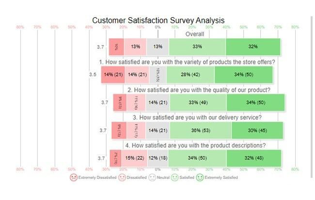
Let’s analyze this sample data in Excel using ChartExpo.

Questions Scale Responses
How satisfied are you with the variety of products the store offers? 1 21
How satisfied are you with the variety of products the store offers? 2 21
How satisfied are you with the variety of products the store offers? 3 15
How satisfied are you with the variety of products the store offers? 4 42
How satisfied are you with the variety of products the store offers? 5 50
How satisfied are you with the quality of our product? 1 13
How satisfied are you with the quality of our product? 2 16
How satisfied are you with the quality of our product? 3 21
How satisfied are you with the quality of our product? 4 49
How satisfied are you with the quality of our product? 5 50
How satisfied are you with our delivery service? 1 13
How satisfied are you with our delivery service? 2 17
How satisfied are you with our delivery service? 3 21
How satisfied are you with our delivery service? 4 53
How satisfied are you with our delivery service? 5 45
How satisfied are you with the product descriptions? 1 11
How satisfied are you with the product descriptions? 2 22
How satisfied are you with the product descriptions? 3 18
How satisfied are you with the product descriptions? 4 50
How satisfied are you with the product descriptions? 5 48
  • To get started with ChartExpo, install ChartExpo in Google Sheets.
  • Go to Extensions > Charts, Graphs & Visualizations by ChartExpo > Open.
open chartexpo in google sheets
  • To access the charts library, click the Add new chart button.
add new chart in google sheets
  • Once ChartExpo is loaded. Click on “Likert Scale Chart”.
search likert scale chart in google sheets
  • First, insert the data table into the sheet. Then, choose the Sheet name from the drop-down menu in the ChartExpo section.
  • Select the metric column; metric is the numeric column in your data sheet (in this example, it is the Responses.
  • Select the dimensions column; the dimension is the categorical column in your datasheet that contains text information (in this case, it is the Questions & Scale).
  • Click the Create chart button to complete the process.
Click Create Chart for Learning How to Use Google Spreadsheet to Create Chart
  • If you want to have the chart’s title, click Edit Chart, as shown in the image below.
Click Edit Chart for Learning How to Use Google Spreadsheet to Create Chart
  • Click the pencil icon next to Chart Header to change the title.
  • It will open the properties dialog. Under the Text section, you can add a heading in Line 1 and enable Show.
  • Give the appropriate title of your chart and click the Apply button.
Add Chart Header for Learning How to Use Google Spreadsheet to Create Chart
  • Let’s add the question number to each question: Click on the highlight pencil icon at the top of the Overall bars. Then, navigate to the “Question” area and toggle the “Show question no” option. Once complete, select the “Apply” button.
Show Questions No for Learning How to Use Google Spreadsheet to Create Chart
  • Let’s say you want to add text responses instead of numbers against every emoji.
  • Click the pencil icon next to the respective emoji. Expand the “Label” properties and write the required text. Then click the “Apply All” button.
  • Click the “Save” button to persist the changes.
Click Save Button for Learning How to Use Google Spreadsheet to Create Chart
  • Your final chart will appear as below.
Final How to Use Google Spreadsheet

Insights

  • 65% of customers are satisfied with the store with 32% extremely satisfied.
  • 62% are satisfied with product variety, 28% dissatisfied, and 10% neutral.
  • 67% found what they were looking for easily, while 20% had difficulty.
  • 66% are satisfied with both the product prices and the checkout process, while 20%-22% are dissatisfied.

Steps to Make Likert Chart in Google Sheets:

  1. Open your Google Sheets Application.
  2. Install ChartExpo Add-in for Google Sheets from Google Workspace Marketplace.
  3. Select the Likert Scale Chart from the list of charts.
  4. Fill in the necessary fields
  5. Click on the “Create Chart” button.
  6. Customize your chart properties to add header, axis, legends, and other required information.
  7. Export your chart and share it with your audience.

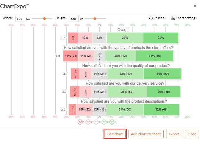
The following video will help you to create a Likert Scale Chart in Google Sheets.

FAQs

What is Google Sheets best used for?

Google Sheets is best for real-time collaboration, data organization, and basic analysis. It’s ideal for creating shared spreadsheets, tracking projects, and performing calculations. Cloud storage and integration with other Google tools simplify team workflows.

How do I create a data sheet in Google Sheets?

To create a data sheet in Google Sheets, open Google Sheets and select “Blank” to start a new sheet. Then, enter your data into the cells. You can organize it into columns and rows. Use headers for clarity.

How do I fill in Google Sheets?

To fill in Google Sheets, click on a cell and type your data. Press Enter to move to the next cell. You can also drag the fill handle (small square) to copy or auto-fill data across multiple cells.

Wrap Up

Google Spreadsheets is a powerful tool for managing data and a simple tool to use. It enables you to create, edit, and share spreadsheets online. This makes it a great tool for collaboration.

You can use basic formulas to perform calculations quickly. Moreover, Google Sheets automatically saves your work in the cloud, helping to prevent any loss of data.

The platform also offers features for formatting cells and data, and you can insert charts to display your information visually. This helps make your data more understandable.

Google Sheets also has tools for data validation. These tools help ensure your data is accurate and consistent. You can also set rules to control what data can be entered.

Sharing your work with others is simple. You can control who can view or edit the document, making collaboration efficient and secure.

Finally, Google Sheets is flexible and user-friendly. It’s an excellent choice for personal, educational, and business use.

How much did you enjoy this article?

GSAd2
Start Free Trial!
144762

Related articles

next previous
Google Sheets10 min read

Google Sheets Amortization Schedule with Clear Visuals

A Google Sheets Amortization Schedule tracks loan payments, interest, and balances. Learn how to create your schedule for better loan management.

Google Sheets11 min read

Google Sheet Profit and Loss Template for Financial Success

Google Sheet profit and loss template simplifies tracking income and expenses. Learn tips and steps for using this template for better financial management.

Google Sheets11 min read

Sales Tracking Spreadsheet for Better Insights

A Spreadsheet for Sales Tracking organizes data, tracks performance, and analyzes trends. This guide covers its benefits, templates, and visualization tips.

Google Sheets11 min read

How to Create a Chart in Google Sheets in Few Steps?

Learn step-by-step how to create a chart in Google Sheets to visualize your data clearly and effectively, even if you're a beginner.

Google Sheets11 min read

Commission Spreadsheet Template: An Easy Guide

A commission spreadsheet template ensures accuracy, saves time, and reduces errors. Learn its benefits and best practices for efficient commission tracking.

ChartExpo logo

Turn Data into Visual
Stories

CHARTEXPO

  • Home
  • Gallery
  • Videos
  • Services
  • Pricing
  • Contact us
  • FAQs
  • Privacy policy
  • Terms of Service
  • Sitemap

TOOLS

  • ChartExpo for Google Sheets
  • ChartExpo for Microsoft Excel
  • Power BI Custom Visuals by ChartExpo
  • Word Cloud

CATEGORIES

  • Bar Charts
  • Circle Graphs
  • Column Charts
  • Combo Charts
  • Comparison Charts
  • Line Graphs
  • PPC Charts
  • Sentiment Analysis Charts
  • Survey Charts

TOP CHARTS

  • Sankey Diagram
  • Likert Scale Chart
  • Comparison Bar Chart
  • Pareto Chart
  • Funnel Chart
  • Gauge Chart
  • Radar Chart
  • Radial Bar Chart
  • Sunburst Chart
  • see more
  • Scatter Plot Chart
  • CSAT Survey Bar Chart
  • CSAT Survey Chart
  • Dot Plot Chart
  • Double Bar Graph
  • Matrix Chart
  • Multi Axis Line Chart
  • Overlapping Bar Chart
  • Control Chart
  • Slope Chart
  • Clustered Bar Chart
  • Clustered Column Chart
  • Box and Whisker Plot
  • Tornado Chart
  • Waterfall Chart
  • Word Cloud
  • see less

RESOURCES

  • Blog
  • Resources
  • YouTube
SIGN UP FOR UPDATES

We wouldn't dream of spamming you or selling your info.

© 2025 ChartExpo, all rights reserved.