Categories
By ChartExpo Content Team
Tracking project progress can feel overwhelming. Deadlines move fast, and without the right tools, you’re left guessing if you’re on track or falling behind. This is where a burndown chart makes all the difference. A burndown chart is simple yet powerful, offering a clear visual of how much work remains versus the time available. It’s like having a guiding map that shows where you are and how much ground you need to cover to reach the finish line.
A burndown chart isn’t just a static graph. It’s a real-time snapshot of your project’s pace. You’ll know right away if your team is on schedule or if adjustments need to be made. This keeps everyone aligned and accountable.


When teams see their progress laid out in a burndown chart, it sparks focused discussions and quick action to stay on target. You’re not just tracking tasks—you’re ensuring the project’s health.
Why is a burndown chart so effective? Because it turns raw data into a clear story. The chart shows an “ideal work line” and the actual progress, making it easy to spot gaps and anticipate challenges.
Whether you’re managing a sprint, a release, or a large-scale project, using a burndown chart can transform how you approach project management. Ready to get the most out of your project planning? It starts with understanding the value a burndown chart brings.
First…
Ever felt overwhelmed trying to track progress in your projects? Well, Burndown Charts are here to save the day. Imagine you’re on a road trip. You have your map and you’re marking off the distance as you go, making sure you’re on track to arrive on time. That’s what a Burndown Chart does for project management.
A Burndown Chart is a data presentation that shows how much work you still have to do versus the time you have left.
It’s like having a countdown timer that not only tells you the time ticking away but also shows what you should have accomplished during that time. It matters because it gives you and your team a clear visual of your project’s progress. No more guessing if you’re behind schedule or if you can kick back and relax!
Now, let’s get to the juicy part: making your life easier with Burndown Charts. Managing projects without them is like trying to hit a moving target blindfolded.
With Burndown Charts, you can see everything clearly. They help you spot problems early. Think of them as your project’s early warning system. If your chart shows that your team is consistently behind schedule, it’s a flag waving at you to fix something before it’s too late.
Burndown Charts also promote transparency. Everyone on the team can see the chart, right? This means every team member knows exactly what’s happening. It’s like having an open book policy for project progress, which can seriously boost team motivation.
When team members see a visual representation of what they’ve accomplished through visual analytics, it can be a big morale booster. Plus, it’s a great way to keep everyone accountable.
In essence, Burndown Charts don’t just track progress; they help streamline the entire project management process. They allow you to adjust quicker, communicate better, and lead more effectively.
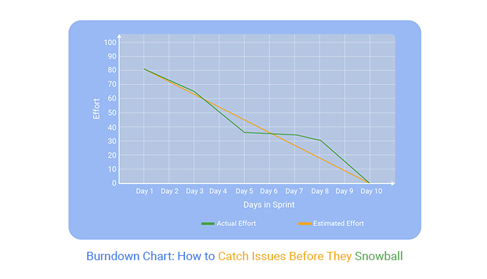
A burndown chart is a data visualization used in project management, especially in agile methodologies, to track the progress of a project. It shows the amount of work left to do versus the time you have to complete it. Let’s break down the essential elements of a burndown chart to understand how it functions effectively.
In any burndown chart, the X-axis (horizontal line) represents time. This could be in days, sprints, or weeks, depending on the project’s timeline.
The Y-axis (vertical line), on the other hand, shows the amount of work that remains. This work is often measured in tasks, story points, or hours.
Two critical lines are drawn on the burndown chart: the Ideal Work Line and the Actual Work Line.
The Ideal Work Line represents a straight line from the top of the Y-axis (total work at the start) to the bottom (zero work left) at the project’s end date. It shows the pace at which the team needs to work to complete the project on time.
The Actual Work Line shows the real-time progress of the team. It might zigzag above or below the Ideal Work Line, providing a visual representation of whether the team is ahead, on track, or behind schedule.
Real-time updates are vital for the effectiveness of a burndown chart. They allow the project team to see daily progress and adjust their pace or priorities accordingly.
If the Actual Work Line deviates significantly from the Ideal Work Line, it can signal issues like scope creep, underestimated tasks, or external blockers. Updating the burndown chart in real time keeps the team informed and agile, and pairing it with a Scatter chart can help highlight patterns or anomalies that show why the project is starting to veer off course.
Sprint Burndown Charts are essential tools in Agile project management. They visually track the amount of work left in a sprint versus the time remaining.
Each day, the team updates the chart, plotting the current amount of work left. This provides a clear picture of whether the sprint is on track to complete the planned tasks. Teams use these charts in daily stand-ups to discuss progress and tackle any delays.
Sprint Burndown Charts help maintain the pace and ensure that everyone remains updated on the sprint’s status.
Release Burndown Charts focus on the bigger picture, tracking progress across multiple sprints within a release cycle. They show the total work remaining and how much has been completed since the start of the release.
These types of charts and graphs are beneficial for project managers and stakeholders to gauge if the release is progressing as planned and if adjustments are needed. By providing a long-term view, Release Burndown Charts help teams stay aligned with the overall project goals and timelines.
Epic Burndown Charts are used for tracking large blocks of work that span multiple sprints, often referred to as ‘Epics’. These charts are crucial when managing significant features or substantial updates that need to be broken down into smaller, more manageable tasks spread over a lengthy period.
Epic Burndown Charts offer a visual representation of the progress on these major tasks, showing how much work remains and how far the team has come. They are particularly useful in large-scale projects where keeping track of every detail is essential for success.
The following video will help you create a Multi Axis Line Chart in Microsoft Excel.


The following video will help you create a Multi Axis Line Chart in Google Sheets.
When managing a project, understanding how tasks depend on each other is key. By mapping out these dependencies in your burndown chart, you give a clearer picture of the project timeline.
Start by identifying critical tasks that impact others. Next, link these tasks on your chart. This visual representation helps teams anticipate delays and adjust their workflows, ensuring smoother project execution.
Why stop at just tracking tasks? Annotate your burndown chart with key milestones and major challenges. This method turns your chart into a comprehensive project story.
For each milestone, mark its expected completion date directly on the chart. When challenges arise, note these too. This approach not only keeps the team informed but also aids in pinpointing where things might be going off track, allowing for timely interventions.
Projects rarely go exactly as planned. Unplanned tasks can pop up, throwing your original schedule off balance. To handle this, add a buffer zone in your burndown chart. This zone accounts for unexpected tasks, giving you the flexibility to adapt without overhauling your entire chart.
Regularly update this buffer to reflect the current state of the project, helping maintain an accurate and functional project timeline.
Interpreting a burndown chart can feel like reading a story where each point conveys part of a larger narrative. This chart isn’t just a bunch of lines and numbers—it’s a snapshot of team progress and project pace.
When you’re analyzing and interpreting data in a burndown chart, you’re essentially seeing a timeline that tells you how quickly tasks are being completed compared to how quickly they need to be completed. It’s like watching a race where the project tasks are runners, and the deadline is the finish line.
Imagine you’re following a path in the woods marked by a straight line. If you start veering off the path, you know you’re probably going to face some obstacles.
That’s similar to what happens when your project’s burndown chart starts to deviate from its ideal line. If the actual line rises above the ideal, it’s a hint that your project might be facing delays. Maybe tasks are piling up, or maybe the team hit an unexpected roadblock. It’s a signal to dig deeper and find out what’s holding things up.
Now, let’s say you’re tracking your progress on that hike with a GPS that suddenly stops recording your movement—you’re stuck at the same coordinates.
That’s what a plateau on a burndown chart looks like. It means your team isn’t moving forward. This could be because of unclear instructions, dependencies on other tasks that haven’t been completed, or maybe a key team member is out sick.
On the flip side, a sudden drop might feel great, like you’re sprinting down the trail, but it could also mean tasks were rushed or improperly marked as completed. Both scenarios deserve a closer look to ensure the team’s pace is healthy and sustainable.
Fluctuations in a burndown chart are like the small ups and downs you experience on a gentle hiking trail. They’re normal and expected.
However, significant swings could indicate deeper issues or changes in project scope. It’s crucial to balance expectations with reality. If you see frequent, drastic fluctuations, it may be time to check if the team is facing challenges or if perhaps they’re being too optimistic with their task markings.
Regular check-ins can help smooth out these fluctuations, keeping the project on a more predictable path.
Scope creep can throw a burndown chart off track, making it look like little progress is being made.
To keep your chart accurate, clearly define project boundaries from the start. Hold regular check-ins to ensure everyone understands these limits. If new tasks must be added, update the chart immediately to reflect these changes. This keeps everyone on the same page and maintains the integrity of the chart.
Starting with inaccurate task estimations can skew your entire project timeline. To enhance estimation accuracy, use historical data from similar projects as a benchmark. Involve multiple team members in the estimation process to get a well-rounded view of the task complexities.
Regularly revisit and adjust estimations based on actual progress to keep your burndown chart realistic and useful.
Partially completed tasks can be a headache when it comes to burndown charts. To address this, break tasks into smaller, manageable sub-tasks that can be completed within a single reporting period. This approach not only simplifies tracking but also provides a more granular view of project progress.
Ensure each sub-task has a clear definition of “done” to avoid ambiguity in completion status.
Starting your burndown chart begins with gathering your initial data. This includes all the tasks you plan to complete and an estimate of the effort each task will require, usually in hours or days. Input this data into a spreadsheet, as it will form the backbone of your burndown chart.
As your project progresses, keep this data fresh with ongoing updates. Every time a task is completed, or its estimated effort changes, adjust your data. This keeps your burndown chart accurate and reflective of real-time progress.
Once your data is set, the next step is plotting the ideal work line. This line represents the rate at which you need to complete tasks to finish the project on time.
Start by calculating the total effort required, then divide this by the number of days available to work. Plot this line on your chart from the starting point down to zero on your project’s end date. This line is your project’s heartbeat, showing where you should be.
Tracking actual progress is vital. You’ll want to record the amount of work completed at regular intervals—daily is ideal. Update your burndown chart with these actuals by marking a new point every time you record updates and connecting these points with a line.
This line will sometimes sit above (behind schedule) or below (ahead of schedule) your ideal work line.
Keeping your burndown chart up-to-date is essential. Why? Well, think of it as the health monitor for your project.
Regular updates mean you’re always aware of how your team’s doing against the planned work schedule. Here’s the trick: update the chart at the end of each day. Yes, every single day! This way, no task slips through the cracks, and you can sleep a little easier knowing exactly where your project stands.
You can’t do it alone, right? For a burndown chart to truly reflect your project’s progress, everyone must chip in with their updates.
Make it a team sport! Have quick daily check-ins where team members report their progress. This not only keeps your chart accurate but also fosters a spirit of transparency and teamwork. Remember, a burndown chart is only as good as the data it displays. So, make data collection a team effort!
Ever shown a chart and got blank stares in return? We’ve all been there. To avoid that, make your burndown chart as clear as a sunny day.
Use colors to differentiate between tasks completed and those pending. Choose a clear font and appropriate sizes for texts and legends. Consider using dashed lines or shading for important thresholds.
Why? Because when your stakeholders can read the chart easily, they understand the project better. And when they understand, they support. Simple as that!
When using burndown charts, it’s easy to fall into some common traps. Let’s make sure you sidestep these pitfalls to keep your project tracking on point!
Don’t stuff your burndown chart with every piece of data you have. That’s a surefire way to make it unreadable. Stick to the essentials: the planned work versus the actual work done. This keeps your chart clean and your team focused on the main progress indicators.
A burndown chart can look straightforward, but misreading the data is a common error. For instance, a downward trend is generally positive, indicating work completion.
However, if this drop happens too quickly, it might suggest that tasks are being overlooked or marked off too soon. Take time to assess what the data really shows about your project’s progress.
Updating your burndown chart sporadically defeats its purpose. Regular updates provide a real-time picture of where your project stands. Aim for daily updates if possible. This habit keeps everyone in the loop and enables quick adjustments.
Consistency in updates ensures your chart truly reflects project dynamics, helping avoid surprises at the end of the sprint.
Burndown charts simplify project management by turning complex data into clear visuals. They track work against time, letting you spot issues early and keep your team on target.
From understanding the ideal work line to interpreting real-time progress, these charts help balance expectations with project realities. Whether you’re managing sprints, releases, or major features, burndown charts guide your next steps with clarity.
The real power of a burndown chart lies in how it transforms raw data into actionable insights. By consistently updating your chart, collaborating with your team for accurate data, and tailoring it to your workflow, you create a reliable project compass. Integrate tools like ChartExpo for enhanced visualization and better communication across your team.
Incorporate burndown charts into your projects, and watch how quickly they become essential for maintaining focus and meeting deadlines. They don’t just track progress—they tell the story of your project’s journey.
Make your data work for you, stay proactive, and keep your projects on course. That’s the path to efficient project management and successful outcomes.
How much did you enjoy this article?


Calculate accounts receivable turnover ratio to measure credit collection speed, improve cash flow, and strengthen your financial strategy. Read on!

Change Management KPIs are the key to tracking adoption, performance, and ROI during transitions. Find out which metrics matter. Read on!

Data collection methods and techniques determine the quality of every insight you act on. Explore key approaches for gathering reliable data. Read on!


