• Home
  • Tools dropdown img
    • Spreadsheet Charts

      • ChartExpo for Google Sheets
      • ChartExpo for Microsoft Excel
    • Power BI Charts

      • Power BI Custom Visuals by ChartExpo
    • Word Cloud

  • Charts dropdown img
    • Chart Category

      • Bar Charts
      • Circle Graphs
      • Column Charts
      • Combo Charts
      • Comparison Charts
      • Line Graphs
      • PPC Charts
      • Sentiment Analysis Charts
      • Survey Charts
    • Chart Type

      • Box and Whisker Plot
      • Clustered Bar Chart
      • Clustered Column Chart
      • Comparison Bar Chart
      • Control Chart
      • CSAT Survey Bar Chart
      • CSAT Survey Chart
      • Dot Plot Chart
      • Double Bar Graph
      • Funnel Chart
      • Gauge Chart
      • Likert Scale Chart
      • Matrix Chart
      • Multi Axis Line Chart
      • Overlapping Bar Chart
      • Pareto Chart
      • Radar Chart
      • Radial Bar Chart
      • Sankey Diagram
      • Scatter Plot Chart
      • Slope Chart
      • Sunburst Chart
      • Tornado Chart
      • Waterfall Chart
      • Word Cloud
    • Google Sheets
      Microsoft Excel
  • Services
  • Pricing
  • Contact us
  • Blog
  • Support dropdown img
      • Gallery
      • Videos
      • Contact us
      • FAQs
      • Resources
    • Please feel free to contact us

      atsupport@chartexpo.com

Categories
All Data Visualizations Data Analytics Surveys
Add-ons/
  • Google Sheets
  • Microsoft Excel
  • Power BI
All Data Visualizations Data Analytics Surveys
Add-ons
  • Google Sheets
  • Microsoft Excel
  • Power BI

We use cookies

This website uses cookies to provide better user experience and user's session management.
By continuing visiting this website you consent the use of these cookies.

Ok

ChartExpo Survey


Home > Blog > Microsoft Excel

Google Sheets vs. Excel: Key Differences and Benefits

Google Spreadsheets vs. Excel: the ultimate showdown for data analysis.

Picture this: You’re sitting at your desk, holding a cup of coffee, prepared to tackle massive data. What tool do you grab? Which is better: Google Sheets or Excel?

Google Spreadsheet vs Excel

Google Sheets provides smooth teamwork capabilities, ideal for group assignments. It is free and accessible from any location. Thus, it is preferred by those who work remotely. More than 2 billion individuals utilize it, a testament to its widespread appeal.

Excel is a powerful tool for individuals who need to perform complex numbers crunching. It has features like advanced statistical tests and robust data analysis tools. So, it’s no wonder Excel remains the go-to for professionals handling massive datasets.

Google Sheets vs. Excel might seem like an easy choice. For real-time collaboration, Google Sheets shines. Multiple users can work simultaneously, making updates in real-time. However, Excel’s advanced functions provide deeper insights crucial for detailed analysis.

What if you need the best of both worlds? You can merge Google Sheets’ collaborative features with Excel’s analytical capabilities. You can effortlessly import and export data between them, leveraging their strengths. This hybrid approach ensures you’re not missing out on any features.

In a rapidly digitizing world, choosing between Google Spreadsheets vs. Excel depends on your needs. Whether it’s teamwork or deep data analysis, understanding the strengths of each tool can transform your data analysis game.

Ready to make an informed choice? Let’s explore how these tools can elevate your data analysis.

Table of Contents:

  1. Google Sheets vs. Excel: Definitions
  2. Google Sheets vs. Excel: Pros And Cons
  3. What is the Difference between Google Sheets and Excel?
  4. What are the Similarities between Excel and Google Sheets?
  5. Google Sheets vs. Excel: Uses for Data Analysis
  6. Wrap Up

First…

Google Sheets vs. Excel: Definitions

Microsoft Excel

Microsoft Excel is a spreadsheet program developed by Microsoft. It is part of the Microsoft Office suite. Excel is used for data organization, data analysis, and visualization. It allows you to create and format spreadsheets, perform calculations, and generate charts.

Excel includes a grid of cells arranged in numbered rows and letter-named columns. You can input data into these cells.

Excel supports various functions and formulas for manipulating and analyzing data. It is widely used in business, finance, and research for budgeting, sales forecasting, and statistical analysis.

Additionally, Excel offers features like pivot tables, which help summarize large data sets. It also includes tools for conditional formatting, data validation, and collaboration. You can share Excel files and work on them simultaneously.

Excel’s versatility and powerful features make it a valuable tool for analyzing and interpreting data.

Google Sheets

Google Sheets is a web-based spreadsheet application developed by Google. It is part of the Google Workspace suite.

Google Sheets allows you to create, edit, and share spreadsheets online. It provides a grid of cells organized into rows and columns. You can input and manipulate data in these cells. It supports various functions and formulas for calculations and data analysis.

Google Sheets is accessible from any device with internet access.

One of its key features is real-time collaboration. Multiple users can work on the same spreadsheet simultaneously. Changes are saved automatically, and revision history is available.

Google Sheets integrates with other Google services, like Google Drive, Google Forms, and Google Data Studio. It also supports add-ons to extend its functionality.

Google Sheets is free to use, with additional features available through a subscription. Its ease of use and collaboration capabilities make it popular for personal and professional use.

Google Sheets vs. Excel: Pros And Cons

Pros and Cons of Excel

Microsoft Excel is a powerhouse in data management and analysis. However, like any tool, it has its strengths and weaknesses. Let’s explore the pros and cons of using Excel.

Excel Pros:

  • Powerful functionality: Excel offers a wide range of functions and formulas for handling complex calculations and data manipulation. From basic arithmetic to advanced statistical operations, it’s all there.
  • Customization: You can tailor Excel to your needs. Customize the interface, create macros, and design unique templates to streamline your workflow.
  • Integration: Excel seamlessly integrates with other Microsoft Office applications and third-party tools. This makes it easier to import and export data across platforms.
  • Advanced data analysis: Features like pivot tables, data analysis tools, and add-ins enable deep data analysis. This allows you to uncover trends, correlations, and insights that might not be immediately obvious.
  • Data visualization: Excel provides different types of charts, graphs, and formatting options that elevate data into the realm of visual storytelling. These tools enable you to craft visually appealing and informative data visualizations, turning raw numbers into compelling stories that present information with clarity and impact.

Excel Cons:

  • Cost: Excel is part of the Microsoft Office suite, which requires a subscription or one-time purchase. This can be a barrier for individuals or small businesses on a tight budget.
  • Steep learning curve: While Excel is powerful, it can overwhelm beginners. Mastering its advanced features and functions takes time and practice.
  • Compatibility issues: Files created in different versions of Excel or on different operating systems can sometimes encounter compatibility issues. This can lead to formatting problems or data loss.
  • Limited collaboration features: Although Excel supports real-time collaboration, it’s not as robust as other modern collaboration tools. Concurrent editing can lead to conflicts and data inconsistencies.
  • Security concerns: Excel files can be vulnerable to security risks, primarily if not properly managed. Sensitive data can be at risk if the files are shared without adequate protection.

Pros and Cons of Google Sheets

Google Sheets has become a popular tool for individuals and businesses alike. Its cloud-based nature makes it incredibly versatile but has advantages and disadvantages. Let’s explore the pros and cons of using Google Sheets.

Google Sheets Pros:

  • Real-time collaboration: Google Sheets excels in real-time collaboration. Multiple users can work on a spreadsheet simultaneously, instantly seeing each other’s changes. This feature is perfect for team projects and remote work.
  • Accessibility: Because it’s web-based, you can access Google Sheets from any device with an internet connection. Your spreadsheets are always within reach, whether on a laptop, tablet, or smartphone.
  • Integration with Google Workspace: Google Sheets seamlessly integrates with other Google Workspace apps like Google Drive, Google Forms, and Google Data Studio. This makes importing data, automating tasks, and streamlining workflows easy.
  • Version history and automatic saving: Changes in Google Sheets are saved automatically. The version history feature allows you to track and revert to previous versions, ensuring your work is never lost.
  • Cost: Google Sheets is free for individuals and small teams to use. For larger organizations, additional features are available through a Google Workspace subscription. This subscription is cost-effective compared to some alternatives.

Sheets Cons:

  • Limited offline functionality: While you can work offline with Google Sheets, its offline capabilities are limited compared to other spreadsheet programs. Full functionality requires an internet connection.
  • Complexity in advanced features: Google Sheets handles basic tasks well, but it can be challenging for advanced data analysis and complex functions. Users might find it lacking compared to dedicated software like Microsoft Excel.
  • Privacy concerns: Storing sensitive data in the cloud always carries privacy risks. You have to trust Google with your data and rely on its security measures to protect it.
  • File compatibility issues: Google Sheets may struggle with files created in other spreadsheet programs. Formatting and feature discrepancies can occur, leading to compatibility issues.
  • Dependency on Google’s infrastructure: Google Sheets is a cloud-based service dependent on Google’s infrastructure. Service outages or internet issues can disrupt access to your spreadsheets.

What is the Difference between Google Sheets and Excel?

Choosing between Google Sheets and Microsoft Excel can be a tough decision. Both have strengths, but some differences might make one a better fit for your needs. The table below efficiently breaks down these differences.

Feature Google Sheets Microsoft Excel
Ownership and Cost Free for personal use; subscription for advanced features A one-time purchase or subscription is required
Platform Web-based with mobile apps Desktop, web, and mobile apps
Real-Time Collaboration Excellent real-time collaboration with multiple users Limited real-time collaboration in certain versions
Offline Access Limited offline functionality Full offline functionality
Integration Integrates seamlessly with Google Workspace Integrates with Microsoft Office and other software
Automation/Macros Basic scripting with Google Apps Script Advanced VBA macros and Power Query
Advanced Features Limited advanced features Extensive advanced features, including Power Pivot
File Compatibility Can struggle with complex Excel files Handles a wide range of file types, including Google Sheets
Customization Limited customization options Extensive customization options
Security Relies on Google’s cloud security measures Advanced security features, including data encryption
Cost Generally lower cost, especially for small teams Higher cost, especially for a full Office suite
Learning Curve Easier for beginners Steeper learning curve for advanced features
Data Visualization Basic charts and graphs Advanced charting and data visualization tools

What are the Similarities between Excel and Google Sheets?

Excel and Google Sheets are heavyweights in the spreadsheet world. Each offers a range of features that make them indispensable data management and analysis tools.

While these tools have unique strengths, they also share many similarities. Let’s take a look at what these two platforms have in common.

  1. Core functionality: Excel and Google Sheets provide robust core functionality. They offer a grid of cells to input, manipulate, and analyze data. Basic features like sorting, filtering, and formatting are available in both, allowing you to organize and present data effectively.
  2. Data handling: Excel and Google Sheets support various functions and formulas for data calculations and analysis. They can handle complex mathematical, statistical, and financial operations, making them powerful tools for data analysis.
  3. Integration: Both platforms integrate well with other software and services. Excel works seamlessly with other Microsoft Office applications, while Google Sheets integrates smoothly with Google Workspace apps. They also support third-party add-ons and extensions to enhance their functionality.
  4. Accessibility: Excel and Google Sheets are accessible across multiple devices. Excel offers desktop, web, and mobile versions. Google Sheets is primarily web-based but also available on mobile devices. This multi-platform availability ensures you can work on your spreadsheets from anywhere.
  5. Community and support: These tools have extensive communities and support resources. You can access a wealth of tutorials, forums, and documentation to troubleshoot issues and learn new skills. This strong community support helps you maximize each platform’s capabilities.

Google Sheets vs. Excel: Uses for Data Analysis

Picture yourself juggling mountains of data, trying to make sense of the chaos. Excel and Google Sheets are excellent, but they sometimes miss the mark with data visualization. Excel is powerful but clunky, and Google Sheets’ chart options might be limited.

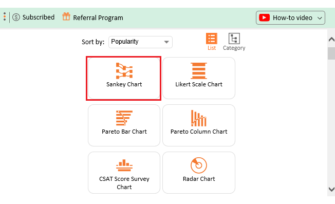
Enter ChartExpo, the knight in shining armor for your data visualization woes. This add-on supercharges your charts, offering a vast library of dynamic visualizations that make your data sing.

Ready to turn your data into a visual masterpiece? Let’s dive in!

Excel

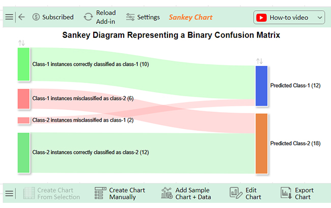
Let’s learn how to install ChartExpo in Excel.

  1. Open your Excel application.
  2. Open the worksheet and click the “Insert” menu.
  3. You’ll see the “My Apps” option.
  4. In the Office Add-ins window, click “Store” and search for ChartExpo on my Apps Store.
  5. Click the “Add” button to install ChartExpo in your Excel.

ChartExpo charts are available both in Google Sheets and Microsoft Excel. Please use the following CTAs to install the tool of your choice and create beautiful visualizations with a few clicks in your favorite tool.

Example 1

Let’s analyze the data below in Excel using ChartExpo.

Source Target Count
Class-1 instances correctly classified as class-1 Predicted Class-1 10
Class-1 instances misclassified as class-2 Predicted Class-2 6
Class-2 instances misclassified as class-1 Predicted Class-1 2
Class-2 instances correctly classified as class-2 Predicted Class-2 12
  • To get started with ChartExpo, install ChartExpo in Excel.
  • Now Click on My Apps from the INSERT menu.
insert chartexpo in excel
  • Choose ChartExpo from My Apps, then click Insert.
open chartexpo in excel
  • Once it loads, choose the “Sankey Chart” from the charts list.
search sankey chart in excel
  • Click the “Create Chart From Selection” button after selecting the data from the sheet, as shown.
Click Create Chart From Selection After Learning Google Spreadsheet vs Excel
  • ChartExpo will generate the visualization below for you.
Click Edit Chart in Excel After Learning Google Spreadsheet vs Excel
  • If you want to have the chart’s title, click Edit Chart, as shown in the above image.
  • Click the pencil icon next to the Chart Header to change the title.
  • It will open the properties dialog. Under the Text section, you can add a heading in Line 1 and enable Show.
  • Give the appropriate title of your chart and click the Apply button.
Add Chart Header After Learning Google Spreadsheet vs Excel
  • You can disable the percentage value of all nodes as follows:
Disable Percentage Value After Learning Google Spreadsheet vs Excel
  • You can disable the footer label by clicking on the small pencil icon:
Disable Footer Label After Learning Google Spreadsheet vs Excel
  • Let’s give colors to the nodes. Click the pencil icon at the top of the nodes and go to “Node“. Select the color and click the “Apply” button to save all changes.
Give Colors of Nodes After Learning Google Spreadsheet vs Excel
  • Click the “Save Changes” button to persist the changes.
Click Save Changes After Learning Google Spreadsheet vs Excel
  • Your final chart will appear below.
Excel Final Google Spreadsheet vs Excel

Insights

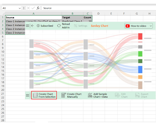
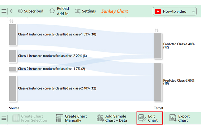
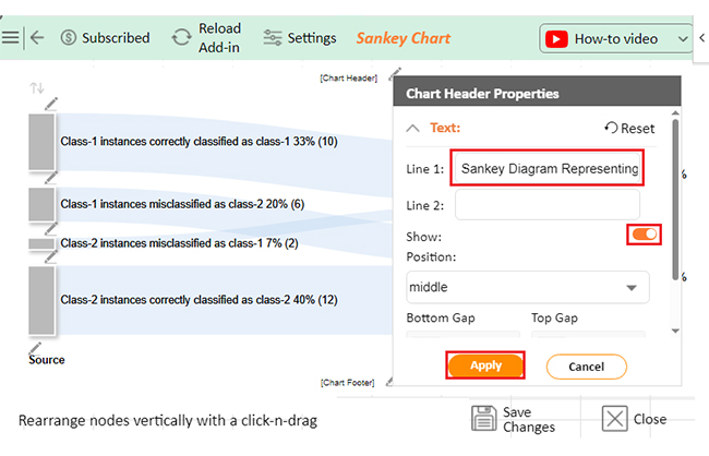
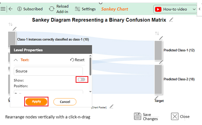
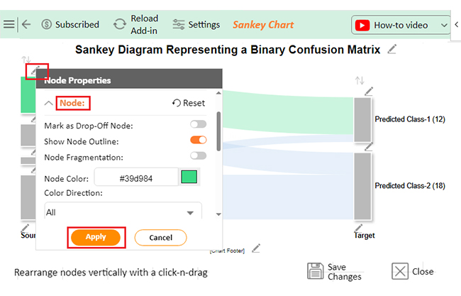
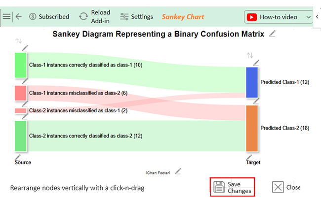
The data shows a classification model’s performance:

  • Class-1: 10 correctly classified, 6 misclassified as Class-2
  • Class-2: 12 correctly classified, 2 misclassified as Class-1

Enhance Your Data Analysis with Sankey Charts in Microsoft Excel

This video will demonstrate how to create a Sankey Chart in Microsoft Excel, a powerful method for visualizing data flows and relationships. Integrate this skill into your Excel toolkit to enhance your analysis!

Google Sheets

Let’s learn how to install ChartExpo in Google Sheets.

  1. To start using ChartExpo, download it directly from the Google Sheets program. To do this, select Extensions from the top toolbar.
  2. A menu will appear. Click the Get add-ons option.
  3. Search for ChartExpo, and click on Charts, Graphs & Visualizations by ChartExpo when it appears in the results.
  4. Click the Install button. You will have to confirm your Google account and accept some permissions.

ChartExpo charts are available both in Google Sheets and Microsoft Excel. Please use the following CTAs to install the tool of your choice and create beautiful visualizations in a few clicks in your favorite tool.

Example 2

Let’s analyze the data below using ChartExpo in Google Sheets.

Questions Scale Responses
How likely will you buy this product again in future? 1 1
How likely will you buy this product again in future? 2 4
How likely will you buy this product again in future? 3 3
How likely will you buy this product again in future? 4 7
How likely will you buy this product again in future? 5 5
How likely will you use the discount code? 1 3
How likely will you use the discount code? 2 4
How likely will you use the discount code? 3 2
How likely will you use the discount code? 4 7
How likely will you use the discount code? 5 4
How likely will you recommend this product to your friend circle? 1 2
How likely will you recommend this product to your friend circle? 2 2
How likely will you recommend this product to your friend circle? 3 5
How likely will you recommend this product to your friend circle? 4 2
How likely will you recommend this product to your friend circle? 5 5
  • To get started with ChartExpo, install ChartExpo in Google Sheets.
  • Go to Extensions > Charts, Graphs & Visualizations by ChartExpo > Open.
open chartexpo in google sheets
  • To access the charts library, click the Add new chart button.
add new chart in google sheets
  • Once ChartExpo is loaded. Click on “Likert Scale Chart”.
search likert scale chart in google sheets
  • Put the data table in the sheet first. Then, choose the Sheet name from the drop-down in the ChartExpo section.
  • Select the metric column. The metric column is the numeric column in your data sheet (in this example, it is the Responses).
  • Select the dimensions column; the dimension is the categorical column in your datasheet that contains text information (in this case, it is the Question & Scale).
  • Click the Create chart button to complete the process.
Click Create Chart After Learning Google Spreadsheet vs Excel
  • The Likert Scale Chart will look as follows.
Click Edit Chart in Google Sheets After Learning Google Spreadsheet vs Excel
  • Click the Edit chart button to make custom changes.
  • Click the pencil icon next to the Chart Header to change the title.
  • It will open the properties dialog. Under the Text section, you can add a heading in Line 1 and enable Show.
  • Give the appropriate title of your chart and click the Apply button.
Click Add Chart Header After Learning Google Spreadsheet vs Excel
  • Let’s say you want to add text responses instead of numbers against every emoji.
  • Click the pencil icon next to the respective emoji. Expand the “Label” properties and write the required text. Then click the “Apply All” button.
  • Click the “Save” button to persist the changes.
Click Save After Learning Google Spreadsheet vs Excel
  • Your final chart will appear below.
Final Google Spreadsheet vs Excel

Insights

  • 60% of customers would repurchase, 25% would not, and 15% are unsure.
  • 55% would use discount codes, while 35% would not.
  • 44% would recommend products to friends, and 26% would not.
  • Overall, 56% are satisfied, but 29% are dissatisfied with the product and store.

Enhance Your Survey Data Visualization Skills in Google Sheets

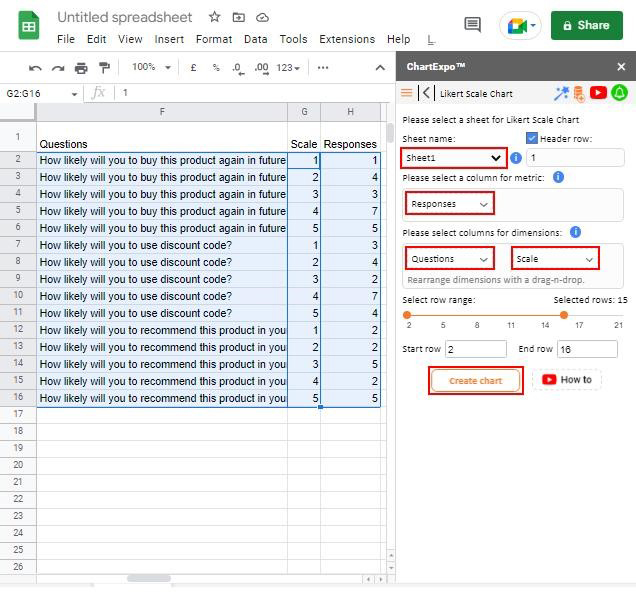
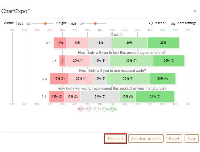
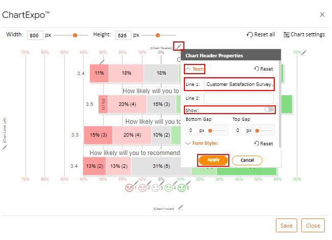
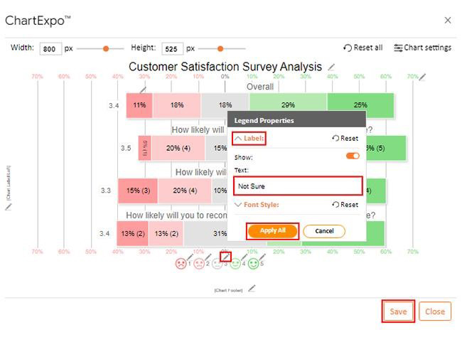
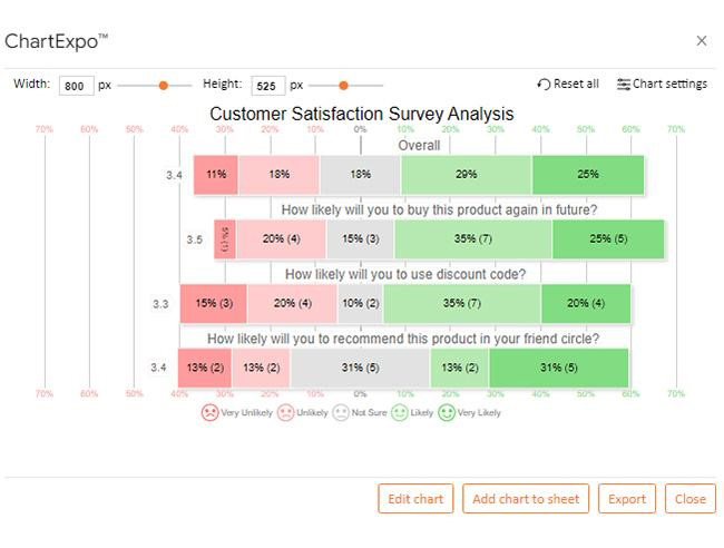
This video will teach you how to create a Likert Scale Chart in Google Sheets, an essential tool for visualizing survey data and capturing nuanced responses. Integrate this skill into your analysis toolkit to create more insightful and impactful presentations!

FAQs

Is Google Sheets or Excel better for graphs?

Excel offers more advanced graphing options and customization features. Google Sheets is easier for collaboration but has fewer graphing tools. Choose based on your needs for complexity versus convenience.

Is Google Sheets the same as Excel?

Google Sheets and Excel are similar but not identical. Excel has more advanced features and tools. Google Sheets excels in real-time collaboration and accessibility. Both are powerful but serve slightly different purposes.

Does Google Sheets have the same shortcuts as Excel?

Many shortcuts in Google Sheets are similar to those in Excel. However, some shortcuts differ or are unavailable. Users familiar with Excel will find most commands work similarly but may need to learn a few new ones.

Wrap Up

When deciding between Google Sheets and Excel for data analysis, it’s essential to consider your specific needs and preferences. Both tools offer unique advantages and can effectively handle various data tasks.

Google Sheets excels at real-time collaboration. If your data analysis requires multiple users to work simultaneously, Sheets is the way to go. Changes are updated instantly, and everyone can see them in real-time. This makes it ideal for team projects and remote work environments.

Accessibility is another strong point of Google Sheets. Being web-based allows you to access data from any device with an internet connection. This flexibility is crucial if you need to work on the go or from different locations. Additionally, Sheets integrates seamlessly with other Google Workspace apps.

However, Google Sheets has limitations. Its advanced data analysis features are less robust than those in Excel. While Sheets supports basic functions and formulas, it may struggle with more complex tasks. Excel is often the better choice for users needing advanced data manipulation and statistical tools.

Microsoft Excel offers extensive advanced features. It has powerful functions, such as Power Pivot, Power Query, and VBA macros, which enable deep data analysis and automation. These features make Excel the preferred tool for handling large datasets and performing sophisticated calculations.

Customization is another area where Excel shines. It allows for customized charts, graphs, and other visual elements. This is particularly useful for creating professional reports and presentations. Excel’s desktop application also ensures full offline functionality, providing flexibility for working without internet access.

Understanding the strengths and limitations of each tool will help you make the best decision for your data analysis. Choose Google Sheets for collaborative, accessible, and straightforward data analysis tasks. Opt for Excel when you need advanced features, extensive customization, and powerful offline capabilities.

How much did you enjoy this article?

ExcelAd2
Start Free Trial!
137701

Related articles

next previous
Microsoft Excel10 min read

Excel Bookkeeping for Small Business: Insights at a Glance

Excel bookkeeping for small businesses helps track income, expenses, and cash flow. Learn about templates and financial analysis to simplify bookkeeping.

Microsoft Excel10 min read

Compound Interest in Excel for Smarter Reporting

Discover compound interest in Excel and how it works. Learn its formulas, calculation tips, and common errors to avoid for more accurate financial analysis.

Microsoft Excel9 min read

KPI Dashboard in Excel: A Complete Guide

A KPI dashboard in Excel helps track key metrics and streamline data visualization. Discover how to create, analyze, and use it with clear guides and examples.

Microsoft Excel11 min read

How to Plot a Speedometer Chart in Excel?

Create a Speedometer Chart in Excel to track KPIs, goals, and performance metrics visually. Explore templates, examples, and step-by-step instructions for better dashboards.

Microsoft Excel13 min read

Excel for Teachers for Insightful Preparation

Excel for teachers simplifies grading, tracks attendance, and organizes data. Find its key features, expert tips, and how ChartExpo enhances data visualization.

ChartExpo logo

Turn Data into Visual
Stories

CHARTEXPO

  • Home
  • Gallery
  • Videos
  • Services
  • Pricing
  • Contact us
  • FAQs
  • Privacy policy
  • Terms of Service
  • Sitemap

TOOLS

  • ChartExpo for Google Sheets
  • ChartExpo for Microsoft Excel
  • Power BI Custom Visuals by ChartExpo
  • Word Cloud

CATEGORIES

  • Bar Charts
  • Circle Graphs
  • Column Charts
  • Combo Charts
  • Comparison Charts
  • Line Graphs
  • PPC Charts
  • Sentiment Analysis Charts
  • Survey Charts

TOP CHARTS

  • Sankey Diagram
  • Likert Scale Chart
  • Comparison Bar Chart
  • Pareto Chart
  • Funnel Chart
  • Gauge Chart
  • Radar Chart
  • Radial Bar Chart
  • Sunburst Chart
  • see more
  • Scatter Plot Chart
  • CSAT Survey Bar Chart
  • CSAT Survey Chart
  • Dot Plot Chart
  • Double Bar Graph
  • Matrix Chart
  • Multi Axis Line Chart
  • Overlapping Bar Chart
  • Control Chart
  • Slope Chart
  • Clustered Bar Chart
  • Clustered Column Chart
  • Box and Whisker Plot
  • Tornado Chart
  • Waterfall Chart
  • Word Cloud
  • see less

RESOURCES

  • Blog
  • Resources
  • YouTube
SIGN UP FOR UPDATES

We wouldn't dream of spamming you or selling your info.

© 2025 ChartExpo, all rights reserved.