• Home
  • Tools dropdown img
    • Spreadsheet Charts

      • ChartExpo for Google Sheets
      • ChartExpo for Microsoft Excel
    • Power BI Charts

      • Power BI Custom Visuals by ChartExpo
    • Word Cloud

  • Charts dropdown img
    • Chart Category

      • Bar Charts
      • Circle Graphs
      • Column Charts
      • Combo Charts
      • Comparison Charts
      • Line Graphs
      • PPC Charts
      • Sentiment Analysis Charts
      • Survey Charts
    • Chart Type

      • Box and Whisker Plot
      • Clustered Bar Chart
      • Clustered Column Chart
      • Comparison Bar Chart
      • Control Chart
      • CSAT Survey Bar Chart
      • CSAT Survey Chart
      • Dot Plot Chart
      • Double Bar Graph
      • Funnel Chart
      • Gauge Chart
      • Likert Scale Chart
      • Matrix Chart
      • Multi Axis Line Chart
      • Overlapping Bar Chart
      • Pareto Chart
      • Radar Chart
      • Radial Bar Chart
      • Sankey Diagram
      • Scatter Plot Chart
      • Slope Chart
      • Sunburst Chart
      • Tornado Chart
      • Waterfall Chart
      • Word Cloud
    • Google Sheets
      Microsoft Excel
  • Services
  • Pricing
  • Contact us
  • Blog
  • Support dropdown img
      • Gallery
      • Videos
      • Contact us
      • FAQs
      • Resources
    • Please feel free to contact us

      atsupport@chartexpo.com

Categories
All Data Visualizations Data Analytics Surveys
Add-ons/
  • Google Sheets
  • Microsoft Excel
  • Power BI
All Data Visualizations Data Analytics Surveys
Add-ons
  • Google Sheets
  • Microsoft Excel
  • Power BI

We use cookies

This website uses cookies to provide better user experience and user's session management.
By continuing visiting this website you consent the use of these cookies.

Ok

ChartExpo Survey


Home > Blog > Microsoft Excel

How to Add Data Label to Excel Chart? A Quick Guide

Picture this: You’ve finished creating a visually appealing chart in Excel. However, the default legends aren’t doing justice to your data series. You’re now pondering, “How do I add data labels to the Excel chart and make it more informative?”

Add Data Label to Excel Chart

Here’s the surprising truth: Adding data labels in Excel is easier than you realize. As statistics show, data comprehension and interpretation can be enhanced by using clear, labeled data points in a chart.

How do you approach the task, and what advantages does it offer?

Let’s break it down: By adding data labels in Excel, you can show the values of data points directly on the chart. It provides instant insights without the need for complex analysis. It’s not just about adding labels. It’s about transforming your chart into an intuitive visual aid that conveys crucial information at a glance.

Are you ready to explore the art of adding data labels to your Excel charts? Buckle up! This blog post will guide you through practical techniques, empowering you to elevate the impact of your visualizations.

Let’s witness data labels’ transformative power in enhancing your data visuals’ communicative prowess.

Table of Contents:

  1. What are Data Labels in Excel Charts?
  2. Why Do We Add Data Labels to the Chart in Excel?
  3. How to Remove Data Labels from Excel Charts?
  4. How to Change or Edit Data Labels in Excel Chart?
  5. How Do We Add Data Labels to the Excel Chart?
  6. Wrap Up

First…

What are Data Labels in Excel Charts?

Definition: Data labels in an Excel chart are textual values displayed on the chart. They provide additional information about data points.

These labels can include each data point’s value, name, or percentage. They help identify the specific values represented by bars, lines, or slices in charts. For example, in a pie chart, data labels might display percentages. In a bar chart, they might show the actual values, making it easier to interpret trends, just like when you move columns in Excel to organize data more effectively.

Data labels enhance the readability and interpretability of charts. They make it easier to understand the precise values without referencing the data table.

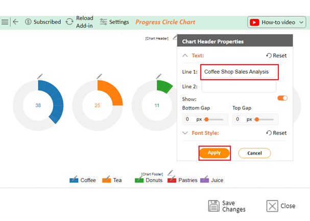
You can customize data labels to show different types of information. Excel allows you to format data labels by changing their font, size, color, and position. Using the best colors for graphs ensures the chart communicates information clearly and effectively, making it easier for the audience to understand and engage with the data.

Why Do We Add Data Labels to the Chart in Excel?

Adding data labels to charts in Excel gives your data a voice. It makes your charts communicate effectively.

Here’s why we add data labels:

  • Improves data interpretation: Data labels help you quickly understand what each part of the chart represents. They turn abstract visuals into clear, understandable information by displaying specific values directly on the chart.
  • Increases clarity and precision: With data labels, there’s no need to guess the values. They provide exact numbers for each data point, eliminating ambiguity and making your charts more precise.
  • Enhances visual appeal: Well-placed data labels can make your charts look more professional and polished. They add an extra layer of detail, enhancing the overall presentation and making the data visually engaging. This is a key aspect of visual storytelling, transforming raw numbers into a compelling narrative that captures attention and communicates insights effectively.
  • Facilitates quick decision-making: When you can see the exact values at a glance, making data-driven decisions is easier. Data labels provide immediate access to key information without referencing the underlying data table.
  • Supports detailed analysis: Data labels allow for a deeper dive into the data. Displaying specific values provides the details needed for thorough analysis and helps identify trends, patterns, and relationships. This detailed view is essential for effective trend analysis, enabling more accurate and insightful interpretations of the data. By analyzing and interpreting data with these precise labels, you can uncover deeper insights and make more informed decisions.
  • Helps in identifying outliers: Outliers and anomalies stand out more clearly with data labels. This makes it easier to spot unusual data points requiring further investigation or action.
  • Communication aids: Data labels make it easier to convey your message to others. Whether you’re presenting to colleagues, clients, or stakeholders, they ensure everyone understands the data the same way. This makes your charts more effective communication tools.
  • Customizable and dynamic: You can customize data labels to show exactly what you need, such as values, percentages, or categories. They can be formatted to match your chart’s style, ensuring a cohesive and visually appealing presentation. Additionally, as your data changes, these labels update dynamically, keeping your charts accurate and relevant. For even more customization, you can learn how to change the chart style in Excel, making your data visualization both functional and aesthetically pleasing.

How to Remove Data Labels from Excel Charts?

To eliminate data labels from a chart, follow these steps:

  1. Select the chart you wish to eliminate data labels by clicking on it. This displays the Chart Tools, which consist of Design and Format options.
  2. Choose one of the following options:
    • Within the Chart Layouts group on the Design tab, click Chart Element, opt for Data Labels, and finally choose None.
    • Click once on a data label to choose all data labels in the data series. Or twice to pick only a single data label for deletion. Then, press the DELETE key.
    • To remove a data label, right-click on it and select Delete.
  1. After adding data labels, you have the option to remove them quickly. How? Click the Undo Button image on the Quick Access Toolbar or press CTRL+Z.

How to Change or Edit Data Labels in Excel Chart?

Modify the appearance of the data labels as described below:

  1. To view additional data for a data series or label, right-click and select Format Data Labels.
  2. Select Label Options and choose the desired options under Label Contains.
Change or Edit Data Label After Adding Data Label to Excel Chart

Use Cell Values as Data Labels

You can use cell values as data labels for your chart.

  1. To see additional information for the data series or label, right-click and select Format Data Labels.
  2. Click on Label Options and choose Label Contains to select the Values From Cells checkbox.
  3. Return to the spreadsheet after the Data Label Range dialog box pops up. Choose the specific range where cell values are shown as data labels. Upon doing so, the chosen range will be visible in the Data Label Range dialog box.

How Do We Add Data Labels to the Excel Chart?

To add data labels in an Excel chart, follow these steps:

Using Excel’s Interface:

  1. Select the chart: Click on the chart where you wish to include data labels. This action will highlight the chart and show the Chart Tools on the ribbon.
  2. Add data labels:
    • Navigate to the Chart Tools tab located on the ribbon. There are two tabs under Chart Tools: Design and Format.
    • Click the Design tab.
    • Look for the Add Chart Element button in the Chart Layouts group within the Design tab.
    • Select Add Chart Element, hover over Data Labels, and then select the preferred location for the data labels (such as Center, Inside End, Outside End, etc.).
  1. Customize Data Labels:
    • After adding data labels, you have the option to personalize them. Select the data labels you wish to format by clicking on them.
    • Right-click and choose Format Data Labels. This will create a window where you can personalize the content and appearance of the data labels.

Using Excel Add-in (ChartExpo)

Data visualization plays a crucial role in data analysis, aiding in interpreting and communicating complex datasets.

Microsoft Excel is a popular tool for creating charts and graphs. However, it can fall short of providing advanced data labeling options and visually engaging data presentations.

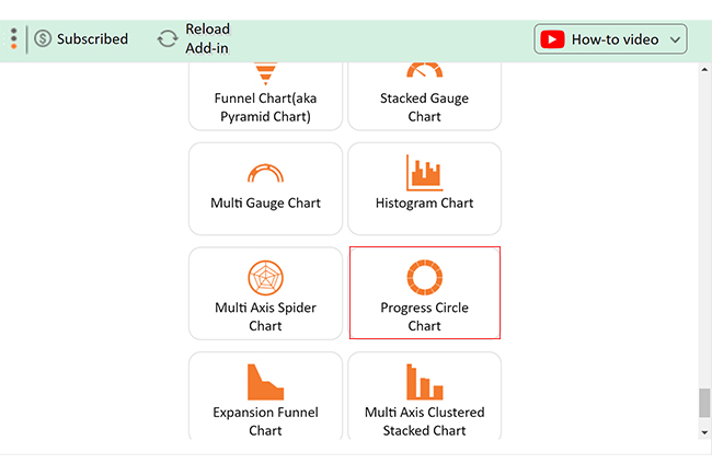
Don’t worry; ChartExpo, an Excel add-in, addresses these limitations. How? By offering enhanced data labeling features, and a more comprehensive range of visualization options, including Pyramid charts, and other advanced tools. This empowers you to create more insightful and impactful visualizations within Excel.

Let’s explore how to add data labels to Excel charts using the ChartExpo add-in.

Let’s learn how to install ChartExpo in Excel.

  1. Open your Excel application.
  2. Open the worksheet and click the “Insert” menu.
  3. You’ll see the “My Apps” option.
  4. In the Office Add-ins window, click “Store” and search for ChartExpo on my Apps Store.
  5. Click the “Add” button to install ChartExpo in your Excel.

ChartExpo charts are available both in Google Sheets and Microsoft Excel. Please use the following CTAs to install the tool of your choice and create beautiful visualizations with a few clicks in your favorite tool.

Example

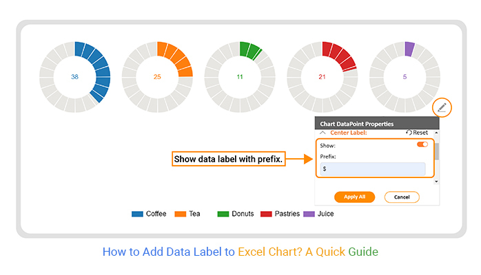
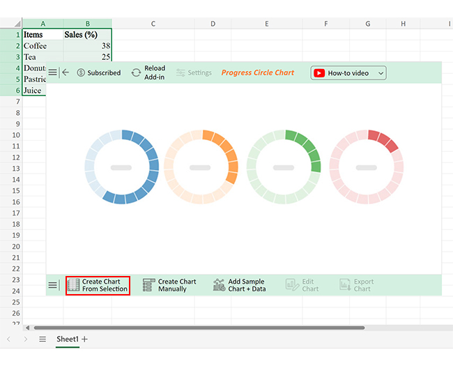
Let’s create a chart with labels of the data below using ChartExpo and glean valuable insights.

Items Sales (%)
Coffee 38
Tea 25
Donuts 11
Pastries 21
Juice 5
  • To get started with ChartExpo, install ChartExpo in Excel.
  • Now Click on My Apps from the INSERT menu.
insert chartexpo in excel
  • Choose ChartExpo from My Apps, then click Insert.
open chartexpo in excel
  • Once it loads, scroll through the charts list to locate and choose the “Progress Circle Chart”.
search Progress Circle Chart in Excel
  • Click the “Create Chart From Selection” button after selecting the data from the sheet, as shown.
Click Create Chart From Selection to Add Data Label to Excel Chart
  • ChartExpo will generate the visualization below for you.
Click Edit Chart to Add Data Label to Excel Chart
  • If you want to add anything to the chart, click the Edit Chart button:
  • Click the pencil icon next to the Chart Header to change the title.
  • It will open the properties dialog. Under the Text section, you can add a heading in Line 1 and enable Show.
  • Give the appropriate title of your chart and click the Apply button.
Click Add Chart Header to Add Data Label to Excel Chart
  • You can prepend the dollar ($) sign with chart data labels by clicking on the small pencil icon as follows:
Add Postfix to Add Data Label to Excel Chart
  • Click the “Save Changes” button to persist the changes made to the chart.
Click Save Changes to Add Data Label to Excel Chart
  • Your final Progress Circle Chart will look like the one below. Data labels shown in the legend make it easy to read the chart.
Final Add Data Label to Excel Chart

Insights

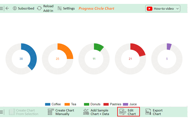
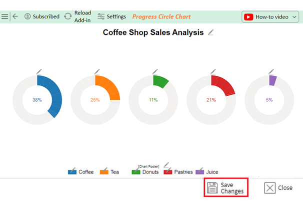
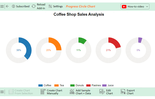
Coffee is the best-selling product with a 38% share, with tea following closely at 25% and pastries at 21%. Donuts represent 11% of total sales, with juice being the least favored, making up only 5% of sales.

FAQs

What is the shortcut for adding data labels in Excel?

In Excel, you can quickly add data labels to a chart by selecting the chart and pressing “Alt” + “F1”. Then, right-click the chart and choose “Add Data Labels.” This provides a fast way to label your data points.

How do you move data labels to the top of a chart in Excel?

To move data labels to the top of a chart in Excel:

  1. Select the chart and click on a data label.
  2. Right-click the data label and choose “Format Data Labels”.
  3. Select “Label Position”.
  4. Choose “Above”.

How do you change data labels to percentages in Excel charts?

To change data labels to percentages in an Excel chart:

  1. Right-click on a data label.
  2. Select “Format Data Labels”.
  3. Check the “Percentage” box.
  4. Ensure your data is in a format that supports percentage calculations.

Wrap Up

Adding data labels to an Excel chart enhances its clarity and effectiveness. This process is straightforward and customizable.

First, create your chart by selecting your data and choosing your desired chart type from the “Insert” tab. This is the foundation step.

Next, select the chart by clicking on it. This activates the Chart Tools, where you can modify various chart elements. Right-click on any data point within the chart. A menu will appear, offering several customization options.

From the menu, choose “Add Data Labels.” This will add default labels to your chart, displaying the values of each data point. These labels provide immediate insight into your data, making it easier to understand and analyze.

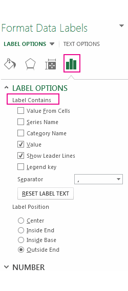
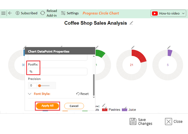
To customize your data labels further, right-click on any data label and select “Format Data Labels.” You can change the label content to show values, percentages, or other relevant information here. You can also adjust the label position to enhance readability.

Finally, fine-tune the appearance of your data labels. You can change their font, size, color, and positioning to match your chart’s design. This ensures your data labels convey the right information and complements the visual appeal of your chart.

Follow these steps to effectively add and customize data labels in Excel, making your visuals precise and impactful.

How much did you enjoy this article?

ExcelAd2
Start Free Trial!
137082

Related articles

next previous
Microsoft Excel8 min read

Excel Task Tracker Template for Smarter Task Insights

Task tracker template in Excel organizes tasks, tracks deadlines, and boosts efficiency. Learn its benefits, and explore expert tips to simplify task management.

Microsoft Excel10 min read

Invoice Tracker Template in Excel for Better Insights

An invoice tracker Excel template helps track invoices, due dates, and payments. Learn how to use this template for better financial management.

Microsoft Excel12 min read

Key Performance Indicators in Healthcare for Better Insights

Key Performance Indicators in healthcare track patient care and efficiency. Learn about these KPIs, top examples, and how to use them to improve outcomes.

Microsoft Excel10 min read

BMI Calculation Formula in Excel for Better Fitness Insights

The BMI calculation formula in Excel helps track and analyze body mass index. Explore step-by-step instructions and tips to simplify BMI tracking in Excel.

Microsoft Excel29 min read

How to Create a Tornado Chart in Excel? A Complete Guide

Click to learn how to plot a Tornado Chart in Excel using easy-to-follow steps. Also, we’ll address the following question: what is a Tornado Diagram?

ChartExpo logo

Turn Data into Visual
Stories

CHARTEXPO

  • Home
  • Gallery
  • Videos
  • Services
  • Pricing
  • Contact us
  • FAQs
  • Privacy policy
  • Terms of Service
  • Sitemap

TOOLS

  • ChartExpo for Google Sheets
  • ChartExpo for Microsoft Excel
  • Power BI Custom Visuals by ChartExpo
  • Word Cloud

CATEGORIES

  • Bar Charts
  • Circle Graphs
  • Column Charts
  • Combo Charts
  • Comparison Charts
  • Line Graphs
  • PPC Charts
  • Sentiment Analysis Charts
  • Survey Charts

TOP CHARTS

  • Sankey Diagram
  • Likert Scale Chart
  • Comparison Bar Chart
  • Pareto Chart
  • Funnel Chart
  • Gauge Chart
  • Radar Chart
  • Radial Bar Chart
  • Sunburst Chart
  • see more
  • Scatter Plot Chart
  • CSAT Survey Bar Chart
  • CSAT Survey Chart
  • Dot Plot Chart
  • Double Bar Graph
  • Matrix Chart
  • Multi Axis Line Chart
  • Overlapping Bar Chart
  • Control Chart
  • Slope Chart
  • Clustered Bar Chart
  • Clustered Column Chart
  • Box and Whisker Plot
  • Tornado Chart
  • Waterfall Chart
  • Word Cloud
  • see less

RESOURCES

  • Blog
  • Resources
  • YouTube
SIGN UP FOR UPDATES

We wouldn't dream of spamming you or selling your info.

© 2025 ChartExpo, all rights reserved.