• Home
  • Tools dropdown img
    • Spreadsheet Charts

      • ChartExpo for Google Sheets
      • ChartExpo for Microsoft Excel
    • Power BI Charts

      • Power BI Custom Visuals by ChartExpo
    • Word Cloud

  • Charts dropdown img
    • Chart Category

      • Bar Charts
      • Circle Graphs
      • Column Charts
      • Combo Charts
      • Comparison Charts
      • Line Graphs
      • PPC Charts
      • Sentiment Analysis Charts
      • Survey Charts
    • Chart Type

      • Box and Whisker Plot
      • Clustered Bar Chart
      • Clustered Column Chart
      • Comparison Bar Chart
      • Control Chart
      • CSAT Survey Bar Chart
      • CSAT Survey Chart
      • Dot Plot Chart
      • Double Bar Graph
      • Funnel Chart
      • Gauge Chart
      • Likert Scale Chart
      • Matrix Chart
      • Multi Axis Line Chart
      • Overlapping Bar Chart
      • Pareto Chart
      • Radar Chart
      • Radial Bar Chart
      • Sankey Diagram
      • Scatter Plot Chart
      • Slope Chart
      • Sunburst Chart
      • Tornado Chart
      • Waterfall Chart
      • Word Cloud
    • Google Sheets
      Microsoft Excel
  • Services
  • Pricing
  • Contact us
  • Blog
  • Support dropdown img
      • Gallery
      • Videos
      • Contact us
      • FAQs
      • Resources
    • Please feel free to contact us

      atsupport@chartexpo.com

Categories
All Data Visualizations Data Analytics Surveys
Add-ons/
  • Google Sheets
  • Microsoft Excel
  • Power BI
All Data Visualizations Data Analytics Surveys
Add-ons
  • Google Sheets
  • Microsoft Excel
  • Power BI

We use cookies

This website uses cookies to provide better user experience and user's session management.
By continuing visiting this website you consent the use of these cookies.

Ok

ChartExpo Survey


Home > Blog > Microsoft Excel

How to Change the Chart Style in Excel?

Are you tired of the same old chart styles in Excel? Do you find yourself wondering how to change the chart style in Excel to make your data pop? Well, you’re in luck because we’re about to embark on a journey to revolutionize your charts.

How to Change the Chart Style in Excel

Excel has become an essential tool for businesses, educators, and individuals with over 1.2 billion users worldwide. However, many users continue to use the default chart styles without realizing the creative options available.

In this blog post, we’ll dive into the nitty-gritty of how to change the chart style in Excel. This will unlock the potential to make your data visually appealing and impactful.

Studies show visually appealing charts can significantly enhance audience comprehension and engagement. With attention spans shorter than ever, it’s crucial to captivate your audience from the get-go. How to change the chart style in Excel can elevate your data from mundane to mesmerizing. This will make your insights more impactful and memorable.

With 30 million PowerPoint presentations being created daily, the opportunity to make your charts stand out is immense.

Let’s break free from the mundane and infuse your charts with personality.

Table of Contents:

  1. What are Chart Styles in Excel?
  2. Why Do We Change Chart Style in Excel?
  3. How to Change Chart Layout in Excel?
  4. What are the Steps for Changing the Chart Layout in Excel?
  5. Wrap Up

First…

What are Chart Styles in Excel?

Definition: Chart styles in Excel are predefined visual designs applied to charts to alter their appearance. These styles include variations in colors, fonts, and other graphical elements. They allow you to change the look and feel of your charts without manual formatting.

Excel offers a range of built-in chart styles to suit different data types and presentation preferences. These styles can make charts more appealing, easier to interpret, and aligned with branding or design guidelines. You can customize chart styles further by adjusting elements like colors, borders, and labels. Each style is designed to complement different types of data and presentation purposes.

Why Do We Change Chart Style in Excel?

How to change chart styles in Excel isn’t just about aesthetics. It’s a strategic tool for enhancing communication and comprehension. Let’s explore the reasons why changing chart styles is crucial:

  • Enhancing visual appeal: Picture a chart as the canvas and the chart style as the paintbrush. With a few clicks, you can transform a drab bar graph into a dazzling masterpiece. Complete with eye-catching colors, sleek fonts, and stylish effects. After all, who doesn’t love a little visual flair?
  • Improving interpretability: Have you ever stumbled upon a chart that made your eyes glaze over? Yeah, it’s not fun. By choosing the right chart style, you’re not just making your data look pretty; you’re making it understandable. Clear labels, intuitive design choices, and smart scaling can turn a jumble of numbers into an engaging story.
  • Maintaining consistency: Think of chart styles as your signature look. Using consistent chart styles across your presentations and reports creates a sense of cohesion. It’s like saying, “Hey, this is my brand, and I’m sticking to it.”
  • Emphasizing key data points: Imagine trying to find a needle in a haystack. Not fun, right? Highlighting key data points is like shining a spotlight on that elusive needle. It ensures your audience doesn’t miss the most crucial bits of information. This is your ticket to data-driven enlightenment.
  • Facilitating communication: Let’s be honest nobody wants to be the person at the party who talks, but nobody listens. Changing chart styles isn’t just about making your data look pretty; it’s about ensuring your message gets heard. Crafting charts that are stylish and insightful ensures your audience sees your data and truly understands it. And that, my friends, is the mark of a true Excel maestro.

How to Change Chart Layout in Excel?

Changing chart layouts in Excel is as easy as rearranging your sock drawer (well, almost). Let’s embark on this stylish journey together:

  1. Select the chart: Find the chart you want to jazz up. Click on the chart area, and it will become highlighted, indicating it’s ready for editing.
  2. Access the Design tab: Navigate to the Design tab at the top of your Excel window. This is your gateway to a world of chart customization possibilities.
  3. Choose a layout: Within the Design tab, you’ll find a selection of predefined chart layouts. These layouts offer various arrangements of elements such as titles, axes, and data labels. Hover over each layout to preview how it will affect your chart. Experiment like a scientist in a lab full of beakers.
  4. Review and adjust: Once you’ve found a layout that tickles your fancy, take a moment to admire your handiwork. Does it highlight the key insights effectively? If not, don’t worry you can always make adjustments. Adjust as needed until you strike the perfect balance.
  5. Fine-tune if necessary: It’s all in the details, darling. Fine-tune your layout to perfection tweak fonts, colors, and spacing until your chart exudes effortless elegance.
  6. Save your changes: Don’t forget to save your newfound chart glory. After all, you wouldn’t want your masterpiece to vanish into the digital abyss, would you?

What are the Steps for Changing the Chart Layout in Excel?

When making sense of data, data visualization is your trusty magnifying glass. But alas, Excel, the stalwart of number-crunching, often leaves much to be desired in the visualization department. It’s like trying to paint a masterpiece with only one color.

Fear not, for ChartExpo comes to the rescue, offering a palette of possibilities to overcome Excel’s visual limitations. With ChartExpo, your charts will pop, insights will shine, and data analysis will go from drab to fab, especially with the Side-By-Side Bar Chart templates that bring clarity and impact to your presentations.

Let’s learn how to install ChartExpo in Excel.

  1. Open your Excel application.
  2. Open the worksheet and click the “Insert” menu.
  3. You’ll see the “My Apps” option.
  4. In the Office Add-ins window, click “Store” and search for ChartExpo on my Apps Store.
  5. Click the “Add” button to install ChartExpo in your Excel.

ChartExpo charts are available both in Google Sheets and Microsoft Excel. Please use the following CTAs to install the tool of your choice and create beautiful visualizations with a few clicks in your favorite tool.

Example

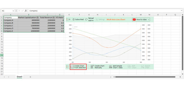
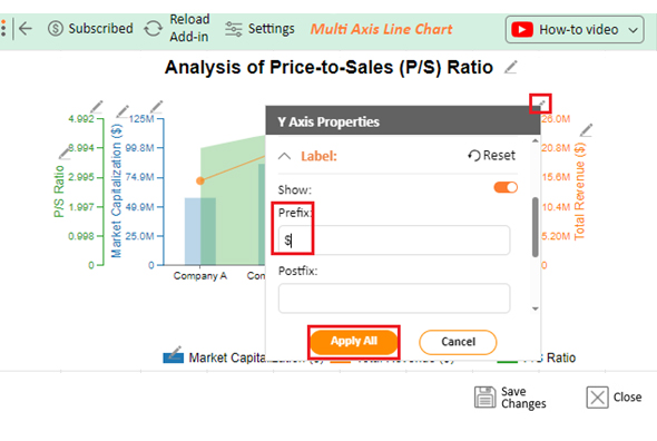
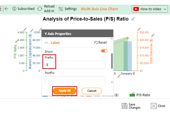
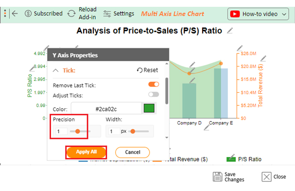
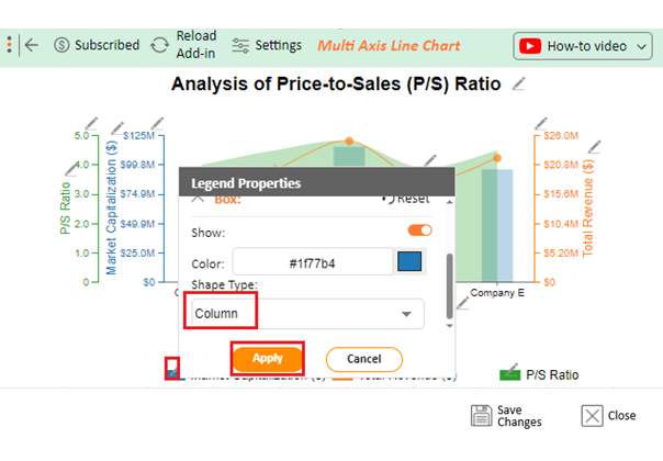
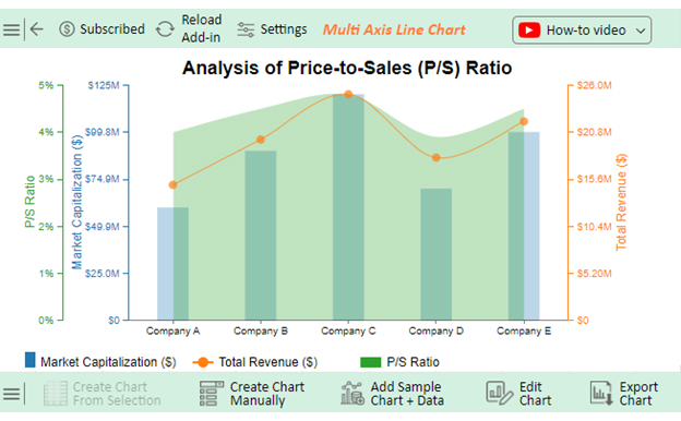
Let’s use this data to create a chart in Excel and change its style.

Company Market Capitalization ($) Total Revenue ($) P/S Ratio
Company A 60000000 15000000 4
Company B 90000000 20000000 4.5
Company C 120000000 25000000 4.8
Company D 70000000 18000000 3.9
Company E 100000000 22000000 4.5

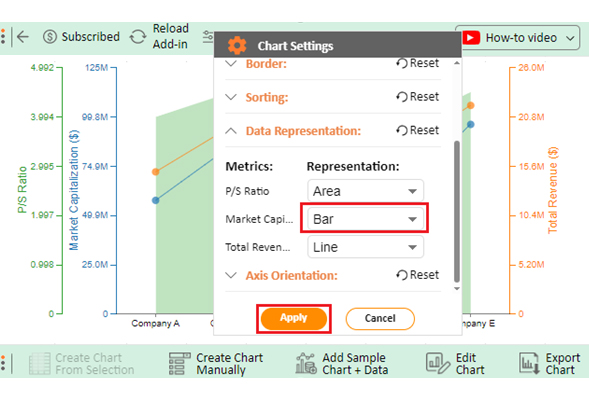
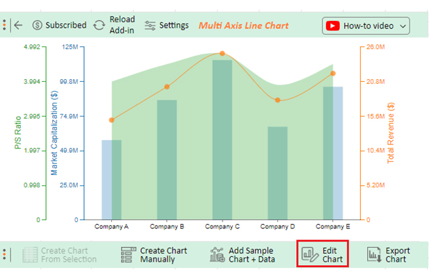
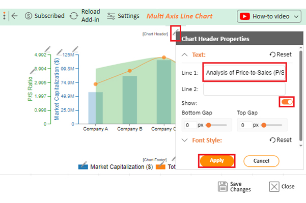
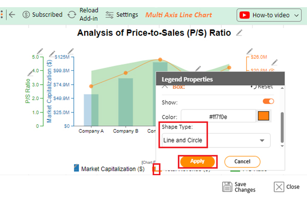
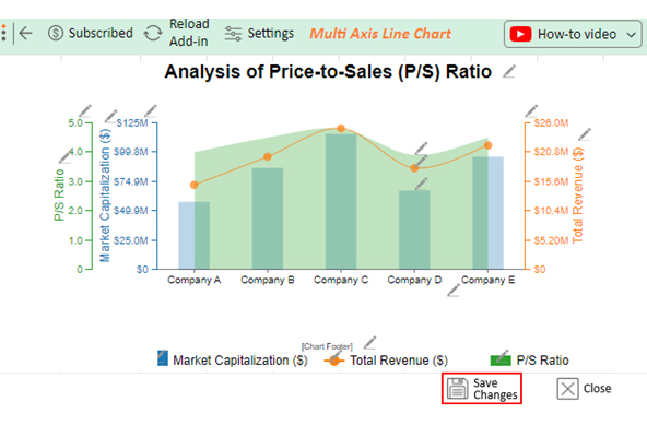
Follow these steps to create a visualization of this data using ChartExpo.

  • To get started with ChartExpo, install ChartExpo in Excel.
  • Now Click on My Apps from the INSERT menu.
insert chartexpo in excel
  • Choose ChartExpo from My Apps, then click Insert.
open chartexpo in excel
  • Once it loads, scroll through the charts list to locate and choose the “Multi-Axis Line Chart”.
search multi axis line chart in excel
  • Click the “Create Chart From Selection” button after selecting the data from the sheet, as shown.
Create Chart From Selection for Learning How to Change the Chart Style in Excel
  • Click on Settings and change the “Data Representation” of Profit Markup into Bar as follows.
Change Data Representation for Learning How to Change the Chart Style in Excel
  • If you want to add anything to the chart, click the Edit Chart button:
Edit Chart for Doing How to Change the Chart Style in Excel
  • Click the pencil icon next to the Chart Header to change the title.
  • It will open the properties dialog. Under the Text section, you can add a heading in Line 1 and enable Show.
  • Give the appropriate title of your chart and click the Apply button.
Add Chart Header for Doing How to Change the Chart Style in Excel
  • Add a dollar sign with Total Revenue values:
Add Prefix in Total Revenue for Doing How to Change the Chart Style in Excel
  • Add the dollar sign to Market Capitalization:
Add Prefix in Market Capitalization for Doing How to Change the Chart Style in Excel
  • Change the Precision value into one:
Change Precision for Doing How to Change the Chart Style in Excel
  • Change the Legend shape of “Market Capitalization” to Column and click the Apply button.
Change Legend of Market Capitalization for Doing How to Change the Chart Style in Excel
  • Change the Legend shape of “Total Revenue” into a Line and Circle and click the Apply button.
Change Legend in Total Revenue for Doing How to Change the Chart Style in Excel
  • Click the Save Changes button to persist the changes made to the chart.
Save Changes for Doing How to Change the Chart Style in Excel
  • Your final Multi Axis Line Chart will look like the one below.
Final How to Change the Chart Style in Excel

Insights

  • Company C leads with the highest market capitalization of $120,000,000, trailed by Companies E and B at $100,000,000 and $90,000,000, respectively.
  • Additionally, Company C claims the top spot for total revenue, boasting $25,000,000.
  • Company D exhibits the lowest P/S ratio at 3.9, suggesting potential undervaluation relative to revenue compared to its counterparts.
  • Companies A, B, and E fall within a similar P/S ratio range of 4 to 4.5.

FAQs

How do I change the shape of a chart in Excel?

To change the shape of a chart in Excel, click on the chart to select it. Then, go to the ‘Format’ tab. From there, navigate to the ‘Shape Styles’ group and choose the desired shape variant.

What is the shortcut for changing chart style?

The shortcut for changing chart style in Excel is to select the chart, then press Alt + JT. This opens the Chart Styles gallery, where you can navigate through and choose the desired style quickly and efficiently.

How do I change an Excel chart to style 8?

To change an Excel chart to style 8, select the chart. Then, press Alt + JT to open the Chart Styles gallery. Finally, navigate to style 8 using the arrow keys or clicking directly on it. The chart will be updated accordingly.

Wrap Up

Learning how to change the chart style in Excel is crucial for enhancing data presentations. With a deep understanding of Excel’s features and functionalities, you can effectively communicate insights to your audience.

Shortcuts like Alt + JT streamline the process, allowing efficient navigation through the Chart Styles gallery. This saves time and empowers you to experiment with different styles until you find the perfect fit.

Excel offers a wide range of customization options to meet diverse requirements. Tailoring chart layouts to suit specific needs and preferences ensures your message is communicated clearly and effectively.

Excel provides a variety of customization choices to fulfill different needs. Customizing chart designs to meet individual requirements and tastes guarantees that your message is conveyed with clarity and impact.

Excel offers a range of styles to choose from, including classic, professional, modern, and vibrant. This versatility guarantees there is a design to match every preference and need. In this way, you can make visually appealing charts and engage your audience.

Excel is a robust resource for creating interactive and captivating presentations that make a lasting impact. You can unlock your creativity and turn ordinary data into engaging visual stories through practice and experimentation.

In essence, mastering Excel’s chart-style options empowers you to convey your message and engage your audience effectively. Moreover, you can make data-driven decisions with confidence.

Do not hesitate.

Embrace Excel’s chart-style options with ChartExpo today to elevate your data visualization game.

How much did you enjoy this article?

ExcelAd1
Start Free Trial!
134730

Related articles

next previous
Microsoft Excel8 min read

Excel Task Tracker Template for Smarter Task Insights

Task tracker template in Excel organizes tasks, tracks deadlines, and boosts efficiency. Learn its benefits, and explore expert tips to simplify task management.

Microsoft Excel10 min read

Invoice Tracker Template in Excel for Better Insights

An invoice tracker Excel template helps track invoices, due dates, and payments. Learn how to use this template for better financial management.

Microsoft Excel12 min read

Key Performance Indicators in Healthcare for Better Insights

Key Performance Indicators in healthcare track patient care and efficiency. Learn about these KPIs, top examples, and how to use them to improve outcomes.

Microsoft Excel10 min read

BMI Calculation Formula in Excel for Better Fitness Insights

The BMI calculation formula in Excel helps track and analyze body mass index. Explore step-by-step instructions and tips to simplify BMI tracking in Excel.

Microsoft Excel29 min read

How to Create a Tornado Chart in Excel? A Complete Guide

Click to learn how to plot a Tornado Chart in Excel using easy-to-follow steps. Also, we’ll address the following question: what is a Tornado Diagram?

ChartExpo logo

Turn Data into Visual
Stories

CHARTEXPO

  • Home
  • Gallery
  • Videos
  • Services
  • Pricing
  • Contact us
  • FAQs
  • Privacy policy
  • Terms of Service
  • Sitemap

TOOLS

  • ChartExpo for Google Sheets
  • ChartExpo for Microsoft Excel
  • Power BI Custom Visuals by ChartExpo
  • Word Cloud

CATEGORIES

  • Bar Charts
  • Circle Graphs
  • Column Charts
  • Combo Charts
  • Comparison Charts
  • Line Graphs
  • PPC Charts
  • Sentiment Analysis Charts
  • Survey Charts

TOP CHARTS

  • Sankey Diagram
  • Likert Scale Chart
  • Comparison Bar Chart
  • Pareto Chart
  • Funnel Chart
  • Gauge Chart
  • Radar Chart
  • Radial Bar Chart
  • Sunburst Chart
  • see more
  • Scatter Plot Chart
  • CSAT Survey Bar Chart
  • CSAT Survey Chart
  • Dot Plot Chart
  • Double Bar Graph
  • Matrix Chart
  • Multi Axis Line Chart
  • Overlapping Bar Chart
  • Control Chart
  • Slope Chart
  • Clustered Bar Chart
  • Clustered Column Chart
  • Box and Whisker Plot
  • Tornado Chart
  • Waterfall Chart
  • Word Cloud
  • see less

RESOURCES

  • Blog
  • Resources
  • YouTube
SIGN UP FOR UPDATES

We wouldn't dream of spamming you or selling your info.

© 2025 ChartExpo, all rights reserved.