• Home
  • Tools dropdown img
    • Spreadsheet Charts

      • ChartExpo for Google Sheets
      • ChartExpo for Microsoft Excel
    • Power BI Charts

      • Power BI Custom Visuals by ChartExpo
    • Word Cloud

  • Charts dropdown img
    • Chart Category

      • Bar Charts
      • Circle Graphs
      • Column Charts
      • Combo Charts
      • Comparison Charts
      • Line Graphs
      • PPC Charts
      • Sentiment Analysis Charts
      • Survey Charts
    • Chart Type

      • Box and Whisker Plot
      • Clustered Bar Chart
      • Clustered Column Chart
      • Comparison Bar Chart
      • Control Chart
      • CSAT Survey Bar Chart
      • CSAT Survey Chart
      • Dot Plot Chart
      • Double Bar Graph
      • Funnel Chart
      • Gauge Chart
      • Likert Scale Chart
      • Matrix Chart
      • Multi Axis Line Chart
      • Overlapping Bar Chart
      • Pareto Chart
      • Radar Chart
      • Radial Bar Chart
      • Sankey Diagram
      • Scatter Plot Chart
      • Slope Chart
      • Sunburst Chart
      • Tornado Chart
      • Waterfall Chart
      • Word Cloud
    • Google Sheets
      Microsoft Excel
  • Services
  • Pricing
  • Contact us
  • Blog
  • Support dropdown img
      • Gallery
      • Videos
      • Contact us
      • FAQs
      • Resources
    • Please feel free to contact us

      atsupport@chartexpo.com

Categories
All Data Visualizations Data Analytics Surveys
Add-ons/
  • Google Sheets
  • Microsoft Excel
  • Power BI
All Data Visualizations Data Analytics Surveys
Add-ons
  • Google Sheets
  • Microsoft Excel
  • Power BI

We use cookies

This website uses cookies to provide better user experience and user's session management.
By continuing visiting this website you consent the use of these cookies.

Ok

ChartExpo Survey


Home > Blog > Microsoft Excel

How to Add a Legend to a Chart in Excel?

Are you tired of struggling to add a legend to your Excel chart? Look no further – we’ve got you. Adding a legend to a chart in Excel is crucial for enhancing data comprehension.

A well-crafted legend significantly boosts chart readability. Studies show that charts with clear legends are 40% more likely to be understood by viewers. The legend effortlessly guides everyone through the intricacies of your data, making your presentation engaging and impactful.

Add a Legend to a Chart in Excel

Don’t worry; adding a legend to a chart in Excel is not rocket science. Here, we’ll walk you through the simple yet effective techniques to add, position, and format a legend. This will make your charts informative and visually engaging.

That’s not all. You can also customize your legend. How? By incorporating text in useful places. This can be an elegant and thoughtful approach to presenting your data. Adding text as a subheader ensures your readers see it right away. Moreover, they understand which data series corresponds to which color.

So, let’s embark on this journey of demystifying the art of charting in Excel together. This step-by-step guide will help you master adding a compelling legend to your Excel. Your data presentations will become more impactful than ever.

Table of Contents:

  1. What is Legend in Excel Chart?
  2. Why Do We Add Legend to Excel Chart?
  3. How to Add a Legend to a Chart in Excel?
  4. What are the Tips for Using Legend in Excel Chart?
  5. Wrap Up

First…

What is Legend in Excel Chart?

Definition: In an Excel chart, the legend is a key that identifies the data series. It explains what each color, pattern, or symbol represents. Each entry in the legend corresponds to a different data series in the chart. This helps viewers distinguish between various data sets.

For example, in a bar chart with sales data for three products, the legend shows which color bar represents each product. You can customize the legend’s position, font, and appearance.

Use the “Chart Tools” menu to add or modify a legend.

In essence, the legend enhances the chart’s readability. It ensures viewers can easily understand and interpret the data presented. This makes the legend an essential component of any Excel chart.

Why Do We Add Legend to Excel Chart?

Adding a legend to an Excel chart is similar to adding a caption to a photo. It’s essential for clarity and understanding. Here are reasons why incorporating a legend is so beneficial:

  • Clarifies data representation: A legend identifies what each color, pattern, or symbol in the chart stands for. For example, in a sales chart with different products, the legend will indicate which color corresponds to each product. This helps prevent any confusion about what the chart elements represent.
  • Enhances readability: Charts with legends are easier to understand at a glance. When viewers can quickly associate data series with their representations in the legend, it reduces cognitive load. It makes the chart more user-friendly. This is especially important when dealing with complex data.
  • Supports decision-making: Clear data representation aids in making informed decisions. A legend ensures all stakeholders can accurately interpret the data, leading to better insights and more strategic decisions. For instance, knowing which line represents profit versus expenses in a financial report can directly impact budgetary decisions.
  • Improves aesthetics and professionalism: A well-designed legend makes your chart more informative and visually appealing. It adds professionalism to your presentation, indicating that you’ve thoughtfully organized and presented your data. This can be particularly important in business and academic settings.
  • Facilitates communication: In collaborative environments, a legend helps ensure everyone interprets the chart in the same way. It provides a common reference point, which is crucial for effective communication and teamwork. For example, team members can easily refer to the legend during a meeting to discuss specific data points.
  • Prevents misinterpretation: Without a legend, different viewers might interpret the same chart differently, leading to misunderstandings. A legend eliminates this risk by providing clear labels for each data series. It ensures everyone has the same understanding of the chart’s information.

How to Add a Legend to a Chart in Excel?

Are you drowning in a sea of data, struggling to find the hidden gems? It’s time to add a dash of creativity and clarity to your data visualizations.

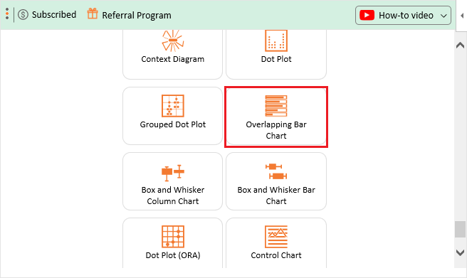
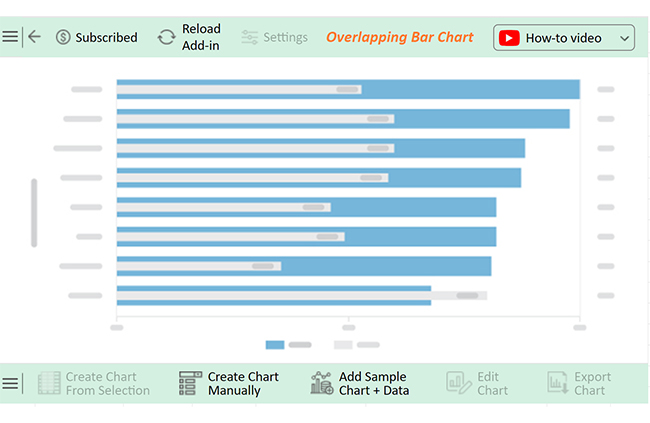
Excel, the trusty companion of many, falls short when visualizing data effectively. But fear not, for there’s a shining beacon on the horizon – ChartExpo! ChartExpo, available as add-in for Excel on Mac or Windows, offers an array of captivating visualizations to illuminate the path to insightful data analysis.

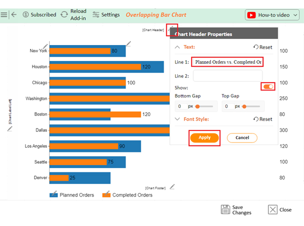
Now, let’s learn how to insert a legend into a chart in Excel and discover the wonders of ChartExpo.

Let’s learn how to install ChartExpo in Excel.

  1. Open your Excel application.
  2. Open the worksheet and click the “Insert” menu.
  3. You’ll see the “My Apps” option.
  4. In the Office Add-ins window, click “Store” and search for ChartExpo on my Apps Store.
  5. Click the “Add” button to install ChartExpo in your Excel.

ChartExpo charts are available both in Google Sheets and Microsoft Excel. Please use the following CTAs to install the tool of your choice and create beautiful visualizations with a few clicks in your favorite tool.

Example

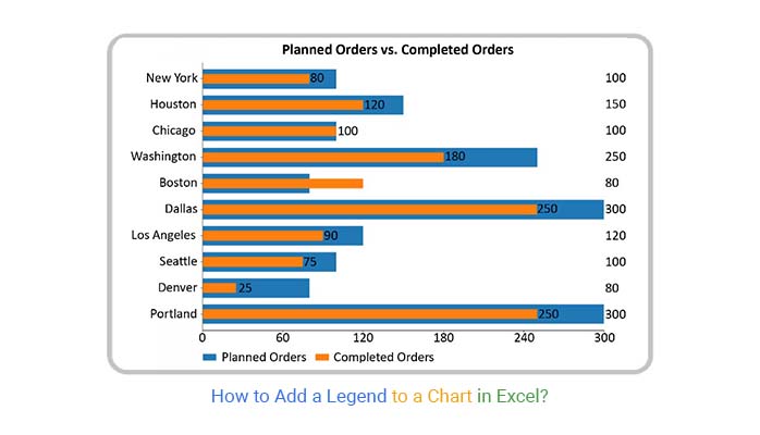
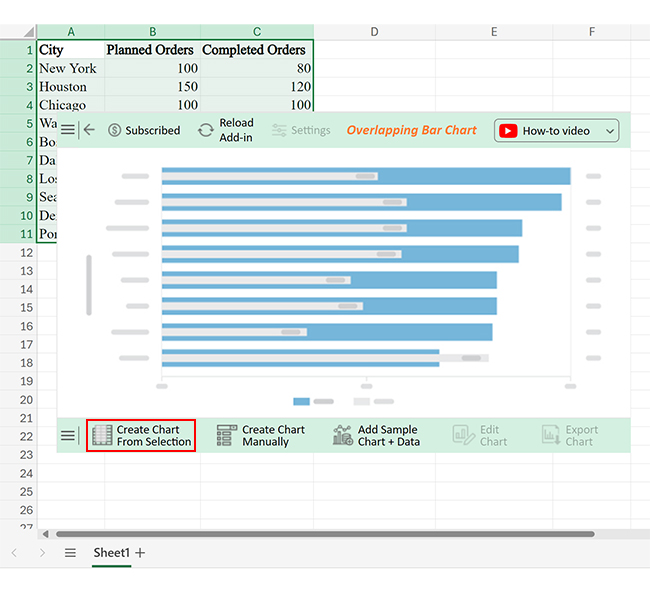
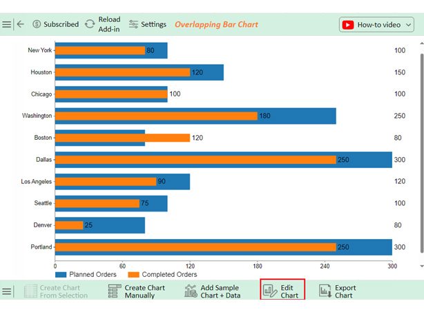
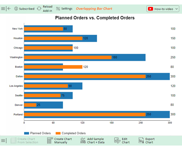
We’ll use the sample data below to create a Chart in Excel using ChartExpo and add a legend.

City Planned Orders Completed Orders
New York 100 80
Houston 150 120
Chicago 100 100
Washington 250 180
Boston 80 120
Dallas 300 250
Los Angeles 120 90
Seattle 100 75
Denver 80 25
Portland 300 250
  • To get started with ChartExpo, install ChartExpo in Excel.
  • Now Click on My Apps from the INSERT menu.
insert chartexpo in excel
  • Choose ChartExpo from My Apps, then click Insert.
open chartexpo in excel
  • Once it loads, scroll through the charts list to locate and choose the “Overlapping Bar Chart”. This chart is best suited to this scenario.
search overlapping bar chart in excel
  • You will see an Overlapping Bar Chart on the screen.
Initial Overlapping Bar Chart for Add a Legend to a Chart in Excel
  • Click the “Create Chart From Selection” button after selecting the data from the sheet.
Click Create Chart From Selection for Add a Legend to a Chart in Excel
  • ChartExpo will generate the visualization below for you.
Click Edit Chart for Add a Legend to a Chart in Excel
  • If you want the chart’s title, click Edit Chart, as shown in the above image.
  • Click the pencil icon next to the Chart Header to change the title.
  • It will open the properties dialog. Under the Text section, you can add a heading in Line 1 and enable Show.
  • Give the appropriate title of your chart and click the Apply button.
Add Chart Header for Add a Legend to a Chart in Excel
  • Click the “Save Changes” button to persist the changes.
Click Save Changes for Add a Legend to a Chart in Excel
  • Your Overlapping Bar Chart will appear as below.
Final Add a Legend to a Chart in Excel

Insights

  • Chicago completed all planned orders, achieving a 100% completion rate.
  • Boston outperformed in fulfilling orders by achieving a completion rate of 150%, surpassing the planned 80 orders by completing 120.
  • Dallas and Portland completed 83.3% of their orders, finishing 250 out of 300 as planned.
  • Denver has the worst completion rate of 31.3%, with only 25 out of 80 scheduled orders being finished.
  • Washington had a completion rate of 72%, with 180 out of 250 orders that were originally scheduled being finished.
  • New York and Houston have an 80% completion rate.
  • Completion rates in Los Angeles and Seattle are 75%.
  • Dallas and Portland have the most planned orders, with 300, while Washington comes in next with 250.
  • Denver has the least planned orders, with a volume of 80.

What are the Tips for Using Legend in Excel Chart?

Using a legend in your Excel chart is crucial for clarity and effective communication. However, there are a few key tips to make the most out of this feature. Here’s how to ensure your legends are functional and stylish:

  1. Keep it simple: A cluttered legend can confuse rather than clarify. Keep your legend straightforward by including only the most essential data series. Avoid overloading it with too many items.
  2. Position wisely: The placement of your legend matters. Position it where it doesn’t obscure the data. Common choices include the chart’s top, bottom, right, or left. Choose a position that maintains the chart’s readability.
  3. Consistent formatting: Maintain consistent formatting across your legend and chart. Use the same colors, fonts, and styles for a cohesive look. This consistency helps in better understanding and professional appearance.
  4. Descriptive labels: Use clear, descriptive labels in your legend. Instead of generic terms like “Series 1” or “Data 2,” use specific labels like “Quarterly Sales” or “Marketing Expenses”. This makes the data easier to understand at a glance.
  5. Adjust font size and style: Make sure your legend’s font size and style are readable but not overpowering. It should complement the chart without drawing attention away from the data itself.
  6. Order of items: Arrange the items in your legend logically, usually in the order the data appears in the chart. This makes it easier for viewers to match the legend to the corresponding data series.
  7. Hide unnecessary legends: If your chart is simple like a Radar Chart or the data series is obvious, you might not need a legend. In such cases, hiding the legend can reduce visual clutter and make your chart look cleaner.
  8. Use sufficient contrast: Ensure there is enough contrast between the legend items and the chart background. This makes the legend easy to read. For example, use dark text on a light background or vice versa.
  9. Interactive features: Consider using legends highlighting data when hovering over or clicking for interactive charts, especially those used in presentations. This adds a layer of engagement and helps emphasize key points during discussions.
  10. Regular updates: Keep your legends up-to-date. If you modify or add a new data series, update the legend accordingly. An outdated legend can lead to misinterpretation of the data.

FAQs

How do you add a legend to a chart in Excel on a Mac?

To add a legend to a chart in Excel on a Mac:

  1. Select the chart.
  2. Click the “Chart Design” tab.
  3. Click “Add Chart Element”.
  4. Choose “Legend”.
  5. Select the desired legend position.

How do I add a legend to a chart in Numbers?

To add a legend to a chart in Numbers:

  1. Select the chart.
  2. Click the “Format” button.
  3. Go to the “Chart” tab.
  4. Check the “Legend” box.
  5. Adjust the legend position as needed.

How do I change the names in the legend in Excel?

To change the names in the legend in Excel:

  1. Right-click the chart.
  2. Select “Select Data”.
  3. Select the series in the “Legend Entries (Series)” box.
  4. Click “Edit”.
  5. Enter the new name.
  6. Click “OK”.

Wrap Up

Adding a legend to a chart in Excel is a simple but essential task. A legend helps clarify the data represented in your chart. It ensures viewers can easily distinguish between different data series.

First, select your chart by clicking on it. This will bring up the “Chart Tools” menu. Under this menu, find the “Chart Design” tab. This is where you can access various chart customization options.

Next, click on “Add Chart Element.” This option is located within the “Chart Design” tab. A dropdown menu will appear. From this menu, select “Legend.”

After selecting “Legend,” you can choose its position. Excel offers several options like top, bottom, right, or left. Select the position that best fits your chart’s layout. The legend will appear in the chosen position.

If you need to change the legend names, it’s straightforward. Right-click on the chart and select “Select Data.” Choose the series you want to rename in the “Legend Entries (Series)” box. Click “Edit,” enter the new name, and confirm by clicking “OK.”

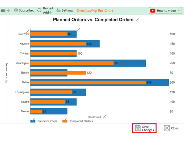
In conclusion, adding and customizing a legend in Excel enhances chart readability. It allows for more explicit data interpretation and better communication. Following these steps ensures your charts are informative and visually appealing. This small addition can significantly affect how your data is perceived.

How much did you enjoy this article?

ExcelAd1
Start Free Trial!
136577

Related articles

next previous
Microsoft Excel10 min read

Invoice Tracker Template in Excel for Better Insights

An invoice tracker Excel template helps track invoices, due dates, and payments. Learn how to use this template for better financial management.

Microsoft Excel12 min read

Key Performance Indicators in Healthcare for Better Insights

Key Performance Indicators in healthcare track patient care and efficiency. Learn about these KPIs, top examples, and how to use them to improve outcomes.

Microsoft Excel10 min read

BMI Calculation Formula in Excel for Better Fitness Insights

The BMI calculation formula in Excel helps track and analyze body mass index. Explore step-by-step instructions and tips to simplify BMI tracking in Excel.

Microsoft Excel29 min read

How to Create a Tornado Chart in Excel? A Complete Guide

Click to learn how to plot a Tornado Chart in Excel using easy-to-follow steps. Also, we’ll address the following question: what is a Tornado Diagram?

Microsoft Excel14 min read

How to Create a Scatter Plot in Excel with 3 Variables?

Click to discover how to create a Scatter Plot in Excel with 3 variables. We’ll also address the following question: why do we use Scatter Plot Graph?

ChartExpo logo

Turn Data into Visual
Stories

CHARTEXPO

  • Home
  • Gallery
  • Videos
  • Services
  • Pricing
  • Contact us
  • FAQs
  • Privacy policy
  • Terms of Service
  • Sitemap

TOOLS

  • ChartExpo for Google Sheets
  • ChartExpo for Microsoft Excel
  • Power BI Custom Visuals by ChartExpo
  • Word Cloud

CATEGORIES

  • Bar Charts
  • Circle Graphs
  • Column Charts
  • Combo Charts
  • Comparison Charts
  • Line Graphs
  • PPC Charts
  • Sentiment Analysis Charts
  • Survey Charts

TOP CHARTS

  • Sankey Diagram
  • Likert Scale Chart
  • Comparison Bar Chart
  • Pareto Chart
  • Funnel Chart
  • Gauge Chart
  • Radar Chart
  • Radial Bar Chart
  • Sunburst Chart
  • see more
  • Scatter Plot Chart
  • CSAT Survey Bar Chart
  • CSAT Survey Chart
  • Dot Plot Chart
  • Double Bar Graph
  • Matrix Chart
  • Multi Axis Line Chart
  • Overlapping Bar Chart
  • Control Chart
  • Slope Chart
  • Clustered Bar Chart
  • Clustered Column Chart
  • Box and Whisker Plot
  • Tornado Chart
  • Waterfall Chart
  • Word Cloud
  • see less

RESOURCES

  • Blog
  • Resources
  • YouTube
SIGN UP FOR UPDATES

We wouldn't dream of spamming you or selling your info.

© 2025 ChartExpo, all rights reserved.