• Home
  • Tools dropdown img
    • Spreadsheet Charts

      • ChartExpo for Google Sheets
      • ChartExpo for Microsoft Excel
    • Power BI Charts

      • Power BI Custom Visuals by ChartExpo
    • Word Cloud

  • Charts dropdown img
    • Chart Category

      • Bar Charts
      • Circle Graphs
      • Column Charts
      • Combo Charts
      • Comparison Charts
      • Line Graphs
      • PPC Charts
      • Sentiment Analysis Charts
      • Survey Charts
    • Chart Type

      • Box and Whisker Plot
      • Clustered Bar Chart
      • Clustered Column Chart
      • Comparison Bar Chart
      • Control Chart
      • CSAT Survey Bar Chart
      • CSAT Survey Chart
      • Dot Plot Chart
      • Double Bar Graph
      • Funnel Chart
      • Gauge Chart
      • Likert Scale Chart
      • Matrix Chart
      • Multi Axis Line Chart
      • Overlapping Bar Chart
      • Pareto Chart
      • Radar Chart
      • Radial Bar Chart
      • Sankey Diagram
      • Scatter Plot Chart
      • Slope Chart
      • Sunburst Chart
      • Tornado Chart
      • Waterfall Chart
      • Word Cloud
    • Google Sheets
      Microsoft Excel
  • Services
  • Pricing
  • Contact us
  • Blog
  • Support dropdown img
      • Gallery
      • Videos
      • Contact us
      • FAQs
      • Resources
    • Please feel free to contact us

      atsupport@chartexpo.com

Categories
All Data Visualizations Data Analytics Surveys
Add-ons/
  • Google Sheets
  • Microsoft Excel
  • Power BI
All Data Visualizations Data Analytics Surveys
Add-ons
  • Google Sheets
  • Microsoft Excel
  • Power BI

We use cookies

This website uses cookies to provide better user experience and user's session management.
By continuing visiting this website you consent the use of these cookies.

Ok

ChartExpo Survey


Home > Blog > Data Visualization

Charting Standard Deviation: A How-to Guide

Have you ever thought about the importance of charting standard deviation?

This article is for you. Standard deviation is an indicator of how numbers within a set are spread out. Therefore, charting standard deviation is not only a regular statistical procedure. The pulse call helps you comprehend the dispersion within a dataset.

Charting Standard Deviation

Data is the “new gold”. Therefore, it’s important to evaluate and portray data variability precisely. As of 2024, we produce more than 2.5 quintillion bytes of data a day. Standard deviation implies clarity from vast amounts of data and an end to decision-making confusion.

But how do we best represent this critical statistic? The answer lies in best practices that turn complex data into comprehensible visuals. The best practices for charting standard deviation revolve around clarity, accuracy, and simplicity. It’s about making complex data easily understandable at a glance.

A chart that is too busy or cluttered can obscure the vital story the numbers are telling. Therefore, the focus should be on creating a visual representation that speaks volumes without saying a word.

So, let’s explore how to chart standard deviation in a way that brings your data to life.

Table of Contents:

  1. What is the Standard Deviation?
  2. How Do You Find the Standard Deviation?
  3. How to Make Standard Deviation Graphs/Charts?
  4. What are the Best Practices for Charting Standard Deviation?
  5. Wrap Up

First…

What is the Standard Deviation?

Definition: Standard deviation is a statistical measure that quantifies the variation or dispersion in data points. It provides insight into the spread of values around the mean (average) of the data set. A higher standard deviation indicates greater variability. On the other hand, a lower standard deviation indicates that the data points are closer to the mean.

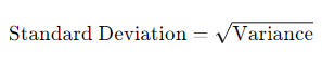
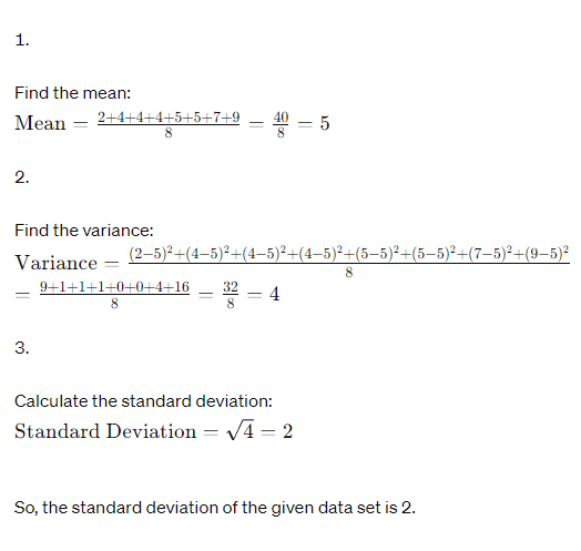
First, find the mean of the data set to calculate the standard deviation. Next, determine the difference between each data point and the mean. Square the differences and find the average of the squared differences. Finally, find the square root of the average to obtain the standard deviation.

Standard deviation is widely used in various fields, including finance, engineering, and social sciences, to analyze and interpret data. It helps researchers and analysts understand the distribution of data and identify outliers. Then, make data-driven decisions based on the variability present in the data set.

How Do You Find the Standard Deviation?

How to find the standard deviation is fundamental in statistics. Why? It allows us to measure the dispersion or spread of data points in a dataset. Here’s how to calculate the standard deviation:

  1. Find the Mean: Begin by calculating the mean, or average, of the dataset. Sum all the values in the dataset and divide by the total number of values.

          Mean = Total sum of values / Number of values
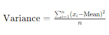
  1. Find the Variance: Calculate the variance by finding the average of the squared differences between each data point and the mean.
Variance Formula for Charting Standard Deviation

Where xi​ represents each data point, and n is the total number of data points.

  1. Calculate the Standard Deviation: Finally, compute the standard deviation by taking the square root of the variance. This step yields a single value that represents the spread or dispersion of the data around the mean.
Standard Deviation for Charting Standard Deviation

          Here’s a step-by-step example:

          Let’s say we have the following data set: 2,4,4,4,5,5,7,92,4,4,4,5,5,7,9

Calculating for Charting Standard Deviation

How to Make Standard Deviation Graphs/Charts?

Picture this: you’re knee-deep in numbers, aiming to make a standard deviation graph.

The goal? Clarity.

The reality? A maze of menus and a tangle of toolbars.

Excel, the old guard of data analysis, often turns a simple task into a Herculean ordeal. The journey through Excel’s complex corridors can leave even the bravest souls craving a lifeline.

Enter ChartExpo, the beacon of simplicity in the tempest of data visualization. Its intuitive interface and advanced data visualization options, including dot plots, sweep away the cobwebs of complication. It offers a haven for communicating our statistical stories with ease.

Let’s learn how to install ChartExpo in Excel.

  1. Open your Excel application.
  2. Open the worksheet and click the “Insert” menu.
  3. You’ll see the “My Apps” option.
  4. In the Office Add-ins window, click “Store” and search for ChartExpo on my Apps Store.
  5. Click the “Add” button to install ChartExpo in your Excel.

ChartExpo charts are available both in Google Sheets and Microsoft Excel. Please use the following CTAs to install the tool of your choice and create beautiful visualizations with a few clicks in your favorite tool.

Example

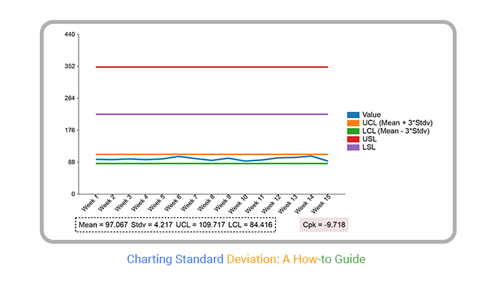
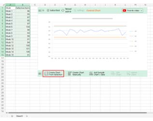
Let’s you want to create a standard deviation chart of the data below.

Week Defective Items
Week 1 96
Week 2 95
Week 3 97
Week 4 95
Week 5 97
Week 6 104
Week 7 98
Week 8 93
Week 9 99
Week 10 91
Week 11 94
Week 12 100
Week 13 101
Week 14 105
Week 15 91

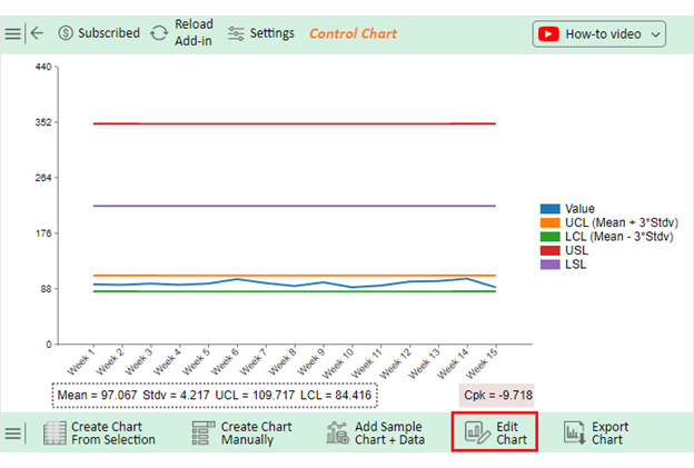
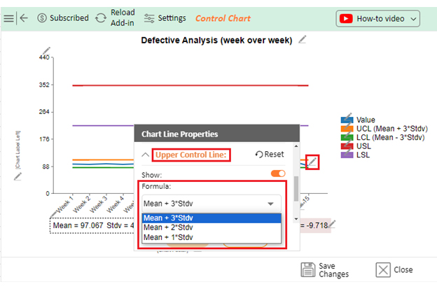
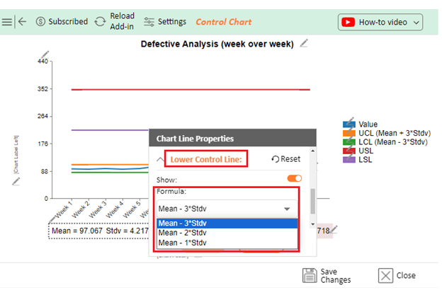
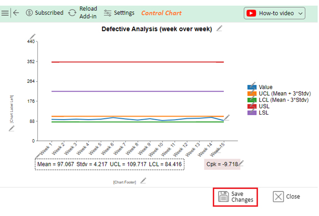
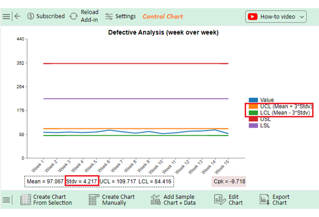
Follow these steps to analyze the standard deviation in Excel using ChartExpo.

  • To get started with ChartExpo, install ChartExpo in Excel.
  • Now Click on My Apps from the INSERT menu.
insert chartexpo in excel
  • Choose ChartExpo from My Apps, then click Insert.
open chartexpo in excel
  • Once it loads, scroll through the charts list to locate and choose the “Control Chart”.
search control chart in excel
  • Click the “Create Chart From Selection” button after selecting the data from the sheet, as shown.
Create Chart From Selection for Charting Standard Deviation
  • ChartExpo will generate the visualization below for you.
Edit Chart for Charting Standard Deviation
  • If you want to have the chart’s title, click Edit Chart, as shown in the above image.
  • Click the pencil icon next to the Chart Header to change the title.
  • It will open the properties dialog. Under the Text section, you can add a heading in Line 1 and enable Show.
  • Give the appropriate title of your chart and click the Apply button.
Create Header for Charting Standard Deviation
  • You can set the “Upper Control Line” formula concerning 1 Stdv. (Standard deviation), 2 Stdv. And 3 Stdv
Upper Control Line for Charting Standard Deviation
  • Similarly, you can set the “Lower Control Line” formula concerning 1 Stdv. (Standard deviation), 2 Stdv. And 3 Stdv.
Lower Control Line for Charting Standard Deviation
  • Click the “Save Changes” button to persist the changes.
Save Changes for Charting Standard Deviation
  • Your Control Chart, showing Standard Deviation along with other metrics, will appear below.
Final Charting Standard Deviation

Insights

  • Chemistry shows a significant gender disparity, with more males enrolled than females.
  • Physics has a significant disparity in enrollment numbers between males and females, with a large difference.
  • Mathematics has a relatively equal distribution of both genders.
  • Male enrollment is slightly higher than female enrollment in computers.
  • In all academic areas, males demonstrate greater involvement, especially in the fields of Physics and Chemistry.

What are the Best Practices for Charting Standard Deviation?

Charting standard deviation is essential for visually representing the spread or variability of data. To ensure clarity and accuracy in your visualizations, consider the following best practices:

  1. Choose the right type of chart: Select a chart type that will best present the connection between the data points and their standard deviations. This could be one of the following: scatter plot, line chart, or bar chart, depending on your data.
  2. Use error bars: Include error bars in your charts to make the standard deviation clear. These error bars show the standard deviation around each data point, making the data variability explicit. This allows viewers to understand the distribution of the values.
  3. Label your axes appropriately: Label the x-axis and y-axis with descriptive titles to provide context and help viewers understand the data presented. Include units of measurement where applicable.
  4. Provide a legend or key: Include a legend or key to identify each series and its corresponding standard deviation. This helps viewers interpret the chart more easily. Do this when your chart includes multiple data series or groups.
  5. Consider transparency: Use transparency or alpha blending to distinguish overlapping data points or error bars. This technique can improve the readability of the chart and prevent visual clutter.
  6. Avoid clutter: Remove unnecessary elements or reduce visual clutter to declutter your chart. This helps the viewer to grasp the most critical information without any distractions. Keep a balanced data-ink ratio.
  7. Maintain consistent scale: Ensure that both axes are distributed evenly and in proportion. Consistent scales are necessary to maintain the appropriate view of your data. Without balanced scales, the visual perception of your data might be distorted and lead to misunderstandings.
  8. Provide context: Add context in the form of annotations or other elements to help the viewer understand the chart better. This can include highlighting significant data points, trends, or outliers.
  9. Consider interactive features: Add interactive aspects to your chart to let viewers dive deep into your data. Interactive charts promote engagement and understanding.
  10. Test readability: Before finalizing your chart, review it on different devices and screen sizes to ensure its readability. Ensure the text, labels, and data points are visible and legible across various platforms.

FAQs

What does SD mean in a chart?

SD in a chart stands for “Standard Deviation.” It represents the measure of dispersion or variability in a dataset. Including SD in a chart allows viewers to visualize the spread of data points around the mean or average value.

How do you know if the standard deviation is high or low?

You can determine if the standard deviation is high or low by comparing it to the mean. If the standard deviation is close to the mean, it’s low, indicating that data points are clustered around the average. If it’s far from the mean, it’s high, suggesting greater variability in the data.

Is 3 a high standard deviation?

A standard deviation of 3 is considered relatively high. It indicates that data points are more spread out from the mean, suggesting significant variability in the dataset. A high standard deviation signifies a greater dispersion of values around the average.

Wrap Up

Employing best practices for charting standard deviation is essential for creating clear and informative visualizations of data variability. These practices can enhance the clarity, accuracy, and interpretability of your charts.

Choose the correct type of chart to ensure the relationship between data points and their standard deviations is clear. Whether using scatter plots, line charts, or bar charts, selecting the appropriate chart type is crucial for accuracy.

Include error bars in your charts to provide a visual representation of the standard deviation around each data point. Error bars offer valuable insights into the variability of the data. Moreover, they aid viewers in understanding the spread of values within the dataset.

Label axes appropriately with descriptive titles to provide context and enable viewers to interpret the data accurately. Clear axis labels with units of measurement enhance the understanding of the charted information.

Moreover, providing a legend or key is essential, especially for charts with multiple data series or groups. A legend helps to identify each series and its corresponding standard deviation, facilitating viewers’ easier interpretation of the chart.

Adhering to these best practices ensures your charts effectively convey the variability and dispersion of data points. This enables you to make informed decisions and derive meaningful insights from the visualized information.

Do not hesitate.

Start charting standard deviation using ChartExpo today to drive strategic moves.

How much did you enjoy this article?

PBIAd1
Start Free Trial!
135493

Related articles

next previous
Data Visualization29 min read

Pick the Right Histogram Maker: Speed, Polish, and Wow

Histogram maker tips that avoid common chart mistakes and simplify data visualization. Want clarity without code or clutter? Get started with ease!

Data Analytics7 min read

Financial Forecasting for Startups: A Complete Guide

This guide dives deep into financial forecasting for startups. You'll also discover elements of a financial projection for a startup, and tips for creating one.

Data Analytics32 min read

Data Reporting: Making Your Reports Irresistible

Data reporting turns numbers into insights that guide decisions. Learn how to simplify complex data and make confident choices. Read on for key strategies!

Data Analytics10 min read

Employee Performance KPIs: Insights That Drive Action

Employee performance KPIs track productivity and success. Learn the key metrics, measurement methods, and analysis techniques to boost performance.

Data Analytics27 min read

Prescriptive Analytics: From Forecasts to Fixes

Prescriptive analytics helps you turn data into action. Learn how it improves decision-making, drives results, and supports smarter strategies. Get started!

ChartExpo logo

Turn Data into Visual
Stories

CHARTEXPO

  • Home
  • Gallery
  • Videos
  • Services
  • Pricing
  • Contact us
  • FAQs
  • Privacy policy
  • Terms of Service
  • Sitemap

TOOLS

  • ChartExpo for Google Sheets
  • ChartExpo for Microsoft Excel
  • Power BI Custom Visuals by ChartExpo
  • Word Cloud

CATEGORIES

  • Bar Charts
  • Circle Graphs
  • Column Charts
  • Combo Charts
  • Comparison Charts
  • Line Graphs
  • PPC Charts
  • Sentiment Analysis Charts
  • Survey Charts

TOP CHARTS

  • Sankey Diagram
  • Likert Scale Chart
  • Comparison Bar Chart
  • Pareto Chart
  • Funnel Chart
  • Gauge Chart
  • Radar Chart
  • Radial Bar Chart
  • Sunburst Chart
  • see more
  • Scatter Plot Chart
  • CSAT Survey Bar Chart
  • CSAT Survey Chart
  • Dot Plot Chart
  • Double Bar Graph
  • Matrix Chart
  • Multi Axis Line Chart
  • Overlapping Bar Chart
  • Control Chart
  • Slope Chart
  • Clustered Bar Chart
  • Clustered Column Chart
  • Box and Whisker Plot
  • Tornado Chart
  • Waterfall Chart
  • Word Cloud
  • see less

RESOURCES

  • Blog
  • Resources
  • YouTube
SIGN UP FOR UPDATES

We wouldn't dream of spamming you or selling your info.

© 2025 ChartExpo, all rights reserved.