Categories
Data is everywhere, but making sense of it isn’t always easy. Numbers in a spreadsheet can feel like a maze, leaving you unsure where to start. That’s where an X and Y axis chart comes in.

By plotting data points across two axes, you can transform rows of figures into a clear visual story. Patterns, trends, and relationships that were once hidden in raw numbers suddenly become easy to spot.
Whether you’re analyzing sales, tracking website performance, or comparing multiple variables, mastering X and Y axis graphs gives you a powerful lens to interpret your data quickly and accurately.
With the right approach, these charts turn complex datasets into actionable insights, helping you make smarter decisions without getting lost in the numbers.
Definition: An X and Y axis chart in Excel is a visual tool that plots data points along two perpendicular axes: the horizontal X-axis (usually representing categories or independent variables) and the vertical Y-axis (usually representing values or dependent variables).
This chart helps reveal trends, relationships, and patterns in your data, making analysis and decision-making easier.
X and Y axis graphs are essential because they turn raw data into clear, structured insights. Instead of reading rows of numbers, you can instantly understand relationships, trends, and patterns.
Here’s why they matter:
An XY axis chart is built on a few essential components that help organize and display data clearly. Understanding these elements ensures accurate interpretation and better analysis.
Also known as the abscissa, it typically represents the independent variable, such as time, categories, or input values.
Known as the ordinate, it shows the dependent variable or measured values, such as sales, revenue, temperature, or performance metrics.
The point where the X-axis and Y-axis intersect, usually represented as (0,0). It acts as the reference point for plotting data.
These are plotted values on the chart, represented as coordinate pairs (X, Y). Each point shows the relationship between two variables.
The axes divide the chart into four sections (I, II, III, IV). These quadrants help display both positive and negative values.
Light horizontal and vertical lines that improve readability and make it easier to compare values across the chart.
Axis labels and chart titles provide context, helping users quickly understand what the data represents.
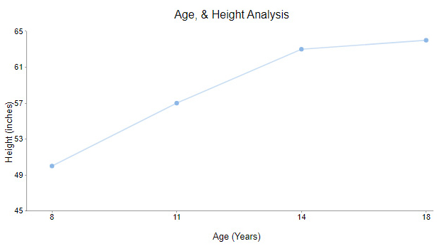
A line chart is one of the most widely used X and Y-axis charts for visualizing trends over time. It connects data points using straight lines, making it easy to track changes and patterns.
Typically, the X-axis represents time or categories, while the Y-axis shows corresponding values such as sales, revenue, or temperature. This chart works best for continuous data and helps quickly identify upward or downward trends.
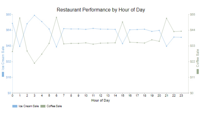
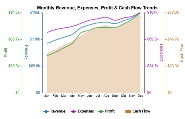
A Dual-axis line chart allows you to plot two different variables on the same chart using separate Y-axes.
This is useful when comparing related datasets with different value ranges.
For example, you can track revenue and profit margin together without losing clarity. It helps reveal relationships between variables while keeping the visualization clean and easy to interpret.
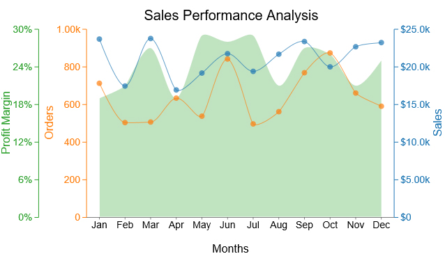
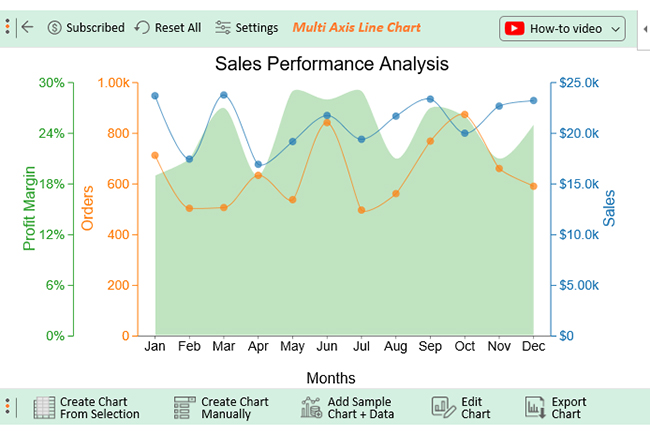
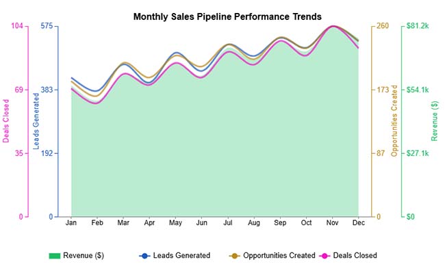
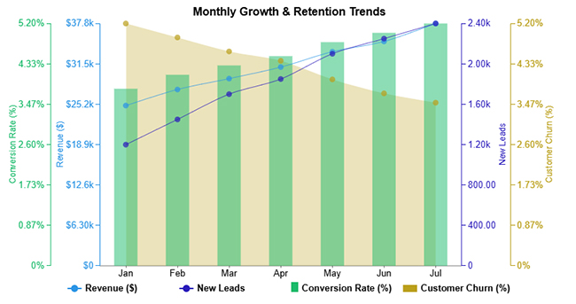
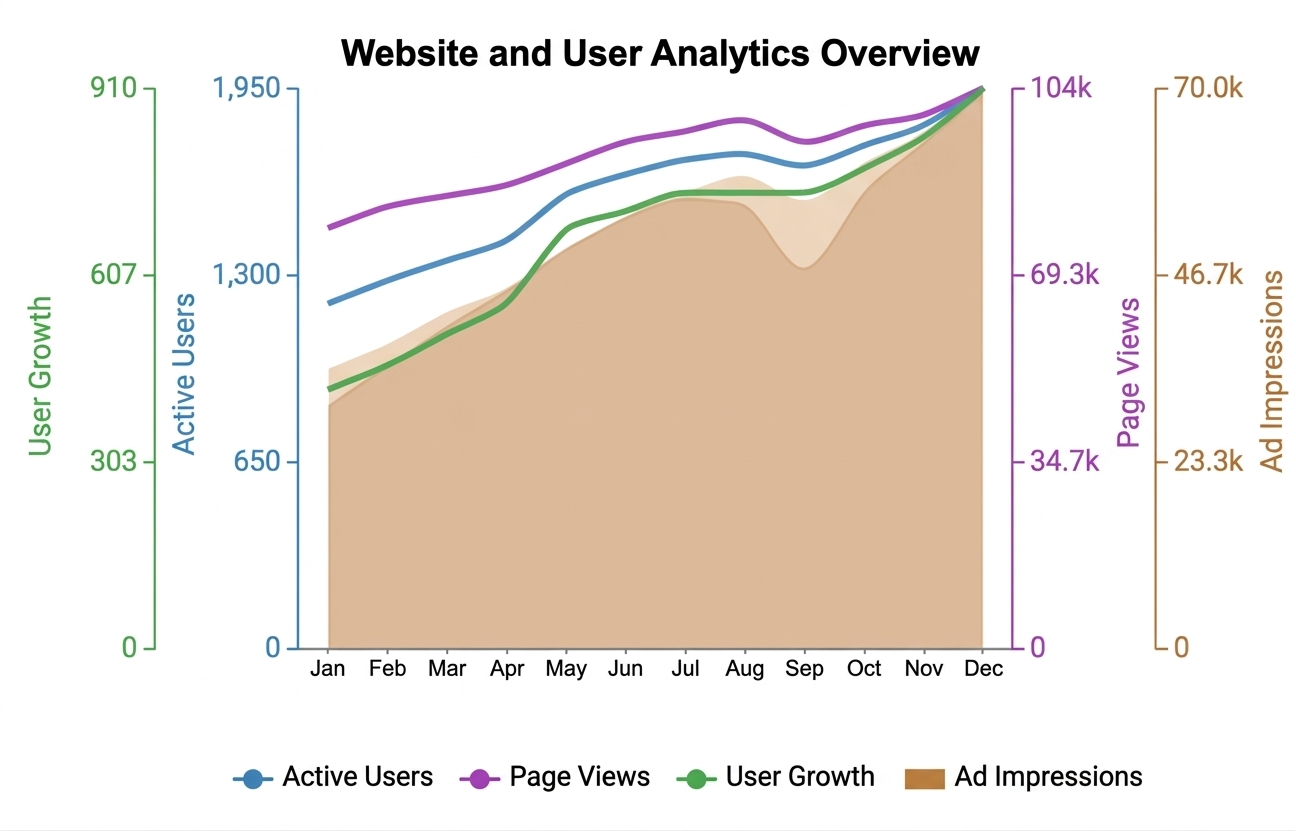
A Multi-axis line chart is designed for analyzing multiple variables at once. It uses more than two axes to display different datasets with varying scales.
This type of chart is useful when you need to compare several performance indicators over the same period.
Although it may seem complex at first, a well-structured multi-axis chart can provide deep insights into patterns, relationships, and performance trends.
Proper labeling and consistent scaling are key to keeping the chart readable and effective.
Reading an X and Y axis chart becomes simple once you understand how the data is structured and displayed. Follow these key points:
Avoiding common errors can make your charts more accurate, clear, and easier to interpret. Here are key mistakes to watch out for:
The X and Y axes are the two reference lines used to plot data on a graph. The X-axis is the horizontal line that typically represents the independent variable or categories, while the Y-axis is the vertical line that shows the dependent values or measurements. Together, they help display relationships and patterns between data points.
The X and Y axes form the foundation of any graph. The X-axis organizes data horizontally, usually showing time or categories, while the Y-axis displays values vertically. Together, they make it easy to understand relationships, trends, and patterns in the data.
Yes, tools like Excel offer built-in chart options for basic needs. For more advanced and customizable visuals, tools like ChartExpo provide additional features that make creating clear and professional charts easier.
X and Y-axis charts play a key role in turning raw data into clear, actionable insights. Instead of relying on complex tables, these charts help you quickly understand trends, relationships, and performance patterns.
By choosing the right structure, labeling axes correctly, and keeping your visuals clean, you can create charts that are both accurate and easy to interpret. A well-designed chart not only presents data but also tells a clear story that supports better decision-making.
Tools like ChartExpo can further simplify the process by helping you create more advanced and visually appealing charts without extra effort.
Start applying these techniques to your data and turn your charts into powerful tools for analysis and communication.
How much did you enjoy this article?


Calculate accounts receivable turnover ratio to measure credit collection speed, improve cash flow, and strengthen your financial strategy. Read on!

Change Management KPIs are the key to tracking adoption, performance, and ROI during transitions. Find out which metrics matter. Read on!

Data collection methods and techniques determine the quality of every insight you act on. Explore key approaches for gathering reliable data. Read on!


