• Home
  • Tools dropdown img
    • Spreadsheet Charts

      • ChartExpo for Google Sheets
      • ChartExpo for Microsoft Excel
    • Power BI Charts

      • Power BI Custom Visuals by ChartExpo
    • Word Cloud

  • Charts dropdown img
    • Chart Category

      • Bar Charts
      • Circle Graphs
      • Column Charts
      • Combo Charts
      • Comparison Charts
      • Line Graphs
      • PPC Charts
      • Sentiment Analysis Charts
      • Survey Charts
    • Chart Type

      • Box and Whisker Plot
      • Clustered Bar Chart
      • Clustered Column Chart
      • Comparison Bar Chart
      • Control Chart
      • CSAT Survey Bar Chart
      • CSAT Survey Chart
      • Dot Plot Chart
      • Double Bar Graph
      • Funnel Chart
      • Gauge Chart
      • Likert Scale Chart
      • Matrix Chart
      • Multi Axis Line Chart
      • Overlapping Bar Chart
      • Pareto Chart
      • Radar Chart
      • Radial Bar Chart
      • Sankey Diagram
      • Scatter Plot Chart
      • Slope Chart
      • Sunburst Chart
      • Tornado Chart
      • Waterfall Chart
      • Word Cloud
    • Google Sheets
      Microsoft Excel
  • Services
  • Pricing
  • Contact us
  • Blog
  • Support dropdown img
      • Gallery
      • Videos
      • Contact us
      • FAQs
      • Resources
    • Please feel free to contact us

      atsupport@chartexpo.com

Categories
All Data Visualizations Data Analytics Surveys
Add-ons/
  • Google Sheets
  • Microsoft Excel
  • Power BI
All Data Visualizations Data Analytics Surveys
Add-ons
  • Google Sheets
  • Microsoft Excel
  • Power BI

We use cookies

This website uses cookies to provide better user experience and user's session management.
By continuing visiting this website you consent the use of these cookies.

Ok

ChartExpo Survey


Home > Blog > Surveys

How to Analyze Customer Service Questionnaire Results?

Imagine yourself as a customer service manager for a company that sells the most delicious cakes in town.

customer service questionnaire

You’ve spent countless hours perfecting your customer service strategies. You’ve trained your team to be smiling, helpful, and prompt.

While you believe your customers are satisfied with your product’s quality, complete certainty is lacking. Therefore, you administer a customer service questionnaire to analyze customer satisfaction levels.

You send out the survey, and the responses start pouring in. Anticipation builds as you open each response to see how customers rated their experience with your company.

Are they happy with the service? Do they have any complaints? Do they think the cakes are worth the price?

Analyzing the results of a customer service questionnaire can be a bit of a mystery, but fear not. With the right tools and techniques, you can decode and use the feedback to improve your business.

Table of Contents:

  1. What is a Customer Service Survey?
  2. Best Questions to Ask in Customer Service Survey
  3. How to Create a Customer Service Questionnaire?
  4. How to Create a Chart to Analyze Customer Service Questionnaire Results in Excel?
  5. Wrap Up

What is a Customer Service Survey?

A Customer service survey is the corporate version of asking your significant other, “How was I?” after a date. It’s a way for businesses to gauge their performance and receive customer feedback. Unlike a date, however, the feedback is usually anonymous.

Also, it won’t result in awkward conversations about not calling back. The results provide valuable insights for identifying improvement areas and enhancing the quality of customer service.

Best Questions to Ask in Customer Service Survey

  1. How would you rate the overall quality of the customer service you received?
  2. Did the customer service representative respond to your inquiries on time?
  3. Were you greeted and treated with courtesy and professionalism?
  4. How satisfied are you with the solution provided by our customer service?
  5. Did the customer service representative actively listen to your concerns?
  6. How knowledgeable and competent was the customer service representative?
  7. Were your expectations met or exceeded during your interaction with customer service?
  8. How would you rate the ease of reaching customer service (e.g., phone, email, live chat)?
  9. Did the customer service representative empathize with your situation and make you feel valued?
  10. How likely will you recommend our company based on your customer service experience?
  11. Did the customer service representative satisfactorily resolve your issue?
  12. Were you provided with adequate options and solutions to choose from?
  13. Did the customer service representative follow up to ensure your issue was resolved to your satisfaction?
  14. How would you rate the availability and accessibility of customer service channels?
  15. Did the customer service representative take ownership of your issue and show a genuine desire to help?

How to Create a Customer Service Questionnaire?

There are a few guidelines to follow if you want to make your questionnaire a success. Keep it short, provide all necessary information, and make the introduction engaging. With that in mind, let’s create a questionnaire to knock off your customers’ socks.

Let’s say you want to create a customer service feedback survey with the following questions.

  • How satisfied are you with your experience at the restaurants?
  • How satisfied are you with staff behavior?
  • How satisfied are you with the cleanliness of the restaurants?

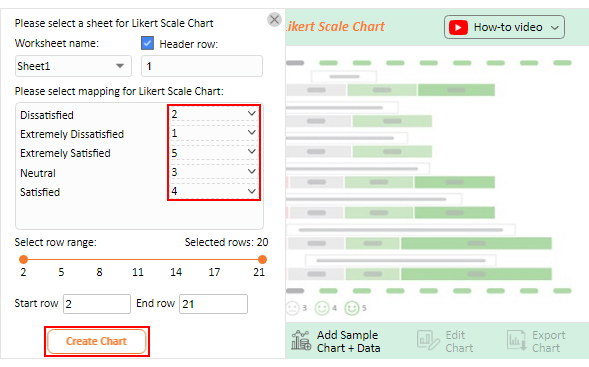
You want to map the response scale below to your customer service survey questions.

  1. Extremely Dissatisfied
  2. Dissatisfied
  3. Neutral
  4. Satisfied
  5. Extremely Satisfied

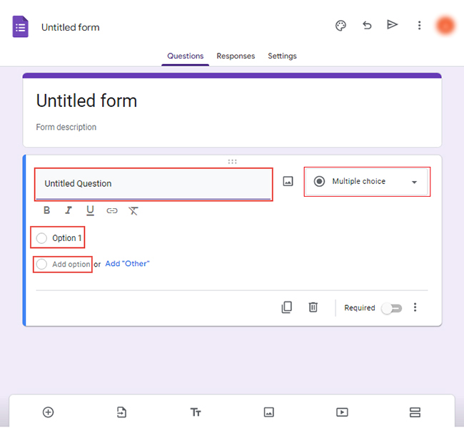
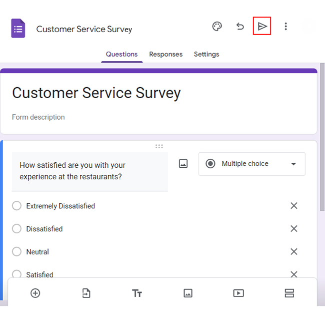
Creating a customer service questionnaire in Google Forms can be fun and productive – a win-win situation.

How?

Follow the steps below.

  • Log in to Google Forms using your Google account.
  • Click the “Blank” button to create a new form.
open a new form
  • Select the type of question you want to use, such as multiple-choice, checkbox, or short answer.
  • Type your Questions in the “Untitled Question” section. Write “Option 1” and choose “Add option” for more options.
Untitled Question
  • Click the “Send” button to share the form with the target audience.
Send button
  • When you have collected sufficient responses, click the three vertical dots next to “Link to Sheets.”
Link to Sheets
  • Select the option to download the responses as a.csv file.
download the responses

How to Create a Chart to Analyze Customer Service Questionnaire Results in Excel?

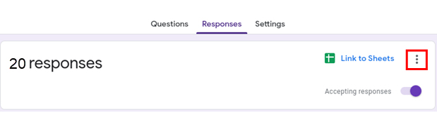
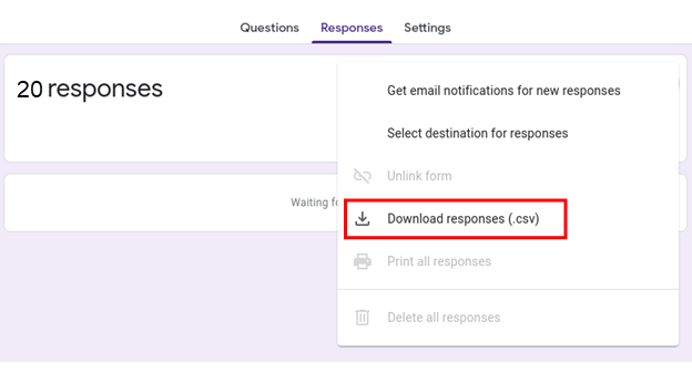
A wise person once said, “The customer is always right.” Once you’ve collected all that valuable customer service questionnaire data, what’s next? Well, you could spend hours poring over spreadsheets and trying to decipher the results. Or you could let ChartExpo, your reliable text visualization tool, do the heavy lifting for you.

Why ChartExpo?

ChartExpo is a powerful data visualization tool that helps you easily create insightful charts and graphs. It reduces the time to create charts and offers a library of constantly growing chart options.

Benefits of Using ChartExpo

  • ChartExpo offers many visualizations so you can cherry-pick the most relevant one for your survey data.
  • ChartExpo’s user-friendly interface makes creating insightful visualizations a breeze, even if you’re a coding novice.
  • Customize your visualizations to your heart’s content with CharExpo’s versatile options. Adjust the colors, fonts, and styles to your liking and create a unique visual experience.
  • ChartExpo offers excellent value, with a free 7-day trial and a $10 monthly plan. You won’t find a better deal for such a comprehensive data visualization tool.

How to Install ChartExpo in Excel?

  1. Open your Excel application.
  2. Open the worksheet and click the “Insert” menu.
  3. You’ll see the “My Apps” option.
  4. In the office Add-ins window, click “Store” and search for ChartExpo on my Apps Store.
  5. Click the “Add” button to install ChartExpo in your Excel.

ChartExpo charts are available both in Google Sheets and Microsoft Excel. Please use the following CTAs to install the tool of your choice and create beautiful visualizations with a few clicks in your favorite tool.

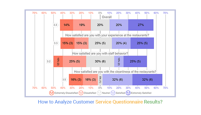
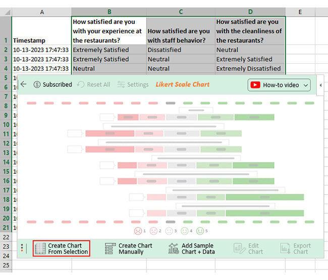
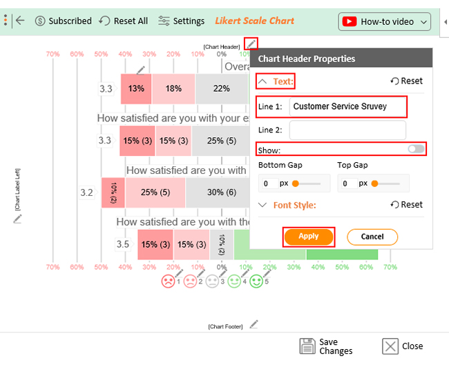
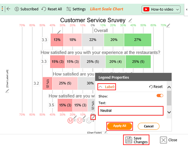
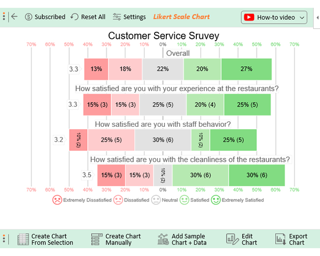
Assume your survey has yielded the results table below.

Timestamp How satisfied are you with your experience at the restaurants? How satisfied are you with staff behavior? How satisfied are you with the cleanliness of the restaurants? 
10-13-2023 17:47:33 Extremely Satisfied Dissatisfied
10-13-2023 17:47:33 Extremely Satisfied Neutral Extremely Satisfied
10-13-2023 17:47:33 Neutral Neutral Extremely Dissatisfied
10-13-2023 17:47:33 Satisfied Extremely Dissatisfied Dissatisfied
10-13-2023 17:47:33 Extremely Satisfied Dissatisfied Satisfied
10-13-2023 17:47:33 Satisfied Dissatisfied Satisfied
10-13-2023 17:47:33 Extremely Dissatisfied Neutral Extremely Satisfied
10-13-2023 17:47:33 Neutral Satisfied Neutral
10-13-2023 17:47:33 Extremely Dissatisfied Extremely Satisfied Extremely Satisfied
10-13-2023 17:47:33 Extremely Satisfied Extremely Dissatisfied Satisfied
10-13-2023 17:47:33 Dissatisfied Neutral Extremely Satisfied
10-13-2023 17:47:34 Neutral Neutral Extremely Dissatisfied
10-13-2023 17:47:35 Dissatisfied Neutral Extremely Satisfied
10-13-2023 17:47:36 Neutral Extremely Satisfied Satisfied
10-13-2023 17:47:37 Neutral Extremely Satisfied Dissatisfied
10-13-2023 17:47:38 Extremely Dissatisfied Extremely Satisfied Dissatisfied
10-13-2023 17:47:39 Extremely Satisfied Satisfied Extremely Dissatisfied
10-13-2023 17:47:40 Dissatisfied Dissatisfied Satisfied
10-13-2023 17:47:41 Satisfied Dissatisfied Extremely Satisfied
10-13-2023 17:47:42 Satisfied Extremely Satisfied Satisfied

This table contains example data. Expect many responses and questions in real life.

  • To get started with ChartExpo, install ChartExpo in Excel.
  • Now Click on My Apps from the INSERT menu.
insert chartexpo in excel
  • Choose ChartExpo from My Apps, then click Insert.
open chartexpo in excel
  • Once it loads, choose the “Likert Scale Chart” from the charts list.
search likert scale chart in excel
  • Click “Create Chart From Selection” button after selecting the data from the sheet, as shown.
create likert scale chart in excel
  • When you click the “Create Chart From Selection” button, you have to map responses with numbers manually. The Likert scale has this arrangement:
    • Extremely Dissatisfied = 1
    • Dissatisfied = 2
    • Neutral = 3
    • Satisfied = 4
    • Extremely Satisfied = 5
  • Once all is set, click the “Create Chart” button.
make likert scale chart in excel
  • ChartExpo will generate the visualization below for you.
edit likert scale chart in excel
  • If you want to have the title of chart, click on Edit Chart, as shown in the above image.
  • To change the title of the chart, click on the pencil icon that is available very next to Chart Header.
  • It will open the properties dialog. Under the Text section, you can add a heading in Line 1 and enable the Show Give the appropriate title of your chart and click on Apply button.
set likert scale chart in excel
  • Let’s say you want to add text responses instead of numbers against every emoji.
  • Click the pencil icon next to the respective emoji. Expand the “Label” properties and write the required text. Then click the “Apply All” button.
  • Click the “Save Changes” button to persist the changes.
save likert scale chart in excel
  • The final chart will look as below.
what is customer service questionnaire

Insights

  • 45% of customers reported satisfaction with their restaurant experience, 30% were dissatisfied, and 25% remained neutral.
  • Regarding staff behavior, 35% are satisfied, while 35% expressed dissatisfaction.
  • As far as restaurant cleanliness goes, 60% of customers are satisfied, but 30% expressed dissatisfaction.
  • Overall, 47% of customers reported being satisfied with the restaurant, with 27% stating they were extremely satisfied. On the other hand, 31% are dissatisfied, with 13% being extremely dissatisfied. The remaining 22% remained neutral.

FAQs

How do you create a customer service questionnaire?

To create a customer service questionnaire, follow these steps:

  • Define the objective of the questionnaire.
  • Determine the format.
  • Design clear and concise questions.
  • Use a mix of question types.
  • Test the questionnaire for clarity and flow.
  • Administer the questionnaire through suitable channels.

What is a questionnaire example?

An example of a questionnaire is a survey asking customers about their satisfaction with their recent shopping experience. This includes questions about product quality, staff friendliness, checkout process, and overall satisfaction with the shopping experience.

How can I use customer service questionnaires to improve customer experience?

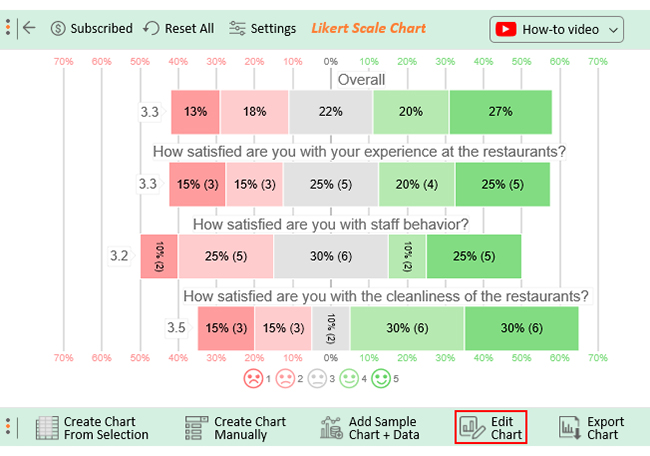
You can use customer service questionnaires to improve customer experience by gathering valuable feedback and insights. Analyze the responses to identify areas for improvement, address pain points, enhance staff training and refine processes. Most importantly, prioritize actions that will enhance overall customer satisfaction and loyalty.

Wrap Up

Analyzing customer service questionnaire results is essential to gain valuable insights and improve the customer experience.

First, categorize and organize the data obtained from the questionnaire. Group responses on common themes or areas of focus, such as responsiveness, product knowledge, or problem resolution. Identify patterns and trends to spot strengths and weaknesses in the customer service experience.

Then, compare the results against predefined benchmarks or industry standards to determine performance gaps and areas for improvement. Prioritize the issues that have the most significant impact on customer satisfaction.

Once the analysis is complete, develop an action plan to address the identified areas for improvement. This may involve refining training programs, streamlining processes, or empowering customer service representatives with additional resources.

ChartExpo for Excel makes this easy.

How?

It enables you to create captivating and informative charts effortlessly. Efficient data analysis doesn’t necessitate coding skills. ChartExpo empowers you to become a data guru by offering user-friendly tools for creating insightful visualizations.

How much did you enjoy this article?

ExcelAd1
Start Free Trial!
127144

Related articles

next previous
Surveys10 min read

How to Present Likert Scale Data Visually?

Learn how to present Likert scale data clearly using charts like stacked bars and heatmaps. Make survey results easy to interpret and visually engaging.

Surveys7 min read

Workplace Culture Surveys: Visual Perception, Not Guesswork

This guide dives deep into what the workplace culture survey is. You'll also discover what an employee culture survey is, and top 10 culture survey questions.

Surveys11 min read

How to Interpret 4-Point Likert Scale Results?

Click to learn How to Create, Gather and Analyze Data Using the 4-Point Likert Scale? A complete guide with definition, examples, uses, and applications.

Surveys7 min read

Benchmark for Surveying: Visual Insights

This guide dives deep into benchmarks for surveying. It shows you what it is, and the types of benchmarks in the survey. You'll also discover how to analyze it.

Surveys13 min read

5 Point Likert Scale Analysis, Interpretation & Examples

Dive deep into the realm of 5-point Likert Scale Analysis and Interpretation to unravel the sentiments behind your responses. Gain actionable insights today.

ChartExpo logo

Turn Data into Visual
Stories

CHARTEXPO

  • Home
  • Gallery
  • Videos
  • Services
  • Pricing
  • Contact us
  • FAQs
  • Privacy policy
  • Terms of Service
  • Sitemap

TOOLS

  • ChartExpo for Google Sheets
  • ChartExpo for Microsoft Excel
  • Power BI Custom Visuals by ChartExpo
  • Word Cloud

CATEGORIES

  • Bar Charts
  • Circle Graphs
  • Column Charts
  • Combo Charts
  • Comparison Charts
  • Line Graphs
  • PPC Charts
  • Sentiment Analysis Charts
  • Survey Charts

TOP CHARTS

  • Sankey Diagram
  • Likert Scale Chart
  • Comparison Bar Chart
  • Pareto Chart
  • Funnel Chart
  • Gauge Chart
  • Radar Chart
  • Radial Bar Chart
  • Sunburst Chart
  • see more
  • Scatter Plot Chart
  • CSAT Survey Bar Chart
  • CSAT Survey Chart
  • Dot Plot Chart
  • Double Bar Graph
  • Matrix Chart
  • Multi Axis Line Chart
  • Overlapping Bar Chart
  • Control Chart
  • Slope Chart
  • Clustered Bar Chart
  • Clustered Column Chart
  • Box and Whisker Plot
  • Tornado Chart
  • Waterfall Chart
  • Word Cloud
  • see less

RESOURCES

  • Blog
  • Resources
  • YouTube
SIGN UP FOR UPDATES

We wouldn't dream of spamming you or selling your info.

© 2025 ChartExpo, all rights reserved.