• Home
  • Tools dropdown img
    • Spreadsheet Charts

      • ChartExpo for Google Sheets
      • ChartExpo for Microsoft Excel
    • Power BI Charts

      • Power BI Custom Visuals by ChartExpo
    • Word Cloud

  • Charts dropdown img
    • Chart Category

      • Bar Charts
      • Circle Graphs
      • Column Charts
      • Combo Charts
      • Comparison Charts
      • Line Graphs
      • PPC Charts
      • Sentiment Analysis Charts
      • Survey Charts
    • Chart Type

      • Box and Whisker Plot
      • Clustered Bar Chart
      • Clustered Column Chart
      • Comparison Bar Chart
      • Control Chart
      • CSAT Survey Bar Chart
      • CSAT Survey Chart
      • Dot Plot Chart
      • Double Bar Graph
      • Funnel Chart
      • Gauge Chart
      • Likert Scale Chart
      • Matrix Chart
      • Multi Axis Line Chart
      • Overlapping Bar Chart
      • Pareto Chart
      • Radar Chart
      • Radial Bar Chart
      • Sankey Diagram
      • Scatter Plot Chart
      • Slope Chart
      • Sunburst Chart
      • Tornado Chart
      • Waterfall Chart
      • Word Cloud
    • Google Sheets
      Microsoft Excel
  • Services
  • Pricing
  • Contact us
  • Blog
  • Support dropdown img
      • Gallery
      • Videos
      • Contact us
      • FAQs
      • Resources
    • Please feel free to contact us

      atsupport@chartexpo.com

Categories
All Data Visualizations Data Analytics Surveys
Add-ons/
  • Google Sheets
  • Microsoft Excel
  • Power BI
All Data Visualizations Data Analytics Surveys
Add-ons
  • Google Sheets
  • Microsoft Excel
  • Power BI

We use cookies

This website uses cookies to provide better user experience and user's session management.
By continuing visiting this website you consent the use of these cookies.

Ok

ChartExpo Survey


Home > Blog > Google Sheets

How to Make an XY Graph in Google Sheets?

In the modern world, data is precious, particularly for understanding performance, consumers, and markets.

how to make an x y graph in google sheets

But let’s be honest: Calculating numbers is not fun or interesting. And because of this, it’s critical to investigate how to convey raw data compellingly and clearly.

XY Graphs are helpful in this situation. You can use the XY Chart template in Google Sheets to view your data and gain insights. However, customization will take a lot of time and effort because it is only a basic tool. But worry not. This guide will inform you how to make an XY Graph in Google Sheets.

Table of Contents:

  1. What is an XY Graph in Google Sheets?
  2. Understanding the Basics of Google Sheets X-Y Graph
  3. Why do we use XY Graph in Google Sheets?
  4. When to Use XY Graph in Google Sheets?
  5. Google Sheets XY Graphs Examples
  6. How to Make an XY Graph in Google Sheets?
  7. How to Edit an X and Y Graph in Google Sheets?
  8. What are the Pros of an XY Graph in Google Sheets?
  9. Wrap Up

What is an XY Graph in Google Sheets?

There are occasionally connections between important measures in your data. Comprehending these connections can help you find insights to put into practice.

Many call center managers are keen on the correlation between the number of individuals working a shift and the typical answer time. You can utilize an XY Graph in Google Sheets to draw out relationship insights from your data. This simple chart reveals relationships that tables and other visualization techniques, like bar charts, cannot show.

This chart uses dots to denote significant data points. The placement of each dot on the horizontal and vertical axis shows values for data points. ”˜’Use the chart below to see how two variables in your data relate to one another.”

x y graph in google sheets

Understanding the Basics of Google Sheets X-Y Graph

An x-y graph, or Cartesian coordinate system, is a presentation of data points plotted on two perpendicular axes: the x-axis (horizontal) and y-axis (vertical).

It’s used to analyze relationships between variables, trend analysis, and visualize mathematical functions or equations.

Why do we use XY Graph in Google Sheets?

We use XY graphs in Google Sheets to visualize and analyze relationships between two variables. By plotting data points on the x and y axes, we can identify patterns, trends, correlations, and other insights that help us understand the relationship between the variables being studied.

When to Use XY Graph in Google Sheets?

You may use various graphs and charts to visualize your data and get insights. However, a wider range of elements, such as your objective and context, play a role in selecting the best.

See the examples below to learn the best uses for Google Sheets Graph X and Y.

  • Utilize an XY Graph in Google Sheets to Examine the Connections between Essential Data Variables.

You can examine the potential relationship between your data’s crucial parameters by plotting this chart to see whether it exists. Observing and illuminating correlations between two numerical variables is the primary purpose of XY Graph.

  • Visualizing Causal Effect in Company Data

The ability to visualize causal-effect linkages in your business data using XY charts is also a helpful skill. For example, lack of cleanliness and customer service are the leading causes of restaurant customer complaints.

The purpose of an XY Graph is to obtain causal-effect insights. It is simple to see how a factor, like customer returns, directly contributes to a problem that costs money.

  • In circumstances where the Independent Variable has Numerous Values

This graph can investigate hidden connections between dependent and independent variables in your data. Use Google Sheets Graph X and Y to see the link between data points that logically go together: sales revenue and profits.

As we previously stated, how to make an XY Graph in Google Sheets need not be complicated. With advice gathered from data visualization specialists, we’ve got you covered. You shouldn’t miss this, so keep reading.

Google Sheets XY Graphs Examples

  1. Financial Correlation: XY graphs can depict the correlation between two financial assets, aiding investors in understanding their relationship.
  2. Scientific Experiments: They’re crucial in scientific research, displaying variables like temperature against reaction rates, and facilitating analysis.
  3. Market Analysis: In marketing, XY graphs help assess advertising effectiveness by plotting expenditure against sales revenue, and guiding resource allocation.

How to Make an XY Graph in Google Sheets?

You can’t easily reach some of the controls for modifying Google Sheets since they are too far away. As a result, using Google Sheets XY Graph Maker to create an X and Y Axis Chart to visualize your data will take a lot of time. Make it perfect to fit your content needs.

So what’s the answer?

With a third-party add-on, you can make it the most reliable tool. There are many add-ons for Google Sheets for data visualization, but ChartExpo is the best we suggest.

ChartExpo achieves perfect marks across the board (in our checklist).

  • Simplicity of use
  • Cost of access
  • The quality of charts produced
  • Impact on your browser

Even better, ChartExpo does not require coding or programming knowledge, unlike other data visualization-based extensions.

How to install ChartExpo in Google Sheets?

  1. You can download ChartExpo directly from the Google Sheets App. To get started, click on Extensions in the top toolbar.
  2. In the menu that appears, go to Add-ons and press the option Get add-ons.
  3. Search for ChartExpo in the bar and click the Charts, Graphs & Visualizations by ChartExpo when it appears in the results.
  4. Press the Install button, you will have to accept some permissions and you may have to confirm your Google account.

There is another direct way to install ChartExpo by clicking on the below link as well for your desired tool.

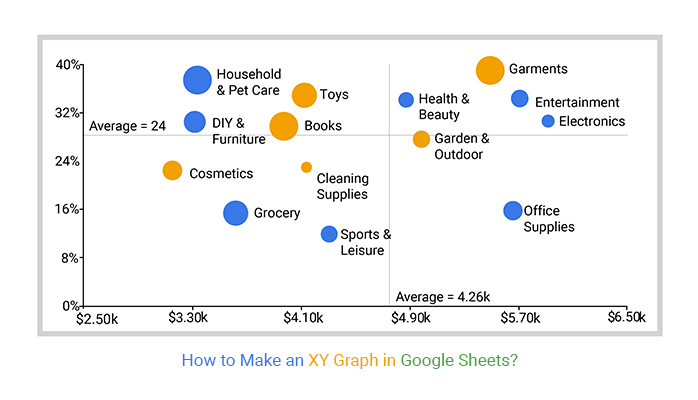
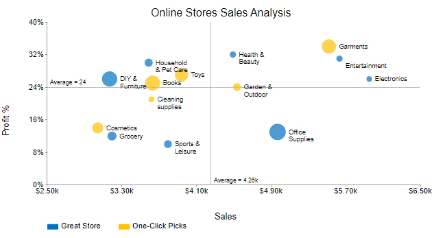
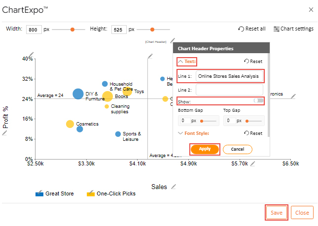
Suppose you have two online stores and you want to analyze sales, profit margin, & the number of orders. Here is the data below.

Stores Items Sales Profit % Number of Orders
Great Store Grocery 3195 12 405
Great Store Household & Pet Care 3588 30 382
Great Store Health & Beauty 4491 32 343
Great Store DIY & Furniture 3169 26 541
Great Store Office Supplies 4970 13 567
Great Store Sports & Leisure 3794 10 378
Great Store Electronics 5953 26 326
Great Store Entertainment 5634 31 342
One-Click Picks Garments 5520 34 521
One-Click Picks Cosmetics 3042 14 451
One-Click Picks Toys 3940 27 503
One-Click Picks Books 3630 25 533
One-Click Picks Garden & Outdoor 4535 24 380
One-Click Picks Cleaning supplies 3618 21 335
  • To get started with ChartExpo, install ChartExpo in Google Sheets from this link.
  • Go to Extensions > Charts, Graphs & Visualizations by ChartExpo > Open.
open chartexpo in google sheets
  • To access your chart library, click the Add new chart button.
add new chart in google sheets
  • Once ChartExpo is loaded, you will see a list of charts.
list of charts graphs google sheets
  • Then, scroll through the numerous chart templates until you see the Scatter Plot.
search XY chart in google sheets
  • Choose the Metrics option after selecting the sheet that contains your data. Add the corresponding numbers (in our example, we’ll add the Sales, Profit %, and Number of orders).
  • To add dimensional data, click the Dimensions button and enter the desired values (in our case, we’ll use Items and Stores).
create xy chart in google sheets
  • You can use these simple steps for how to make an XY graph in Google Sheets. The process is smooth and straightforward, thanks to ChartExpo.
  • Click the Create Chart button to complete the quick procedure and generate an XY Chart for your data.
  • Your example of an XY Graph should resemble this if you follow the preceding procedures (below).
edit xy chart in google sheets

How to Edit an X and Y Graph in Google Sheets?

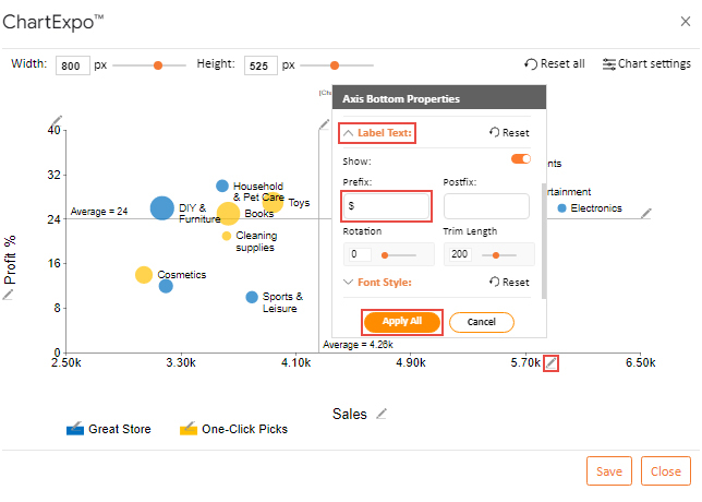
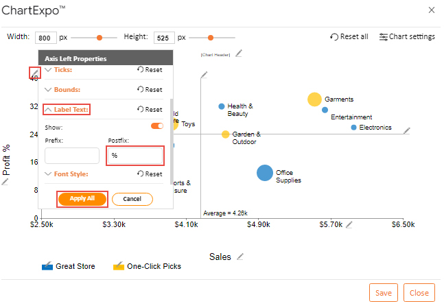
Here are simple edits to accomplish on the XY Graph maker.

How to add Postfixes and prefixes?

Follow these easy procedures to add prefixes and postfixes, such as currency symbols:

  • To edit the x-axis, select the pencil-shaped icon.
  • Click the Label Text in the Axis Bottom Properties interface after it appears. Add the dollar sign.
settings xy chart in google sheets
  • Choose “Apply All” from the menu.
  • Click the pencil-shaped icon next to the y-axis to add a postfix.
  • When the Axis Left Properties interface appears, select Label Text by clicking the button.
  • When prompted, type your % in the Postfix.
apply settings x and y graph in google sheets

How to add a legend?

  • If you wish to add a legend to the XY Graph, click the pencil-shaped icon.
  • When the Legend Properties box appears, enable the Show button.
  • Click the Apply function to save the changes.
apply functios XY graph in google sheets

How to add a title

  • Select the pencil-shaped icon next to the title placeholder.
  • Once the Property window appears, type “Online Store Sales Analysis” in the Line 1 text box.
  • Next, select Show from the menu and move the switch to the right (i.e., on position).
  • Click the Apply button to keep the changes.
  • Click the Save button to keep your adjustments in the XY Graph.
save XY graph in google sheets
  • Here is your final chart.
how to create an x y graph in google sheets

 Insights

  • Here the Dot size represents the number of orders.
  • Garments and electronics have high sales, & profit margins. But Garments have high numbers of order. On the other hand, Electronics have low numbers of orders.
  • Cosmetics and groceries have low sales and profit margins. But both items have the almost same number of orders.
  • DIY & Furniture have low sales. But it has a high-profit margin and several orders.

Revolutionize Data Connections by Combining XY Graphs in Google Sheets:

  1. Open your Excel Application.
  2. Install ChartExpo Add-in for Excel from Microsoft AppSource to create interactive visualizations.
  3. Select the Scatter Plot from the list of charts.
  4. Select your data
  5. Click on the “Create Chart from Selection” button.
  6. Customize your chart properties to add header, axis, legends, and other required information.
  7. Export your chart and share it with your audience.

The following video will help you to create a Scatter Plot in Microsoft Excel.

What are the Pros of an XY Graph in Google Sheets?

  • Clear Data Visualization: Easily identify patterns and correlations between two variables.
  • Customizable: Various options for colors, shapes, trendlines, and labels.
  • Real-Time Collaboration: Multiple users can work on the same graph simultaneously.
  • Accessibility: Access your graphs from any device with internet connectivity.
  • Seamless Integration: Works well with other Google Workspace tools.

Frequently Asked Questions About the XY Chart in Google Sheets

Can you graph an equation on Google Sheets?

Yes, you can graph an equation on Google Sheets by creating a table of values that satisfy the equation. Enter your X values in one column and use a formula to calculate the corresponding Y values in the next column. Then, select the data and use the chart tool to create an XY scatter plot.

How do you label XY on a graph?

To label the X and Y axes on a graph in Google Sheets:

  1. Select the chart.
  2. Click on the three vertical dots in the upper right corner and select “Edit chart.”
  3. Go to the “Customize” tab.
  4. Expand the “Chart & axis titles” section.
  5. Enter the labels for the X and Y axes in the provided fields.

Wrap Up

How to make an XY Graph in Google Sheets doesn’t have to be complicated. We have just discussed the process in detail above. We advise you to take your time and read the informative advice about how to make an XY in Google Sheets quickly and easily.

Which program is the most effective for use with an XY Graph to visualize data? One of the most prevalent tools for visualizing data is Google Sheets. Furthermore, it includes an XY graph and an easy-to-use Plot.

Because ChartExpo is one of the most reliable add-ons, we suggest using it to create XY Graph. Additionally, there are plenty of users worldwide. It is also incredibly user-friendly for anyone, regardless of their level of computer proficiency.

How much did you enjoy this article?

GSAd2
Start Free Trial!
123695

Related articles

next previous
Google Sheets11 min read

How to Create a Chart in Google Sheets in Few Steps?

Learn step-by-step how to create a chart in Google Sheets to visualize your data clearly and effectively, even if you're a beginner.

Google Sheets14 min read

How to Use Google Spreadsheet for Insightful Results

Learn how to use Google Sheets for data management. You’ll discover tips on adding data, using formulas, creating charts, and more to streamline your work.

Google Sheets11 min read

Commission Spreadsheet Template: An Easy Guide

A commission spreadsheet template ensures accuracy, saves time, and reduces errors. Learn its benefits and best practices for efficient commission tracking.

Google Sheets12 min read

How to Make Progress Bar in Google Sheets: Step-by-Step

Learn how to create a dynamic progress bar in Google Sheets to visually track goals, tasks, or project completion. Step-by-step guide with tips and examples.

Google Sheets11 min read

Travel Expenses Spreadsheet Template for Better Planning

A travel expenses spreadsheet template helps organize and manage trip costs. It simplifies budgeting, tracking, and reporting expenses in one place.

ChartExpo logo

Turn Data into Visual
Stories

CHARTEXPO

  • Home
  • Gallery
  • Videos
  • Services
  • Pricing
  • Contact us
  • FAQs
  • Privacy policy
  • Terms of Service
  • Sitemap

TOOLS

  • ChartExpo for Google Sheets
  • ChartExpo for Microsoft Excel
  • Power BI Custom Visuals by ChartExpo
  • Word Cloud

CATEGORIES

  • Bar Charts
  • Circle Graphs
  • Column Charts
  • Combo Charts
  • Comparison Charts
  • Line Graphs
  • PPC Charts
  • Sentiment Analysis Charts
  • Survey Charts

TOP CHARTS

  • Sankey Diagram
  • Likert Scale Chart
  • Comparison Bar Chart
  • Pareto Chart
  • Funnel Chart
  • Gauge Chart
  • Radar Chart
  • Radial Bar Chart
  • Sunburst Chart
  • see more
  • Scatter Plot Chart
  • CSAT Survey Bar Chart
  • CSAT Survey Chart
  • Dot Plot Chart
  • Double Bar Graph
  • Matrix Chart
  • Multi Axis Line Chart
  • Overlapping Bar Chart
  • Control Chart
  • Slope Chart
  • Clustered Bar Chart
  • Clustered Column Chart
  • Box and Whisker Plot
  • Tornado Chart
  • Waterfall Chart
  • Word Cloud
  • see less

RESOURCES

  • Blog
  • Resources
  • YouTube
SIGN UP FOR UPDATES

We wouldn't dream of spamming you or selling your info.

© 2025 ChartExpo, all rights reserved.