Categories
Displaying data with three or more key variables is not a walk in the park.
Why?
You’re likely to end up with distorted insights if you use the wrong visualization design. To avoid the aforementioned challenge, use Bar Graphs with 3 variables in Excel.


Bar Graphs are arguably among the most straightforward charts to decode. Besides, they’re familiar to many. You can use this chart to create persuasive and irresistible data stories.
You require the best visualization tool to plot easy-to-interpret and visually stunning Bar Graphs. Yes, you need a tool that’s easy to use and affordable.
Excel seems to be the logical choice for many because they are free. However, the spreadsheet application lacks ready-made Bar Graphs with 3 variables. In other words, Excel charts require extra work in editing.
So what’s the solution for drawing the best graph for 3 variables in Excel?
It turns out there’s a particular add-on you can easily download and install in your Excel. This add-on generates a ready-to-use Bar Graph with 3 variables for your data stories, which we will show you later in this blog.
In this blog, you’ll learn:
Before delving right into the how-to guide, let’s define the chart.
Definition: A Bar Graph with 3 variables is a specific type of bar chart that you can use to display comparison insights into 3 variables of data. But sometimes, you can use bar graphs to show trends. Besides, the chart is amazingly familiar to many because it’s easy to read and interpret.
Data in a Bar graph with 3 variables is displayed using vertical or horizontal bars. The length or height of each bar is proportionally equivalent to the data it represents. There are many types of Bar Visualization designs, but we’ll focus on 3 key types, namely:
A Bar Chart with 3 variables is best suited for displaying comparison insights into data. A common variation, the Side-By-Side Bar Chart, is particularly effective for comparing multiple categories across different groups. You can also use a Bar Chart with 3 variables to track trends and patterns of key variables.
One of the key reasons why this chart is amazingly popular among business owners and professionals is that it’s easy to decode. To interpret the chart accurately, focus on the length or height of the bars.
The key focus of the blog is mainly a Bar Graph with 3 variables. In other words, we’ll focus more on the Bar Chart variants you can use to display three or more key metrics.
Bar Visualization Designs have three key attributes. Let’s check them out.
How to Make a Bar Graph with 3 Variables should never throw a curveball at you. Keep reading to discover more.
Excel and Google Sheets are trusted data visualization tools because they’re familiar. Besides, their parent companies are reputable market leaders in many aspects of global technology.
Avoid over-relying on Excel as your go-to visualization tool if your goal is to access a ready-made Bar Graph with 3 variables.
The spreadsheet application produces very basic bar charts, which can consume massive amounts of time in editing.
We’re not advising you to do away with Excel.
You have the option of downloading and installing an add-in for Excel and an add-on extension for Google Sheets. Yes, you read that right.
The add-in we’ve tested and highly recommend is ChartExpo. You can use ChartExpo to create basic to highly advanced charts and graphs in Excel and Google Sheets.
In the coming section, we’ll demonstrate how you can leverage ChartExpo to generate a ready-made Bar Graph with 3 variables, such as the following:
In this example, we’ll use a specific type of Bar Chart with 3 variables in Excel to visualize the data set below.
So here we go.
| Country | 0 – 14 years | 15 – 64 years | 64 years & older |
| United Kingdom | 5 | 20 | 3 |
| Germany | 6 | 29 | 5 |
| Mexico | 17 | 31 | 2 |
| Japan | 9 | 44 | 10 |
| Russia | 13 | 49 | 5 |
| Brazil | 26 | 55 | 3 |
| United States | 29 | 91 | 15 |


Insights
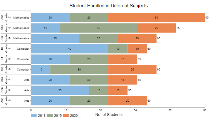
In this section, we’ll visualize the data below using a Stacked Bar Diagram to explain how to visualize a bar graph with 3 variables.
| Teacher | Class | Subjects | 2018 | 2019 | 2020 |
| Abe | Grade-7 | Mathematics | 20 | 20 | 50 |
| Abe | Grade-8 | Mathematics | 15 | 40 | 20 |
| Abe | Grade-9 | Mathematics | 25 | 20 | 20 |
| Bif | Grade-7 | Computer | 40 | 10 | 10 |
| Bif | Grade-8 | Computer | 20 | 20 | 15 |
| Bif | Grade-9 | Computer | 10 | 30 | 25 |
| Ann | Grade-7 | Arts | 20 | 20 | 15 |
| Ann | Grade-8 | Arts | 30 | 10 | 10 |
| Ann | Grade-9 | Arts | 20 | 20 | 20 |
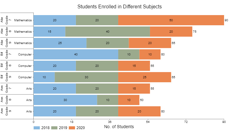
Insights
In this example, we’ll use a Grouped Bar Chart, also known as a Clustered bar chart, to visualize the data below containing at least 3 variables for insights.
Let’s dive in.
| Products | Q1 | Q2 | Q3 | Q4 |
| Rolex | 500 | 1000 | 1200 | 670 |
| Patek Philippe | 400 | 290 | 150 | 280 |
| Omega | 470 | 342 | 200 | 337 |
| Audemars Piguet | 900 | 622 | 110 | 544 |
| Piaget | 430 | 600 | 220 | 417 |
| Cartier | 290 | 550 | 900 | 580 |

In this last example, we’ll display insights into the table below using the Comparison Bar Chart.
| Months | Name | Sales |
| March | Alan | 90 |
| March | David | 82 |
| March | Lewis | 66 |
| March | Boris | 72 |
| April | Alan | 85 |
| April | David | 62 |
| April | Lewis | 50 |
| April | Boris | 73 |
| May | Alan | 40 |
| May | David | 60 |
| May | Lewis | 80 |
| May | Boris | 76 |
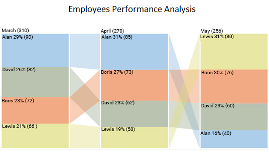
Insights
There are many types of charts and graphs, but a Bar Graph simplifies the data analysis process by helping you to manage large volumes of data easily. In other words, the chart offers a fundamental way of comparing key data points.
The other key advantage of using a bar graph for analysis is that you can leverage it to map and track changes in variables over time.
You can use the chart to track key and strategic metrics, such as profit, employee turnover, equity, debt, and cash flow growth over a specified period.
Bar charts are also the most commonly used charts for comparison. Visualization designs, such as a Bar Graph with 3 variables, are best suited to displaying part-to-whole comparisons between variables. Essentially, you can use the chart to compare key data points relative to the aggregate values in each bar.
Use vertical or horizontal bar charts based on your data and space. Horizontal bars are great for long category names.
Avoid unnecessary 3D effects. Use consistent, clear colors to keep your chart easy to read.
Add axis labels, category names, and a descriptive title so viewers can understand your data at a glance.
Sort bars by value or category to make comparisons easier and highlight trends effectively.
To visualize 3 variables in Excel, choose a bubble chart if you want to show the relationship between two variables along the X and Y axes while using bubble size for the third.
If you prefer a bar-based approach, use a clustered or stacked bar chart with color coding or data labels to represent the third variable. The key is to pick a chart that keeps your data clear, readable, and aligned with the story you want your data to tell.
While bar charts typically show one or two variables, you can display three variables effectively by:
Using these approaches, bar charts can help you present three variables in a clear, structured, and easy-to-read format within Excel.
While Excel doesn’t support a true bar graph with 3 axes, you can still display 3 variables by:
Follow the steps below to create a bar graph with 3 variables in Excel.
Displaying data with three or more key variables is easier said than done.
You’re likely to end up with distorted insights if you use the wrong visualization design.
This is where Bar Graphs with 3 variables come in.
Bar Graphs are arguably among the most straightforward charts to decode. Besides, they’re familiar to many. You can use the charts to create persuasive and irresistible data stories.
Some of the Bar Graphs with 3 variables key types include:
You require the best visualization tool to plot easy-to-interpret and visually stunning Bar Graphs. Yes, you need a tool that’s easy to use and affordable.
Google Sheets is one of the go-to data visualization tools among professionals and business owners worldwide.
But the visualization tool has a pretty basic Bar Graph with 3 variables. And this implies you’ve got to invest extra effort and time to edit the charts to align with your needs.
There’s a specific add-on you can download and install in your Google Sheets to access ready-to-use Bar Charts.
We recommend installing ChartExpo in your Google Sheets to access ready-made Bar Charts, such as Comparison and Grouped Bar Charts.
ChartExpo has all five Circle Graphs, and many other advanced charts, which are visually stunning and easy to interpret.
Unlike other visualization tools, you don’t need programming skills to visualize your data using ChartExpo.
Sign up for a 7-day free trial today to access visually appealing and insightful Bar Charts in Google Sheets & Excel.
How much did you enjoy this article?


Calculate accounts receivable turnover ratio to measure credit collection speed, improve cash flow, and strengthen your financial strategy. Read on!

Change Management KPIs are the key to tracking adoption, performance, and ROI during transitions. Find out which metrics matter. Read on!

Data collection methods and techniques determine the quality of every insight you act on. Explore key approaches for gathering reliable data. Read on!


