Categories
The 7-Point Likert Scale is a robust measurement tool employed to gauge the intensity of opinions, attitudes, and perceptions within a given survey or research context.

Distinguished by its seven-point range, this scale provides respondents with a spectrum of choices, typically ranging from strongly disagree to strongly agree.
What sets the 7 Point Likert Scale apart is its ability to capture nuances in participant responses, offering a more refined understanding of their viewpoints.
By allowing individuals to express degrees of agreement or disagreement, this scale introduces a level of granularity that proves invaluable in discerning subtle shifts in sentiment.
Widely embraced across disciplines, the 7-Point Likert Scale stands as a versatile and insightful instrument, providing researchers with a nuanced lens to explore the intricacies of human perspectives.
In this blog, you’ll learn:
Definition: A 7-point Likert scale is a survey response format designed to measure attitudes, perceptions, or levels of agreement with greater precision. It presents respondents with seven clearly defined options, typically ranging from strong disagreement to strong agreement, including a neutral midpoint.
This expanded range allows for more detailed insights into how people feel or think, making it especially useful in research where subtle differences in opinion matter.
You’re likely to recommend our brand to your family and friends.
In the following video, you’ll learn how to create a 7-point Likert Scale Chart in Excel.
In the following video, you’ll learn how to create a 7-point Likert Scale Chart in Google Sheets.
In the following video, you’ll learn how to create a 7-point Likert Scale Chart in Power BI.
A 7-point Likert scale is used because it offers a balanced range of response options, capturing a broader spectrum of attitudes, opinions, and behaviors.
This scale allows for greater granularity and precision in data, making it easier to detect subtle differences and providing more reliable and valid results in research studies. Additionally, it reduces central tendency bias and enables respondents to express their feelings more accurately.
A 7-point scale provides a more nuanced range of response options than a 5-point scale. With two extra points, it captures subtle differences in opinion, making it easier to detect mild agreement or disagreement. This granularity supports more refined data interpretation and enhances the overall reliability of responses.
Widely used across various domains, Likert scale 1 to 7 are popular in customer satisfaction surveys, employee engagement evaluations, academic research, and product or service assessments. Their balanced structure makes them suitable for capturing sentiments, behaviors, and expectations with greater depth.
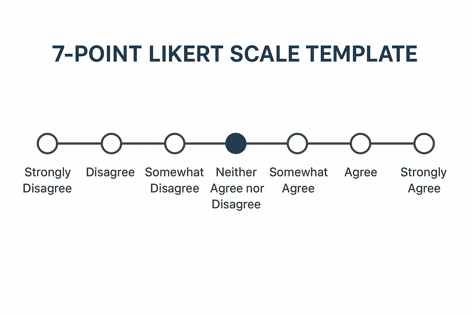
A typical 7-point Likert scale includes a neutral midpoint and equal gradations on either side. For example: “Strongly Disagree,” “Disagree,” “Somewhat Disagree,” “Neither Agree nor Disagree,” “Somewhat Agree,” “Agree,” and “Strongly Agree.” Variants also exist for rating importance, frequency, likelihood, or satisfaction.
While offering more detailed feedback, a Likert scale 1 to 7 can lead to respondent fatigue in longer surveys if overused. The increased choices may confuse participants who prefer simpler formats, but when used appropriately, they strike a strong balance between detail and usability.
Data from a Likert scale 1 to 7, often supports more advanced statistical analysis, including mean comparisons and trend analysis. The broader range helps researchers and decision-makers extract actionable insights that might be overlooked with fewer response categories.
Here are the 7-point Likert scale questions we can use:
The following template can be used for a 7-Point Likert Scale:
The data below is about respondents and their views towards the training that was recently conducted.
| Questions | Scale | Responses |
| This training was relevant to the work I perform daily | 1 | 100 |
| This training was relevant to the work I perform daily | 2 | 120 |
| This training was relevant to the work I perform daily | 3 | 34 |
| This training was relevant to the work I perform daily | 4 | 130 |
| This training was relevant to the work I perform daily | 5 | 210 |
| This training was relevant to the work I perform daily | 6 | 230 |
| This training was relevant to the work I perform daily | 7 | 200 |
| The location of the training was appropriate | 1 | 170 |
| The location of the training was appropriate | 2 | 180 |
| The location of the training was appropriate | 3 | 100 |
| The location of the training was appropriate | 4 | 180 |
| The location of the training was appropriate | 5 | 130 |
| The location of the training was appropriate | 6 | 295 |
| The location of the training was appropriate | 7 | 300 |
| The facilities were clean | 1 | 180 |
| The facilities were clean | 2 | 100 |
| The facilities were clean | 3 | 130 |
| The facilities were clean | 4 | 150 |
| The facilities were clean | 5 | 300 |
| The facilities were clean | 6 | 350 |
| The facilities were clean | 7 | 400 |
| The instructor was good and knowledgeable | 1 | 80 |
| The instructor was good and knowledgeable | 2 | 120 |
| The instructor was good and knowledgeable | 3 | 180 |
| The instructor was good and knowledgeable | 4 | 200 |
| The instructor was good and knowledgeable | 5 | 250 |
| The instructor was good and knowledgeable | 6 | 300 |
| The instructor was good and knowledgeable | 7 | 350 |
Note the difference after visualizing the survey data below.

The survey data below is about ratings of a particular shoe brand.
Let’s dive in.
| Questions | Scale | Responses |
| I felt very stylish whenever I put these shoes on | 1 | 70 |
| I felt very stylish whenever I put these shoes on | 2 | 130 |
| I felt very stylish whenever I put these shoes on | 3 | 200 |
| I felt very stylish whenever I put these shoes on | 4 | 250 |
| I felt very stylish whenever I put these shoes on | 5 | 150 |
| I felt very stylish whenever I put these shoes on | 6 | 220 |
| I felt very stylish whenever I put these shoes on | 7 | 300 |
| I am confident in the quality of the shoes | 1 | 120 |
| I am confident in the quality of the shoes | 2 | 100 |
| I am confident in the quality of the shoes | 3 | 200 |
| I am confident in the quality of the shoes | 4 | 250 |
| I am confident in the quality of the shoes | 5 | 300 |
| I am confident in the quality of the shoes | 6 | 270 |
| I am confident in the quality of the shoes | 7 | 320 |
| I would recommend these shoes to others | 1 | 210 |
| I would recommend these shoes to others | 2 | 200 |
| I would recommend these shoes to others | 3 | 180 |
| I would recommend these shoes to others | 4 | 300 |
| I would recommend these shoes to others | 5 | 250 |
| I would recommend these shoes to others | 6 | 210 |
| I would recommend these shoes to others | 7 | 320 |
| I plan to buy these shoes for friends or family members | 1 | 100 |
| I plan to buy these shoes for friends or family members | 2 | 120 |
| I plan to buy these shoes for friends or family members | 3 | 150 |
| I plan to buy these shoes for friends or family members | 4 | 200 |
| I plan to buy these shoes for friends or family members | 5 | 180 |
| I plan to buy these shoes for friends or family members | 6 | 250 |
| I plan to buy these shoes for friends or family members | 7 | 280 |
Check out the final 7 point Likert Scale below.

Excel & Google Sheets are popular visualization tools among business owners. However, they lack a ready-made Likert Scale with up to 7 levels.
We’re not advising you to dump Microsoft Excel.
There’s an amazingly affordable tool that comes as an add-in you can easily install in Excel & Google Sheets to access a ready-to-go and easy-to-read Likert Scale.
The application is called ChartExpo.
What is ChartExpo?
ChartExpo is an add-in you can easily install in your Excel to access a ready-made and visually appealing 7-point Likert Scale.
Features and Benefits
Let’s get on with it.
To get started with ChartExpo in Excel, follow the steps below:
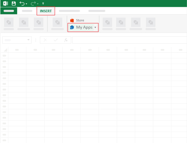
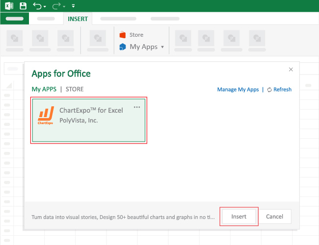

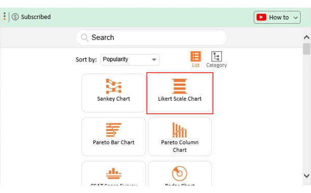


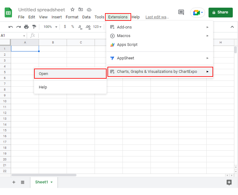
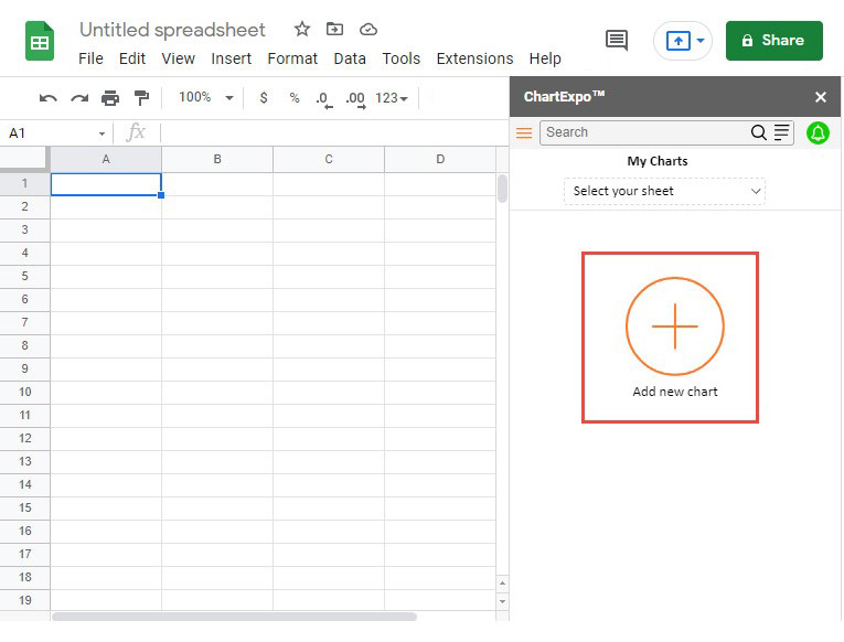
To install the ChartExpo add-on for Google Sheets, from this link.


To simplify interpretation, cluster responses into categories:
This helps identify overall sentiment trends without overcomplicating the data.
Each scale point should have a consistent and descriptive label (e.g., Strongly Disagree, Disagree, Somewhat Disagree…) to avoid confusion and ensure uniform understanding among respondents.
While a 7-point scale offers more granularity, be cautious not to overstate the significance of small score differences (e.g., a 0.2 shift in average rating). Use statistical tests when concluding subtle changes.
The midpoint (typically point 4) should be treated as a valid “neutral” or “undecided” response, not ignored. It can reflect indecision, lack of knowledge, or genuine neutrality.
Use Likert charts, heatmaps, or stacked column charts to show distribution across the 7 points. This makes patterns and outliers more visible and helps stakeholders grasp insights quickly.
One of the key benefits of a 7-point Likert Scale is that it provides different degrees (up to 7) of agreement and disagreement
A 7-point scale is a type of rating scale that offers seven response options, typically ranging from strongly negative to strongly positive. It’s commonly used in surveys to measure attitudes, satisfaction, or agreement levels.
For example:
A 7-point Likert scale typically produces ordinal data, which represents ranked responses with a clear order (e.g., from “Strongly Disagree” to “Strongly Agree”).
However, when the intervals between points are assumed to be equal, researchers often treat it as interval data for statistical analysis, such as mean, standard deviation, and correlation.
The 7-point Likert scale is considered ordinal because it shows rank order without guaranteed equal spacing between points. However, in practice, researchers often treat it as an interval to perform statistical analyses, such as calculating averages or running regressions.
Analyzing survey responses for in-depth insights shouldn’t be a hassle. Or even overwhelming to you.
Survey responses are complex and may have textual and numerical data. This requires you to change your strategy during the analysis phase.
A 7-point Likert Scale comes in handy in this phase.
This visualization design is popular among seasoned data visualization experts, especially when extracting actionable insights from survey data.