• Home
  • Tools dropdown img
    • Spreadsheet Charts

      • ChartExpo for Google Sheets
      • ChartExpo for Microsoft Excel
    • Power BI Charts

      • Power BI Custom Visuals by ChartExpo
    • Word Cloud

  • Charts dropdown img
    • Chart Category

      • Bar Charts
      • Circle Graphs
      • Column Charts
      • Combo Charts
      • Comparison Charts
      • Line Graphs
      • PPC Charts
      • Sentiment Analysis Charts
      • Survey Charts
    • Chart Type

      • Box and Whisker Plot
      • Clustered Bar Chart
      • Clustered Column Chart
      • Comparison Bar Chart
      • Control Chart
      • CSAT Survey Bar Chart
      • CSAT Survey Chart
      • Dot Plot Chart
      • Double Bar Graph
      • Funnel Chart
      • Gauge Chart
      • Likert Scale Chart
      • Matrix Chart
      • Multi Axis Line Chart
      • Overlapping Bar Chart
      • Pareto Chart
      • Radar Chart
      • Radial Bar Chart
      • Sankey Diagram
      • Scatter Plot Chart
      • Slope Chart
      • Sunburst Chart
      • Tornado Chart
      • Waterfall Chart
      • Word Cloud
    • Google Sheets
      Microsoft Excel
  • Services
  • Pricing
  • Contact us
  • Blog
  • Support dropdown img
      • Gallery
      • Videos
      • Contact us
      • FAQs
      • Resources
    • Please feel free to contact us

      atsupport@chartexpo.com

Categories
All Data Visualizations Data Analytics Surveys
Add-ons/
  • Google Sheets
  • Microsoft Excel
  • Power BI
All Data Visualizations Data Analytics Surveys
Add-ons
  • Google Sheets
  • Microsoft Excel
  • Power BI

We use cookies

This website uses cookies to provide better user experience and user's session management.
By continuing visiting this website you consent the use of these cookies.

Ok

ChartExpo Survey


Home > Blog > Power BI

Power BI Incremental Refresh: A Complete Guide

Power BI Incremental Refresh loads only new or changed data, which enhances performance, efficiency, and scalability for large datasets. These help optimize data updates.

Power BI Incremental Refresh

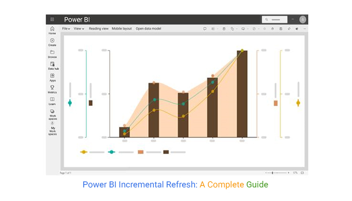
This guide shows you what Power BI Refresh is, why you should use the Power BI data flow incremental refresh, and how to set it up. The guide also shows you some Power BI report examples to demonstrate how Power BI automatic refresh works.

If you’re a beginner, this guide will show you how to use Power BI and also unveil the difference between Power BI Pro vs. Premium. Aside from all these, you’ll discover the Power BI metrics to look out for. And that plays a role in the data-driven decision-making process.

Finally, you’ll discover how to analyze incremental refresh in Power BI and the benefits of incremental data refresh in Power BI.

Table of Contents:

  1. What is Power BI Incremental Refresh?
  2. Why Use Power BI Data Flow Incremental Refresh?
  3. How to Set Up Incremental Refresh in Power BI? Step by Step
  4. How to Analyze Incremental Refresh in Power BI?
  5. Limitations of Power BI Data Flow Incremental Refresh
  6. FAQs
  7. Wrap Up

What is Power BI Incremental Refresh?

Definition: Power BI Incremental Refresh optimizes data refreshes by loading only new (or changed) data instead of refreshing the entire dataset. This improves performance, minimizes resource consumption, and reduces refresh time. It’s ideal for handling large datasets in Power BI.

Why Use Power BI Data Flow Incremental Refresh?

  • Reduced Load on Data Sources

Frequent full refreshes can put significant strain on data sources like APIs, cloud storage, and SQL databases. By refreshing only incremental changes, Power BI minimizes the load on source systems, which prevents performance issues and slowdowns.

  • Scalability for Large Datasets

Organizations that deal with extensive historical data can use incremental refresh to scale their data processing efficiently. Incremental refresh supports large datasets by partitioning data into segments, which ensures smooth performance without overwhelming system resources.

  • Efficient Use of Storage and Processing Power

Power BI Service and Power BI Premium users benefit from reduced storage and memory requirements. Since only modified or new data is processed, storage consumption is optimized, and that leads to lower infrastructure costs.

  • Better Data Accuracy and Freshness

Incremental refresh ensures that only the latest data updates are included while historical data is retained. This enables businesses to make timely, data-driven decisions without delays caused by lengthy refresh cycles.

How to Set Up Incremental Refresh in Power BI? Step by Step

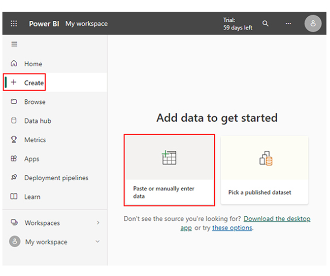
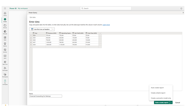
Step 1: Load Data into Power BI

  • Open Power BI Desktop
  • Click Home → Transform Data to open Power Query Editor
  • Connect to the data source (SQL Server, Excel, etc).

Step 2: Create Range Parameters

  • In the Power Query Editor, navigate to Manage Parameters —> New Parameter.
  • Create two parameters:
    • RangeStart (Date/Time) — Set a default value (like 2023-01-01).
    • RangeEnd (Date/Time) — Set a default value (like 2023-12-31).

Step 3: Apply Filters to the Data

  • Select the date column you want to filter by.
  • Click Filter —> Custom Filter.
  • Set the filter condition:
    • Greater than or equal to —> RangeStart.
    • Less than —> RangeEnd.
  • Click Close & Apply to apply changes.

Step 4: Enable Incremental Refresh

  • In Power BI Desktop, right-click the table —> Incremental Refresh.
  • Configure settings:
    • Store data for (like 5 years).
    • Refresh data for (like the last 1 month).
  • Click Apply.

Step 5: Publish to Power BI Service

  • Click Publish and upload the report to the Power BI Service.
  • In Power BI Service, navigate to Dataset Settings —> Refresh —> Scheduled Refresh.

Step 6: Test and Verify Refresh

  • Run a manual refresh to verify if only recent data updates.
  • Monitor refresh logs for errors.

How to Analyze Incremental Refresh in Power BI?

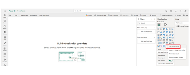
This section dives deep into how Power BI data visualization works, and also showcases some advanced features like the Power BI alerts and how Power BI transforms data.

When it comes to analyzing incremental refresh in Power BI, here are the stages to follow.

  • Stage 1: Log in to Power BI, enter your email, and click the “Submit” button.
Power BI Incremental Refresh
  • Enter your password, and click “Sign in.”
Power BI Incremental Refresh
  • You can opt to stay signed in.
Power BI Incremental Refresh
  • Stage 2: Create a Data Set and Select the Data Set to Use in the Multi-Axis Line Chart.
  • Navigate to the left-side menu, and click on the “Create” option. At this point, select “Paste or manually enter data.”
Power BI Incremental Refresh
  • The data below will be used for this illustration.
Power BI Incremental Refresh
  • Paste the Power BI Datasets above into the “Power Query” window. After that, select the “Create a semantic model only” option.
Power BI Incremental Refresh
  • Navigate to the left-side menu, and click on the “OneLake” option. Power BI will populate the data set list. If no data set has been created, you’ll get an error message.
  • Click on “Create report.”
Power BI Incremental Refresh
  • To see your chart metrics, click on “Expand All.” You’ll be able to check the dimensions and metrics. Click on “Get more visuals.” After that, search for ChartExpo and select the Multi-Axis Line Chart.
Power BI Incremental Refresh
  • Click on “Add.”
Power BI Incremental Refresh
  • You’ll see the Multi-Axis Line Chart in the visuals list.
Power BI Incremental Refresh
  • Enter your email in Visual Properties under the “Trial Mode” section.
Power BI Incremental Refresh
  • You will receive the ChartExpo key in your email. Copy the key from your email and paste it into the ChartExpo License Key text box under the “License Settings” section.
Power BI Incremental Refresh
  • Here is the sequence of fields from the data table (or model) used in this chart.
Power BI Incremental Refresh
  • At this point, add the Header text on top of the chart as follows:
Power BI Incremental Refresh
  • You can add the dollar sign to all values in the y-axis. Repeat the same for all x-axes.
Power BI Incremental Refresh
  • You can set the property “Dynamic Range” from the common y-axis properties section. Dynamically, y-axis ticks will be generated.
Power BI Incremental Refresh
  • You can arrange the y-axis orientation.
Power BI Incremental Refresh
  • You can sort the chart for different metrics and dimensions.
Power BI Incremental Refresh
  • You can change the data representation (like bar, line, and area). In this illustration, you’re showing revenue as bars, operating expenses as fill area, net profit, and cash flow with a circle and line.
Power BI Incremental Refresh
  • You can change the shape of the legend, and that will be based on the chart’s look and feel. In this illustration, changes are made for all metrics shown in the legend.
Power BI Incremental Refresh
  • The final chart should look like the image below.
Power BI Incremental Refresh

There are cases where you’ll have to use the Date hierarchy in Power BI to perform data analysis. As a general rule of thumb, you need to ascertain what you need before performing any data analysis.

Insights

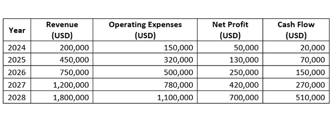
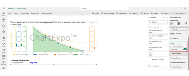
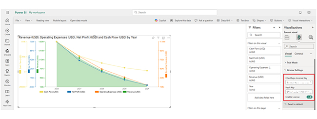
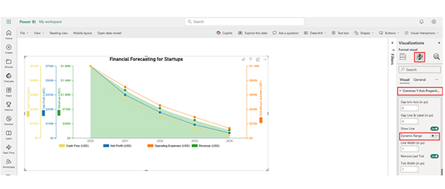
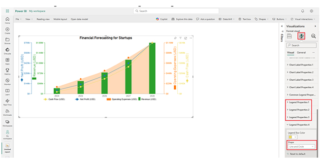
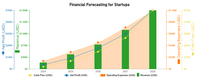
The financial chart shows several key insights about the company’s performance from 2024 to 2028.

  • Strong Revenue Growth: The revenue increases from $200K in 2024 to $1.8M in 2028. This suggests a rapidly growing business, and that is due to increased market demand, better product offerings, or expansion.
  • Rising Operating Expenses: The revenue is increasing, with increasing operating expenses. It has grown from $150K in 2024 to $1.1M in 2028. The expenses, on the other hand, are increasing at a controlled rate relative to revenue.
  • Increasing Profitability: Net profit is growing steadily from $50K in 2024 to $700K in 2028. This shows that the business is managing costs effectively while scaling up.
  • Improving Cash Flow: The cash flow grows from $20K in 2024 to $510K in 2028. It shows a healthier financial position, and that shows that the company has more liquidity to reinvest or cover operational needs.

Limitations of Power BI Data Flow Incremental Refresh

  • Requires a Premium or PPU License

Incremental Refresh in Dataflows is available only in Power BI Premium, Premium Per User (PPU), or Fabric capacities, and that makes it inaccessible for Pro users.

  • Requires a Date/Time Column

Incremental refresh depends on a Date/Time column to filter new (or modified) data. If the dataset lacks such a column, you’ll need additional transformations before implementing it.

  • Cannot Refresh Deleted Records

Incremental refresh only updates new (or modified) records but does not automatically handle deleted records unless designed using custom logic or soft delete.

  • Limited Data Source Support

Not all data sources support incremental refresh. It typically works with SQL databases, certain cloud-based sources, and Azure. Direct API-based sources may not be compatible.

FAQs

What is the timeout for incremental refresh in Power BI?

The timeout for incremental Refresh in Power BI depends on the data source, but generally follows the default 2-hour (120 minutes) limit for dataset refreshes in Power BI Service.

What is the difference between a full refresh and an incremental refresh?

A full refresh reloads the entire dataset, and that consumes more time and resources. Incremental refresh, on the other hand, updates only new or changed data. This improves performance, reduces load, and optimizes storage.

Why is incremental refresh not working in Power BI?

Incremental refresh may fail due to missing a Date/Time column, unsupported data sources, incorrect RangStart/RangeEnd parameters, DirectQuery mode, misconfigured Power BI Service settings, or exceeding the refresh timeout.

Wrap Up

Power BI Incremental Refresh updates only new (or modified) data instead of reloading the entire dataset. It improves performance, minimizes data source load, reduces refresh time, enhances scalability, and optimizes storage for large datasets.

But why should you use the Power BI data flow incremental refresh? Well, it comes with a reduced load on data sources, and it’s scalable for large datasets.

With the Power BI data flow incremental refresh, Power BI minimizes the load on source systems, which prevents performance issues and slowdowns.

Organizations that handle extensive historical data can use incremental refresh to scale their data processing efficiently. Incremental refresh partitions data into segments, and that ensures smooth performance without overwhelming system resources.

Now you know what the Power BI incremental refresh is, how will you set up one for your organization?

How much did you enjoy this article?

PBIAd2
Start Free Trial!
152433

Related articles

next previous
Power BI17 min read

Creating a Hierarchy in Power BI: Unveiling Essential Steps

Unlock full potential with our comprehensive guide on creating a hierarchy in Power BI. Learn processes, & user-friendly techniques for insightful visuals.

Power BI13 min read

Date Hierarchy in Power BI: Ultimate Guide for Users

Enhance your analysis with Date Hierarchy in Power BI. Discover the steps to create, customize, & utilize hierarchies effectively for more insight and reporting.

Power BI12 min read

How to Create a Dashboard in Power BI?

Uncover the secrets through the steps for how to create a dashboard in Power BI. Harness the power of Microsoft's business intelligence platform.

Power BI12 min read

Power BI Sales Dashboard for Actionable Insights

Boost your sales analysis with Power BI. Discover the benefits of a Power BI sales dashboard and learn how to create one with this step-by-step guide.

Power BI12 min read

Healthcare Dashboard Examples for Better Patient Insights

Immerse yourself in Healthcare Dashboard Examples, illustrating innovative ways to transform complex data into actionable insights for healthcare professionals.

ChartExpo logo

Turn Data into Visual
Stories

CHARTEXPO

  • Home
  • Gallery
  • Videos
  • Services
  • Pricing
  • Contact us
  • FAQs
  • Privacy policy
  • Terms of Service
  • Sitemap

TOOLS

  • ChartExpo for Google Sheets
  • ChartExpo for Microsoft Excel
  • Power BI Custom Visuals by ChartExpo
  • Word Cloud

CATEGORIES

  • Bar Charts
  • Circle Graphs
  • Column Charts
  • Combo Charts
  • Comparison Charts
  • Line Graphs
  • PPC Charts
  • Sentiment Analysis Charts
  • Survey Charts

TOP CHARTS

  • Sankey Diagram
  • Likert Scale Chart
  • Comparison Bar Chart
  • Pareto Chart
  • Funnel Chart
  • Gauge Chart
  • Radar Chart
  • Radial Bar Chart
  • Sunburst Chart
  • see more
  • Scatter Plot Chart
  • CSAT Survey Bar Chart
  • CSAT Survey Chart
  • Dot Plot Chart
  • Double Bar Graph
  • Matrix Chart
  • Multi Axis Line Chart
  • Overlapping Bar Chart
  • Control Chart
  • Slope Chart
  • Clustered Bar Chart
  • Clustered Column Chart
  • Box and Whisker Plot
  • Tornado Chart
  • Waterfall Chart
  • Word Cloud
  • see less

RESOURCES

  • Blog
  • Resources
  • YouTube
SIGN UP FOR UPDATES

We wouldn't dream of spamming you or selling your info.

© 2025 ChartExpo, all rights reserved.