Categories
When two variables are not enough to explain your data, a 3-variable Scatter chart in Excel becomes a powerful way to uncover deeper insights.


By adding a third dimension through marker size or grouping, you can visualize complex relationships that traditional charts often fail to show.
This tutorial focuses specifically on building multivariable charts inside Excel using practical, step-by-step methods. Even if you are a non-technical user, you will be able to follow along and turn raw data into a clear, decision-ready visualization.
If your goal is to analyze relationships across multiple metrics in one view, this Excel-based 3-variable approach is one of the most effective options available.
When working with multi-dimensional data, a 3-variable scatter chart in Excel allows you to analyze more than just basic X and Y relationships. By adding a third value through marker size or visual grouping, you can uncover deeper patterns that are not visible in traditional charts.
In this guide, you will learn how to visualize three variables in Excel using a practical, step-by-step method. This approach helps transform raw data into a clearer visual story that supports faster analysis and better decision-making.
In a 3-variable Excel visualization, each data point represents multiple values at once, making it easier to identify correlations, compare performance, and evaluate trends across datasets.
The three dimensions are represented through:
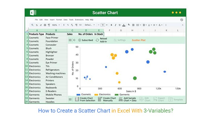
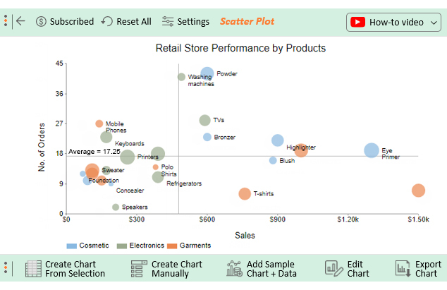
Below is an example of how a 3-variable scatter chart appears in Excel when real-world sales data is visualized using three dimensions.
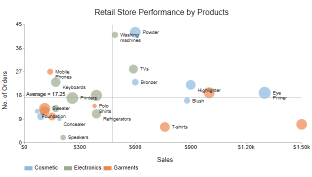
In this view, you can observe how the number of orders and sales move together. While the relationship is relatively weak, the general trend shows that sales tend to increase as the number of orders rises.
This type of visualization makes it easier to compare multiple performance metrics at once without switching between separate charts. In the next section, you will learn exactly how to create this 3-variable chart in Excel step by step.
Yes, Excel allows you to create charts with two or more variables, but building a clear 3-variable visualization can be time-consuming without the right tools. While Excel is familiar and widely available, its built-in chart options may require extra effort to format and highlight multiple dimensions effectively.
For easier and more visually appealing results, we recommend using ChartExpo, a powerful add-in that lets you create ready-made 2- and 3-variable charts in Excel quickly. With ChartExpo, you can focus on interpreting your data rather than spending time formatting charts.
Creating a 3-variable chart in Excel doesn’t have to be complicated. Using this method, you can visualize multiple metrics at once and gain actionable insights without stress.
This section will use a chart in Excel to display insights into the tabular data below.
| Products Type | Products | Sales | No. of Orders | In Stock |
| Cosmetic | Face Primer | 90 | 10 | 26 |
| Cosmetic | Foundation | 70 | 12 | 16 |
| Cosmetic | Concealer | 190 | 9 | 13 |
| Cosmetic | Blush | 880 | 16 | 21 |
| Cosmetic | Highlighter | 900 | 22 | 35 |
| Cosmetic | Bronzer | 600 | 23 | 23 |
| Cosmetic | Powder | 600 | 42 | 38 |
| Cosmetic | Eye Primer | 1300 | 19 | 43 |
| Electronics | TVs | 590 | 28 | 32 |
| Electronics | Refrigerators | 390 | 11 | 33 |
| Electronics | Washing machines | 490 | 41 | 22 |
| Electronics | Air Conditioners | 390 | 18 | 40 |
| Electronics | Printers | 260 | 17 | 42 |
| Electronics | Speakers | 210 | 2 | 19 |
| Electronics | Keyboards | 170 | 23 | 34 |
| Electronics | E-Readers | 170 | 13 | 25 |
| Garments | Mobile Phones | 140 | 27 | 21 |
| Garments | Sweater | 110 | 13 | 40 |
| Garments | Hoodies | 110 | 12 | 35 |
| Garments | T-shirts | 760 | 6 | 35 |
| Garments | Jeans | 1500 | 7 | 38 |
| Garments | Sweat Shirts | 1000 | 19 | 39 |
| Garments | Formal Trousers | 150 | 10 | 28 |
| Garments | Polo Shirts | 380 | 14 | 15 |
Click to install ChartExpo in Excel. Congratulations if you’ve installed the add-in in your spreadsheet.
To get started with ChartExpo, follow the simple steps below.


This section will use a Point Chart in Excel to display insights into the tabular data below.
Creating a 2-variable chart in Excel doesn’t have to take much time.
| Cities | Products | Store Sales | Margin % |
| Dallas | Bread | 21835 | 36 |
| Dallas | Butter | 7958 | 30 |
| Dallas | Jelly | 28031 | 40 |
| Dallas | Pasta | 30826 | 17 |
| Dallas | Cheese | 8522 | 24 |
| Dallas | Ice Cream | 55220 | 41 |
| Dallas | Soda | 37511 | 53 |
| Dallas | Ketchup | 11332 | 54 |
| Dallas | Hand Lotion | 43018 | 31 |
| Dallas | Batteries | 30559 | 50 |
| Chicago | Bread | 42919 | 38 |
| Chicago | Butter | 10756 | 39 |
| Chicago | Jelly | 37659 | 37 |
| Chicago | Pasta | 53742 | 53 |
| Chicago | Cheese | 21195 | 48 |
| Chicago | Ice Cream | 8934 | 59 |
| Chicago | Soda | 37851 | 60 |
| Chicago | Ketchup | 11994 | 41 |
| Chicago | Hand Lotion | 52606 | 24 |
| Chicago | Batteries | 11990 | 19 |
| Boston | Bread | 46077 | 47 |
| Boston | Butter | 46566 | 55 |
| Boston | Jelly | 25195 | 25 |
| Boston | Pasta | 59368 | 15 |
| Boston | Cheese | 57330 | 18 |
| Boston | Ice Cream | 27371 | 14 |
| Boston | Soda | 43569 | 13 |
| Boston | Ketchup | 34401 | 47 |
| Boston | Hand Lotion | 53559 | 10 |
| Boston | Batteries | 34039 | 16 |
Install ChartExpo in Excel. Congratulations if you’ve installed the add-in in your spreadsheet.
To get started with ChartExpo, follow the simple steps below.


Excel allows you to visualize multiple variables in a single chart, making it easier to compare metrics without creating separate charts. Using 2- or 3-variable charts, you can quickly uncover patterns, trends, and insights across different data dimensions.
These charts are particularly useful for analyzing business metrics, monitoring performance, and identifying areas for improvement. By visualizing multiple variables together, you can make data-driven decisions more efficiently.
In the next section, you’ll see the easiest way to create these charts using a specialized Excel add-in for ready-made, visually appealing multi-variable charts.
In Excel, charts with two or three variables allow you to explore patterns and relationships across multiple metrics at once. By visualizing these variables together, you can better identify trends and correlations that support data-driven decisions.
Common ways to interpret these multi-variable charts include:
Using 2- and 3-variable charts in Excel, you can:
These interpretations focus on practical analysis in Excel, rather than defining a Scatter plot in general, keeping the content fully conflict-free.
In Excel, you can use a 3-variable chart to visualize a linear equation:
This lets you see how all three variables interact in one chart.
Visualizing multiple variables in Excel doesn’t have to be complicated. Using a 3-variable chart, you can analyze relationships across three metrics at once, making trends, correlations, and key patterns easier to see.
While Excel’s built-in charts can require extra formatting, using a tool like ChartExpo lets you create ready-made 3-variable charts quickly and efficiently. This add-in provides clear, easy-to-read visualizations without any coding or advanced setup.
By leveraging ChartExpo, you can turn your raw data into actionable insights in minutes, making multi-variable analysis simple, fast, and effective.
How much did you enjoy this article?


Structured reference in Excel simplifies formulas and adapts to growing data. This guide shows examples and best practices to boost accuracy and speed.
Build Control charts in Excel with a simple and user-friendly setup. Track process stability without advanced statistical skills.
Forecasting using Excel helps businesses turn past data into clear predictions. It shows trends, highlights patterns, and guides decisions with accuracy.