• Home
  • Tools dropdown img
    • Spreadsheet Charts

      • ChartExpo for Google Sheets
      • ChartExpo for Microsoft Excel
    • Power BI Charts

      • Power BI Custom Visuals by ChartExpo
    • Word Cloud

  • Charts dropdown img
    • Chart Category

      • Bar Charts
      • Circle Graphs
      • Column Charts
      • Combo Charts
      • Comparison Charts
      • Line Graphs
      • PPC Charts
      • Sentiment Analysis Charts
      • Survey Charts
    • Chart Type

      • Box and Whisker Plot
      • Clustered Bar Chart
      • Clustered Column Chart
      • Comparison Bar Chart
      • Control Chart
      • CSAT Survey Bar Chart
      • CSAT Survey Chart
      • Dot Plot Chart
      • Double Bar Graph
      • Funnel Chart
      • Gauge Chart
      • Likert Scale Chart
      • Matrix Chart
      • Multi Axis Line Chart
      • Overlapping Bar Chart
      • Pareto Chart
      • Radar Chart
      • Radial Bar Chart
      • Sankey Diagram
      • Scatter Plot Chart
      • Slope Chart
      • Sunburst Chart
      • Tornado Chart
      • Waterfall Chart
      • Word Cloud
    • Google Sheets
      Microsoft Excel
  • Services
  • Pricing
  • Contact us
  • Blog
  • Support dropdown img
      • Gallery
      • Videos
      • Contact us
      • FAQs
      • Resources
    • Please feel free to contact us

      atsupport@chartexpo.com

Categories
All Data Visualizations Data Analytics Surveys
Add-ons/
  • Google Sheets
  • Microsoft Excel
  • Power BI
All Data Visualizations Data Analytics Surveys
Add-ons
  • Google Sheets
  • Microsoft Excel
  • Power BI

We use cookies

This website uses cookies to provide better user experience and user's session management.
By continuing visiting this website you consent the use of these cookies.

Ok

ChartExpo Survey


Home > Blog > Microsoft Excel

Hlookup in Excel: The Key to Faster Analysis

HLOOKUP in Excel says, “Have you ever needed to find data across a row instead of a column?” Don’t worry; I’m here to sort you out. Many users don’t realize the value of this function until they encounter a large dataset with key information presented horizontally.

Hlookup in Excel

Imagine you manage monthly performance data for different departments, laid out side by side. Instead of scrolling endlessly or rewriting formulas, HLOOKUP in Excel gives you what you need in seconds. It pulls information from a specific row, based on your lookup value. That’s precision.

This function is handy for tracking KPIs, product pricing by region, or student grades across various subjects. Wide tables become less of a hassle. You tell Excel what to find and where, and it delivers the results.

While many are familiar with VLOOKUP, far fewer explore HLOOKUP. And that’s a missed opportunity. Sometimes your data isn’t vertical. Flipping the entire table to make VLOOKUP work isn’t an efficient solution. You need the proper function for the structure you have.

This blog post demonstrates how to utilize HLOOKUP in Excel effectively. Whether managing sales, scheduling, or reporting, this tool can make horizontal data easier to manage and organize. You’ll also learn the use of Excel functions for data analysis and what-if analysis in Excel.

Let’s get started.

Table of Contents:

  1. What is HLOOKUP in Excel?
  2. Why Use Excel HLOOKUP?
  3. How to Use Excel HLOOKUP Formulas with Examples?
  4. How to Use the Excel HLOOKUP Function for Visualization?
  5. Benefits of Using Excel HLOOKUP
  6. Common Mistakes in Using HLOOKUP in Excel
  7. Best Practices When Working with Excel HLOOKUP
  8. FAQs
  9. Wrap Up

What is HLOOKUP in Excel?

Definition: HLOOKUP in Excel searches horizontally. It searches rows instead of columns. So, you use it when your data is arranged side by side. You enter a value to find in the top row, and Excel returns a value from the same column in the row you specify. It helps compare categories or time-based data.

Why Use Excel HLOOKUP?

Have you ever opened a spreadsheet and found the data stretching endlessly from left to right? That’s a clear sign you need HLOOKUP in Excel. It’s made for moments when your key information runs across the top—months, categories, or departments—and you need answers quickly.

Here’s why you should use this function:

  • Ideal for horizontal data: When your data is structured in rows, HLOOKUP saves time. You won’t need to rearrange your sheet or flip your layout to make it work.
  • Saves time on manual search: Manually scanning wide spreadsheets is time-consuming and prone to errors. HLOOKUP instantly finds the exact value for you.
  • Keeps your layout intact: No need to rotate or duplicate tables to use vertical functions. HLOOKUP works with your existing format, keeping things clean.
  • Supports cross-sheet lookups: You can retrieve data from other worksheets using the HLOOKUP function. This is particularly useful when managing dashboards across multiple sheets in an Excel workbook vs. a worksheet setup.
  • Works well with time-based data: Monthly, quarterly, or yearly comparisons often spread across rows. HLOOKUP helps pull out trends without reshaping the sheet.
  • Reduces errors in reporting: When done manually, data entry can lead to small mistakes. HLOOKUP automates retrieval, reducing those risks.

How to Use Excel HLOOKUP Formulas with Examples?

Have you ever tried pulling data from a wide spreadsheet and got stuck scrolling left to right? We’ve all been there. HLOOKUP in Excel is your fix for that. It searches through rows, making it ideal when your headers are located at the top of the table.
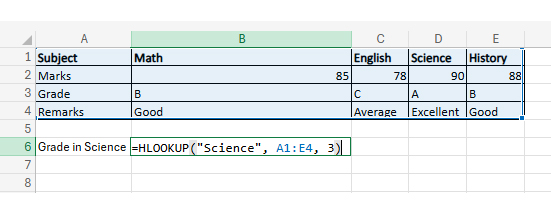
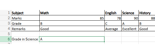
  • HLOOKUP example: student performance report: Assume we have this table set up in Excel:
Subject Math English Science History
Marks 85 78 90 88
Grade B C A B
Remarks Good Average Excellent Good
  • Objective: We want to extract the Grade for Science.

Here’s the Formula:

=HLOOKUP (“Science”, A1:E4, 3)

Explanation:

    • “Science”: This is your search keyword. Excel will look for this in the first row.
    • A1:E4: This is the table range where the search happens. It includes subjects, marks, grades, and remarks.
    • 3: This tells Excel to pull data from the third row, which contains the grades.
Hlookup in Excel
  • The result is “A”:
Hlookup in Excel

Top 4 Visuals by ChartExpo can be created after applying HLOOKUP in Excel

Are you tired of dull, confusing spreadsheets? Visuals can turn those flat numbers into clear insights. If you want your data to speak instantly, visuals are your answer. Let’s explore the top 5 visuals by ChartExpo that bring your data to life—fast, clean, and with impact:

  • Multi-Axis Line Chart: The chart shows monthly Revenue, Net Profit, and ROI trends across the year. Revenue (bars) steadily increases, while Net Profit (purple line) follows a similar upward pattern. ROI (teal area) fluctuates but generally rises, peaking toward the end of the year.
Hlookup in Excel
  • Likert Chart: Need to show how people feel about a service or product? The Likert Chart turns survey responses into a balanced, readable display of satisfaction, agreement, or perception levels.
Hlookup in Excel
  • Heatmap: This one turns data into color. Heatmaps are ideal for analyzing large datasets and identifying patterns—no formulas, just visuals.
Hlookup in Excel
  • Comparison BAR CHART: Want to compare revenue by social media platform? This chart uses bold bars to show who’s winning, who’s lagging, and how the numbers stack up.
Hlookup in Excel
  • Gauge Chart: Picture a speedometer for your goals. A Gauge Chart shows performance vs. target and makes it evident whether you’re on track or far off.
Hlookup in Excel

How to Use the Excel HLOOKUP Function for Visualization?

Have you ever wrestled with a spreadsheet so wide it needed its zip code? HLOOKUP in Excel is your quick fix for that horizontal madness. It helps you find what you need without flipping tables or squinting at endless rows. But let’s be honest—while Excel is brilliant for formulas, it often falls flat on visuals. Charts can look basic, confusing, or both. And in data analysis, a dull chart tells no story.

That’s where ChartExpo steps in. It fills Excel’s visual gap with stunning, insightful charts. Clean visuals, quick insights—no design degree needed.

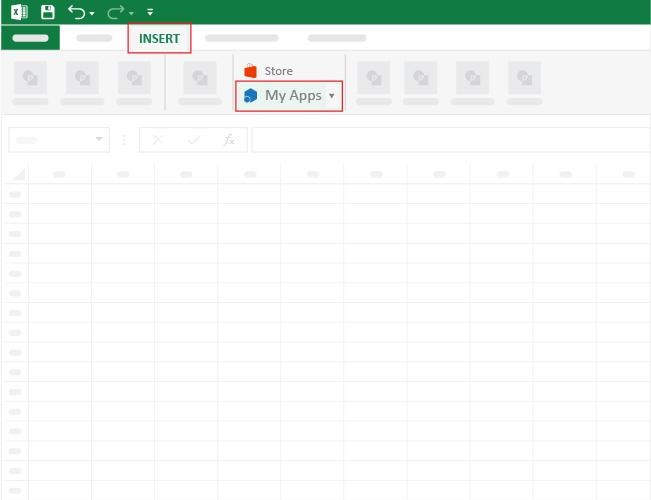
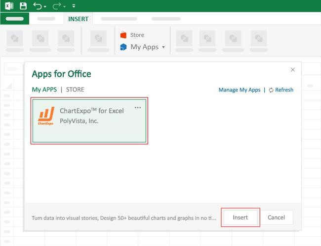
How to Install ChartExpo in Excel?

  1. Open your Excel application.
  2. Open the worksheet and click the “Insert” menu.
  3. You’ll see the “My Apps” option.
  4. In the Office Add-ins window, click “Store” and search for ChartExpo on My Apps Store.
  5. Click the “Add” button to install ChartExpo in your Excel.

ChartExpo charts are available both in Google Sheets and Microsoft Excel. Please use the following CTAs to install the tool of your choice and create beautiful visualizations with a few clicks in your favorite tool.

Example

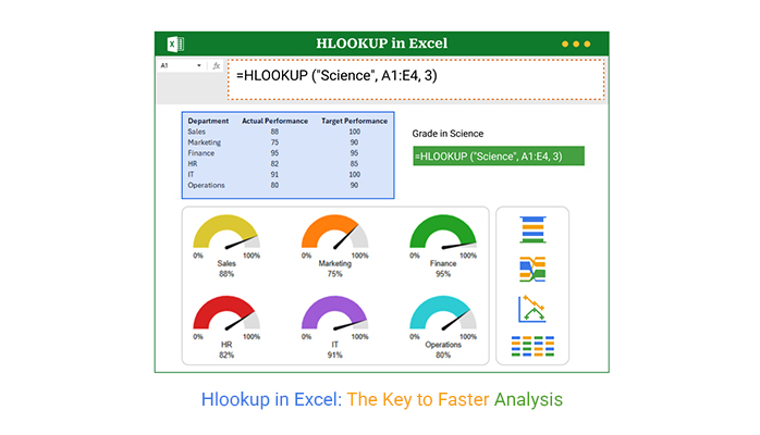
Let’s visualize and analyze this sample data in Excel using ChartExpo.
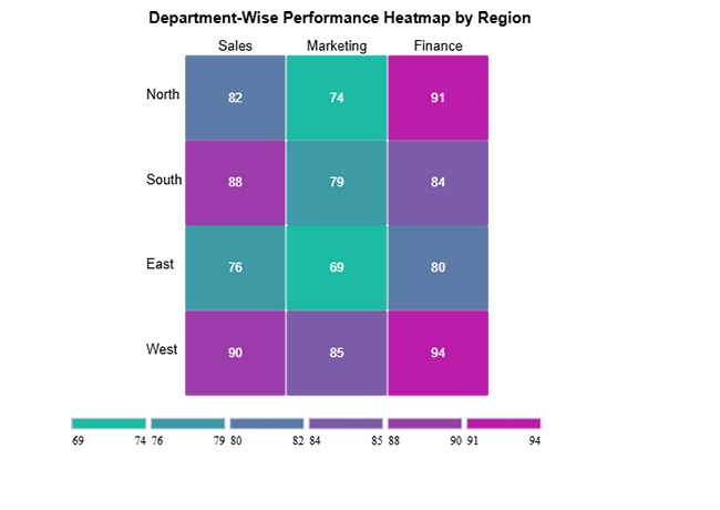
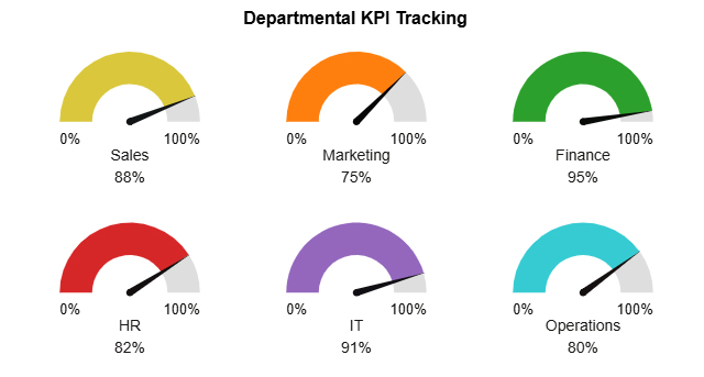
Department Actual Performance Target Performance
Sales 88 100
Marketing 75 90
Finance 95 95
HR 82 85
IT 91 100
Operations 80 90
  • To get started with ChartExpo, install ChartExpo in Excel.
  • Now, click on My Apps from the INSERT menu.
Hlookup in Excel
  • Choose ChartExpo from My Apps, then click Insert.
Hlookup in Excel
  • Once it loads, scroll through the charts list to locate and choose the “Gauge Chart”.
Hlookup in Excel
  • Click the “Create Chart From Selection” button after selecting the data from the sheet, as shown.
Hlookup in Excel
  • ChartExpo will generate the visualization below for you.
Hlookup in Excel
  • If you want to add anything to the chart, click the Edit Chart button:
  • Click the pencil icon next to the Chart Header to change the title.
  • It will open the properties dialog. Under the Text section, you can add a heading in Line 1 and enable Show.
  • Give the appropriate title of your chart and click the Apply button.
Hlookup in Excel
  • You can change the bar color from “Bar Properties as follows:
Hlookup in Excel
  • Set the needle color to black by clicking the pencil icon on the needle:
Hlookup in Excel
  • You can add a percentage sign on the central label and axis label from “Label Properties”:
Hlookup in Excel
  • You can change font size and color for better readability:
Hlookup in Excel
  • You can change the variation type from “Chart Settings” to make the chart look more presentable.
Hlookup in Excel
  • Click the “Save Changes” button to persist the changes made to the chart.
Hlookup in Excel
  • Your final Chart will look like the one below.
Hlookup in Excel

Insights

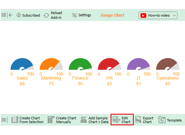
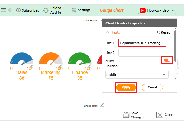
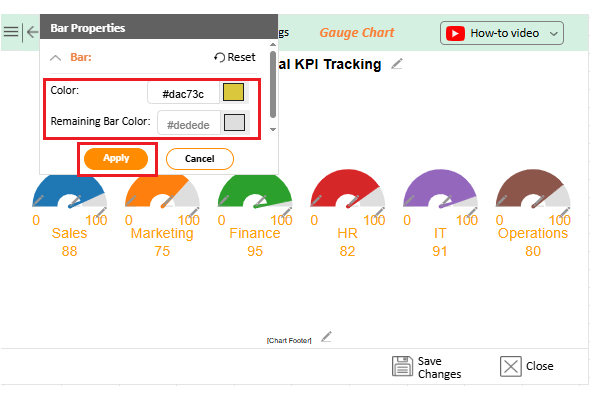
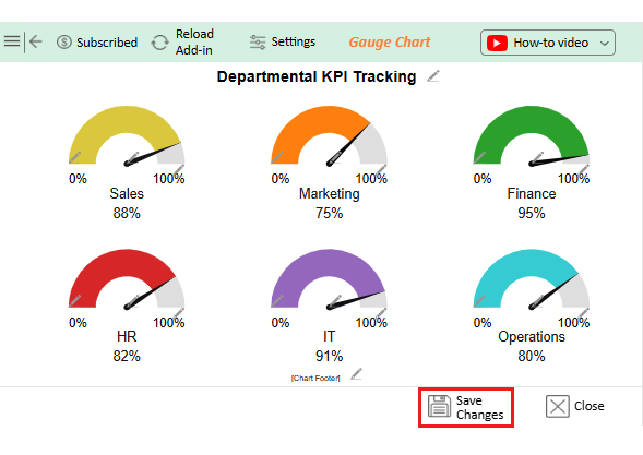
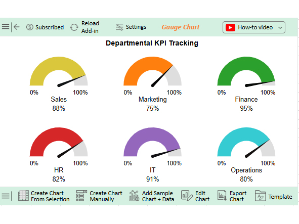
Gauge Chart KPI Overview:

  • Sales: 88%
  • Marketing: 75%
  • Finance: 95% (highest)
  • HR: 82%
  • IT: 91%
  • Operations: 80%

Performance Highlights:

  • Finance and IT are the top-performing departments.
  • Marketing shows room for improvement and may benefit from targeted strategies.

Benefits of Using Excel HLOOKUP

Have you ever had your data run sideways like a conveyor belt? That’s where HLOOKUP in Excel shines. It finds what you need in wide tables. There is no need to rearrange rows or squint at endless columns.

Here’s why HLOOKUP deserves a spot in your Excel toolkit:

  • Perfect for horizontal data: It’s designed for when your categories are displayed across the top row. Instead of flipping your sheet, let HLOOKUP do the heavy lifting.
  • Simplifies complex sheets: Wide tables become manageable. You tell Excel what to find, where to look, and which row to pull from—done.
  • Saves time on repetitive tasks: Automate your lookups to eliminate manual searches. It’s beneficial in Excel workbook vs. worksheet setups with consistent layouts.
  • Works well with other functions: Pair it with what-if analysis in Excel or conditional formatting to build innovative, responsive dashboards. Your reports will not only work better—they’ll look smarter too.
  • Reduces human error: Manual searches lead to mistakes. HLOOKUP ensures consistent, accurate data retrieval every time.

Common Mistakes in Using HLOOKUP in Excel

HLOOKUP in Excel is powerful, but even a minor error can disrupt the entire process. It’s not the formula’s fault—it’s usually something sneaky.

Here are the most common HLOOKUP slip-ups and how to avoid them:

  • Using the wrong row index: If your row index is higher than the number of rows in your table range, Excel returns an error. Always double-check that your index matches your layout.
  • Forgetting to lock the table range: Copying your formula without dollar signs in the range (like $A$1:$E$4) can break everything. Your references will shift, and results will go rogue.
  • Not starting with the top row: HLOOKUP only looks in the first row of your selected range. If your headers aren’t at the top, Excel won’t find your lookup value.
  • Using approximate match by accident: If you leave out the fourth argument (or set it to TRUE), Excel will guess based on sorted data. That’s risky—use FALSE unless you’re sure your data is sorted correctly.
  • Mismatch between data type and lookup value: Looking up a number but typing it as text? Excel won’t match it. Data type consistency is key for a clean lookup.

Best Practices When Working with Excel HLOOKUP

Have you ever built a HLOOKUP formula that “almost” worked? Almost isn’t good enough when your report is due. HLOOKUP in Excel can be a lifesaver, but only if you use it right.

Here are the best practices to keep your HLOOKUPs error-free and efficient:

  • Always lock your table range: Use absolute references ($A$1:$E$4) so your formula doesn’t break when copied. It keeps your lookups anchored exactly where they should be.
  • Keep headers in the first row: HLOOKUP only searches in the top row of your selected range. Ensure your categories are populated—or you’ll receive empty results.
  • Double-check your row index: Ensure your row number matches the data you want to retrieve. Miscount by one, and you’ll end up pulling the wrong value.
  • Use false for exact matches: Unless your data is sorted, avoid approximate matches. FALSE ensures HLOOKUP returns the exact value you need—no surprises.
  • Clean your data first: Be aware of extra spaces or inconsistent formatting. A hidden space can cause a failed match and hours of head-scratching.

FAQs

What is the difference between XLOOKUP and HLOOKUP in Excel?

XLOOKUP works in both directions—rows and columns—while HLOOKUP in Excel only searches horizontally. XLOOKUP replaces older lookup functions with more flexibility. It pairs well with tools like GETPIVOTDATA in Excel and advanced functions used to interpolate in Excel.

What is HLOOKUP used for in Excel?

HLOOKUP in Excel is used to find and return data from a specific row in a horizontal table. It’s helpful for retrieving values based on column headers. Unlike the VLOOKUP in Excel, it searches across rows. It complements functions that Interpolate in Excel when working with time-based or structured data.

Wrap Up

HLOOKUP in Excel is a powerful tool when working with wide tables. It helps you search across rows to find the data you need quickly. Whether it’s grades, sales, or stock levels, HLOOKUP gets it done.

It’s essential to set it up right. Lock your table range, use the correct row index, and match your lookup value exactly. These small steps avoid big headaches.

Want cleaner tables? Try learning how to flip data in Excel. It can be helpful when your data works better vertically. If flipping makes your layout easier, HLOOKUP might not even be needed.

You should also know how to move a Table in Excel. Clean layouts make formulas simpler, and well-placed tables result in fewer errors and more accurate analysis. Need to focus on specific values? Learn how to filter the data in Excel. Filters enable you to zero in on what matters, mainly when used in conjunction with lookup functions.

And if you’re comparing options, ask yourself: What is the VLOOKUP in Excel?

Let me help you: It’s HLOOKUP’s vertical twin. Learn both, and you’ll have twice the power to manage your data. And don’t stop there. Install ChartExpo for Excel. This tool will bring your Excel data to life with valuable insights.

How much did you enjoy this article?

ExcelAd2
Start Free Trial!
156034

Related articles

next previous
Microsoft Excel11 min read

How to Refresh a Pivot Table in Excel?

Learn how to refresh a Pivot Table in Excel for accurate data. Enhance your analysis with advanced charts, auto-refresh features, and intuitive visual tools.

Microsoft Excel12 min read

How to Use Copilot in Excel for Faster Analysis

Discover how to use Copilot in Excel to boost productivity and simplify data tasks. You’ll learn key features, benefits, and how ChartExpo improves your charts.

Microsoft Excel10 min read

How to Create a Scatter Plot in Excel with 3 Variables?

Learn how to create a Scatter Plot in Excel with 3 variables? Everything you need to create, format, and interpret a multi-variable chart.

Microsoft Excel12 min read

How to Create Sankey Diagram in Excel? Easy Steps

Create your own Sankey Diagram in Excel with simple steps. This guide shows you how to build, format, and customize a professional flow chart without coding.

Microsoft Excel10 min read

Tableau vs Excel: How to Pick the Right Tool for You

Learn the key differences between Tableau vs. Excel and when to use each tool. You’ll find out how add-ins enhance Excel visuals and help you analyze data.

ChartExpo logo

Turn Data into Visual
Stories

CHARTEXPO

  • Home
  • Gallery
  • Videos
  • Services
  • Pricing
  • Contact us
  • FAQs
  • Privacy policy
  • Terms of Service
  • Sitemap

TOOLS

  • ChartExpo for Google Sheets
  • ChartExpo for Microsoft Excel
  • Power BI Custom Visuals by ChartExpo
  • Word Cloud

CATEGORIES

  • Bar Charts
  • Circle Graphs
  • Column Charts
  • Combo Charts
  • Comparison Charts
  • Line Graphs
  • PPC Charts
  • Sentiment Analysis Charts
  • Survey Charts

TOP CHARTS

  • Sankey Diagram
  • Likert Scale Chart
  • Comparison Bar Chart
  • Pareto Chart
  • Funnel Chart
  • Gauge Chart
  • Radar Chart
  • Radial Bar Chart
  • Sunburst Chart
  • see more
  • Scatter Plot Chart
  • CSAT Survey Bar Chart
  • CSAT Survey Chart
  • Dot Plot Chart
  • Double Bar Graph
  • Matrix Chart
  • Multi Axis Line Chart
  • Overlapping Bar Chart
  • Control Chart
  • Slope Chart
  • Clustered Bar Chart
  • Clustered Column Chart
  • Box and Whisker Plot
  • Tornado Chart
  • Waterfall Chart
  • Word Cloud
  • see less

RESOURCES

  • Blog
  • Resources
  • YouTube
SIGN UP FOR UPDATES

We wouldn't dream of spamming you or selling your info.

© 2025 ChartExpo, all rights reserved.