Categories
In the complex world of personal finance, few metrics hold as much sway over our financial lives as the elusive credit score. It’s the numerical gatekeeper that lenders, landlords, and even potential employers use to gauge our financial reliability and trustworthiness.
Yet, for many, understanding what exactly a credit score is and how it impacts our lives can feel like deciphering a cryptic code.


A credit score chart shows your business’s likelihood of meeting its debt obligations.
In other words, it shows your creditworthiness.
Debt is one of the financial instruments you can leverage to grow and expand your business. It’s one of the go-to sources of capital for the expansion of businesses worldwide.
You’re unlikely to expand faster without a well-structured debt.
A rating expresses the likelihood that you’ll go into default within a given time. The timeframe could be a year (short-term), anything above that is considered long-term.
Keeping a close eye on your credit score rating could spell the difference between financial health and turmoil.
Let’s assume you’ve gathered enough credit score rating data points for in-depth analysis.
How do you make sense of this data faster?
This is where credit ratings scale charts, such as the Gauge Chart and Likert Scale Chart, come in.
A Likert Scale Chart has choices to help you get a holistic view of your business credit score ratings. It’s straightforward to read and interpret a Likert Scale Chart, as you will see later.
Definition: A credit score is a numerical representation of an individual’s creditworthiness, which is used by lenders to evaluate the likelihood that a person will repay their debts on time. It is a key factor in determining whether someone qualifies for credit, such as loans, credit cards, or mortgages, and what interest rate they will be offered.
FICO Score, developed by the Fair Isaac Corporation, reigns as the most widely used credit scoring model in the United States. Ranging from 300 to 850, this three-digit number assesses your creditworthiness based on five key factors: payment history, credit utilization, length of credit history, types of credit used, and new credit inquiries. Lenders heavily rely on FICO Scores to evaluate loan applications, with higher scores indicating lower credit risk and vice versa.
In recent years, VantageScore has emerged as a formidable competitor to FICO Score, offering a similar yet distinct approach to credit scoring. Developed collaboratively by the three major credit bureaus Equifax, Experian, and TransUnion’ VantageScore employs a scoring range of 300 to 850 and considers similar factors as the FICO Score, albeit with some variations in weighting. While the FICO Score remains dominant, VantageScore provides consumers and lenders with an alternative perspective on creditworthiness.
Here’s a breakdown of the key components and concepts related to credit scores:
1. Numerical Representation: Credit scores typically range from 300 to 850 in the United States, with higher scores indicating better creditworthiness. The score is calculated based on information in an individual’s credit report.
2. Credit Reporting Agencies: Credit scores are generated by credit reporting agencies, also known as credit bureaus, such as Equifax, Experian, and TransUnion. These agencies collect and maintain information about individuals’ credit history, including their payment history, amounts owed, length of credit history, types of credit used, and new credit accounts.
3. Factors Affecting Credit Score: The exact formula used to calculate credit scores varies between credit reporting agencies, but common factors include:
4. Importance of Credit Score: A person’s credit score plays a crucial role in their financial life. It not only determines their eligibility for credit but also affects the terms and conditions of credit offers. A high credit score can result in lower interest rates and better loan terms, while a low credit score may lead to higher interest rates or difficulty obtaining credit.
5. Monitoring and Improvement: Individuals need to monitor their credit scores regularly to ensure accuracy and identify any potential issues. There are several ways to improve credit scores, such as making timely payments, keeping credit card balances low, avoiding opening too many new accounts, and maintaining a long credit history.
Overall, a credit score serves as a tool for lenders to assess risk and for individuals to understand their financial standing and borrowing capabilities. By maintaining a good credit score, individuals can access credit more easily and on better terms, ultimately contributing to their financial well-being.
Having a good credit score is crucial because it helps you secure loans and credit cards at lower interest rates, which can save you money over time. It also increases your chances of being approved for rentals, jobs, and insurance.
In essence, a high credit score reflects financial reliability and can provide better opportunities for financial stability.
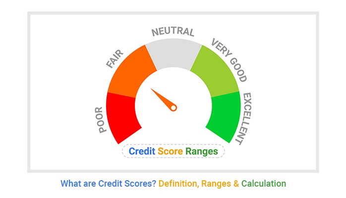
It’s usually on a scale of 300 to 850, which estimates the likelihood of repaying debt. The score is calculated using data from your credit accounts. This data is mostly gathered by credit-reporting agencies and compiled into a report you can easily refer to.
The highest credit score you can attain is 850. The higher the credit score, the lower the perceived risk.
The table below will provide a clue about the credit score rating range, plus the corresponding risk level.
| Credit Quality | Credit Score Ranges |
| Bad: severe risk | 300-549 |
| Poor: high to moderate risk | 550-649 |
| Average/Fair: moderate to minor risk | 650-699 |
| Good: low risk | 700-749 |
| Excellent: negligible risk | 750-850 |
Let’s assume your credit score rating data is massive. It has been accumulating for years.
How can you analyze a table with hundreds of rows and columns of data? It would probably cost you a lot of time to make sense of the data.
This is where charts with rating scales, such as Gauge Chart and Likert Scale Chart, come in.
Definition: A “Credit Score Chart” is a visual representation of credit scores and their corresponding creditworthiness categories.
A credit score is a three-digit number. Credit scores are numerical representations of an individual’s creditworthiness, and they are often used by lenders to assess the risk of lending money or extending credit to a person.

One time-saving way to analyze your credit score rating data is using charts and graphs, such as Likert Scale and Gauge Chart.
You’re unlikely to find visualizations designed purposely to visualize credit score rating data in Microsoft Excel.
We’re not advocating you leave Microsoft Excel.
Install a particular third-party add-in in your Excel Mac to access credit score rating charts, such as the Likert Scale Chart.
The application is called ChartExpo.
What is ChartExpo?
ChartExpo is an add-in you can easily install in your Microsoft Excel to access credit score charts.
ChartExpo is inexpensive. You’ll only spend $10 every month. Besides, you’re free to cancel your subscription anytime.
Also, you don’t need coding skills to generate insightful and ready-made credit score rating charts for your Data storytelling.
How to install ChartExpo in Excel?
ChartExpo charts are available both in Google Sheets and Microsoft Excel. Please use the following CTA’s to install the tool of your choice and create beautiful visualizations in a few clicks in your favorite tool.


Before making any chart let’s first see how we will map credit score data:
| Scales | Credit Quality | Credit Score Ranges |
| 1 | Very Bad (Severe Risk) | 300-549 |
| 2 | Bad (High to Moderate Risk) | 550-649 |
| 3 | Average/Fair (Moderate to Minor Risk) | 650-699 |
| 4 | Good (Low Risk) | 700-749 |
| 5 | Excellent (Negligible risk) | 750-850 |
Suppose you have hypothetical credit score data of numerous companies which are located in different states of the USA. Some of these companies have good credit scores and some of them have bad credit scores.
Now, let’s have a look at the data below:
| States | Scales | Count |
| New York | 1 | 216 |
| New York | 2 | 231 |
| New York | 3 | 556 |
| New York | 4 | 567 |
| New York | 5 | 966 |
| Alabama | 1 | 126 |
| Alabama | 2 | 285 |
| Alabama | 3 | 646 |
| Alabama | 4 | 609 |
| Alabama | 5 | 550 |
| Texas | 1 | 145 |
| Texas | 2 | 211 |
| Texas | 3 | 854 |
| Texas | 4 | 752 |
| Texas | 5 | 812 |


Avoid creating overly broad or generic ranges that fail to capture meaningful distinctions in creditworthiness. Use industry-recognized ranges (e.g., 300-579 for “Poor,” 580-669 for “Fair”) to maintain accuracy.
Different credit scoring models, such as FICO and VantageScore, may have different ranges. Failing to account for these differences can result in misleading information.
A chart without explanations of what each range represents (e.g., loan approval likelihood) can confuse viewers. Always provide clear labels and insights for each category.
Using disproportionate bar lengths, confusing colors, or inaccurate scaling can distort the data. Ensure the design visually reflects accurate credit score distributions.
Credit scoring models evolve. Neglecting to update your chart to reflect the latest scoring practices may render it outdated and unreliable.
Analyzing credit score data in bulky tables can be frustrating and expensive in the long run.
Credit Score rating charts, such as the Likert Scale, can help you save time and energy by analyzing your business’s ability to meet its debt obligations.
A credit score chart provides a versatile way of comparing data for in-depth insights.
With data visualization tools such as ChartExpo, you can easily visualize your credit score data for in-depth insights to measure your business’s ability to service its debt.
Opportunities are always appearing in your data.
You can continuously improve your credit rating standing using data if you have credit score rating charts in your armory.
These charts can uncover hidden opportunities by pointing out gaps and outliers in your data.
One of the common uses of a credit score chart is to highlight changes between two or more key variables in your data.
You can easily know when your credit rating score is taking a nosedive or growing.
You’ll never get caught off-guard by your debtors.
Some credit score rating charts show changes over time.
This means you can easily compare the results of two metrics with a common attribute. In other words, you can learn how a data point influences another data point.
This will help you optimize your credit score rating with long-term growth in mind.
Credit score rating charts can help you create compelling data stories you can easily share with top management and other key stakeholders.
These charts are easy to read, you don’t need specialized skills or knowledge to make sense of credit score rating data.
A credit score chart only reflects credit history and behavior, not overall financial stability, income, or savings.
Grouping scores into broad categories (e.g., Good, Fair, Poor) may not fully represent an individual’s unique financial situation.
The chart shows score ranges but doesn’t detail the reasons behind fluctuations, such as late payments or credit utilization.
Different lenders may interpret the same score differently, making the chart less reliable for predicting loan approvals.
Credit score charts follow general industry standards and may not account for specific financial habits or regional differences.
Follow industry norms like 300–579 (Poor), 580–669 (Fair), etc.
Use distinct colors, proportional scaling, and clear labels.
Briefly explain what each range signifies (e.g., loan approval chances).
Indicate if the chart is based on FICO or VantageScore.
Use high-contrast colors, readable fonts, and mobile-friendly design.
A good or excellent Credit score depicts you qualify for the best debt options at the lowest advertised rates. If your goal is to grow and expand according to your long-term plans, this is where you want your business to be. A fair to good score implies you may qualify for more credit options at good rates or terms.
The highest credit score you can achieve is 850. This is the maximum score on most credit scoring models, such as FICO and VantageScore. A score of 850 indicates excellent creditworthiness, which can help secure the best interest rates and financial terms.
A credit rating scale chart shows your business’s likelihood of meeting its debt obligations.
A rating expresses the likelihood that you’ll go into default within a given time. The timeframe could be a year (short-term).
Keeping a close eye on your credit score rating could spell the difference between financial health and turmoil.
Let’s assume you’ve gathered enough data points for in-depth analysis.
How do you make sense of this data?
This is where credit rating scale charts, such as the Likert Scale, come in.
A Likert Scale Chart has choices to help you get a holistic view of your business credit score ratings. It’s straightforward to read and interpret a Likert Scale Chart.
Microsoft Excel lacks credit rating scale charts. We’re not advising you to do away with your Excel.
So, what’s the solution?
We recommend you install an add-in, such as ChartExpo, to access the Likert Scale Chart and other credit score rating-friendly charts.
ChartExpo is an Excel add-in loaded with ready-made credit score charts, such as the Likert Scale Chart.
Sign up for a 7-day free trial today to access ready-made graphs for visualizing credit score rating data.
How much did you enjoy this article?


Calculate accounts receivable turnover ratio to measure credit collection speed, improve cash flow, and strengthen your financial strategy. Read on!

Change Management KPIs are the key to tracking adoption, performance, and ROI during transitions. Find out which metrics matter. Read on!

Data collection methods and techniques determine the quality of every insight you act on. Explore key approaches for gathering reliable data. Read on!


