• Home
  • Tools dropdown img
    • Spreadsheet Charts

      • ChartExpo for Google Sheets
      • ChartExpo for Microsoft Excel
    • Power BI Charts

      • Power BI Custom Visuals by ChartExpo
    • Word Cloud

  • Charts dropdown img
    • Chart Category

      • Bar Charts
      • Circle Graphs
      • Column Charts
      • Combo Charts
      • Comparison Charts
      • Line Graphs
      • PPC Charts
      • Sentiment Analysis Charts
      • Survey Charts
    • Chart Type

      • Box and Whisker Plot
      • Clustered Bar Chart
      • Clustered Column Chart
      • Comparison Bar Chart
      • Control Chart
      • CSAT Survey Bar Chart
      • CSAT Survey Chart
      • Dot Plot Chart
      • Double Bar Graph
      • Funnel Chart
      • Gauge Chart
      • Likert Scale Chart
      • Matrix Chart
      • Multi Axis Line Chart
      • Overlapping Bar Chart
      • Pareto Chart
      • Radar Chart
      • Radial Bar Chart
      • Sankey Diagram
      • Scatter Plot Chart
      • Slope Chart
      • Sunburst Chart
      • Tornado Chart
      • Waterfall Chart
      • Word Cloud
    • Google Sheets
      Microsoft Excel
  • Services
  • Pricing
  • Contact us
  • Blog
  • Support dropdown img
      • Gallery
      • Videos
      • Contact us
      • FAQs
      • Resources
    • Please feel free to contact us

      atsupport@chartexpo.com

Categories
All Data Visualizations Data Analytics Surveys
Add-ons/
  • Google Sheets
  • Microsoft Excel
  • Power BI
All Data Visualizations Data Analytics Surveys
Add-ons
  • Google Sheets
  • Microsoft Excel
  • Power BI

We use cookies

This website uses cookies to provide better user experience and user's session management.
By continuing visiting this website you consent the use of these cookies.

Ok

ChartExpo Survey


Home > Blog > Power BI

Compare House Prices by Area and Spot Pricing Patterns

Comparing house prices by area helps you to identify regional trends, and highlight variations in market value. It offers valuable insights into affordability, demand, and investment potential. This will aid buyers, investors, and sellers in making the right decision.

Compare House Prices by Area

This guide shows you how to compare house prices by area. It also shows you how to perform house price comparison by city, and how to analyze home price comparison by city in Power BI. Speaking of Power BI, you’ll discover how to perform market analysis, and easy ways of creating a hierarchy in Power BI.

Since Power BI will be used as one of the data visualization tools, you’ll be introduced to some Power BI advanced features, and how the Power BI deployment pipeline works.

Finally, this guide outlines the best practices of house price area comparison and the benefits of comparing house prices by area.

Table of Contents:

  1. Understanding Comparable Prices Homes by Area
  2. How to Perform House price Comparisons by City?
  3. How to Analyze Home Price Comparison by City in Power BI?
  4. Best Practices of House Price Area Comparison
  5. Benefits of Comparing House Prices by Area
  6. FAQs
  7. Wrap Up

Understanding Comparable Prices Homes by Area

To understand comparable home prices by area, you have to analyze the prices of similar homes in different locations. This will help you identify trends and value differences. It also helps in assessing the affordability and investment potential of specific areas.

To analyze local market trends, you should consider using tools like Power BI. You’ll learn how to incorporate Power BI calculated tables and Power BI number format during this analysis.

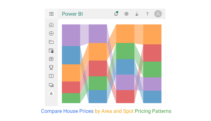
Analyzing Compare House Prices by Area in Microsoft Excel using Comparison Bar Chart

Analyzing Compare House Prices by Area in Google Sheets using Comparison Bar Chart

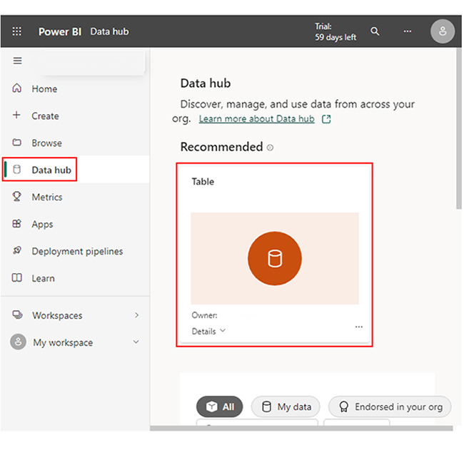
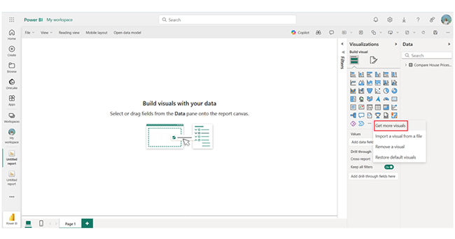
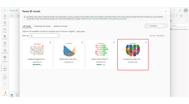
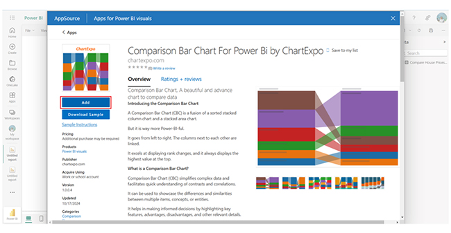
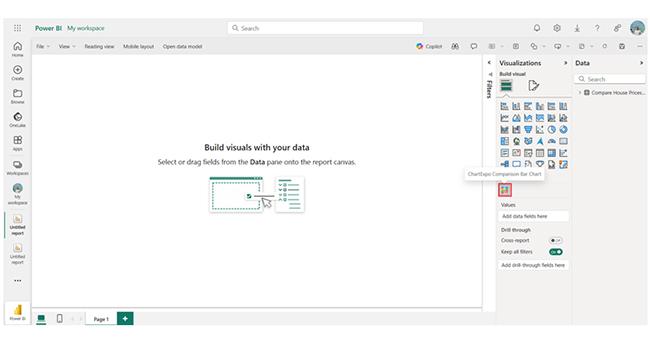
Analyzing Compare House Prices by Area in Power BI using Comparison Bar Chart

How to Perform House price Comparisons by City?

  • Gather Data on Comparable Properties

You have to collect data on homes with similar characteristics (size, type, condition, age, and amenities) across different cities. You can use local listings, real estate websites, or property databases to gather this information. To make your comparison more accurate, you have to compare a good number of homes.

  • Analyze Location-Specific Factors

To evaluate the impact of location on home prices, you have to consider factors like:

  • Economic conditions: Cities with higher income levels, better economic growth, or more job opportunities will have higher property prices.
  • Neighborhood and city appeal: There are cities (or neighborhoods) with higher demand due to their amenities, proximity to key areas, or schools.
  • Transport and infrastructure: Accessibility through public transport, highways, and the availability of essential services like schools, hospitals, and shopping centers can raise demand in certain areas.
  • Use Median Home Prices

Identify the median home price for each city. This will give you a better understanding of the typical market value than the average price (which may be skewed by extremely low or high values). This enables you to compare cities on a more even footing.

  • Consider Historical Price Trends

A close look at historical data helps you understand how house prices have changed over the past few years in the city. This will help you figure out if the city’s real estate is appreciating or depreciating, and that comes in handy when making investment decisions.

How to Analyze Home Price Comparison by City in Power BI?

This section dives down into the Power BI report builder, and how slicers in Power BI work. You’ll also see some Power BI dashboard designs, a Power BI sales dashboard, and a digital dashboard.

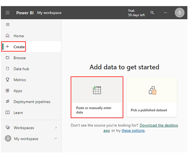
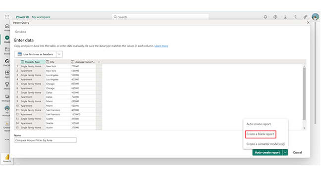
Here are the stages to follow when analyzing home price comparison by city in Power BI.

  • Stage 1: Log into Power BI, enter your email, and click the “Submit” button.
Compare House Prices by Area
  • You’ll be redirected to a Microsoft account. Enter your password, and click “Sign in.”
Compare House Prices by Area
  • You can opt to stay signed in.
Compare House Prices by Area
  • Stage 2: Create a Data Set and Select the Data Set to Use in the Comparison Bar Chart.
  • Navigate to the left-side menu, and click on the “Create” option. After that, select “Paste or manually enter data.”
Compare House Prices by Area
  • The following Compare House Prices by Area data will be used for this illustration.
Compare House Prices by Area
  • Paste the data table above into the “Power Query” window. Select the third “Create a blank report” option.
Compare House Prices by Area
  • Navigate to the left-side menu, and click on the “Data Hub” option. Power BI will populate the data set list. If no data set has been created, you’ll get an error message.
Compare House Prices by Area
  • To add the Power BI Comparison Bar Chart Extension by ChartExpo, you’ll need an add-in (or Power BI visual) from AppSource. Navigate to the right side of the Power BI dashboard, and open the Power BI visualizations panel. Click the ellipsis symbol (…) to import the Power BI Comparison Bar Chart extension by ChartExpo.
  • In the following menu that opens, select the “Get more visuals” option.
Compare House Prices by Area
  • In the following window that opens, enter “ChartExpo” in the highlighted search box. You’ll see the “Comparison Bar Chart for Power BI by ChartExpo.”
Compare House Prices by Area
  • After that, click on “Comparison Bar Chart” and also click the highlighted “Add” button.
Compare House Prices by Area
  • Power BI will add the “Comparison Bar Chart for Power BI by ChartExpo” icon in the visualization panel.
Compare House Prices by Area
  • To draw a Comparison Bar Chart with ChartExpo’s Power BI extension, you’ll have to select the “Comparison Bar Chart for Power BI by ChartExpo” icon in the visualization panel. You’ll have to select the fields to use in the Comparison Bar Chart.
  • At this point, you’ll provide your email address or a ChartExpo license key. Add the key under the visual section. After that, you’ll see the Comparison Bar Chart.
Compare House Prices by Area
  • You can add the top header text in the chart under the General section. Click on General and add the top header text.
Compare House Prices by Area
  • You can add the dollar sign.
Compare House Prices by Area
  • Here’s the final look at the Comparison Bar Chart.
Compare House Prices by Area

Insights

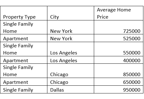
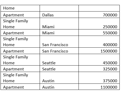
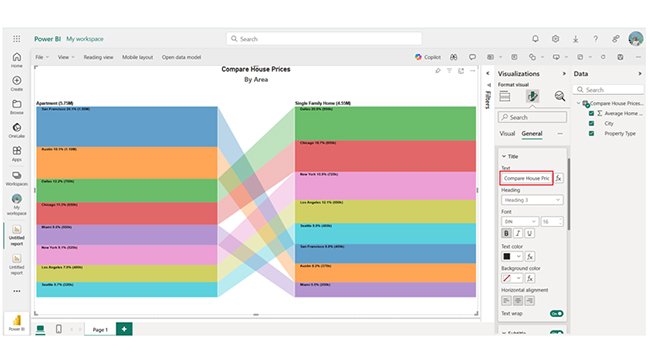
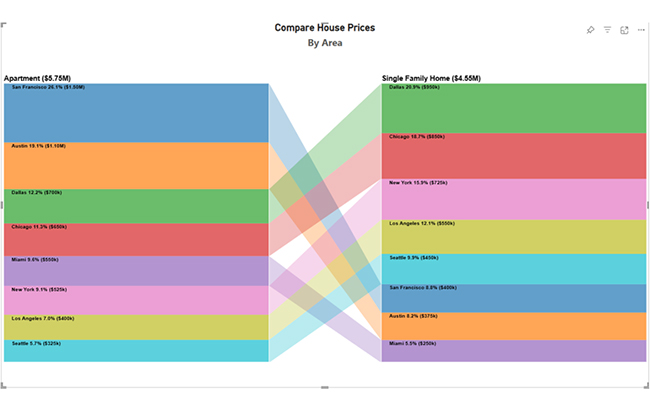
Single-family homes are the most expensive in Dallas and Chicago, while apartments are the most expensive in Austin and San Francisco. Miami offers affordable single-family homes, and that contrasts with high apartment prices.

Best Practices of House Price Area Comparison

  • Use Comparable Properties

You have to ascertain that the properties being compared are as similar as possible in terms of type (detached, semi-detached, apartment), size, condition, and age. The closer the properties are in these aspects, the more accurate the comparison will be.

You should also pay attention to details like the number of bathrooms, bedrooms, and parking spaces.

  • Assess Market Trends and Historical Data

Examine how house prices in the area have changed over time. Historical price trends offer insights into whether an area is appreciating (or depreciating). By comparing the historical growth rates of home values, you’ll be able to figure out if the current prices are reflective of the city’s long-term trajectory.

  • Account for Market Conditions

Market conditions like local economic factors, interest rates, and housing supply and demand play a role in setting prices. For instance, a seller’s market will see higher prices due to limited inventory, while a buyer’s market will lead to more negotiable prices.

  • Consider Property Taxes and Costs

When comparing homes by area, you have to consider property taxes, homeowner’s association fees, and other location-based costs. All these costs vary, and they may affect the long-term affordability of a home.

Benefits of Comparing House Prices by Area

  • Informed Decision-Making

By analyzing house prices across various areas, buyers can make better buying decisions, and that will help them get the best value for their money. It also helps sellers to figure out if their properties are priced competitively within the local market.

  • Identify affordability

Comparing prices helps buyers find affordable options in areas with similar amenities. It provides a clearer picture of what to expect in terms of price per square foot. It also helps buyers set realistic expectations within their budget.

  • Understanding Market Trends

Price comparisons allow for the identification of falling or rising markets. This insight helps in predicting future price movements and knowing when to buy (or sell) to maximize returns.

  • Assessing Value for Money

Understanding what you get for the price in different areas allows for a better judgment of property value. It helps you see whether certain areas offer better returns on investment or more desirable features.

FAQs

How to compare property prices?

To compare property prices, you have to analyze location, property type, size, and amenities. Evaluate market trends, historical data, and price per square foot for similar properties. This ensures accurate and informed comparisons.

What is the best way to determine a list price for a residential property?

Evaluate comparable properties in the area, analyze recent sales, and keep a close eye on the property features and condition. You should also assess market trends, and consult local real estate experts to determine an accurate residential property list price.

Wrap Up

To compare house prices by area, you have to consider factors like the similarity of the properties in terms of size, type, age, and condition. Having a good grasp of comparable home prices by area helps you assess property value, market trends, and affordability.

By comparing house prices by area, you’ll be able to make informed decisions, gain investment insights, and identify areas of growth.

To get the most out of the house price area comparison process, you have to assess market trends and historical data. You have to examine how house prices in the area have changed over time. Historical price trends offer insights into whether an area is appreciating or depreciating.

By following the steps in this guide, you’ll be able to compare house prices using visualizations like the comparison bar chart.

Now you know how to compare house prices by area, what things will you consider when comparing house prices within a region?

How much did you enjoy this article?

PBIAd2
Start Free Trial!
148858

Related articles

next previous
Power BI12 min read

How to Create Sankey Diagram in Microsoft Power BI?

Learn How to Create Sankey Diagram in Microsoft Power BI using Desktop & Web Service. What they are and how to use them effectively.

Power BI8 min read

Power BI Artificial Intelligence: Insights Using Visuals

Discover all there is to know about the Power BI artificial intelligence. You'll also discover how AI is used in Power BI, and how to use it for analysis and more.

Power BI9 min read

Budgeting in Healthcare: Use Visuals to Spot Budget Gaps

This guide helps you discover what budgeting in healthcare is. You'll also discover the factors that affect hospital budgets and types of budgeting in healthcare.

Power BI9 min read

Predictive Analytics in Power BI for Making Insightful Visuals

This guide shows you everything you need to know about Predictive Analytics in Power BI. It also shows you how it works, and how to interpret the results.

Power BI8 min read

Quarterly Business Review Template for Optimum Reports

Discover what the quarterly business review template is. This guide also shows you the best practices to consider when using the QBR template.

ChartExpo logo

Turn Data into Visual
Stories

CHARTEXPO

  • Home
  • Gallery
  • Videos
  • Services
  • Pricing
  • Contact us
  • FAQs
  • Privacy policy
  • Terms of Service
  • Sitemap

TOOLS

  • ChartExpo for Google Sheets
  • ChartExpo for Microsoft Excel
  • Power BI Custom Visuals by ChartExpo
  • Word Cloud

CATEGORIES

  • Bar Charts
  • Circle Graphs
  • Column Charts
  • Combo Charts
  • Comparison Charts
  • Line Graphs
  • PPC Charts
  • Sentiment Analysis Charts
  • Survey Charts

TOP CHARTS

  • Sankey Diagram
  • Likert Scale Chart
  • Comparison Bar Chart
  • Pareto Chart
  • Funnel Chart
  • Gauge Chart
  • Radar Chart
  • Radial Bar Chart
  • Sunburst Chart
  • see more
  • Scatter Plot Chart
  • CSAT Survey Bar Chart
  • CSAT Survey Chart
  • Dot Plot Chart
  • Double Bar Graph
  • Matrix Chart
  • Multi Axis Line Chart
  • Overlapping Bar Chart
  • Control Chart
  • Slope Chart
  • Clustered Bar Chart
  • Clustered Column Chart
  • Box and Whisker Plot
  • Tornado Chart
  • Waterfall Chart
  • Word Cloud
  • see less

RESOURCES

  • Blog
  • Resources
  • YouTube
SIGN UP FOR UPDATES

We wouldn't dream of spamming you or selling your info.

© 2025 ChartExpo, all rights reserved.