Categories
Displaying flows and relationships between key variables simplifies data analysis. Why?
Multiple pieces of research prove that the human brain can instantly decode node-to-node flows and relationships.
Displaying relationship insights using flow-based visualization designs can help you communicate your findings easily. And one of such graph is a Chord Chart.
The Chord chart, as mentioned earlier, is straightforward to interpret. Now the question is How to create and read a Chord Chart. It’s no secret that Google Sheets is the go-to visualization tool, especially among professionals and business owners.
However, the spreadsheet application does not natively support Chord Diagrams. You need to invest in other tools to visualize your data.
There’s an add-in you can easily download and install in your Google Sheets to access ready-made Chord Charts, plus many other ready-made and advanced visualization designs.
In this blog, you’ll learn the following:
We’ll define a couple of basic terms before diving into the how-to guide.
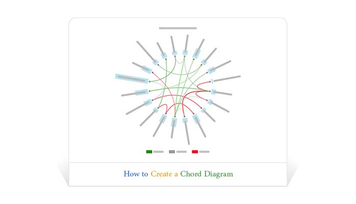
Definition: A Chord Diagram is a chart you can use to display the relationship between data points.

The visualization design is ideal for comparing the similarities within a dataset or between different data groups.
Nodes are arranged along a circle to depict the relationships between key data points, such as those found in YouTubers analytics. Values are assigned to each connection based on the size of each arc. You have an option of using high-contrast colors to create a distinction between key variables in your data.
The key problem with Chord Diagrams is clutter, especially when many connections are displayed simultaneously.
How to read Chord Diagrams should never be a time-intensive affair for you. Keep reading to discover more.
Chord Diagrams allow you to visualize bulky and complex data in an appealing and informative way.
Below are the questions that a Chord Chart helps you address.
Interpreting a Chord Chart is amazingly easy. Just look at the color codes of various lines in the chart.
For instance:
Key data points connected by green lines are directly proportionate to each other. If one variable grows, the other will also record growth.
Conversely, variables connected by red lines are inversely proportionate to each other. Data points connected via grey lines are indifferent to each other.
Take a look at the massive table below. Can you tell a data story of what’s going on?
| Platform | Video Type | Comments Status | Chord Darkness | Total PT Comments | Total VT Comments |
| Film | Positive | 9 | 52 | 25 | |
| Animals | Positive | 9 | 52 | 9 | |
| Sports | Negative | 9 | 52 | 18 | |
| YouTube | Vehicles | Positive | 6 | 24 | 10 |
| YouTube | Travel | Neutral | 10 | 24 | 8 |
| YouTube | Comedy | Negative | 6 | 24 | 6 |
| Entertainment | Negative | 6 | 21 | 8 | |
| Events | Negative | 6 | 21 | 4 | |
| Music | Neutral | 6 | 21 | 9 | |
| People | Negative | 8 | 30 | 15 | |
| News | Negative | 4 | 30 | 5 | |
| Science | Negative | 6 | 30 | 10 | |
| Others | Education | Positive | 15 | 35 | 15 |
| Others | Nonprofit | Positive | 6 | 35 | 5 |
| Others | Agriculture | Neutral | 6 | 35 | 15 |
Note the difference after visualizing the data using a Chord Diagram.

You can easily point out the relationships between key data points.
We acknowledge that Google Sheets is one of the most used data visualization tools by many professionals. Besides, it has been around for years and is familiar to a wide range of users. However, while Google Sheets excels as a versatile text visualization tool, it does not natively support Chord Charts. This limitation means you’ll need to use other tools to plot such charts effectively.
To access a ready-to-use and visually appealing Chord Diagram or any type of Circular Chart in Google Sheets, you have to install third-party apps (add-ons). There are thousands of add-ons purposely for Google Sheets. To save you time, we’ve tested hundreds of add-ons to find the best one for day-to-day visualization needs.
ChartExpo ticks all the boxes concerning the following:
How to read Chord Diagram should never be a stressful affair for you.
In the coming section, you’ll learn how you can install the ChartExpo add-ins for Excel Mac and Windows to access the advanced ready-made and visually stunning charts in Google Sheets.
Click this link to install ChartExpo into your Google Sheets.
Once you have installed ChartExpo for Google Sheets, follow the easy steps below:


If you follow the instructions (above), your final chart should look like this (above).
To add a title to your chart using the Chord Diagram creator (ChartExpo), follow the simple steps below:


Below is the image you will get after exporting:

The Chord Visualization Design is ideal for comparing the similarities within a dataset or between different groups of data.
Nodes in the chart are arranged along a circle to depict the relationships between key data points. Values are assigned to each connection based on the size of each arc.
A Chord Diagram is a graphical method used to visualize relationships between data points in a circular layout. It shows how different segments (nodes) are interconnected through arcs (chords), making it useful for illustrating complex networks, such as connections between entities, flow of resources, or migration patterns.
The diagram helps to quickly identify and understand the strength and direction of relationships within the data.
As we said, displaying flows and relationships between key variables simplifies data analysis.
Displaying relationship insights using flow-based visualization designs can help you communicate your findings easily. One of the tested and proven charts for the task mentioned above is a Chord Diagram. The aforementioned chart is amazingly easy to interpret.
It’s no secret that Google Sheets is the go-to visualization tool, especially among professionals and business owners.
But Google Sheets does not natively support Chord Diagrams. You have to invest in other tools to visualize your data using the visualization design.
We recommend you install a particular add-on called ChartExpo in your Google Sheets to access the ready-to-use, insightful, and visually appealing Chord Diagram.
ChartExpo has a ready-made, easy-to-interpret, and visually stunning Chord Diagram for your data stories.
You don’t need programming or coding skills to visualize your data using Chord Diagrams in the tool. Furthermore, you can easily export your charts to the world’s most recognized formats, namely JPEG and PNG.
How to read Chord Diagram should never throw a curveball at you.
Sign up for a 7-day free trial today to access a complete list of ready-made, insightful, and visually appealing Chord Diagrams.
How much did you enjoy this article?


Enterprise reporting transforms data into clear insights for smarter decisions. Learn steps, tools, and visuals to use to create reports that drive results.
Learn what an issue tracker template is and why it’s useful. This blog post shows you how to build and analyze one to track issues and boost team productivity.
Lead generation KPIs measure how well you attract and convert leads. Click here to learn how to track, analyze, and improve these KPIs for better results.