• Home
  • Tools dropdown img
    • Spreadsheet Charts

      • ChartExpo for Google Sheets
      • ChartExpo for Microsoft Excel
    • Power BI Charts

      • Power BI Custom Visuals by ChartExpo
    • Word Cloud

  • Charts dropdown img
    • Chart Category

      • Bar Charts
      • Circle Graphs
      • Column Charts
      • Combo Charts
      • Comparison Charts
      • Line Graphs
      • PPC Charts
      • Sentiment Analysis Charts
      • Survey Charts
    • Chart Type

      • Box and Whisker Plot
      • Clustered Bar Chart
      • Clustered Column Chart
      • Comparison Bar Chart
      • Control Chart
      • CSAT Survey Bar Chart
      • CSAT Survey Chart
      • Dot Plot Chart
      • Double Bar Graph
      • Funnel Chart
      • Gauge Chart
      • Likert Scale Chart
      • Matrix Chart
      • Multi Axis Line Chart
      • Overlapping Bar Chart
      • Pareto Chart
      • Radar Chart
      • Radial Bar Chart
      • Sankey Diagram
      • Scatter Plot Chart
      • Slope Chart
      • Sunburst Chart
      • Tornado Chart
      • Waterfall Chart
      • Word Cloud
    • Google Sheets
      Microsoft Excel
  • Services
  • Pricing
  • Contact us
  • Blog
  • Support dropdown img
      • Gallery
      • Videos
      • Contact us
      • FAQs
      • Resources
    • Please feel free to contact us

      atsupport@chartexpo.com

Categories
All Data Visualizations Data Analytics Surveys
Add-ons/
  • Google Sheets
  • Microsoft Excel
  • Power BI
All Data Visualizations Data Analytics Surveys
Add-ons
  • Google Sheets
  • Microsoft Excel
  • Power BI

We use cookies

This website uses cookies to provide better user experience and user's session management.
By continuing visiting this website you consent the use of these cookies.

Ok

ChartExpo Survey


Home > Blog > Google Sheets

Averages in Google Sheets: Turn Numbers Into Insights

Data alone won’t help you. You need meaning. That’s what averages in Google Sheets deliver. They take messy data and boil it down to one number you can actually use.

Averages in Google Sheets

Let’s say you’re reviewing customer satisfaction scores. Or tracking expenses. Or watching your team’s response time. You don’t need every detail; you need the average. And you need it fast. Google Sheets makes that easy.

This guide explains exactly how. You’ll learn what averages are, how the formulas work, and how to build visuals that make your data clear. Whether you’re working on budgets, surveys, or monthly metrics, this helps you track and communicate what matters.

We’ll walk through simple formulas, real examples, and smart tools like ChartExpo. We’ll even show how to use things like Google Sheets transpose and visualization tools so your reports hit harder. If you want cleaner reports, faster insights, and fewer headaches, this is for you.

Table of Contents:

  1. What is Average in Google Sheets?
  2. Importance of Google Sheets Average
  3. What is Google Sheets’ Average Formula?
  4. How To Calculate Averages in Google Sheets?
  5. Examples of Average in Google Sheets
  6. How To Analyze Average in Google Sheets?
  7. How To Use Averages in Google Sheets?
  8. Benefits of Using Google Sheets Averages
  9. Common Mistakes of Calculating Average in Google Sheets
  10. Averages in Google Sheets: FAQs
  11. Averages in Google Sheets: Wrap-up

What is Average in Google Sheets?

Definition: An average in Google Sheets is the middle value in your data. Not the biggest. Not the smallest. It’s the number that sums everything up.

You get it by adding all the numbers in a range and dividing by the number of entries.

This is useful for tracking performance. Want to know how much you spend each month? What do your customer scores look like over time? Use averages.

They work across all kinds of data, sales, surveys, performance logs, and more. Whether you’re dealing with 10 rows or 10,000, an average can tell you the trend.

Importance of Google Sheets Average

Averages make raw data readable.

They show shifts in performance. You’ll spot dips or gains before they become problems.

Use averages to guide decisions. Whether you’re adjusting your team’s pace or changing your marketing budget, averages tell you what’s working.

You can also mix averages with other tools. Try a Google Sheets histogram to see frequency. Use VLOOKUP for Google Sheets to compare records while pulling averages. It’s flexible, fast, and sharpens your data’s value.

What is Google Sheets’ Average Formula?

Google Sheets gives you the built-in formula:
=AVERAGE(range)

Here, “range” is the set of cells you’re measuring.

Example:
=AVERAGE(B2:B10)

This adds everything in B2 to B10, then divides by how many cells are included.

Simple, but it scales. Whether you’re averaging scores, expenses, or hours worked, this one line saves time and reduces errors. It works across sheets, tabs, and even dynamic datasets.

How To Calculate Averages in Google Sheets?

Let’s go step by step. You’ll see how easy this is.

Step 1: Prepare Your Dataset

Set up your numbers. For example, monthly sales data for several regions. Keep it neat, headers in one row, data below.

Averages in Google Sheets

Step 2: AVERAGE Formula

To find the average sales in March, type:
=AVERAGE(D2:D5)

That grabs all sales numbers in March and gives you the average.

Averages in Google Sheets

Your result updates automatically when your data changes. That’s the beauty of it. You can also use this on vertical or horizontal data; it doesn’t matter.

Examples of Average in Google Sheets

  • Student Grades

Use it to find each student’s average score across assignments. One line shows how they’re doing overall.

  • Sales Reports

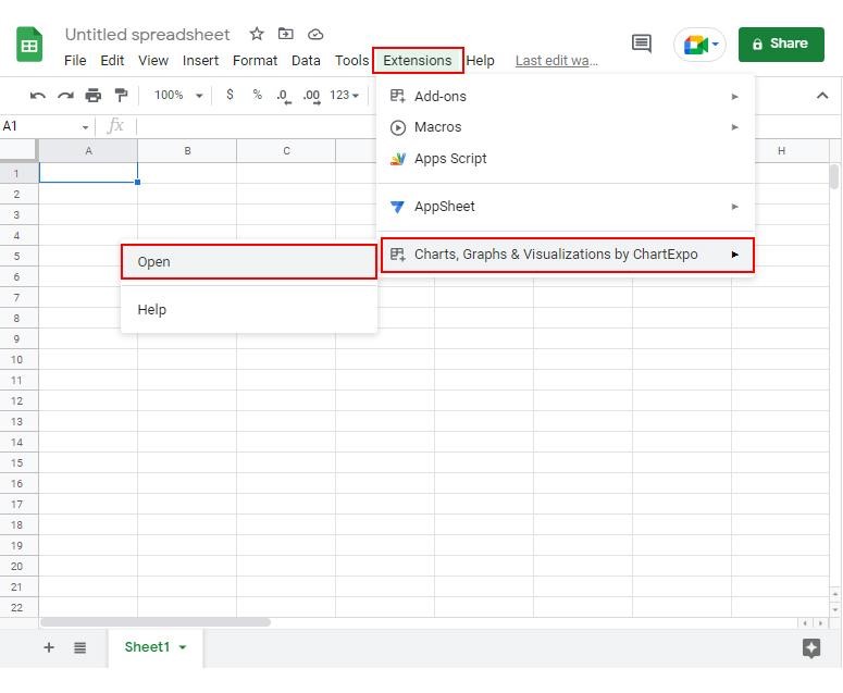
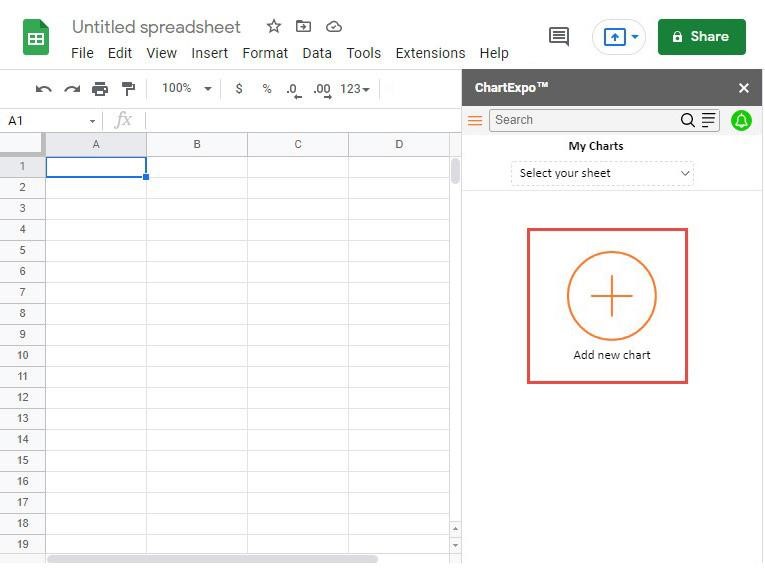
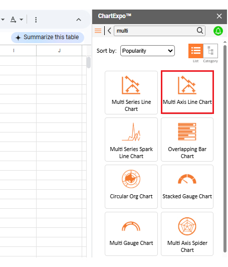
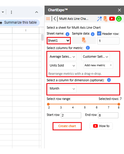
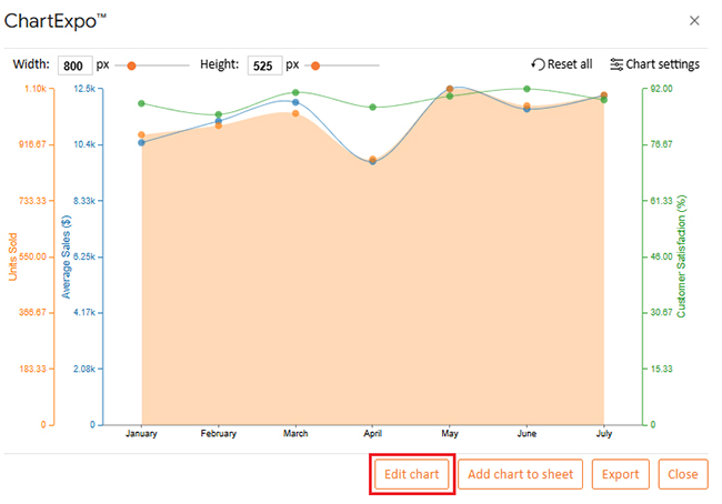
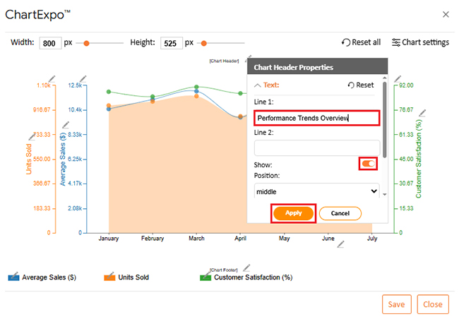
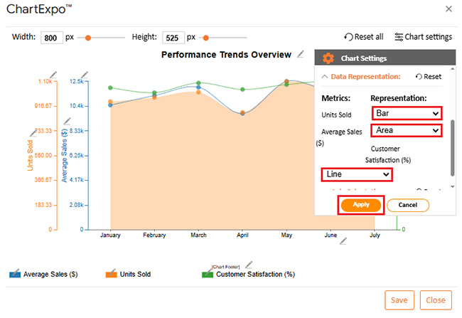
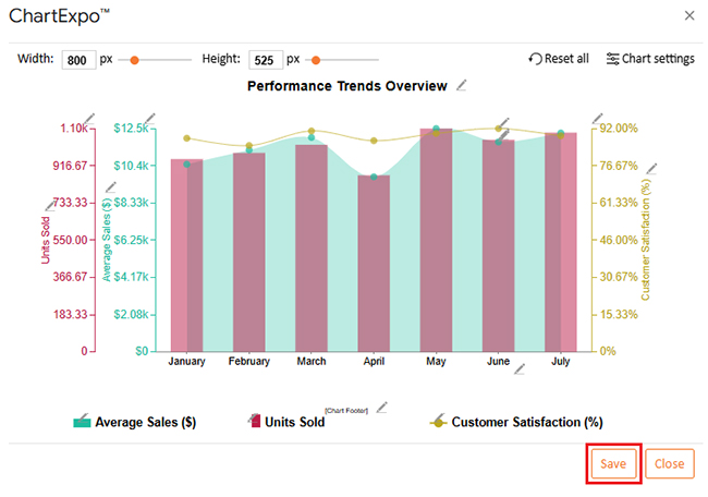
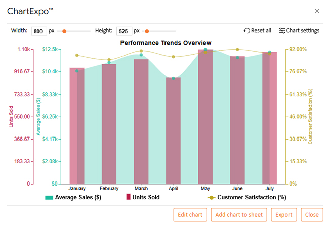
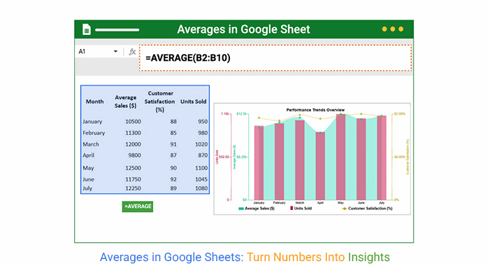
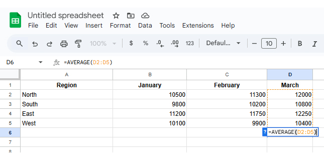
Get the average sales per month to track business performance. This helps set realistic sales goals and spot good months.

  • Budgets

If you track monthly spending, this shows how much you usually spend. It’s the basis of any smart budget on Google Sheets.

  • Survey Analysis

Looking at survey answers? Find the average survey response rates to spot trends. Are scores rising? Flat? Averages give you that story.

How To Analyze Average in Google Sheets?

The number alone isn’t always enough. You need to see the pattern.

That’s where visuals help. Tools like ChartExpo take your averages and turn them into clear graphs, line charts, bar graphs, and more.

ChartExpo works inside Google Sheets. No exporting. No jumping between apps. Just point to your data, click a chart type, and build.

This brings patterns forward, like a dip in sales or a peak in satisfaction. It works with the average, averageif, and other formulas to give better context.

This saves time. You don’t stare at rows. You see shapes, trends, and shifts instantly.

Why Use ChartExpo?

  • Takes less than a minute to visualize averages
    • Makes reports look professional
    • No coding or formula-tweaking needed
    • Works great with Google Sheets functionality

Now let’s build a real chart.

Chart Example: Multi Axis Line Chart

We’ve got data for seven months. It includes:

  • Average Sales
    • Customer Satisfaction
    • Units Sold
Month Average Sales ($) Customer Satisfaction (%) Units Sold
January 10,500 88 950
February 11,300 85 980
March 12,000 91 1,020
April 9,800 87 870
May 12,500 90 1,100
June 11,750 92 1,045
July 12,250 89 1,080

To begin, install ChartExpo in Google Sheets.

  • Step 1: Go to Extensions > Charts, Graphs & Visualizations by ChartExpo > Open
Averages in Google Sheets
  • Step 2: Click “Add new Chart”
Averages in Google Sheets
  • Step 3: Choose “Multi Axis Line Chart”
Averages in Google Sheets
  • Step 4: Pick your data: sheet, metrics, dimensions. Click “Create Chart.”
Averages in Google Sheets

Now you’ve got your chart. Want to customize?

  • Step 5: Click “Edit Chart”
Averages in Google Sheets
  • Step 6: Click the pencil icon on the chart title. Rename it. Hit Apply.
Averages in Google Sheets
  • Step 7: Adjust data format with “Data Representation”
Averages in Google Sheets
  • Step 8: Change bar width and opacity
Averages in Google Sheets
  • Step 9: Edit legend shape and color
Averages in Google Sheets
  • Step 10: Add symbols: $ for sales, % for satisfaction
Averages in Google Sheets
  • Step 11: Adjust font size for clarity
Averages in Google Sheets
  • Step 12: Change legend alignment
Averages in Google Sheets
  • Step 13: Save your chart
Averages in Google Sheets
  • Final Result
Averages in Google Sheets

This chart reveals several patterns in the data.

  • Satisfaction jumped in June and July. That might reflect new service changes.
    • May had the highest sales, likely a seasonal peak.
    • April sales dipped. Something may need fixing.
    • More units sold usually means more revenue. The trend holds.
    • March looks balanced. Strong numbers across all categories.

How To Use Averages in Google Sheets?

Use averages to make better reports.

Want smarter dashboards? Add average formulas and combine them with Google Sheets artificial intelligence for smarter auto-summaries.

In reports, use charts and merge them with Google Sheets transpose to rotate the layout and fit better.

For forecasting, moving averages show trends over time. That’s how teams plan launches, campaigns, and hiring needs.

Benefits of Using Google Sheets Averages

  • The formula is easy to use
    • Real-time updates, no need to refresh
    • Combines well with tools like ChartExpo
    • Works with small or large data
    • Useful in school, business, personal finance, and more

It’s the one formula that fits in every type of spreadsheet.

Common Mistakes of Calculating Average in Google Sheets

Non-numeric cells ruin averages. Even blanks can throw things off.

Using the wrong range? Your number means nothing. Double-check your formulas.

Ignoring zero values in formulas like AVERAGEIF can distort performance.

No visuals? Then the number may be right, but nobody gets the message. Use charts to fix that.

Averages in Google Sheets: FAQs

What Is the Formula for AverageIf in Google Sheets?

Use this: =AVERAGEIF(range, criteria, [average range])
It finds the average of values that meet a certain rule.

How To Do Average in a Spreadsheet?

Type: =AVERAGE(range)
Use AVERAGEIF or AVERAGEIFS for conditional averages.

Averages in Google Sheets: Wrap-up

Averages in Google Sheets help you summarize, explain, and present data. When used right, they speed up reports and improve decisions.

They’re easy to set up. Even better, they work with tools that boost your Google Sheets workflow. Want smart dashboards? Want cleaner financials? Averages make that happen.

By combining averages with features like Google Sheets transpose or VLOOKUP for Google Sheets, you get flexible, detailed reports that guide smarter moves.

Whether you’re tracking average survey response rates or monthly profits, averages give context. Add visual tools, avoid errors, and focus on clarity.

Averages in Google Sheets may be simple, but they carry big weight. Use them, and your data finally makes sense.

How much did you enjoy this article?

GSAd2
Start Free Trial!
153158

Related articles

next previous
Google Sheets9 min read

Sparklines in Google Sheets: A Complete Guide

Sparklines in Google Sheets offer quick, cell-based visual trends that make data analysis faster and clearer without taking up extra space.

Google Sheets13 min read

Google Sheets as a Database for Insightful Reports

Learn to use Google Sheets as a database to store, manage, and visualize data. Get setup tips, best practices, and chart options to improve your workflow.

Google Sheets12 min read

Google Sheet Lookup Table: A Complete Guide

A Google Sheet lookup table helps link and organize data fast. Click here to learn how to build, use, and troubleshoot lookup tables in Google Sheets.

Google Sheets10 min read

Google Sheet Travel Itinerary Template: A Visual Layout

A Google Sheet travel itinerary template helps you plan and track your trips. Learn how to create and customize templates for better travel organization.

Google Sheets10 min read

Forecasting in Google Sheets: A Complete Walkthrough

Forecasting in Google Sheets helps you predict trends using past data. Click here for simple steps, tools, and charts to improve planning and decision-making.

ChartExpo logo

Turn Data into Visual
Stories

CHARTEXPO

  • Home
  • Gallery
  • Videos
  • Services
  • Pricing
  • Contact us
  • FAQs
  • Privacy policy
  • Terms of Service
  • Sitemap

TOOLS

  • ChartExpo for Google Sheets
  • ChartExpo for Microsoft Excel
  • Power BI Custom Visuals by ChartExpo
  • Word Cloud

CATEGORIES

  • Bar Charts
  • Circle Graphs
  • Column Charts
  • Combo Charts
  • Comparison Charts
  • Line Graphs
  • PPC Charts
  • Sentiment Analysis Charts
  • Survey Charts

TOP CHARTS

  • Sankey Diagram
  • Likert Scale Chart
  • Comparison Bar Chart
  • Pareto Chart
  • Funnel Chart
  • Gauge Chart
  • Radar Chart
  • Radial Bar Chart
  • Sunburst Chart
  • see more
  • Scatter Plot Chart
  • CSAT Survey Bar Chart
  • CSAT Survey Chart
  • Dot Plot Chart
  • Double Bar Graph
  • Matrix Chart
  • Multi Axis Line Chart
  • Overlapping Bar Chart
  • Control Chart
  • Slope Chart
  • Clustered Bar Chart
  • Clustered Column Chart
  • Box and Whisker Plot
  • Tornado Chart
  • Waterfall Chart
  • Word Cloud
  • see less

RESOURCES

  • Blog
  • Resources
  • YouTube
SIGN UP FOR UPDATES

We wouldn't dream of spamming you or selling your info.

© 2025 ChartExpo, all rights reserved.