Categories
What is a Power BI App? Why should you use Power BI Apps, and when should you use Power BI Apps? This guide dives deep into all these. It also delves deep into the key features and benefits of Power BI Apps, the various types of Power BI Apps, and the differences between Power Apps and Power BI.


This guide shows you how Power BI transforms data and how to update it. It also shows you how Power BI publishing to the web works and the various Power BI services, such as Power BI in Office 365, Power BI for Mac, and Power BI web. This guide addresses the difference between Power BI Pro and Premium.
Aside from all these, you’ll discover how to use the Power BI Application for reporting.
Definition: A Power BI App is a packaged collection of reports and dashboards that provides pre-built, interactive insights for users. It provides a platform for easy visualization, data sharing, and analytics across an organization. This ensures streamlined reporting and efficient decision-making.
Power BI Apps allow organizations to distribute and package reports and dashboards to specific user groups. Instead of a user sharing multiple reports individually, the app ensures all stakeholders have access to the most relevant data in a structured manner.
Organizations can assign different permission levels within an app, and that ensures sensitive data is visible only to authorized users. This will enhance security and compliance with data governance policies.
Apps in Power BI offer a single access point for reports, and that makes it easy for users to find and interact with data. Users can gain access to insights on the web, mobile devices, or embedded within other applications.
Power BI Apps supports seamless updates. When a report is updated, users automatically receive the latest version without the need for manual redistribution.
It provides centralized and up-to-date insights that prevent outdated (or conflicting) versions of reports.
It makes data easily accessible without overwhelming users. This is important for organizations that handle multiple reports across various teams.
The data security is maintained since varying levels of access are needed by different users. This helps in maintaining a unified reporting structure.
It helps users share consistent, pre-built reports with different departments (or teams) without sending multiple files.
These are the key features and benefits of Power BI Apps:
These are created and managed within an organization to distribute dashboards and reports to specific user groups. There is role-based access control for secure data sharing.
These are pre-built apps developed by third-party vendors (or Microsoft). It’s designed for quick deployment. Template apps come in handy when integrating with popular business applications like Google Analytics, Salesforce, or Dynamics 365.
Power BI reports are embedded into other business applications, portals, or websites. It’s used for seamlessly integrating Power BI into existing workflows.
Power BI Mobile apps are designed for viewing Power BI reports on mobile devices (Android and iOS). It enables on-the-go access to insights.
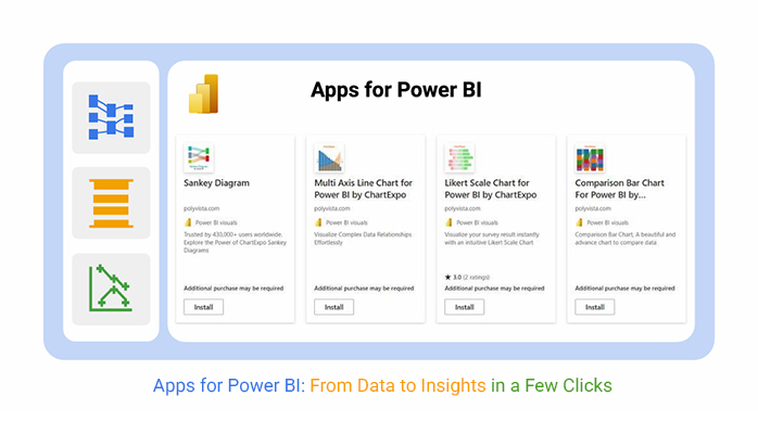
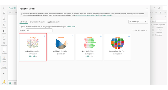
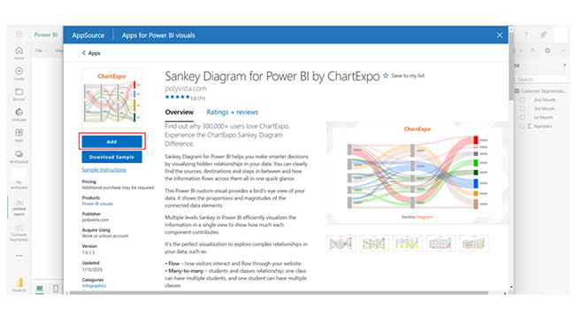
Here are some custom visuals by ChartExpo that you can use in Power BI.
Sankey Diagram:
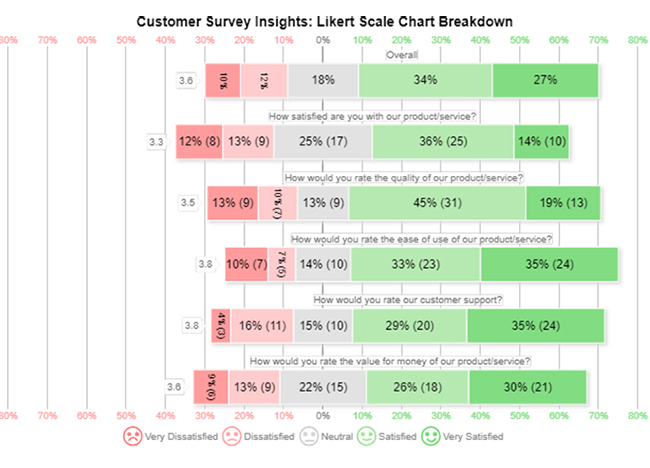
Likert Scale Chart:
Comparison Bar Chart:
Multi-Axis Line Chart:
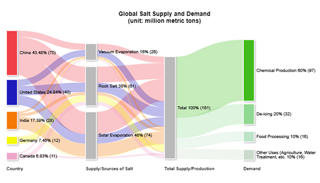
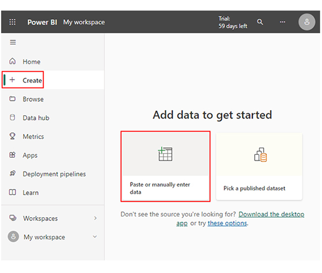
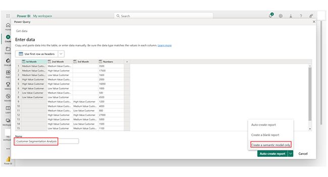
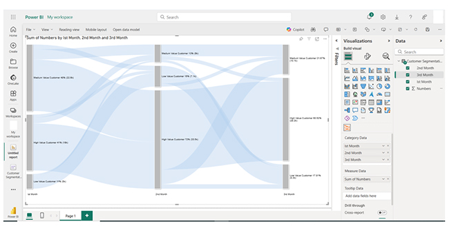
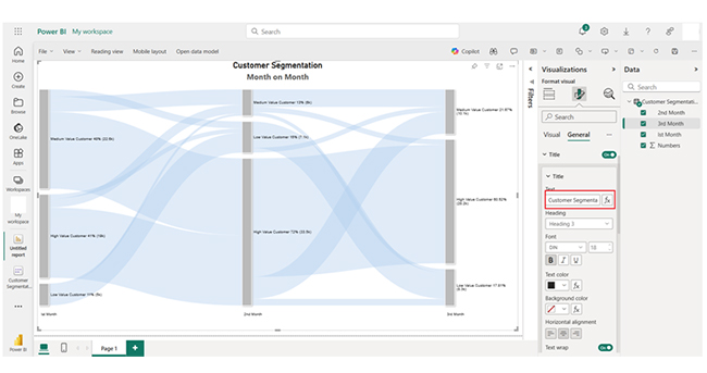
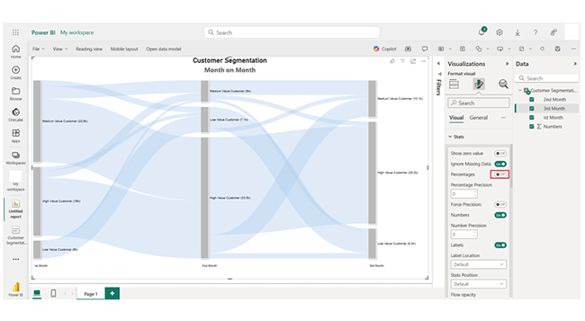
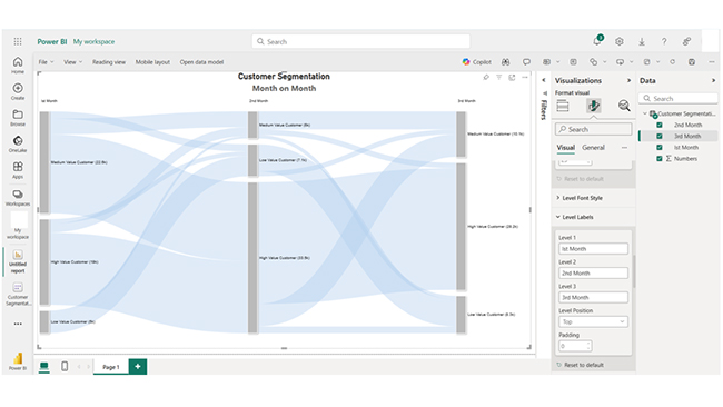
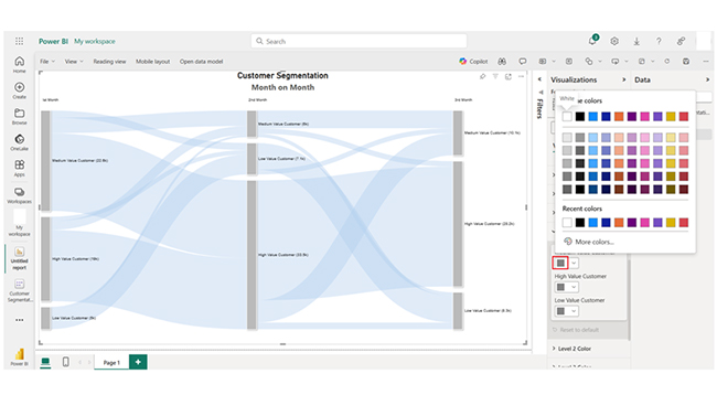
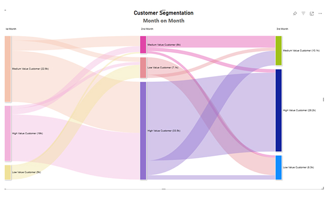
The section below shows you detailed steps to create a Sankey Diagram by ChartExpo in Power BI. You will have to visualize customer segmentation data. Power BI best practices and some Power BI advanced features are also showcased in this section and also guide to creating a Sankey Diagram in Power BI.
The steps above can be used when working with any Power BI calculated table.
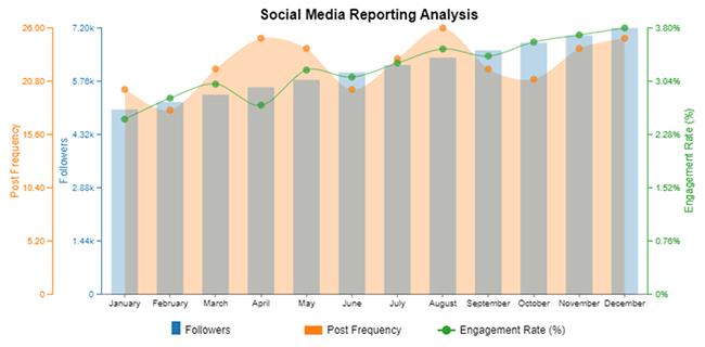
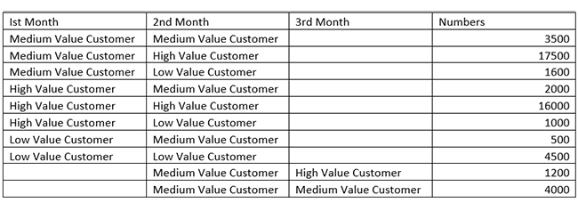
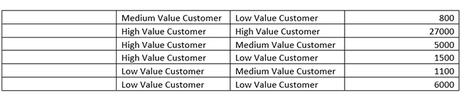
The data tracks customer transitions across multiple value categories over three months. High-value customers dominate revenue, with consistent retention and some downgrades.
Medium-value customers frequently shift between higher and lower tiers, and that reflects volatility. Low-value customers mostly remain in their category but occasionally upgrade, and that indicates potential growth opportunities in targeted engagement.
Power BI free version has a 1 GB per dataset limit. Power BI Pro has limitations on dataset refresh rates. Users who work with large datasets may encounter performance issues, especially when there’s no proper data modeling.
Power BI offers many visuals, but customization options are limited compared to other tools like Tableau.
Power BI Premium and Pro licenses are somewhat expensive for large organizations that need advanced features.
Free users are unable to share dashboards without a Power BI Pro license, and the row-level security is somewhat complex to configure.
Apps in Power BI Service are pre-packaged collections of reports and dashboards that give room for structured data sharing across an organization. They provide role-based security, centralized access, and easy updates for efficient decision-making.
Each workspace in Power BI has one app at a time. But you can update and republish the app as needed. This ensures users always access the latest dashboards and reports.
You’ll have to use the Power BI title control in Power Apps to embed reports or utilize Power Automate and Dataverse for seamless data exchange between both platforms.
The Power BI App is a packaged collection of dashboards and reports for easy data sharing. It enhances security, accessibility, and collaboration, and ensures users receive consistent, up-to-date insights for better decision-making.
The Power BI App comes with some limitations, like limited customization and cost constraints. The customization options in the Power BI App are limited compared to other tools like Tableau.
Large organizations that are looking to use the advanced features will likely pay more for the Power BI Pro and Premium licenses.
Now you know the various Apps in Power BI, which of them is the most valuable in your organization?
Explore more about the Sankey Chart app for Power BI.
How much did you enjoy this article?


Discover diverse and high-quality Power BI report examples for inspiration and insights. Elevate your reporting with strategic visualization techniques.

A Customer Relationship Management Dashboard centralizes data, tracks key metrics, and drives smarter business decisions. Discover now!

Explore Healthcare Dashboard Examples and learn how to turn complex healthcare data into clear, actionable insights for better decision-making.


