Categories
Airbnb is the “Uber” of housing in today’s world.
The disruptive technology in the housing sector is increasingly acting as a bridge between tourists and best bargains (cost savings). Besides, it’s one of the profitable businesses to have because you don’t have to own real estate.

You just have to rent houses and furnish them with top-notch amenities before subletting them.
To succeed in the Airbnb business, you have to leverage data maximally. Yes, you have to use data to your advantage. For instance, you can leverage the data on past bookings to determine the behavior of your target market.
This is where Airbnb data visualization designs, such as the Double Bar Graph, come in.
Insights from charts (such as the Double Bar Charts) can help you optimize your business for more profits. Besides, you can get in-depth insights into the specific needs of your target market, which you can use to personalize your services.
Google Sheets is one of the visualization tools small and medium-sized businesses (SMBs), use to make sense of their data. However, it produces pretty basic charts, which can easily mislead you.
In this blog, we’ll walk you through the best tools that can set you up for success in your Airbnb data analysis project. You’ll also learn how to make sense of the data generated by your accommodation business.
To succeed in your Airbnb data analytics project, you need the best tool.
You don’t want a tool that will consume significant amounts of your valuable time. To get the most from your data, leverage visualization tools that produce visually appealing and easy-to-interpret diagrams.
Let’s talk about Google Sheets because it’s one of the most used charting tools by Airbnb business owners.
Google Sheets is a cloud-hosted spreadsheet app with similar functions to Excel. Besides, it’s free of charge to use it. You just need to open an email account (Gmail) to get started.
However, it comes with a set of weaknesses that can do more harm than good to your Airbnb business.
Google Sheets has very basic charts, which require a lot of time to edit. In other words, you won’t find ready-made charts that are insightful and visually stunning.
You need an Airbnb data visualization generator loaded with advanced and easy-to-interpret charts.
You don’t want to skip the coming section if you intend to get actionable results from your Airbnb data analytics.
So what’s the solution?
You don’t have to dump the Google Sheets app. We have a very viable alternative for you. Yes, you read that right.
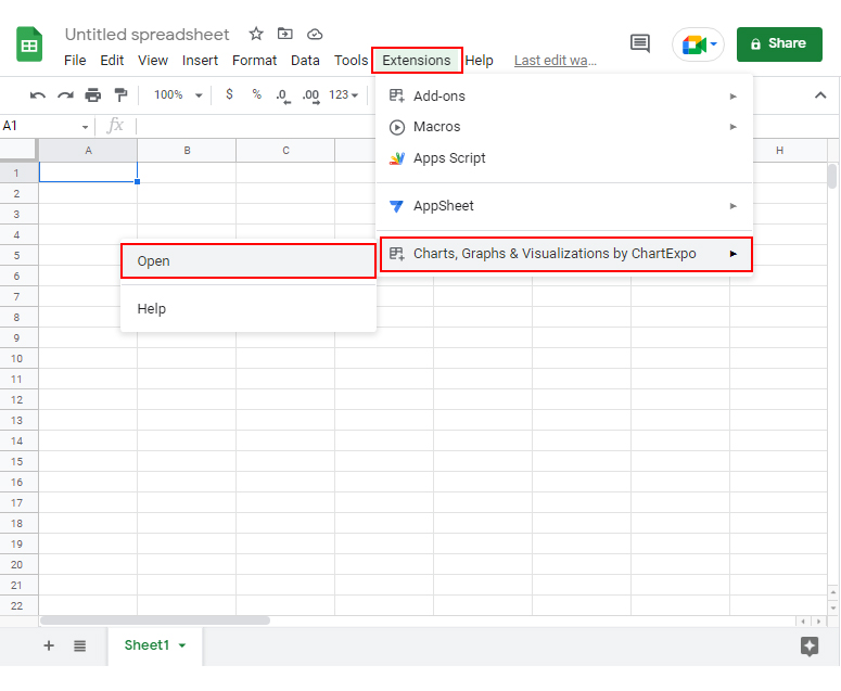
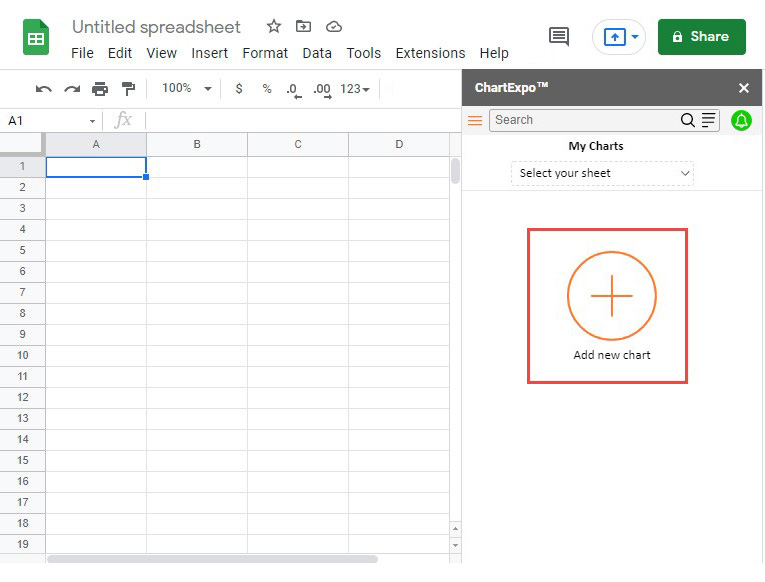
Head to the Google Workspace Marketplace and download the Google Sheets add-on. There are thousands of add-ons you can use. ChartExpo is recommended by thousands of people who tested hundreds of data visualization add-ons.
Why?
ChartExpo has an ultra-friendly user interface (UI) to ensure you never struggle with your Airbnb data analysis project. With features like the Chord diagram, you don’t have to watch hours of YouTube tutorials or sift through tens of pages of PDFs to get acquainted with ChartExpo.
The cost of accessing a tool containing a large number of chart templates is $10 a month. And this is not to mention the 7-day FREE trial you get once you sign up.
Make ChartExpo your primary Airbnb data visualization generator to enjoy unlimited access to growth-based and money-gaining insights.
You don’t have to struggle in your next Airbnb data analysis project. Just use ChartExpo.
Imagine you own an Airbnb business. Your homes are scattered in different neighborhoods. Each house has a different price. Assume you want to establish a relationship between your prices and customer growth.
Let’s assume the table below is what you’ve collected for your Airbnb data analytics project.
We’ll use the Double Bar Graph (one of the many Airbnb data visualization designs)
| Neighborhood | Price per night | Customer Growth |
| Randall Park City | 299 | 18 |
| Battery Park City | 248 | 8 |
| Breezy Point | 213 | 2 |
| Riverdale | 210 | 27 |
| Sea Gate | 186 | 1 |
| Tribeca | 184 | 12 |
| Flatiron District | 159 | 18 |
| Jamaica Estates | 140 | 31 |
| Novo | 138 | 13 |
| City Island | 138 | 42 |


You can change the chart properties to add a header and properties and have a final look as shown below.

Your Airbnb data analysis project does not have to be a nerve-wracking affair. Use ChartExpo to make the whole process seamless and easy.
The following video will help you to create a Double Bar Graph in Google Sheets.
Imagine the data (below) is what you’ve collected for your Airbnb data analysis project.
We’ll use the Grouped Column Chart (one of the Airbnb data visualization designs).
| Areas | Apartment | Condominium | House | Loft | Townhouse |
| Bronx | 66 | 5 | 22 | 2.5 | 4.5 |
| Brooklyn | 78 | 2 | 6 | 7 | 7 |
| Manhattan | 85 | 6.5 | 1.5 | 4 | 3 |
| Queens | 56 | 5 | 28 | 8 | 3 |
| Staten Island | 28 | 3 | 55 | 3 | 11 |
To get started with the Airbnb visualization tool, follow the steps below.


Visualizing your data with Airbnb data visualization charts should be a stress-free task. Intuitive visualizations like multicolored bar graphs help you understand data better and make quick decisions.
Follow the best practices below to increase your chances of succeeding in your Airbnb data analysis project.
The first step to telling a good data story is to uncover a story worth telling. Start by asking a question or forming a hypothesis. Dig into relevant data to find answers.
Use the questions (below) for guidance.
What connections do you see in key variables in your data?
Are there interesting or surprising correlations?
Remember, these relationships can provide a compelling foundation for a data store.
Trends are incredibly important in Airbnb data visualization because they indicate the general patterns of key metrics. For example, you can use tornado chart visualization to check for the existence of an up or downtrend in customer growth in your Airbnb business.
Identifying new or evolving trends in your Airbnb project is crucial for understanding how you should react to opportunities and risks.
You can easily compare the performance of key metrics, such as profitability versus costs in your Airbnb business. For instance, in example #2, we compared different Airbnb listings in various neighborhoods.
Outliers are any data that act unusually or outside the norm.
Making business decisions using outliers can result in losses. In other words, outliers are misleading. Look for outliers and ask the following questions.
Always mind your audience, especially when developing and sharing your data stories. Whether you’re presenting a butterfly chart or any other type of visualization, if the story you want to tell isn’t relevant or interesting to your intended audience, it won’t have an impact.
As you prepare for the Airbnb data analysis project, ask yourself:
Companies, such as Airbnb have democratized their data. In other words, they allow their stakeholders to interact with data generated by its application.
As an Airbnb business owner, you should leverage this data to personalize your services based on the actual needs of the market.
Freemium tools, such as Google Sheets lack ready-made Airbnb data visualization Graphs. To get around this problem, we recommend you to download and install the ChartExpo add-on into your Google Sheets.
Using ChartExpo does not require you to have coding or programming skills. Besides, it comes loaded with many advanced charts.
Visualizing data generated by your Airbnb accommodation business should never be a nerve-wracking or time-consuming affair.
Yes, you read that right.
It turns out there are Airbnb data visualization designs, such as the Double Bar Graph and Grouped Column Charts, which are proven and tested for the task. Why?
Essentially, using these charts (Double Bar Graph and Grouped Column Charts) can increase your chances of success in the Airbnb business.
More so, these charts are incredibly easy to interpret, even for non-technical audiences.
For instance, to interpret a Double Bar Graph, check for the sizes of the bars on both sides and compare them.
To gain access to low-hanging insights into the performance of your Airbnb business, avoid native Google Sheets charts. Yes, if your goal is to access easy-to-interpret and ready-made charts, you’ve got to think beyond the spreadsheet app.
Why?
Charts in Google Sheets are very basic and require a lot of effort and time to edit. But, we’re not recommending you do away with the freemium spreadsheet application.
We recommend you install third-party applications (add-ons), such as ChartExpo into your Google Sheets to access advanced Airbnb data visualization charts.
ChartExpo is an add-on you can easily download and install in your Google Sheets. Besides, it has 50-plus advanced charts to save you time, especially during your Airbnb data analysis project.
You don’t need programming or coding skills to visualize your data using this tool. Furthermore, you can easily export your charts in the world’s most recognized formats, namely JPEG and PNG.
Sign up for a 7-day free trial today to access easy-to-interpret and visually appealing Airbnb data visualization designs.