• Home
  • Tools dropdown img
    • Spreadsheet Charts

      • ChartExpo for Google Sheets
      • ChartExpo for Microsoft Excel
    • Power BI Charts

      • Power BI Custom Visuals by ChartExpo
    • Word Cloud

  • Charts dropdown img
    • Chart Category

      • Bar Charts
      • Circle Graphs
      • Column Charts
      • Combo Charts
      • Comparison Charts
      • Line Graphs
      • PPC Charts
      • Sentiment Analysis Charts
      • Survey Charts
    • Chart Type

      • Box and Whisker Plot
      • Clustered Bar Chart
      • Clustered Column Chart
      • Comparison Bar Chart
      • Control Chart
      • CSAT Survey Bar Chart
      • CSAT Survey Chart
      • Dot Plot Chart
      • Double Bar Graph
      • Funnel Chart
      • Gauge Chart
      • Likert Scale Chart
      • Matrix Chart
      • Multi Axis Line Chart
      • Overlapping Bar Chart
      • Pareto Chart
      • Radar Chart
      • Radial Bar Chart
      • Sankey Diagram
      • Scatter Plot Chart
      • Slope Chart
      • Sunburst Chart
      • Tornado Chart
      • Waterfall Chart
      • Word Cloud
    • Google Sheets
      Microsoft Excel
  • Services
  • Pricing
  • Contact us
  • Blog
  • Support dropdown img
      • Gallery
      • Videos
      • Contact us
      • FAQs
      • Resources
    • Please feel free to contact us

      atsupport@chartexpo.com

Categories
All Data Visualizations Data Analytics Surveys
Add-ons/
  • Google Sheets
  • Microsoft Excel
  • Power BI
All Data Visualizations Data Analytics Surveys
Add-ons
  • Google Sheets
  • Microsoft Excel
  • Power BI

We use cookies

This website uses cookies to provide better user experience and user's session management.
By continuing visiting this website you consent the use of these cookies.

Ok

ChartExpo Survey


Home > Blog > Data Analytics

Vanity Metrics: From Data Noise to Clear Insights

Data fills every corner of modern business reporting, yet not all numbers carry the same strategic weight. Organizations that treat volume as a proxy for success often celebrate growth that never materializes in revenue, retention, or any outcome that actually moves the business forward in a meaningful, sustainable direction.

Vanity Metrics

This blog examines what vanity metrics look like in practice, why they persist across reporting cycles despite limited usefulness, how to distinguish them from measurements that support real business decisions, and how structured spreadsheet analysis can help teams evaluate performance data with greater precision and confidence.

What are Vanity Metrics?

Definition: Vanity metrics are performance indicators that look favorable on the surface but carry no direct connection to meaningful business outcomes. They prioritize visibility and volume over measurable progress, making them attractive in summary reports while offering limited direction for actual data-driven decision-making.

Their appeal comes from how quickly they grow. Large follower counts or rising page view totals generate considerable internal confidence, but without a line connecting those figures to conversions, retention, or revenue, that confidence has no structural support.

Tracking them alongside metrics and KPIs without adequate context distorts how teams read performance data. Recognizing their limitations is the first step toward an analytics approach that generates genuine answers rather than simply reinforcing complacency.

Why are Vanity Metrics Important?

Even when they carry no decision-making power, vanity indicators still appear in business reporting. Their value is perceptual rather than operational, and that distinction shapes how teams should respond to them.

  • Definition-level role: Vanity indicators reflect activity volume without connecting to business impact or outcomes.
  • Apparent growth without substance: Numbers can climb while revenue and retention both remain flat.
  • Marketing dashboard presence: Reports highlight reach figures to show campaign breadth and audience scale.
  • Executive summary preference: Some leaders prioritize large, easy-to-read figures over data needing deeper analysis.
  • Short-term brand visibility: High impression counts make a brand appear prominent even when engagement lags.
  • Early stakeholder confidence: Audience figures influence how investors and partners perceive traction.
  • Distinction from financial metrics: Unlike financial metrics, they rarely map to profitability or investment returns.

Core Characteristics of a Vanity Metric

The most common examples of vanity metrics share patterns that distinguish them from actionable data. Recognizing them helps teams evaluate which numbers actually deserve attention.

  • High visibility, low decision value: These appear in dashboards but rarely guide operational choices.
  • Simple to track and inflate: They grow quickly through basic tactics like promotional campaigns.
  • Weak link to ROI: No clear relationship exists between these numbers and revenue or profit.
  • Volume over outcomes: They highlight quantity rather than actual results or conversions achieved.
  • Limited optimization insights: They do not reveal which actions would improve performance.
  • Surface-level reporting use: Often included in summary reports over deeper performance metrics analysis.

Vanity Metrics vs Actionable Metrics: Key Differences

Using data well requires knowing which numbers describe activity and which explain outcomes. That distinction matters for genuine improvement.

  • What each type measures: Vanity indicators show activity levels, while actionable metrics explain results.
  • Decision-making impact: Actionable indicators drive strategy; vanity ones mostly describe visibility.
  • Measurability vs. insight: Both types are measurable, but only actionable metrics reveal why results occur.
  • Short-term perception vs. long-term growth: Vanity numbers boost perception; actionable data supports sustainable growth metrics.
  • Revenue correlation: Actionable indicators often connect directly to sales or retention.
  • Optimization potential: Teams can iterate using actionable data; vanity figures resist improvement.
  • Value in reporting: Stakeholders evaluating progress across agile performance metrics frameworks rely on actionable indicators.

How to Identify Vanity Metrics?

Spotting vanity indicators requires asking precise questions about purpose and consequence for each metric. A measurement unable to influence decisions or predict results may fall into this category.

  • Ask whether it drives strategic decisions: If it does not guide actions, it may not be valuable.
  • Check connection to business metrics: Metrics should align with core business metrics or defined objectives.
  • Test predictive value: Indicators should help anticipate revenue, retention, or engagement outcomes.
  • Evaluate optimization potential: Useful metrics reveal where improvement opportunities exist.
  • Assess behavioral insights: Effective indicators explain customer patterns and underlying motivations.
  • Determine performance impact: Metrics should improve customer service metrics or measurable operational efficiency.

These evaluation steps help organizations focus on meaningful indicators rather than impressive but irrelevant numbers.

Common Examples of Vanity Metrics

Digital campaigns, product platforms, and social channels all produce data that can fall into vanity territory. Knowing which patterns appear most often helps teams flag these indicators before they distort performance evaluations.

  • Social media follower count

The social media follower count performance example shows strong follower growth but comparatively lower engagement, clicks, and influencer mentions, highlighting follower count as one of the common examples of vanity metrics that may not reflect true social media impact.

Vanity Metrics
  • Website page views

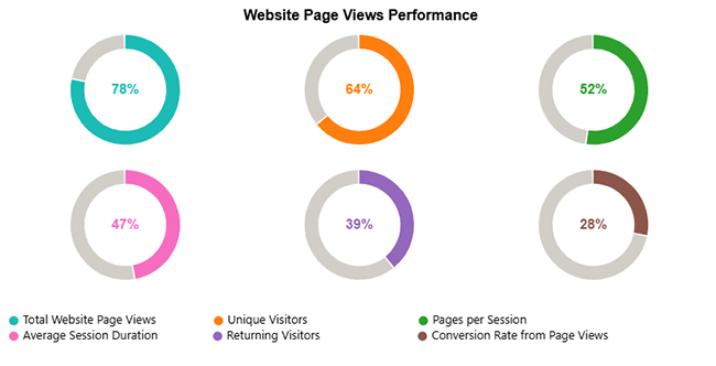
The Website Page Views Performance chart shows high page views but lower engagement and conversions, indicating that page views alone can be misleading without deeper performance metrics.

Vanity Metrics
  • App downloads without active usage

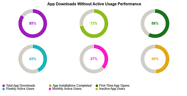
The app downloads without active usage performance example shows high downloads but lower active users, indicating downloads alone don’t reflect real engagement.

Vanity Metrics

How to Analyze Vanity Metrics in Excel?

Running vanity indicators through structured spreadsheet analysis helps separate measurements with real insight from those that only add visual appeal to reports without informing decisions.

  1. Collect and organize relevant data

Import campaign or product data into a spreadsheet and separate visibility indicators from outcome-based indicators such as conversions or revenue.

  1. Compare vanity indicators with outcome metrics

Align metrics like followers or impressions with revenue or engagement data to determine whether relationships exist.

  1. Calculate correlation patterns

Use formulas or statistical functions to see whether the indicator predicts meaningful outcomes.

  1. Segment the data for deeper insights

Analyze results by campaign, time period, or audience group to identify trends.

  1. Visualize progress with charts

Visualization tools can reveal patterns quickly. For example, a Progress Circle Chart helps highlight gaps between visible activity and real performance.

  1. Final Visuals

While spreadsheet tools provide basic charts, visualization extensions like ChartExpo transform raw data into advanced dashboards. By converting vanity indicators into intuitive visuals.

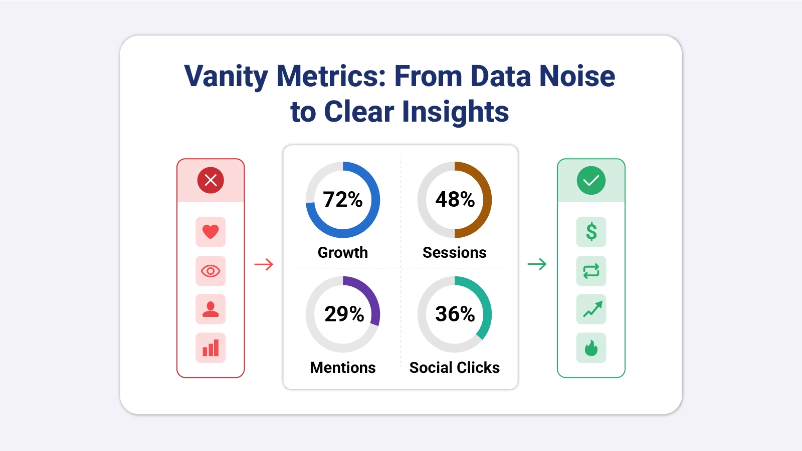
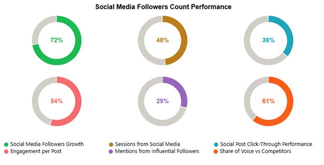
This final image shows social media performance with strong follower growth (72%) and a solid share of voice (61%), reflecting good brand visibility.

However, lower metrics like mentions (29%) and click-through rate (36%) highlight opportunities to improve engagement and audience interaction.

Vanity Metrics

Key Insights

  • Follower growth at 72% outpaces engagement per post at 54%, pointing to an audience that is expanding faster than it actively participates.
  • Social sessions at 48% and click-through performance at 36% show that a large follower count is not consistently generating website traffic or action.
  • A 61% share of voice set against just 29% in influencer mentions indicates broad brand visibility that has not yet converted into meaningful endorsement.

Risks and Limitations of Tracking Vanity KPIs

Overreliance on vanity KPIs creates compounding problems that often go unnoticed until strategic damage is done. Organizations must recognize the risks these measurements carry when they dominate reporting.

  • Misleading performance evaluation: Teams may believe campaigns are effective even when actual outcomes stay unchanged.
  • Poor strategic decisions: Leaders might redirect priorities toward visibility over genuine value creation.
  • Resource misallocation: Budget and effort may shift toward tactics that only inflate numbers.
  • False sense of growth: High activity can mask flat revenue or declining retention across periods.
  • Difficulty measuring ROI: Without structured frameworks like b2b marketing KPIs, measuring returns becomes harder.
  • Long-term stagnation: Companies focused on vanity indicators often struggle to scale their operations sustainably.

Best Practices to Manage Vanity KPIs Effectively

Even with their limitations, vanity KPIs can serve a purpose when managed alongside outcome data within a clear measurement context.

  • Combine with actionable metrics: Always evaluate vanity KPIs alongside revenue or retention indicators for context.
  • Focus on decision-making metrics: Prioritize indicators that influence strategy and trigger operational changes.
  • Use dashboards carefully: Visualization should highlight insights, not just large numbers.
  • Establish clear measurement frameworks: Define how metrics relate to outcomes within your analytics model, similar to how structured frameworks like retail industry KPIs track performance across sales, inventory, and customer behavior.
  • Educate stakeholders: Help teams recognize the difference between vanity KPIs and progress indicators.

FAQs

What is the difference between KPI and vanity metrics?

KPIs measure progress toward specific business goals such as revenue growth, customer acquisition, or retention improvement.

Vanity metrics, on the other hand, display impressive numbers that lack a direct connection to those outcomes, making them appealing in reports without contributing to real business performance.

What are vanity metrics on social media?

On social platforms, vanity indicators typically include follower counts, impression totals, and overall reach figures.

These numbers grow with exposure and can appear substantial, but they do not consistently indicate whether audiences take meaningful actions like purchasing, signing up, or returning for repeat engagement.

Is engagement a vanity metric?

Engagement can function as a vanity indicator when it only tracks passive actions like likes with no downstream effect on business outcomes.

When it connects to conversions, sign-ups, or sustained interaction, however, it earns a place among valuable performance metrics worth monitoring closely.

Which KPI is a vanity metric?

Indicators such as total page views, app downloads without active users, or large audience counts can function as vanity metrics when they do not contribute to revenue, retention, or measurable business growth goals.

Wrap Up

Chasing impressive numbers is straightforward; building a measurement framework that genuinely guides decisions requires deliberate effort and a willingness to ask harder questions about what the data actually represents.

Vanity metrics will always appear at the top of dashboards because they grow quickly and present well in summaries, but teams relying on them alone risk mistaking activity for progress.

The stronger path combines visibility data with outcome indicators, examines what each number is actually driving, and treats analysis as a directional tool rather than a validation exercise.

With the right approach to visualization, the patterns that separate surface-level results from meaningful business momentum become clear and actionable.

How much did you enjoy this article?

PBIAd1
Start Free Trial!
160753

Related articles

next previous
Data Analytics9 min read

Vertical Analysis and Horizontal Analysis: A Complete Guide

Vertical analysis and horizontal analysis reveal how financial statements shift over time and within a period. Learn both methods now!

Data Analytics9 min read

Performance-Based Budgeting: Examples & Analysis

Performance-based budgeting links spending to measurable results. Explore how it works, see examples, benefits, challenges, and analyze PBB in Excel.

Data Analytics7 min read

LLM Evaluation Metrics: What You Need to Know

LLM evaluation metrics help teams measure AI output quality and guide deployment decisions. Learn which metrics matter most. Read on!

Data Analytics10 min read

Salesforce Data Export: All Options Explained

Salesforce data export gives you control over your CRM records for backup, analysis, and migration. Learn the top methods and best practices. Read on!

Data Analytics9 min read

Snowflake Data Schema: Definition, Structure, and Benefits

Snowflake data schema organizes warehouse data into normalized tables for scalable analytics. Learn how to apply it in Power BI. Read on!

ChartExpo logo

Turn Data into Visual
Stories

CHARTEXPO

  • Home
  • Gallery
  • Videos
  • Services
  • Pricing
  • Contact us
  • FAQs
  • Privacy policy
  • Terms of Service
  • Sitemap

TOOLS

  • ChartExpo for Google Sheets
  • ChartExpo for Microsoft Excel
  • Power BI Custom Visuals by ChartExpo
  • Word Cloud

CATEGORIES

  • Bar Charts
  • Circle Graphs
  • Column Charts
  • Combo Charts
  • Comparison Charts
  • Line Graphs
  • PPC Charts
  • Sentiment Analysis Charts
  • Survey Charts

TOP CHARTS

  • Sankey Diagram
  • Likert Scale Chart
  • Comparison Bar Chart
  • Pareto Chart
  • Funnel Chart
  • Gauge Chart
  • Radar Chart
  • Radial Bar Chart
  • Sunburst Chart
  • see more
  • Scatter Plot Chart
  • CSAT Survey Bar Chart
  • CSAT Survey Chart
  • Dot Plot Chart
  • Double Bar Graph
  • Matrix Chart
  • Multi Axis Line Chart
  • Overlapping Bar Chart
  • Control Chart
  • Slope Chart
  • Clustered Bar Chart
  • Clustered Column Chart
  • Box and Whisker Plot
  • Tornado Chart
  • Waterfall Chart
  • Word Cloud
  • see less

RESOURCES

  • Blog
  • Resources
  • YouTube
SIGN UP FOR UPDATES

We wouldn't dream of spamming you or selling your info.

© 2026 ChartExpo, all rights reserved.