• Home
  • Tools dropdown img
    • Spreadsheet Charts

      • ChartExpo for Google Sheets
      • ChartExpo for Microsoft Excel
    • Power BI Charts

      • Power BI Custom Visuals by ChartExpo
    • Word Cloud

  • Charts dropdown img
    • Chart Category

      • Bar Charts
      • Circle Graphs
      • Column Charts
      • Combo Charts
      • Comparison Charts
      • Line Graphs
      • PPC Charts
      • Sentiment Analysis Charts
      • Survey Charts
    • Chart Type

      • Box and Whisker Plot
      • Clustered Bar Chart
      • Clustered Column Chart
      • Comparison Bar Chart
      • Control Chart
      • CSAT Survey Bar Chart
      • CSAT Survey Chart
      • Dot Plot Chart
      • Double Bar Graph
      • Funnel Chart
      • Gauge Chart
      • Likert Scale Chart
      • Matrix Chart
      • Multi Axis Line Chart
      • Overlapping Bar Chart
      • Pareto Chart
      • Radar Chart
      • Radial Bar Chart
      • Sankey Diagram
      • Scatter Plot Chart
      • Slope Chart
      • Sunburst Chart
      • Tornado Chart
      • Waterfall Chart
      • Word Cloud
    • Google Sheets
      Microsoft Excel
  • Services
  • Pricing
  • Contact us
  • Blog
  • Support dropdown img
      • Gallery
      • Videos
      • Contact us
      • FAQs
      • Resources
    • Please feel free to contact us

      atsupport@chartexpo.com

Categories
All Data Visualizations Data Analytics Surveys
Add-ons/
  • Google Sheets
  • Microsoft Excel
  • Power BI
All Data Visualizations Data Analytics Surveys
Add-ons
  • Google Sheets
  • Microsoft Excel
  • Power BI

We use cookies

This website uses cookies to provide better user experience and user's session management.
By continuing visiting this website you consent the use of these cookies.

Ok

ChartExpo Survey


Home > Blog > Data Analytics

Cap Table Template: Simplifying Equity Analysis

It may feel sudden, or perhaps you saw it coming months ago, but equity ownership moves quickly.

Cap Table Template

Cap table template: why do so many founders, CFOs, and investors rely on it to stay clear? It tracks ownership changes, maintains transparency, and prevents costly errors. Startups grow, rounds accumulate, and suddenly there are dozens of stakeholders with shifting ownership percentages. Without structure, mistakes burn trust and cost millions.

In 2023, global venture capital funding hit over $285 billion. That means thousands of founders had to track who owns what, and how each new investment reshaped their company. A spreadsheet without order cannot keep up. And that’s where a cap table template comes into play. It brings order to the chaos, making it easier to spot trends and prepare reports on financial analysis.

Equity is more than numbers. It’s a story of risk, reward, and long-term value. Investors seek transparent ownership, while employees want their share protected. Founders want control, even as their ownership is diluted. This balance is delicate. The right cap table template gives all parties a clear view, accurate records, and supports rapid, data-driven decisions.

Think of it as a living ownership map. Add an investor, issue options, or adjust valuations—the record updates instantly. Cap table templates save time, prevent errors, and give you confidence when sharing ownership data. Combined with data analysis, it’s more than a spreadsheet. It becomes a decision tool that shapes growth with precision. The choice is clear: manage equity or be managed.

Let`s dive in.

Table of Contents:

  1. What is a Cap Table Template in Google Sheets?
  2. Importance of the Capitalization Table Template in Google Sheets
  3. What are Capital Table Template Examples?
  4. How the Cap Table Works in Google Sheets?
  5. How to Create a Cap Table Template in Google Sheets?
  6. How to Analyze a Cap Table Template in Google Sheets?
  7. Benefits of Using a Cap Table Spreadsheet
  8. Use Cases of the Capitalization Table Template in Google Sheets
  9. FAQs
  10. Wrap Up

What is a Cap Table Template in Google Sheets?

Definition: A cap table template offers a clear way to track equity ownership and dilution as funding grows. It lists shareholders, percentages, and option pools all in one place. Founders often combine it with financial metrics to see the impact of each round. Teams updates it quickly, and everyone sees every change in real time.

This approach makes investor conversations smoother and gives teams the confidence they need to succeed. A well-structured template supports data-driven decision-making, ensuring teams base their choices on facts, not guesses. Ultimately, it maintains equity transparency, facilitates easy management, and aligns with long-term company goals.

Importance of the Capitalization Table Template in Google Sheets

Growth creates opportunities, but it also creates layers of complexity. Each new round of funding shifts ownership, and without order, mistakes creep in. A capitalization table template in Google Sheets solves this by keeping records accurate, transparent, and easy to manage. It provides founders, investors, and employees with a single, accurate version of the truth.

Here are the importances:

  • Clarity for founders: A cap table provides a comprehensive view of company ownership at any given moment. With that visibility, founders can plan funding rounds and protect control with greater confidence.
  • Confidence for investors: A structured cap table provides investors with precise numbers before they invest. This clarity supports informed decisions and reassures them of responsible capital management.
  • Motivation for employees: Equity is a powerful incentive for employees when it is easily understood. Showing them exactly how their shares fit into the bigger picture builds loyalty and commitment.
  • Better planning: Cap tables with financial metrics allow leaders to test scenarios before raising funds. This foresight reduces risk and supports long-term planning.
  • Stronger communication: When everyone uses the same data, misunderstandings decrease. Ownership discussions become faster, more transparent, and more productive.

What are Capital Table Template Examples?

Startups evolve fast, and ownership shifts with every new investor. Capital table templates track these changes and support precise planning. They also structure key discussions with investors, employees, and advisors. Using Google Finance in Google Sheets provides valuable context for informed decisions.

I believe these cap table template examples will inspire you:

  • Basic cap table template: This version keeps things simple by listing shareholders, share counts, and ownership percentages. It is ideal for early-stage companies that require clarity without added complexity.
  • Detailed cap table template: The detailed cap table template includes option pools, funding rounds, and valuation changes. This format enables the analysis of financial statements alongside ownership data, providing a more comprehensive picture.
  • Exit scenario cap table template: This model simulates outcomes during a sale or IPO. Paired with a financial performance analysis example, it shows exactly how proceeds would be distributed among stakeholders.

How the Cap Table Works in Google Sheets?

A cap table in Google Sheets brings ownership data to life in a dynamic and accessible way. Imagine each row telling the story of a shareholder and their shares, with percentages that update automatically as your team grows. Founders see dilution play out in real time as each funding round unfolds.

Investors can instantly check their stake. No more confusion, just clarity. Add financial metrics, and you get a complete picture that connects ownership changes with company performance.

Need to plan? The sheet easily grows to include option pools, valuations, and what-if scenarios. Simple formulas ensure accuracy and transparency, making equity management accessible and reliable for long-term success.

How to Create a Cap Table Template in Google Sheets?

Building a cap table is more than filling cells. It creates a record of ownership that grows with your company. Google Sheets lets you connect numbers to insights, test scenarios, and compare growth with tools like a market capitalization chart. A structured template helps manage dilution and shows the story of each funding round.

Here are the steps on how to create a cap table template:

  1. Set up columns: Start by adding columns for shareholder names, share counts, and ownership percentages. This creates the backbone of your template.
  2. Use formulas: Apply formulas to calculate percentages and dilution automatically. This reduces errors and keeps the table accurate as new data is added.
  3. Add conditional formatting: Highlight key rows or percentages with simple rules. This makes shifts in ownership easier to spot at a glance.
  4. Link valuation metrics: Add valuation data to see how ownership equals real value. This helps you compare financial statements with your equity records.
  5. Use charts: Visualize equity splits with a pie chart or a Pareto chart. Clear visuals simplify conversations with investors and employees.
  6. Advanced integration: Go further by comparing equity returns with fixed income vs. equity scenarios. Integrating external data sources makes your cap table a decision-making tool rather than just a record.

Top 5 ChartExpo Visuals for Cap Table Template in Google Sheets

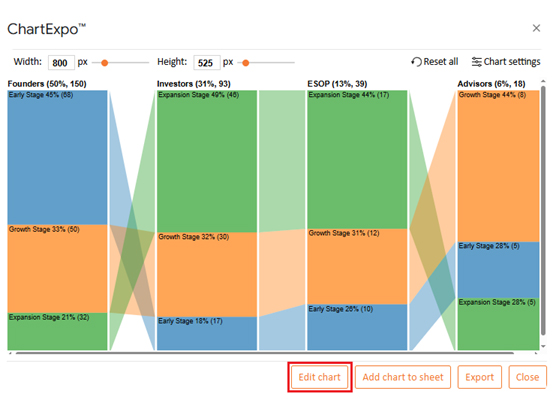
Data is easier to trust when it is clear and visual. With ChartExpo in Google Sheets, equity shifts become simple to understand. Its charts, illustrated by the examples below, help founders, investors, and employees see ownership at a glance:

  • Sankey Chart: The Sankey Chart illustrates how values are transferred across categories through proportional links. A cap table highlights shareholder ownership transfers through funding rounds and share classes.
Cap Table Template
  • Progress Circle Chart: The Progress Circle Chart is a circular gauge that tracks progress toward a percentage. A cap table clearly shows each stakeholder’s ownership share simply and intuitively.
Cap Table Template
  • Comparison Bar Chart: A Comparison Bar Chart highlights differences across groups or time periods. In equity, it makes shifts in ownership across funding stages easier to compare side by side.
Cap Table Template
  • Multi-Axis Spider Chart: A Multi-Axis Spider Chart displays multiple variables simultaneously in a radial design. It captures how the founder, investor, and ESOP ownership change over multiple stages.
Cap Table Template
  • Waterfall Chart: A Waterfall chart illustrates the step-by-step accumulation of value until a total is reached. A cap table outlines how equity is allocated to establish the complete ownership structure.
Cap Table Template

How to Analyze a Cap Table Template in Google Sheets?

Equity can easily be overlooked if not tracked carefully. That is why using a cap table template to track equity ownership and dilution with ease is important. However, rows and columns only offer part of the picture. Data becomes powerful when it is visualized, not just read.

Visualization is central to data analysis, yet Google Sheets can sometimes fall short. Basic charts provide limited insight and can oversimplify ownership structures. ChartExpo addresses this by transforming raw data into visuals that are clear, insightful, and actionable.

Take control of your equity data—try ChartExpo today and unlock insights that matter.

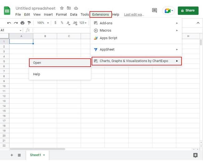
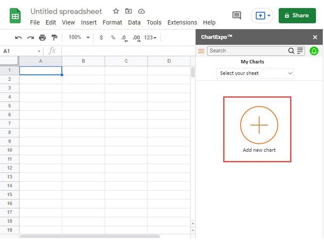
How to Install ChartExpo in Google Sheets?

  1. To start using ChartExpo, download it directly from the Google Sheets program. To do this, select Extensions from the top toolbar.
  2. A menu will appear. Click the Get add-ons option.
  3. Search for ChartExpo, and click on Charts, Graphs & Visualizations by ChartExpo when it appears in the results.
  4. Click the Install button. You will have to confirm your Google account and accept some permissions.

ChartExpo charts are available both in Google Sheets and Microsoft Excel. Please use the following CTAs to install the tool of your choice and create beautiful visualizations in a few clicks in your favorite tool.

Example

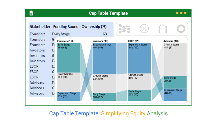
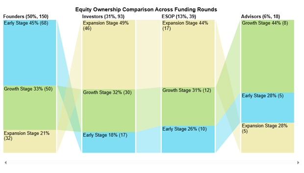
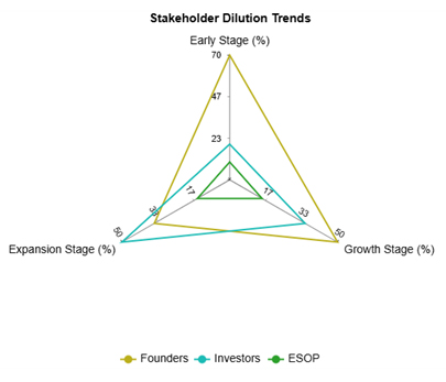
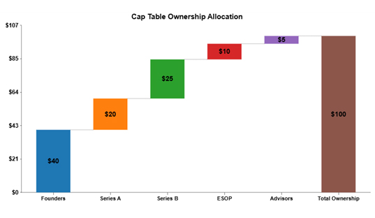
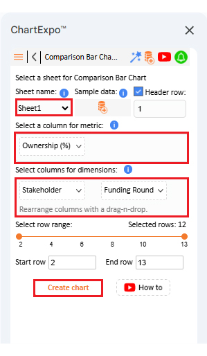
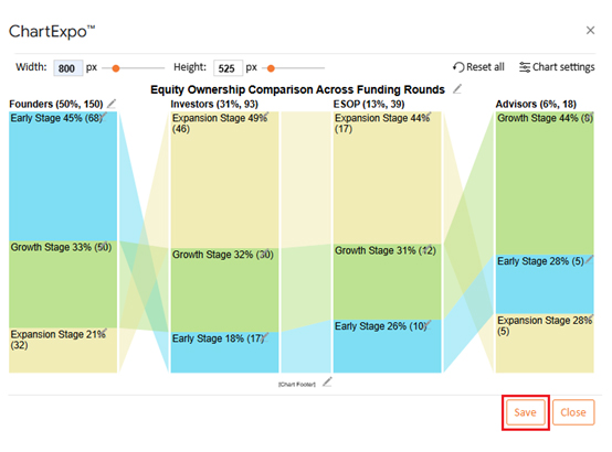
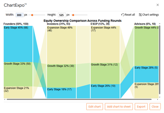
Let’s analyze the cap table template sample data in Google Sheets using ChartExpo.

Stakeholder Funding Round Ownership (%)
Founders Early Stage 68
Founders Growth Stage 50
Founders Expansion Stage 32
Investors Early Stage 17
Investors Growth Stage 30
Investors Expansion Stage 46
ESOP Early Stage 10
ESOP Growth Stage 12
ESOP Expansion Stage 17
Advisors Early Stage 5
Advisors Growth Stage 8
Advisors Expansion Stage 5
  • To get started with ChartExpo, install ChartExpo in Google Sheets.
  • Go to Extensions > Charts, Graphs & Visualizations by ChartExpo > Open.
Cap Table Template
  • To access the charts library, click the Add new chart button.
Cap Table Template
  • Once it loads, scroll through the charts list to locate and choose the “Comparison Bar Chart”.
Cap Table Template
  • Put the data table in the sheet first. Then, choose the Sheet name from the drop-down in the ChartExpo section.
  • Select the metric column; metric is the numeric column in your data sheet.
  • Select the dimensions column; the dimension is the categorical column in your datasheet that contains text information.
  • Click the Create chart button to complete the process.
Cap Table Template
  • If you want to add anything to the chart, click the Edit Chart button:
Cap Table Template
  • Click the pencil icon next to the Chart Header to change the title.
  • It will open the properties dialog. Under the Text section, you can add a heading in Line 1 and enable Show.
  • Give the appropriate title of your chart and click the Apply button.
Cap Table Template
  • Change bar color from the “Column Bar Properties” menu as follows:
Cap Table Template
  • You can increase font size for better readability from “Font Style”:
Cap Table Template
  • After making all changes, click on the “Save” button:
Cap Table Template
  • Your final chart will look like the one below.
Cap Table Template

Insights

  • Founders’ ownership decreases from 45% in the Early Stage to 21% in the Expansion Stage.
  • Investors steadily gain equity, reaching 49% in the Expansion Stage.
  • ESOP grows consistently, giving employees a strong 44% stake by the Expansion Stage.
  • Advisors hold a small share, peaking at 44% in the Growth Stage before declining.

Benefits of Using a Cap Table Spreadsheet

Equity is more than numbers. It reflects who built, believed in, and grew the company. A cap table spreadsheet keeps this story clear, simple, and shareable, turning scattered data into a tool for smarter decisions.

How?

  • Transparency: A spreadsheet provides a single, unified version of the truth. Everyone from founders to employees sees the same numbers, which builds trust.
  • Accuracy: Formulas reduce manual errors and ensure that percentages remain up to date. Dilution becomes easy to track across every round.
  • Planning: Leaders can model funding scenarios before making a decision. This foresight protects ownership and readies the company for growth.
  • Communication: Clear data smooths conversations. Investors and employees understand their stake without long explanations.
  • Integration: The spreadsheet connects with financial data for richer insights. This allows equity to align with long-term strategy.

Use Cases of the Capitalization Table Template in Google Sheets

Equity has many moving parts, and each stakeholder views it differently. A capitalization table template in Google Sheets adapts to those perspectives, giving clarity. It keeps ownership transparent, numbers accurate, and decisions smarter.

Here are some use cases to help you sink this information in:

  • Startups: Early-stage founders use cap tables to track shares across co-founders, seed investors, and ESOPs. This ensures equity stays clear as the company grows.
  • SMEs: Small and medium enterprises rely on templates to manage multiple investors and funding rounds. It helps them balance growth with control over ownership.
  • Investors: They use cap tables to monitor their stakes across various companies. They can compare positions and measure returns with reliable data.
  • Corporate finance: Large companies apply cap tables to manage complex ownership structures. They also connect it with financial metrics to support strategic planning.
  • Analysts: Analysts use templates to model scenarios and forecast outcomes. It allows them to analyze financial statements alongside equity data for sharper insights.

FAQs

What is the difference between a cap table and a balance sheet?

A cap table shows ownership, shares, and dilution. A balance sheet shows assets, liabilities, and the value of equity. The cap table tracks ownership, whereas the balance sheet tracks what the company owns and owes.

What is the cap table strategy?

A cap table strategy is the plan for managing equity ownership. It helps founders control dilution and align stakeholders. The strategy includes setting option pools, planning fundraising rounds, and using data-driven decision-making to protect long-term value.

Wrap Up

Equity guides every company’s journey. It determines who holds control, shares risk, and benefits from rewards. A cap table template tracks equity ownership and dilution with ease, making this process clear and measurable.

Clarity is the biggest advantage. Founders, employees, and investors all gain a single version of the truth. This transparency fosters trust and prevents confusion as ownership transitions through various funding stages.

Growth introduces new complexities. Each funding round shifts equity and introduces dilution. A cap table enables you to anticipate these changes, thereby preventing unexpected outcomes. It is a tool that supports informed planning.

Cap tables offer more than a record of ownership. They enable financial insights, such as comparing equity outcomes with fixed income strategies. You can also link values to a market capitalization chart for a broader company perspective.

Cap tables also work well in conjunction with a more comprehensive financial review. Leaders can analyze financial statements in conjunction with equity changes. This shows not only who owns the company but also how ownership links to its health and growth.

The future of equity management is visual. Traditional tables no longer suffice. ChartExpo enhances ownership visibility with clear, impactful visuals.

So, do not hesitate. Install ChartExpo to transform your cap table into a tool for clarity, trust, and growth.

How much did you enjoy this article?

PBIAd1
Start Free Trial!
157986

Related articles

next previous
Data Analytics12 min read

Cash Flow Analysis Template: A Complete Guide

A cash flow analysis template helps track inflows and outflows with clarity. Discover how Google Sheets and smart tools improve analysis and decision-making.

Data Analytics14 min read

Visual Encoding: The Rules That Improve Insights

Visual encoding converts complex data into visuals that are simple to read. It uses color, size, shape, and position to reveal trends, comparisons, and insights.

Data Analytics15 min read

Operational Reporting for Data-Driven Operations

Operational Reporting tracks daily performance with real-time data. Discover its benefits, examples, and Power BI tips to make smarter business decisions.

Data Analytics12 min read

Startup Financial Model: A Visual Approach

A startup financial model helps founders plan revenue, expenses, and cash flow. This guide shows how to create, analyze, and visualize your model.

Data Analytics12 min read

Restaurant Profit and Loss Template for Data Insights

A Restaurant Profit and Loss Template shows income and costs. Learn how to create, use, and analyze it in Excel to make smarter decisions and boost profits.

ChartExpo logo

Turn Data into Visual
Stories

CHARTEXPO

  • Home
  • Gallery
  • Videos
  • Services
  • Pricing
  • Contact us
  • FAQs
  • Privacy policy
  • Terms of Service
  • Sitemap

TOOLS

  • ChartExpo for Google Sheets
  • ChartExpo for Microsoft Excel
  • Power BI Custom Visuals by ChartExpo
  • Word Cloud

CATEGORIES

  • Bar Charts
  • Circle Graphs
  • Column Charts
  • Combo Charts
  • Comparison Charts
  • Line Graphs
  • PPC Charts
  • Sentiment Analysis Charts
  • Survey Charts

TOP CHARTS

  • Sankey Diagram
  • Likert Scale Chart
  • Comparison Bar Chart
  • Pareto Chart
  • Funnel Chart
  • Gauge Chart
  • Radar Chart
  • Radial Bar Chart
  • Sunburst Chart
  • see more
  • Scatter Plot Chart
  • CSAT Survey Bar Chart
  • CSAT Survey Chart
  • Dot Plot Chart
  • Double Bar Graph
  • Matrix Chart
  • Multi Axis Line Chart
  • Overlapping Bar Chart
  • Control Chart
  • Slope Chart
  • Clustered Bar Chart
  • Clustered Column Chart
  • Box and Whisker Plot
  • Tornado Chart
  • Waterfall Chart
  • Word Cloud
  • see less

RESOURCES

  • Blog
  • Resources
  • YouTube
SIGN UP FOR UPDATES

We wouldn't dream of spamming you or selling your info.

© 2026 ChartExpo, all rights reserved.