• Home
  • Tools dropdown img
    • Spreadsheet Charts

      • ChartExpo for Google Sheets
      • ChartExpo for Microsoft Excel
    • Power BI Charts

      • Power BI Custom Visuals by ChartExpo
    • Word Cloud

  • Charts dropdown img
    • Chart Category

      • Bar Charts
      • Circle Graphs
      • Column Charts
      • Combo Charts
      • Comparison Charts
      • Line Graphs
      • PPC Charts
      • Sentiment Analysis Charts
      • Survey Charts
    • Chart Type

      • Box and Whisker Plot
      • Clustered Bar Chart
      • Clustered Column Chart
      • Comparison Bar Chart
      • Control Chart
      • CSAT Survey Bar Chart
      • CSAT Survey Chart
      • Dot Plot Chart
      • Double Bar Graph
      • Funnel Chart
      • Gauge Chart
      • Likert Scale Chart
      • Matrix Chart
      • Multi Axis Line Chart
      • Overlapping Bar Chart
      • Pareto Chart
      • Radar Chart
      • Radial Bar Chart
      • Sankey Diagram
      • Scatter Plot Chart
      • Slope Chart
      • Sunburst Chart
      • Tornado Chart
      • Waterfall Chart
      • Word Cloud
    • Google Sheets
      Microsoft Excel
  • Services
  • Pricing
  • Contact us
  • Blog
  • Support dropdown img
      • Gallery
      • Videos
      • Contact us
      • FAQs
      • Resources
    • Please feel free to contact us

      atsupport@chartexpo.com

Categories
All Data Visualizations Data Analytics Surveys
Add-ons/
  • Google Sheets
  • Microsoft Excel
  • Power BI
All Data Visualizations Data Analytics Surveys
Add-ons
  • Google Sheets
  • Microsoft Excel
  • Power BI

We use cookies

This website uses cookies to provide better user experience and user's session management.
By continuing visiting this website you consent the use of these cookies.

Ok

ChartExpo Survey


Home > Blog > Google Sheets

Sales Projection Template in Google Sheets for Clear Insights

A pizza shop in New York once lost $50,000 in a year because its owner underestimated demand for Friday nights. That’s strange, right? But it’s exactly what poor forecasting does.

Sales Projection Template

Have you ever thought about how a single spreadsheet could prevent that kind of loss? Try a sales projection template. Why? Numbers tell stories. And in business, the story is survival or growth.

Research shows 82% of small businesses fail due to cash flow problems. That’s not bad luck. It’s avoidable with better planning. A sales projection template in Google Sheets gives structure to those plans. It’s simple, collaborative, and it turns uncertainty into clarity.

Think about what happens when you add sales analytics into the mix. Suddenly, trends become visible, and future revenue feels less like guesswork. A spreadsheet for sales tracking then adds real-time accountability. Pair it with a sales pipeline report, and you can pinpoint where opportunities leak away. Together, these insights drive decisions that actually work.

Here’s the kicker: McKinsey reports companies using advanced forecasting achieve 10% higher revenue growth on average. That’s the edge strong projections deliver.

So, are you planning next month’s budget or shaping next year’s strategy? Try a sales projection template. It’s the difference between guessing and growing.

Don’t know where to begin? This is the guide for you…

Table of Contents:

  1. What is a Sales Projection Template in Google Sheets?
  2. Why is the Sales Forecast Template in Google Sheets Important?
  3. Top 5 Google Sheets Sales Forecast Templates
  4. Key Components of a Sales Projection Template in Google Sheets
  5. How to Create the Sales Forecast Template in Google Sheets?
  6. How to Analyze a Sales Forecast Template in Google Sheets?
  7. How to Use the Sales Projection Template in Google Sheets?
  8. Benefits of the Sales Projection Template in Google Sheets
  9. Best Practices of Sales Projection Template in Google Sheets
  10. FAQs
  11. Wrap Up

What is a Sales Projection Template in Google Sheets?

Definition: A sales projection template in Google Sheets is a tool that helps businesses predict future revenue. It organizes data into clear rows and columns, where managers can adjust numbers to see possible outcomes.

This template allows easy collaboration since Google Sheets updates in real time. It reduces the guesswork in planning.

A sales forecast example can guide decisions on hiring or budgeting. Moreover, adding sales analytics makes projections more accurate. The template is flexible for small teams or large companies. It is simple to use yet powerful for long-term growth.

In short, a sales projection template in Google Sheets turns raw numbers into actionable insights.

Why is the Sales Forecast Template in Google Sheets Important?

Ever wondered why some businesses always seem prepared for the future? The truth is, they rely on smart tools to plan. A sales forecast template in Google Sheets is one of those tools. It keeps things simple, clear, and actionable.

Here is why it matters:

  • Better cash flow planning: A clear forecast shows how much money may come in. It helps you avoid shortages and prepare for growth.
  • Smarter decision making: A Google Sheets sales forecast template highlights trends. This lets you adjust strategies before problems grow.
  • Easy collaboration: Google Sheets updates instantly. Teams can review numbers together without confusion.
  • Tracking progress over time: Forecasts can be compared to actual results. This makes performance reviews meaningful and helps refine future goals.
  • Confidence with investors: Clear projections build trust. Investors see a business that understands its numbers and plans ahead.

Top 5 Google Sheets Sales Forecast Templates

Choosing the right template can make sales planning easier than ever. Google Sheets makes it flexible, accessible, and free with templates that serve unique purposes. Whether you are planning for a single day or mapping out an entire year, using the right tool saves time and brings clarity.

Here are five popular options worth exploring:

Monthly Sales Forecast Template

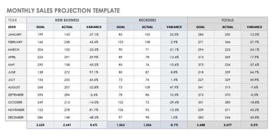
This template breaks down revenue month by month. It’s excellent for identifying seasonal shifts and comparing one period against another. With this, you can build monthly sales report templates that show growth or highlight weak spots. Businesses use it to set realistic goals and keep a steady rhythm.

Sales Projection Template

Daily Sales Forecast Template

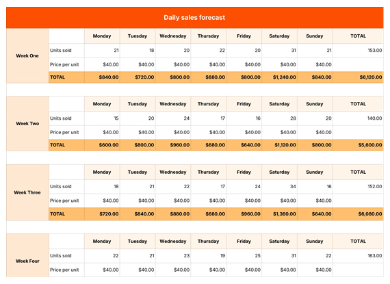
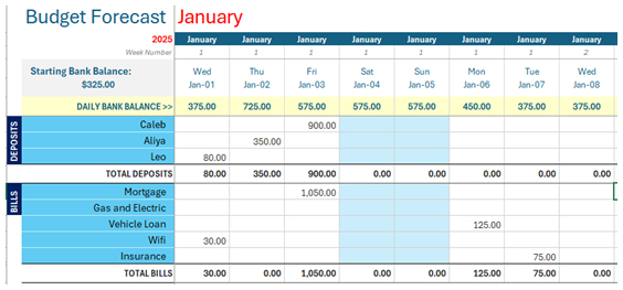
Fast-moving businesses need sharper detail. A daily sheet tracks patterns by the hour or day, making it valuable for restaurants, retail, and e-commerce. It helps teams react quickly if sales dip or spike unexpectedly. This keeps planning practical and precise.

Sales Projection Template

Retail Sales Forecast Template

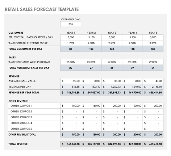
Retail depends on inventory, foot traffic, and promotions. This template connects product sales to stock levels, helping avoid shortages or overstock. Pairing it with the sales dashboard makes performance even more visual. Retailers gain both clarity and control.

Sales Projection Template

Yearly Sales Forecast Template

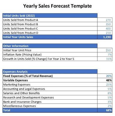
For a long-term strategy, a yearly sheet is essential. It maps the bigger picture, showing how short-term wins contribute to long-term goals. Businesses can prepare for holidays, budget cycles, and investment rounds with confidence.

Sales Projection Template

Budget Sales Forecast Template

Sales only make sense when tied to costs. This template combines income and expenses, showing how spending affects projections. It’s useful for balancing growth plans against financial limits. Managers use it to keep projections realistic and sustainable.

Sales Projection Template

Key Components of a Sales Projection Template in Google Sheets

Every strong sales plan starts with structure. A sales projection template is not just a table of numbers. It organizes information so decisions become clear and purposeful. By focusing on the right components, businesses can see both the present and the future more confidently. Here are the key elements that make a projection work:

  • Time periods: Forecasts need clear timelines. Whether it is weeks, months, or years, defining time periods makes comparisons accurate.
  • Sales volume forecasts: This shows how many units or services you expect to sell. It helps in creating a sales forecast example that feels realistic and measurable.
  • Revenue projections: Here, you calculate expected earnings. This turns volume into a financial impact that guides bigger planning.
  • Sales KPIs: Metrics tell the story behind the numbers. Knowing what sales KPIs help teams track progress against real goals.
  • Cash flow impact: Every projection should highlight how sales affect available cash. It shows whether the business can cover costs or invest in growth without stress.

How to Create the Sales Forecast Template in Google Sheets?

Building a forecast does not need to feel overwhelming. Google Sheets makes it simple, flexible, and collaborative. A projected sales forecast template is more than numbers on a page. It is a living document that grows with your business.

Follow these steps to create one that works:

  1. Start with a blank template: Open a new sheet and set up basic columns. This creates space for data like dates, products, and revenue.
  2. Add formulas: Use formulas to calculate totals and averages automatically. This saves time and reduces errors in your sales analytics.
  3. Insert timeframes: Choose daily, monthly, or yearly periods depending on your goals. Clear timeframes keep the forecast structured and easy to compare.
  4. Use conditional formatting: Highlight trends or warning signs with color rules. This makes insights visible at a glance.
  5. Automate charts: Turn data into charts for quick analysis. Use a sales dashboard setup to make reports visual and easy to share.

How to Analyze a Sales Forecast Template in Google Sheets?

Spreadsheets are great until they start looking like a maze of endless rows and numbers. Sure, Google Sheets helps you manage a sales forecast template, but staring at raw data can feel more confusing than helpful.

Data analysis thrives on visualization. Why? Because patterns jump out when numbers turn into charts. Google Sheets’ built-in graphs are basic and sometimes miss the bigger picture.

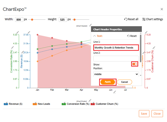
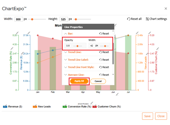
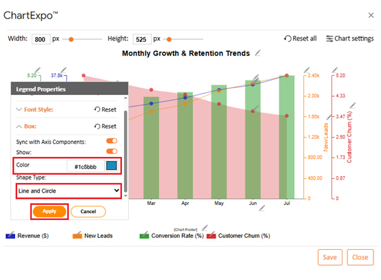
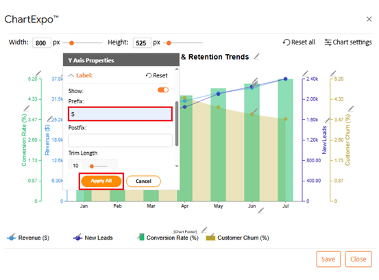
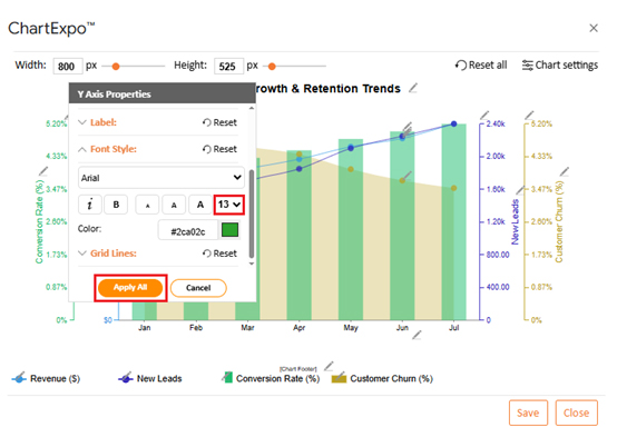
Enter ChartExpo. This tool transforms dull spreadsheets into engaging visuals that make insights clear. With ChartExpo, analyzing forecasts becomes faster, sharper, and far more effective.

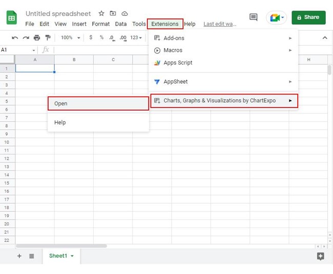
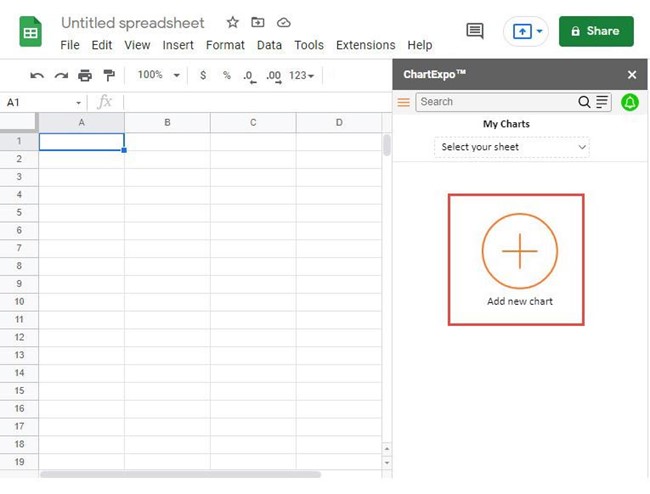
How to Install ChartExpo in Google Sheets?

  1. To start using ChartExpo, download it directly from the Google Sheets program. To do this, select Extensions from the top toolbar.
  2. A menu will appear. Click the Get add-ons option.
  3. Search for ChartExpo, and click on Charts, Graphs & Visualizations by ChartExpo when it appears in the results.
  4. Click the Install button. You will have to confirm your Google account and accept some permissions.

ChartExpo charts are available both in Google Sheets and Microsoft Excel. Please use the following CTAs to install the tool of your choice and create beautiful visualizations in a few clicks in your favorite tool.

Example

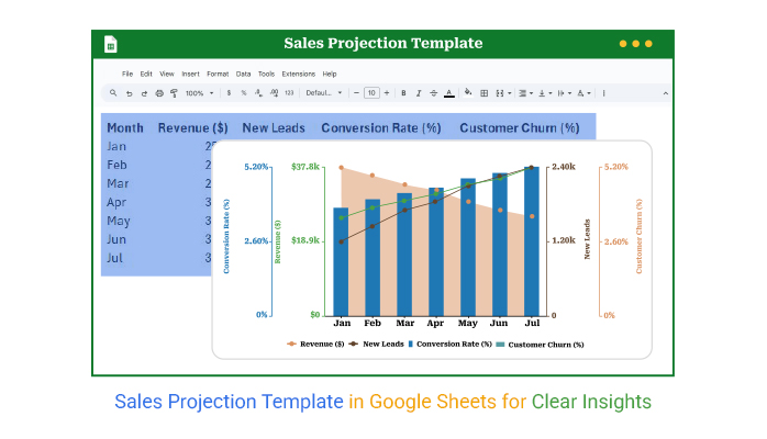
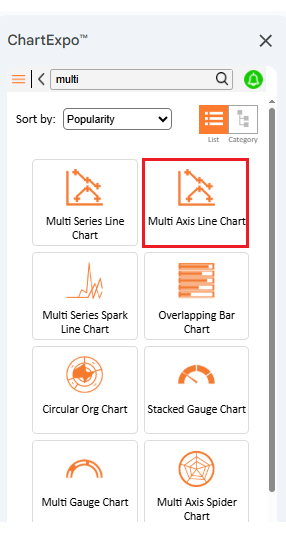
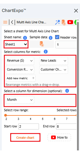
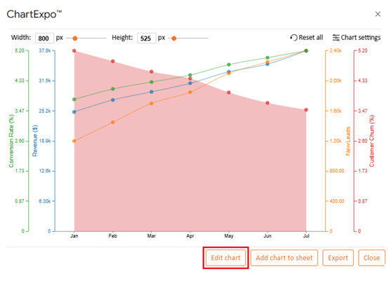
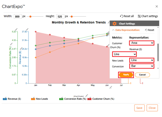
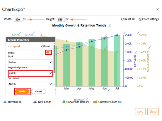
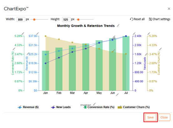
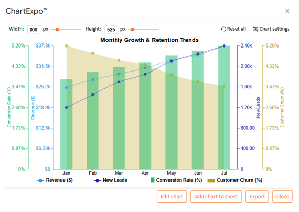
Let’s create a Multi Axis Line Chart from the data below in Google Sheets using ChartExpo and analyze the visualization.

Month

Revenue ($) New Leads Conversion Rate (%)

Customer Churn (%)

Jan 25,000 1,200 3.8 5.2
Feb 27,500 1,450 4.1 4.9
Mar 29,200 1,700 4.3 4.6
Apr 31,000 1,850 4.5 4.4
May 33,400 2,100 4.8 4
Jun 35,000 2,250 5 3.7
Jul 37,800 2,400 5.2 3.5
  • To get started with ChartExpo, install ChartExpo in Google Sheets.
  • Go to Extensions > Charts, Graphs & Visualizations by ChartExpo > Open.
Sales Projection Template
  • To access the charts library, click the Add new chart button.
Sales Projection Template
  • Once it loads, scroll through the charts list to locate and choose the “Multi Axils Line Chart”.
Sales Projection Template
  • Put the data table in the sheet first. Then, choose the Sheet name from the drop-down in the ChartExpo section.
  • Select the metric column; metric is the numeric column in your data sheet.
  • Select the dimensions column; the dimension is the categorical column in your datasheet that contains text information.
  • Click the Create chart button to complete the process.
Sales Projection Template
  • If you want to add anything to the chart, click the Edit Chart button:
Sales Projection Template
  • Click the pencil icon next to the Chart Header to change the title.
  • It will open the properties dialog. Under the Text section, you can add a heading in Line 1 and enable Show.
  • Give the appropriate title of your chart and click the Apply button.
Sales Projection Template
  • You can also change the data representation, click on the “Data Representation” from the “Chart Settings”:
Sales Projection Template
  • You can change bars’ Opacity and width:
Sales Projection Template
  • You can also change the Legend shape type and color. Select the pencil icon from the chart footer menu. After the Legend Properties window appears, click in the “Box” and select the shape type. You can change color as well:
Sales Projection Template
  • If you want to add “$” and “%” with Revenue, Customer Churn, and Conversion Rate, respectively, you can do it as well:
Sales Projection Template
  • You can also increase font size for better readability:
Sales Projection Template
  • You can change legend alignment from “Legend Properties”:
Sales Projection Template
  • When you are done with all the changes, click the “Save” button:
Sales Projection Template
  • The final look of the Multi Axis Line Chart is shown below:
Sales Projection Template

Insights

  • Revenue grows steadily from January to July, showing consistent business growth.
  • Month-on-month growth in new leads drives higher revenue.
  • Conversion rate improves over time, proving marketing is more effective.
  • Customer churn rate declines, reflecting stronger retention.
  • Trends show strong links between acquisition, conversion, and retention.

How to Use the Sales Projection Template in Google Sheets?

Planning future sales feels less like guesswork when you have structure. A sales projection template in Google Sheets makes that possible. Let’s use the example of a retailer to understand this. For them, it means knowing how much stock to order, when to run promotions, and how to balance expenses with incoming revenue.

Here is how you can use the template effectively:

  • Input historical data: Enter past sales for each product category. You can see how items performed during different seasons and spot repeat patterns.
  • Define timeframes and apply formulas: Set weekly, monthly, or holiday-specific periods. Use formulas to calculate projections so you do not overstock slow movers or understock best sellers.
  • Track and compare performance: Compare projected sales with actual numbers after each cycle. Pair it with monthly sales reports templates to refine future stock and pricing decisions.
  • Share with teams for alignment: Share the sheet with sales staff and finance. This ensures promotions, discounts, and cash flow planning stay in sync.
  • Adjust and combine with reports: Update forecasts for new product launches or seasonal events. Use the sales pipeline template to see where demand is building and adjust strategies before shelves run empty.

Benefits of the Sales Projection Template in Google Sheets

Guessing sales numbers can leave a business blind to risks and opportunities. A sales projection template in Google Sheets makes that change. It makes forecasting simple, collaborative, and more accurate.

How?

  • Smarter financial planning: Revenue projections guide spending decisions. This helps managers balance expenses with income and avoid cash flow surprises.
  • Clear team collaboration: Google Sheets updates in real time. Sharing with sales or finance teams ensures everyone works with the same numbers.
  • Better tracking of performance: Compare forecasts with actual sales. Use monthly sales reports templates to identify gaps and refine future assumptions.
  • Stronger strategic decisions: Pair projections with sales dashboard examples to visualize trends. This makes it easier to adjust strategies and respond quickly to market shifts.

Best Practices of Sales Projection Template in Google Sheets

A forecast is only as good as the way it is built. Many businesses create a sales projection template but fail to use it effectively. The difference comes from following a few simple best practices. These practices keep the numbers accurate, the sheet organized, and the insights actionable:

  • Keep data accurate and updated: Old numbers lead to poor decisions. Refresh your template with the latest sales data to keep projections reliable.
  • Set realistic assumptions: Avoid overly optimistic or cautious inputs. Ground your forecasts in past trends and market conditions for balanced results.
  • Use visuals for clarity: Numbers alone can overwhelm. Add charts or link the sheet to sales dashboards so trends are easy to spot.

FAQs

How to create a sales forecast for a new business template?

  • Start with estimated sales based on market research.
  • Define time periods such as months or quarters.
  • Add pricing and expected units sold.
  • Include costs to compare with revenue.
  • Adjust numbers as real data comes in.
  • Keep updating regularly.

How to do a sales forecast in Google Sheets?

  • Open a blank sheet in Google Sheets.
  • List products, prices, and estimated sales.
  • Add time periods for daily, monthly, or yearly tracking.
  • Use formulas to calculate totals and averages.
  • Insert charts for clarity.
  • Update regularly to improve accuracy.

Wrap Up

Sales forecasting is not guesswork. It is a structured process that shapes business decisions. A sales projection template in Google Sheets gives you that structure. It turns raw numbers into meaningful insights that guide growth.

When used consistently, the template becomes more than a spreadsheet. It is a planning tool that helps you spot risks before they hurt profits. It also highlights opportunities that may otherwise go unnoticed. Accuracy improves as you feed it better data.

One clear benefit is control. Businesses can compare revenue against costs and adjust quickly. Adding insights from monthly sales reports templates makes the process even sharper. Decisions then move from reactive to proactive.

Another advantage is visibility across teams. Sharing the template ensures sales and finance work in sync. This collaboration builds confidence. Everyone knows the numbers and works toward the same goals.

To go deeper, businesses can track performance metrics. You can even calculate Days Sales Outstanding to measure how fast payments come in. Pairing projections with a sales dashboard adds a visual layer that makes trends clear at a glance.

Still, Google Sheets has its limits. Its charts are basic and often lack depth. That is why installing ChartExpo is the next smart step. It transforms your forecasts into powerful visuals that tell a story.

So, start using ChartExpo today. It will make your sales projection template truly effective.

How much did you enjoy this article?

GSAd2
Start Free Trial!
157931

Related articles

next previous
Google Sheets11 min read

Google Sheets Apps for Presentable Insights

Google Sheets apps boost productivity with smarter data handling. Click here to learn how to use them for better charts, faster analysis, and smarter decisions.

Google Sheets14 min read

Google Sheets Query Function: A Visual Approach

The Google Sheets query function filters and analyzes data fast. Click here to learn the syntax with examples and best practices to boost your data analysis.

Google Sheets14 min read

Google Sheets Automation: Practical Use Cases

Google Sheets automation helps you save time and reduce errors with smart tools. Learn how to automate, analyze, and visualize your data with ease.

Google Sheets9 min read

How to Group Columns in Google Sheets for Faster Insights

Learn how to group columns in Google Sheets to organize data fast. You’ll discover step-by-step tips and charts to manage and analyze spreadsheets easily.

Google Sheets10 min read

Import XML to Google Sheets: Smarter Ways to Use XML

Importing XML to Google Sheets helps you pull structured web data into spreadsheets. This guide will show you how to use it, analyze results, and avert issues.

ChartExpo logo

Turn Data into Visual
Stories

CHARTEXPO

  • Home
  • Gallery
  • Videos
  • Services
  • Pricing
  • Contact us
  • FAQs
  • Privacy policy
  • Terms of Service
  • Sitemap

TOOLS

  • ChartExpo for Google Sheets
  • ChartExpo for Microsoft Excel
  • Power BI Custom Visuals by ChartExpo
  • Word Cloud

CATEGORIES

  • Bar Charts
  • Circle Graphs
  • Column Charts
  • Combo Charts
  • Comparison Charts
  • Line Graphs
  • PPC Charts
  • Sentiment Analysis Charts
  • Survey Charts

TOP CHARTS

  • Sankey Diagram
  • Likert Scale Chart
  • Comparison Bar Chart
  • Pareto Chart
  • Funnel Chart
  • Gauge Chart
  • Radar Chart
  • Radial Bar Chart
  • Sunburst Chart
  • see more
  • Scatter Plot Chart
  • CSAT Survey Bar Chart
  • CSAT Survey Chart
  • Dot Plot Chart
  • Double Bar Graph
  • Matrix Chart
  • Multi Axis Line Chart
  • Overlapping Bar Chart
  • Control Chart
  • Slope Chart
  • Clustered Bar Chart
  • Clustered Column Chart
  • Box and Whisker Plot
  • Tornado Chart
  • Waterfall Chart
  • Word Cloud
  • see less

RESOURCES

  • Blog
  • Resources
  • YouTube
SIGN UP FOR UPDATES

We wouldn't dream of spamming you or selling your info.

© 2026 ChartExpo, all rights reserved.