• Home
  • Tools dropdown img
    • Spreadsheet Charts

      • ChartExpo for Google Sheets
      • ChartExpo for Microsoft Excel
    • Power BI Charts

      • Power BI Custom Visuals by ChartExpo
    • Word Cloud

  • Charts dropdown img
    • Chart Category

      • Bar Charts
      • Circle Graphs
      • Column Charts
      • Combo Charts
      • Comparison Charts
      • Line Graphs
      • PPC Charts
      • Sentiment Analysis Charts
      • Survey Charts
    • Chart Type

      • Box and Whisker Plot
      • Clustered Bar Chart
      • Clustered Column Chart
      • Comparison Bar Chart
      • Control Chart
      • CSAT Survey Bar Chart
      • CSAT Survey Chart
      • Dot Plot Chart
      • Double Bar Graph
      • Funnel Chart
      • Gauge Chart
      • Likert Scale Chart
      • Matrix Chart
      • Multi Axis Line Chart
      • Overlapping Bar Chart
      • Pareto Chart
      • Radar Chart
      • Radial Bar Chart
      • Sankey Diagram
      • Scatter Plot Chart
      • Slope Chart
      • Sunburst Chart
      • Tornado Chart
      • Waterfall Chart
      • Word Cloud
    • Google Sheets
      Microsoft Excel
  • Services
  • Pricing
  • Contact us
  • Blog
  • Support dropdown img
      • Gallery
      • Videos
      • Contact us
      • FAQs
      • Resources
    • Please feel free to contact us

      atsupport@chartexpo.com

Categories
All Data Visualizations Data Analytics Surveys
Add-ons/
  • Google Sheets
  • Microsoft Excel
  • Power BI
All Data Visualizations Data Analytics Surveys
Add-ons
  • Google Sheets
  • Microsoft Excel
  • Power BI

We use cookies

This website uses cookies to provide better user experience and user's session management.
By continuing visiting this website you consent the use of these cookies.

Ok

ChartExpo Survey


Home > Blog > Data Visualization

Cumulative Flow Chart: A Complete Guide

What is a Cumulative Flow Chart, and why are so many businesses using it? This powerful visual tool helps teams spot bottlenecks quickly. It shows work in progress, completed tasks, and work yet to begin—all in one view.

Cumulative Flow Chart

Each chart section grows over time, giving an instant read on process health. There is no guesswork, no fluff, just hard data.

Take a tech startup, for example. Sprints are fast, and deadlines are tighter. Using a Cumulative Flow Chart, they can identify where tasks accumulate and reallocate resources in real-time. This helps avoid project gridlock, which can mean the difference between a product launch and a costly delay.

Visual tools aren’t new, but their importance is growing. Companies now want tools that show performance at a glance. That’s why features like Multi Axis Chart Excel and Sankey Diagram in Excel are gaining traction. They offer layered insight, making it easier to communicate trends and shifts to stakeholders.

Data doesn’t need to be overwhelming. The right chart can simplify everything. Visuals make the story clear, whether you’re tracking workflow or understanding energy transfer. More teams are ditching traditional tables for smart, visual tools that speak louder than rows of numbers.

Startups, enterprises, and educators use charts to make smarter, faster decisions. Charts are simple and visual and deliver clarity without noise. That’s why they’re more than a trend—they’re a shift.

Let’s explore further…

Table of Contents:

  1. What is a Cumulative Flow Chart?
  2. Why is a Cumulative Flow Diagram Useful?
  3. What Does an Excel Cumulative Flow Diagram Show?
  4. How to Read a Cumulative Flow Diagram?
  5. How to Create a Cumulative Flow Chart in Excel?
  6. Tips for Using a Cumulative Workflow Diagram
  7. FAQs
  8. Wrap Up

What is a Cumulative Flow Chart?

Definition: A Cumulative Flow Chart is a visual tool for tracking work across different process stages. It displays the total number of tasks in each stage over time, making it easy to see trends, bottlenecks, and progress.

Teams often use this tool in project management to improve workflow. Unlike a Radar Chart, which compares variables, this chart focuses on time and task status. Many teams create it using a chart add-in for Excel for quick updates and analysis.

Why is a Cumulative Flow Diagram Useful?

Have you ever noticed some teams fire on all cylinders while others spin in circles? It’s often a difference of clarity. A Cumulative Flow Diagram(CFD) provides clarity and insight into the moment of truth. It’s not just data but a story about how your workflow works.

Why?

  • It visualizes the progress of a workflow: A CFD illustrates how tasks move through stages — like to-do, in-progress, and done — over time. This makes it easy to see if the work is flowing well or backing up somewhere.
  • Spot bottlenecks and blockages: If one part of the chart gets taller while the rest stays flat, it indicates a slowdown. It lets you know exactly where tasks are being held so you can troubleshoot the issue fast.
  • Tracks work in progress (WIP) totals: Too much happening? That’s a recipe for overload. A Cumulative Flow Diagram helps limit WIP so teams get to DONE quicker and stay focused.
  • Supports predictability and planning: Consistent chart patterns show stable delivery rates. This data can be used to forecast future work with more confidence than a Pyramid Chart or other static models.
  • Encourages transparency and collaboration: There’s no confusion about status when everyone sees the same chart. Shared visuals—especially when integrated with a chart maker or dashboard—spark better communication and smarter decisions.

What Does an Excel Cumulative Flow Diagram Show?

Have you ever felt like your project is moving, but unsure how well? An Excel cumulative flow diagram doesn’t leave that to guesswork. It gives a real-time snapshot of your workflow’s behavior in one visual.

  • Workflow progress: The chart shows how tasks are added, worked on, and completed over time. Each color band grows as work moves through different stages.
  • Work-in-progress (WIP): It clearly shows how many tasks are being worked on. If the middle band widens, your team might be overloaded.
  • Bottlenecks and blockages: When one section of the chart stacks up faster than the rest, you’ve got a bottleneck. This makes it easier to solve issues before they affect deadlines.
  • Predictability and efficiency: A steady shape means a steady process. Combine it with a Slope Chart or an Energy Flow Diagram to compare output across teams or departments.

How to Read a Cumulative Flow Diagram?

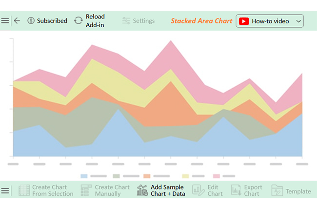
Are you staring at a Cumulative Flow Diagram for the first time? It might look like a rainbow mountain range. But don’t worry—once you know what to look for, it will tell you everything about your workflow in seconds.

Let’s break the process down:

  1. Understand the axes: The horizontal axis shows time, usually days or sprints. The vertical axis shows the number of tasks in the system.
  2. Recognize the colored bands: Each color represents a stage: to-do, in progress, done. The thickness of each band tells you how much work is needed at that stage.
  3. Interpret the slope: The steeper the slope, the faster the work moves. A flat line? That’s a red flag—nothing is progressing.
  4. Identify bottlenecks: Look for sudden bulges in a band. That’s work getting stuck, and it could delay the entire flow.
  5. Analyze work-in-progress (WIP): Wider bands in the “in progress” section mean your team might be juggling too much. A slim, steady band? That’s a healthy workload.
  6. Evaluate delivery performance: A smooth, rising “done” section shows consistent output. Pair this with an Excel multi-axis chart view or a Radar Chart to compare performance across teams.

How to Create a Cumulative Flow Chart in Excel?

Are you drowning in data but starving for insight? You’re not alone. Excel is great for crunching numbers, but it does not show what those numbers mean.

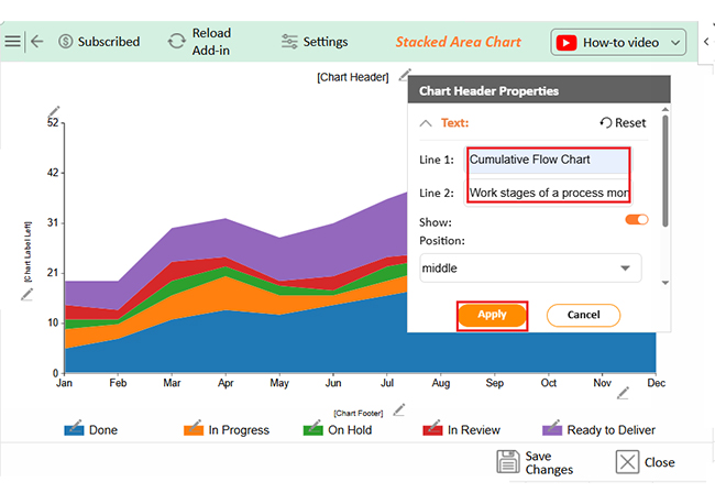
Have you ever tried building a Cumulative Flow Chart in Excel? It’s doable but far from delightful. Data visualization plays a huge role in smart analysis, yet Excel often leaves you stuck with clunky graphs and limited styling. That’s where ChartExpo comes in. It’s a powerful chart add-in that transforms dry data into clear, engaging visuals—without the stress.

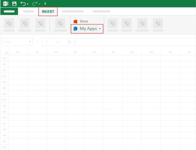
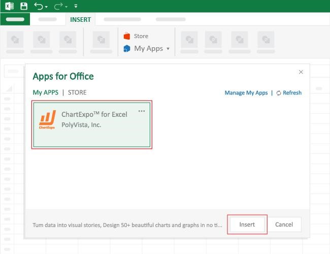
How to Install ChartExpo in Excel?

  1. Open your Excel application.
  2. Open the worksheet and click the “Insert” menu.
  3. You’ll see the “My Apps” option.
  4. In the Office Add-ins window, click “Store” and search for ChartExpo on my Apps Store.
  5. Click the “Add” button to install ChartExpo in your Excel.

ChartExpo charts are available both in Google Sheets and Microsoft Excel. Please use the following CTAs to install the tool of your choice and create beautiful visualizations with a few clicks in your favorite tool.

Example

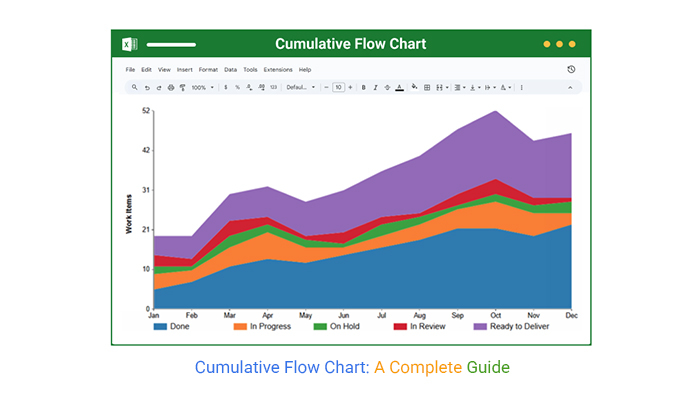
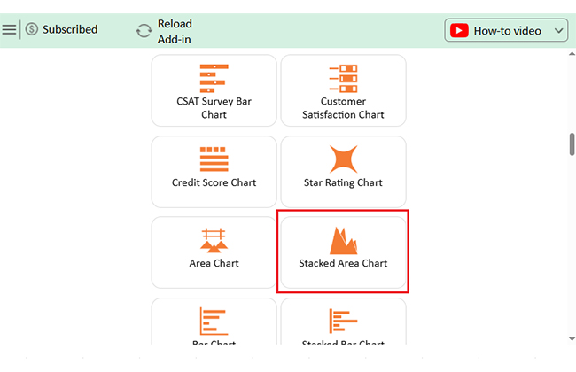
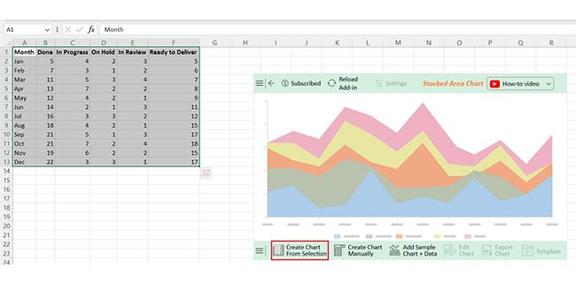
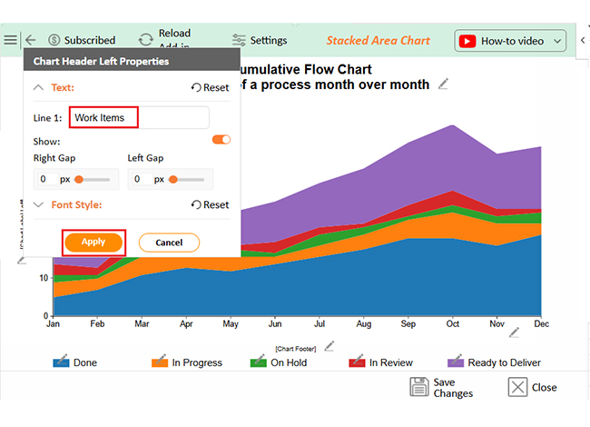
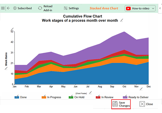
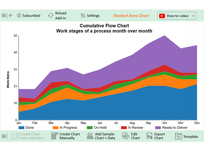
Let’s visualize this sample data in Excel using ChartExpo and analyze it.

Month Done In Progress On Hold In Review Ready to Deliver
Jan 5 4 2 3 5
Feb 7 3 1 2 6
Mar 11 5 3 4 7
Apr 13 7 2 2 8
May 12 4 2 1 9
Jun 14 2 1 3 11
Jul 16 3 3 2 12
Aug 18 4 2 1 15
Sep 21 5 1 3 17
Oct 21 7 2 4 18
Nov 19 6 2 2 15
Dec 22 3 3 1 17
  • To get started with ChartExpo, install ChartExpo in Excel.
  • Now, click on My Apps from the INSERT menu.
Cumulative Flow Chart
  • Choose ChartExpo from My Apps, then click Insert.
Cumulative Flow Chart
  • Once it loads, scroll through the charts list to locate and choose the “Stacked Area Chart”.
Cumulative Flow Chart
  • The Stacked Area Chart will appear as follows.
Cumulative Flow Chart
  • Click the “Create Chart From Selection” button after selecting the data from the sheet, as shown.
Cumulative Flow Chart
  • ChartExpo will generate the visualization below for you.
Cumulative Flow Chart
  • If you want to add anything to the chart, click the Edit Chart button:
  • Click the pencil icon next to the Chart Header to change the title.
  • It will open the properties dialog. Under the Text section, you can add a heading in Line 1 and enable Show.
  • Give the appropriate title of your chart and click the Apply button.
Cumulative Flow Chart
  • You can add the “Chart Label Left” as follows:
Cumulative Flow Chart
  • Click the “Save Changes” button to persist the changes made to the chart.
Cumulative Flow Chart
  • Your final chart will look like the one below.
Cumulative Flow Chart

Insights

  • Tasks Completed (“Done”) steadily increased throughout the year, peaking at 22 in December.
  • “Ready to Deliver” numbers also rose, showing a more efficient workflow.
  • “On Hold” and “In Review” stayed consistently low, indicating stronger task management and fewer bottlenecks.

Tips for Using a Cumulative Workflow Diagram

Want to get real value from your Cumulative Flow Chart? Then don’t just glance at it—use it with intention. A well-read diagram is powerful, but a well-maintained one is game-changing.

Here are some practical tips to keep yours sharp and insightful:

  • Define clear workflow stages: Start with well-defined steps, like backlog, development, testing, and done. A cluttered or vague structure leads to a confusing chart and poor insights.
  • Update data regularly: Outdated data tells the wrong story. Whether you’re using Excel or a chart maker, automate updates or build a habit of frequent check-ins.
  • Limit work-in-progress (WIP): Too much multitasking kills flow. Use the chart to spot overstuffed stages and trim them down before efficiency tanks.
  • Watch for band changes: A sudden spike or dip in a band’s width can signal a shift in performance. It could mean more resources, a blocker, or even scope creep—keep your eye on it.
  • Use it for forecasting: Look at trends in the “done” band to estimate future delivery. Combine this with a misleading charts review session to ensure your data visuals are clear and trustworthy.
  • Share with the team: Visibility builds alignment. Pair the chart with other tools, such as Area Chart reports during retros, to keep everyone in the loop.

FAQs

How does a CFD work?

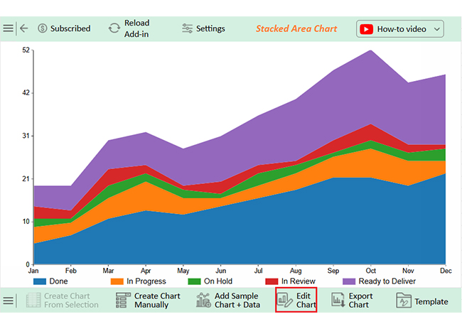
A Cumulative Flow Diagram(CFD) tracks work items across various stages. It visualizes progress, delays, and bottlenecks. Each band shows the number of tasks in a stage, and the chart updates as tasks move through the workflow.

What type of information does a Cumulative Flow Diagram provide?

A CFD shows task status, workflow efficiency, and delivery trends. You can spot bottlenecks, track Work-in-Progress (WIP), and measure throughput. It also helps teams forecast future work. This chart reveals how smoothly tasks flow from start to finish.

Wrap Up

A Cumulative Flow Chart is more than a chart. It’s a tool for insight. It shows how tasks move through your workflow over time, and each color tells a story. This chart helps spot delays quickly. If a section grows too quickly, there’s a bottleneck. If bands stay flat, work isn’t progressing. That’s valuable information.

A Cumulative Flow Diagram(CFD) also helps track Work-in-Progress (WIP). Too many tasks at once slow everyone down. A balanced chart means better focus, which in turn means faster delivery.

You can use this tool to forecast, too. A steady “done” line shows consistent output, making planning easier and smarter. It’s even better when paired with a Clustered Stacked Bar Chart for comparing teams or projects.

Visualization matters. Excel helps, but it’s limited. Tools like Google Charts, pyramid charts, and multi-axis charts in Excel give you more depth and flexibility. They help make data pop, not just sit.

Conclusively, a Cumulative Flow Chart keeps your process visible. It highlights progress, problems, and pace, keeping your team on track and aligned. To bring these insights to life with clarity and simplicity, install ChartExpo.

How much did you enjoy this article?

GSAd1
Start Free Trial!
155379

Related articles

next previous
Data Analytics7 min read

Leveraging Big Data Analytics to Reduce Healthcare Costs

This guide dives deep into how to leverage big data analytics to reduce healthcare costs. It shows you why you should use big data in the healthcare industry.

Data Analytics9 min read

Bank Dashboard: Enhancing Insights Through Data

Here is all you need to know about bank dashboards. You'll discover key features of an effective bank dashboard and how to analyze a banking dashboard.

Data Analytics8 min read

Metrics vs. Measures: Understanding the Key Differences

Metrics vs. measures track the right data and explain performance. This blog shows how to use both effectively with examples and visualization tips.

Data Analytics10 min read

DevOps Performance Metrics for Chart-Based Insights

DevOps performance metrics track efficiency in software delivery. This blog shows you how to use them to boost performance and streamline workflows.

Data Analytics8 min read

Social Media Dashboard to Improve Marketing Insights

This guide delves into what a social media dashboard is and how to create one. You'll also discover how to use a social media dashboard and more.

ChartExpo logo

Turn Data into Visual
Stories

CHARTEXPO

  • Home
  • Gallery
  • Videos
  • Services
  • Pricing
  • Contact us
  • FAQs
  • Privacy policy
  • Terms of Service
  • Sitemap

TOOLS

  • ChartExpo for Google Sheets
  • ChartExpo for Microsoft Excel
  • Power BI Custom Visuals by ChartExpo
  • Word Cloud

CATEGORIES

  • Bar Charts
  • Circle Graphs
  • Column Charts
  • Combo Charts
  • Comparison Charts
  • Line Graphs
  • PPC Charts
  • Sentiment Analysis Charts
  • Survey Charts

TOP CHARTS

  • Sankey Diagram
  • Likert Scale Chart
  • Comparison Bar Chart
  • Pareto Chart
  • Funnel Chart
  • Gauge Chart
  • Radar Chart
  • Radial Bar Chart
  • Sunburst Chart
  • see more
  • Scatter Plot Chart
  • CSAT Survey Bar Chart
  • CSAT Survey Chart
  • Dot Plot Chart
  • Double Bar Graph
  • Matrix Chart
  • Multi Axis Line Chart
  • Overlapping Bar Chart
  • Control Chart
  • Slope Chart
  • Clustered Bar Chart
  • Clustered Column Chart
  • Box and Whisker Plot
  • Tornado Chart
  • Waterfall Chart
  • Word Cloud
  • see less

RESOURCES

  • Blog
  • Resources
  • YouTube
SIGN UP FOR UPDATES

We wouldn't dream of spamming you or selling your info.

© 2025 ChartExpo, all rights reserved.