• Home
  • Tools dropdown img
    • Spreadsheet Charts

      • ChartExpo for Google Sheets
      • ChartExpo for Microsoft Excel
    • Power BI Charts

      • Power BI Custom Visuals by ChartExpo
    • Word Cloud

  • Charts dropdown img
    • Chart Category

      • Bar Charts
      • Circle Graphs
      • Column Charts
      • Combo Charts
      • Comparison Charts
      • Line Graphs
      • PPC Charts
      • Sentiment Analysis Charts
      • Survey Charts
    • Chart Type

      • Box and Whisker Plot
      • Clustered Bar Chart
      • Clustered Column Chart
      • Comparison Bar Chart
      • Control Chart
      • CSAT Survey Bar Chart
      • CSAT Survey Chart
      • Dot Plot Chart
      • Double Bar Graph
      • Funnel Chart
      • Gauge Chart
      • Likert Scale Chart
      • Matrix Chart
      • Multi Axis Line Chart
      • Overlapping Bar Chart
      • Pareto Chart
      • Radar Chart
      • Radial Bar Chart
      • Sankey Diagram
      • Scatter Plot Chart
      • Slope Chart
      • Sunburst Chart
      • Tornado Chart
      • Waterfall Chart
      • Word Cloud
    • Google Sheets
      Microsoft Excel
  • Services
  • Pricing
  • Contact us
  • Blog
  • Support dropdown img
      • Gallery
      • Videos
      • Contact us
      • FAQs
      • Resources
    • Please feel free to contact us

      atsupport@chartexpo.com

Categories
All Data Visualizations Data Analytics Surveys
Add-ons/
  • Google Sheets
  • Microsoft Excel
  • Power BI
All Data Visualizations Data Analytics Surveys
Add-ons
  • Google Sheets
  • Microsoft Excel
  • Power BI

We use cookies

This website uses cookies to provide better user experience and user's session management.
By continuing visiting this website you consent the use of these cookies.

Ok

ChartExpo Survey


Home > Blog > Microsoft Excel

Chart Formatting in Excel: Clean Charts in Less Time

Chart formatting in Excel—what makes it so important today? Data alone doesn’t speak. The way you present it does. A clear, concise chart can influence decisions. A cluttered one? It gets ignored.

Chart Formatting in Excel

Think of a quarterly sales chart. Without bold labels or clear axes, the story loses its clarity. However, trends stand out when colors, chart elements in Excel, and legends work together.

Excel gives you massive control. Many skip formatting and stick with the default, which often appears bland and can confuse the viewer. That’s where proper chart formatting in Excel steps in. It helps transform average data into something engaging and valuable.

Small changes have a significant impact. Adjusting chart elements in Excel boosts understanding. Choosing the right chart type cuts through the noise, and a good chart doesn’t ask for attention—it commands it.

With Excel, there’s power in the details. Formatting makes that power visible. We’ll explore innovative ways to use formatting features to bring your data to life. You’ll learn how basic edits can lead to cool Excel charts and graphs and better storytelling.

So, are you ready to bring clarity to your data? Let’s make your Excel charts speak louder, sharper, and smarter.

Table of Contents:

  1. What is Chart Formatting in Excel?
  2. Why Do Graph Formatting in Excel?
  3. When to Format a Chart in Excel?
  4. How to Format Different Charts in Excel for Analysis?
  5. Best Practices for Chart Formatting in Excel
  6. FAQs
  7. Wrap Up

What is Chart Formatting in Excel?

Definition: Chart formatting in Excel means adjusting how a chart looks to improve clarity. It includes changing colors, fonts, lines, and labels. This makes the data easier to understand since you can highlight trends or key points.

Formatting also helps match the chart to a report or presentation style. When adding a data label to an Excel chart, you clarify values. Knowing how to edit a chart in Excel helps you control how your message appears. Clear visuals lead to better decisions.

Why Do Graph Formatting in Excel?

Why bother with formatting graphs in Excel? Because first impressions count—even in spreadsheets. A messy chart can confuse, while a clean one builds trust. People judge data by how it’s shown.

  • Improve readability and clarity: Well-formatted charts remove distractions. Clean labels, clever color use, and a structured layout help people understand data faster.
  • Highlight key data points: Formatting draws attention to what matters most. When you add a data label to an Excel chart, it’s easier to spot trends, outliers, or totals at a glance.
  • Enhance professional appearance: Neatly formatted graphs look more credible and trustworthy. A polished chart reflects your attention to detail and boosts the impact of your report.
  • Support data storytelling: A good chart guides the viewer through your message. Learning how to edit a chart in Excel allows you to emphasize the parts of the story that count.
  • Maintain consistency across reports: Consistent styles, fonts, and colors make reports easier to compare and build a clear visual identity.
  • Facilitate better decision-making: People make faster choices when data is clear and visual. Effective formatting helps them absorb key insights without digging through clutter.

When to Format a Chart in Excel?

Formatting isn’t an afterthought. It’s part of how you shape your message. A raw chart shows numbers, while a formatted one tells the story. Timing matters, too. So, when should you format a chart in Excel?

  • Before presenting to stakeholders: Don’t show raw charts to decision-makers. A clean, professional design builds confidence and keeps the focus where it belongs—on the data.
  • When emphasizing specific data trends: Do you want your audience to notice a spike or drop? Formatting helps highlight it instantly by adjusting chart elements in Excel.
  • To improve readability: A messy chart loses attention fast—smart spacing, readable fonts, and a clean layout can fix that quickly.
  • For branding and consistency: Your charts should match your brand style. That means using the same fonts, colors, and layout across all visuals.
  • When combining multiple charts: Knowing how to combine two charts in Excel can give a clearer picture. Formatting ensures the combined view stays readable and aligned.
  • To simplify complex data: Large datasets can be overwhelming. Formatting breaks it down, making complex information easier to digest in seconds.

How to Format Different Charts in Excel for Analysis?

Data is everywhere, but numbers alone don’t tell the whole story. Enter data visualization—the secret weapon that turns raw numbers into insights.

But we have a huddle. Excel is excellent for crunching data, but its chart formatting features can feel like a one-size-fits-all solution. You can create a chart, but it may not always look visually appealing or convey information.

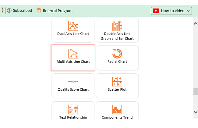
That’s where ChartExpo comes in. It takes your Excel charts from bland to brilliant, with more innovative formatting options. Your data speaks louder and clearly.

Let’s see how chart formatting in Excel works and why ChartExpo is a game-changer.

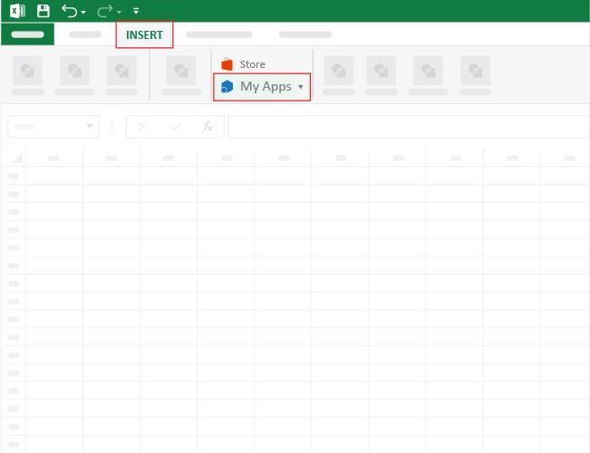
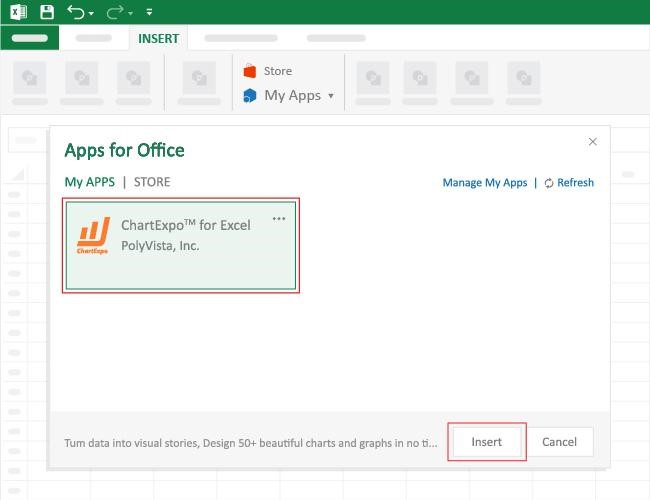
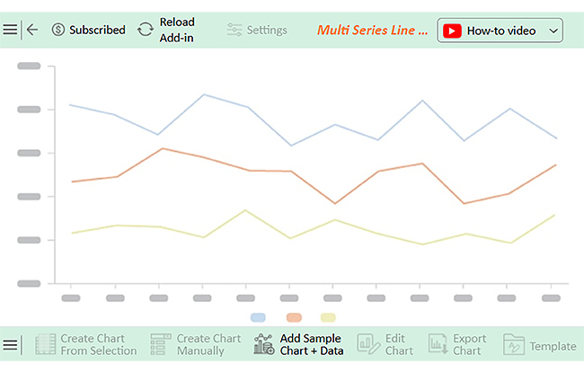
How to Install ChartExpo in Excel?

  1. Open your Excel application.
  2. Open the worksheet and click the “Insert” menu.
  3. You’ll see the “My Apps” option.
  4. In the Office Add-ins window, click “Store” and search for ChartExpo on the My Apps Store.
  5. Click the “Add” button to install ChartExpo in your Excel.

ChartExpo charts are available both in Google Sheets and Microsoft Excel. Please use the following CTAs to install the tool of your choice and create beautiful visualizations with a few clicks in your favorite tool.

Example

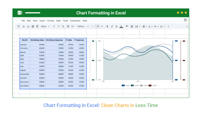
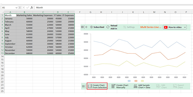
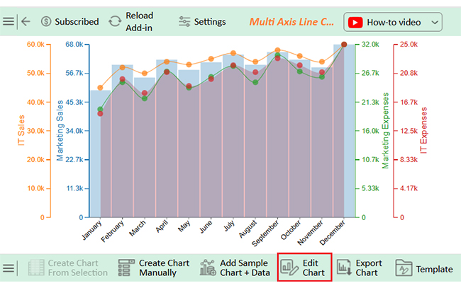
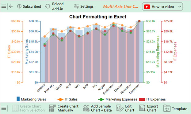
Let’s use this sample data to learn how to select data for a chart in Excel and analyze it using ChartExpo.

Month Marketing Sales Marketing Expenses IT Sales IT Expenses
January 50000 20000 45000 15000
February 60000 25000 52000 20000
March 55000 22000 50000 18000
April 62000 27000 54000 21000
May 58000 24000 53000 19000
June 61000 26000 55000 20000
July 64000 28000 57000 22000
August 60000 25000 54000 21000
September 65000 30000 58000 23000
October 62000 27000 56000 22000
November 59000 26000 54000 21000
December 68000 32000 60000 25000
  • To get started with ChartExpo, install ChartExpo in Excel.
  • Now, click on My Apps from the INSERT menu.
Chart Formatting in Excel
  • Choose ChartExpo from My Apps, then click Insert.
Chart Formatting in Excel
  • Once it loads, scroll through the charts list to locate and choose the “Multi Axis Line Chart”.
Chart Formatting in Excel
  • You will see a Multi-Axis Line Chart on the screen.
Chart Formatting in Excel
  • Click the “Create Chart From Selection” button after selecting the data from the sheet, as shown.
Chart Formatting in Excel
  • ChartExpo will generate the visualization below for you.
Chart Formatting in Excel
  • Click on Settings and change the “Data Representation” as follows.
Chart Formatting in Excel
  • If you want to add anything to the chart, click the Edit Chart button:
Chart Formatting in Excel
  • Click the pencil icon next to the Chart Header to change the title.
  • It will open the properties dialog. Under the Text section, you can add a heading in Line 1 and enable Show.
  • Give the appropriate title of your chart and click the Apply button.
Chart Formatting in Excel
  • You can add the dollar sign to all values:
Chart Formatting in Excel
  • Enable the Legend show button and align it in the center as follows:
Chart Formatting in Excel
  • Change the Legend shape of Marketing Sales into a Column and click the “Apply” button:
Chart Formatting in Excel
  •  Change the Legend shape of IT Sales and Marketing Expenses into Line and Circle, and click the “Apply” button:
Chart Formatting in Excel
  • Click the “Save Changes” button to persist the changes made to the chart.
Chart Formatting in Excel
  • Your final Multi-Axis Line Chart will resemble the one below.
Chart Formatting in Excel

Insights

  • Seasonal trends: Peaks in December for both sales and expenses across departments.
  • Marketing and sales consistently outperform IT, but IT shows stable growth.
  • Higher expenses align with increased sales, indicating resource-driven performance.
  • February and September show notable activity, suggesting periodic business cycles or campaigns.

Best Practices for Chart Formatting in Excel

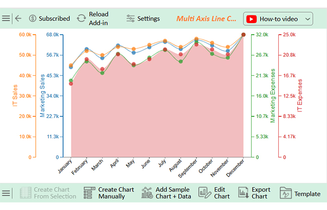
Creating an impactful chart goes beyond plotting data—it’s about presenting it. With the right approach, you can turn a standard chart into a visual powerhouse that grabs attention and drives decisions.

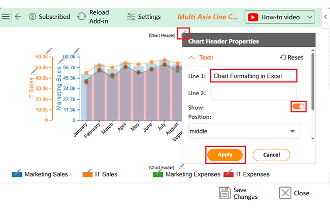
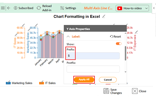
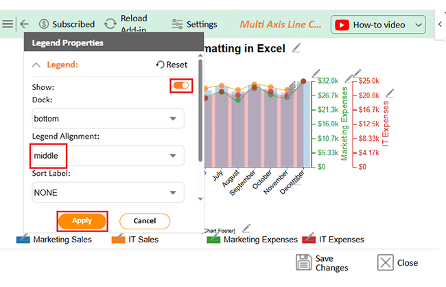
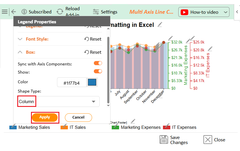
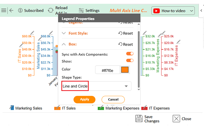
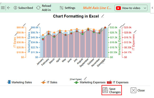
Follow these steps to format your charts effectively in Excel:

  1. Pick the correct chart for the job: Choosing the right chart is crucial. Choose charts based on your message—lines for trends, pies for proportions, and bars for comparisons.
  2. Keep the design simple: Less clutter equals more clarity. Avoid unnecessary elements like 3D effects or gridlines that distract from the message.
  3. Use clear titles and labels: A well-labeled chart is easy to understand. Use clear titles and precise axis labels to help viewers understand your chart at a glance.
  4. Be smart with color: Colors should help, not hinder. Stick to a color scheme that complements your data and enhances readability, maintaining consistency throughout your charts.
  5. Make essential data stand out: Adjust font size, color, or style to highlight key points. If you’re showing trends or anomalies, add a data label to the Excel chart for extra emphasis.
  6. Stay consistent with style: Ensure your charts align with the overall design of your report or presentation. Consistency in colors, fonts, and layout gives a professional look.

FAQs

How do you format a chart in Excel?

  • Click on the chart.
  • Use the “Chart Tools” menu.
  • Format titles, labels, and colors.
  • Adjust chart elements in Excel.
  • Use the Format pane for detailed changes.
  • Apply automatic formatting in Excel for quick edits.

How do I format a chart scale in Excel?

  • Click on the axis you want to change.
  • Right-click and choose “Format Axis”.
  • Set minimum and maximum bounds.
  • Adjust the major and minor units.
  • Use consistent intervals.
  • Keep scales accurate for readability.

How do you format all series in an Excel chart?

  • Click one data series.
  • Right-click and choose “Format Data Series”.
  • In the pane, apply style changes.
  • Repeat for other series.
  • To format them all at once, group them.
  • Use templates for consistency.

Wrap Up

Chart formatting in Excel turns raw data into something meaningful. It’s not just for looks; it makes your message clearer and helps people understand faster.

Knowing how to move columns in Excel gives you more control. Rearranging data can shift focus. It’s a simple way to improve the story your chart tells.

Choosing the right range matters. That’s why you must know how to select data for a chart in Excel. Clean selection creates clean visuals. It’s the first step to smart formatting.

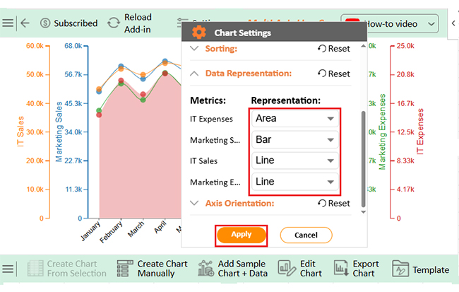
Keep your charts updated – don’t show old data. Start by learning how to edit a chart in Excel to make fast changes. Fresh charts build trust. Use easy-to-read labels and titles. Stick with a simple color scheme. Avoid unnecessary clutter – Let your data speak clearly and confidently.

Excel offers helpful tools, such as automatic formatting in Excel, to speed up design. Need more than what Excel offers? Install ChartExpo for Excel to unlock a range of advanced, easy-to-use chart types.

How much did you enjoy this article?

ExcelAd1
Start Free Trial!
152041

Related articles

next previous
Microsoft Excel10 min read

Travel Itinerary Template in Excel with Smart Insights

An Excel travel itinerary template organizes trip plans and expenses. This blog shows how to build, analyze, and enhance it with smart Excel features.

Microsoft Excel10 min read

How to Convert Excel Data to Graph?

Discover how Excel Data to Graph can convert your spreadsheets into clear, engaging charts, making data analysis and trend tracking simple.

Microsoft Excel11 min read

Habit Tracking in Excel: Visualize Your Wins and Misses

Discover what habit tracking in Excel is and how it helps you track goals and habits. You’ll receive tips, examples, and tools to build a simple, effective tracker.

Microsoft Excel10 min read

Business Budget Template in Excel: Simplified

A business budget template in Excel tracks income and expenses. Click here to learn how to create and optimize your template for better financial control.

Microsoft Excel12 min read

How to Make a Stacked Bar Chart in Excel With Multiple Data?

Click to learn how to create a Stacked Bar Chart in Excel With Multiple Data. You’ll learn how to get started with a Stacked Bar Graph in your data stories.

ChartExpo logo

Turn Data into Visual
Stories

CHARTEXPO

  • Home
  • Gallery
  • Videos
  • Services
  • Pricing
  • Contact us
  • FAQs
  • Privacy policy
  • Terms of Service
  • Sitemap

TOOLS

  • ChartExpo for Google Sheets
  • ChartExpo for Microsoft Excel
  • Power BI Custom Visuals by ChartExpo
  • Word Cloud

CATEGORIES

  • Bar Charts
  • Circle Graphs
  • Column Charts
  • Combo Charts
  • Comparison Charts
  • Line Graphs
  • PPC Charts
  • Sentiment Analysis Charts
  • Survey Charts

TOP CHARTS

  • Sankey Diagram
  • Likert Scale Chart
  • Comparison Bar Chart
  • Pareto Chart
  • Funnel Chart
  • Gauge Chart
  • Radar Chart
  • Radial Bar Chart
  • Sunburst Chart
  • see more
  • Scatter Plot Chart
  • CSAT Survey Bar Chart
  • CSAT Survey Chart
  • Dot Plot Chart
  • Double Bar Graph
  • Matrix Chart
  • Multi Axis Line Chart
  • Overlapping Bar Chart
  • Control Chart
  • Slope Chart
  • Clustered Bar Chart
  • Clustered Column Chart
  • Box and Whisker Plot
  • Tornado Chart
  • Waterfall Chart
  • Word Cloud
  • see less

RESOURCES

  • Blog
  • Resources
  • YouTube
SIGN UP FOR UPDATES

We wouldn't dream of spamming you or selling your info.

© 2025 ChartExpo, all rights reserved.