Categories
What is a market capitalization chart, and why does it matter? Understanding these charts can shift your view of the stock market as an investor or an entrepreneur.
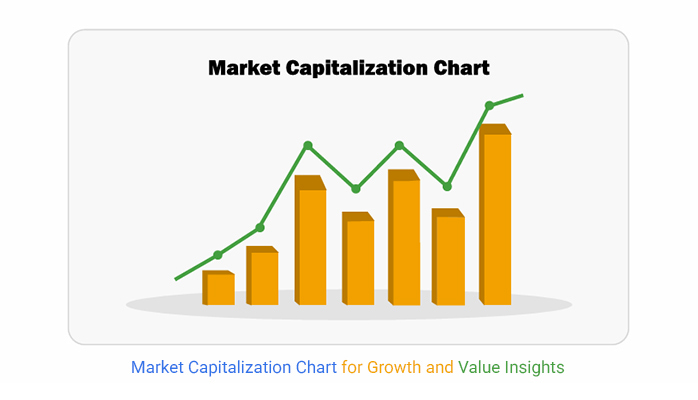


Market capitalization is the total value of a company’s shares. A market capitalization chart visually represents this data, showing how companies stack up in size. These charts help investors compare businesses, much like an exponential growth chart highlights rapid expansion.
The market capitalization chart highlights company rankings and uncovers trends. If the largest firms keep growing, it signals investor confidence. A shrinking market cap across industries could signal an economic slowdown. Trend chart examples in market analysis provide similar insights.
A market capitalization chart simplifies investing for beginners. Instead of scanning endless financial reports, one glance shows which companies dominate and which are emerging. Even experienced investors use them to spot patterns, like the year-over-year growth chart, which tracks performance.
Every stock tells a story. These charts bring those stories to life. Understanding them is one step toward making smarter financial choices.
Let’s dive in.
Definition: Market capitalization charts show the total value of a company’s outstanding shares. They help investors compare company sizes. How? Higher market cap firms are often more stable, while smaller ones may offer higher growth. These charts guide investment decisions in stocks and portfolios.
Market cap is calculated by multiplying the share price by the total shares outstanding. Charts display these trends over time. The makers of these charts ensure accurate data visualization for better insights. Combined with a month-to-month comparison Excel chart, these charts effectively track changes for deeper analysis.
Market capitalization charts tell a story about companies, industries, and the economy. Investors, analysts, and businesses rely on them to make informed choices. Here’s why these charts matter:
A market cap crypto chart isn’t just for seasoned investors. It’s a powerful tool for anyone looking to understand the cryptocurrency landscape. Many traders and regulators rely on these charts to make informed decisions. Here’s who benefits the most:
Spreadsheets are great—until they aren’t. Have you ever tried making sense of complex financial data in Excel? Charts turn into a mess, and insights get buried in cluttered tables.
This is where data visualization comes in. A market capitalization chart transforms raw numbers into explicit, visual stories. But Excel’s basic charts don’t always cut it.
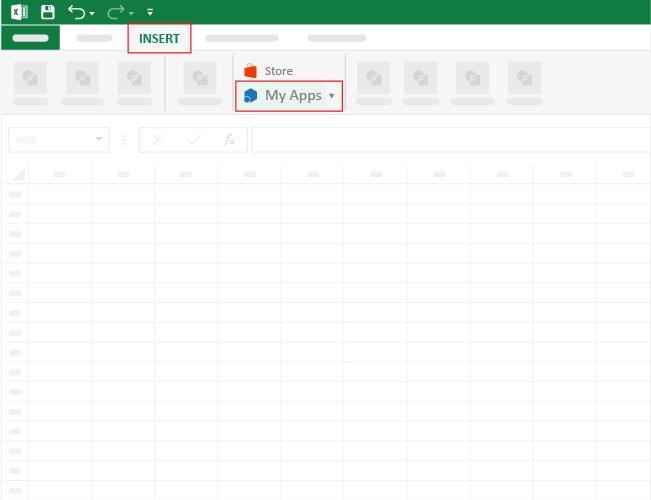
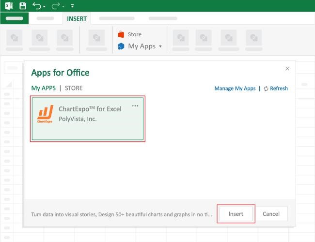
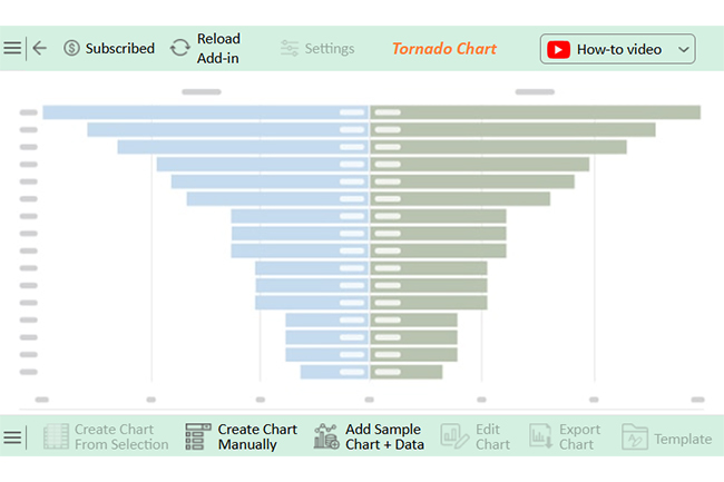
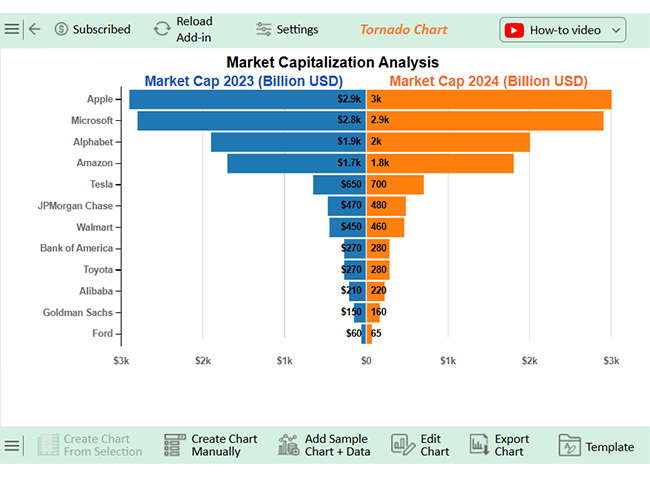
That’s where ChartExpo, a powerful chart add-in for Excel, comes in. It simplifies data visualization, making complex market trends easy to understand. If Excel leaves you frustrated, it’s time for a better solution – Install ChartExpo for Excel.
How to Install ChartExpo in Excel?
ChartExpo charts are available both in Google Sheets and Microsoft Excel. Please use the following CTAs to install the tool of your choice and create beautiful visualizations with a few clicks in your favorite tool.
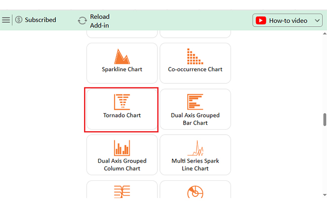
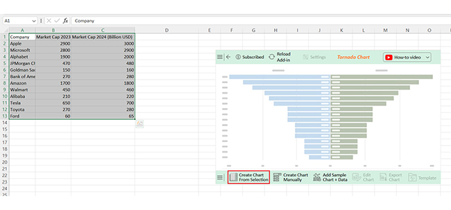
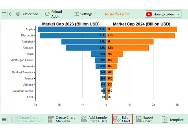
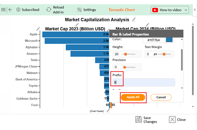
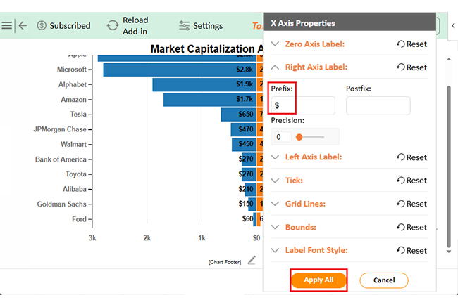
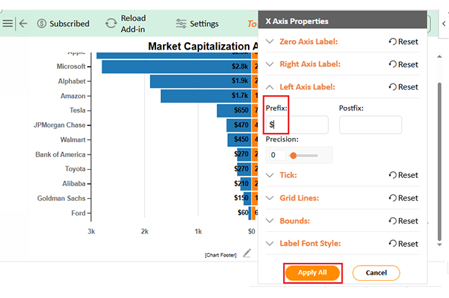
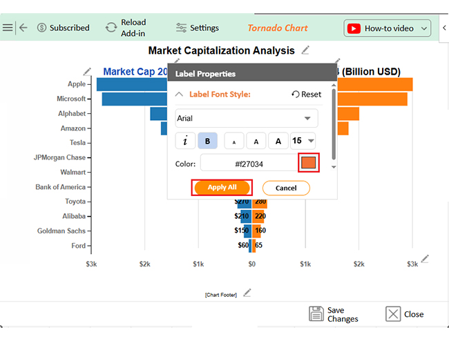
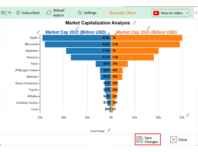
Let’s learn how to create a bar chart and analyze this sample data in Excel using ChartExpo:
| Company | Market Cap 2023 (Billion USD) | Market Cap 2024 (Billion USD) |
| Apple | 2900 | 3000 |
| Microsoft | 2800 | 2900 |
| Alphabet | 1900 | 2000 |
| JPMorgan Chase | 470 | 480 |
| Goldman Sachs | 150 | 160 |
| Bank of America | 270 | 280 |
| Amazon | 1700 | 1800 |
| Walmart | 450 | 460 |
| Alibaba | 210 | 220 |
| Tesla | 650 | 700 |
| Toyota | 270 | 280 |
| Ford | 60 | 65 |


A historical market cap chart is like a time machine for investors. It shows how companies, industries, or assets have grown or declined. Looking at past data helps spot patterns, avoid mistakes, and make more brilliant financial moves.
Here’s how to use it effectively:
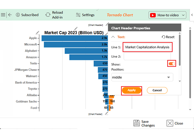
A market capitalization chart is more than a list of numbers. It’s a tool that reveals trends, risks, and opportunities. To create accurate visual insights, a chart maker can help simplify complex data. But to use it effectively, you need to dig deeper. Here are key tips to get the most out of it.


The market cap of a graph depends on the total value it represents. A market capitalization chart reflects the combined worth of companies or assets. This value changes based on stock prices, crypto values, or other financial metrics.
You can find a market capitalization chart on financial websites, stock exchanges, and investment platforms. Sites like Yahoo Finance, CoinMarketCap, and Bloomberg provide real-time data. Many trading apps and research tools also offer interactive market cap charts for analysis.
A market capitalization chart is more than numbers. It shows the value of companies or cryptocurrencies. Investors use it to compare, analyze, and predict market trends.
Market cap helps classify assets into large, mid, or small categories. Each category carries different risks and rewards. A clustered stacked bar chart can visually compare these categories for better analysis.
Trends become clear when tracking market cap over time. Growth signals investor confidence, while declines may warn of risks. A single snapshot isn’t enough—you need the whole picture.
Market cap alone doesn’t tell the whole story. Other factors like revenue, debt, and industry trends matter, too. Understanding the various types of charts and graphs can help you find more profound insights.
For crypto investors, market cap charts help spot potential and also risks. Crypto chart analysis is essential to detect misleading spikes and market manipulation. Always check volume and liquidity before making decisions.
Using a market capitalization chart correctly leads to better financial choices. Whether investing in stocks or crypto, understanding market cap is essential. Data-driven decisions always win. To enhance your analysis, install ChartExpo for clearer, more insightful visualizations.
How much did you enjoy this article?


Calculate accounts receivable turnover ratio to measure credit collection speed, improve cash flow, and strengthen your financial strategy. Read on!

Change Management KPIs are the key to tracking adoption, performance, and ROI during transitions. Find out which metrics matter. Read on!

Data collection methods and techniques determine the quality of every insight you act on. Explore key approaches for gathering reliable data. Read on!


