Categories
By ChartExpo Content Team
Pie charts are everywhere. In dashboards, decks, and reports, they show up like clockwork. Their circular shape is familiar. Their message feels simple. That’s the trick.
Pie charts look clear. But they often hide what matters. They suggest precision but rarely deliver it. A tiny slice might hold the most important number, yet it’s lost between colors and labels that blend together.


People keep using pie charts because they’re easy to make. But easy doesn’t mean right. A pie chart might seem helpful until the wrong decision gets made. Knowing when not to use one is as important as knowing how.
Pie charts do one thing well: they give a fast sense of part-to-whole. That’s it. Ask more from them, and you’re asking for trouble. Understanding their limits helps you choose smarter tools for the job.
Pie charts don’t need to disappear. They need better judgment. That starts with knowing what they really show—and what they don’t. Keep reading. You’ll see what works, what fails, and how to fix it.
Imagine a big, round pizza. This pizza has slices of different sizes, showing how much of each topping covers the pie. That’s the basic idea. This circle tries to show how parts make up a whole. Each slice represents a part of the data, and the whole circle is the sum of these parts. It’s colorful and straightforward, like a pizza party where everyone gets a slice.
But here’s the catch—while it looks simple, understanding the exact size of each slice isn’t always easy. Each slice’s angle and size can be tricky to compare. Just like when you argue about who got the biggest slice of pizza! It’s not always clear, and sometimes it can be misleading. Yet, its visual appeal keeps it popular, sticking around even when it’s not the best choice for clarity.
Now, think of this circle as a tool that often tries to make us see three numbers as a complete picture. It’s a bit like a magician’s trick, drawing your eyes to the colors and shapes. It’s perfect for making a simple dataset look like a grand display. People use it to show distribution, but it’s not always effective in providing a detailed picture.
Despite its limitations, it remains a go-to tool for many because it’s easy to create and visually appealing. It’s like having a flashy gadget that doesn’t always do the job well but looks impressive on your desk. It simplifies data into digestible pieces, but sometimes, it doesn’t show the whole story. Some love it for its simplicity, while others find it lacking in depth.
So why does this circle show up everywhere? Well, it’s incredibly easy to put together. You can whip one up in minutes with basic tools. That’s one big reason it’s popular. It’s like using a shortcut that looks nice but doesn’t always take you where you want to go. Despite its flaws, people keep using it because it’s quick and doesn’t require much effort.
However, reading it can be a challenge. It’s like trying to read a map with no compass. The shapes can be confusing, and the lack of precision can lead to misunderstandings. Yet, its charm lies in its simplicity and ability to attract the eye. This is why it’s survived for so long, making it a staple in reports and presentations. It’s a survivor, sticking around because it’s easy to make, even if it’s not always the best choice.
Picture this: A room full of people, eyes glued to a colorful circle. It’s supposed to explain data. But all it does is make them think of lunch. People love food. And circles remind them of pies and pizzas. Instead of getting smarter, they get hungry.
The slices can be misleading. They seem to promise clarity but fail to deliver. If slices look almost the same, it’s hard to tell which is bigger. It’s like trying to pick the better slice of cake when both look delicious. You’re left guessing, not knowing.
Imagine staring at a work of art. It’s pretty, colorful, and neatly arranged. But does it tell you anything? That’s what happens when this form gets too fancy. It turns simple data into a mystery. You’re left wondering what it’s supposed to say.
Instead of solving problems, it creates them. It’s like a riddle without an answer. You spend more time figuring it out than understanding the data. Not all that glitters is gold, and not all circles speak the truth.
The circle can seem simple. But that simplicity can be a trick. It makes you think you’re looking at something easy to understand. In reality, it’s not always the case. It’s like a book with a pretty cover but a confusing story.
The circle can hide important details. It can make differences look smaller or bigger than they are. It’s like looking at a landscape through a keyhole. You see part of the view, but not the whole picture. Real understanding needs a wider lens.
Ever played the game where you whisper a message around a circle? By the end, it’s often hilariously wrong. The same happens when we assume everyone “gets it” without checking. People nod along, but their understanding might differ vastly. This can lead to decisions based on misinterpretations.
Asking someone to explain what they understood can reveal gaps. Have you ever thought you grasped something, only to fumble when explaining it? This shows that our perceptions of clarity can be deceiving. Encouraging questions and discussions can help ensure that everyone truly comprehends the message.
Remember playing Trivial Pursuit and feeling lost amid random facts? Data presentations can feel the same. They often bombard us with information that seems random or out of place. This is especially true when trying to compare different data sets.
The challenge is that we often attempt to fit too much into a small space. Imagine trying to fit your entire grocery list on a sticky note. Important items can get lost or misrepresented. Providing clear, focused information allows for better understanding. It prevents the confusion that comes from trying to do too much at once.
Imagine using a broken compass to find your way. It might point somewhere, but it won’t lead you correctly. This happens when we try to make complex comparisons using simple visuals. They might give a direction, but not the right one.
When comparing multiple data points, clarity is key. Simplifying too much can skew perceptions. It’s like trying to compare apples and oranges with a single description. Each has unique characteristics that need to be highlighted. Providing a more detailed breakdown ensures accurate understanding and better decision-making.
Too many slices can confuse more than help. Each slice represents a piece of information, but packing too many into one chart is like cramming a suitcase. It overwhelms the viewer and hides important details. When every slice fights for attention, none of them win.
Imagine standing at a busy intersection without traffic lights. That’s how a cluttered chart feels. It’s hard to see which way to go. Fewer slices help guide the viewer’s eye. It allows them to understand the story behind the data. Think of it as giving your data room to breathe.
Tiny labels are a common mistake. They turn your chart into a puzzle. If viewers squint or lean in to read, the message gets lost. It’s like whispering in a noisy room—no one hears you. Labels should be clear and easy to read, just like a friendly chat.
Imagine you’re at a party, and everyone’s speaking in hushed tones. Frustrating, right? That’s how your audience feels with tiny labels. Use larger fonts to make your message clear. It’s like turning up the volume so everyone can join the conversation.
Not all data fits into a circular chart. Using them everywhere dilutes their impact. Think of it as wearing the same outfit to every occasion. It loses its charm. Choose the right chart for the right data to keep things fresh.
Imagine trying to fit a square peg in a round hole. That’s what happens when you force data into a circular format. It doesn’t work and frustrates the viewer. Instead, use formats that best fit the data’s story. It makes your dashboards look sharp and professional.
Ever been to a buffet with too many choices? It’s overwhelming. The same thing happens with charts. Keep it simple. Stick to three slices or fewer. This way, each slice has its moment to shine.
Too many slices, and you’re lost in a sea of colors. The message gets muddled. By limiting the number of slices, you keep things clear and focused. It’s like picking three favorite dishes instead of trying everything.
Colors aren’t just for decoration. They carry weight and meaning. Think of them as signals. They guide the viewer’s eye to what’s important. Choose colors that make sense for the data, not just because they’re pretty.
Imagine traffic lights. Red means stop, green means go. Simple, right? Use the same principle with data. Assign colors with intent. This way, viewers can quickly grasp the information without second-guessing.
Labels are the unsung heroes of data visuals. They tell you what you’re seeing without making you guess. Clear labels mean clear understanding. They’re like signs on a road, guiding you in the right direction.
Skip the jargon. Use plain language to describe what each part represents. This way, viewers aren’t left scratching their heads. Make them feel confident in what they’re seeing. It’s all about clarity and precision.
Bar charts are the champions when it comes to comparing data. Imagine a row of colorful blocks standing tall, each one representing a different number. This makes it easy to see which is bigger or smaller at a glance. No more squinting at slices and wondering if that sliver is really larger than the next. Bar charts take out the guesswork and put the facts in front of you.
But the magic doesn’t stop there. Bar charts also let you stack information on top of each other. This means you can show more than one type of data in a single chart. It’s like stacking Lego blocks—each layer tells a part of the story. With this, you can quickly spot trends and patterns without getting lost in a sea of colors.
Donut charts are the cousin of the classic circle chart, offering a little twist. They keep the round shape but add a hole in the middle, giving space for more details. This makes it easier to focus on the data around the edges. It’s like having a picture frame that highlights the important parts.
These charts work best when you want to show parts of a whole but avoid overwhelming the viewer. The open center can hold extra information, like a total number or a key insight. This helps the viewer understand the chart without feeling lost. Donut charts offer a fresh take on circles, making them both informative and eye-catching.
Small multiples are like having a gallery of tiny charts. Each one tells a part of the bigger story. They let you see different data sets side by side, making it easy to spot differences and similarities. It’s like flipping through a comic strip where each frame adds to the overall tale.
These chart collections shine when you have lots of data to show. Instead of cramming everything into one space, you spread it out. Viewers can then focus on each piece without feeling overwhelmed. Small multiples help you keep things clear and organized, turning data chaos into a neat display.
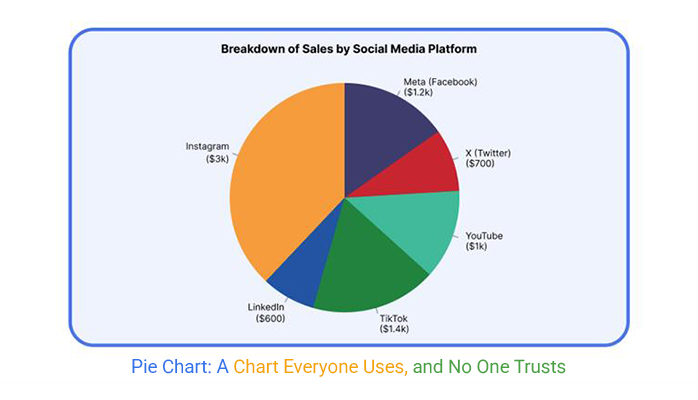
Ever seen a pizza that left you hungry for answers? That’s what happened when a finance team presented a budget chart that looked more like a pizza gone wrong. The chart had too many slices, each one a different color, making it hard to see what mattered most.
People around the table squinted, tilted their heads, and tried to make sense of it. It was a classic case of too much information and not enough clarity.
Instead of driving the point home, this colorful mess left everyone puzzled. The budget numbers got lost in the chaos, and the meeting went off track. The team realized they needed a better way to show the budget story. Less clutter, more focus. It was a lesson learned the hard way: simplicity can save the day.
Sometimes, less really is more. Imagine a sales pitch where the presenter used just one simple graph. No bells and whistles, just clean and clear. It showed market share with only a few slices. The message was easy to grasp at a glance. This simplicity turned a skeptical client into a happy partner.
The focus was on the big picture, not the tiny details. The presenter spoke confidently, pointing out the key segments. The audience nodded along, and questions were few because the answers were already there. This minimalist approach wasn’t just about style; it was all about clarity. By removing distractions, the team made sure their message was loud and clear.
We’ve all been there. You pour effort into a chart, and then someone looks at it and says, “Looks fun… what am I looking at?” It’s feedback you wish you didn’t hear, yet it’s crucial. This happens when a chart is more like a circus than a tool. It’s a sign that something went wrong in the design.
When a chart gets this kind of feedback, it’s time to rethink the approach. The goal is to inform, not confuse. You need to make sure the audience sees what you want them to see. Strip away the extras and focus on the essentials. This way, the next time someone sees your work, they’ll say, “Now I get it!” instead of scratching their head.
Sometimes, one part stands out, demanding more attention. Here’s where exploding a slice comes into play. Pulling out a piece can highlight its importance. Think of it like putting a spotlight on a star performer in a play. But beware, too much drama can overshadow the rest of the cast.
Balance is key. Ensure the rest of the chart remains stable. This way, the focus remains on the highlighted slice without confusion. It’s like a well-rehearsed dance, where every move complements the next. The aim is to guide the viewer’s eye without overwhelming them.
Adding motion can be a neat trick to draw eyes. But it’s a double-edged sword. Too much can make the viewer dizzy. The secret is in subtlety. Use gentle transitions to shift focus from one part to another. This creates a narrative, guiding the viewer through the story step by step.
Think of it like flipping through a photo album. Each page tells a part of the story, and the flow should feel natural. This engagement keeps the viewer interested without causing them to lose track. It’s all about keeping the experience smooth and engaging.
Showing change over time can be tricky. Using sequential views helps. Imagine flipping through a comic book, where each frame progresses the story. Each view should connect to the next, painting a picture of how things evolve. This approach keeps the viewer grounded.
To keep it clear, stick to a consistent layout. This consistency helps the viewer follow the progression without getting lost. It’s like following a trail of breadcrumbs, each one leading to a fuller understanding of the whole picture.
Templates can be a lifesaver. They save time and provide structure. But relying on them blindly can lead to problems. Just because something is in a template doesn’t mean it’s the best choice. Templates can become outdated. They might not suit the current needs. It’s important to think critically about each element.
Imagine a toolbox. You wouldn’t use a hammer for every job. The same goes for templates. Consider the data you’re presenting. Ask if it truly fits the template’s format. Maybe a different approach would tell the story better. Don’t be afraid to challenge the status quo.
CEOs have a lot on their plate. They make quick decisions. When they say they like something, it might be a habit. Or it might be familiarity. But liking doesn’t mean they get the full picture. It’s up to you to make sure the information is clear.
Think of when you see a movie. You might like it for the action. But that doesn’t mean you understood the plot. It’s the same with data. Make sure the message is reaching the CEO. Explain the insights clearly. Don’t leave them guessing.
If people always expect the same thing, it’s time to mix it up. Routine can lead to boredom. If the audience expects pie, they might not be paying attention. They see it and tune out. Surprise them with something different.
Imagine eating the same meal every day. You’d start to crave variety. The brain works the same way with information. Offer new perspectives. Use different tools to tell the story. Keep your audience engaged by keeping them on their toes.


Think of default charts like those comfy old sneakers. They’re easy to slip on, but not always the best for the occasion. In the world of data, default charts often lead to confusion or misinterpretation.
So, what’s the plan? Ban them! But not forever. Only until they prove their worth. This isn’t an act of rebellion; it’s about encouraging thoughtful choices. When teams have to justify their visual selections, they tend to make better decisions.
This approach isn’t about being a chart dictator. It’s about fostering a culture of conscious choice. It’s like teaching someone to cook without relying on instant noodles. Sure, it requires more effort, but the results are so much tastier!
Encourage teams to explore alternatives and find the best fit for their data. Over time, this practice becomes second nature, leading to more effective communication and fewer misunderstandings. In many cases, this also means moving beyond default visuals and considering better options as an alternative of Pie chart, especially when clarity, comparison, and interpretation matter more than simple proportion display.
Everyone loves a good makeover story, right? “Fix This Chart” Fridays turn blunders into muscle-building sessions for teams. It’s like a workout for the brain! Every week, gather the team and choose a chart that didn’t quite hit the mark.
Then, have a fun, collaborative session to improve it. This isn’t about pointing fingers; it’s about learning together. It’s a safe space to make mistakes and grow from them.
Why Fridays, you ask? Well, what better way to end the week than by flexing those analytical muscles? This practice not only improves skills but also boosts team morale. It’s like a mini-celebration of progress.
Team members leave the session feeling accomplished and ready to tackle the next challenge. Plus, it’s a great way to strengthen bonds and build a culture of continuous improvement.
Ah, the pizza slice diagram. It’s as tempting as a real slice of pizza, but use it wisely! These guidelines help teams know when it’s appropriate to indulge. First, ensure the data is simple and can be divided into clear, distinct parts.
Think of it as a pizza with well-defined toppings. If the ingredients blend, it’s not the right choice.
Also, consider the audience. Will they easily digest this visual? If there’s any doubt, it might be time to rethink the approach. But when it fits, go ahead and enjoy that slice! It’s all about making sure the visual adds value and clarity. When teams follow these guidelines, they can use the pizza slice diagram without a hint of guilt.
Picture a jumbled mess of colors and lines. That’s what you get when a chart tries too hard. It starts with the best intentions, showing slices of information. But soon it spirals into chaos. Each slice fights for attention. The colors clash. The labels overlap. It’s like a circus with no ringmaster.
With so much going on, the message gets lost. You squint, trying to make sense of it all. But your brain waves a white flag. The chart becomes a guessing game. You wonder why it feels like a puzzle missing pieces. It was supposed to inform, but now it confuses. This wheel of chaos spins out of control, leaving you dizzy and frustrated.
Now, imagine a donut. Not the kind you eat, but one that serves a greater good. The clutter is gone. The slices are tidy. Each one tells a clear story. The middle is open, providing space for extra details. This donut knows its purpose. It speaks with clarity.
You see the difference right away. The colors complement each other. The labels are easy to read. It doesn’t just show data; it communicates. The message is strong and direct. You get the point without breaking a sweat. This focused donut delivers what you need to know, without the headache.
Imagine stepping into a story. That’s what this diagram offers. It doesn’t just sit there. It invites you to explore. You hover over a slice, and it comes to life. Numbers and facts appear, telling a tale. Each section has a voice, adding depth to the data.
This is more than a chart. It’s a journey. It guides you through the information, one highlight at a time. You feel engaged, not overwhelmed. The data dances before your eyes, weaving a narrative. It’s like reading a book where each page reveals a new twist. This interactive experience transforms data into a compelling story.
Before setting sail on any charting adventure, pinpoint your main idea. Imagine you’re a storyteller—what’s the tale you’re eager to share? If your message is as clear as mud, step back. When you have a single, strong point, your chart becomes a lighthouse guiding the viewer’s understanding. It’s like crafting a headline for a news article; the clearer the headline, the more readers will finish the story.
Think of it as creating a masterpiece with colors. Each slice should add to the whole picture, not blur it. If you’re trying to express too many ideas, it’s like mixing too many colors—everything turns brown. Your chart should tell its own story without leaving the audience guessing. The clearer your one point, the more effective your message.
Now, ask yourself: Is your goal to show how parts make up a whole or to compare different sets of data? If you’re talking about how things fit together, you’re on the right track. When you want to compare, consider other options. A composition is about synergy, where each part adds up to a meaningful whole.
However, if your purpose leans toward comparison, a different path might suit you better. Imagine you’re at a bake-off judging pies. You wouldn’t want to compare an apple to a cherry based on crust alone. Choose the best tool for each situation. If you’re more interested in direct comparisons, bars or lines might suit you better.
When you question the best way to present your data, think of it as choosing the right tool for a job. Bars, boxes, and bullets each have strengths. Bars are for direct comparisons, like lining up contestants in a race. They show differences clearly and make your point stand out.
Boxes, on the other hand, can neatly package related information. They act like gift boxes, keeping everything tidy and contained. Bullets are great for straightforwardly listing key points. They’re like using a highlighter to draw attention to the essentials. Analyze your data and decide which method makes your information shine brightest.
Imagine walking past a sign. Do you get the message without stopping? That’s the power of the eye test. It’s about instant understanding. A good visual should scream its message even if you’re in a rush.
The faster someone grasps the data, the better. Think of it as a speed check for visuals. If you have to squint or pause, it’s not working. The goal is clarity at a glance.
Memory is a tricky thing. Five minutes might seem short, but it tests true retention. If someone can recall the key point later, the visual did its job. It’s like remembering a catchy song chorus—effortless.
This test measures impact. Did the message stick, or did it vanish like smoke? Successful visuals leave a lasting imprint. If it fades, it failed the memory game.
Think of A/B testing as a taste test for visuals. You compare two versions to see which one wins. It’s about finding what clicks with viewers.
You might swap colors, shapes, or even styles. The idea is to test small changes. It’s like tweaking a recipe to get it just right. You learn what works best by seeing what folks prefer.
Every great chart begins with a clear objective. Imagine setting out on a road trip without a destination. Chaos, right? Before choosing that eye-catching chart, focus on what you’re trying to say. Is it a story of growth over time? Maybe it’s a snapshot of market share. The goal should guide the choice, not the other way around.
When you start with the end in mind, the path becomes clearer. Suppose you want to show a trend. A line might be your best friend here. If you’re looking to compare parts of a whole, maybe something else fits better. Always keep the message at the forefront. This approach saves time and ensures your audience gets the message loud and clear.
Tradition can be comforting. But sometimes, it leads to confusion. Many people default to familiar charts, thinking they’re the safest bet. However, the clearest choice isn’t always the most common. Consider your audience. What will they understand best?
Clarity is king. Imagine explaining a complex idea with a simple story. Your aim should be the same with charts. Don’t rely on what others do. Instead, focus on what will make the information shine. This choice will make your data not just seen, but understood.
While doughnuts are tasty, they’re not always the most nutritious choice. The same goes for certain charts. They might look appealing, but they can be misleading. The slices can confuse more than clarify when the data is complex.
Consider alternatives that pack a punch with more precision. Maybe a bar or line could serve the purpose better. By reserving certain charts for specific scenarios, you maintain clarity and avoid misinterpretation. This thoughtful approach ensures your data speaks volumes without saying a word too many.
I hope this meets your requirements and retains the engaging, informative style you’re looking for. Let me know if there’s anything else you need!


Pie charts are simple to make and easy to recognize. That’s why they show up in reports, decks, and dashboards again and again.
But familiarity doesn’t mean effectiveness. Pie charts often fail at showing detail, clarity, or change. They flatten differences and confuse comparisons.
They work best for showing parts of a whole—if the parts are few, distinct, and labeled well. Anything more, and you risk losing the point.
You’ve seen the traps: too many slices, unclear labels, messy colors, poor scale. You’ve also seen better options: bars, bullets, donuts, and stories with context.
If your goal is clarity, pie charts won’t always help. Ask what you want to say. Then pick the chart that says it best.
Bad charts blur thinking. Good ones guide it. Choose the chart that helps people see what matters.
How much did you enjoy this article?


Calculate accounts receivable turnover ratio to measure credit collection speed, improve cash flow, and strengthen your financial strategy. Read on!

Change Management KPIs are the key to tracking adoption, performance, and ROI during transitions. Find out which metrics matter. Read on!

Data collection methods and techniques determine the quality of every insight you act on. Explore key approaches for gathering reliable data. Read on!


