Categories
By ChartExpo Content Team
Think a triangle makes your message clearer? Think again.
Pyramid charts look clean. They feel intuitive. But they often trick the eye and mislead the mind. A wider base doesn’t mean something matters more. A tall peak doesn’t make it important. Pyramid charts can misrepresent data without anyone noticing.


Many teams use pyramid charts to show hierarchy or process. That shape can mislead. Stakeholders glance at the top and assume that’s where the focus should be. But the real message might be buried in the layers below.
Pyramid charts can fail fast. Projects flop, strategies get misunderstood, and decisions suffer. And yet, people keep using them. Why? Because they look tidy. Because they’re easy to build. Because they feel familiar.
If you’ve ever built a pyramid chart or stared at one in a boardroom, it’s time to ask better questions. Are you showing the right message? Or are you sending signals you didn’t mean to? This guide will help you think twice before stacking another triangle.
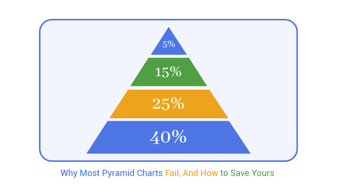
A pyramid chart shows data in layers. Each layer sits on the one below it. The shape gets smaller as you move up. This makes it easy to compare parts of a whole.
The widest part at the base shows the biggest group. The smallest layer at the top shows the smallest. The shape helps people see size differences fast.
This chart works well when showing steps, ranks, or levels. For example, a sales funnel or food chain fits nicely into this shape. The pyramid chart makes it easy to read and understand.
They’re also called triangle charts or hierarchical charts. The shape helps organize data from largest to smallest or from broad to narrow. That gives the viewer a clear view of what’s being measured.
Triangles are sneaky. They promise clarity by stacking information neatly. But this shape misleads more than it guides. The triangle’s tapering top suggests importance, making us think the peak holds the most weight.
But here’s the catch: this visual cue doesn’t always match reality. Triangles push our eyes upward. This trick can skew our understanding, making us focus on the tip when the base might be more important. It’s like a magician distracting you with one hand while the real trick is happening elsewhere.
A wider base looks hefty. We think it means more value or importance. But a big base can be an illusion. It doesn’t always reflect more significance. This part of the triangle might contain less crucial details. Our brains get fooled, linking size with value.
Visual weight plays tricks on us. Just because a section is wide, doesn’t mean it’s vital. It’s like a big, flashy box that’s really just full of packing peanuts. The real treasure could be somewhere else, hidden under layers of fluff.
Pyramid charts suggest a clear hierarchy. They imply a top-down flow of information. However, these structures can distort strategies. The top seems to hold authority, but layers below might hold essential insights. This can mislead stakeholders about priorities.
Imagine a pyramid that looks strong from the outside. Inside, the foundation might be shaky. A top-down approach can gloss over crucial layers, hiding the real story beneath a simple shape. The strategy might be lost in translation, leading to poor decisions.
Pyramid charts have led many astray. In one case, a company used one to show its strategy. The chart looked neat and tidy. But it misrepresented priorities. Stakeholders focused on the shiny top. They missed critical issues buried in the base, leading to a project flop.
Another example involved a marketing team. Their pyramid chart ranked tasks by importance. But the visual hierarchy was misleading. Essential tasks at the base were overlooked. This oversight resulted in missed deadlines and a failed campaign. The shape’s simplicity masked the complexity below, causing confusion and chaos.
These scenarios highlight the pitfalls of relying on triangular visuals for clarity. They show how a seemingly simple shape can mislead even the sharpest minds.
People often fall for shiny things. Pyramid charts look cool, with their sleek lines and tiered layers. But looks can deceive. They sometimes confuse more than they clarify. Their shape draws attention, but what about the numbers? They might not tell the whole story.
This is especially important when working with population pyramid types, where the structure is meant to communicate age and gender distribution clearly. If misused or oversimplified, even this well-known format can lead to misinterpretation.
Imagine trying to fit a square peg into a round hole. Pyramid charts can do the same with data. They squeeze complex information into a simple shape. This can distort the facts. In the race to make data “pretty,” clarity takes a back seat.
HR teams love visual aids. Pyramid charts seem perfect for showing company structure. But they can lead to wrong conclusions. They suggest a hierarchy that might not exist. This can create confusion in communication.
Sales teams also jump on the pyramid bandwagon. They try to show product features or client tiers. But the chart often oversimplifies things. It can miss vital details, leaving teams with a half-baked plan. It’s like trying to bake a cake without the right ingredients.
Funnels and pyramids look alike but serve different purposes. Funnels show a process, narrowing stages to a point. Pyramids stack layers to show levels or categories. Swapping them can muddy the waters. It’s like using a spoon when you need a fork.
Businesses use funnels to track customer journeys. Swapping it for a pyramid can confuse the process. It makes tracking conversions hard. Teams miss the mark, losing sight of key steps. This can lead to missteps and missed opportunities.
Picture this: A startup in Series B funding. They’re eager to impress investors. They use a pyramid chart to show sales growth. Investors glance at the chart and scratch their heads. The chart doesn’t match the narrative.
The pyramid suggested a strong base, but investors saw gaps. They couldn’t connect the dots. Sales weren’t as solid as the chart implied. The pitch fell flat. The startup’s excitement fizzled, all because of a pretty, yet misleading chart.
In some scenarios, the arrangement of layers can speak volumes, far beyond any numbers. Imagine you’re organizing a town fair. You wouldn’t start with the rides and games at the top. Instead, you’d begin with safety and permits.
This order of priorities helps ensure everyone has fun without chaos. Similarly, the pyramid structure in these instances helps keep everything in perspective. Each level supports the one above it, creating a solid foundation for decision-making.
Take Maslow’s hierarchy of needs, for example. This classic model isn’t about counting needs but understanding their order. Starting with basics like food and safety, it moves up to social connections and self-fulfillment.
The emphasis is on the progression. Each tier builds on the last, creating a roadmap for personal growth. Numbers pale in comparison to the clarity this structure provides.
Maslow’s hierarchy stands as a beacon for understanding human needs. It’s not a tally but a journey from basic to complex needs. At its base, we find physiological needs like food and shelter. These are the essentials without which higher aspirations falter.
As we climb, the focus shifts to safety, love, and belonging. Finally, we reach self-actualization, where one fulfills personal potential.
Other idea-first models follow similar paths. They organize thoughts into layers that tell a story. These structures help one visualize concepts in a clear and organized way. By focusing on ideas rather than numbers, they provide insight into processes and priorities.
Whether in business or personal growth, these models guide planning and understanding in a way numbers alone cannot.
Priority pyramids shine when aligning teams internally. Think of them as a roadmap for shared goals. They lay out what’s important, ensuring everyone pulls in the same direction. This isn’t about showing off to outsiders but creating harmony within.
A well-structured pyramid can help dodge misunderstandings and keep everyone on the same page.
These pyramids clarify roles and responsibilities. Each layer represents a group’s priorities, making it clear who does what. It’s like a band playing a symphony, with each section knowing its part. This alignment fosters cooperation and smooth workflow.
The result? Projects run like clockwork, without unnecessary hiccups.
The following video will help you to create a Pyramid Chart in Microsoft Excel.


The following video will help you to create a Pyramid Chart in Google Sheets.
Pyramid charts often start with a grand idea. They aim to show hierarchy or proportion. But the bigger blocks can fool the eye. People tend to think larger blocks mean more importance. This isn’t always true. The size of the block might not match the value it represents. This misleads viewers and creates confusion.
Imagine a pyramid showing company departments. The sales department takes up a huge block. It seems like they run the show. But what if they’re not the biggest revenue generator? The chart misleads, making the company’s real story hard to see. It’s like reading a book where the cover doesn’t match the story inside. Misunderstanding grows, and trust in the data shrinks.
Colors can make or break a pyramid chart. Bright colors grab attention, but too many create chaos. It’s like a circus act with too many clowns. You don’t know where to look! Poor color choices make it hard to focus on what matters. It’s the same with contrast. Too much, and the chart looks messy. Too little, and important details get lost.
Think of a chart with a rainbow of colors. It dazzles the eyes but leaves the brain foggy. The viewer spends more time figuring out the colors than understanding the data. It’s like trying to find your way in a maze. The real message gets buried under a pile of visual clutter. Simplicity in design leads to better understanding.
Sometimes, flipping the pyramid makes more sense. Inverted pyramids can show processes that narrow down. Imagine a funnel guiding you to the end point. It might show steps in decision-making or layers of filtering. This approach gives clarity where a regular pyramid falls short.
Picture a reorg plan in a company. An inverted pyramid might better show the flow from broad strategy to specific tasks. It helps people see how general ideas translate into specific actions. The viewer gets a clear path from top to bottom. It’s like having a map for a treasure hunt, showing exactly where to dig.
A few years back, a company decided on a big reorg plan. They used a pyramid to show the new hierarchy. It looked good on paper. But once presented, it caused confusion. Employees scratched their heads. The pyramid didn’t match the real hierarchy. It was like reading a recipe with the steps out of order.
The chart showed the top management in a huge block. It seemed like they were taking over. But the detailed roles were hidden in tiny blocks at the bottom. Employees couldn’t see the connections between layers. They felt lost and frustrated. The chart added more questions than answers. It shows how important it is to match design with reality.
Choosing the right format is key to delivering your message. Tapered charts are all about direction. They show us how something shrinks or grows. Think of them like a funnel, narrowing down options or ideas. They’re great for processes that filter down, like sales pipelines.
Step pyramid charts, on the other hand, highlight progression. Each layer builds on the last, showing growth or development. It’s like climbing stairs, one step at a time. Funnel charts take us on a journey from start to finish. They guide us through stages, from awareness to decision-making. Each layer tells part of the story, leading us to the end.
Ranked layer charts stack information in a way that makes sense. Picture a layered cake. Each layer holds its own flavor, but together, they make a delicious whole. Ranked layers let viewers see relationships. They compare items at a glance, making complex data simple.
Level-based charts, on the other hand, focus on hierarchy. They lay out information step by step, like climbing a ladder. Each step is clear, offering insight into the bigger picture. This chart type works well for breaking down stages or levels of importance. It helps audiences grasp the flow and significance of each level.
Executives love efficiency. They want to grasp information quickly. A pyramid infographic can be too detailed. It often requires deep focus, losing attention at the exec table. In contrast, a hierarchy diagram is straightforward. It presents information in a top-down approach, easy to skim and understand.
Hierarchy diagrams prioritize clarity. They show how parts connect to the whole. This makes them a winner for quick decision-making. They provide a bird’s-eye view, giving execs the facts they need without the clutter. It’s like having a clear map, guiding them through the data landscape.
Picture a product strategy team struggling to align. They used a segmented pyramid diagram. It confused more than clarified. Each layer seemed disconnected, leaving team members lost. So, they swapped it for a tiered flowchart. Suddenly, the fog lifted.
The flowchart outlined each step of the strategy. It showed how each part connected and supported the whole. Team members finally saw the big picture. They understood their roles and contributions. The flowchart became their guide, leading to better collaboration and results. It was a turning point, showing the power of clear visuals.
Imagine the chaos of stacking blocks without a plan. Pyramid charts often fall into this trap. They need a top-to-bottom logic, much like building a sturdy tower. Each section should make sense in its position, leading the viewer’s eyes down the pyramid with purpose. This approach helps audiences grasp the information without getting lost.
Visual guesswork can lead to confusion. Instead of randomly placing data, think of the pyramid as a story. Each level tells a part of the story, building on the last. This method ensures clarity and keeps the audience engaged. It’s all about guiding them through the narrative step by step.
A 3D pyramid might seem flashy. But think of it as a carnival trick—distracting and often misleading. Gimmicks don’t add value; they clutter the message. A flat, clean design speaks volumes. It’s straightforward and helps people focus on the data itself, not the bells and whistles.
Remember, clarity trumps flashiness every time. A simple design can be both elegant and effective. It shows respect for your audience by valuing their time and attention. So, ditch the gimmicks and keep it real. Your audience will thank you.
Templates act as your safety net. They ensure your pyramid stays neat and client-safe. A good template should be easy to follow and modify. It should allow you to convey your information clearly without any fuss.
Think of templates as reliable friends. They help maintain consistency and professionalism. They let you focus on the content rather than getting lost in design details. With the right template, your message comes across just the way you want it to.
Picture this: A financial wizard walks into a boardroom. She has a pyramid list diagram that looks like a masterpiece. It’s simple, clear, and intentional. The executives lean in, nodding in understanding. She’s nailed it.
Her secret? She redesigned the pyramid with purpose. She used logical stacking and avoided distractions. The result? Her message was clear. The board got it instantly, and her ideas were embraced. Her story shows how a well-crafted pyramid can win over even the toughest crowd.
Imagine a tool that speaks volumes without uttering a word. That’s the magic of a well-designed pyramid chart template. It communicates at a glance. The layers tell a story, and the top-down view shows priorities. It’s like having a map that guides the viewer’s eyes exactly where you want them to go.
In a world where time is precious, these templates cut through the noise. Busy executives appreciate visuals that don’t require a manual to understand. The simplicity allows them to focus on what matters—making informed decisions. No more endless explanations. Just one glance, and the message is clear.
Let’s talk about purpose. Pyramid chart templates cover various needs. The marketing pyramid helps you lay out strategies from awareness to action. It’s like building a staircase for customers to climb. Each step is a crucial part of the journey.
Then there’s the food pyramid, a classic tool. It’s not just about nutrition—it’s about balance. Visualizing it helps everyone see the bigger picture. And don’t forget the organizational pyramid. It’s perfect for showing company structure or illustrating leadership levels. These templates are crafted with specific goals in mind, making them versatile players in your toolkit.
You’re in the hot seat. Questions fly, and you need your visuals to hold up under pressure. These templates are ready. They’re built to withstand scrutiny. They offer clarity in the blink of an eye, which is crucial when you’re presenting to a mixed audience.
Think of them as your safety net. When the going gets tough, they provide a solid foundation. Whether the CEO is looking for details or a colleague wants the big picture, these templates deliver. They’re your visual armor in a world of fast reads and even faster judgements.
Let’s dive into a story. Imagine a startup founder looking to win over investors. They have a plan but need to convey it clearly. They use a pyramid graph to break down their go-to-market (GTM) strategy. Each tier in the pyramid represents a step in their plan, from initial launch to market expansion.
The investors see the logic immediately. They understand the founder’s vision and see the potential. It’s not just about data; it’s about building confidence. The pyramid graph becomes the linchpin in the presentation, turning uncertainty into trust. This is the power of visual clarity in action.
Once upon a time, a tech firm had a brilliant product idea. The excitement was palpable. But the plan went awry. The team used a hierarchy diagram that resembled a pyramid. It was meant to clarify roles and tasks. Instead, it confused everyone.
The pyramid’s top-down approach muddled priorities. Team members couldn’t grasp who was responsible for what. Deadlines slipped and chaos ensued. The diagram was a puzzle, and everyone was missing pieces. The lesson? A picture isn’t worth a thousand words if it’s the wrong one.
In another saga, a company faced a roadmap crisis. Their path was tangled and unclear. They needed a fresh perspective. Enter the triangular configuration. This wasn’t your average triangle. It was a beacon of clarity.
This new shape turned confusion into cohesion. It outlined steps and stages with precision. Decisions became easier. The team rallied around this new guide. The triangle didn’t just point the way—it lit it up.
In the bustling halls of a corporation, a process flow pyramid chart took center stage. But it was a silent saboteur. Its layers seemed straightforward. They weren’t. Misinterpretations spread like wildfire.
The chart’s intended simplicity was its downfall. Teams read it differently. Internal conflict brewed. Departments clashed over misaligned goals. The pyramid was a culprit, hiding in plain sight. When clarity returned, the damage had been done.
Our brains don’t really jive with pyramid visuals. Why? Well, the simple shape of a pyramid suggests order and importance, but our minds often interpret it differently. People see the base of a pyramid and think, “Hey, that’s bigger; it must be more important.” It’s kind of like assuming the biggest slice of cake is the tastiest. This can lead to misunderstandings, especially when the top of the pyramid holds the key message.
Human minds also crave simplicity. We like to find patterns and make quick judgments. With pyramid visuals, the wider base can trick us into thinking those elements are crucial, even if they’re not. This bias can muddle the intended message, leaving us confused. It’s like trying to follow a map where the landmarks are all the same size—pretty tough, right?
When we see something wide, we think it’s important. It’s like when you walk into a room and spot the big comfy chair; you assume it’s the best seat. This bias can mess with pyramid visuals. The base often looks more significant than the top, even if that’s not true.
This mental shortcut can lead to errors in understanding. Imagine reading a story where the most exciting part is buried in the middle. You might miss it because you focus on the beginning and end. To fix this, we need to guide eyes to the right spots, ensuring the key points stand out.
People don’t spend much time looking at visuals. We’re busy bees, always on the go. Pyramid infographics often get a quick glance rather than a deep look. If the key message is hidden at the top, it might get overlooked like a hidden gem in the sand.
Our attention spans are like goldfish. We flip through things fast, wanting quick information. Pyramid charts need to highlight important points clearly, or they risk losing the audience. It’s like a magician hiding the trick—nobody gets it unless they see it in action.
To guide the eye, use color and size strategically. Bright colors draw attention like a moth to a flame. Use them for key points. Size matters too; bigger elements grab focus. It’s like putting a spotlight on the star of the show.
Another trick is to use lines and arrows. They act like traffic signs, showing where to look next. Think of them as helpful guides, leading viewers through the pyramid’s layers. This keeps the focus where it should be, avoiding the base bias trap.
An NGO had a problem. Their pyramid chart confused donors. The base was wide, but the key message was at the top. People missed it, and donations lagged. So, they shook things up.
They used color and arrows to guide eyes up the pyramid. The message popped, and donations increased. It was like flipping a switch. The new design made the important parts clear, showing that with a little tweak, even a pyramid can shine.
Picture this: You’re excited about making a pyramid chart. But wait! Don’t start by drawing the shape. Let your data tell its story first. Begin with what you want to convey. Let your structure follow this narrative. This way, your chart will make more sense.
Putting the shape first can lead to confusion. It might look nice, but the story can get lost. Focus on the real message. Let the structure naturally evolve from your data. This ensures clarity and keeps your audience engaged.
Don’t fall for the trap of visual volume. A pyramid chart looks impressive, but what’s inside counts. Make sure each layer represents real value. Quantify these layers accurately. This means giving each part a fair share of the data.
Misleading visuals can distract from the truth. Make sure your chart’s layers are proportional to the data. This honest representation builds trust. Show value, not just volume. Your audience will thank you for the clarity.
Think of your data as a hierarchy. This helps in structuring smarter visuals. Start with the most important points. Build downwards, adding layers of detail. This approach creates a logical flow. It’s like building a house with a strong foundation.
Hierarchical workflows guide the viewer’s eye. They make information easy to digest. Each layer has a purpose, supporting the next. This method ensures that your chart isn’t just pretty. It’s also meaningful and informative.
Imagine an insurance firm facing a tough audit. Their process flow pyramid chart was a mess. It didn’t pass regulatory scrutiny. They had to overhaul the structure. They started with the data and built backwards.
The new pyramid chart told a clear story. It showed the process flow step-by-step. Each layer represented real data points. The regulators were impressed. This example shows the power of building backwards from data. It’s not about the shape; it’s about the story.


Pyramid charts look neat. But neat doesn’t mean right.
The shape tricks the eye. It pulls attention to the top and hides what matters at the base. This false sense of order can throw off decision-making.
They often confuse structure with value. Bigger blocks don’t always mean more importance. Charts that rely on size alone miss the point.
Many teams fall for the pyramid’s clean look. But a clean look doesn’t fix a mixed message. Pretty charts can still mislead.
Use them with care. Only choose a pyramid when the order of layers means more than the numbers themselves. Even then, check that the message stays clear.
If your goal is clarity, think twice before stacking another triangle. The wrong chart can bury the right insight.
The shape is simple. The risk is real.
How much did you enjoy this article?


Calculate accounts receivable turnover ratio to measure credit collection speed, improve cash flow, and strengthen your financial strategy. Read on!

Change Management KPIs are the key to tracking adoption, performance, and ROI during transitions. Find out which metrics matter. Read on!

Data collection methods and techniques determine the quality of every insight you act on. Explore key approaches for gathering reliable data. Read on!


