• Home
  • Tools dropdown img
    • Spreadsheet Charts

      • ChartExpo for Google Sheets
      • ChartExpo for Microsoft Excel
    • Power BI Charts

      • Power BI Custom Visuals by ChartExpo
    • Word Cloud

  • Charts dropdown img
    • Chart Category

      • Bar Charts
      • Circle Graphs
      • Column Charts
      • Combo Charts
      • Comparison Charts
      • Line Graphs
      • PPC Charts
      • Sentiment Analysis Charts
      • Survey Charts
    • Chart Type

      • Box and Whisker Plot
      • Clustered Bar Chart
      • Clustered Column Chart
      • Comparison Bar Chart
      • Control Chart
      • CSAT Survey Bar Chart
      • CSAT Survey Chart
      • Dot Plot Chart
      • Double Bar Graph
      • Funnel Chart
      • Gauge Chart
      • Likert Scale Chart
      • Matrix Chart
      • Multi Axis Line Chart
      • Overlapping Bar Chart
      • Pareto Chart
      • Radar Chart
      • Radial Bar Chart
      • Sankey Diagram
      • Scatter Plot Chart
      • Slope Chart
      • Sunburst Chart
      • Tornado Chart
      • Waterfall Chart
      • Word Cloud
    • Google Sheets
      Microsoft Excel
  • Services
  • Pricing
  • Contact us
  • Blog
  • Support dropdown img
      • Gallery
      • Videos
      • Contact us
      • FAQs
      • Resources
    • Please feel free to contact us

      atsupport@chartexpo.com

Categories
All Data Visualizations Data Analytics Surveys
Add-ons/
  • Google Sheets
  • Microsoft Excel
  • Power BI
All Data Visualizations Data Analytics Surveys
Add-ons
  • Google Sheets
  • Microsoft Excel
  • Power BI

We use cookies

This website uses cookies to provide better user experience and user's session management.
By continuing visiting this website you consent the use of these cookies.

Ok

ChartExpo Survey


Home > Blog > Microsoft Excel

Custom Sorting in Excel: Making Data Easier to Visualize

Custom sorting in Excel—why would you need it? Imagine managing a list of hundreds of names, dates, or sales figures. The default sorting options often fail to provide the structure you need. That’s where custom sorting steps in to save time and frustration. It empowers you to arrange data in a way that makes sense for your goals.

Custom sorting in Excel

Custom sorting in Excel allows you to dig deeper. Organizing product categories by popularity or prioritizing tasks by urgency creates order in ways that default sorting can’t. It structures data from online forms to Excel, making analysis faster and easier to manage.

Custom sorting turns a cluttered spreadsheet into an actionable resource. It’s handy for repetitive tasks or complex datasets, where precision matters most. When paired with cross-tabulation in Excel, it enhances your ability to compare and analyze data across multiple variables.

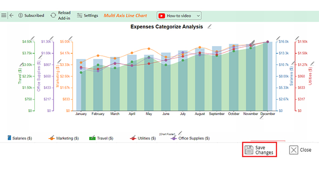
Custom sorting in Excel lets you sort months by calendar order or prioritize sales regions. The ability to refine data presentation is no longer optional but essential. Custom sorting helps you stay on top of your data and ensures clarity. Pair it with custom Excel charts to make your data organized and visually impactful.

Custom sorting is a simple step with a big impact. It makes Excel a more powerful ally for any professional.

Let’s dive deeper.

Table of Contents:

  1. What is Custom Sorting in Excel?
  2. Why Do Custom Sort in Excel?
  3. How to Make a Custom Sort List in Excel?
  4. How to Analyze a Custom Sorted List in Excel?
  5. Advantages and Disadvantages of Custom Sort Orders in Excel
  6. FAQs
  7. Wrap Up

What is Custom Sorting in Excel?

Definition: Custom sorting in Excel lets you organize data your way. It goes beyond default options like alphabetical or numerical order. How? You can define specific sequences, such as sorting months in calendar order or arranging items by priority.

This feature is ideal for datasets requiring a personalized structure, such as grouping products by category. It also works well for organizing tasks by urgency or other custom criteria. Pair it with tools to eliminate duplicates in Excel, and your data becomes cleaner and more reliable.

Custom sorting makes your data easier to analyze and understand. It’s a simple tool that adds flexibility and precision to your work.

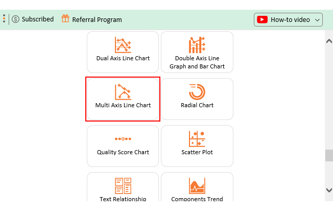
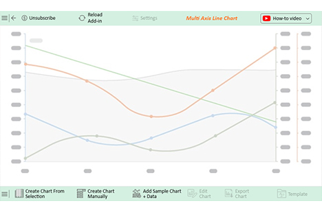
Understanding Custom Sorting in Excel in Power BI Using Multi Axis Line Chart to Organize Data Efficiently

Understanding Custom Sorting in Excel in Google Sheets Using Multi Axis Line Chart to Organize Data Efficiently

Understanding Custom Sorting in Excel in Microsoft Excel Using Multi Axis Line Chart to Organize Data Efficiently

Why Do Custom Sort in Excel?

Why do custom sorting in Excel? Because it changes how you use your data. Sort it your way for smarter work. It improves data analysis by making trends and insights easier to find;

  • Improved data analysis: Custom sorting allows you to arrange data, highlighting trends and patterns. Organizing information enables you to make better, faster decisions based on your findings.
  • Enhanced presentation: A clear dataset looks professional and is easy to understand. Moreover, custom sorting improves information design, ensuring key information stands out.
  • Increased efficiency: Custom sorting automates repetitive tasks, saving time and effort. Moreover, Excel remembers your sorting rules, streamlining future data management.
  • Tailored organization: Custom list sort in Excel gives you control over how data is grouped and ordered. It ensures your unique priorities, such as sorting by regions or deadlines, are reflected in your spreadsheets.

How to Make a Custom Sort List in Excel?

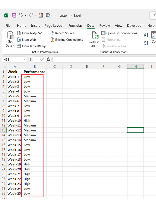
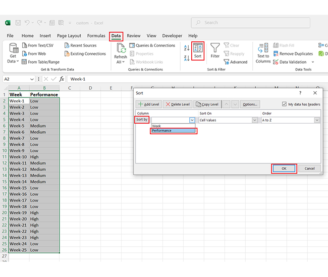
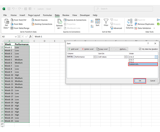
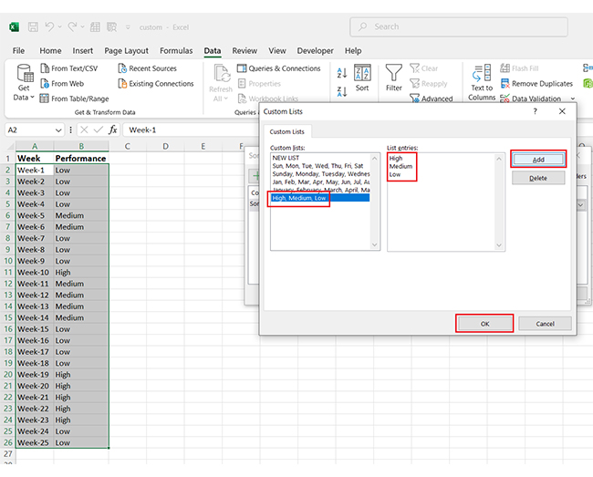
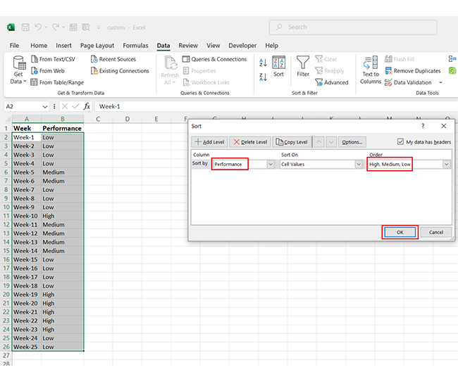
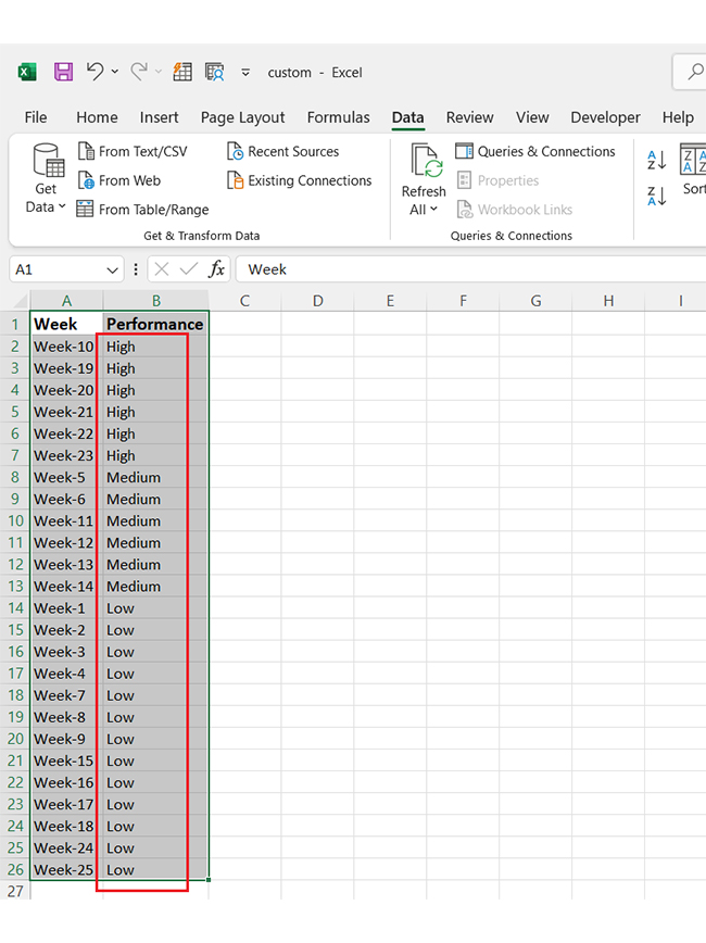
Creating a custom list sort in Excel is a great way to bring order to your data and save time. You can also improve visual storytelling by organizing data meaningfully. Let’s break it down step by step:

  • Start by adding your unsorted data to an Excel sheet. Don’t worry about the current order—Excel will handle it.
Custom sorting in Excel
  • Select your entire dataset, then go to the Data tab and click Sort. It opens the sorting options where you can choose the column to sort by under Sort by (e.g., “Performance”).
Custom sorting in Excel
  • Next, set the sorting order by selecting Custom List. Click on it, and then hit OK to proceed.
Custom sorting in Excel
  • A window will open where you can define your custom sequence. Enter the order you need, click Add, and press OK again.
Custom sorting in Excel
  • You’ll now see your selections reflected under Sort by and Order. This confirms your custom sort list is ready to apply.
Custom sorting in Excel
  • Finally, Excel reorders your data based on your custom sort. You’ll see your dataset neatly arranged according to your preferences.
Custom sorting in Excel

How to Analyze a Custom Sorted List in Excel?

Data analysis thrives on clear insights, but Excel often falls short in data visualization. Sure, it’s great for organizing data, but making it visually impactful? Not so much.

That’s where custom sorting becomes your secret weapon, bringing order to chaos. But for next-level visual storytelling, Excel alone isn’t enough. You need data visualization tools to create stunning graphs and charts for your data.

Enter ChartExpo. This tool effortlessly transforms your sorted data into clear, actionable, next-level charts like the Tornado Chart.

The charts below were created in Excel using ChartExpo:

Sankey Chart:

Custom sorting in Excel

Likert Scale Chart

Custom sorting in Excel

Comparison Bar Chart

Custom sorting in Excel

Multi-Axis Line Chart:

Custom sorting in Excel

Stacked Waterfall Chart

Custom sorting in Excel

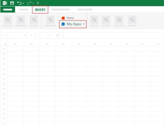
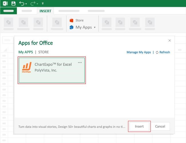
How to Install ChartExpo in Excel?

  1. Open your Excel application.
  2. Open the worksheet and click the “Insert” menu.
  3. You’ll see the “My Apps” option.
  4. In the Office Add-ins window, click “Store” and search for ChartExpo on my Apps Store.
  5. Click the “Add” button to install ChartExpo in your Excel.

ChartExpo charts are available both in Google Sheets and Microsoft Excel. Please use the following CTAs to install the tool of your choice and create beautiful visualizations with a few clicks in your favorite tool.

Example

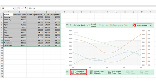
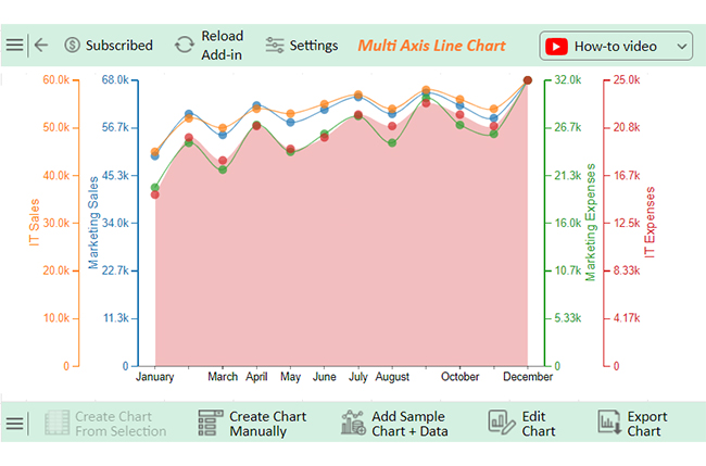
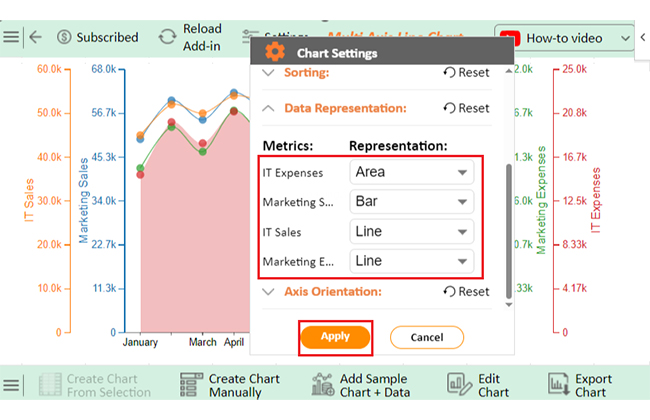
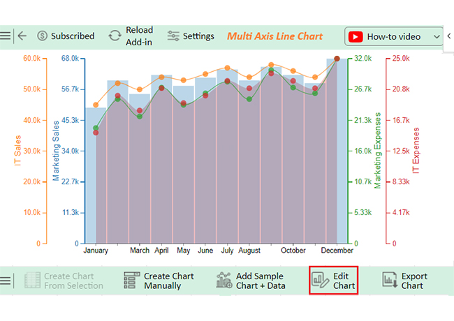
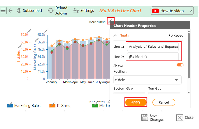
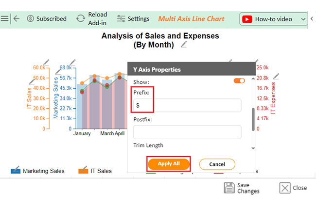
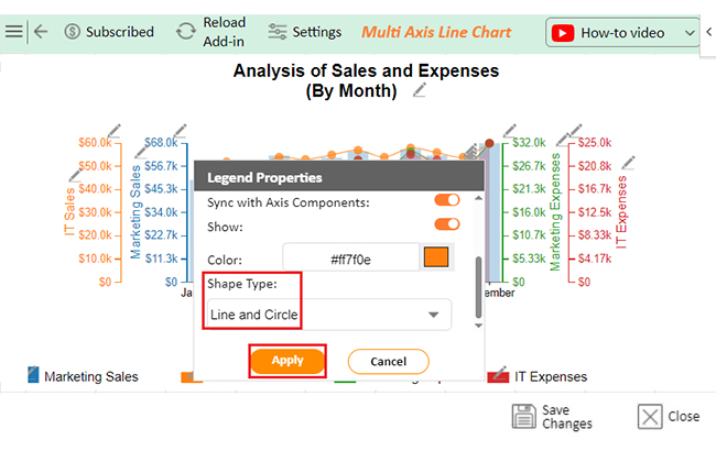
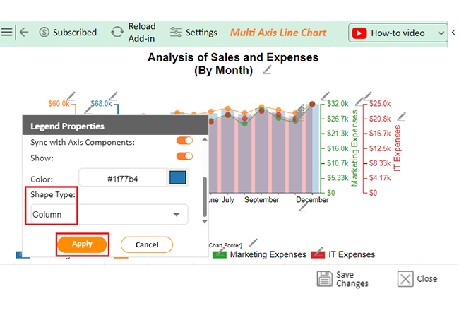
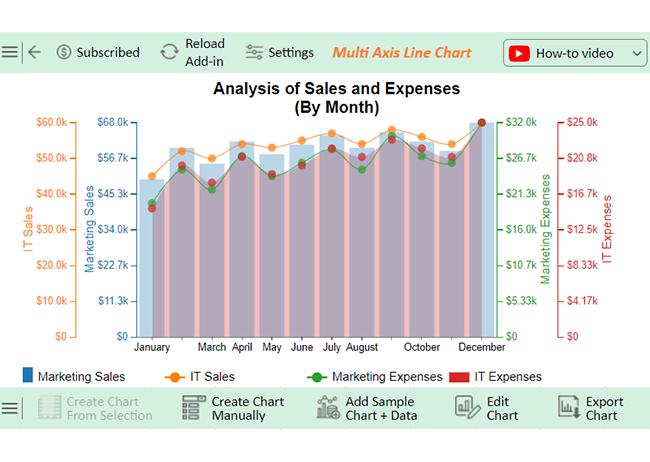
Let’s analyze this sample data and learn how to add a data label to Excel charts using ChartExpo;

Month Marketing Sales Marketing Expenses IT Sales IT Expenses
January 50000 20000 45000 15000
February 60000 25000 52000 20000
March 55000 22000 50000 18000
April 62000 27000 54000 21000
May 58000 24000 53000 19000
June 61000 26000 55000 20000
July 64000 28000 57000 22000
August 60000 25000 54000 21000
September 65000 30000 58000 23000
October 62000 27000 56000 22000
November 59000 26000 54000 21000
December 68000 32000 60000 25000


  • To get started with ChartExpo, install ChartExpo in Excel.
  • Now Click on My Apps from the INSERT.
Custom sorting in Excel
  • Choose ChartExpo from My Apps, then click.
Custom sorting in Excel
  • Once it loads, scroll through the charts list to locate and choose the “Multi Axis Line Chart”.
Custom sorting in Excel
  • You will see a Multi Axis Line Chart on the screen.
Custom sorting in Excel
  • Click the “Create Chart From Selection” button after selecting the data from the sheet, as shown.
Custom sorting in Excel
  • When you click this button, you see the Multi Axis Line Chart for the given data.
Custom sorting in Excel
  • Change Data presentation as follows;
Custom sorting in Excel
  • If you want to add anything to the chart, click the Edit Chart button:
Custom sorting in Excel
  • Click the pencil icon next to the Chart Header to change the title.
  • It will open the properties dialog. Under the Text section, you can add a heading in Line 1 and enable Show.
  • Give the appropriate title of your chart and click the Apply button.
Custom sorting in Excel
  • You can add the sign of ($) with all field values and also change the precision value to zero:
Custom sorting in Excel
  • Change the Legend shape of “Sales” into a Line and Circle and click the “Apply” button.
Custom sorting in Excel
  • Change the shape of “Orders” into a Column and click the “Apply” button:
Custom sorting in Excel
  • Click the “Save Changes” button to persist the changes made to the chart.
Custom sorting in Excel
  • Your final Multi Axis Line Chart will appear as shown below.
Custom sorting in Excel

Insights

  • Seasonal trends show peaks in December for sales and expenses across departments.
  • Marketing sales outperform IT, though IT demonstrates stable growth.
  • Increased sales align with higher expenses, highlighting resource-driven performance.
  • February and September activity suggests periodic business cycles or campaigns.

Advantages and Disadvantages of Custom Sort Orders in Excel

Sorting data in Excel sounds simple. But what if you need more than alphabetical or numerical order? Custom sort orders shine here, giving you control over your data. They also enhance data storytelling by organizing information meaningfully. However, there are strengths and challenges.

Advantages

  • Tailored data organization: Custom sorting allows you to organize data to fit your needs. This flexibility ensures your spreadsheet reflects the logic and structure you want.
  • Enhanced data analysis: Organizing data meaningfully helps you quickly identify hidden trends and patterns. This technique helps generate insights and make decisions from structured reports.
  • Professional presentation: Organized data is easier to understand and looks polished. Circular charts can boost clarity and leave a strong impression in presentations.
  • Time efficiency: Are you wondering how to clean data in Excel? Custom sorting minimizes the time spent searching or filtering through disorganized data. With information already in the desired order, you can focus on analysis or decision-making.

Disadvantages

  • Limited default options: Excel’s default custom sort lists are limited, so you may need to create your own for specific needs. Setting up the order requires extra time and effort upfront.
  • Complexity for new users: Custom sorting can confuse beginners unfamiliar with Excel’s features. Moreover, missteps in setting up a sort can lead to incorrect data arrangements or frustration.
  • Not dynamic: Custom sorting doesn’t adjust when new data is added. Data discovery tools can help, but you must reapply the sort manually.
  • Compatibility issues: Sharing files with custom sort orders may not work seamlessly if the recipient’s Excel setup differs from yours. It can make the data appear jumbled or out of order for others.

FAQs

How do I create a custom sort order in Excel?

  1. Go to the Data tab and click Sort.
  2. Under the Order dropdown, select Custom List.
  3. Enter your desired sequence in the Custom List box.
  4. Click OK to save the custom order.
  5. Apply it to your data.

What is the shortcut for custom sort in Excel?

  1. Press Alt + D + S to open the Sort dialog box.
  2. Click the Order dropdown and select Custom List.
  3. Enter or select your custom sort sequence.
  4. Click OK and apply the custom sort.

How do I create a custom sort bar chart in Excel?

To create a custom sort bar chart in Excel;

  1. Create a bar chart from your data in Excel.
  2. Sort your data manually or using the Sort option in the Data tab.
  3. The chart updates automatically to reflect the custom order.
  4. Adjust formatting as needed.

Wrap Up

Custom sorting in Excel is more than a tool; it’s a game-changer. It lets you easily control your data and work smarter, not harder.

Improved data analysis is a key benefit. Custom sorting helps uncover trends and patterns, making decision-making faster and more accurate. Combined with data from Google Forms to Excel, it streamlines your workflow and provides deeper insights.

Another advantage is enhanced presentation. A well-organized spreadsheet looks professional and ensures your data tells a clear and compelling story. This is useful when preparing business graphs to present key metrics effectively.

Efficiency is also greatly improved. Custom sorting saves time by automating repetitive tasks. Once set, your preferences are ready for future use. You can quickly sort and analyze survey responses with an Excel survey template.

Tailored organization makes your data unique to your needs. Whether sorting by priority or creating custom categories, the flexibility is unmatched. It adapts to your specific goals and workflows.

Custom sorting in Excel turns data chaos into clarity. It’s a simple yet powerful feature every professional should use.

Do not hesitate.

Start customizing your data today for better results tomorrow. Install ChartExpo for easy data visualization and enhanced reporting.

How much did you enjoy this article?

ExcelAd2
Start Free Trial!
148914

Related articles

next previous
Microsoft Excel10 min read

What is Excel Software Used for: A Complete Guide

What is Excel software used for? It organizes, analyzes, and manages data. Explore its workplace applications, benefits, and top tips for efficiency and more.

Microsoft Excel12 min read

Artificial Intelligence in Excel for Clear Insights

Discover how AI elevates Excel, from automation to advanced data analysis. This blog covers benefits, limitations, and examples to enhance your productivity.

Microsoft Excel8 min read

Excel Task Tracker Template for Smarter Task Insights

Task tracker template in Excel organizes tasks, tracks deadlines, and boosts efficiency. Learn its benefits, and explore expert tips to simplify task management.

Microsoft Excel10 min read

Invoice Tracker Template in Excel for Better Insights

An invoice tracker Excel template helps track invoices, due dates, and payments. Learn how to use this template for better financial management.

Microsoft Excel12 min read

Key Performance Indicators in Healthcare for Better Insights

Key Performance Indicators in healthcare track patient care and efficiency. Learn about these KPIs, top examples, and how to use them to improve outcomes.

ChartExpo logo

Turn Data into Visual
Stories

CHARTEXPO

  • Home
  • Gallery
  • Videos
  • Services
  • Pricing
  • Contact us
  • FAQs
  • Privacy policy
  • Terms of Service
  • Sitemap

TOOLS

  • ChartExpo for Google Sheets
  • ChartExpo for Microsoft Excel
  • Power BI Custom Visuals by ChartExpo
  • Word Cloud

CATEGORIES

  • Bar Charts
  • Circle Graphs
  • Column Charts
  • Combo Charts
  • Comparison Charts
  • Line Graphs
  • PPC Charts
  • Sentiment Analysis Charts
  • Survey Charts

TOP CHARTS

  • Sankey Diagram
  • Likert Scale Chart
  • Comparison Bar Chart
  • Pareto Chart
  • Funnel Chart
  • Gauge Chart
  • Radar Chart
  • Radial Bar Chart
  • Sunburst Chart
  • see more
  • Scatter Plot Chart
  • CSAT Survey Bar Chart
  • CSAT Survey Chart
  • Dot Plot Chart
  • Double Bar Graph
  • Matrix Chart
  • Multi Axis Line Chart
  • Overlapping Bar Chart
  • Control Chart
  • Slope Chart
  • Clustered Bar Chart
  • Clustered Column Chart
  • Box and Whisker Plot
  • Tornado Chart
  • Waterfall Chart
  • Word Cloud
  • see less

RESOURCES

  • Blog
  • Resources
  • YouTube
SIGN UP FOR UPDATES

We wouldn't dream of spamming you or selling your info.

© 2025 ChartExpo, all rights reserved.