Categories
Understanding a budget deficit becomes much easier when you see it over time. A budget deficit by year graph does more than display numbers.
It reveals how a country’s financial decisions evolve across different economic cycles.
A budget deficit occurs when government spending exceeds revenue, often leading to increased borrowing and rising national debt.
In contrast, a surplus indicates excess revenue that can be reinvested or used to reduce debt. But the real value lies in tracking these changes year by year.
When visualized, deficit trends highlight critical patterns. For example, sharp increases often align with major events like wars, economic crises, or policy shifts.
During periods such as World War I or after the September 11 attacks, governments significantly expanded spending, leading to noticeable spikes in deficits.
This is where a budget deficit graph becomes powerful. It helps you move beyond definitions and start identifying trends, turning points, and the real impact of fiscal decisions.
In this guide, you’ll learn how to create a budget deficit by year graph and, more importantly, how to interpret the insights it reveals in Excel, Power BI, or Google Sheets.
Definition: A budget deficit graph is a visual representation of how a government’s spending compares to its revenue over time.
It shows whether a country runs a deficit (spending exceeds revenue) or a surplus (revenue exceeds spending) across different years.
Instead of looking at isolated numbers, the graph highlights trends. You can quickly spot periods of rising deficits, fiscal stability, or recovery.
These patterns often align with economic slowdowns, policy changes, or major national events.
Governments typically finance deficits by borrowing, which adds to national debt.
When visualized year by year, this helps track how consistently a country relies on borrowing and whether the situation is improving or worsening.
A budget deficit by year graph transforms financial data into clear, time-based insights.
Instead of isolated figures, it helps you understand how a country’s fiscal position evolves year by year.
The graph shows whether deficits are rising, falling, or remaining stable. This helps you quickly assess if a country is moving toward fiscal balance or deeper financial gaps.
It highlights the difference between government income and expenses. You can clearly see how wide the gap is and how it changes across different years.
Sharp increases or declines often reflect major events such as economic downturns, policy shifts, or increased public spending. These patterns help explain why deficits change.
The graph distinguishes between temporary deficits and long-term structural issues. Short spikes may indicate stimulus efforts, while persistent deficits suggest deeper fiscal challenges.
By analyzing different time periods, you can evaluate how policies or economic conditions influence financial outcomes and whether strategies are improving stability.
A budget deficit by year graph reveals recurring patterns that help explain how governments respond to economic conditions and policy changes over time.
Deficits often increase during economic downturns. Governments spend more to stimulate growth while tax revenues decline, creating temporary spikes in the graph that can sometimes resemble an exponential growth chart during severe economic crises.
When deficits persist even during strong economic periods, it signals a structural imbalance. This usually points to long-term issues such as excessive spending commitments or inefficient tax systems.
Sharp and sudden increases typically align with major events like financial crises, wars, or global disruptions. These periods show aggressive government spending to stabilize the economy.
After a spike, deficits often decline as governments reduce spending or increase revenue. This phase reflects efforts to restore fiscal balance and control debt levels.
Changes in taxation, subsidies, or public investment can directly impact deficit trends. These shifts appear as gradual rises or declines depending on the policy direction.
Consistent deficits over time contribute to rising national debt. The graph helps visualize whether borrowing is becoming a long-term dependency.
A budget deficit by year graph is not just about tracking financial gaps. It helps you understand how government decisions impact long-term economic stability and financial flexibility.
Consistent deficits lead to rising national debt. By analyzing trends, you can see whether borrowing is increasing gradually or accelerating during specific periods.
Deficit trends often reflect the broader economic environment. Rising deficits may indicate economic stress, while stabilizing or declining deficits can signal recovery or controlled spending.
Sustained high deficits reduce a government’s ability to respond to future challenges. The graph helps assess whether there is room for new policies or if financial constraints are tightening.
Changes in taxation, spending, or public investment show up clearly in deficit trends. This makes it easier to evaluate whether policy decisions are improving or worsening fiscal balance.
Higher deficits typically increase borrowing needs, which can influence interest rates. Trend analysis helps identify periods where government borrowing may impact the broader financial system.
A budget deficit graph helps distinguish between short-term spikes and long-term imbalances. This is critical for understanding whether deficits are temporary responses or ongoing structural issues.
Calculating a budget deficit by year is straightforward once you focus on two key components: total revenue and total expenditure for each year.
Start by collecting yearly data on government income and spending.
Ensure the data is accurate and consistent across years. Use official sources such as government budget reports, finance ministry releases, or treasury statements to avoid discrepancies.
To calculate the deficit for each year, subtract total revenue from total expenditure:
Budget Deficit=Total Expenditures−Total Revenues
Perform this calculation for multiple years to create a time-series dataset. This allows you to visualize trends and identify patterns in government financial behavior.
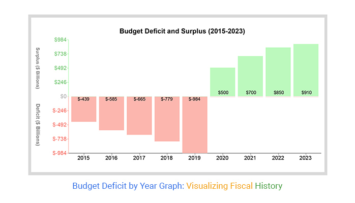
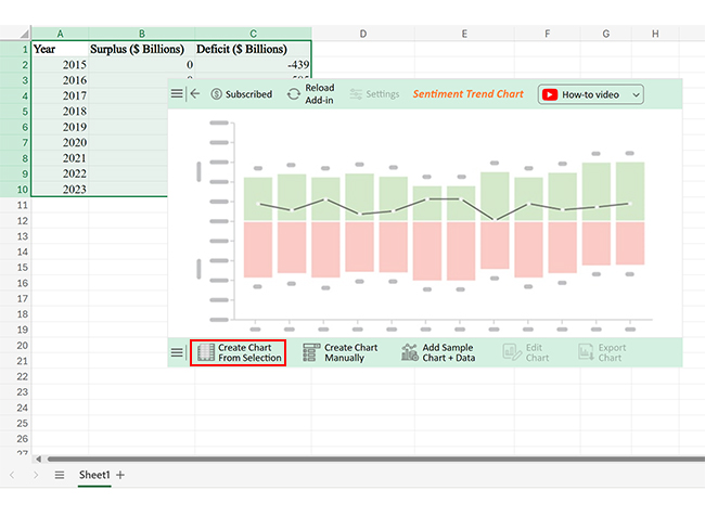
Visualizing a budget deficit by year graph helps you move from raw numbers to clear financial trends. Follow these steps to build an effective graph in Excel.
Organize your dataset in a simple table format:
Make sure each row represents one year for accurate trend analysis.
Use a formula in Excel to calculate the deficit for each year:
This creates a consistent dataset ready for visualization.
Highlight the Year and Budget Deficit columns.
This ensures your chart focuses on the time-based deficit trend rather than raw financial inputs.
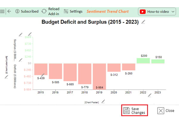
A Sentiment Trend Chart works best for showing trends over time, while a column chart helps compare year-by-year differences.
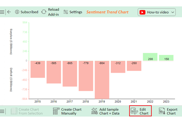
Default charts often lack clarity. To improve readability:
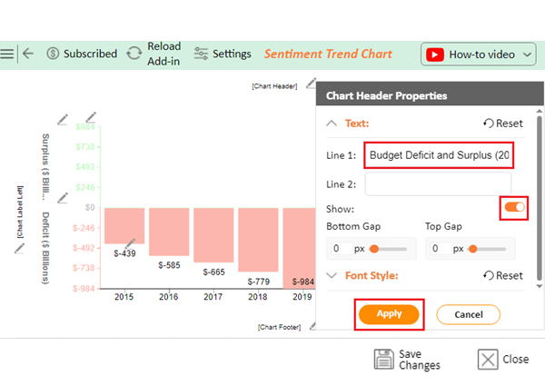
For deeper insights and a more interactive view, use Chartexpo to build advanced charts directly within Excel. It helps you better highlight trends, patterns, and turning points that standard charts may not clearly reveal.
Once your graph is ready, focus on what it reveals:
This step turns your chart into a decision-making tool, not just a visual.

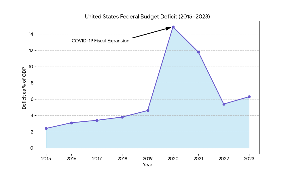
During the pandemic, government spending increased sharply on stimulus packages, healthcare support, and unemployment benefits.
This created a steep rise in budget deficits, clearly visible as a sudden spike in yearly deficit graphs.
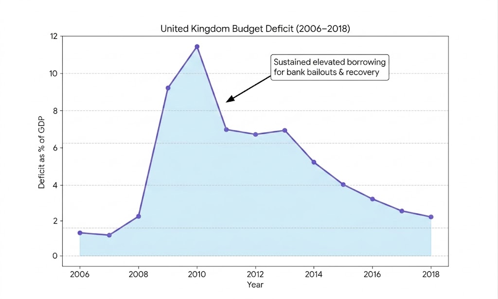
Following the global financial crisis, the UK experienced sustained high deficits due to bank bailouts and economic recovery programs.
The trend shows a prolonged period of elevated borrowing before gradual stabilization.
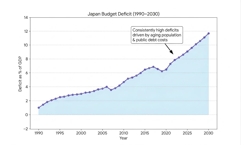
Japan is known for consistently running budget deficits for decades due to high public debt and the costs of an aging population.
The graph shows a long, steady pattern of deficits rather than short-term fluctuations.
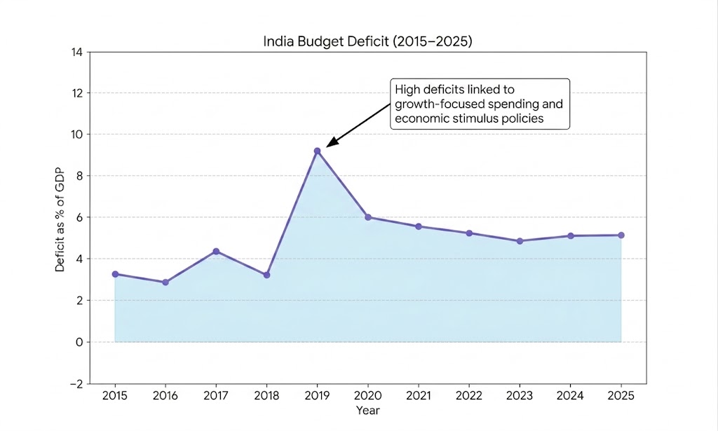
India’s budget deficit trends often reflect increased public investment in infrastructure and development programs.
Certain years show higher deficits linked to growth-focused spending and economic stimulus policies.
One of the most common errors is plotting revenue, expenditure, and deficit without a clear separation.
Since these values behave differently, combining them without distinction can distort trends and make interpretation misleading.
Using inconsistent time periods (for example, skipping years or mixing fiscal calendars) breaks the trend line.
This leads to false spikes or drops that do not reflect real economic changes.
A budget deficit is a time-series concept, but many users rely on pie charts or static visuals.
This hides trends and makes it difficult to detect growth patterns, cycles, or anomalies over time.
Even with a correct chart, failing to mark major spikes or reversals reduces insight value.
Important economic shifts like crisis years or policy changes become harder to identify and interpret.
A deficit is a shortage or lack of funds, usually in a financial setting. It occurs when spending surpasses earnings or income. Governments, businesses, and individuals may face deficits, requiring actions such as borrowing to compensate for the shortfall.
A budget deficit is usually viewed as a concern. It can indicate excessive spending, resulting in higher debt and interest charges. Yet, in certain scenarios, such as when facing economic declines, deficits can strategically spur growth and aid recovery endeavors.
Creating a budget deficit by year graph is not just about visualization. It’s about understanding how government spending behavior changes over time.
By organizing accurate revenue and expenditure data, calculating yearly deficits, and plotting them in Excel or Google Sheets, you can turn raw numbers into a clear financial narrative. The real value comes from identifying patterns such as rising deficits, recovery phases, or long-term fiscal imbalances.
Quick Recap:
Why This Matters:
A budget deficit graph helps you move beyond calculations and focus on insights. It allows you to spot turning points, understand the impact of policy decisions, and evaluate long-term economic direction.
When used effectively, this type of visualization becomes a practical tool for analysis, reporting, and decision-making, not just a chart.
How much did you enjoy this article?


Calculate accounts receivable turnover ratio to measure credit collection speed, improve cash flow, and strengthen your financial strategy. Read on!

Change Management KPIs are the key to tracking adoption, performance, and ROI during transitions. Find out which metrics matter. Read on!

Data collection methods and techniques determine the quality of every insight you act on. Explore key approaches for gathering reliable data. Read on!


