• Home
  • Tools dropdown img
    • Spreadsheet Charts

      • ChartExpo for Google Sheets
      • ChartExpo for Microsoft Excel
    • Power BI Charts

      • Power BI Custom Visuals by ChartExpo
    • Word Cloud

  • Charts dropdown img
    • Chart Category

      • Bar Charts
      • Circle Graphs
      • Column Charts
      • Combo Charts
      • Comparison Charts
      • Line Graphs
      • PPC Charts
      • Sentiment Analysis Charts
      • Survey Charts
    • Chart Type

      • Box and Whisker Plot
      • Clustered Bar Chart
      • Clustered Column Chart
      • Comparison Bar Chart
      • Control Chart
      • CSAT Survey Bar Chart
      • CSAT Survey Chart
      • Dot Plot Chart
      • Double Bar Graph
      • Funnel Chart
      • Gauge Chart
      • Likert Scale Chart
      • Matrix Chart
      • Multi Axis Line Chart
      • Overlapping Bar Chart
      • Pareto Chart
      • Radar Chart
      • Radial Bar Chart
      • Sankey Diagram
      • Scatter Plot Chart
      • Slope Chart
      • Sunburst Chart
      • Tornado Chart
      • Waterfall Chart
      • Word Cloud
    • Google Sheets
      Microsoft Excel
  • Services
  • Pricing
  • Contact us
  • Blog
  • Support dropdown img
      • Gallery
      • Videos
      • Contact us
      • FAQs
      • Resources
    • Please feel free to contact us

      atsupport@chartexpo.com

Categories
All Data Visualizations Data Analytics Surveys
Add-ons/
  • Google Sheets
  • Microsoft Excel
  • Power BI
All Data Visualizations Data Analytics Surveys
Add-ons
  • Google Sheets
  • Microsoft Excel
  • Power BI

We use cookies

This website uses cookies to provide better user experience and user's session management.
By continuing visiting this website you consent the use of these cookies.

Ok

ChartExpo Survey


Home > Blog > Surveys

How to Analyze 360 Surveys in Excel with Benefits?

Picture yourself sitting in an office, surrounded by a mountain of papers and a never-ending to-do list. Your boss just dropped the bombshell that you need to analyze a bunch of 360 surveys.

360 surveys

You have no clue where to start.

Don’t worry because the superhero of spreadsheets, Excel, is here to save you.

Why Excel?

Let me enlighten you.

You can transform those overwhelming surveys into valuable insights with Excel’s analytical prowess and user-friendly interface.

Say goodbye to tedious manual calculations and hello to efficiency and accuracy. Excel allows you to slice and dice your 360 survey data and uncover hidden patterns.

But the benefits don’t stop there.

Excel’s versatility allows you to create insightful, appealing visualizations that impress even the harshest critics. All this with just a few clicks.

How?

Let me guide you through the process of unraveling the secrets of Excel’s data analysis tools. We will leave no stone unturned on this quest for knowledge.

Table of Content:

  1. What are 360 Surveys?
  2. What are the Best Practices for Implementing 360 Surveys?
  3. How to Create 360 Survey Questions?
  4. How to Analyze 360 Surveys in Excel?
  5. Wrap Up

What are 360 Surveys?

One might think that 360 surveys are taken from a roller coaster (that would be quite adventurous). However, 360 surveys are like powerful mirrors that reflect a multifaceted view of an individual’s performance.

They gather feedback from various sources such as managers, peers, subordinates, and self-assessments. By utilizing a survey template in Excel, these surveys become easy to organize and analyze.

With their comprehensive approach, they unlock a treasure trove of insights, illuminating strengths and exposing weaknesses, consequently guiding the way to growth and development.

What are the Best Practices for Implementing 360 Surveys?

Implementing effective 360 surveys involves following these best practices to ensure reliable and meaningful feedback:

  • Clear purpose and goals: Clearly define the purpose and objectives of the survey, ensuring alignment with organizational goals.
  • Confidentiality and anonymity: Ensure respondents remain confidential and anonymous to encourage honest feedback.
  • Careful selection of raters: Select raters with sufficient knowledge and experience with the individual. This will ensure accurate and relevant feedback.
  • Valid and reliable assessment: Use validated and reliable assessment tools or questionnaires to accurately measure the desired competencies or behaviors.
  • Communication and expectations: Communicate the purpose, process, and expectations of the 360 survey to participants. Also, provide clear instructions on how to provide feedback.
  • Training and support: Provide training and support to participants to help them understand the assessment process and effectively provide feedback.
  • Timing and frequency: Determine the appropriate timing and frequency of the 360 survey to ensure efficiency. Consider organizational cycles and the need for timely feedback.
  • Feedback and action planning: Ensure participants receive constructive feedback. Also, support them in developing action plans based on the assessment results to improve their performance.
  • Follow-up and evaluation: Implement mechanisms to monitor and follow up on individuals’ progress based on their action plans.
  • Continuous improvement: Regularly evaluate the effectiveness of the 360 survey process. Then make necessary adjustments to improve its impact and relevance.

How to Create 360 Survey Questions?

Creating effective 360 survey questions is like crafting the perfect punchline. It requires the right balance of wit and insight. Grab your virtual notepad and create a 360 survey gem following the steps below.

  1. Define the purpose: Clearly define the purpose of the 360 survey to ensure the questions align with the desired outcomes.
  2. Identify competencies: Determine the key competencies or behaviors to be assessed in the survey. These should be relevant to the individual’s role and aligned with organizational objectives.
  3. Determine rating scales: Select appropriate scales to capture respondents’ perceptions of the individual’s performance or behavior. Common rating scales include numerical scales, Likert scales, or competency-based scales.
  4. Use open-ended and closed-ended questions: Use a combination of Open-Ended Questionnaires to gather qualitative feedback and closed-ended questions for quantitative analysis. This allows for a more comprehensive assessment.
  5. Structure questions: Craft clear and concise questions that are easy to understand. Use simple and unambiguous language to ensure respondents provide accurate feedback.
  6. Include self-assessment: Incorporate self-assessment questions, such as those found in a skills matrix example, to allow individuals to reflect on their performance. This provides a comprehensive perspective on their self-awareness and aligns with the 360-degree feedback process.
  7. Ensure anonymity and confidentiality: Assure respondents of the anonymity and confidentiality of their feedback to encourage honest and unbiased responses.
  8. Pilot test and revise: Pilot test the survey questions with a small group to identify any issues or improvement areas. Then revise the questions based on the feedback.
  9. Keep it reasonable in length: Strive to create a reasonable survey length to maintain respondent engagement. Long surveys may lead to fatigue and incomplete responses.
  10. Analyze and interpret results: Analyze and interpret the data using self-service data analytics tools to gain insights and identify areas for development or improvement.

How to Analyze 360 Surveys in Excel?

Excel, the trusty tool in every data analyst’s arsenal, has long been hailed for its number-crunching prowess. But when visualizing survey results, Excel falls a little short.
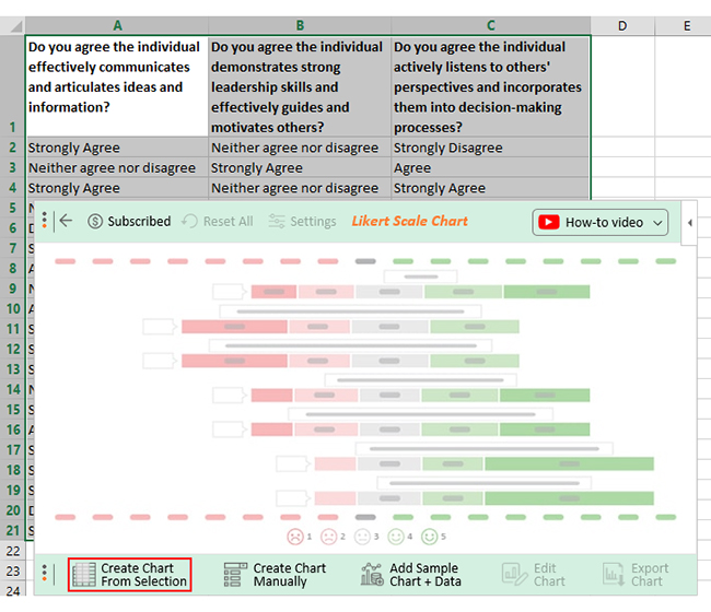
We have a solution that will have you analyzing 360 surveys with finesse and flair ChartExpo. The knight in shining armor that will transform your mundane Excel charts into stunning visual masterpieces. With its user-friendly interface and a plethora of customization options, ChartExpo will make your data come alive.

The difficulties of gleaning valuable insights are now a thing of the past.

Benefits of Using ChartExpo

  • ChartExpo gives you a wide range of visualizations at your fingertips. You can choose the perfect one to bring your data to life.
  • ChartExpo’s intuitive user interface makes creating insightful visualizations a breeze no coding experience is required.
  • With ChartExpo’s customization options, you can add your personal touch by tweaking colors, fonts, and styles.
  • The best part? ChartExpo offers great value for your money. It has a free 7-day trial and a monthly plan that won’t break the bank at just $10.

How to Install ChartExpo in Excel?

  1. Open your Excel application.
  2. Open the worksheet and click the “Insert” menu.
  3. You’ll see the “My Apps” option.
  4. In the office Add-ins window, click “Store” and search for ChartExpo on my Apps Store.
  5. Click the “Add” button to install ChartExpo in your Excel.

ChartExpo charts are available both in Google Sheets and Microsoft Excel. Please use the following CTA’s to install the tool of your choice and create beautiful visualizations in a few clicks in your favorite tool.

Example

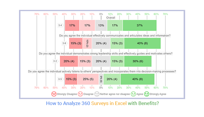
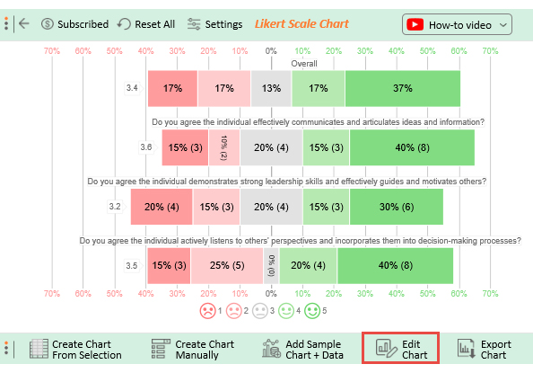
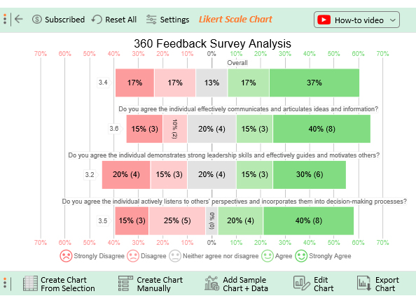
Let’s say you use one of the 360 survey tools to create a survey with the following 360 survey questions;

  • Do you agree the individual effectively communicates and articulates ideas and information?
  • Do you agree the individual demonstrates strong leadership skills and effectively guides and motivates others?
  • Do you agree the individual actively listens to others’ perspectives and incorporates them into decision-making processes?

You are expecting one of the following responses for each question.

  1. Strongly Disagree
  2. Disagree
  3. Neither agree nor disagree
  4. Agree
  5. Strongly Agree

Let’s say your survey yields the data table below.

Do you agree the individual effectively communicates and articulates ideas and information? Do you agree the individual demonstrates strong leadership skills and effectively guides and motivates others? Do you agree the individual actively listens to others’ perspectives and incorporates them into decision-making processes?
Strongly Agree Neither agree nor disagree Strongly Disagree
Neither agree nor disagree Strongly Agree Agree
Strongly Agree Neither agree nor disagree Strongly Agree
Neither agree nor disagree Disagree Agree
Disagree Strongly Disagree Strongly Disagree
Strongly Agree Agree Strongly Agree
Agree Strongly Disagree Agree
Neither agree nor disagree Agree Disagree
Agree Strongly Agree Strongly Agree
Strongly Agree Strongly Agree Strongly Agree
Strongly Disagree Neither agree nor disagree Disagree
Strongly Agree Strongly Agree Strongly Disagree
Neither agree nor disagree Strongly Disagree Disagree
Strongly Agree Strongly Agree Strongly Agree
Agree Agree Agree
Strongly Disagree Neither agree nor disagree Disagree
Strongly Agree Strongly Agree Strongly Agree
Strongly Agree Disagree Strongly Agree
Disagree Strongly Disagree Strongly Agree
Strongly Disagree Disagree Disagree

This table contains example data. Expect many responses and questions in real life.

  • To get started with ChartExpo, install ChartExpo in Excel.
  • Now Click My Apps from the INSERT menu. 
insert chartexpo in excel
  • Select ChartExpo and click the “Insert” button.
open chartexpo in excel
  • Once it loads, choose the “Likert Scale Chart” from the charts list.
search likert scale chart in excel
  • Click the “Create Chart From Selection” button after selecting the data from the sheet, as shown.
Create Chart From Selection ce342
  • When you click the “Create Chart From Selection” button, you have to map responses with numbers manually. The Likert scale has this arrangement:
    • Strongly Disagree=1
    • Disagree=2
    • Neither agree nor disagree=3
    • Agree=4
    • Strongly Agree=5
  • Once all is set, click the “Create Chart” button.
Map Likert Responses to Numbers ce342
  • ChartExpo will generate the visualization below for you.
360 surveys example
  • If you want to have the title of the chart, click on Edit Chart, as shown in the above image.
  • To change the title of the chart, click on the pencil icon that is available very next to Chart Header.
  • It will open the properties dialog. Under the Text section, you can add a heading in Line 1 enable the Show Give the appropriate title of your chart, and click on Apply button.
Apply title on Chart ce342
  • Let’s say you want to add text responses instead of numbers against every emoji.
  • Click the pencil icon next to the respective emoji. Expand the “Label” properties and write the required text. Then click the “Apply All” button.
  • Click the “Save Changes” button to persist the changes.
Apply label on Chart ce342
  • Your final chart will appear below.
Final 360 surveys

Insights

  • 60% of the respondents agree that the individual listens to others, while 40% disagree.
  • When it comes to demonstrating strong leadership, 45% agree, 35% disagree, and 20% remain neutral.
  • Regarding effective communication, 55% agree, 25% disagree, and 20% remain neutral.
  • Overall, 54% of the respondents gave positive feedback, 34% gave negative feedback, and 13% maintained neutrality.

FAQs:

What is a 360 survey?

A 360 survey, also known as a 360-degree feedback survey, is a performance assessment tool. It gathers feedback from multiple perspectives, including supervisors, peers, subordinates, and sometimes customers. Consequently, providing a panoramic view of an individual’s strengths, weaknesses, and areas for development.

How often should 360 surveys be conducted?

The frequency of conducting 360 surveys can vary depending on organizational needs and resources. Typically, organizations conduct 360 surveys annually. This allows for meaningful progress assessment and development planning. The timing should provide enough time for individuals to implement actions and measure growth.

Can 360 surveys be used for team assessments?

Yes, you can use 360 surveys for team assessments. In addition to individual feedback, team members can provide feedback on team dynamics, collaboration, and communication. This helps identify strengths and improvement areas, fostering a more cohesive and effective work environment.

Wrap Up

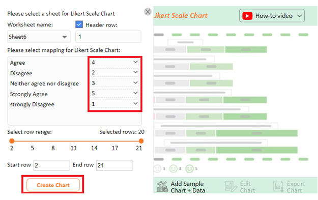
Analyzing 360 surveys in Excel offers a versatile and efficient way to glean insights from the collected feedback. Following a systematic approach, you can effectively utilize Excel for data analysis and interpretation.

First, import the survey data into Excel and properly organize it. Clean the data by removing any inconsistencies or errors that may affect the analysis.

Utilize Excel’s functions and formulas to calculate various statistics and metrics. These calculations provide a quantitative understanding of the feedback received.

Perform cross-tabulations and data segmentation to examine relationships and patterns within the feedback. Analyze the data by different demographic groups, raters, or specific competencies to identify trends and improvement areas.

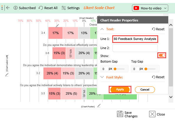
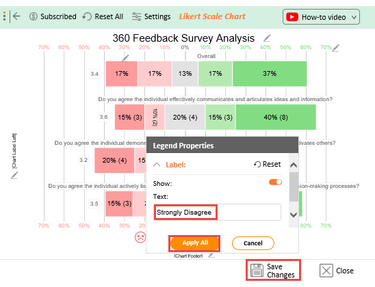
Leverage ChartExpo’s visualization capabilities to create compelling charts, graphs, and dashboards. This helps identify patterns, strengths, and areas for improvement at a glance.

Unleash the chart wizard within you – Try ChartExpo and create visual masterpieces with a few clicks. No coding is required.

How much did you enjoy this article?

PBIAd1
Start Free Trial!
127283

Related articles

next previous
Surveys7 min read

Benchmark for Surveying: Visual Insights

This guide dives deep into benchmarks for surveying. It shows you what it is, and the types of benchmarks in the survey. You'll also discover how to analyze it.

Surveys13 min read

5 Point Likert Scale Analysis, Interpretation & Examples

Dive deep into the realm of 5-point Likert Scale Analysis and Interpretation to unravel the sentiments behind your responses. Gain actionable insights today.

Surveys11 min read

3-Point Likert Scale: Range Interpretation & Analysis

Learn the basics of the 3-point Likert scale, including examples, benefits, and when it's best applied in research and feedback forms.

Surveys16 min read

Survey Data Collection: Definition, Methods and Analysis

Find the best methods of Survey data collection. Elevate your research game with practical tips for gathering, analyzing, and leveraging valuable information.

Surveys11 min read

5-Point Performance Rating Scale With Examples: Quick Guide

Discover how the 5-Point Performance Rating Scale helps organizations evaluate employee performance with clarity, consistency, and fairness across teams.

ChartExpo logo

Turn Data into Visual
Stories

CHARTEXPO

  • Home
  • Gallery
  • Videos
  • Services
  • Pricing
  • Contact us
  • FAQs
  • Privacy policy
  • Terms of Service
  • Sitemap

TOOLS

  • ChartExpo for Google Sheets
  • ChartExpo for Microsoft Excel
  • Power BI Custom Visuals by ChartExpo
  • Word Cloud

CATEGORIES

  • Bar Charts
  • Circle Graphs
  • Column Charts
  • Combo Charts
  • Comparison Charts
  • Line Graphs
  • PPC Charts
  • Sentiment Analysis Charts
  • Survey Charts

TOP CHARTS

  • Sankey Diagram
  • Likert Scale Chart
  • Comparison Bar Chart
  • Pareto Chart
  • Funnel Chart
  • Gauge Chart
  • Radar Chart
  • Radial Bar Chart
  • Sunburst Chart
  • see more
  • Scatter Plot Chart
  • CSAT Survey Bar Chart
  • CSAT Survey Chart
  • Dot Plot Chart
  • Double Bar Graph
  • Matrix Chart
  • Multi Axis Line Chart
  • Overlapping Bar Chart
  • Control Chart
  • Slope Chart
  • Clustered Bar Chart
  • Clustered Column Chart
  • Box and Whisker Plot
  • Tornado Chart
  • Waterfall Chart
  • Word Cloud
  • see less

RESOURCES

  • Blog
  • Resources
  • YouTube
SIGN UP FOR UPDATES

We wouldn't dream of spamming you or selling your info.

© 2025 ChartExpo, all rights reserved.