• Home
  • Tools dropdown img
    • Spreadsheet Charts

      • ChartExpo for Google Sheets
      • ChartExpo for Microsoft Excel
    • Power BI Charts

      • Power BI Custom Visuals by ChartExpo
    • Word Cloud

  • Charts dropdown img
    • Chart Category

      • Bar Charts
      • Circle Graphs
      • Column Charts
      • Combo Charts
      • Comparison Charts
      • Line Graphs
      • PPC Charts
      • Sentiment Analysis Charts
      • Survey Charts
    • Chart Type

      • Box and Whisker Plot
      • Clustered Bar Chart
      • Clustered Column Chart
      • Comparison Bar Chart
      • Control Chart
      • CSAT Survey Bar Chart
      • CSAT Survey Chart
      • Dot Plot Chart
      • Double Bar Graph
      • Funnel Chart
      • Gauge Chart
      • Likert Scale Chart
      • Matrix Chart
      • Multi Axis Line Chart
      • Overlapping Bar Chart
      • Pareto Chart
      • Radar Chart
      • Radial Bar Chart
      • Sankey Diagram
      • Scatter Plot Chart
      • Slope Chart
      • Sunburst Chart
      • Tornado Chart
      • Waterfall Chart
      • Word Cloud
    • Google Sheets
      Microsoft Excel
  • Services
  • Pricing
  • Contact us
  • Blog
  • Support dropdown img
      • Gallery
      • Videos
      • Contact us
      • FAQs
      • Resources
    • Please feel free to contact us

      atsupport@chartexpo.com

Categories
All Data Visualizations Data Analytics Surveys
Add-ons/
  • Google Sheets
  • Microsoft Excel
  • Power BI
All Data Visualizations Data Analytics Surveys
Add-ons
  • Google Sheets
  • Microsoft Excel
  • Power BI

We use cookies

This website uses cookies to provide better user experience and user's session management.
By continuing visiting this website you consent the use of these cookies.

Ok

ChartExpo Survey


Home > Blog > Data Visualization

Segmented Bar Graph: Make Layered Data Understandable

A Segmented bar graph helps visualize how smaller categories contribute to a larger total.

Instead of showing only overall values, it breaks each bar into segments, making it easier to compare both totals and category composition in a single chart.

Segmented Bar Graph

This type of visualization is widely used in Excel, Google Sheets, and Power BI dashboards to analyze:

  • sales by product category
  • survey responses
  • departmental performance
  • regional comparisons

For example, this graph can show not only which region generates the highest revenue, but also which product category contributes the most within that region.

While Excel supports basic stacked bar charts, customizing them for better readability and dashboard reporting often requires additional formatting and manual adjustments.

What is a Segmented Bar Graph?

Definition: A Segmented Bar Graph, also known as a Stacked bar chart, is a visualization used to show how individual subcategories contribute to a total value across different categories.

Each bar is divided into segments that represent separate components of the whole, making it easier to compare both overall totals and internal composition within the same chart.

Unlike a standard bar chart that focuses only on value comparison, this visualization also reveals how each category is distributed.

It is commonly used in business reporting and dashboard analysis to visualize sales performance, survey responses, budget allocation, and regional comparisons.

For example, a company can compare total revenue across store locations while simultaneously identifying which product categories contribute the most to sales in each region.

Because it combines comparison and composition in a single view, this graph is especially useful for analyzing part-to-whole relationships in complex datasets.

Key Features of a Segmented Bar Graph

1. Displays Part-to-Whole Relationships Clearly

  • A Segmented Bar Graph shows how individual subcategories contribute to a total value, making it easier to understand the overall composition within each category.

2. Combines Comparison and Breakdown in One Chart

  • It allows users to compare total values across categories while also analyzing the internal distribution of each category in the same visualization.

3. Supports Multiple Data Categories

  • The chart can display several subcategories within a single bar, making it useful for analyzing sales data, survey responses, regional performance, and other multi-dimensional datasets.

4. Improves Data Readability and Reporting

  • By converting large tables into a visual format, it simplifies complex data and helps users identify trends, patterns, and dominant contributors more quickly.

When to Use and When NOT to Use a Segmented Bar Graph

A Segmented bar graph is most effective when you need to analyze both totals and the composition within those totals.

However, it is not suitable for every type of dataset. Choosing the right scenario is important to avoid misleading interpretations.

When to Use a Segmented Bar Graph

It works best when:

  • You need to analyze part-to-whole relationships within categories
  • You want to compare multiple categories along with their internal breakdown
  • Your data includes clear subcategories under each main category
  • You are working with dashboard-style reporting in Excel, Google Sheets, or Power BI
  • You need to identify dominant contributors within each category
  • You are tracking distribution changes across regions, products, or time periods

When NOT to Use a Segmented Bar Graph

It is not suitable when:

  • You need to compare exact values between subcategories with high precision
  • The dataset contains too many segments, making the chart visually cluttered
  • The focus is only on overall trends without needing an internal breakdown
  • Categories are unrelated or do not share a meaningful total value
  • You are working with highly volatile data where composition changes too frequently

Types of Segmented Bar Charts

There are three types based on how they represent values and comparisons.

  • Simple Segmented Bar Graph

A Simple Segmented graph shows the actual values of each subcategory within a bar.

Each bar represents a total, and the segments inside show how that total is split across different components.

It helps compare both the overall value and the contribution of each part clearly and directly.

This type can be used in both vertical and horizontal formats, depending on how the data is structured.

segmented bar chart
  • Hierarchical Segmented Bar Chart

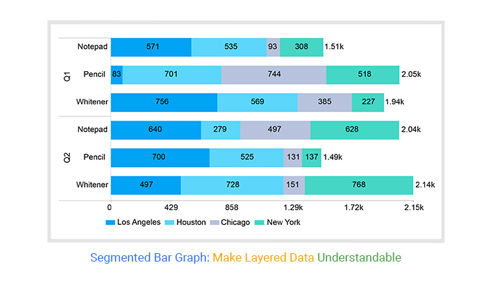
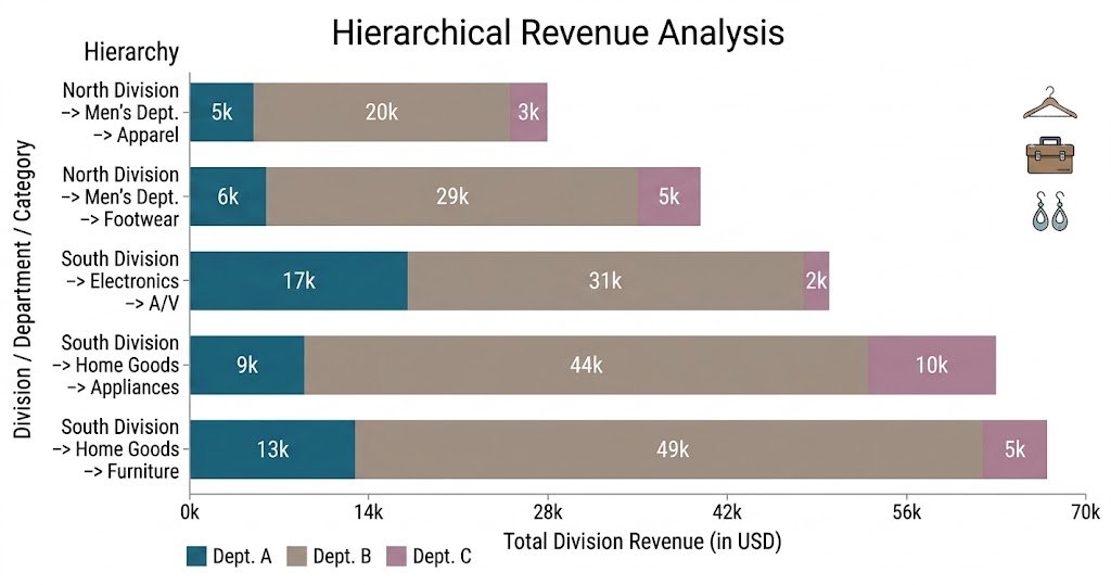
This chart is used when data has multiple levels of categories.

Each main bar represents a primary category, and the segments inside show related subcategories.

This makes it easier to analyze layered or grouped data in a single view.

It is useful when you want to compare structures across multiple groups.

Hierarchical Segmented Bar Chart
  • Percentage Segmented Bar Graph

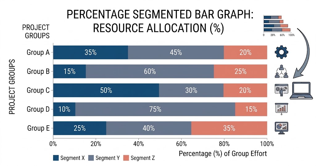
This bar graph shows each bar as 100%, with segments representing the percentage share of each subcategory.

This makes it easier to compare how different categories are distributed, even when their total values are not the same.

It is especially useful for analyzing composition and proportions across groups.

Percentage Segmented Bar Graph

Stacked Bar Graph vs Segmented Bar Graph: Key Differences

Feature Stacked Bar Graph Segmented Bar Graph
Basic Definition A chart that displays multiple data series stacked within a single bar A chart that shows how subcategories contribute to a total within each bar
Primary Focus Comparison of totals and their stacked components Emphasis on part-to-whole relationships and composition
Data Interpretation Focuses more on cumulative values across categories Focuses more on the internal breakdown of each category
Best Use Case Tracking changes across multiple variables or time periods Understanding how different segments make up a whole
Level of Detail Can include multiple layers of data series Usually focuses on clearer category-wise segmentation
Readability Can become complex with too many layers Easier to interpret when showing composition clearly
Common Use Sales trends, time-based comparisons, multi-series analysis Revenue breakdowns, survey results, category distribution

Top 3 Segmented Bar Graph Examples

This makes it easier to understand composition and identify patterns within complex datasets.

Below are three practical examples where this Excel chart is most effective.

  • Sales Data by Region

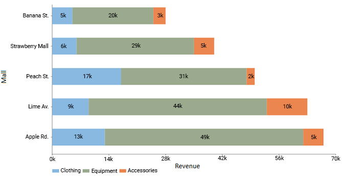
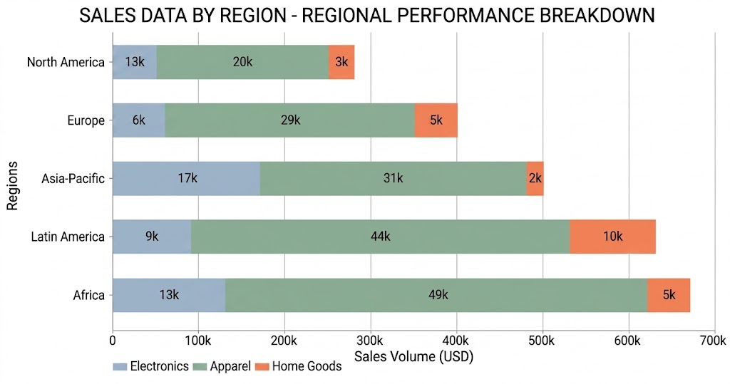
A company can use this graph to compare total sales across different regions while also breaking down performance by product categories.

Each region is represented by a single bar, and the segments show contributions from products such as electronics, clothing, and accessories.

This helps identify not only which region performs best, but also what drives that performance within each location.

Sales Data by Region
  • Customer Satisfaction Survey Results

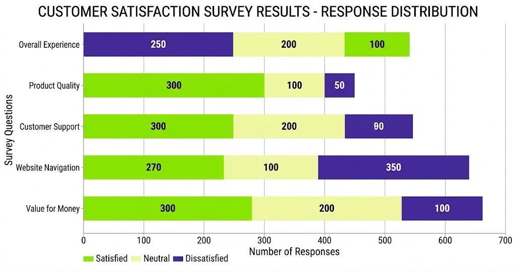
It’s commonly used to visualize survey responses.

Each bar represents a survey question, and the segments show response categories such as satisfied, neutral, and dissatisfied.

This makes it easy to evaluate overall customer sentiment while also understanding the distribution of responses for each question.

It helps businesses quickly identify strengths and areas that need improvement.

Customer Satisfaction Survey Results
  • Population Distribution by Age and Gender

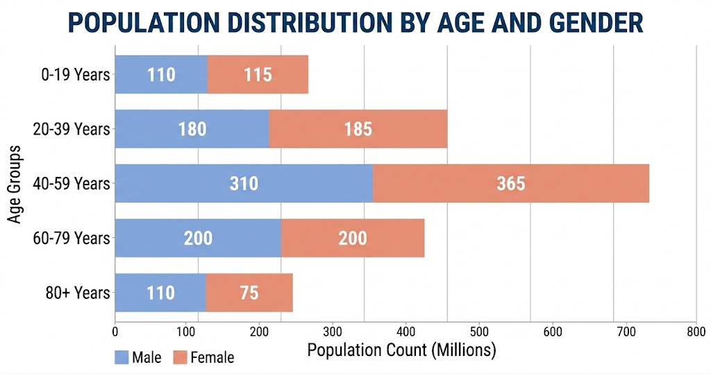
In demographic analysis, a graph helps visualize population structure clearly.

Each bar represents an age group, while the segments show the distribution of males and females within that group.

This allows analysts to quickly understand population balance and identify trends across different age segments.

It is commonly used in planning healthcare, education, and public services.

Population Distribution by Age and Gender

How to Create a Segmented Bar Graph in Excel: Easy Steps

Creating a Segmented bar graph in Excel is simple if you follow a structured process.

Step 1: Prepare Your Data

  • Organize your data in a clean table format.
  • Make sure you have one main category (such as Region, Month, or Department) and multiple subcategories (such as Product types or segments) with their corresponding values.

Step 2: Select Your Dataset

  • Highlight the entire dataset, including both category labels and numerical values. This ensures Excel correctly maps your data into a segmented structure.

Step 3: Insert a Stacked Bar Chart

  • Go to the Insert tab in Excel.
  • Choose Bar Chart and select Stacked Bar Chart from the available options.
  • This is the base format used for a Segmented Bar Graph.

Step 4: Adjust Chart Design

  • Once the chart is inserted, refine the visual layout.
  • You can switch row/column orientation if needed to improve clarity and ensure segments are displayed correctly within each bar.
  • Assign different colors to each segment to improve readability.
  • Add data labels if required to display exact values or percentages for better interpretation.

Step 5: Improve Readability

  • Remove unnecessary gridlines and adjust axis formatting for a cleaner look.
  • This helps highlight the segmented structure more clearly in dashboards and reports.

Step 6: Use Advanced Visualization (Optional)

  • If you want faster creation and more polished visuals without heavy manual formatting, tools like ChartExpo can help you generate ready-made segmented bar charts directly inside Excel.

Step 7: Final Review

  • Check whether the chart clearly shows both total values and segment breakdowns.
  • Ensure each bar is easy to interpret and comparisons are visually balanced.
segmented bar graph in google sheets

Pros and Cons of Segmented Bar Graphs

However, like any chart type, they come with strengths and limitations that should be considered before use.

Pros

Clear part-to-whole comparison

  • This chart shows both the total value and how each component contributes to it, making it easy to understand how data is structured within each category.

Strong composition insight

  • They clearly display how different segments make up a whole, such as product contributions to total sales or departmental contributions to revenue.

Useful for trend comparison over time

  • When used across multiple time periods, these charts help visualize how the composition of categories changes, making it easier to track shifts in performance or distribution.

Simple and easy to understand

  • Despite showing multiple data layers, the stacked format remains visually intuitive, making it accessible even for non-technical audiences.

Cons

Can become visually complex

  • When too many segments are added, the chart can become crowded and harder to interpret clearly.

Hard to read exact values

  • Small segments can make it difficult to accurately identify precise values without additional labels or data references.

Limited analytical depth for comparisons

  • While effective for part-to-whole analysis, they are not ideal when the main goal is to compare exact values across categories.

Risk of misinterpretation

  • If colors, scaling, or segment order are not designed properly, viewers may misjudge differences between segments or totals.

Common Mistakes to Avoid When Creating a Segmented Bar Chart

Avoiding the errors ensures your chart remains clear, accurate, and easy to interpret.

1. Using Too Many Segments

  • Adding too many subcategories in a single bar makes the chart visually cluttered. When there are excessive segments, it becomes difficult to compare values or identify meaningful patterns.

2. Inconsistent or Similar Colors

  • Using colors that are too similar or inconsistent across segments reduces readability. It can make it hard for users to distinguish between categories, leading to misinterpretation of the data.

3. Ignoring Proper Labeling

  • Without clear labels or legends, viewers may struggle to understand what each segment represents. Missing or unclear labeling reduces the effectiveness of the chart and creates confusion in analysis.

4. Using the Chart for the Wrong Data Type

  • A Segmented bar chart is designed for part-to-whole relationships. Using it for unrelated comparisons or datasets without a meaningful total can distort insights and lead to incorrect conclusions.

Best Practices For Creating a Segmented Bar Chart

1. Keep the Number of Segments Limited

  • Avoid adding too many subcategories in a single bar. Too many segments can make the chart cluttered and difficult to interpret. Keep only meaningful categories that support clear comparison.

2. Use Consistent and High-Contrast Colors

  • Assign distinct and consistent colors to each segment. This makes it easier to differentiate categories and prevents confusion when analyzing multiple bars.

3. Maintain Logical Data Ordering

  • Arrange categories in a meaningful order, such as highest to lowest or chronological sequence. This improves readability and helps users quickly identify patterns.

4. Use Clear Labels and Legends

  • Always label segments properly or include a clear legend. Without proper labeling, even a well-designed chart can become confusing and reduce analytical value.

5. Choose the Right Level of Detail

  • Ensure the chart focuses on the right level of granularity. Avoid mixing unrelated data or overly detailed breakdowns that do not support the main insight.

FAQs

Does a Segmented Bar Graph work with categorical data?

Yes, this graph works very well with categorical data. It is specifically designed for this type of analysis.

Each bar represents a category, while the segments inside show subcategories, making it easy to understand both the total and its breakdown.

How to read a segmented bar graph?

  1. Start by looking at the full height or length of the bar, which represents the total value
  2. Then, observe each segment inside the bar to understand how the total is divided
  3. Compare segment sizes across different bars to identify which categories contribute more or less
  4. Focus on patterns, such as increasing or decreasing segment sizes across categories or time

This approach helps you quickly interpret both overall performance and internal composition.

What is the difference between a segmented bar chart and a histogram?

Segmented Bar Chart:

  1. Used for categorical data
  2. Shows part-to-whole relationships
  3. Each bar is divided into segments representing subcategories
  4. Focuses on comparison and composition

Histogram:

  1. Used for continuous numerical data
  2. Group the data into ranges (bins)
  3. Shows the frequency distribution of values
  4. Focuses on data distribution patterns

Wrap Up

A Segmented bar graph is a practical way to understand how different components contribute to a total value within a dataset.

It is widely used in Excel, Google Sheets, and Power BI to analyze categories such as sales, performance, and survey data in a more structured visual format.

Instead of relying on tables or multiple charts, it combines both total values and internal breakdowns into a single view, making data interpretation faster and clearer.

While basic chart tools can create segmented visuals, they often require manual formatting to improve readability and presentation quality.

For faster and more structured visualization, tools like ChartExpo help simplify the process by generating ready-to-use charts directly inside Excel.

When used correctly, a Segmented graph improves clarity, supports better comparisons, and helps turn raw data into meaningful insights for reporting and decision-making.

How much did you enjoy this article?

PBIAd1
Start Free Trial!
120027

Related articles

next previous
Data Analytics9 min read

How to Calculate Accounts Receivable Turnover Ratio?

Calculate accounts receivable turnover ratio to measure credit collection speed, improve cash flow, and strengthen your financial strategy. Read on!

Data Analytics10 min read

Change Management KPIs: You Should Track for Success

Change Management KPIs are the key to tracking adoption, performance, and ROI during transitions. Find out which metrics matter. Read on!

Data Analytics11 min read

Data Collection Methods and Techniques: A Complete Guide

Data collection methods and techniques determine the quality of every insight you act on. Explore key approaches for gathering reliable data. Read on!

Data Visualization10 min read

How to Visualize Data Using Exponential Growth Chart?

Explore exponential growth, its real-world applications, and how to visualize it in Excel. Includes examples, chart types, and key limitations for better data insights.

Data Analytics11 min read

Measuring Workforce Productivity for Insightful Analysis

Measuring Workforce Productivity helps businesses track performance and boost efficiency. Explore key methods, formulas, and metrics. Read on!

ChartExpo logo

Turn Data into Visual
Stories

CHARTEXPO

  • Home
  • Gallery
  • Videos
  • Services
  • Pricing
  • Contact us
  • FAQs
  • Privacy policy
  • Terms of Service
  • Sitemap

TOOLS

  • ChartExpo for Google Sheets
  • ChartExpo for Microsoft Excel
  • Power BI Custom Visuals by ChartExpo
  • Word Cloud

CATEGORIES

  • Bar Charts
  • Circle Graphs
  • Column Charts
  • Combo Charts
  • Comparison Charts
  • Line Graphs
  • PPC Charts
  • Sentiment Analysis Charts
  • Survey Charts

TOP CHARTS

  • Sankey Diagram
  • Likert Scale Chart
  • Comparison Bar Chart
  • Pareto Chart
  • Funnel Chart
  • Gauge Chart
  • Radar Chart
  • Radial Bar Chart
  • Sunburst Chart
  • see more
  • Scatter Plot Chart
  • CSAT Survey Bar Chart
  • CSAT Survey Chart
  • Dot Plot Chart
  • Double Bar Graph
  • Matrix Chart
  • Multi Axis Line Chart
  • Overlapping Bar Chart
  • Control Chart
  • Slope Chart
  • Clustered Bar Chart
  • Clustered Column Chart
  • Box and Whisker Plot
  • Tornado Chart
  • Waterfall Chart
  • Word Cloud
  • see less

RESOURCES

  • Blog
  • Resources
  • YouTube
SIGN UP FOR UPDATES

We wouldn't dream of spamming you or selling your info.

© 2026 ChartExpo, all rights reserved.