Categories
A Clustered Bar Chart in Google Sheets is one of the best-suited visualization designs for displaying multiple varying metrics in your data.
The visualization design is straightforward to decode.
Popular and widely used visualization tools like Google Sheets lack a ready-made Clustered Bar Chart in Google Sheets.
But you can transform the application into a reliable tool by installing third-party add-ons to access visually appealing and ready-to-use Clustered Bar Graphs in Google Sheets.
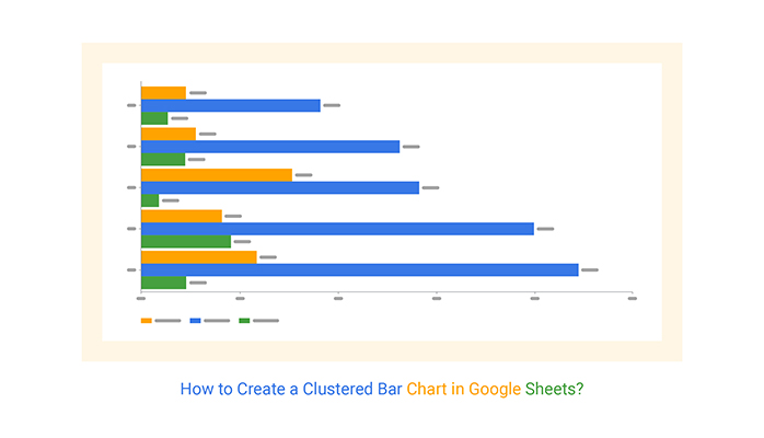
Definition: A Clustered Bar Chart in Google Sheets helps you compare multiple data series side-by-side with clear, easy-to-read horizontal bars. Each data series shares the same axis labels, so horizontal bars are grouped by category.
A clustered bar chart in Google Sheets directly compares multiple series in a given category. The chart is amazingly easy to read and interpret, even for a non-technical audience.
Adding another variable to a chart can double the amount of data that is represented. Besides, the spacing between clusters makes comparisons clearer.
The Google Sheets Clustered Bar Chart emphasizes the data within categories more than the data between them.
However, you can make comparisons between categories more clearly by using consistent color schemes. For instance, in a quarterly sales chart, each quarter should have the same color in each category to avoid confusion.
This approach works particularly well when using a Side-By-Side Bar Chart, as it allows for straightforward visual comparisons across different periods.
Take a look at the table below:
How easy is it to interpret the table?
| Cities | Quarter-1 | Quarter-2 | Quarter-3 | Quarter-4 |
| New York | 500 | 300 | 600 | 650 |
| Chicago | 400 | 550 | 300 | 400 |
| Austin | 350 | 400 | 450 | 500 |
| Boston | 450 | 500 | 550 | 300 |
| Seattle | 600 | 400 | 300 | 250 |
Note the difference after visualizing the data using a Google Sheets Clustered Bar Chart in Google Sheets. You can easily point out key insights in the table above.

In this video, you’ll learn how to create a Clustered Bar Chart in Google Sheets.
Keep reading because we’ll address the following question in the coming section: When should a Clustered Bar Graph in Google Sheets be used?
Like a standard Bar Chart, the Clustered Bar Chart in Google Sheets is built to display comparisons across different data categories.
Use the visualization design if your goal is to assess how the second category variable changes within each level of the first.
There are two types of comparison insights displayed in the chart, namely:
For within-group comparisons, the levels of the primary categorical variable determine the location for a cluster of bars to be plotted. In a stacked bar diagram or Stacked Bar chart, the number of bars you can plot in each group equals the number of levels of the secondary categorical variables.
On the other hand, the between-group comparisons are aided by choosing a consistent color and order for each secondary variable’s level to be plotted in each group. For more advanced insights, you can also use a Pareto chart in Google Sheets to highlight the most significant contributors across groups.
In the next section, we’ll cover the following: How to create a Clustered Bar Chart in Google Sheets?

This section will use a Clustered Bar Chart in Google Sheets to visualize the data below.
| Cities | Quarter-1 | Quarter-2 | Quarter-3 | Quarter-4 |
| New York | 500 | 300 | 600 | 650 |
| Chicago | 400 | 550 | 300 | 400 |
| Austin | 350 | 400 | 450 | 500 |
| Boston | 450 | 500 | 550 | 300 |
| Seattle | 600 | 400 | 300 | 250 |
To Get Started with the Clustered Bar Chart in Google Sheets, install the ChartExpo Add-on for Google Sheets from the link, and then follow the simple and easy steps below.


Using a clustered bar chart template in Google Sheets is an efficient way to visualize and compare data. Here’s how:
You can quickly compare multiple data series within the same category, such as product sales across regions or performance across departments.
The grouped horizontal bars reduce clutter and make differences obvious, even for non-technical viewers.
Perfect for tracking changes over time, budgets vs. actuals, or survey results in a clean, organized way.
You can use consistent color schemes to enhance readability and highlight trends effectively.
By turning raw data into clear visuals, progress bars in Google Sheets and Clustered Bar Graphs help you spot patterns and insights, supporting faster, data-driven decisions.
Compare monthly or quarterly sales across different regions side-by-side, helping teams quickly identify which regions are performing best.
Visualize customer feedback across multiple survey questions, easily comparing responses for different products or services.
Track the performance of various campaigns (clicks, conversions, impressions) across different platforms to see which campaign performs best.
Display budgeted vs. actual expenses across departments in a single view, making it easy to manage and adjust financial plans.
A Clustered Bar Chart is similar to a simple Bar Chart.
However, a Bar Chart displays insights into a single metric of a given category. On the other hand, a Clustered Bar Graph can display insights into two or more key variables in your data.
To make clusters in Google Sheets, insert a bar chart, add multiple data series, and Google Sheets will automatically group (cluster) them side by side for each category, allowing clear comparisons across your data.
A Clustered Bar Chart in Google Sheets is one of the best-suited visualization designs for displaying multiple varying metrics in your data.
The chart displays more than one data series in clustered horizontal columns. Each data series shares the same axis labels, so horizontal bars are grouped by category. Clustered bars in Google Sheets directly compare multiple series in a given category.
The chart is amazingly easy to read and interpret, even for a non-technical audience.
Adding another variable to a Clustered Bar Chart Google Sheets can double the amount of data that is represented. Besides, the spacing between clusters makes comparisons clearer.
Popular and widely used visualization tools like Google Sheets lack ready-made Clustered Bar Charts.
To access ready-made Clustered Bar Graphs Google Sheets, such as Grouped Bar Charts, we recommend you install third-party apps, such as ChartExpo, into your Google Sheets.
ChartExpo is an add-on you can easily download and install in your Google Sheets app. More so, the tool comes with insightful and ready-to-go 50-plus charts in Google Sheets.
Sign up for a 7-day trial to enjoy unlimited access to simple and visually appealing Clustered Bar Charts in Google Sheets for your data stories.
How much did you enjoy this article?


SUMPRODUCT in Google Sheets handles multi-condition calculations without extra columns. Master its syntax, uses, and errors. Read on!

An annual budget template in Google Sheets organizes your yearly finances, tracks every dollar, and reveals spending patterns. Read on!

Learn the best graph to show profit and loss with practical examples and use cases. Discover how to visualize your business data, track trends, and make smarter financial decisions.


