• Home
  • Tools dropdown img
    • Spreadsheet Charts

      • ChartExpo for Google Sheets
      • ChartExpo for Microsoft Excel
    • Power BI Charts

      • Power BI Custom Visuals by ChartExpo
    • Word Cloud

  • Charts dropdown img
    • Chart Category

      • Bar Charts
      • Circle Graphs
      • Column Charts
      • Combo Charts
      • Comparison Charts
      • Line Graphs
      • PPC Charts
      • Sentiment Analysis Charts
      • Survey Charts
    • Chart Type

      • Box and Whisker Plot
      • Clustered Bar Chart
      • Clustered Column Chart
      • Comparison Bar Chart
      • Control Chart
      • CSAT Survey Bar Chart
      • CSAT Survey Chart
      • Dot Plot Chart
      • Double Bar Graph
      • Funnel Chart
      • Gauge Chart
      • Likert Scale Chart
      • Matrix Chart
      • Multi Axis Line Chart
      • Overlapping Bar Chart
      • Pareto Chart
      • Radar Chart
      • Radial Bar Chart
      • Sankey Diagram
      • Scatter Plot Chart
      • Slope Chart
      • Sunburst Chart
      • Tornado Chart
      • Waterfall Chart
      • Word Cloud
    • Google Sheets
      Microsoft Excel
  • Services
  • Pricing
  • Contact us
  • Blog
  • Support dropdown img
      • Gallery
      • Videos
      • Contact us
      • FAQs
      • Resources
    • Please feel free to contact us

      atsupport@chartexpo.com

Categories
All Data Visualizations Data Analytics Surveys
Add-ons/
  • Google Sheets
  • Microsoft Excel
  • Power BI
All Data Visualizations Data Analytics Surveys
Add-ons
  • Google Sheets
  • Microsoft Excel
  • Power BI

We use cookies

This website uses cookies to provide better user experience and user's session management.
By continuing visiting this website you consent the use of these cookies.

Ok

ChartExpo Survey


Home > Blog > Microsoft Excel

Unlocking Customer Insights: The Voice of Customer Template

Picture yourself as an ambitious entrepreneur looking to elevate your company to unprecedented levels of success. You’ve got a brilliant product, a killer marketing strategy, and a team of talented individuals. But one thing is missing – the secret ingredient that sets you apart from the competition.


voice of customer template

That’s where the Voice of Customer template comes in.

This innovative tool allows you to delve into your customers’ minds. Then, unveil their untapped needs, desires, and hidden frustrations.

It’s like a pair of night-vision goggles, allowing you to see clearly in the darkness of customer opinions. You’ll no longer be left in the dark, guessing what your customers want.

You’ll have a clear roadmap guiding you on the following;

  • How to design your products.
  • How to tailor your marketing campaigns.
  • How to provide top-notch customer service.

Don your detective cap and embrace the curiosity of a young mind. We will uncover valuable customer insights using the Voice of Customer template.

Table of Contents:

  1. What Is the Voice of the Customer?
  2. When to Use the Voice of the Customer Template?
  3. Voice of the Customer Examples in Surveys
  4. How to Make a Customer Satisfaction Survey?
  5. How to Analyze Voice of Customer Data in Excel?
  6. Wrap Up

What is the Voice of the Customer?

Voice of the Customer (VoC) is customer feedback about their experiences and expectations. It helps businesses understand customer needs and preferences. Moreover, VoC data improves customer experience and business performance, increasing loyalty and revenue.

When to Use the Voice of the Customer Template?

Say goodbye to assumptions and hello to data-driven decision-making. It’s time to let your customers do the talking. Here are instances where the Voice of Customer template can be your secret weapon.

  • Product development: VoC template helps capture customer insights, preferences, and pain points. This information is essential when developing new products or enhancing existing ones. It provides valuable guidance for aligning product features with customer needs and expectations.
  • Market research: The VoC template aids in conducting market research by gathering feedback on customer preferences, trends, and demands. It enables you to identify market opportunities, understand target audiences, and make informed strategic decisions.
  • Customer satisfaction assessment: The VoC template is valuable for assessing and improving customer satisfaction. It helps measure satisfaction levels, identify areas for improvement, and track changes over time. Consequently enabling you to enhance customer experience and loyalty.
  • Continuous improvement: The VoC template supports continuous improvement initiatives through systematic customer feedback collection. It facilitates the identification of process inefficiencies, service gaps, and areas where you can enhance your operations.

Voice of the Customer Examples in Surveys

Are you ready to unleash the power of the customers’ voices? Here are some examples of VoC questions that will make your customers’ voices sing in your surveys.

Overall Satisfaction:

  • On a scale of 1-10, how satisfied are you with our product/service?
  • How likely are you to recommend our product/service to others?

Needs and Expectations:

  • What are the most important features or qualities you look for in a product/service like ours?
  • What are your expectations when using our product/service?

Pain Points and Challenges:

  • What are your major challenges or frustrations when using our product/service?
  • Are there any specific issues or areas where you believe we can improve?

Customer Support:

  • How satisfied are you with the customer support you received?
  • Did our customer support team resolve your issue or inquiry promptly and satisfactorily?

Competitor Comparison:

  • How do you perceive our product/service in comparison to our competitors?
  • What advantages or disadvantages do you see when comparing our product/service with alternatives in the market?

Recommendations:

  • What improvements or changes would you suggest to enhance our product/service?
  • Is there anything specific we can do to exceed your expectations?

Purchase Decision:

  • What factors influenced your decision to purchase our product/service?
  • Did you have any concerns or hesitations before making the purchase?

Future Expectations:

  • What are your expectations for future updates or enhancements to our product/service?
  • Are there any new features or offerings you would like to see from us in the future?

How to Make a Customer Satisfaction Survey?

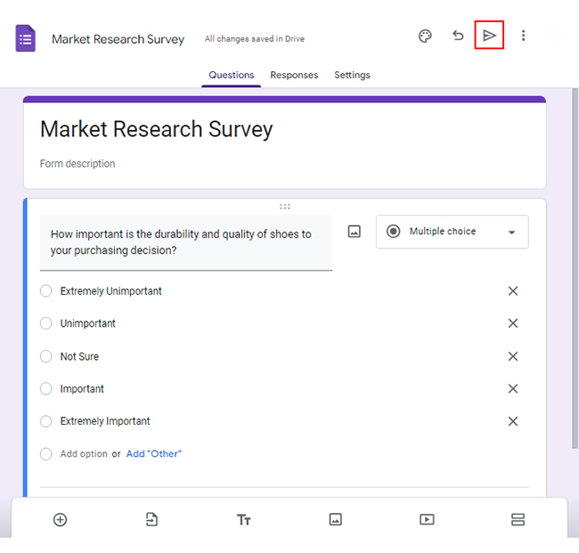
Let’s say you want to conduct a customer satisfaction survey consisting of the following questions;

  • How important is the quality of shoes to your purchasing decision?
  • How important is the fit of shoes when considering a purchase?
  • How important is the breathability of shoes for your needs?

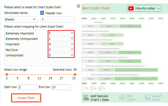
You want to map the rating scale below on each question;

  1. Extremely Unimportant
  2. Unimportant
  3. Not Sure
  4. Important
  5. Extremely Important

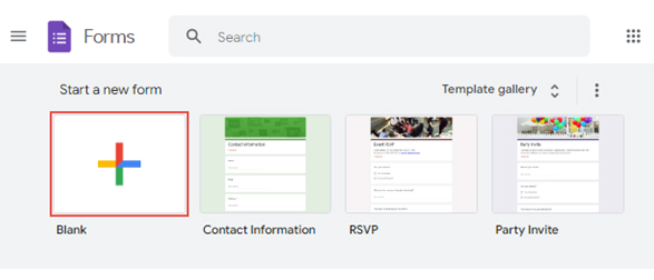
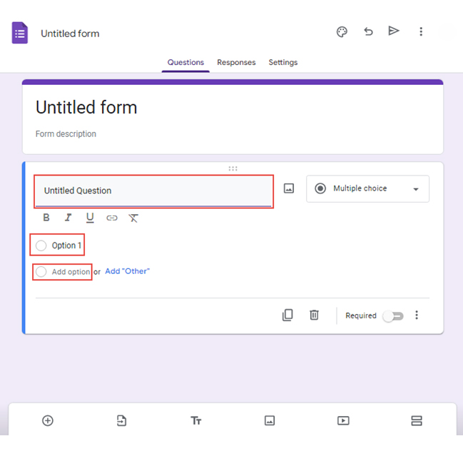
Follow these steps to make your customer satisfaction survey using Google Forms.

  • Open Google Forms and sign in with your Google account.
  • Click the “Blank” button to create a new form.
survey in google forms 1 ce344
  • Give your form a title and description that reflects your brand or purpose.
  • Choose the type of question you want to use, such as multiple-choice, checkbox, or short answer.
  • Type your question in the “Untitled Question” section for multiple-choice questions. Then write “Option 1” and choose “Add option” for more options.
survey in google forms 2 ce344
  • You can customize the look and feel of your survey to match your brand or theme.
  • Preview the form before sharing it with your target audience.
  • Click the share button to distribute it to your target audience.
survey in google forms 3 ce344
  • Once you collect enough responses, click the “Link to Sheets” button.
survey in google forms 4 ce344
  • Download your responses as a .csv file from the dropdown menu.
survey in google forms 5 ce344

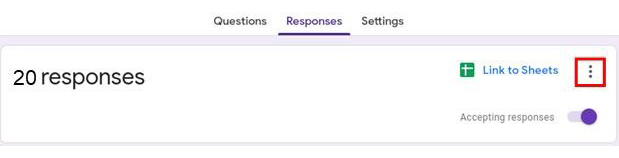
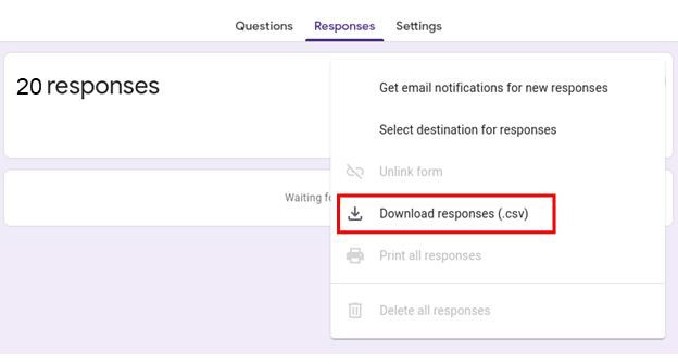
It will download the results from Google Forms to Excel.

How to Analyze Voice of Customer Data in Excel?

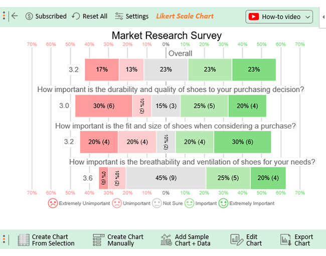
Are you ready to embark on a data-driven adventure? Buckle up as we take a thrilling dive into the world of data analysis in Excel with ChartExpo. ChartExpo will unlock the secrets hidden within your survey responses and transform them into insightful, appealing survey visualizations.

You will decode the secrets of human perception and unleash the full potential of your survey results.

Benefits of Using ChartExpo

  • ChartExpo unlocks the power data with its impressive array of visualizations. It’s like having a visual wizard at your fingertips, ready to transform your data into captivating insights.
  • ChartExpo is the secret weapon for data analysis superheroes. With its intuitive interface and powerful features, you’ll create insightful visualizations faster than a speeding bullet.
  • ChartExpo is the Picasso of data visualization. It turns boring spreadsheets into works of art that tell compelling stories and leave a lasting impression.
  • ChartExpo is the budget-friendly data visualization genie with a free 7-day trial and a $10 monthly plan.

How to Install ChartExpo in Excel?

  1. Open your Excel application.
  2. Open the worksheet and click the “Insert” menu.
  3. You’ll see the “My Apps” option.
  4. In the office Add-ins window, click “Store” and search for ChartExpo on my Apps Store.
  5. Click the “Add” button to install ChartExpo in your Excel.

ChartExpo charts are available both in Google Sheets and Microsoft Excel. Please use the following CTA’s to install the tool of your choice and create beautiful visualizations in a few clicks in your favorite tool.

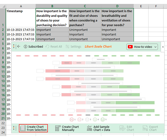
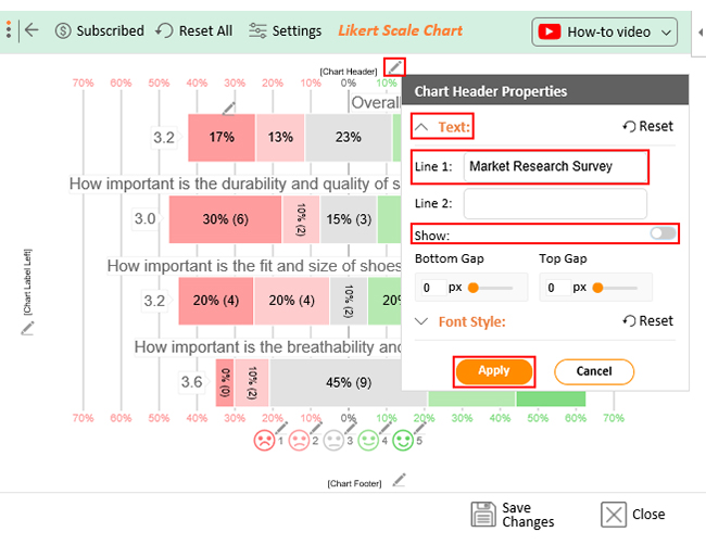
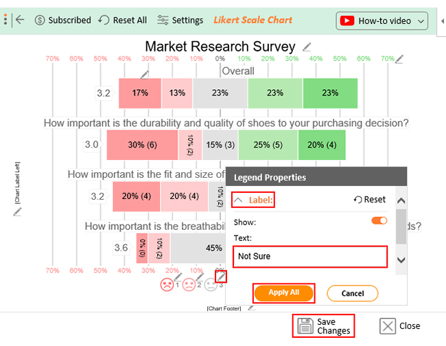
Let’s say your survey yields the data table below.

Timestamp How important is the quality of shoes to your purchasing decision? How important is the fit of shoes when considering a purchase? How important is the breathability of shoes for your needs?
10-13-2023 17:47:33 Important Unimportant Important
10-13-2023 17:47:33 Important Important Important
10-13-2023 17:47:33 Unimportant Unimportant Unimportant
10-13-2023 17:47:33 Extremely Important Unimportant Important
10-13-2023 17:47:33 Unimportant Important Not Sure
10-13-2023 17:47:33 Important Extremely Important Not Sure
10-13-2023 17:47:33 Extremely Unimportant Extremely Unimportant Not Sure
10-13-2023 17:47:33 Extremely Unimportant Extremely Unimportant Unimportant
10-13-2023 17:47:33 Extremely Unimportant Extremely Important Extremely Important
10-13-2023 17:47:33 Extremely Important Extremely Unimportant Not Sure
10-13-2023 17:47:33 Not Sure Extremely Important Not Sure
10-13-2023 17:47:34 Extremely Unimportant Extremely Important Not Sure
10-13-2023 17:47:35 Extremely Unimportant Unimportant Not Sure
10-13-2023 17:47:36 Important Extremely Unimportant Not Sure
10-13-2023 17:47:37 Not Sure Important Extremely Important
10-13-2023 17:47:38 Extremely Important Extremely Important Important
10-13-2023 17:47:39 Not Sure Not Sure Important
10-13-2023 17:47:40 Extremely Unimportant Extremely Important Not Sure
10-13-2023 17:47:41 Extremely Important Important Extremely Important
10-13-2023 17:47:42 Important Not Sure Extremely Important

This table contains example data. Expect many responses and questions in real life.

  • To get started with ChartExpo, install ChartExpo in Excel.
  • Now Click My Apps from the INSERT menu.
insert chartexpo in excel
  • Select ChartExpo and click the “Insert” button.
open chartexpo in excel
  • Once it loads, choose the “Likert Scale Chart” from the charts list.
search likert scale chart in excel
  • Click the “Create Chart From Selection” button after selecting the data from the sheet, as shown.
Create Chart From Selection ce344
  • When you click the “Create Chart From Selection” button, you have to map responses with numbers manually. The Likert scale has this arrangement:
    • Extremely Unimportant = 1
    • Unimportant = 2
    • Not Sure = 3
    • Important = 4
    • Extremely Important = 5
  • Once all is set, click the “Create Chart” button.
Map Likert Responses to Numbers ce344
  • ChartExpo will generate the visualization below for you.
voice of customer template example
  • If you want to have the chart’s title, click Edit Chart, as shown in the above image.
  • Click the pencil icon next to Chart Header to change the title.
  • It will open the properties dialog. Under the Text section, you can add a heading in Line 1 and enable Show.
  • Give the appropriate title of your chart and click the Apply button.
Apply title on Chart ce344
  • Let’s say you want to add text responses instead of numbers against every emoji.
  • Click the pencil icon next to the respective emoji. Expand the “Label” properties and write the required text. Then click the “Apply All” button.
  • Click the “Save Changes” button to persist the changes.
Apply label on Chart ce344
  • Your final chart will appear below.
Final voice of customer template

Insights

  • 45% of respondents consider the durability of shoes important when making a purchasing decision. 40% do not consider it important, while 15% remain neutral.
  • 50% prioritize the fit of shoes, while 40% do not consider it important.
  • Regarding breathability, 45% of respondents find it important, whereas 10% do not prioritize it.
  • Overall, 46% of respondents consider the above factors important in their decision-making process. On the other hand, 30% do not find them significant.

FAQs

What is the Voice of the Customer?

Voice of the Customer (VoC) refers to collecting, analyzing, and understanding customer feedback, preferences, needs, and expectations. It involves actively listening to customer opinions. Then incorporating them into decision-making to improve products, services, and overall customer experience.

How do you present the Voice of a customer?

Analyze and summarize customer feedback and insights with precision. You can do this through reports, presentations, or data visualization techniques like charts, graphs, or infographics. The presentation should focus on key themes, trends, and customer sentiments to comprehensively understand their perspectives.

What is an example of Voice of the Customer analysis?

An example of customer voice analysis is analyzing survey responses to identify common themes and sentiments. Categorizing and quantifying feedback allows you to gain insights into customer preferences, pain points, and improvement areas. Consequently, informs strategic decisions and enhances customer satisfaction.

Wrap Up

The Voice of Customer (VoC) template is a powerful tool for unlocking valuable customer insights. Employing the template allows you to systematically collect and analyze customer feedback, preferences, and expectations.

Furthermore, it facilitates a structured approach to understanding the Voice of the customer. Consequently, providing a framework for addressing their needs and improving customer satisfaction.

Through the VoC template, you can assess overall satisfaction levels, identify pain points, and acquire recommendations for improvement. Then tailor your products, services, and experiences to meet customer expectations.

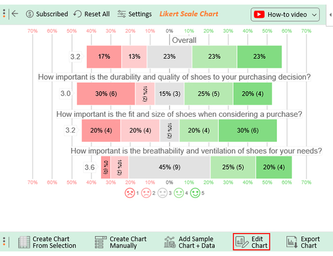
The visual representation of the Voice of customer data through charts, graphs, and infographics facilitates decision-making. It highlights key trends, patterns, and areas for improvement.

ChartExpo, with its visualization capabilities, empowers you to communicate customer feedback effectively. This makes it easier for stakeholders to understand and act upon the Voice of the customer.

Don’t settle for boring charts. Embrace the data revolution with ChartExpo – where innovation meets visual perfection.

How much did you enjoy this article?

ExcelAd2
Start Free Trial!
127347

Related articles

next previous
Microsoft Excel8 min read

Excel Task Tracker Template for Smarter Task Insights

Task tracker template in Excel organizes tasks, tracks deadlines, and boosts efficiency. Learn its benefits, and explore expert tips to simplify task management.

Microsoft Excel10 min read

Invoice Tracker Template in Excel for Better Insights

An invoice tracker Excel template helps track invoices, due dates, and payments. Learn how to use this template for better financial management.

Microsoft Excel12 min read

Key Performance Indicators in Healthcare for Better Insights

Key Performance Indicators in healthcare track patient care and efficiency. Learn about these KPIs, top examples, and how to use them to improve outcomes.

Microsoft Excel10 min read

BMI Calculation Formula in Excel for Better Fitness Insights

The BMI calculation formula in Excel helps track and analyze body mass index. Explore step-by-step instructions and tips to simplify BMI tracking in Excel.

Microsoft Excel29 min read

How to Create a Tornado Chart in Excel? A Complete Guide

Click to learn how to plot a Tornado Chart in Excel using easy-to-follow steps. Also, we’ll address the following question: what is a Tornado Diagram?

ChartExpo logo

Turn Data into Visual
Stories

CHARTEXPO

  • Home
  • Gallery
  • Videos
  • Services
  • Pricing
  • Contact us
  • FAQs
  • Privacy policy
  • Terms of Service
  • Sitemap

TOOLS

  • ChartExpo for Google Sheets
  • ChartExpo for Microsoft Excel
  • Power BI Custom Visuals by ChartExpo
  • Word Cloud

CATEGORIES

  • Bar Charts
  • Circle Graphs
  • Column Charts
  • Combo Charts
  • Comparison Charts
  • Line Graphs
  • PPC Charts
  • Sentiment Analysis Charts
  • Survey Charts

TOP CHARTS

  • Sankey Diagram
  • Likert Scale Chart
  • Comparison Bar Chart
  • Pareto Chart
  • Funnel Chart
  • Gauge Chart
  • Radar Chart
  • Radial Bar Chart
  • Sunburst Chart
  • see more
  • Scatter Plot Chart
  • CSAT Survey Bar Chart
  • CSAT Survey Chart
  • Dot Plot Chart
  • Double Bar Graph
  • Matrix Chart
  • Multi Axis Line Chart
  • Overlapping Bar Chart
  • Control Chart
  • Slope Chart
  • Clustered Bar Chart
  • Clustered Column Chart
  • Box and Whisker Plot
  • Tornado Chart
  • Waterfall Chart
  • Word Cloud
  • see less

RESOURCES

  • Blog
  • Resources
  • YouTube
SIGN UP FOR UPDATES

We wouldn't dream of spamming you or selling your info.

© 2025 ChartExpo, all rights reserved.