• Home
  • Tools dropdown img
    • Spreadsheet Charts

      • ChartExpo for Google Sheets
      • ChartExpo for Microsoft Excel
    • Power BI Charts

      • Power BI Custom Visuals by ChartExpo
    • Word Cloud

  • Charts dropdown img
    • Chart Category

      • Bar Charts
      • Circle Graphs
      • Column Charts
      • Combo Charts
      • Comparison Charts
      • Line Graphs
      • PPC Charts
      • Sentiment Analysis Charts
      • Survey Charts
    • Chart Type

      • Box and Whisker Plot
      • Clustered Bar Chart
      • Clustered Column Chart
      • Comparison Bar Chart
      • Control Chart
      • CSAT Survey Bar Chart
      • CSAT Survey Chart
      • Dot Plot Chart
      • Double Bar Graph
      • Funnel Chart
      • Gauge Chart
      • Likert Scale Chart
      • Matrix Chart
      • Multi Axis Line Chart
      • Overlapping Bar Chart
      • Pareto Chart
      • Radar Chart
      • Radial Bar Chart
      • Sankey Diagram
      • Scatter Plot Chart
      • Slope Chart
      • Sunburst Chart
      • Tornado Chart
      • Waterfall Chart
      • Word Cloud
    • Google Sheets
      Microsoft Excel
  • Services
  • Pricing
  • Contact us
  • Blog
  • Support dropdown img
      • Gallery
      • Videos
      • Contact us
      • FAQs
      • Resources
    • Please feel free to contact us

      atsupport@chartexpo.com

Categories
All Data Visualizations Data Analytics Surveys
Add-ons/
  • Google Sheets
  • Microsoft Excel
  • Power BI
All Data Visualizations Data Analytics Surveys
Add-ons
  • Google Sheets
  • Microsoft Excel
  • Power BI

We use cookies

This website uses cookies to provide better user experience and user's session management.
By continuing visiting this website you consent the use of these cookies.

Ok

ChartExpo Survey


Home > Blog > Microsoft Excel

How to Use Slicer in Excel for Better Chart Interaction?

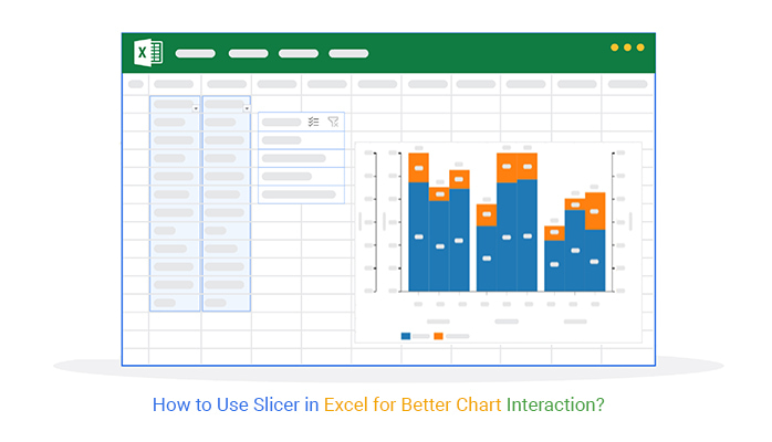
How do you use a slicer in Excel to simplify your data analysis?

Picture this: You’re working with an extensive sales report. You need to quickly filter data by regions, product categories, or timeframes. Instead of struggling with traditional filters, the Slicer tool lets you visually interact with your data. Click a button and see results instantly – it’s that easy.

Slicers first became available in Excel 2010, and their popularity has only grown. Today, many professionals rely on them for data analysis. Over 750 million people worldwide use Excel, making it one of the most popular tools for businesses, educators, and students. Slicers are a key part of why it’s such a powerful platform. They allow anyone to make data-driven decisions faster and with more clarity.

How to Use Slicer in Excel

In a world overflowing with information, speed matters. Companies that make quick, informed decisions are more likely to outperform their competitors by up to 30%. Using Slicers in Excel can help you achieve that kind of agility.

But how do you use slicer in Excel effectively? It starts with understanding what Slicers do and how to set them up for your specific needs. The tool is simple to use but brings significant benefits.

It’s time to explore what you’ve been missing and start filtering data with ease.

Table of Contents:

  1. What is Slicer in Excel?
  2. How to Add Slicers in Excel?
  3. How to Remove Slicer from Sheet?
  4. How to Analyze Data Using Slicer in Excel?
  5. What are the Benefits of Slicer in Excel?
  6. What are the Tips for Using Slicers in Excel?
  7. Wrap Up

First…

What is Slicer in Excel?

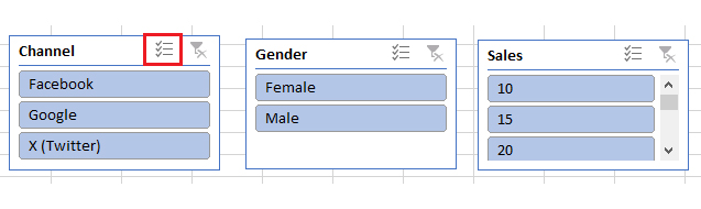
Definition: A slicer in Excel is a visual analytics tool for filtering data in PivotTables, charts, and tables. It shows buttons you can click to filter specific data categories, making it easy to focus on certain details.

Unlike standard filters, slicers are more interactive and user-friendly. They allow you to instantly see which data is selected.

Moreover, slicers enhance reports by creating a clear, dynamic way to explore data without navigating menus.

How to Add Slicers in Excel?

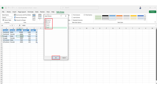
Ever wish you could filter your Excel data with just a click? That’s where slicers come in—they make data filtering quick and visual. Here’s how to add them:

  1. Insert your data into an Excel sheet. Click any data field, then click “Tables”. In the “Create Table” box, check the box and click “OK”.
In Create Table Box Cheeck the Box and Click Ok for Learning How to Use Slicer in Excel
  1. Your data will now be in table form.
Data in Table Form for Learning How to Use Slicer in Excel
  1. Click on “Table Design,” then select “Insert Slicer”.
Click on Table Design then Select Insert Slicer for Learning How to Use Slicer in Excel
  1. In the “Insert Slicer” box, select the fields you want to use as slicers. Select your columns and click “OK.”
Select Columns and Click Ok for Learning How to Use Slicer in Excel
  1. You can see the slicers of your selected data columns as follows:
See Slicers of Selected Data Columns for Learning How to Use Slicer in Excel
  1. The slicers for your selected data will appear. You can now filter data, like filtering for the “Facebook” channel.
Now Filter Data for Learning How to Use Slicer in Excel
  1. Click the clear filter button or use the shortcut Alt + C to clear filters.
Click Clear Filter Button for Learning How to Use Slicer in Excel 1
Click Clear Filter Button for Learning How to Use Slicer in Excel 2
  1. To enable multi-select, click “Multi-Select” or press Alt + S.
Click Multi Select for Learning How to Use Slicer in Excel
  1. Once multi-select is enabled, you can filter by multiple data points using the slicer.
Filter by Multiple Data Points Using Slicer for Learning How to Use Slicer in Excel

How to Remove Slicer from Sheet?

Removing a slicer from your Excel sheet takes only a few clicks. Whether you’re cleaning up your report or no longer need a particular filter, here’s how to eliminate a slicer.

  • Select the slicer: Click on the slicer you want to remove.
  • Press delete: Once selected, just press the “Delete” key, and it’s gone.

Alternatively, you can:

  • Right-click on the Slicer: Find the slicer, right-click on it, and a menu will appear.
  • Choose “Remove”: Select “Remove,” from the menu, and the slicer will disappear from your sheet.

How to Analyze Data Using Slicer in Excel?

Data analysis is key to making smart decisions, and data visualization helps understand trends and patterns.

But let’s face it—Excel’s built-in tools can limit data visualization. Sure, you can filter and organize with a slicer, but creating eye-catching visuals? That’s where things get tricky.

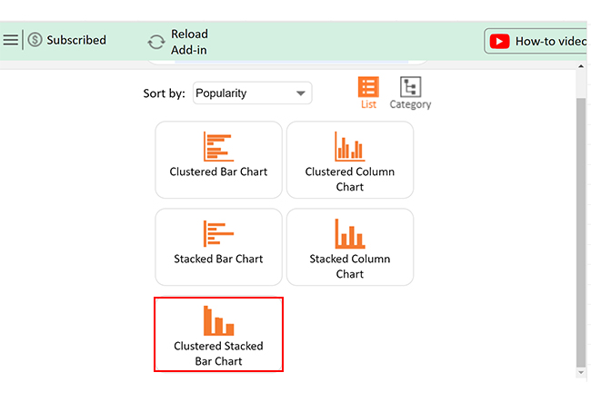
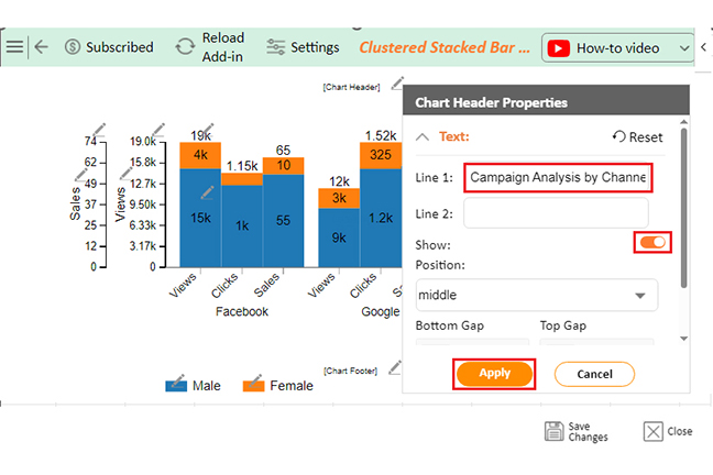
Enter ChartExpo—a game-changer that helps you create stunning, interactive visuals. If you want to elevate your data analysis beyond the basics, you’ll need more than just Excel’s slicer.

Let’s explore how.

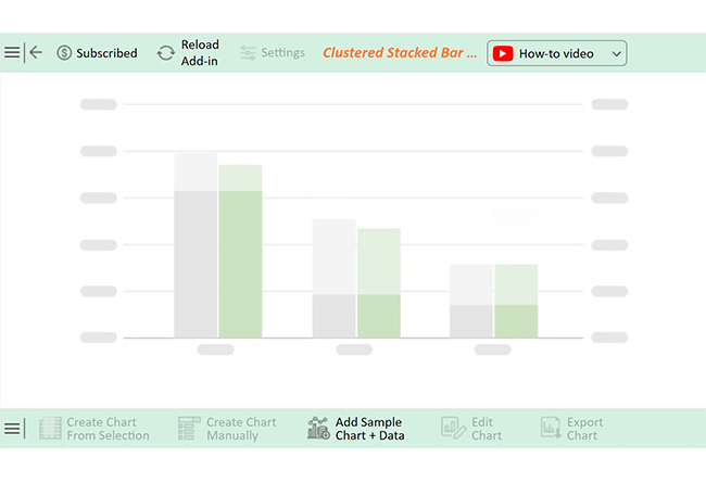
Let’s learn how to install ChartExpo in Excel.

  1. Open your Excel application.
  2. Open the worksheet and click the “Insert” menu.
  3. You’ll see the “My Apps” option.
  4. In the Office Add-ins window, click “Store” and search for ChartExpo on my Apps Store.
  5. Click the “Add” button to install ChartExpo in your Excel.

ChartExpo charts are available both in Google Sheets and Microsoft Excel. Please use the following CTAs to install the tool of your choice and create beautiful visualizations with a few clicks in your favorite tool.

Example

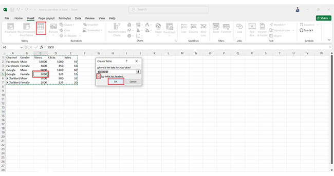
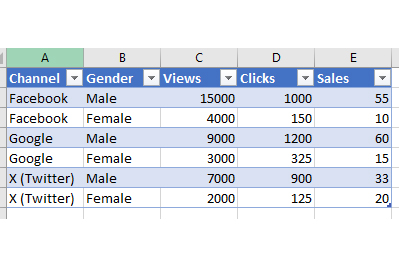
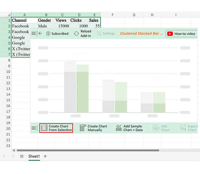
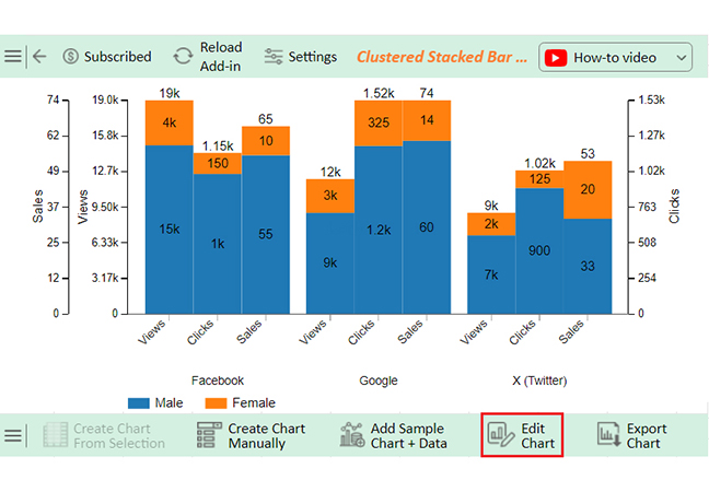
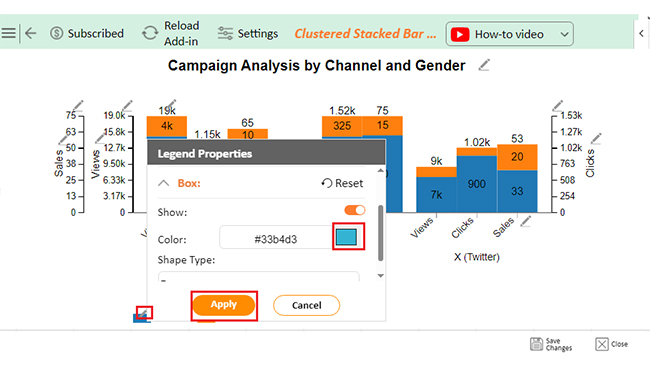
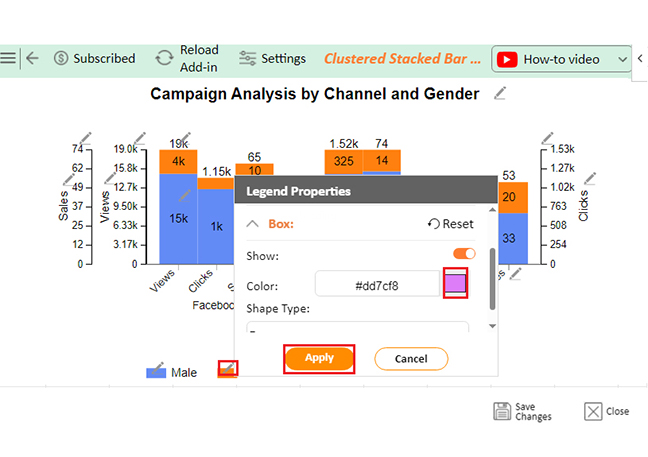
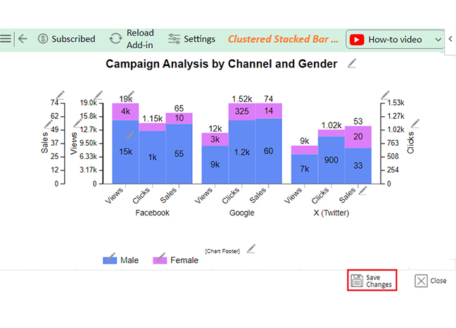
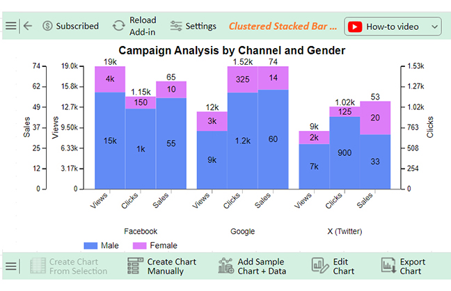
Let’s analyze the data below in Excel using ChartExpo.

Channel Gender Views Clicks Sales
Facebook Male 15000 1000 55
Facebook Female 4000 150 10
Google Male 9000 1200 60
Google Female 3000 325 15
X (Twitter) Male 7000 900 33
X (Twitter) Female 2000 125 20
  • To get started with ChartExpo, install ChartExpo in Excel.
  • Now Click on My Apps from the INSERT menu.
insert chartexpo in excel
  • Choose ChartExpo from My Apps, then click Insert.
open chartexpo in excel
  • Once it loads, scroll through the charts list to locate and choose the “Clustered Stacked Bar Chart”. This chart is best suited to this scenario.
search clustered stacked bar chart in excel
  • You will see a Clustered Stacked Bar Chart on the screen.
See Clustered Stacked Bar Chart After Learning How to Use Slicer in Excel
  • Click the “Create Chart From Selection” button after selecting the data from the sheet, as shown.
Click Create Chart From Selection After Learning How to Use Slicer in Excel
  • ChartExpo will generate the visualization below for you.
Initial Visual After Learning How to Use Slicer in Excel
  • If you want to have the chart’s title, click Edit Chart, as shown in the above image.
  • Click the pencil icon next to the Chart Header to change the title.
  • It will open the properties dialog. Under the Text section, you can add a heading in Line 1 and enable Show.
  • Give the appropriate title of your chart and click the Apply button.
Add Chart Header After Learning How to Use Slicer in Excel
  • You can change the color of the Male section by clicking on the Legend small pencil icon:.
Change Color of Male Section by Clicking on Legend Small Pencil After Learning How to Use Slicer in Excel
  • You can change the color of the Female section by clicking on the Legend small pencil icon:
Change Color of Female Section by Clicking on Legend Small Pencil After Learning How to Use Slicer in Excel
  • Click the “Save Changes” button to persist the changes.
Click Save Changes After Learning How to Use Slicer in Excel
  • Your Clustered Stacked Bar Chart will appear as below.
Final How to Use Slicer in Excel

Insights

  • Male users dominate in generating views, clicks, and sales across every channel.
  • Google shines in sales, with males leading the charge.
  • Facebook grabs the spotlight in views but struggles to turn them into sales efficiently.

What are the Benefits of Slicer in Excel?

Slicers in Excel offer a range of benefits that can make your data analysis smoother and faster. Whether working on a simple report or creating a complex dashboard, slicers help you easily navigate large datasets.

Here are some of the key advantages of this tool.

  • Visual filtering: Slicers provide a clear, button-based way to filter data, making it more intuitive than traditional drop-down filters.
  • Quick data analysis: With slicers, you can instantly filter and view data, allowing data-driven decision-making.
  • Multiple filter control: You can control multiple filters simultaneously, making it easy to narrow down results from various data fields.
  • Easier for non-technical users: Slicers simplify filtering, making it easy for people who may not be tech-savvy to explore data.
  • Customization: Slicers are customizable in terms of color, style, and size, allowing you to match them to your report’s design.
  • Enhanced dashboard experience: Adding slicers to dashboards creates a more dynamic and interactive user experience.

What are the Tips for Using Slicers in Excel?

Slicers in Excel can make data analysis a breeze. But to get the most out of them, a few tips are worth considering. Follow these tricks to optimize your use of slicers and improve overall efficiency.

  • Use clear labels: Ensure your slicer labels are easy to understand so users can quickly find the data they need.
  • Connect slicers to multiple PivotTables/charts: You can link one slicer to multiple PivotTables or charts. This allows for consistent filtering across different views.
  • Adjust slicer size and layout: Resize and arrange your slicers to fit well within your best-designed dashboards without overwhelming the screen.
  • Use slicer styles: Try different slicer styles to improve the visual appeal and match them to your workbook’s design.
  • Filter multiple items: Enable multi-select to filter multiple items at once. This feature is beneficial with larger datasets.
  • Clear all filters quickly: Use the “Clear Filter” button or keyboard shortcuts like Alt + C to reset slicers in one click.
  • Arrange slicers neatly: To facilitate user navigation, arrange your slicers in a tidy, logical order.
  • Experiment with different slicer types: Test different slicer types, like date and numerical slicers, to explore various ways of filtering data efficiently.

FAQs

How to use a slicer to filter data in Excel?

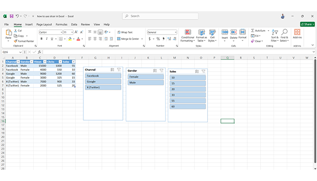
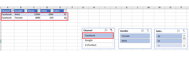
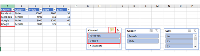
Click the slicer to select a filter option. The data will automatically update to show only the selected items.

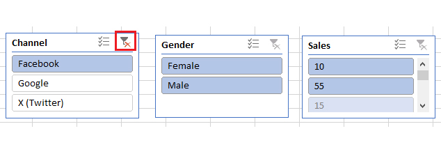
Click the “Clear Filter” button on the slicer to clear the filter.

Use multiple slicers for layered filtering.

How do I use a slicer in Excel without a PivotTable?

  • Convert your data range into a table by selecting it and pressing Ctrl + T.
  • Go to the Table Design tab and click Insert Slicer.
  • Choose the columns to filter, and use the slicer to filter the table data.

How to use a slicer in the formula in Excel?

  • Link the slicer to a PivotTable.
  • Use the FILTERS function or GETPIVOTDATA to reference the slicer’s filtered values.
  • These functions can help integrate slicer selections into formulas, making calculations reflect the filtered data in your spreadsheet.

Wrap Up

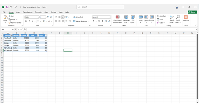
Using a slicer in Excel is a great way to simplify data filtering. It provides a user-friendly visual method to sort through large datasets. With just a few clicks, you can filter data based on specific criteria, making your analysis quicker and more efficient.

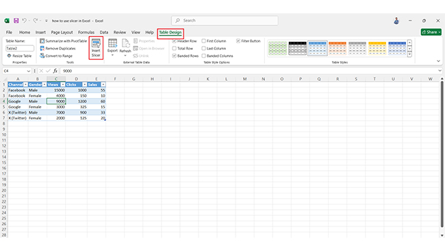
Inserting slicers is easy. Once you’ve created a PivotTable or converted your data into a table, you can add slicers to filter your data instantly. Choose the columns you want to filter; the slicers will do the rest.

Slicers support multiple filters at once. This is perfect when you need to filter across different categories, such as regions or product lines. The multi-select feature allows you to choose multiple items simultaneously, adding flexibility to your data exploration.

Customization is another significant advantage. You can resize and restyle your slicers to fit the look and feel of your report or dashboard. This enhances both the usability and aesthetics of your data presentation.

Clearing filters is simple. You can quickly reset all your slicers with a click of a button or a keyboard shortcut. This makes it easy to start fresh with new data.

While slicers improve Excel’s data filtering, Excel itself can be limiting for data visualization. ChartExpo helps you create advanced, interactive visuals that Excel’s native tools can’t.

Do not hesitate.

Install ChartExpo today to unlock the full potential of your slicers and take your data analysis to the next level!

How much did you enjoy this article?

ExcelAd1
Start Free Trial!
143825

Related articles

next previous
Microsoft Excel10 min read

Compound Interest in Excel for Smarter Reporting

Discover compound interest in Excel and how it works. Learn its formulas, calculation tips, and common errors to avoid for more accurate financial analysis.

Microsoft Excel9 min read

KPI Dashboard in Excel: A Complete Guide

A KPI dashboard in Excel helps track key metrics and streamline data visualization. Discover how to create, analyze, and use it with clear guides and examples.

Microsoft Excel11 min read

How to Plot a Speedometer Chart in Excel?

Create a Speedometer Chart in Excel to track KPIs, goals, and performance metrics visually. Explore templates, examples, and step-by-step instructions for better dashboards.

Microsoft Excel13 min read

Excel for Teachers for Insightful Preparation

Excel for teachers simplifies grading, tracks attendance, and organizes data. Find its key features, expert tips, and how ChartExpo enhances data visualization.

Microsoft Excel14 min read

How to Make a Cash Flow Diagram in Excel?

Learn how to make a Cash Flow Diagram in Excel. It will help you learn to visualize and analyze inflows and outflows of your business cash flow.

ChartExpo logo

Turn Data into Visual
Stories

CHARTEXPO

  • Home
  • Gallery
  • Videos
  • Services
  • Pricing
  • Contact us
  • FAQs
  • Privacy policy
  • Terms of Service
  • Sitemap

TOOLS

  • ChartExpo for Google Sheets
  • ChartExpo for Microsoft Excel
  • Power BI Custom Visuals by ChartExpo
  • Word Cloud

CATEGORIES

  • Bar Charts
  • Circle Graphs
  • Column Charts
  • Combo Charts
  • Comparison Charts
  • Line Graphs
  • PPC Charts
  • Sentiment Analysis Charts
  • Survey Charts

TOP CHARTS

  • Sankey Diagram
  • Likert Scale Chart
  • Comparison Bar Chart
  • Pareto Chart
  • Funnel Chart
  • Gauge Chart
  • Radar Chart
  • Radial Bar Chart
  • Sunburst Chart
  • see more
  • Scatter Plot Chart
  • CSAT Survey Bar Chart
  • CSAT Survey Chart
  • Dot Plot Chart
  • Double Bar Graph
  • Matrix Chart
  • Multi Axis Line Chart
  • Overlapping Bar Chart
  • Control Chart
  • Slope Chart
  • Clustered Bar Chart
  • Clustered Column Chart
  • Box and Whisker Plot
  • Tornado Chart
  • Waterfall Chart
  • Word Cloud
  • see less

RESOURCES

  • Blog
  • Resources
  • YouTube
SIGN UP FOR UPDATES

We wouldn't dream of spamming you or selling your info.

© 2025 ChartExpo, all rights reserved.