Categories
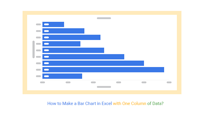
A Bar Chart is best suited in displaying comparison insights, especially if you’re dealing with one column of data.
Why?
Besides, the visualization is arguably among the most straightforward charts to decode. You can use this chart to create persuasive and irresistible data stories.
You require the best visualization tool to plot easy-to-interpret and visually-stunning Bar Graphs. Yes, you need a tool that’s easy to use and affordable.
Excel seems to be the logical choice for many. However, the spreadsheet application has very basic Bar Graphs, which requires a ton of work and time in editing.
So, what’s the solution?
There’s a particular add-in you can easily download and install in your Excel. The add-in (mentioned above) generates a ready-to-use Bar Chart in Excel with one column of data.
A Bar Graph is a chart that displays insights using rectangular bars or columns.

Visualization Source: ChartExpo
Bar charts come in multiple variants, namely:
The visualization design was first used by Nelvin Ks (1759-1824) to display insights into Scotland’s imports between 1780 and 1781.
If your goal is to display the composition and comparison of key variables in your data, your go-to chart should be a side-by-side Bar Chart in Excel, where you can easily compare multiple columns of data.”
Keep reading because we’ll cover the following in the coming section: How to make a Bar Chart in Excel with one column of data?
Excel is one of the most used tools for visualizing data because it’s easy to use.
However, a ready-made Bar Chart in Excel with one column of data does not exist in Excel’s chart library. But this does not mean you should ditch this freemium data visualization tool.
Did you know you can supercharge your Excel with add-ins to access visually stunning and ready-to-go Bar Graphs?
Yes, you can increase the functionality of your tool and access a ready-made Clustered Stacked Bar Graph in Excel with one column of data for your data stories.
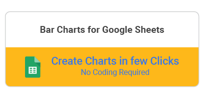
The add-on we recommend you use is ChartExpo.
So, what is ChartExpo?
We recommend this tool (ChartExpo) because it’s super easy to use.
You don’t need to take programming night classes to extract insights from your data. ChartExpo is more of a ‘drag-and-drop tool,’ which means you’ll only need to scroll your mouse and fill in the respective metrics and dimensions in your data.
The Bar Chart in Excel with one column of data, Excel generator comes with a 7-day free trial period.
More so, the tool produces charts that are incredibly easy to read and interpret. And it allows you to save charts in the world’s most recognized formats, namely PNG and JPG.
How to make a Bar Chart in Excel with one column of data should never consume your valuable time. Keep reading to discover tips that can help you hasten the time-intensive process, especially when you need to make a graph from a table.


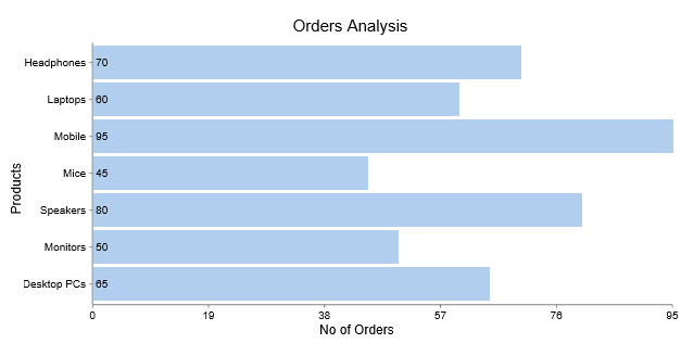
In this section, we’ll use the Bar Chart in ChartExpo to display insights into the table below.
| Product | Number of Orders |
| Headphones | 70 |
| Laptops | 60 |
| Mobile | 95 |
| Mic | 45 |
| Speakers | 80 |
| Monitors | 50 |
| Desktop PCs | 65 |
To install the ChartExpo add-in into your Excel, click this link.


How to make a Bar Chart in Excel with one column of data should never stress you. Use ChartExpo.

How to make a Bar Chart in Excel with one column of data should never overwhelm you with complex steps. Use ChartExpo.

Bar Graphs are charts that display insights using rectangular bars or columns.
Businesses like yours can use the visualization design to display comparison insights into key business metrics, such as profits versus gross revenue, costs versus gross income, and profit vs. costs.
A Bar Graph is a visualization design you can leverage to display insights using rectangular bars or columns. Also, you can use the chart to display one-to-many relationships in data.
The chart comes in multiple variants, namely:

A Bar Chart is best suited to displaying comparison insights, especially if you’re dealing with one column of data.
Why?
Besides, the visualization is arguably among the most detailed charts to decode. You can use this chart to create compelling and irresistible data stories.
You require the best visualization tool to plot easy-to-interpret and visually stunning Bar Graphs. Yes, it would help if you had an easy-to-use and affordable tool.
Excel, one of the popular tools for visualizing data, comes with very basic Bar Charts, which require a ton of work and time in editing.
How to make a Bar Chart in Excel with one column of data should never overwhelm you with complex steps.
We recommend you try ChartExpo because it’s one of the most trusted add-ins. Besides, it has a super-friendly user interface for everyone, irrespective of their computer skills.
Create simple, ready-made, and easy-to-interpret Bar Charts today without breaking a sweat.
How much did you enjoy this article?


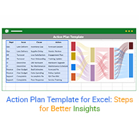
Use an Action Plan Template for Excel to organize tasks, set deadlines, and track progress across any project, from business to personal goals and more.
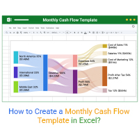
What is a Cash Flow Template? Click to learn how to create a Monthly Cash Flow Template in Excel to keep track of your Financial Position.
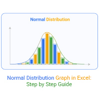
A normal distribution graph in Excel shows patterns, averages, and outliers. Learn how to create one, see examples, and boost your data analysis skills.