Categories
By ChartExpo Content Team
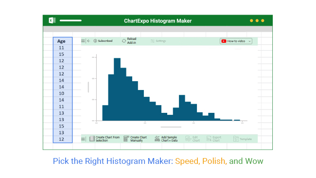
Every chart tells a story. A good histogram maker helps you tell it without wasting words.
Bad charts waste time. Worse, they confuse people. If your histogram buries the story or misleads your reader, it’s not doing its job.
Bins too narrow? You’ll get noise. Too wide? You’ll miss the signal. One small setting in your histogram maker can flip the meaning of your chart. That’s risky. Especially when you’re on a deadline, facing questions, or making a call that matters.
A good histogram maker keeps things simple. It handles weird data. It skips code. It fixes axis issues before they throw people off. It builds trust in your chart, fast. Whether you’re working with sparse numbers or millions of rows, the right histogram maker shows what counts.
You don’t need a tool that promises everything. You need one that builds clear visuals, cuts through confusion, and fits into your workflow. That’s what a good histogram maker does.
Think of bins as the containers for your data. Too many, and the message gets lost. It’s like trying to hear a whisper in a crowded room. You’re looking for the story your data tells, not a chaotic mess. By keeping bins in check, the truth of your data shines through.
When you cut your data too thin, the noise overshadows the signal. You don’t want your insights lost in translation. Fewer bins mean clearer trends and patterns. This approach keeps the focus where it belongs—on the valuable insights your data holds.
Data can be quirky. Sometimes it’s not neatly packed. Skewed data can make your histograms lopsided. Sparse data might leave gaps. And then there’s the downright weird stuff. Don’t panic. The trick is knowing how to handle these quirks.
You can start by identifying the type of data you’ve got. Skewed data might need some transformation. Sparse data may require combining. And for the outright odd, sometimes it’s best to adjust your perspective. Approaching your data with a flexible mindset helps you get the most accurate picture.
| Histogram Maker Binning Strategies for Different Data Types | ||
| Data Type | Recommended Bin Strategy | Reason |
| Normally Distributed | Equal-width bins | Maintains visual symmetry and standard analysis |
| Skewed Data | Log transformation or quantile bins | Reduces distortion from long tails |
| Sparse Data | Fewer bins or grouped ranges | Avoids empty bins and improves signal clarity |
| Multimodal Data | Higher bin count | Reveals multiple peaks in the distribution |
| Censored Data | Custom bin endpoints | Ensures data boundaries are properly represented |
| Bimodal Data | Mid-sized bins with annotations | Highlights both central modes distinctly |
| Categorized Numeric Data | Manual bin breaks | Aligns bins with known category boundaries |
| Time Interval Data | Fixed interval width | Preserves temporal consistency for analysis |
Axes can be tricky. Poorly labeled or scaled axes can lead to confusion. It’s the difference between clarity and chaos. You want your audience to understand your data quickly. Clear labeling and proper scaling do wonders for comprehension.
Fixing these issues is simple. Ensure labels are descriptive yet concise. Adjust scaling to fit the data range. This attention to detail makes your histograms not just good, but impressive. It’s about making sure your data tells the right story, every time.
| Histogram Maker Troubleshooting: Common Issues and Fixes | ||
| Problem | Likely Cause | Suggested Fix |
| Chart looks noisy | Too many bins | Reduce bin count or increase bin width |
| Misleading scale | Incorrect axis range | Adjust axis min and max values |
| Bars are hard to read | Clashing colors or tiny fonts | Use a cleaner palette and increase font size |
| Gaps in data | Sparse dataset | Combine bins or use grouped ranges |
| Blurry export | Low-resolution output | Export as high-res PNG or vector format |
| Chart cuts off values | Improper axis limits | Expand axis range to include all data |
| Chart looks cluttered | Too many callouts or labels | Simplify labels and remove unnecessary elements |
| Long load time | Large dataset or high interactivity | Aggregate data or turn off animation |
| Confusing bin labels | Non-uniform or ambiguous bins | Use consistent, evenly spaced breakpoints |
Think of speed, control, and polish as three sides of a triangle. Each side is important. But sometimes focusing on one can make the others harder to achieve. You want speed for quick results. But sacrificing control can leave you with a bland result. Too much emphasis on polish can slow you down.
What’s the solution? Look for a tool that offers presets and templates. This can give you a head start without sacrificing detail. Customization options should allow you to add your own flair. It’s about balancing these elements. It ensures you get a result that’s quick, tailored, and visually appealing.
| Histogram Maker Use Cases by Industry | ||
| Industry | Use Case for Histogram Maker | Benefit |
| Education | Student performance distribution | Identifies grade trends and outliers |
| Healthcare | Patient age or treatment response distribution | Tracks variation in health metrics |
| E-commerce | Order size or delivery time frequency | Optimizes logistics and pricing |
| Manufacturing | Product defect rates | Supports quality control and root cause analysis |
| Finance | Risk profile or returns distribution | Aids in portfolio risk modeling |
| Marketing | Customer age or spending histogram | Improves segmentation and targeting |
| Public Policy | Census data distribution | Supports demographic and policy planning |
| Retail | Transaction size frequency | Helps forecast demand and inventory |
| Transportation | Commute time or traffic distribution | Improves route planning |
| Human Resources | Employee tenure distribution | Supports workforce planning and retention |
Compatibility is key. You want a tool that fits into your existing process. Think of it like finding a puzzle piece that clicks into place. Some tools integrate smoothly with software you already use. This can save you time and hassle. Look for features that allow for easy data import and export.
You also need a tool that’s flexible. It should adapt to different projects. Whether it’s a small report or a big presentation, it should handle it all. Check for compatibility with other formats. This ensures you can share your visuals anywhere. A good fit means less time wrestling with tech and more time focusing on what matters.
Not everyone is a coding wizard. And that’s okay. Many tools offer powerful features without requiring any coding knowledge. This makes them accessible to everyone, not just tech experts. Look for drag-and-drop interfaces. They make it easy to create stunning visuals without writing a single line of code.
These tools often come with tutorials and guides. They help you get the most out of the features. You can create professional-grade visuals with ease. It’s all about making the process approachable. Everyone should be able to create beautiful visuals, regardless of their coding skills.
Imagine you’re working on a tight deadline. You’ve got a spreadsheet full of data. But you need to present it in a way that’s clear and engaging. You’re feeling the pressure. But with the right tool, you can turn that data into a stunning visual in just six minutes.
One user faced this exact scenario. They had a mountain of data but little time. Using a user-friendly tool, they transformed their spreadsheet into a vibrant visual. It was easy to read and understand. Their audience was impressed, and they delivered their presentation with confidence. It’s proof that the right tool can make all the difference.
Bins are the core of any histogram. They shape how data looks and feels. Imagine bins as buckets for your data. You can decide how many buckets you want and their size. It’s like choosing the number of lanes on a highway to manage traffic.
Adjusting the bin width can change the story your data tells. A wide bin might miss subtle details, while a narrow one could highlight noise over trends. Play with the count to find balance. Breakpoints add another level of customization. They let you place dividers where they matter most. Think of breakpoints as strategic pauses in a conversation. They help emphasize key points.
| Histogram Maker Bin Width Guide: Settings, Outcomes, and Use Cases | ||
| Bin Width Setting | Chart Outcome | When to Use |
| Very Narrow (Too Many Bins) | High noise, over-detailed | Detecting fine-grain anomalies |
| Narrow | Detailed view, but risk of distraction | Exploring sub-patterns in small datasets |
| Optimal (Balanced Bins) | Clear trends, low noise | General analysis, presentations |
| Moderately Wide | Smooth, less granularity | Summarizing data for mid-level overviews |
| Very Wide (Too Few Bins) | Oversimplified, hides variation | Executive summaries, high-level overviews |
A snazzy design might grab attention, but it should also help convey your message. Choose colors that enhance readability. Colors should highlight differences, not distract. Use fonts that are easy on the eyes. Stick with simple, clear fonts. The goal is clarity, not confusion.
Consider gridlines and labels carefully. They guide the viewer’s eye. But too many can create clutter. Aim for a clean look. It should feel like a well-organized bookshelf, not a chaotic library. Every design choice should serve a purpose. It should make your data’s story stronger and clearer.
Histograms can do more than just show data. Add layers for comparison. Think of it as adding pages to a storybook. Each layer adds depth and understanding. Use summary stats to provide context. They offer a quick snapshot of key figures. Imagine them as the blurb on a book cover.
Callouts can highlight important findings. They act like a spotlight, drawing attention where needed. But keep them tidy. Too many callouts can overwhelm, like too much seasoning in a dish. Use them sparingly to emphasize your message without drowning it.
Meet Dr. Smith, an academic researcher. Faced with peer review, she knew her data had to shine. She adjusted bin widths to highlight significant trends. It was like adjusting a camera lens to focus on details that matter. Her precise breakpoints underscored pivotal shifts in her findings.
Dr. Smith also chose a clean, sleek design. Her choice of colors and fonts made the data easy to digest. Reviewers appreciated her clarity and precision. Her strategic use of callouts directed focus to critical insights. This thoughtful presentation helped her secure the approval she needed. Her story shows the impact of thoughtful customization. It can transform data into a compelling narrative.
(And How to Outsmart Them)
Picture this: you’re on a deadline, and the UI decides it’s nap time. Frustrating, right? Your patience wears thin, and the laptop looks like it might fly out the window. Before that happens, take a deep breath.
Start by customizing your toolbar. Move your most-used functions to the forefront. This action saves time and reduces frustration. Also, familiarize yourself with keyboard shortcuts. They might seem intimidating, but they’re lifesavers. A few keystrokes can replace multiple clicks.
Spreadsheet tools offer built-in chart options. But they can be more of a time thief than a timesaver. You think they’re helping, but in reality, they’re slowing you down. These built-ins often lack flexibility and customization.
Consider the time spent tweaking settings to get the look you want. You could spend hours fiddling, only to end up with something subpar. Instead, try specialized software. It often provides more options and reduces the time spent on adjustments.
| Histogram Maker Myths vs. Facts | ||
| Myth | Fact | Clarification |
| Histograms are only for scientists | Histograms are used in business, marketing, education, and more | They are essential tools across industries |
| More bins means more accuracy | Too many bins can introduce noise | Optimal bin count highlights patterns without clutter |
| You need to know coding to make one | Many tools are no-code or low-code | Accessible to non-technical users |
| All histogram tools are the same | Features and usability vary widely | Tool choice affects speed, clarity, and results |
| Histograms are outdated | They remain one of the most reliable visualizations | Used in analytics, QA, education, and more |
| Histogram settings are one-size-fits-all | Settings must be tailored to the data type | Proper customization ensures correct interpretation |
Imagine a world where creating histograms is as easy as pie. No fuss, no muss. It’s all about having a streamlined process that you can rely on every time. Start by setting up templates. A good template saves you from reinventing the wheel every time you start.
Next, create a checklist. This list ensures you don’t miss any steps. From data input to final touches, a checklist keeps you on track. It also makes the process repeatable and efficient. You’ll always know what needs to happen next, making your workflow smooth and predictable.
Meet Sarah, a product manager who faced a real crunch. The quarterly report was due, and her data was a mess. Instead of panicking, she turned to a histogram tool. With a few clicks, she transformed her data chaos into clear visuals.
Sarah’s secret was preparation. She had her data organized and ready. By knowing her tool inside and out, she could work quickly. In just 12 minutes, she completed a task that usually took hours. Thanks to her speed, she even had time for a coffee break.
Side-by-side histograms can be like dueling pianos, each telling its part of the story. Set them up to show how two variables interact. For instance, compare sales data before and after a promotion. It’s like seeing two sides of a coin. Make sure they are on the same scale to avoid misleading the audience.
Spacing between bars is crucial. Too close, and they merge into one. Too far, and the comparison is lost. Labels should be straightforward to help the reader immediately grasp the differences. A clear legend can act like a map, guiding the reader through the data landscape. This kind of setup turns numbers into a conversation.
Time series data is like a diary, recording events over time. When using histograms, you can reveal trends and patterns hidden in the dates. Align the bars to show changes over time, like revenue growth across months. Choose a consistent time unit for a smooth flow. It helps the reader follow the timeline without getting lost.
Highlight significant points to draw attention to key events. Maybe a spike in sales during a holiday season. Use annotations sparingly to point out these highlights. This approach turns a graph from a static image into a dynamic story. The reader can visualize the passage of time and understand the progression of events.
Big data doesn’t have to be overwhelming. Imagine trying to read a book with too many words crammed on each page. That’s what a poorly designed histogram feels like. Use interactive elements to allow zooming and panning. It’s like giving the reader a magnifying glass. They can explore without feeling buried under data.
Simplify without losing detail. Group data into broad categories, and allow the reader to drill down for more. This keeps the initial view neat, while the depth is only a click away. Use tooltips to provide extra information without cluttering the view. It’s like having footnotes in a text, offering deeper insights when needed.
Picture a QA team as detectives, sifting through data to find clues. They faced 2 million rows of data—a daunting task. But histograms helped. By plotting defect rates across products, patterns emerged. One particular product showed a spike in defects. It was like finding a needle in a haystack.
Histograms broke down the data into digestible parts. This visualization highlighted the flaw, which was invisible in raw data. The team could pinpoint the issue and focus on a solution. This example shows the practical power of histograms in real-world problem-solving, transforming chaos into clarity.
| Histogram Maker Performance Tips for Large Datasets | ||
| Challenge | Tip | Reason |
| Millions of rows | Aggregate or sample data before plotting | Reduces load time and visual clutter |
| Slow rendering | Turn off animations or transitions | Improves responsiveness on large charts |
| Cluttered display | Group data into categories | Keeps visualization readable and digestible |
| Excessive labels | Use tooltips or interactive legends | Avoids crowding the chart interface |
| Scaling issues | Use log scale for large value ranges | Normalizes distribution for better visibility |
| Overlapping bars | Increase bin width or spacing | Prevents bars from merging visually |
| Zoom lag | Enable lazy loading or progressive rendering | Loads data in chunks for smoother interaction |
| Export slowness | Limit output resolution or dimensions | Speeds up file generation for large charts |
The transition from your tool to PowerPoint can sometimes cause chaos. Ever seen a histogram that once looked great but now seems like a poor imitation? Avoid this by embedding your charts as images rather than copying and pasting. This keeps everything intact. Adjust the slide layout to accommodate the histogram size without stretching it.
PDFs can also be tricky. Ensure your histogram is in a resolution that suits the output size. High-resolution images ensure they don’t lose quality when printing or zooming in. And remember, PDFs can handle vector images better. So, if your tool allows, export your histogram as a vector file before adding it to your PDF. This keeps lines and text crisp and clear.
| Histogram Maker Export Formats: Best Use by Output Type | ||
| Use Case | Recommended Format | Why |
| Printing reports | TIFF or high-res PNG | Sharp detail and suitable for large print formats |
| Web publishing | SVG or PNG | Scalable, fast-loading, and browser-friendly |
| Slide presentations | EMF or SVG | Retains sharpness when resized in PowerPoint |
| Email attachments | JPEG or compressed PNG | Small file size and widely supported |
| Mobile dashboards | SVG | Responsive and sharp at any screen size |
| PDF documents | Vector-based PDF or SVG | Preserves detail and supports zooming |
| Internal wikis or intranet | Low-res PNG | Quick load time and ease of use |
| Client-facing reports | High-res PNG or SVG | Professional appearance with crisp visuals |
Sharing interactive histograms can be a game-changer. However, embedding them incorrectly can lead to frustration. Always use the embed code provided by your chart tool. This ensures full functionality when shared. Another tip is to check how the chart interacts on different devices. Ensure it remains user-friendly on mobile, tablets, and desktops.
Think about your audience. Not everyone might be tech-savvy. Provide a short guide or tips on how to interact with the chart. A simple line or two can enhance the viewer’s experience. Also, interactive charts can sometimes slow down loading times. Ensure your chart is optimized for faster loading. No one likes waiting!
Choosing the right format can make a big difference. For print, always go for high-resolution images. They capture the details better. Formats like TIFF or high-quality PNGs are ideal. They retain the sharpness and detail required for print media. Ensure your color settings are suitable for print to avoid unexpected color shifts.
For the web, the focus shifts to loading speed and clarity. Web-friendly formats like PNG or JPEG are common. However, SVGs offer scalability without quality loss. They work well for responsive designs where charts need to adjust to different screen sizes. For slides, stick to formats that keep your histogram sharp and clear. High-quality PNGs or vector images are excellent choices.
Imagine a consultant pitching to a big client. Amidst all the data and slides, a histogram in the appendix steals the show. This wasn’t any ordinary chart. It provided clarity to complex data, making it easy for the client to grasp key insights. This histogram was well-crafted, with a clear legend and concise labels.
The consultant’s success didn’t rely solely on data. It was the presentation and clarity that captured the client’s interest. The histogram highlighted trends that were crucial to the client’s decision-making. This simple yet effective presentation tool played a pivotal role in winning the client over. It shows how a well-presented histogram can make a significant impact in the business world.
(Features That Actually Matter)
Your colleagues might rave about certain tools, but experiences can vary. Some find simpler tools sufficient for everyday tasks. These tools may offer basic features, but they tend to be more reliable and user-friendly.
Others might regret using overly complex tools that promise a lot but deliver little. These tools can come with a steep learning curve and might not justify the time spent mastering them. Listening to peer feedback can help guide you toward a tool that aligns with your needs.
| Histogram Maker Evaluation Criteria Checklist | ||
| Criteria | What to Look For | Why It Matters |
| Usability | Clean UI, intuitive workflows | Reduces learning curve and improves efficiency |
| Customization | Bins, labels, colors, annotations | Ensures visual output matches the data story |
| Integration | Excel, PowerPoint, web platforms | Fits into existing toolchains and workflows |
| Export Options | High-res image, SVG, PDF | Supports varied sharing and presentation needs |
| Performance | Handles large datasets smoothly | Prevents lag or crashes with real-world data |
| Support | Tutorials, documentation, user help | Speeds up onboarding and problem resolution |
| Interactivity | Zoom, tooltips, filters | Enhances user engagement and data exploration |
| Automation | Templates, presets, smart defaults | Saves time and ensures consistency |
| Accessibility | Color-safe palettes, readable fonts | Makes charts usable for all audiences |
| Affordability | Clear pricing, free trial or tier | Matches budget without surprise costs |
Old software can be a real headache. Lack of updates is a major red flag. If a tool hasn’t seen an upgrade in years, it’s likely missing essential features and security patches.
Limited compatibility can also signal outdated software. If you find it doesn’t work well with your operating system or other software, it’s time to look elsewhere. Keep an eye out for poor customer support as well. If you can’t get help when you need it, it’s not worth your time.
Sometimes, less is more. The best tools often skip the flashy features for solid performance and reliability. They focus on doing a few things very well, which can be a breath of fresh air in a crowded market.
Simplicity can be a virtue. A straightforward tool allows you to focus on the data, not the bells and whistles. It minimizes distractions and helps you get the job done efficiently. This approach can be especially valuable when deadlines loom.
Meet Alex, an engineer tired of tools that promise the moon but deliver little. He needed something straightforward to handle his data without the fuss. After some trial and error, he found a solution that did just that.
The tool’s simplicity allowed Alex to focus on what mattered: the data. Its reliable performance meant he could trust it to deliver results quickly. This no-nonsense approach freed him up to concentrate on analysis rather than troubleshooting.
(One Click from Brilliance)
Bins in a histogram are like the pockets of a well-organized backpack. They categorize and sort your data, making it easy to find what you need. But, if your bins are too wide or too narrow, your data gets lost in translation. Enter the “Two-Step Bin Rule.” First, determine the range of your data. This step sets the stage for what’s to come. Next, divide that range by a number that gives you a manageable number of bins, typically between 5 and 20. Think of it as finding the sweet spot between too much and too little.
Using this rule ensures your audience doesn’t need a decoder ring to interpret your histogram. It’s like giving them a map with clear landmarks instead of sending them on a treasure hunt. So, when you apply this two-step approach, you help your viewers grasp the story your data tells, without getting caught up in the numbers.
Easy settings in a histogram tool are like training wheels on a bike. They’re helpful for beginners but can limit your potential if you never move beyond them. For those just starting, these settings provide a solid foundation. They handle the basics, offering a quick path to a decent chart. But, as you get more comfortable, it’s time to take off the training wheels. Dive into custom settings to truly make your histogram your own.
However, easy settings aren’t all bad. They’re great for quick presentations where time is tight. They help you produce a good enough chart in a pinch. But when precision matters, or when you want to impress, delve into the advanced options. Customize bin sizes, adjust colors, and fine-tune every detail. By knowing when to use each setting, you can balance ease and expertise, creating histograms that are both effective and efficient.
Smart defaults are like the autopilot of your histogram tool. They give you a head start, getting you to a good place with minimal effort. First, double-check your data input. It’s like making sure your car’s GPS has the right address. Next, set a default color scheme that enhances readability. A simple, consistent palette makes your histograms look professional and cohesive.
Don’t forget to adjust the axis labels. Clear labels are like road signs—they guide viewers through the data journey. Finally, set an appropriate bin size as your default. This ensures your histograms are legible and informative, right out of the gate. By setting these defaults, you save time and prevent common pitfalls, letting you focus on what really matters: your data’s story.
Meet Sarah, a small business owner with big dreams. She had one chance to impress investors and needed her data to speak volumes. Instead of overwhelming them with spreadsheets, she chose a crisp, clean histogram. Her secret weapon? The perfect bin size and a minimalist color palette. These choices made her chart easy to read and understand at a glance, capturing the investors’ attention, similar to how a confidence interval graph helps present data uncertainty in a clear and structured way.
Sarah’s approach was simple but effective. She kept her histogram focused, highlighting key data points without clutter. This clarity allowed her to tell her business story confidently. Investors didn’t just see numbers; they saw potential. By the end of her pitch, Sarah had not only won their interest but also secured the funding she needed. Her success story shows how a well-crafted histogram can be a powerful ally in any business setting.
Using a frequency histogram correctly makes a world of difference. But there’s a thin line between clarity and confusion. If bin sizes aren’t chosen carefully, the message can get lost. Too many bins might clutter the view, while too few can hide important details. Choosing the right bin number is like picking the perfect size of a puzzle piece to fit the picture.
Another pitfall is not labeling axes clearly or using odd scales. This can lead to misinterpretation. If readers can’t easily understand the axis labels or scales, the purpose of the histogram falls flat. Accuracy in these details prevents your graph from becoming a misleading mess.
| Histogram Maker vs Other Charts: When to Switch Tools | ||
| Chart Type | Primary Use | Best When |
| Histogram | Visualizing frequency distribution | Understanding the shape of numerical data |
| Box Plot | Showing spread and outliers | Comparing distributions across multiple groups |
| Pareto Chart | Ranking categories by importance | Highlighting top contributors using the 80/20 rule |
| Line Chart | Tracking changes over time | Displaying trends across time intervals |
| Bar Chart | Comparing discrete categories | Visualizing comparisons among different groups |
| Dot Plot | Showing individual data points | Displaying detailed frequency with small datasets |
| Scatter Plot | Showing relationships between variables | Identifying correlations or clusters |
| Area Chart | Cumulative data over time | Highlighting total volume and trend simultaneously |
Box plots and histograms both display data distributions. But they serve different purposes. Box plots are ideal for showing data spread, especially for comparing distributions. They highlight medians, quartiles, and outliers quickly. When you want to showcase these elements, ditch the bars and embrace the box.
Histograms show frequency, but they don’t highlight medians or outliers well. For data that includes these aspects, box plots shine. Consider a data set of students’ test scores. A box plot will quickly reveal the median score and any outliers, giving a more rounded view of the data.
| Histogram Maker Decision Table: When Not to Use One | ||
| Data Goal | Better Chart Type | Why Histogram Is Not Ideal |
| Compare medians and outliers | Box Plot | Histograms do not show quartiles or specific outlier values |
| Rank categories by importance | Pareto Chart | Histograms show frequency, not priority or ranking |
| Show change over time | Line Chart | Histograms do not capture trends or continuity |
| Track individual values | Dot Plot or Scatter Plot | Histograms aggregate data, hiding individual points |
| Visualize categorical data | Bar Chart | Histograms are meant for continuous numerical data |
| Show relationships between variables | Scatter Plot | Histograms only show one-variable distributions |
| Analyze proportions or parts of a whole | Pie Chart or Stacked Bar | Histograms are not ideal for showing percentages |
| Compare values across groups | Grouped Bar Chart | Histograms do not handle multiple group comparisons well |
Histograms and Pareto charts both have bars, but they tell different stories. A histogram shows frequency, while a Pareto chart highlights priorities. If you’re trying to find the most common defects in a process, Pareto is your go-to. It ranks categories by frequency, helping prioritize issues.
Using a histogram graph calculator in a Pareto situation can obscure insights. You might miss the chance to focus on key problem areas.
Histograms show what happens, but Pareto charts show what matters most. This is where a ranking chart maker can also help, as it simplifies prioritization by clearly ordering categories based on importance or performance.
Imagine a data analyst prepping for a big quarterly business review (QBR). They start with a histogram to show sales data. But something doesn’t sit right. The data seems off, not telling the complete story. With only hours to go, the analyst swaps to a Pareto chart. Suddenly, priority issues pop out, clear as day.
During the QBR, the change makes a big impact. The team quickly identifies and addresses the most pressing sales issues. The analyst’s quick thinking and chart swap highlight the power of choosing the right visualization. It’s a reminder that sometimes, a fresh perspective can change the narrative entirely.
A good histogram maker does more than count. It clears up the mess, fast. It points to what matters. It works when your data is lopsided, sparse, or plain weird. The tool should help—not slow you down.
Bad charts waste time. They confuse. A strong histogram maker makes sure your bins tell the truth. It handles scaling. It keeps your axes clean. It lets you set defaults that work, over and over.
We saw how smart tweaks—like setting the right bin width, picking readable labels, or adding comparison layers—can turn flat charts into clear ones. Tools that skip code, respect your time, and fit your flow will always win.
The wrong chart choice, or bad formatting, can cost you a pitch, a report, or a decision. You’re not here to guess. You’re here to show what’s real.
The best histogram maker is one that gets out of your way—and gets the job done.
Because in the end, clarity beats clever every time.
How much did you enjoy this article?


Calculate accounts receivable turnover ratio to measure credit collection speed, improve cash flow, and strengthen your financial strategy. Read on!

Change Management KPIs are the key to tracking adoption, performance, and ROI during transitions. Find out which metrics matter. Read on!

Data collection methods and techniques determine the quality of every insight you act on. Explore key approaches for gathering reliable data. Read on!


