• Home
  • Tools dropdown img
    • Spreadsheet Charts

      • ChartExpo for Google Sheets
      • ChartExpo for Microsoft Excel
    • Power BI Charts

      • Power BI Custom Visuals by ChartExpo
    • Word Cloud

  • Charts dropdown img
    • Chart Category

      • Bar Charts
      • Circle Graphs
      • Column Charts
      • Combo Charts
      • Comparison Charts
      • Line Graphs
      • PPC Charts
      • Sentiment Analysis Charts
      • Survey Charts
    • Chart Type

      • Box and Whisker Plot
      • Clustered Bar Chart
      • Clustered Column Chart
      • Comparison Bar Chart
      • Control Chart
      • CSAT Survey Bar Chart
      • CSAT Survey Chart
      • Dot Plot Chart
      • Double Bar Graph
      • Funnel Chart
      • Gauge Chart
      • Likert Scale Chart
      • Matrix Chart
      • Multi Axis Line Chart
      • Overlapping Bar Chart
      • Pareto Chart
      • Radar Chart
      • Radial Bar Chart
      • Sankey Diagram
      • Scatter Plot Chart
      • Slope Chart
      • Sunburst Chart
      • Tornado Chart
      • Waterfall Chart
      • Word Cloud
    • Google Sheets
      Microsoft Excel
  • Services
  • Pricing
  • Contact us
  • Blog
  • Support dropdown img
      • Gallery
      • Videos
      • Contact us
      • FAQs
      • Resources
    • Please feel free to contact us

      atsupport@chartexpo.com

Categories
All Data Visualizations Data Analytics Surveys
Add-ons/
  • Google Sheets
  • Microsoft Excel
  • Power BI
All Data Visualizations Data Analytics Surveys
Add-ons
  • Google Sheets
  • Microsoft Excel
  • Power BI

We use cookies

This website uses cookies to provide better user experience and user's session management.
By continuing visiting this website you consent the use of these cookies.

Ok

ChartExpo Survey


Home > Blog > Microsoft Excel

How to Analyze Gallup Survey Questions in Excel?

Employee engagement is a key factor in the success of any organization. When trying to understand employee engagement and satisfaction, there’s no better tool than Gallup survey questions.

Gallup Survey Questions

The Gallup Survey measures employee engagement levels to identify areas of improvement.

This survey consists of questions designed to give a comprehensive understanding of the following;

  • How employees feel about their job.
  • Employee relationship with the organization.

Gallup surveys are among the world’s top opinion polls and survey providers. They have been collecting and analyzing survey data since 1935. Thereby establishing themselves as a reliable source of insights.

Table of Content:

  1. What is a Gallup Survey?
  2. Examples of Gallup Survey Questions
  3. What is the Purpose of a Gallup Survey?
  4. What is a Good Gallup Score?
  5. How to Analyze Gallup Survey Results in Excel?
  6. Wrap Up

Let’s dive in.

What is a Gallup Survey?

Definition: The Gallup survey is a popular research technique for gauging public opinion on a certain topic. This survey originates from the famous polling and research company Gallup.

The poll results assist in informing policy-making, marketing, and business decisions.

Enterprises commonly employ the survey to assess employee engagement and satisfaction. You can administer Gallup surveys electronically or on paper. Then you analyze the results to determine employee sentiment.

Typically, the Gallup survey consists of 12 questions.

The 12 questions for measuring employee engagement are in four categories based on different types of survey:

  • Job contentment
  • Supervisor engagement
  • Personal engagement
  • Organizational engagement

Examples of Gallup Survey Questions

Here are the 12 Gallup survey questions to get you started.

  1. Are you aware of what is expected of you at work?
  2. Do you have the necessary supplies and tools to complete your assignment?
  3. Do you have the opportunity to do what you do best at work every day?
  4. Have you gotten acknowledgment or appreciation for your efforts in the last seven days?
  5. Does your boss or coworker appear to care about you as a person?
  6. Is there somebody at work who encourages your growth?
  7. Do your views matter at work?
  8. Does the company’s mission/purpose help you feel the importance of your job?
  9. Are your coworkers dedicated to producing high-quality results?
  10. Do you have a coworker who is your best friend?
  11. Has someone at work talked to you about your improvement in the last six months?
  12. Have you had the opportunity to learn and improve in the recent year?

What is the Purpose of a Gallup Survey?

  • Measuring Employee Engagement and Morale

You can get important information about the attitudes and opinions of your employees from a Gallup survey. This data can help you become a better manager and leader. Consequently, boosts employee satisfaction and keeps the best employees.

This guarantees that you develop an atmosphere that encourages employee engagement, motivation, and productivity.

  • Provides a Better Understanding of Public Opinion

The survey results provide insight into what people think about a particular topic. It also solicits their opinions and how those opinions can influence decision-making.

Gallup polls can also gauge customer and staff happiness, pinpoint problem areas, and track overall growth.

  • Identifying Trends

Gallup survey data reveal societal shifts in beliefs and practices. One possible application is gathering a snapshot of the general public’s feelings about a certain topic or policy.

Using the data, you can keep tabs on shifts in public opinion and pinpoint any that may have occurred. This can help in policy-making or studying how certain actions or policies have altered public opinion.

  • Decision Making

Gallup surveys measure a variety of metrics, such as;

    • Customer satisfaction.
    • Employee engagement.
    • Public opinion on certain topics.

From this, you can gain insight into the thoughts and opinions of the public. Then you can make decisions regarding;

    • How to best serve your customers.
    • How to foster better employee engagement.
    • How to adjust marketing strategies.
  • Developing Strategies

Gallup surveys help organizations develop strategies for the future. The feedback lets you better understand how employees feel about their job and the organization.

You can use this information to develop strategies to increase employee engagement and satisfaction. Consequently, improve productivity and morale.

What is a Good Gallup Score?

The Gallup score has the following major indicators;

  • The average benchmark score of 33%.
  • Excellent score, which is 50% and above.

A score above 33% (average benchmark) is typically considered a good Gallup score. However, scoring 50% and above is recommended since it indicates a highly engaged and satisfied workforce.

Let’s use the example below to better understand the concept of a good Gallup score.

Assume you want to calculate the average level of engagement in the Marketing department.

The department has 8 people.

Let’s calculate the results of this individual Gallup item.

“Do you know what is expected of you at work?”

  • 3 people answered “4” (Agree)
  • 3 people answered “3” (Neutral)
  • 2 people answered “2” (Disagree)

Therefore, the total amount of points is:

(4×3)+(3×3)+(2×2)=25

The average level of engagement = 3.125

The Gallup Score = 39%

This is an acceptable score since it is above the average benchmark score of 33%.

How to Analyze Gallup Survey Results in Excel?

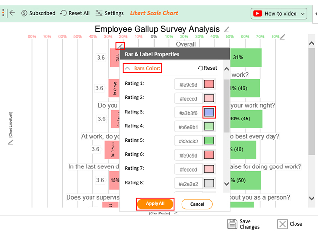
Analyzing Gallup survey results can be a daunting task. Fortunately, there’s a tool that can make the process easier: ChartExpo.

What is ChartExpo?

ChartExpo is a visualization platform that allows you to create insightful charts and graphs for your data.

Features and Benefits of ChartExpo

  • Intuitive user interface: This eases the creation of insightful charts and graphs. You don’t need sophisticated design and coding skills to create visualizations for your data.
  • Customization: Modify the look and feel of your graphs and charts to your liking. You can make them stand out by changing their colors, fonts, and labels.
  • ChartExpo is cost-efficient: Creating charts and graphs for your data does not require huge capital. ChartExpo offers a 7-day free trial, after which you can subscribe to an inexpensive package.

How to Install ChartExpo in Excel?

  1. Open your Excel application.
  2. Open the worksheet and click the “Insert” menu.
  3. You’ll see “My Apps”.
  4. In the office Add-ins window, click “Store” and search for ChartExpo on my Apps Store.
  5. Click the “Add” button to install ChartExpo in your Excel.

ChartExpo charts and graphs are available both in Google Sheets and Microsoft Excel. Please use the following CTA’s to install the tool of your choice and create interactive visualizations in a few clicks in your favorite tool.

Example

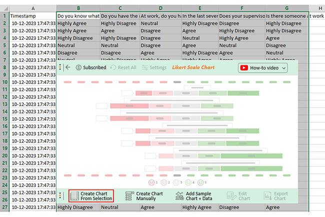
Now let’s learn how to analyze Gallup survey results in Excel with an example.

Assume you have conducted a Gallup survey to study your employees’ satisfaction level.

These are the questions in your survey.

  1. Do you know what is expected of you at work?
  2. Do you have the materials and equipment to do your work right?
  3. At work, do you have the opportunity to do what you do best every day?
  4. In the last seven days, have you received recognition or praise for doing good work?
  5. Does your supervisor, or someone at work, seem to care about you as a person?
  6. Is there someone at work who encourages your development?

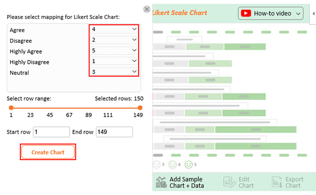
Each employee provides an answer to each question using the scale below.

  1. Highly Disagree
  2. Disagree
  3. Neutral
  4. Agree
  5. Highly Agree

Assume the survey produced data as shown in the sample table below.

Responses Do you know what is expected of you at work? Do you have the materials and equipment to do your work right? At work, do you have the opportunity to do what you do best every day? In the last seven days, have you received recognition or praise for doing good work? Does your supervisor, or someone at work, seem to care about you as a person? Is there someone at work who encourages your development?
Response 1 Highly Agree Highly Disagree Neutral Highly Disagree Disagree Highly Disagree
Response 2 Highly Agree Agree Disagree Agree Highly Disagree Highly Disagree
  • To get started with ChartExpo, install ChartExpo in Excel.
  • Now Click on My Apps from the INSERT menu.
insert chartexpo in excel
  • Choose ChartExpo from My Apps, then click Insert.
open chartexpo in excel
  • Once ChartExpo is loaded. Click on “Likert Scale Chart” from the list of charts.
search likert scale chart in excel
  • Select the sheet holding your data and click the Create Chart from Sheet Data button, as shown below.
create likert scale chart in excel
  • Assign numerical values to this Likert scale and click the “Create Chart” button.
    1. = Highly Disagree
    2. = Disagree
    3. = Neutral
    4. = Agree
    5. = Highly Agree
make likert scale chart in excel
  • The Likert Scale Chart will look as below.
edit likert scale chart in excel
  • To add a title to the chart, click the Edit Chart button as shown above.
  • Click the pencil icon next to the Chart Header to open the properties dialog.
  • In the Text section of this dialog, add a heading in Line 1 and enable the Show Then click the Apply button.
update likert scale chart in excel
  • To switch the color of the neutral bar, click the pencil icon at the top of the Overall bars. Here, we will change the color from gray to blue. Open up the ‘Bars Colors‘ properties and replace the color with blue. Finally, click on the “Apply All” button.
settings likert scale chart in excel
  • Let’s say you want to add text responses instead of numbers against every emoji.
  • Click on the pencil icon next to the respective emoji, expand the “Label” properties, and write the required text. After that click on the “Apply All” button.
  • Click the Save Changes button to keep the changes.
save likert scale chart in excel
  • Your chart will appear as shown below.
Gallup Survey Questions in excel

Insights

  • 64% percent of employees state that they know their work duties. 24% claim to be unaware, and 12% chose to remain neutral.
  • 66% of the employees have the necessary resources to execute their tasks, while the remaining 22% do not.
  • 63% state that they have the chance to do their best. 28% state otherwise.
  • 64% declare they have been recognized or commended for good work, while 23% state otherwise.
  • 61% of the employees believe their supervisor is considerate of them as people at work, while 29% disagree.
  • 69% say they have a colleague who motivates them, while 23% do not.
  • 65% of employees agree with the Gallup queries, and 24% disagree. The remaining 12% chose to remain neutral.

FAQs

What do the 12 Gallup questions mean?

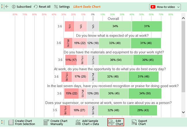
The 12 Gallup questions measure employee engagement and performance. They ask employees to rate their agreement or disagreement with statements such as;

  • “I have the opportunity to do what I do best every day.”
  • “This last year, I have had opportunities to learn and grow.”

Are Gallup surveys anonymous?

Yes, Gallup surveys are anonymous. They don’t ask for private information like your name or address. All information gathered is kept secure and secret. Additionally, no personally identifying data is disclosed to third parties.

How do you pass a Gallup assessment?

The purpose of the assessment is to measure several competencies and skills. There is no universal strategy for passing. The most important thing is for respondents to be truthful and straightforward in their responses.

What is a good Gallup score?

A good Gallup score reflects a high level of employee engagement. The average benchmark score for engagement is 33%. Typically, a good Gallup score is one above the average benchmark score. The highest-performing organizations have scores above 50%.

Wrap Up

Gallup survey questions are invaluable for evaluating employee engagement and satisfaction.

The Gallup survey consists of 12 questions. They assess different facets of worker morale and involvement.

Some examples of the 12 Gallup survey questions include;

  1. Do you know what is expected of you at work?
  2. Do you have the materials and equipment to do your work right?
  3. At work, do you have the opportunity to do what you do best every day?

The 12 questions for measuring employee engagement are divided into four categories:

  • Job contentment
  • Supervisor engagement
  • Personal engagement
  • Organizational engagement

You can also use Gallup survey questions to measure the public’s opinion towards specific topics.

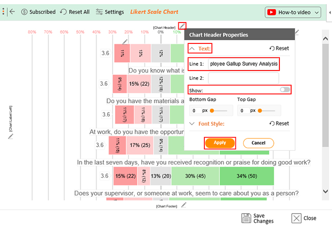
When analyzing Gallup survey results, there’s no better tool than ChartExpo. It enables you to visualize survey data in appealing charts and graphs.

How much did you enjoy this article?

ExcelAd2
Start Free Trial!
125868

Related articles

next previous
Microsoft Excel10 min read

Invoice Tracker Template in Excel for Better Insights

An invoice tracker Excel template helps track invoices, due dates, and payments. Learn how to use this template for better financial management.

Microsoft Excel12 min read

Key Performance Indicators in Healthcare for Better Insights

Key Performance Indicators in healthcare track patient care and efficiency. Learn about these KPIs, top examples, and how to use them to improve outcomes.

Microsoft Excel10 min read

BMI Calculation Formula in Excel for Better Fitness Insights

The BMI calculation formula in Excel helps track and analyze body mass index. Explore step-by-step instructions and tips to simplify BMI tracking in Excel.

Microsoft Excel29 min read

How to Create a Tornado Chart in Excel? A Complete Guide

Click to learn how to plot a Tornado Chart in Excel using easy-to-follow steps. Also, we’ll address the following question: what is a Tornado Diagram?

Microsoft Excel14 min read

How to Create a Scatter Plot in Excel with 3 Variables?

Click to discover how to create a Scatter Plot in Excel with 3 variables. We’ll also address the following question: why do we use Scatter Plot Graph?

ChartExpo logo

Turn Data into Visual
Stories

CHARTEXPO

  • Home
  • Gallery
  • Videos
  • Services
  • Pricing
  • Contact us
  • FAQs
  • Privacy policy
  • Terms of Service
  • Sitemap

TOOLS

  • ChartExpo for Google Sheets
  • ChartExpo for Microsoft Excel
  • Power BI Custom Visuals by ChartExpo
  • Word Cloud

CATEGORIES

  • Bar Charts
  • Circle Graphs
  • Column Charts
  • Combo Charts
  • Comparison Charts
  • Line Graphs
  • PPC Charts
  • Sentiment Analysis Charts
  • Survey Charts

TOP CHARTS

  • Sankey Diagram
  • Likert Scale Chart
  • Comparison Bar Chart
  • Pareto Chart
  • Funnel Chart
  • Gauge Chart
  • Radar Chart
  • Radial Bar Chart
  • Sunburst Chart
  • see more
  • Scatter Plot Chart
  • CSAT Survey Bar Chart
  • CSAT Survey Chart
  • Dot Plot Chart
  • Double Bar Graph
  • Matrix Chart
  • Multi Axis Line Chart
  • Overlapping Bar Chart
  • Control Chart
  • Slope Chart
  • Clustered Bar Chart
  • Clustered Column Chart
  • Box and Whisker Plot
  • Tornado Chart
  • Waterfall Chart
  • Word Cloud
  • see less

RESOURCES

  • Blog
  • Resources
  • YouTube
SIGN UP FOR UPDATES

We wouldn't dream of spamming you or selling your info.

© 2025 ChartExpo, all rights reserved.