• Home
  • Tools dropdown img
    • Spreadsheet Charts

      • ChartExpo for Google Sheets
      • ChartExpo for Microsoft Excel
    • Power BI Charts

      • Power BI Custom Visuals by ChartExpo
    • Word Cloud

  • Charts dropdown img
    • Chart Category

      • Bar Charts
      • Circle Graphs
      • Column Charts
      • Combo Charts
      • Comparison Charts
      • Line Graphs
      • PPC Charts
      • Sentiment Analysis Charts
      • Survey Charts
    • Chart Type

      • Box and Whisker Plot
      • Clustered Bar Chart
      • Clustered Column Chart
      • Comparison Bar Chart
      • Control Chart
      • CSAT Survey Bar Chart
      • CSAT Survey Chart
      • Dot Plot Chart
      • Double Bar Graph
      • Funnel Chart
      • Gauge Chart
      • Likert Scale Chart
      • Matrix Chart
      • Multi Axis Line Chart
      • Overlapping Bar Chart
      • Pareto Chart
      • Radar Chart
      • Radial Bar Chart
      • Sankey Diagram
      • Scatter Plot Chart
      • Slope Chart
      • Sunburst Chart
      • Tornado Chart
      • Waterfall Chart
      • Word Cloud
    • Google Sheets
      Microsoft Excel
  • Services
  • Pricing
  • Contact us
  • Blog
  • Support dropdown img
      • Gallery
      • Videos
      • Contact us
      • FAQs
      • Resources
    • Please feel free to contact us

      atsupport@chartexpo.com

Categories
All Data Visualizations Data Analytics Surveys
Add-ons/
  • Google Sheets
  • Microsoft Excel
  • Power BI
All Data Visualizations Data Analytics Surveys
Add-ons
  • Google Sheets
  • Microsoft Excel
  • Power BI

We use cookies

This website uses cookies to provide better user experience and user's session management.
By continuing visiting this website you consent the use of these cookies.

Ok

ChartExpo Survey


Home > Blog > Data Analytics

Dividend Tracker Spreadsheet for Better Investment Insights

What is a dividend tracker spreadsheet?

This tool can be your best ally if you’re an investor aiming to stay organized and informed. Managing investments isn’t always easy. Keeping track of your income sources is crucial and prevents information overload.

A dividend tracker spreadsheet helps you monitor dividends from multiple stocks or funds in one place. It keeps tabs on payment dates, amounts, and growth over time. This tool provides clarity, helping you spot trends and assess portfolio performance. Using a Google Sheets Extension, you can enhance functionality and even create dashboards in Google Sheets for a real-time view of your portfolio.

Dividend Tracker Spreadsheet

More people are investing today than ever before. A spreadsheet simplifies tracking, ensuring nothing slips through the cracks, and promotes better data analytics for smarter decisions.

Whether you’re new to investing or have years of experience, staying informed is vital. A dividend tracker spreadsheet can help you manage goals and understand how your investments work. Combining it with tools like a Google Sheets extension makes the process seamless and dynamic.

Investing is about building stability. To do that, you need tools like tracking dividends spreadsheets to make sense of the numbers. A well-maintained spreadsheet is straightforward yet powerful. It turns complex details into actionable insights, helping you focus on what truly matters.

Table of Contents:

  1. What is a Dividend Tracker Spreadsheet?
  2. Why Do You Need the Best Dividend Tracking Spreadsheet?
  3. How to Use a Google Sheets Dividend Tracker?
  4. What are the Key Features of the Dividend Spreadsheet Tracker?
  5. How to Use Dividend Tracker Spreadsheet Templates to Create a Long-Term Investing Plan?
  6. What are the Tips for Maintenance of a Dividend Tracker Spreadsheet?
  7. How to Analyze a Dividend Tracker Spreadsheet?
  8. Wrap Up

First…

What is a Dividend Tracker Spreadsheet?

Definition: A dividend tracker spreadsheet is a simple tool for organizing and monitoring your dividend income. With it, you can track payment dates, amounts, and growth over time. This spreadsheet keeps all your investment details in one place, offering an efficient alternative to Excel for tracking and analysis.

It helps you stay informed and make better financial decisions. Dividends are a key part of many portfolios, and tracking them effectively is essential. Using the best dividend tracking spreadsheet as an alternative to Excel provides flexibility and ease of use. This is especially crucial for those looking for more streamlined options.

Why Do You Need the Best Dividend Tracking Spreadsheet?

Because managing your investments shouldn’t feel overwhelming. A good spreadsheet is more than a list; it’s your financial dashboard. It turns numbers into insights and helps you make smarter decisions.

  • Comprehensive overview: Get a complete picture of your portfolio in one place. See which stocks or funds pay dividends, when, and how much. No more flipping between accounts or losing track of income sources.
  • Income monitoring: Track every dollar of dividend income. Know what’s coming in and from where. Whether you’re reinvesting or living off dividends, this clarity is vital.
  • Performance analysis: A dividend tracking spreadsheet helps you evaluate returns. With visual storytelling, you can spot trends, compare payouts, and see how your portfolio grows over time.
  • Diversification insights: Don’t put all your eggs in one basket. Use your spreadsheet to check how well-diversified your portfolio is. Balance is key to managing risk and boosting stability.
  • Goal tracking: Maybe it’s financial freedom or funding a dream retirement. A dividend tracking spreadsheet keeps you focused. Watch your progress and celebrate milestones along the way.

How to Use a Google Sheets Dividend Tracker?

Managing your portfolio doesn’t have to be a chore. Let’s explore a simple, fun guide to making it happen.

  1. Set up the tracker: Open Google Sheets. Download a pre-made dividend tracker template or create your own from scratch. Include columns for stock names, ticker symbols, shares owned, and dividend yield. Please keep it clean and easy to read.
  2. Input your portfolio: List all the stocks or ETFs in your portfolio. Add their ticker symbols, the number of shares, and purchase dates. If you know the dividend payment schedule, include it to support effective data storytelling.
  3. Track dividends: Log each dividend payment as it comes in. Include the payment date, amount, and any reinvestments. Use formulas to calculate totals or yields automatically. Watching those payments grow is incredibly satisfying!
  4. Analyze performance: Use charts and graphs to visualize your income. Check metrics like annual dividend yield or monthly averages. This will help you spot trends and make smarter investment decisions.
  5. Update regularly: Update the tracker every time you buy, sell, or receive dividends. It only takes a few minutes but keeps everything accurate.

What are the Key Features of the Dividend Spreadsheet Tracker?

A dividend tracker spreadsheet is your secret weapon. It’s like having a personal assistant for your portfolio, and here’s what makes it awesome:

  • Investment details: Add stock names, ticker symbols, purchase prices, and the number of shares. Everything you need is in one place, clear and organized.
  • Dividend tracking: Track how much income your investments generate over time. This process isn’t just about monitoring—it’s a form of business analytics for your portfolio.
  • Portfolio metrics: Calculate dividend yield, yield on cost, and annual income. These numbers show how hard your money is working for you.
  • Performance analysis: Use built-in charts and graphs to analyze trends and performance—spot opportunities to rebalance or invest smarter.
  • Customization: You can customize it by adding new columns, changing the layout, or tweaking the formulas. Tailor it to match your investment strategy.

How to Use Dividend Tracker Spreadsheet Templates to Create a Long-Term Investing Plan?

A dividend tracker can help you get there. It’s more than a spreadsheet—it’s your guide to building lasting wealth. Let’s break down how to use it step by step:

  1. Set up the template: You can choose a ready-made dividend tracker or design your own. Make sure it has sections for stocks, dividends, and performance metrics.
  2. Input investment data: Add your portfolio details—stock names, ticker symbols, purchase dates, share counts, and purchase prices. Remember the dividend yield and payment frequency.
  3. Define long-term goals: What’s your endgame? Passive income? Early retirement? Set clear goals for your desired annual income or portfolio size. Write them down in your tracker to stay focused.
  4. Analyze and diversify: Review your holdings. Are you over-invested in one sector? Use the tracker to identify gaps and diversify wisely. A balanced portfolio is a resilient one.
  5. Monitor growth and reinvest: Track your dividend payments regularly, use graphs to visualize growth, and reinvest those dividends to accelerate compounding. It’s the magic ingredient for long-term success.
  6. Adjust the plan: Markets change, and so do goals. Periodically review your tracker and tweak your strategy. Add new investments, rebalance your portfolio, or increase your targets.

What are the Tips for Maintenance of a Dividend Tracker Spreadsheet?

Keeping your Google Sheets dividend tracker in top shape is like giving your portfolio a regular tune-up. It ensures everything runs smoothly and stays on track. Here’s how to keep your tracker sharp and reliable:

  • Regular data updates: Make it a habit to update your tracker. Log new dividends, stock purchases, or changes in share counts. The more accurate your data, the clearer your picture.
  • Portfolio verification: Double-check your holdings against your brokerage account. Ensure every detail matches—ticker symbols, shares, and payments. Small errors can throw off your calculations.
  • Log new transactions: Record those trades immediately. Keeping your tracker up to date helps you avoid gaps or confusion later.
  • Leverage automation: Use formulas to calculate totals, averages, and yields. Consider linking your tracker to financial APIs for real-time updates. This will reduce manual work and free up time for planning.
  • Visualize progress: Add charts to see income or portfolio growth trends. Using visual analytics makes it easy to spot patterns and celebrate milestones. Watching your progress feels genuinely impressive.
  • Backup and version control: Save your spreadsheet in the cloud and keep backups. Use version control to track changes over time. It protects your data and ensures you can recover if something goes wrong.
  • Review goals: Revisit your investment goals regularly. Are you on track for your targets? Adjust as needed to stay aligned with your long-term vision.

How to Analyze a Dividend Tracker Spreadsheet?

Are you tired of wrestling with endless rows and columns in Excel? Enter the Dividend Tracker Spreadsheet, a powerful tool to track and analyze your dividend income. It’s more than just a spreadsheet—it’s your gateway to data analysis that drives data-driven investment decisions.

But here’s the catch—Excel’s built-in charts often fail to deliver clear, impactful visuals. For effective insights, you need data visualization tools that make complex information accessible and actionable.

That’s where ChartExpo comes in. It transforms raw data into stunning, easy-to-read data visualizations, elevating your tracking experience. With the right tools, you can easily uncover trends and optimize your portfolio strategy.

The charts below were created in Google Sheets using ChartExpo:

Sankey Chart

Sankey Chart in Dividend Tracker Spreadsheet

Horizontal Waterfall Chart

Horizontal Waterfall Chart in Dividend Tracker Spreadsheet

Stacked Waterfall Chart

Stacked Waterfall Chart in Dividend Tracker Spreadsheet

Multi-axis Line Chart

Multi Axis Line Chart in Dividend Tracker Spreadsheet

Funnel Chart (aka Pyramid Chart)

Funnel Chart in Dividend Tracker Spreadsheet

Let’s learn how to install ChartExpo in Google Sheets?

  1. To start using ChartExpo, download it directly from the Google Sheets program. To do this, select Extensions from the top toolbar.
  2. A menu will appear. Click the Get add-ons option.
  3. Search for ChartExpo, and click on Charts, Graphs & Visualizations by ChartExpo when it appears in the results.
  4. Click the Install button. You will have to confirm your Google account and accept some permissions.

ChartExpo charts are available both in Google Sheets and Microsoft Excel. Please use the following CTAs to install the tool of your choice and create beautiful visualizations in a few clicks in your favorite tool.

Example

Let’s create a Google Sheet to track dividend data:

Step 1: Create a new spreadsheet and include the following columns: Stock Name, Annual Dividend, Dividend Yield, and Ticker Symbol. Add six individual stocks from your portfolio to get started.

Include Six Columns for Making Dividend Tracker Spreadsheet

Step 2: Gather dividend data. Unfortunately, the GoogleFinance function doesn’t directly support dividend information. But don’t worry—there’s a workaround! We’ll pull the data from a stock analysis website using the ImportXML function.

  • Visit a stock analysis site (e.g., for Apple stock).
  • Press the F12 key on your keyboard to open the developer tools.
  • Locate the “Annual Dividend” and “Dividend Yield” elements in the site’s HTML structure, as shown below.
Locate Annual Dividend and Divided Yield for Making Dividend Tracker Spreadsheet

Step 3: Extract and Save the XPath

  • Copy the XPath for “Annual Dividend” and paste it into a new column in your spreadsheet.
  • Repeat the same process for “Dividend Yield” and add its XPath to another column.
Copy XPath for Annual Dividend for Making Dividend Tracker Spreadsheet

Step 4: Use ImportXML for Annual Dividend

Now it’s time to fetch the data!

In cell B2, enter the following formula:

=IMPORTXML(CONCATENATE(“https://stockanalysis.com/stocks/”, D2, “/dividend/”),$G$2,”en-us”)

Use ImportXML for Annual Dividend for Making Dividend Tracker Spreadsheet

Drag the formula down the column to populate the data for all stocks in your portfolio.

Step 5: Use ImportXML for Dividend Yield

To fetch the dividend yield:

In cell C2, use this formula:

=IMPORTXML(CONCATENATE(“https://stockanalysis.com/stocks/”,D2, “/dividend/”),$H$2,”en-us”)

Use ImportXML for Dividend Yield for Making Dividend Tracker Spreadsheet

Drag and drop the formula for other rows as you did earlier.

Now, let’s see how to create a chart in Google Sheets using ChartExpo:

  • To get started with ChartExpo, install ChartExpo in Google Sheets.
  • Go to Extensions > Charts, Graphs & Visualizations by ChartExpo > Open.
open chartexpo in google sheets
  • To access the charts library, click the Add new chart button.
add new chart in google sheets
  • Once it loads, scroll through the charts list to locate and choose the “Multi Axis Line Chart”.
search multi axis line chart in google sheets
  • Click the “Create Chart” button after selecting the data from the sheet, as shown.
Click Create Chart for Making Dividend Tracker Spreadsheet
  • ChartExpo will generate the visualization below for you.
Initial Visual for Making Dividend Tracker Spreadsheet
  • If you want to have the chart’s title, click Edit Chart, as shown in the above image.
  • Click the pencil icon next to the Chart Header to change the title.
  • It will open the properties dialog. Under the Text section, you can add a heading in Line 1 and enable Show.
  • Give the appropriate title of your chart and click the Apply button.
Add Chart Header for Making Dividend Tracker Spreadsheet
  • You can add the $ sign with values as Prefix as follows:
Add Prefix for Making Dividend Tracker Spreadsheet
  • You can add the % sign with values as Postfix as follows:
Add Postfix for Making Dividend Tracker Spreadsheet
  • You can set data presentation as follows:
Set Data Presentation for Making Dividend Tracker Spreadsheet
  • You can show the legend as follows:
Show Legend for Making Dividend Tracker Spreadsheet
  • Set the shape type in legend as follows, “Annual Dinner showing as line and circle; similarly, for “Dividend Yield” set “column:
Set Shape Type in Legend for Making Dividend Tracker Spreadsheet
  • To persist the changes made to the chart, click on the “Save” button.
Click Save Button for Making Dividend Tracker Spreadsheet
  • Your final chart will look like the one below.
Final Dividend Tracker Spreadsheet

Insights

  • Highest Annual Dividend: JPMorgan Chase ($5.00).
  • Lowest Annual Dividend: Bank of America ($1.04).
  • Highest Dividend Yield: Coca-Cola (3.11%).
  • Lowest Dividend Yield: Apple (0.39%).
  • Key Insight: Companies differ widely in dividends and yields, reflecting diverse payout strategies and stock prices.

Track and Visualize Dividend Trends with Spreadsheets

  1. Open your Google Sheets Application.
  2. Install ChartExpo Add-in for Google Sheets from Google Workspace Marketplace.
  3. Select the Multi Axis Line Chart from the list of charts.
  4. Fill in the necessary fields.
  5. Click on the Create Chart button.
  6. Customize your chart properties to add header, axis, legends, and other required information.
  7. Export your chart and share it with your audience.

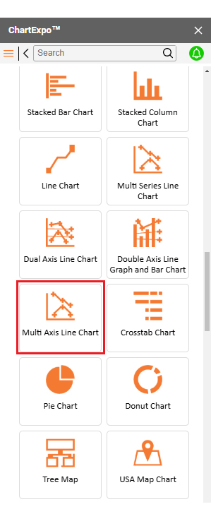
The following video will help you to create the Multi Axis Line Chart in Google Sheets.

FAQs

What is the best spreadsheet to track dividends?

The best spreadsheet for tracking dividends is customizable, easy to use, and includes automation. Google Sheets is a top choice for accessibility, while Excel offers powerful features. Pair either with tools like ChartExpo for superior data visualization.

Can Google Sheets track dividends?

Yes, Google Sheets can effectively track dividends. It allows you to log stocks, payouts, and yields. With formulas and charts, you can automate calculations and visualize data. Its cloud-based access ensures updates anytime, anywhere, for seamless tracking.

What sheet is preferred dividends on?

Preferred dividends are typically recorded under the “dividends” or “preferred dividends” section on the income statement. They may also appear on the balance sheet as part of retained earnings or under liabilities if not yet paid.

Wrap Up

A dividend spreadsheet tracker is a powerful tool for investors. It organizes your dividend income and helps you stay on top of your finances. With all your data in one place, managing investments becomes more straightforward and efficient, enabling data-driven decision-making.

Tracking dividends is essential for informed decisions. It reveals patterns, highlights growth, and ensures you never miss a payment. The spreadsheet transforms scattered information into clear insights, especially when paired with a chart maker for visual analysis.

This tool can benefit investors of all levels. It doesn’t matter whether you’re building wealth or relying on dividends for income. Tracking helps you stay aligned with your goals and puts you in control of your portfolio. Utilizing Google Sheets Charts enhances your tracking by turning raw data into visually intuitive representations.

Staying organized saves time and reduces stress. A dividend tracker spreadsheet eliminates guesswork and provides clarity and confidence as you manage your portfolio. Chart makers simplify complex data, making interpreting patterns and trends more straightforward.

Investing is a journey, and tools like this make it smoother. Start tracking today to maximize your potential.

Leverage Google Sheets Charts and enhance it with ChartExpo to unlock powerful insights and take control of your data visualization. Your financial future is worth it.

How much did you enjoy this article?

GSAd1
Start Free Trial!
147082

Related articles

next previous
Data Analytics12 min read

Business Intelligence in Healthcare Industry: A Visual Approach

Business Intelligence in the healthcare industry improves patient care and streamlines operations. Learn how BI works and benefits healthcare providers.

Data Analytics10 min read

Analytics in Telecom Industry for Better Insights

Analytics in the telecom industry optimizes networks, enhances customer experience, and detect fraud. Learn its key benefits, challenges, and use cases.

Data Analytics7 min read

Financial Forecasting for Startups: A Complete Guide

This guide dives deep into financial forecasting for startups. You'll also discover elements of a financial projection for a startup, and tips for creating one.

Data Analytics32 min read

Data Reporting: Making Your Reports Irresistible

Data reporting turns numbers into insights that guide decisions. Learn how to simplify complex data and make confident choices. Read on for key strategies!

Data Analytics10 min read

Employee Performance KPIs: Insights That Drive Action

Employee performance KPIs track productivity and success. Learn the key metrics, measurement methods, and analysis techniques to boost performance.

ChartExpo logo

Turn Data into Visual
Stories

CHARTEXPO

  • Home
  • Gallery
  • Videos
  • Services
  • Pricing
  • Contact us
  • FAQs
  • Privacy policy
  • Terms of Service
  • Sitemap

TOOLS

  • ChartExpo for Google Sheets
  • ChartExpo for Microsoft Excel
  • Power BI Custom Visuals by ChartExpo
  • Word Cloud

CATEGORIES

  • Bar Charts
  • Circle Graphs
  • Column Charts
  • Combo Charts
  • Comparison Charts
  • Line Graphs
  • PPC Charts
  • Sentiment Analysis Charts
  • Survey Charts

TOP CHARTS

  • Sankey Diagram
  • Likert Scale Chart
  • Comparison Bar Chart
  • Pareto Chart
  • Funnel Chart
  • Gauge Chart
  • Radar Chart
  • Radial Bar Chart
  • Sunburst Chart
  • see more
  • Scatter Plot Chart
  • CSAT Survey Bar Chart
  • CSAT Survey Chart
  • Dot Plot Chart
  • Double Bar Graph
  • Matrix Chart
  • Multi Axis Line Chart
  • Overlapping Bar Chart
  • Control Chart
  • Slope Chart
  • Clustered Bar Chart
  • Clustered Column Chart
  • Box and Whisker Plot
  • Tornado Chart
  • Waterfall Chart
  • Word Cloud
  • see less

RESOURCES

  • Blog
  • Resources
  • YouTube
SIGN UP FOR UPDATES

We wouldn't dream of spamming you or selling your info.

© 2025 ChartExpo, all rights reserved.