• Home
  • Tools dropdown img
    • Spreadsheet Charts

      • ChartExpo for Google Sheets
      • ChartExpo for Microsoft Excel
    • Power BI Charts

      • Power BI Custom Visuals by ChartExpo
    • Word Cloud

  • Charts dropdown img
    • Chart Category

      • Bar Charts
      • Circle Graphs
      • Column Charts
      • Combo Charts
      • Comparison Charts
      • Line Graphs
      • PPC Charts
      • Sentiment Analysis Charts
      • Survey Charts
    • Chart Type

      • Box and Whisker Plot
      • Clustered Bar Chart
      • Clustered Column Chart
      • Comparison Bar Chart
      • Control Chart
      • CSAT Survey Bar Chart
      • CSAT Survey Chart
      • Dot Plot Chart
      • Double Bar Graph
      • Funnel Chart
      • Gauge Chart
      • Likert Scale Chart
      • Matrix Chart
      • Multi Axis Line Chart
      • Overlapping Bar Chart
      • Pareto Chart
      • Radar Chart
      • Radial Bar Chart
      • Sankey Diagram
      • Scatter Plot Chart
      • Slope Chart
      • Sunburst Chart
      • Tornado Chart
      • Waterfall Chart
      • Word Cloud
    • Google Sheets
      Microsoft Excel
  • Services
  • Pricing
  • Contact us
  • Blog
  • Support dropdown img
      • Gallery
      • Videos
      • Contact us
      • FAQs
      • Resources
    • Please feel free to contact us

      atsupport@chartexpo.com

Categories
All Data Visualizations Data Analytics Surveys
Add-ons/
  • Google Sheets
  • Microsoft Excel
  • Power BI
All Data Visualizations Data Analytics Surveys
Add-ons
  • Google Sheets
  • Microsoft Excel
  • Power BI

We use cookies

This website uses cookies to provide better user experience and user's session management.
By continuing visiting this website you consent the use of these cookies.

Ok

ChartExpo Survey


Home > Blog > Google Sheets

Google Sheets Pie Chart: A Complete Visual Guide

Building a Google Sheets Pie Chart turns raw numbers into visual insights anyone can understand at a glance. Split revenue by source, track project completion stages, or show survey breakdowns with circular slices that make proportions obvious.

Google Sheets Pie Chart

Google Sheets handles the heavy lifting while you focus on telling the story behind your data. This walkthrough covers everything from basic setup to advanced customization tricks for a Google Sheets Pie Chart.

You’ll learn exactly how to build Pie Charts that actually look good and communicate clearly. Whether you’re building dashboards or just need quick visuals for a report, these techniques get you there fast.

Table of Contents:

  1. What is a Pie Chart in Google Sheets?
  2. Why Use a Google Sheets Pie Chart?
  3. How to Make a Pie Chart in Google Sheets (Step by Step)?
  4. Why Use ChartExpo for Google Sheets Pie Chart Creation?
  5. Benefits of Using ChartExpo for Google Spreadsheet Pie Chart
  6. Best Practices for Building a Pie Chart in Google Sheets
  7. Challenges for Creating a Pie Graph in Google Sheets
  8. FAQs
  9. Wrap Up

What is a Pie Chart in Google Sheets?

Definition: The Pie Chart in Google Sheets splits a circle into wedges, with each wedge showing one category’s share of the total. Big values get big slices, small values get narrow ones. This makes comparisons quick and intuitive.

You’ll find a Google spreadsheet Pie Chart deployed across these scenarios:

  • Analyzing percentage breakdowns with a Google Sheets Pie Chart.
  • Weighing categories against each other.
  • Summarizing findings for reports.
  • Dashboard visuals built with Google Charts and Pie Chart displays.

The simplicity makes the Pie Graph in Google Sheets a go-to option across business teams, classrooms, and data analysis workflows.

Why Use a Google Sheets Pie Chart?

A Google Sheets Pie Chart shows you instantly which categories dominate and which barely register. That clarity matters when you’re briefing stakeholders who don’t live in spreadsheets all day.

The Google Sheets Pie Chart delivers:

  • Part-to-whole relationships become obvious.
  • Proportions read instantly without mental math.
  • Seamless Google spreadsheet integration with other platforms.
  • Works with automation tools, including Google Sheets AI.

Pair them with progress trackers or forecasting visuals, and you’ve got a dashboard that tells the full story.

How to Make a Pie Chart in Google Sheets (Step by Step)?

Step 1: Open the Sheet

Start by opening the Google Sheets file that contains the data you want to visualize using a Pie Chart.

Google Sheets Pie Chart

Step 2: Select the Data

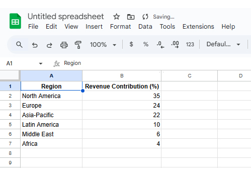
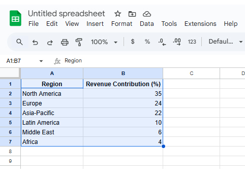
Highlight both columns, including headers, so Google Sheets correctly identifies labels and values.

Google Sheets Pie Chart

Step 3: Insert the Chart

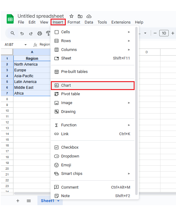
Click Insert → Chart. Google Sheets will automatically generate a default visualization.

Google Sheets Pie Chart

Step 4: Choose Pie Chart

In the Chart Editor panel, select Pie Chart as the chart type. Your data now displays as a Pie Chart in Google Sheets.

Google Sheets Pie Chart

Step 5: Customize the Chart

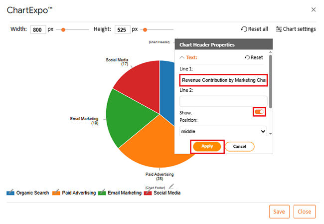
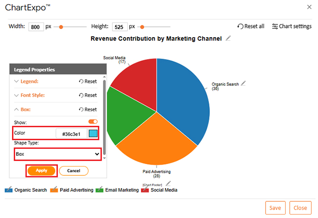
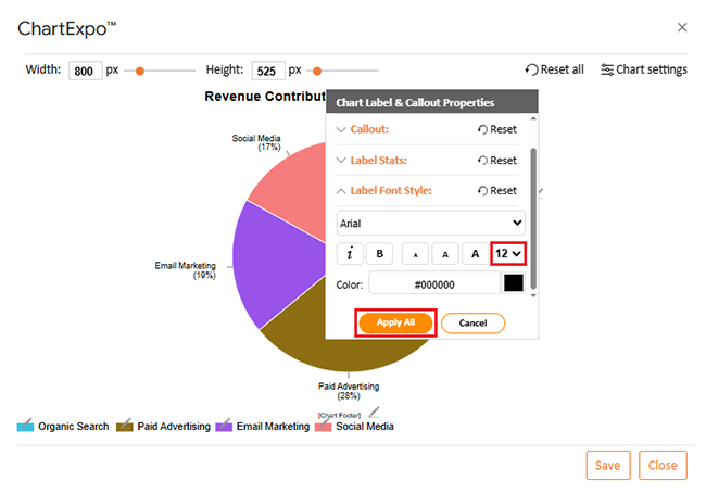
Adjust colors, labels, legends, and percentages to improve readability and presentation quality.

Native Google Sheets gets the job done for simple charts, but customization options hit a ceiling fast.

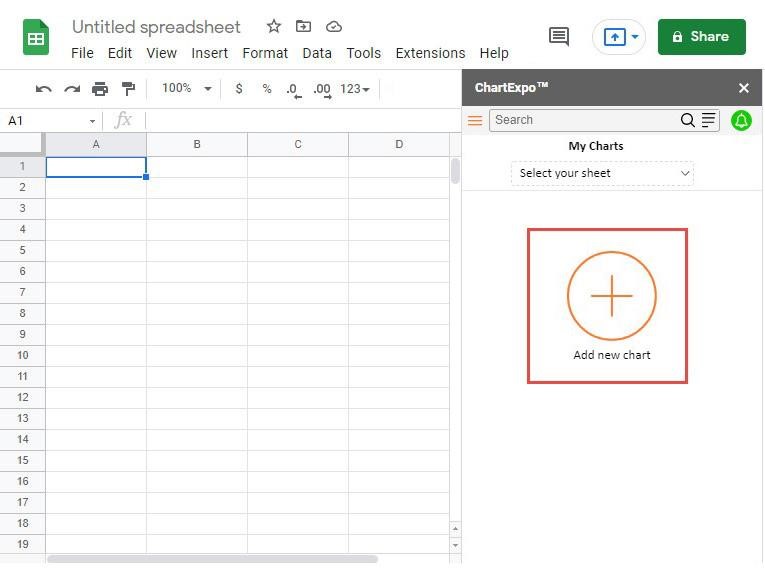
ChartExpo fills that gap with polished templates, better handling when slice sizes bunch together, and cleaner output for presentations.

It cuts down formatting time and makes your charts look professional without manual tweaking.

Why Use ChartExpo for Google Sheets Pie Chart Creation?

  • Advanced designs that distinguish close values more effectively.
  • Pre-built professional templates that eliminate manual styling.
  • Presentation-grade output generated straight from Google Sheets.
  • Offers a 7-day free trial and costs just $10/month for enhanced visualization.

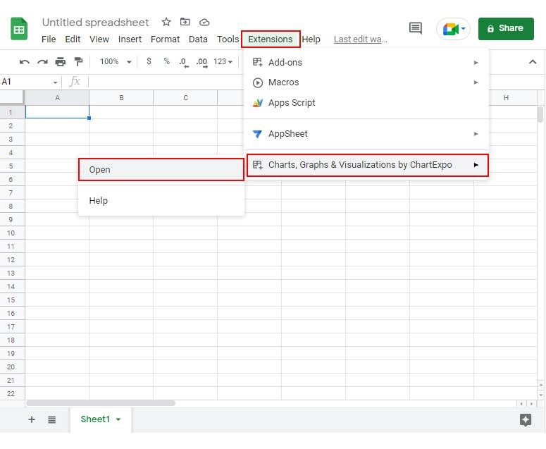
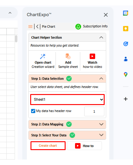
How to install ChartExpo in Google Sheets?

  • Go to Google Sheets and open the file you are interested in. Then click on the Extensions tab in the upper menu.
  • Click on the Add-ons and enter “Get add-ons.”
  • Go to the Google Workspace Marketplace and search for ChartExpo.
  • Explore “Charts, Graphs & Visualizations by ChartExpo, and click the “Install” button.
  • Allow the necessary access and confirm your Google account when asked.

ChartExpo integrates with both Google Sheets and Microsoft Excel. Pick your platform, install the extension, and start building powerful Google Sheets Pie Chart visualizations in seconds.

Example:

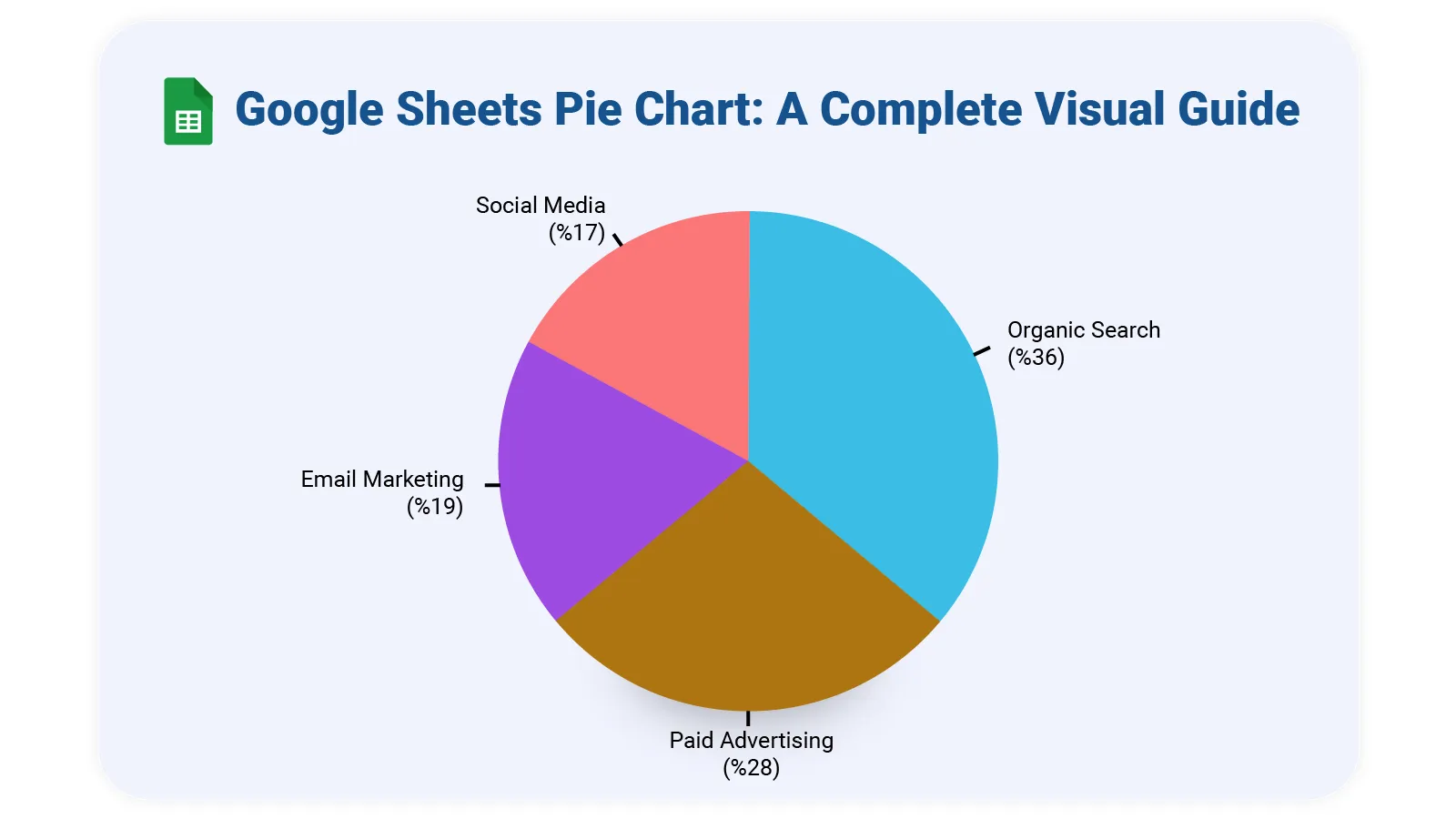
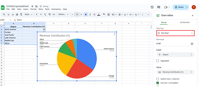
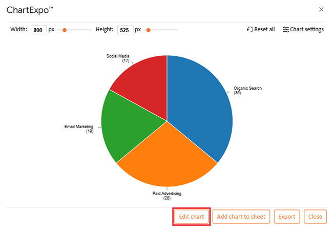
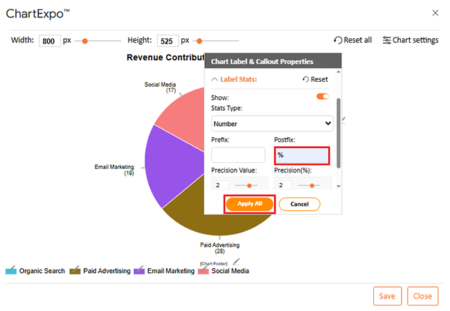
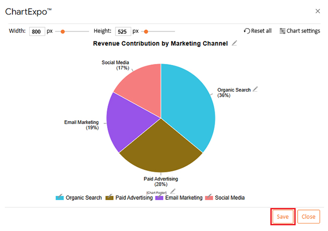
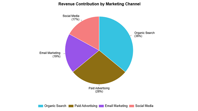
Here’s sample data for building a Google Sheets Pie Chart.

Marketing Channel Revenue Contribution (%)
Organic Search 36
Paid Advertising 28
Email Marketing 19
Social Media 17
  • To get started with ChartExpo, install ChartExpo in Google Sheets.
  • Go to Extensions > Charts, Graphs & Visualizations by ChartExpo > Open.
Google Sheets Pie Chart
  • Once ChartExpo is installed in Google Sheets, click on the “Add new chart” button.
Google Sheets Pie Chart


  • Once ChartExpo is loaded into your sheet, you need to search for or select the “Pie Chart” in the chart options, and you are off to a good start to render your data.
Google Sheets Pie Chart
  • Then, select a sheet, pick the right metrics and dimensions, and press the Create button to have your chart ready in seconds.
Google Sheets Pie Chart
  • If you want to customize your chart, select the ‘Edit Chart’ option and design it to your specifications.
Google Sheets Pie Chart
  • To change the chart’s title, select the pencil icon on the header. Then, enter the text you want and select “Apply”. This will change the chart’s title immediately.
Google Sheets Pie Chart
  • You can change colors and shape type from “Legend Properties”.
Google Sheets Pie Chart
  • You can add a postfix sign as well.
Google Sheets Pie Chart
  • You can also increase font size for better readability.
Google Sheets Pie Chart
  • When you are done with all the changes, click the “Save” button to save them.
Google Sheets Pie Chart
  • The final look of the pie chart is shown below.
Google Sheets Pie Chart

Key Insights

  • Organic search drives 36% of revenue, outperforming all other channels by a significant margin.
  • Paid ads contribute 28%, showing solid returns but falling short of organic traffic’s impact.
  • Email and social media combined pull in another 36%, proving that diversified secondary channels carry serious weight.

Benefits of Using ChartExpo for Google Spreadsheet Pie Chart

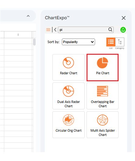
Native charts handle basics fine, but lock you into limited styling choices when you need deeper analysis. ChartExpo, a powerful Google Sheets extension, changes that by offering more control over how charts render and interpret.

With ChartExpo, you can:

  • Push past standard options into custom territory
  • Make tight value groupings easier to distinguish
  • Skip tedious format adjustments
  • Generate polished charts in less time

ChartExpo hooks into spreadsheet workflows without disrupting what already works.

Best Practices for Building a Pie Chart in Google Sheets

Building a clean, readable Google Sheets Pie Chart display means following these rules:

  • Cap slices at five or six maximum.
  • Make labels specific and meaningful.
  • Show exact percentage figures.
  • Pick colors that stand apart visually.
  • Skip Pie Charts when showing trends over time.

When tracking completion rates, a Google Sheets progress bar delivers clearer insights than circular slices.

Challenges for Creating a Pie Graph in Google Sheets

Even with their strengths, Google Sheets Pie Chart visualizations come with built-in trade-offs:

  • Hard to spot differences when values sit close together.
  • Gets messy with too many categories.
  • Offers minimal room for deeper data exploration.

When these limits bite, switch to make a comparison chart in Google Sheets or layer in trend lines using forecasting in Google Sheets instead.

FAQs

How to make a Pie Chart in Google Sheets with two columns?

Set up your data with category names in column one and numbers in column two. Highlight both, hit Insert → Chart, and pick the pie option to create your Google Sheets Pie Chart.

How do I add a Progress Pie Chart in Google Sheets?

Build two data points showing completed versus remaining work, then chart them as a pie. For advanced progress tracking, try add-ons like ChartExpo that offer more visual flexibility.

Wrap Up

A Google Sheets Pie Chart excels at showing how individual parts relate to the whole picture. These charts build fast and read easily. Google Sheets functionality gets you started quickly, while extensions like ChartExpo polish things up when you need sharper visuals or tighter control over design elements.

Keep slice counts low in your Google Sheets Pie Chart, label everything clearly, and don’t shy away from percentages to aid interpretation. For datasets with many categories or values that change over time, consider switching to bar charts or Line Chart formats instead. Match the chart type to what you’re actually trying to show, and your audience will grasp it immediately.

How much did you enjoy this article?

GSAd1
Start Free Trial!
159630

Related articles

next previous
Google Sheets10 min read

How to Make Progress Bar in Google Sheets: Step-by-Step

Create a Google Sheets Progress Bar to track goals, tasks, and project completion visually. Follow our easy step-by-step guide with practical examples.

Google Sheets9 min read

Google Sheet Expense Tracker Template: A Complete Guide

Google Sheet Expense Tracker Template tracks income, bills, and categories in one sheet. Build totals, charts, and alerts. Read on!

Google Sheets11 min read

Google Workspace for Business to Turn Data into Insight

Google Workspace for Business offers secure tools for teams. Click here to see how smarter charts and features enhance efficiency and streamline operations.

Google Sheets10 min read

Data Analysis in Google Sheets: Best Ways to Show Insights

Discover how data analysis in Google Sheets transforms raw spreadsheets into clear insights with pivot tables, charts, formulas, and built-in AI tools.

Google Sheets11 min read

Small Business Budget Spreadsheet: A Complete Guide

A small business budget template tracks income and cash flow. Learn pros and cons, and best practices to manage budgets effectively in Google Sheets.

ChartExpo logo

Turn Data into Visual
Stories

CHARTEXPO

  • Home
  • Gallery
  • Videos
  • Services
  • Pricing
  • Contact us
  • FAQs
  • Privacy policy
  • Terms of Service
  • Sitemap

TOOLS

  • ChartExpo for Google Sheets
  • ChartExpo for Microsoft Excel
  • Power BI Custom Visuals by ChartExpo
  • Word Cloud

CATEGORIES

  • Bar Charts
  • Circle Graphs
  • Column Charts
  • Combo Charts
  • Comparison Charts
  • Line Graphs
  • PPC Charts
  • Sentiment Analysis Charts
  • Survey Charts

TOP CHARTS

  • Sankey Diagram
  • Likert Scale Chart
  • Comparison Bar Chart
  • Pareto Chart
  • Funnel Chart
  • Gauge Chart
  • Radar Chart
  • Radial Bar Chart
  • Sunburst Chart
  • see more
  • Scatter Plot Chart
  • CSAT Survey Bar Chart
  • CSAT Survey Chart
  • Dot Plot Chart
  • Double Bar Graph
  • Matrix Chart
  • Multi Axis Line Chart
  • Overlapping Bar Chart
  • Control Chart
  • Slope Chart
  • Clustered Bar Chart
  • Clustered Column Chart
  • Box and Whisker Plot
  • Tornado Chart
  • Waterfall Chart
  • Word Cloud
  • see less

RESOURCES

  • Blog
  • Resources
  • YouTube
SIGN UP FOR UPDATES

We wouldn't dream of spamming you or selling your info.

© 2026 ChartExpo, all rights reserved.