• Home
  • Tools dropdown img
    • Spreadsheet Charts

      • ChartExpo for Google Sheets
      • ChartExpo for Microsoft Excel
    • Power BI Charts

      • Power BI Custom Visuals by ChartExpo
    • Word Cloud

  • Charts dropdown img
    • Chart Category

      • Bar Charts
      • Circle Graphs
      • Column Charts
      • Combo Charts
      • Comparison Charts
      • Line Graphs
      • PPC Charts
      • Sentiment Analysis Charts
      • Survey Charts
    • Chart Type

      • Box and Whisker Plot
      • Clustered Bar Chart
      • Clustered Column Chart
      • Comparison Bar Chart
      • Control Chart
      • CSAT Survey Bar Chart
      • CSAT Survey Chart
      • Dot Plot Chart
      • Double Bar Graph
      • Funnel Chart
      • Gauge Chart
      • Likert Scale Chart
      • Matrix Chart
      • Multi Axis Line Chart
      • Overlapping Bar Chart
      • Pareto Chart
      • Radar Chart
      • Radial Bar Chart
      • Sankey Diagram
      • Scatter Plot Chart
      • Slope Chart
      • Sunburst Chart
      • Tornado Chart
      • Waterfall Chart
      • Word Cloud
    • Google Sheets
      Microsoft Excel
  • Services
  • Pricing
  • Contact us
  • Blog
  • Support dropdown img
      • Gallery
      • Videos
      • Contact us
      • FAQs
      • Resources
    • Please feel free to contact us

      atsupport@chartexpo.com

Categories
All Data Visualizations Data Analytics Surveys
Add-ons/
  • Google Sheets
  • Microsoft Excel
  • Power BI
All Data Visualizations Data Analytics Surveys
Add-ons
  • Google Sheets
  • Microsoft Excel
  • Power BI

We use cookies

This website uses cookies to provide better user experience and user's session management.
By continuing visiting this website you consent the use of these cookies.

Ok

ChartExpo Survey


Home > Blog > Microsoft Excel

Group Worksheets in Excel for Quick Insights

“How to group worksheets in Excel?” If you’re managing a workbook with monthly reports or regional sales data, you’ve probably asked this question. We have the answer, and it will save you hours of manual work.

Group Worksheets in Excel

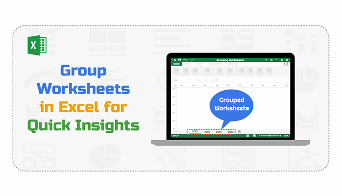
Consider working with multiple sheets and updating the same headers, formatting, or formulas across all of them. Doing that manually is slow. By grouping worksheets, one change reflects across all selected sheets. You stay consistent and get results faster. Whether you manage project timelines, financial reports, or department trackers, this feature can reduce repetition.

This isn’t advanced Excel magic. It’s practical, easy to learn, and impactful. How to group worksheets in Excel is not only about combining sheets. It’s about smarter work habits.

More businesses are embracing innovative data tools. With artificial intelligence in Excel now surfacing patterns and suggestions, you are expected to work faster and cleaner. Grouping worksheets is a simple way to meet that standard.

If you’re comparing one large file to multiple tabs, the setup matters. That’s where understanding Excel workbook vs. worksheet becomes important. Understanding the difference helps you plan better, especially when managing shared data.

Whether preparing reports or streamlining entries, grouping worksheets is a small trick with a significant return on investment. You don’t need to overhaul your process — know the steps.

How?

Follow my lead…

Table of Contents:

  1. What Do You Mean by Grouping Worksheets in Excel?
  2. Why Group Worksheets in Excel?
  3. How to Group Worksheets in Excel?
  4. How to Analyze Grouped Worksheet Data in Excel?
  5. Limitations of Grouping Worksheets in Excel
  6. FAQs
  7. Wrap Up

What Do You Mean by Grouping Worksheets in Excel?

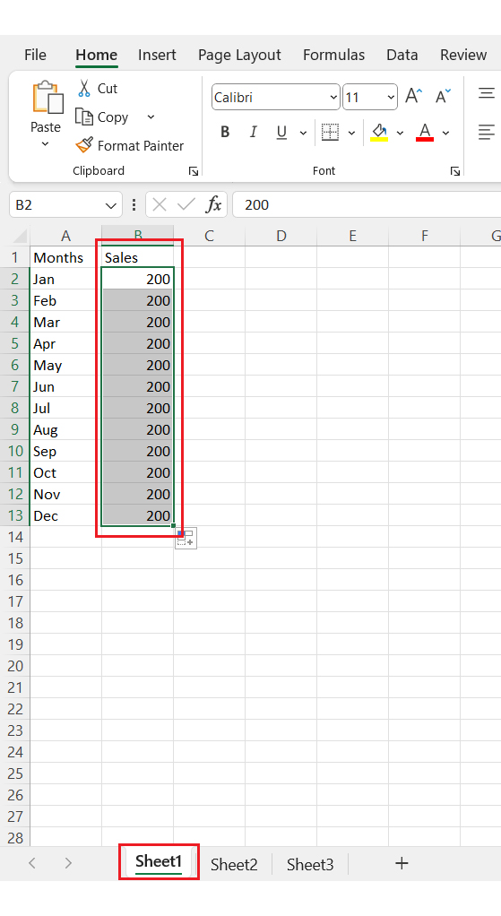
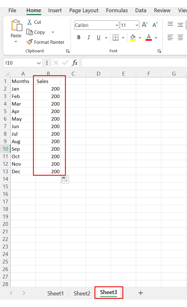
Definition: Grouping data in Excel means selecting worksheets to apply the same edits across all of them simultaneously. This helps when you want the same formatting, formulas, or labels to be used across several sheets.

Instead of editing each sheet one by one, grouping saves time. It ensures consistency, which is beneficial when managing large files. Many users also explore how to duplicate a Sheet in Excel to prepare templates before grouping. This way, the structure and layout remain uniform throughout the workbook.

The top 5 charts can be created after grouping data in Excel

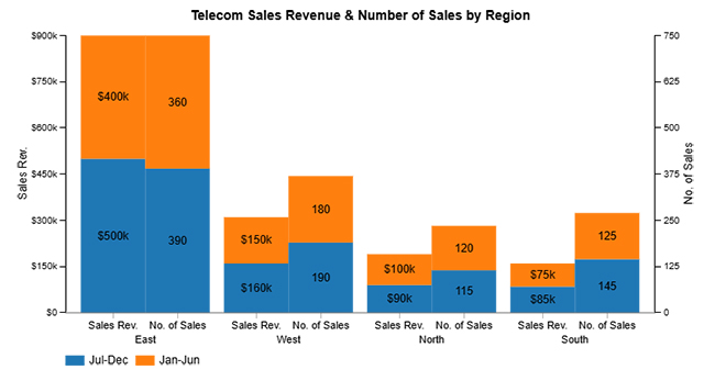
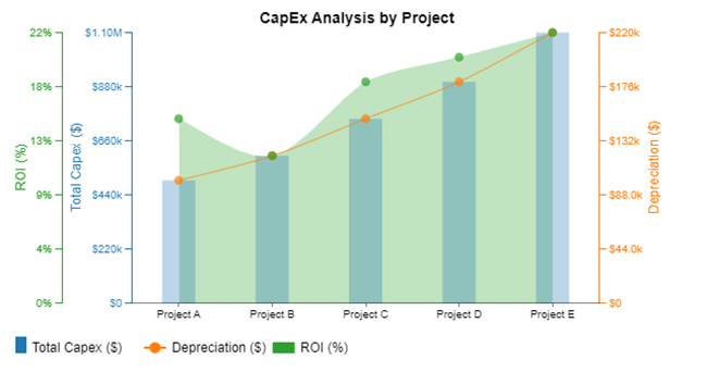
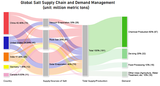
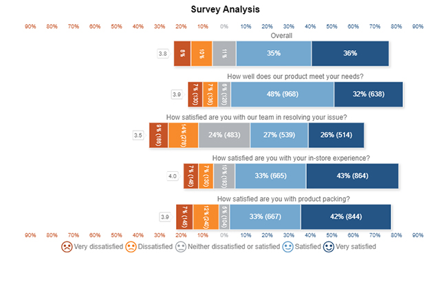
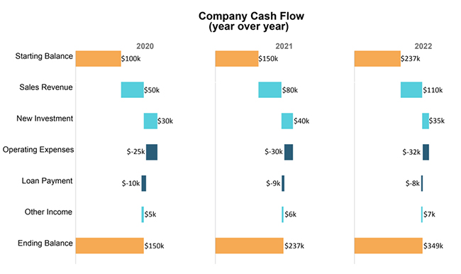
Check out the top five charts you can use to group worksheets in Excel effectively. These visuals were created using ChartExpo. This tool makes your data clear, interactive, and easy to understand.

Clustered Stacked Bar Chart:

Group Worksheets in Excel

Multi Axis Line Chart:

Group Worksheets in Excel

Sankey Chart:

Group Worksheets in Excel

Likert Scale Chart:

Group Worksheets in Excel

Horizontal Waterfall Chart:

Group Worksheets in Excel

Why Group Worksheets in Excel?

Have you ever felt like you’re stuck copying the same thing across ten sheets? You’re not alone. Repeating tasks in Excel can get old quickly. And that’s where grouping worksheets comes in. It’s a simple move that can accomplish a great deal.

Let’s talk about why it matters.

  • Edit multiple sheets simultaneously: When worksheets are grouped, any edits you make—formatting, formulas—happen on all selected sheets at once. This eliminates the need to repeat the same action across multiple tabs.
  • Maintain consistency across worksheets: Grouping ensures that formatting, labels, and formulas remain identical across sheets. This helps prevent minor errors that can occur when editing each sheet separately.
  • Faster data management: You can update multiple sheets in seconds, rather than minutes. That adds up when you’re working with large workbooks or repeating monthly tasks.
  • Simplifies report creation and updates: If your reports share the same structure, grouping allows you to update all of them simultaneously. It keeps your data aligned and your reports accurate with minimal effort.
  • Useful for printing and page setup: Grouped sheets let you set print areas, headers, and margins uniformly. That means you get consistent, professional-looking printouts every time.
  • Error reduction in repetitive tasks: Typing or copying duplicate content repeatedly often leads to mistakes. Grouping cuts down on that by letting you do it once, correctly.
  • Supports bulk operations: You can apply formulas, styles, or cell protection across multiple sheets in one step. This speeds up workbook setup and reduces the chance of missing something.
  • Ideal for template-based workbooks: Start with a well-designed sheet and use how to duplicate a sheet in Excel to build your base. Then group them to apply consistent changes, especially when using a straightforward Excel workbook vs. worksheet strategy.

How to Group Worksheets in Excel?

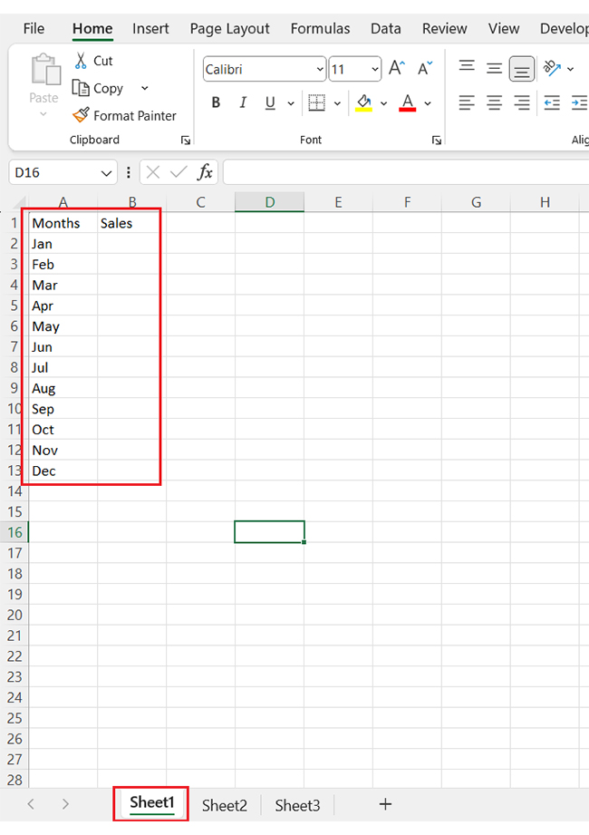
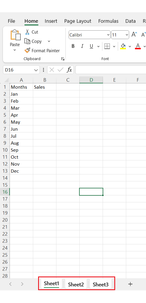
Have you ever felt stuck repeating the same edits across multiple Excel sheets? It’s frustrating and eats up your time. Whether you’re managing sales reports or financial summaries, grouping helps you work smarter, not harder. Let’s walk through how it’s done:

  • Add your sheets and enter data: Start by adding three sheets to your Excel workbook—Sheet1, Sheet2, and Sheet3. Enter your data in Sheet 1, as this will serve as your base for grouped changes.
Group Worksheets in Excel
  • Group all worksheets: To group, hold down the Ctrl key and click on each sheet tab you want to include. You’ll know the grouping worked when you see “Group” next to the file name at the top.
Group Worksheets in Excel
  • Edit once, reflect everywhere: Make any changes in Sheet1, and those edits will appear in all grouped sheets. This includes text, formatting, formulas, and even charts.
Group Worksheets in Excel
  • See the changes across sheets: Click into the other grouped sheets to confirm that your changes were copied exactly. This ensures consistency and saves you from having to re-enter data manually.
Group Worksheets in Excel
  • How to ungroup sheets in Excel: To ungroup, right-click on any selected sheet tab and choose “Ungroup Sheets.” You can also click on a sheet tab that wasn’t part of the group to exit grouping mode.
Group Worksheets in Excel

How to Analyze Grouped Worksheet Data in Excel?

Have you ever tried making sense of data across 12 Excel sheets? It’s like juggling blindfolded. Sure, Excel helps organize information, but visualizing it? That’s where things fall flat. The charts appear dull, and valuable insights are obscured by clutter.

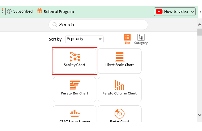
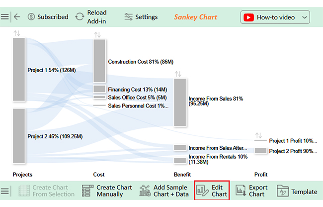
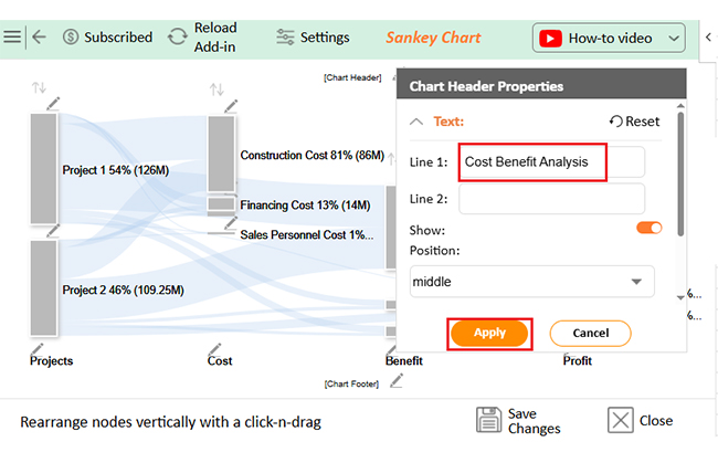
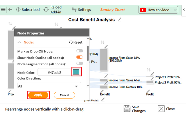
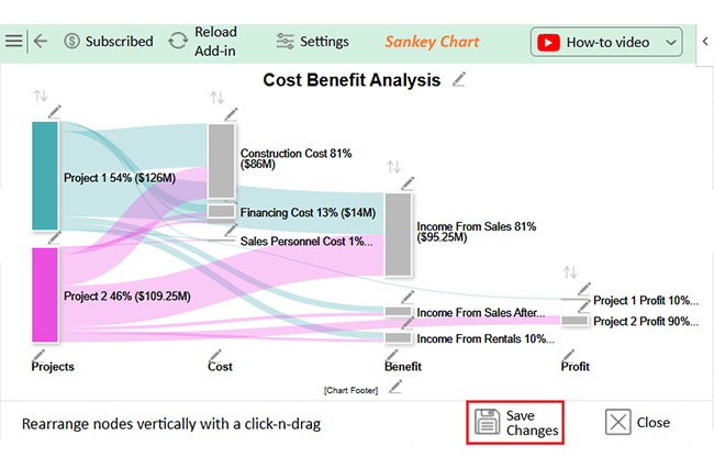
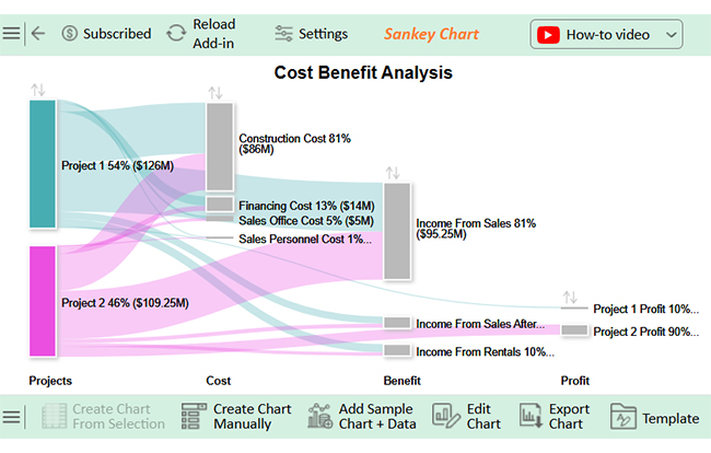
You can learn how to group worksheets in Excel to streamline data entry and organization. But how do you make it appealing and easy to glean insights? That’s where ChartExpo comes into play. ChartExpo is an add-in that transforms dry data into vibrant, easy-to-read visuals—like a Sankey Diagram—without hours of tweaking.

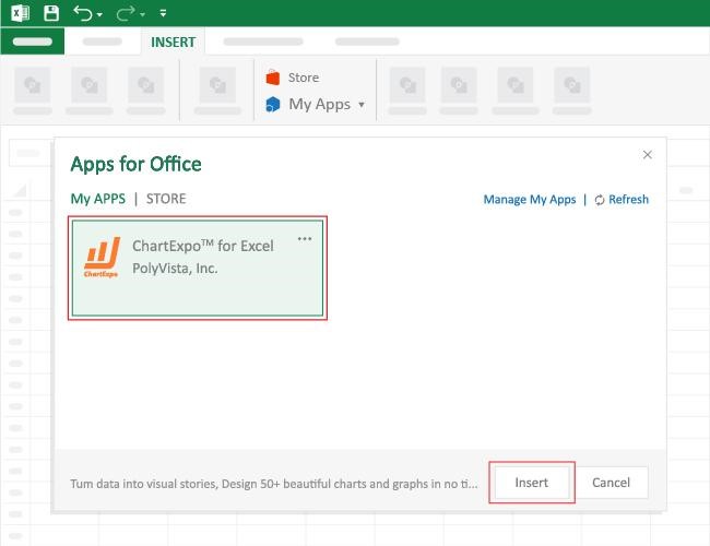
How to Install ChartExpo in Excel?

  1. Open your Excel application.
  2. Open the worksheet and click the “Insert” menu.
  3. You’ll see the “My Apps” option.
  4. In the Office Add-ins window, click “Store” and search for ChartExpo on the My Apps Store.
  5. Click the “Add” button to install ChartExpo in your Excel.

ChartExpo charts are available both in Google Sheets and Microsoft Excel. Please use the following CTAs to install the tool of your choice and create beautiful visualizations with a few clicks in your favorite tool.

Example

Let’s learn how to Link Sheets in Excel using ChartExpo and glean insights from the data.
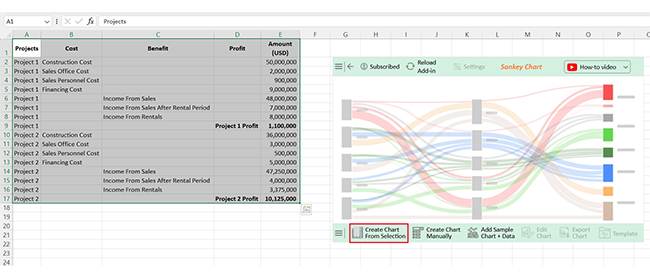
Projects Cost Benefit Profit Amount (USD)
Project 1 Construction Cost          50,000,000
Project 1 Sales Office Cost            2,000,000
Project 1 Sales Personnel Cost               900,000
Project 1 Financing Cost            9,000,000
Project 1 Income From Sales          48,000,000
Project 1 Income From Sales After Rental Period            7,000,000
Project 1 Income From Rentals            8,000,000
Project 1 Project 1 Profit           1,100,000
Project 2 Construction Cost          36,000,000
Project 2 Sales Office Cost            3,000,000
Project 2 Sales Personnel Cost               500,000
Project 2 Financing Cost            5,000,000
Project 2 Income From Sales          47,250,000
Project 2 Income From Sales After Rental Period            4,000,000
Project 2 Income From Rentals            3,375,000
Project 2 Project 2 Profit         10,125,000
  • To get started with ChartExpo, install ChartExpo in Excel.
  • Now, click on My Apps from the INSERT menu.
Group Worksheets in Excel
  • Choose ChartExpo from My Apps, then click Insert.
Group Worksheets in Excel
  • Once it loads, select the “Sankey Chart” from the list of charts.
Group Worksheets in Excel
  • Click the “Create Chart From Selection” button after selecting the data from the sheet, as shown.
Group Worksheets in Excel
  • ChartExpo will generate the visualization below for you.
Group Worksheets in Excel
  • If you want to have the chart’s title, click Edit Chart, as shown in the above image.
  • Click the pencil icon next to the Chart Header to change the title.
  • It will open the properties dialog. Under the Text section, you can add a heading in Line 1 and enable Show.
  • Give the appropriate title of your chart and click the Apply button.
Group Worksheets in Excel
  • You can add the dollar sign with all values as follows:
Group Worksheets in Excel
  • You can add the color in Nodes and set the direction as follows:
Group Worksheets in Excel
  • Click the “Save Changes” button to persist the changes.
Group Worksheets in Excel
  • Your final chart will appear as follows.
Group Worksheets in Excel

Insights

Project 1:

  • Higher overall costs
  • Lower profit: $1.1M
  • Significant financing expenses reduced profitability.

Project 2:

  • Lower overall costs
  • Higher profit: $10.125M
  • Strong sales revenue and minimal financing costs boosted returns

Limitations of Grouping Worksheets in Excel

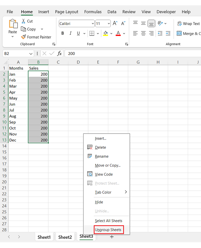
Grouping worksheets feels like a power move—until it catches you off guard. It’s fast, efficient, and competent… but it has a few strings attached. If you’ve ever asked, “Why did all my sheets change at once? You’ve already met one of its pitfalls.

Let’s break down the limitations of grouping:

  • Unintended changes across all sheets: When sheets are grouped, every edit—no matter how small—applies to all. A simple typo or misplaced formula can quietly spread across multiple sheets.
  • Limited function availability: Some Excel tools stop working in group mode. Features like custom sorting in Excel may be disabled or behave unpredictably when multiple sheets are selected.
  • Can’t group non-contiguous sheets in Excel online: If you’re using Excel Online, there’s a catch. You can’t group non-adjacent sheets, which limits flexibility for cloud-based users.
  • Confusion during navigation: It’s easy to forget you’re still in group mode. Without a clear reminder, you might switch tabs and continue editing, not realizing you’re affecting multiple sheets.
  • Group editing restricts sheet-specific customization: Do you want a different chart layout or unique formatting on just one sheet? You’ll need to ungroup first—grouping locks you into making identical edits across all selected sheets.
  • No visual alert for group mode: Excel adds a small “Group” label near the file name, but it’s easy to miss. Without a bold visual cue, users often stay in group mode longer than intended.

FAQs

How do you group sheets in Excel?

  • Open your Excel workbook.
  • Hold the Ctrl key.
  • Click each sheet tab to group.
  • “Group” appears in the title.

How to group tabs in sheets?

  • Select the first sheet tab.
  • Hold Shift for adjacent sheets.
  • Click the last sheet tab.
  • All selected tabs are now grouped.

Wrap Up

Grouping worksheets in Excel saves time by cutting down repetitive work. You edit once, and the changes apply to all grouped sheets.

Many users ask, ‘How do I group worksheets in Excel?’ The answer is simple. Use Ctrl or Shift to select multiple sheet tabs.

So, what is Excel software used for? Excel helps manage large volumes of information. It’s used for organizing, analyzing, and reporting data. Grouping is one way to keep your workflow efficient.

You can boost collaboration by learning how to share an Excel Workbook. When working in teams, grouped sheets keep everyone’s input aligned. It supports a smoother review and editing process.

Need to pull data across sheets? Learn how to link sheets in Excel. When combined with grouping, linked sheets build a dynamic and connected workbook.

Grouping data in Excel isn’t just about visual tidiness. It supports more intelligent decision-making. When done right, grouping gives structure, speed, and clarity to your data tasks.

And don’t hesitate. Install ChartExpo for powerful visual insights from your grouped data.

How much did you enjoy this article?

ExcelAd2
Start Free Trial!
156654

Related articles

next previous
Microsoft Excel11 min read

CSV vs. Excel: A Quick Comparison for Everyday

CSV vs. Excel explains the key differences and when to use each. Discover practical tips, tables, and charts to manage and analyze your data better.

Microsoft Excel12 min read

Financial Graphs and Charts in Excel: Tips and Best Practices

Explore financial charts and graphs to improve data analysis, reveal trends, and make smarter business decisions with clear visual insights.

Microsoft Excel12 min read

Export Jira to Excel: Insights Made Easy

Learn how to export Jira to Excel for better data analysis and reporting. You’ll discover methods, tips, and visuals to turn your data into actionable insights.

Microsoft Excel11 min read

Hlookup in Excel: The Key to Faster Analysis

HLOOKUP in Excel enables you to find data across rows quickly. This blog will show you how to use it, avoid common errors, and enhance data visualizations.

Microsoft Excel7 min read

How to Create a Stacked Waterfall Chart in Excel?

Discover how to build and customize a stacked waterfall chart in Excel. Ideal for showing positive and negative values across categories or time.

ChartExpo logo

Turn Data into Visual
Stories

CHARTEXPO

  • Home
  • Gallery
  • Videos
  • Services
  • Pricing
  • Contact us
  • FAQs
  • Privacy policy
  • Terms of Service
  • Sitemap

TOOLS

  • ChartExpo for Google Sheets
  • ChartExpo for Microsoft Excel
  • Power BI Custom Visuals by ChartExpo
  • Word Cloud

CATEGORIES

  • Bar Charts
  • Circle Graphs
  • Column Charts
  • Combo Charts
  • Comparison Charts
  • Line Graphs
  • PPC Charts
  • Sentiment Analysis Charts
  • Survey Charts

TOP CHARTS

  • Sankey Diagram
  • Likert Scale Chart
  • Comparison Bar Chart
  • Pareto Chart
  • Funnel Chart
  • Gauge Chart
  • Radar Chart
  • Radial Bar Chart
  • Sunburst Chart
  • see more
  • Scatter Plot Chart
  • CSAT Survey Bar Chart
  • CSAT Survey Chart
  • Dot Plot Chart
  • Double Bar Graph
  • Matrix Chart
  • Multi Axis Line Chart
  • Overlapping Bar Chart
  • Control Chart
  • Slope Chart
  • Clustered Bar Chart
  • Clustered Column Chart
  • Box and Whisker Plot
  • Tornado Chart
  • Waterfall Chart
  • Word Cloud
  • see less

RESOURCES

  • Blog
  • Resources
  • YouTube
SIGN UP FOR UPDATES

We wouldn't dream of spamming you or selling your info.

© 2025 ChartExpo, all rights reserved.