• Home
  • Tools dropdown img
    • Spreadsheet Charts

      • ChartExpo for Google Sheets
      • ChartExpo for Microsoft Excel
    • Power BI Charts

      • Power BI Custom Visuals by ChartExpo
    • Word Cloud

  • Charts dropdown img
    • Chart Category

      • Bar Charts
      • Circle Graphs
      • Column Charts
      • Combo Charts
      • Comparison Charts
      • Line Graphs
      • PPC Charts
      • Sentiment Analysis Charts
      • Survey Charts
    • Chart Type

      • Box and Whisker Plot
      • Clustered Bar Chart
      • Clustered Column Chart
      • Comparison Bar Chart
      • Control Chart
      • CSAT Survey Bar Chart
      • CSAT Survey Chart
      • Dot Plot Chart
      • Double Bar Graph
      • Funnel Chart
      • Gauge Chart
      • Likert Scale Chart
      • Matrix Chart
      • Multi Axis Line Chart
      • Overlapping Bar Chart
      • Pareto Chart
      • Radar Chart
      • Radial Bar Chart
      • Sankey Diagram
      • Scatter Plot Chart
      • Slope Chart
      • Sunburst Chart
      • Tornado Chart
      • Waterfall Chart
      • Word Cloud
    • Google Sheets
      Microsoft Excel
  • Services
  • Pricing
  • Contact us
  • Blog
  • Support dropdown img
      • Gallery
      • Videos
      • Contact us
      • FAQs
      • Resources
    • Please feel free to contact us

      atsupport@chartexpo.com

Categories
All Data Visualizations Data Analytics Surveys
Add-ons/
  • Google Sheets
  • Microsoft Excel
  • Power BI
All Data Visualizations Data Analytics Surveys
Add-ons
  • Google Sheets
  • Microsoft Excel
  • Power BI

We use cookies

This website uses cookies to provide better user experience and user's session management.
By continuing visiting this website you consent the use of these cookies.

Ok

ChartExpo Survey


Home > Blog > Data Analytics

Social Media Dashboard to Improve Marketing Insights

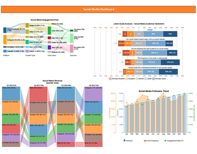
A social media dashboard visually tracks key metrics across platforms. It helps monitor engagement, performance, and campaign effectiveness in real-time.

Social Media Dashboard

This guide uncovers what a social media dashboard is, why a social media analytics dashboard is important, and how to create a dashboard in Power BI. You’ll also discover some of the best-designed dashboards and how a marketing agency client dashboard works.

There’s a section in this guide that dives deep into the Power BI dashboard vs report debate.

Business owners and analysts will have the chance to explore the web analytics dashboard, digital dashboard, business intelligence dashboard, and marketing dashboard.

If you’re having issues managing customers, there’s a section in this guide that shows you how to set up a customer relationship management dashboard. Aside from setting up dashboards, you’ll discover how a dashboard user interface design works.

Table of Contents:

  1. What is a Social Media Dashboard?
  2. Why is a Social Media Analytics Dashboard Important?
  3. Key Features and Benefits of a Social Media Analytics Dashboard
  4. How to Use a Social Media Dashboard?
  5. How to Create a Power BI Social Media Dashboard?
  6. Tips for a Social Media Reporting Dashboard in Power BI
  7. FAQs
  8. Wrap Up

What is a Social Media Dashboard?

Definition: A social media dashboard is a visual reporting tool that consolidates key performance metrics from multiple social media platforms into a single interface. It gives analysts, marketers, and businesses the room to analyze, monitor, and manage their social media activity in real-time.

Top Charts to show the social media dashboard

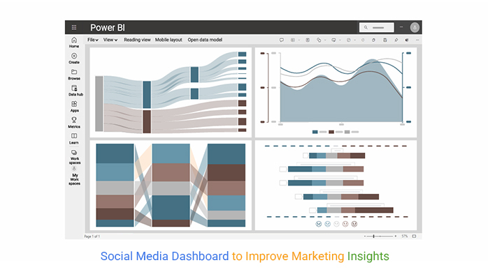
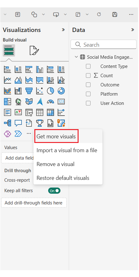
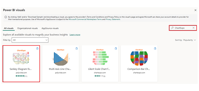
Here are the top charts created in Power BI by using ChartExpo visuals.
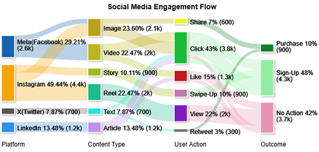
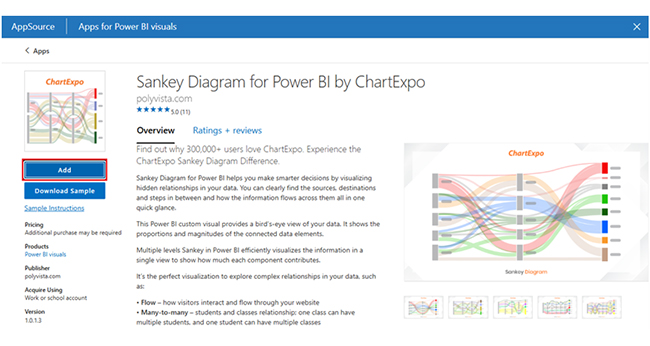
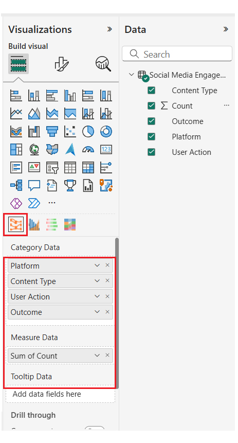
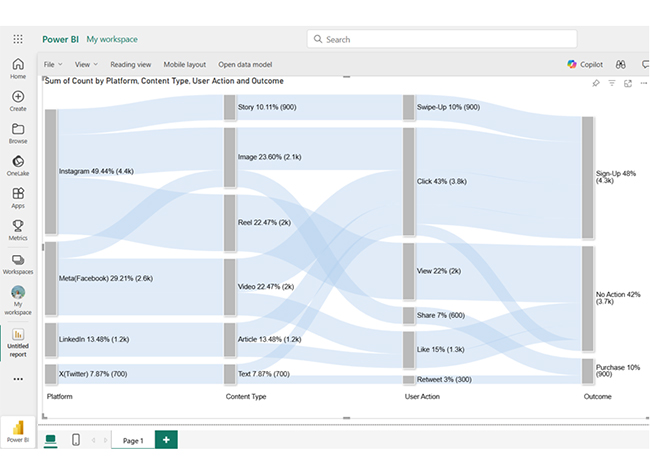
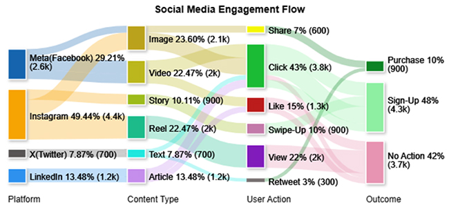
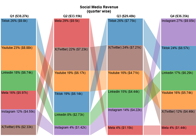
Sankey Diagram:

Social Media Dashboard

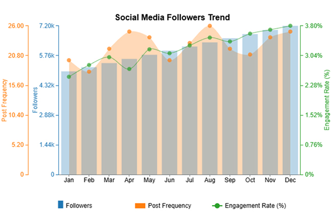
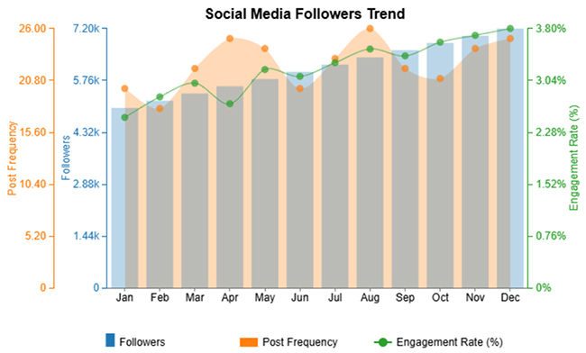
Multi-Axis Line Chart:

Social Media Dashboard

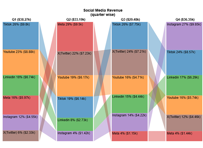
Comparison Bar Chart:
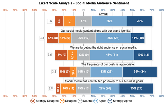
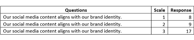
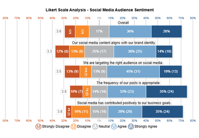
Social Media Dashboard

Likert Scale Chart:

Social Media Dashboard

Why is a Social Media Analytics Dashboard Important?

  • Centralized Data Access

Instead of jumping between multiple social media platforms to gather metrics, a dashboard provides a centralized view of key performance indicators (KPIs).

  • Track ROI and Campaign Success

Dashboards give you room to measure the ROI and effectiveness of social media campaigns. Metrics like conversions, clickthrough rates, and follower growth help tie social media activity to business outcomes.

  • Faster Response Times

Alerts and live updates help you react to trends, monitor brand sentiment, and address negative feedback before it escalates.

  • Enhanced Reporting and Communication

A well-designed dashboard simplifies complex data in a visual, digestible format. This comes in handy during meetings, strategy sessions, or reviews.

Key Features and Benefits of a Social Media Analytics Dashboard

  • Centralized Monitoring

A dashboard brings together data from multiple social media platforms like Facebook, Instagram, Twitter, and LinkedIn into a single interface.

  • Data-Driven Insights

Dashboards use visualizations to highlight user behavior, trends, and campaign impact. These insights show what content resonates with audiences and where improvements are needed.

  • Time-Saving

Instead of manually gathering metrics from each platform, a dashboard provides instant access to up-to-date performance data.

  • Performance Tracking

It supports real-time tracking of key performance indicators (KPIs) like likes, shares, comments, impressions, reach, and follower growth.

How to Use a Social Media Dashboard?

  • Connect Your Social Media Accounts

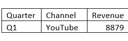
You have to integrate platforms like Instagram, Facebook, LinkedIn, X (Twitter), and YouTube into your dashboard tool.

  • Define Your Goals and KPIs

You have to figure out what success means to you. Typical KPIs include follower growth, impressions, click-through rate (CTR), engagement rate, and conversions.

  • Customize Your Dashboard Layout

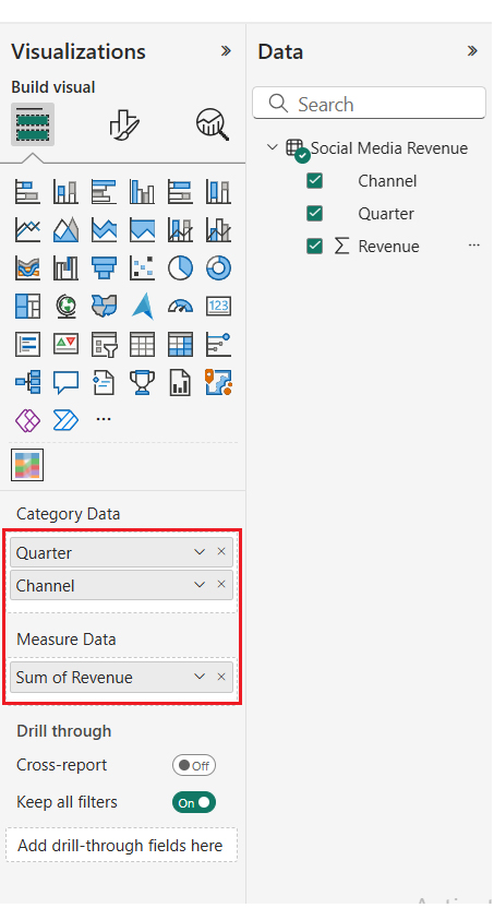
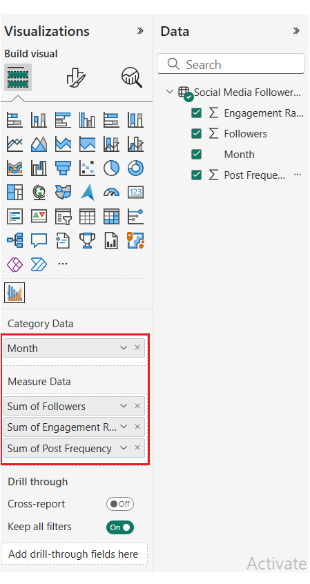
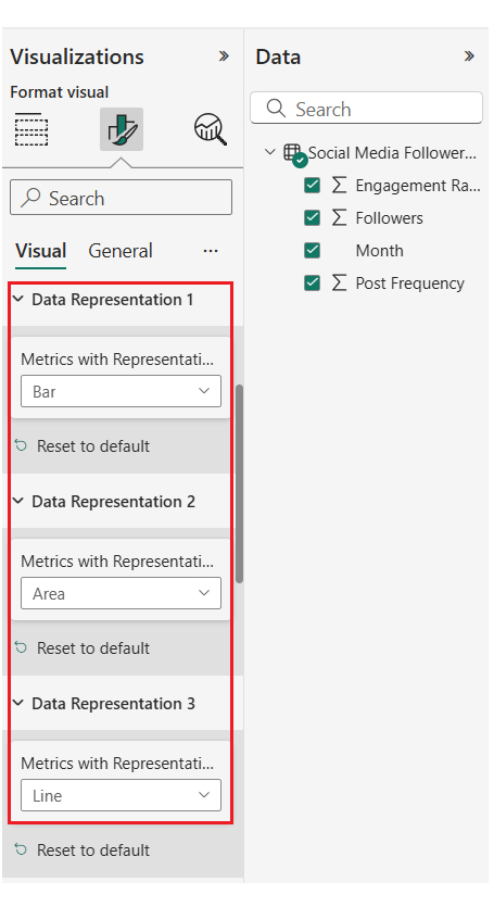
Organize visual elements like line graphs, bar charts, and tables to represent performance. For easier analysis, you have to group similar metrics (like reach and engagement) together.

  • Monitor Trends and Campaigns

Use the dashboard to track the performance of specific campaigns (or content types). Look out for spikes in engagement, drops in reach, or changes in sentiment to figure out what resonates with your audience.

How to Create a Power BI Social Media Dashboard?

Sankey Chart Example

  • Log in to Power BI, enter your email, and click the “Submit” button.
Social Media Dashboard
  • You’ll be redirected to a Microsoft account. Enter your password, and click “Sign in.”
Social Media Dashboard
  • You can opt to stay signed in.
Social Media Dashboard
  • Creating a dataset and selecting the data to use in the required chart.
  • The data table below will be used for the Sankey Diagram in the dashboard.
Social Media Dashboard
  • To add data to the report, click on the “Paste data into a blank report.”
Social Media Dashboard
  • Paste the data table above into the blank table, name it, and click on the “Create a blank report” button.
  • Click on “Expand All” to see the chart metrics. Check the dimensions and metrics.
Social Media Dashboard
  • Click on “Get more visuals.”
Social Media Dashboard
  • Search “ChartExpo” and select the Sankey Diagram. You’ll have to add all the charts to your visuals. After all, you’ll use these charts in your business dashboard for different business insights.
Social Media Dashboard
  • Click on the “Add” button.
Social Media Dashboard
  • After adding all four charts to the visuals, you’ll see the chart icons in your visuals list.
  • From left to right, Sankey Diagram, Multi Axis Line Chart, and Comparison Bar Chart by ChartExpo.
Social Media Dashboard
  • To add the Sankey Diagram visual (first one from left), click on the chart icon, and choose the dimension and measures as shown below.
  • To add the key, navigate to the visualization’s properties and click on License Settings.
Social Media Dashboard
  • After adding the key, you’ll see the Sankey Diagram.
Social Media Dashboard
  • At this point, set the properties to customize the look and feel of the chart. First, you can change the title of the chart.
Social Media Dashboard
  • You’ll have to set node colors for each level.
Social Media Dashboard
  • You can change the Node’s directions.
Social Media Dashboard
  • Here’s the final look and feel of the chart.
Social Media Dashboard
Likert Scale Chart Example
  • You can add the second chart (Likert Scale Chart) to your report/dashboard.
Social Media Dashboard
  • The social media audience sentiment survey data will be used in the Likert Scale Chart.
Social Media Dashboard
  • After the data has been manually pasted in Power BI (or exported from Excel), you’ll have to choose the dimensions and measures.
Social Media Dashboard
  • To remove the watermark, you’ll have to enter the key. You’ll have to set the properties to customize the look and feel of the Likert Chart. You can change the title of the chart, and also change the text in the legend for smiley icons.
Social Media Dashboard
  • Here’s the final look and feel of the Likert Scale Chart.
Social Media Dashboard
Comparison Bar Chart Example
  • You can add the third chart (Comparison Bar Chart) to your report/dashboard.
Social Media Dashboard
  • The following social media revenue data will be used for the Comparison Bar Chart.
Social Media Dashboard
  • After manually pasting the data in Power BI (or exporting from Excel), you’ll have to choose your dimensions and measures.
Social Media Dashboard
  • Enter the key to remove the watermark. You can set the properties to customize the look and feel of the Comparison Bar Chart. There’s also the option to change the title of the chart. Next, sort the data columns.
Social Media Dashboard
  • You can prepend the “$” sign with numbers as prefixes.
Social Media Dashboard
  • Here’s the final look and feel of the Comparison Bar Chart.
Social Media Dashboard
Multi-Axis Line Chart Example
  • Let’s add the final chart (Multi-Axis Line Chart) to the report/dashboard.
Social Media Dashboard
  • The following social media follower trend data will be used in the Multi-Axis Line Chart.
Social Media Dashboard
  • After manually pasting the data in Power BI (or exporting from Excel), you’ll have to choose the dimensions and measures.
Social Media Dashboard
  • To remove the watermark, you’ll have to enter the key. You can set the properties to customize the look and feel of the Likert Chart. You can also change the title of the chart. Next, sort the data columns.
Social Media Dashboard
  • You can change the data representation to the Bar, Line, and Area.
Social Media Dashboard
  • You can change the legend properties to set the shape type Column, Line and Circle, and Area.
Social Media Dashboard
  • Here’s the final look and feel of the Multi-Axis Line Chart.
Social Media Dashboard
  • You’ll have to place the charts in a good way on your dashboard area. After that, here’s what the social media chart will look like.
Social Media Dashboard

Insights

  • Instagram leads in sign-ups and Q4 revenue, showing strong performance through Images and Stories.
  • Meta excels in engagement but drops in later quarters. X (Twitter) and LinkedIn have mixed revenue trends.
  • Follower rising engagement rates and growth indicate an effective content strategy and sustained audience interest.

Tips for a Social Media Reporting Dashboard in Power BI

  • Define Clear Objectives:

Focus on KPIs that align with your marketing goals. These goals could be reached, conversions or engagement.

  • Use Visual Hierarchy:

Prioritize key metrics at the top and group related data to improve readability.

  • Use DAX Measures for Accuracy:

Create calculated metrics like CTR or engagement rate using DAX in Power BI for consistent, reliable reporting.

  • Include Benchmarking Metrics:

Compare current performance against goals (or past periods) to track progress.

FAQs

What are the three types of dashboards?

The three types of dashboards are operational, analytical, and strategic dashboards.

Which is the best platform to create a dashboard?

The best platform to create a dashboard depends on your needs. The top choices are Power BI (for business intelligence), Tableau (for visualization), and Google Data Studio (for free web-based reporting).

How do I monitor my social media platform?

You can monitor your social media platforms using analytical dashboards or tools like Power BI or Hootsuite. You can also use native insights to track engagement, sentiment, reach, and campaign performance in real-time.

Wrap Up

A social media dashboard tracks metrics across platforms in one view. It helps monitor performance, gain insights, save time, and make data-driven decisions.

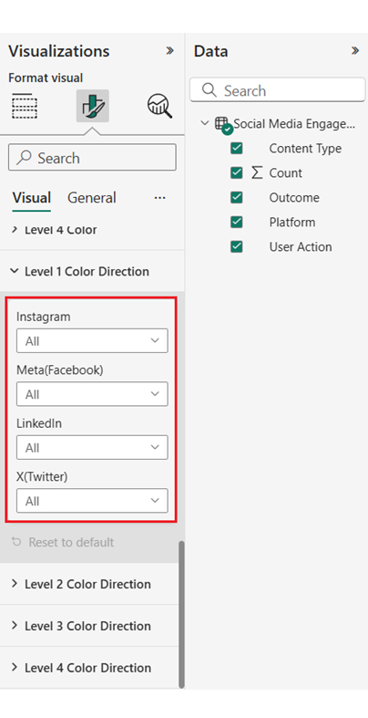
To get the most out of your social media dashboard, you’ll have to define your objective, incorporate filters and slicers, and automate data refresh.

You should focus on KPIs that align with your marketing goals. Also, incorporate filters and slicers. This allows users to segment data by campaign, platform, or time period for deeper analysis.

Furthermore, set scheduled refreshes to ensure your dashboard reflects up-to-date metrics.

Now you know what a social media dashboard is, what metrics will you look out for in your social media dashboard?

How much did you enjoy this article?

PBIAd1
Start Free Trial!
154809

Related articles

next previous
Data Analytics10 min read

DevOps Performance Metrics for Chart-Based Insights

DevOps performance metrics track efficiency in software delivery. This blog shows you how to use them to boost performance and streamline workflows.

Data Analytics10 min read

Consulting Report Template for Better Decision Insights

A consulting report template organizes insights and data for clients. Click here to learn how to write, analyze, and enhance reports with charts and examples.

Data Analytics10 min read

Data Export in Salesforce: Insights Made Simple

Salesforce data export helps you download and use your CRM data. Click here to learn how to export, analyze, and track sales with easy steps and visuals.

Data Analytics10 min read

Analytics in Banking Industry: A Complete Walkthrough

Learn how analytics in the banking industry improves decisions and manages risks. Explore key types, uses, and tips to make data work for your bank.

Data Analytics9 min read

What is a Confusion Matrix? A Quick Guide

Understand what a confusion matrix is and how it helps evaluate the accuracy of predictions, interpret model results, & enhance analysis in classification tasks.

ChartExpo logo

Turn Data into Visual
Stories

CHARTEXPO

  • Home
  • Gallery
  • Videos
  • Services
  • Pricing
  • Contact us
  • FAQs
  • Privacy policy
  • Terms of Service
  • Sitemap

TOOLS

  • ChartExpo for Google Sheets
  • ChartExpo for Microsoft Excel
  • Power BI Custom Visuals by ChartExpo
  • Word Cloud

CATEGORIES

  • Bar Charts
  • Circle Graphs
  • Column Charts
  • Combo Charts
  • Comparison Charts
  • Line Graphs
  • PPC Charts
  • Sentiment Analysis Charts
  • Survey Charts

TOP CHARTS

  • Sankey Diagram
  • Likert Scale Chart
  • Comparison Bar Chart
  • Pareto Chart
  • Funnel Chart
  • Gauge Chart
  • Radar Chart
  • Radial Bar Chart
  • Sunburst Chart
  • see more
  • Scatter Plot Chart
  • CSAT Survey Bar Chart
  • CSAT Survey Chart
  • Dot Plot Chart
  • Double Bar Graph
  • Matrix Chart
  • Multi Axis Line Chart
  • Overlapping Bar Chart
  • Control Chart
  • Slope Chart
  • Clustered Bar Chart
  • Clustered Column Chart
  • Box and Whisker Plot
  • Tornado Chart
  • Waterfall Chart
  • Word Cloud
  • see less

RESOURCES

  • Blog
  • Resources
  • YouTube
SIGN UP FOR UPDATES

We wouldn't dream of spamming you or selling your info.

© 2025 ChartExpo, all rights reserved.