Categories
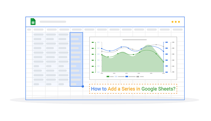
How do I add a series in Google Sheets? This question often arises for those managing data. Whether you’re tracking expenses or planning projects, adding a series saves time and boosts accuracy. Thus, mastering this feature is crucial.
Consider this: businesses spend an average of 20% of their time on repetitive tasks. Automating series in Google Sheets can reduce that. A few clicks can generate lists, sequences, or patterns, making data management faster. Whether you’re managing inventory or planning schedules, efficiency is key.


Adding a series isn’t just about filling cells. It’s about streamlining workflows and eliminating manual errors. Google Sheets, an alternative to Excel, can do it automatically, eliminating typing out dates or sequential numbers. This feature is invaluable for personal and professional tasks alike.
Learning how to add a series in Google Sheets isn’t tricky. It’s an accessible skill with practical benefits. With this tool, anyone can turn data into something meaningful.
Let’s explore how this simple action can transform your work with spreadsheets.
First…
Definition: A series in Google Sheets is a sequence of related data. It can include numbers, dates, or custom text patterns. For example, it might be “1, 2, 3” or “Monday, Tuesday, Wednesday”.
Google Sheets can generate these automatically, saving time and ensuring accuracy. You define a starting value and a pattern, and then the tool completes the sequence for you. Series help track schedules, analyze trends or organize data efficiently. It’s a simple yet powerful feature.
Adding a series in Google Sheets isn’t just a convenience—it’s a smart way to make your data more robust. Whether organizing numbers or creating charts, a series brings clarity and precision. Let’s explore why it’s worth doing.
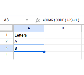
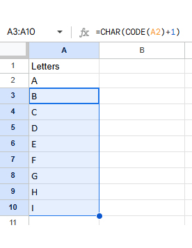
Google Sheets makes it super easy to create various series, such as numbers, dates, months, or even letters. Let’s explore the different ways you can do this, with some handy tips along the way!
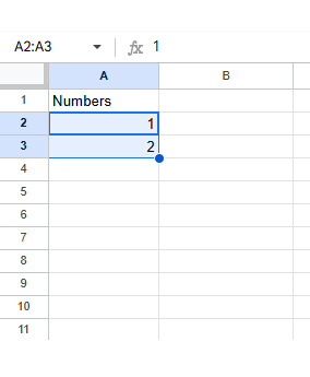
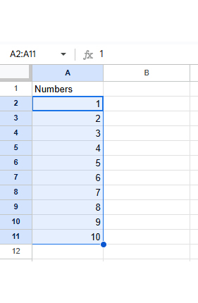
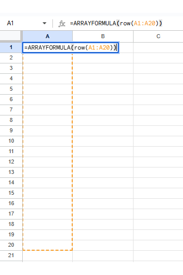
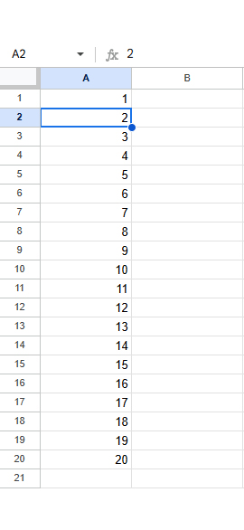
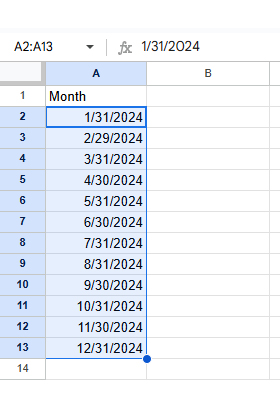
To fill a series of numbers, you can use two methods:
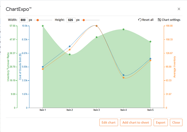
Definition: A Google Sheets line chart with multiple series displays trends for various datasets in one chart. Each series represents a set of data points connected by a line. It helps make visual analytics easy. How? You can compare different variables over time or categories.
For example, you can plot sales and profits in the same chart to analyze their relationship. Each series is colored for easy distinction. This helps visualize patterns and correlations across multiple data series simultaneously.
Here’s how to make your Google Sheets charts stand out, step by step:
Data speaks louder when it’s visual. That’s the real power of data visualization in analysis. It turns raw numbers into clear insights. While Google Sheets handles basic charts well, it often struggles with advanced visuals like a Scatter plot that reveal deeper patterns and relationships.
Enter ChartExpo. This powerful Google Sheets extension levels up your data analysis with advanced, insightful charts. You can even create a Pareto chart in Google Sheets to highlight key contributors. Ready to learn how to add a series in Sheets and make your visuals shine? Install ChartExpo in Google Sheets.
Let’s learn how to install ChartExpo in Google Sheets.
ChartExpo charts are available both in Google Sheets and Microsoft Excel. Please use the following CTAs to install the tool of your choice and create beautiful visualizations in a few clicks in your favorite tool.
Using the data below, let’s practice data analytics with ChartExpo for Google Sheets.
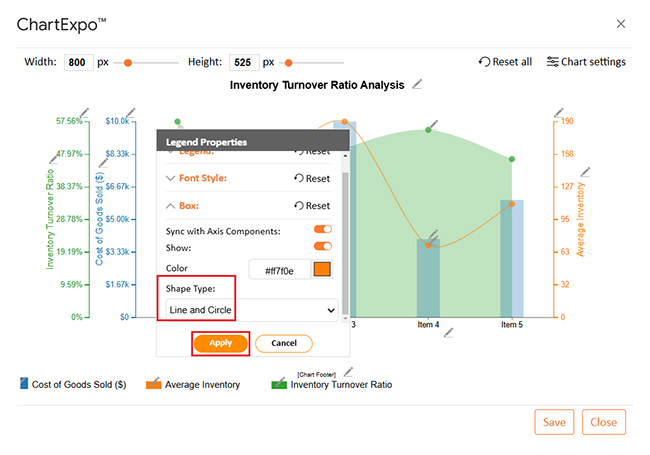
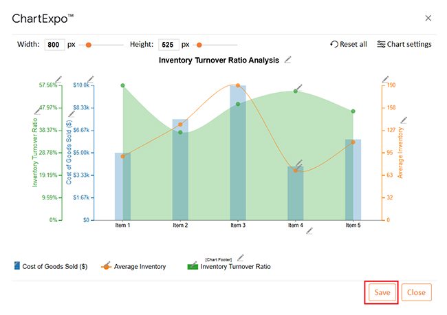
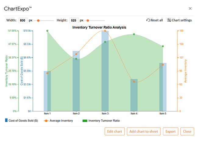
| Item | Cost of Goods Sold ($) | Average Inventory | Inventory Turnover Ratio |
| Item 1 | 5000 | 90 | 57.56 |
| Item 2 | 7500 | 135 | 37.56 |
| Item 3 | 10000 | 190 | 49.63 |
| Item 4 | 4000 | 70 | 55.14 |
| Item 5 | 6000 | 110 | 46.55 |


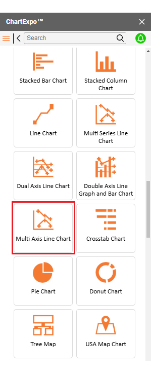
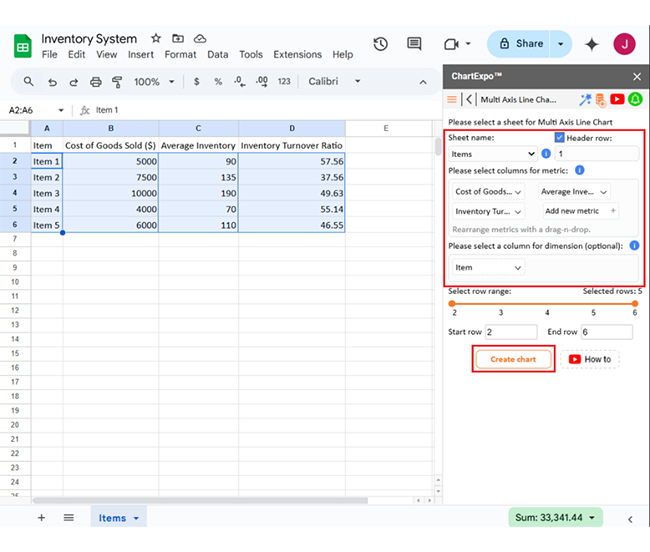
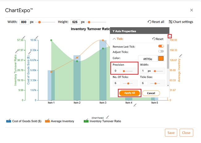
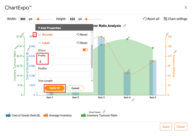
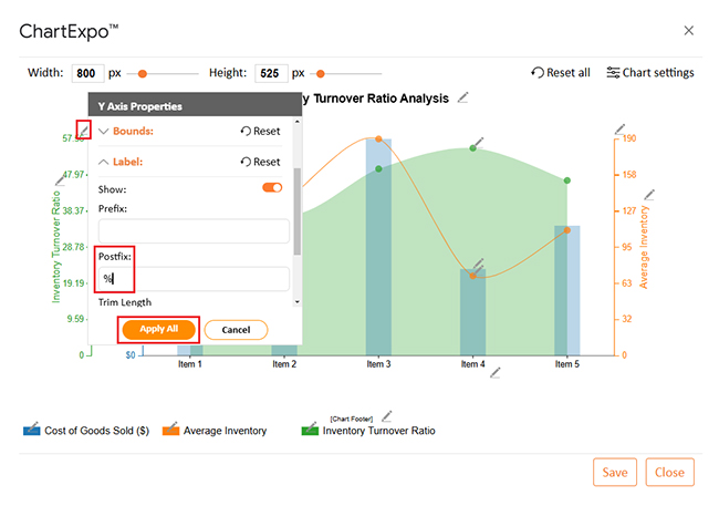
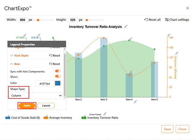
The following video will help you to create the Multi Axis Line Chart in Google Sheets.
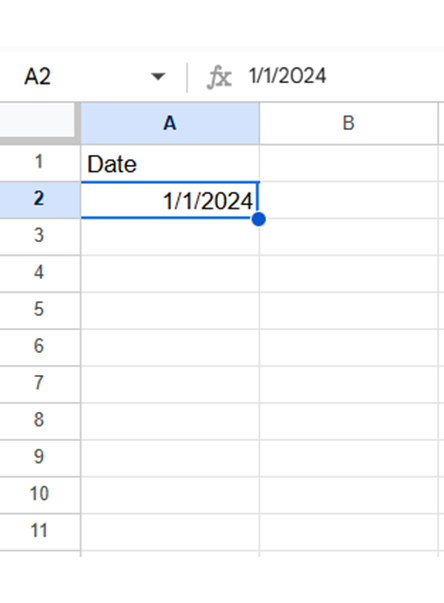
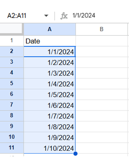
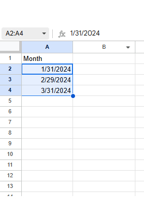
To insert a series in Google Sheets,
To add multiple data series in Google Sheets;
To format a data series in Google Sheets
Adding a series in Google Sheets is simple and effective. It helps organize and visualize data efficiently, and you can easily manage multiple data sets in one Chart. This functionality is especially useful when performing tasks like what-if analysis in Google Sheets. It allows you to compare trends and explore different scenarios with ease.
Start by preparing your data properly. Make sure your series is in separate columns or rows. Proper formatting ensures accuracy and saves time when creating charts.
Next, insert a chart to display your series and highlight the data range you want to include. Go to the Insert menu and select Chart. Google Sheets automatically adds the data to your Chart.
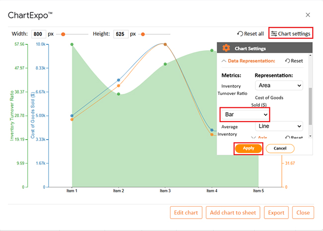
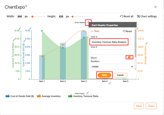
Customize your Chart to suit your needs. The Chart Editor allows you to add or remove series. The Series tab will enable you to modify colors, labels, and styles, enhancing clarity and readability.
Remember to keep your series meaningful. Avoid cluttering your Chart with too much data. Focus on the most relevant information. It will make your analysis more effective.
Adding a series is a powerful feature in Google Sheets. It simplifies complex data and enhances decision-making.
Do not hesitate.
Install ChartExpo and start practicing adding series in Google Sheets. This skill will make your data analysis more insightful and impactful.
How much did you enjoy this article?


SUMPRODUCT in Google Sheets handles multi-condition calculations without extra columns. Master its syntax, uses, and errors. Read on!

An annual budget template in Google Sheets organizes your yearly finances, tracks every dollar, and reveals spending patterns. Read on!

Learn the best graph to show profit and loss with practical examples and use cases. Discover how to visualize your business data, track trends, and make smarter financial decisions.


