Categories
What are Population Pyramid Types?
Population pyramid types describe how a population is structured across age groups and genders, but more importantly, they reveal how that population is changing over time.
These visual patterns are not just demographic summaries.
They reflect underlying trends in birth rates, life expectancy, and population growth, making them useful for understanding long-term social and economic direction.
Broadly, population diagrams fall into three main types, each representing a different stage of population development.
An expansive structure is characterized by a wide base, indicating higher birth rates and a growing younger population.
This pattern is often seen in developing regions where population growth is still accelerating.
A constrictive structure shows a narrower base and a relatively wider upper section, pointing to lower birth rates and an aging population.
This is common in more developed economies where longevity is higher, and fertility rates have declined.
A stationary structure appears more balanced across age groups, suggesting stable population growth with relatively even distribution between younger and older populations.
These distinctions are not just visual. They help explain shifts in workforce availability, healthcare demand, and economic sustainability.
For example, a younger population may signal future labor growth, while an aging population can increase pressure on social support systems.
Population pyramid types are also not fixed.
They evolve as countries undergo demographic and policy changes, reflecting shifts in fertility, mortality, and migration patterns over time.
Understanding these types provides a clearer foundation for analyzing population trends before moving into deeper interpretation.
Definition: A population pyramid is a graphical chart that shows the distribution of a population by age groups and gender.
It is typically structured with:
The shape of the pyramid is what makes it valuable. It reveals whether a population is growing, stable, or declining based on how age groups are distributed.
Population pyramids are commonly classified into three types: expansive, constrictive, and stationary.
Each type reflects a different pattern of population growth and demographic balance.
In practice, these charts are used to analyze population structure and anticipate future trends, such as changes in workforce size, dependency levels, and demand for services like education and healthcare.
Is it possible to visually grasp the age distribution of an entire country? A population pyramid does just that.
To understand this powerful chart, let’s break it down into its key components:
Population diagrams give us a quick visual insight into a population’s makeup. But what exactly can these intriguing graphs tell us? Let’s find out:
Three main types based on their shape and what they reveal about population structure and growth trends.
This type has a wide base and narrows quickly toward the top.
It indicates:
This pattern is common in developing countries where a large portion of the population is under 15.
What it tells you:
There will likely be increasing demand for education, jobs, and infrastructure in the near future.
This type has a narrower base compared to the middle, often with a wider upper section.
It indicates:
This is typical in developed countries with longer life expectancy and lower fertility rates.
What it tells you:
There may be future workforce shortages and increased pressure on healthcare and pension systems.
This type has a more uniform shape across age groups, with similar proportions in the younger and middle ages.
It indicates:
This is often seen in countries with stable economies and controlled population growth.
What it tells you:
The population is relatively balanced, supporting steady economic and social conditions.
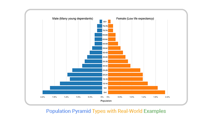
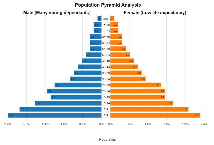
This pyramid represents a growing population with a strong base of younger age groups.
The wider lower sections indicate a high proportion of children and adolescents, while the upper age groups remain relatively small.
On the male side, the broader base suggests a large number of young dependents. On the female side, the rapid decline in older age groups points to lower life expectancy.
When reading this chart, notice:
This type of structure is commonly associated with developing regions where future demand for education, jobs, and infrastructure is expected to rise significantly.
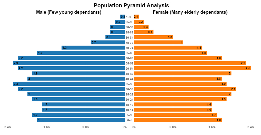
This pyramid shows a more mature or aging population, where the middle and older age groups are more prominent than the younger population.
The narrower base indicates lower birth rates, while the wider upper sections—especially on the female side—highlight a higher number of elderly dependents and longer life expectancy.
When reading this chart, focus on:
This structure is typical in developed regions and signals potential challenges such as workforce shortages and increased pressure on healthcare and pension systems.
Reading a population pyramid diagram may seem complex at first glance.
But once you know what to look for, it becomes a valuable tool for understanding demographic dynamics.
Here’s a step-by-step guide to help you read a population pyramid:
Population pyramids reflect how a population evolves. These stages align closely with demographic changes in birth rates, death rates, and life expectancy.
This stage shows a wide base and a sharply narrowing top.
It indicates:
This is common in developing regions where healthcare and living conditions are still improving.
What it means:
The population is growing quickly, with a large young population that will increase future demand for education and jobs.
The base remains wide but starts to stabilize, and the middle section begins to expand.
It indicates:
What it means:
Population growth continues, but at a slower pace. There is a shift toward a more balanced age structure.
The pyramid becomes more rectangular.
It indicates:
What it means:
Population growth stabilizes. The workforce is strong, and dependency levels are more balanced.
The base narrows relative to the middle, and the upper age groups expand.
It indicates:
What it means:
The population may shrink over time, leading to workforce shortages and increased pressure on healthcare and social systems.
Here’s how you can do it:
Interpreting a pop pyramid in Excel is not just about reading bars. It’s about understanding what the shape reveals about population structure, growth, and future impact.
Follow these steps to interpret it correctly.
Start by identifying how the chart is structured:
This structure helps you compare gender distribution across all age groups.
Look at the full pyramid shape before focusing on details.
The shape gives you a quick summary of population trends.
Examine how the population is spread across age groups.
This helps you understand demographic pressure and future shifts.
Compare the male and female sides across age groups.
This is especially important for identifying long-term demographic trends.
Focus on dependents:
A higher proportion of dependents means more economic pressure on the working population.
Watch for irregularities such as:
These may indicate migration, policy changes, or historical events.
Finally, connect what you see to real-world implications:
Excel charts can become difficult to read when comparing multiple age groups or datasets.
Using tools like ChartExpo can help present pop pyramids more clearly, making patterns easier to interpret and compare.
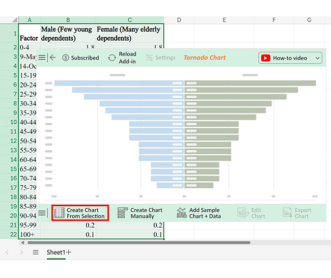
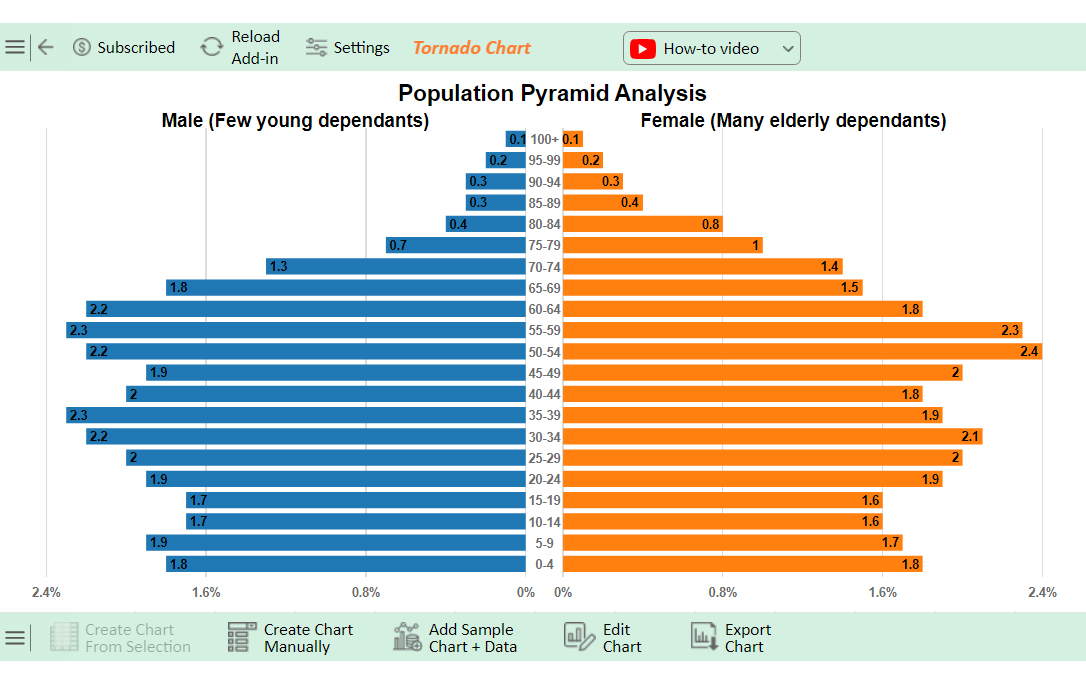
The chart compares two demographic groups by dependency levels: “Male (Few young dependents)” and “Female (Many elderly dependents).”
Key insights include:
Higher Dependency Ratios in Mid-Life (Ages 30-59):
Gender Differences Across Age Groups:
Analysts use them to make decisions about workforce planning, resource allocation, and long-term strategy.
Analysts examine the working-age population (typically 15–64) to assess future labor supply.
This helps businesses and governments prepare for hiring, automation, or skill development needs.
A wider base indicates a high number of children entering schools.
Analysts use this to:
When the upper age groups expand, it signals an aging population.
This helps analysts:
The demographic pyramid clearly shows dependents vs working-age groups.
This is critical for evaluating economic sustainability.
Governments use demographic pyramids to guide decisions such as:
The shape of the pyramid directly influences long-term economic planning.
In AP Human Geography, a population pyramid represents a country’s age and sex distribution. It shows the proportion of different age groups and genders, revealing population growth patterns, decline, and demographic trends.
A Stage 4 population pyramid features a rectangular shape with low birth and death rates. The population is stable or slowly increasing. The age distribution is balanced, with a larger proportion of older individuals, indicating an advanced demographic transition and development.
No, a population pyramid is not a map. It is a chart or graph that displays the age and sex distribution of a population. It helps analyze demographic trends, but does not show geographic locations.
Population pyramid types provide a clear snapshot of how a population is structured and where it is heading.
The three main types, expansive, constrictive, and stationary, each reflect a different pattern of growth and demographic balance.
An expansive pyramid indicates a younger population with higher birth rates and ongoing growth.
A constrictive pyramid reflects lower birth rates and an aging population.
A stationary pyramid represents a more balanced structure, where population growth is relatively stable.
These patterns go beyond visual differences. They help explain shifts in workforce size, dependency levels, and long-term economic pressure.
A younger population may require more investment in education and jobs, while an aging population increases demand for healthcare and social support.
Understanding these types allows analysts, planners, and decision-makers to anticipate future needs and respond more effectively.
In practice, population pyramids are not just descriptive charts—they are tools for forecasting and strategic planning.
How much did you enjoy this article?


Calculate accounts receivable turnover ratio to measure credit collection speed, improve cash flow, and strengthen your financial strategy. Read on!

Change Management KPIs are the key to tracking adoption, performance, and ROI during transitions. Find out which metrics matter. Read on!

Data collection methods and techniques determine the quality of every insight you act on. Explore key approaches for gathering reliable data. Read on!


