• Home
  • Tools dropdown img
    • Spreadsheet Charts

      • ChartExpo for Google Sheets
      • ChartExpo for Microsoft Excel
    • Power BI Charts

      • Power BI Custom Visuals by ChartExpo
    • Word Cloud

  • Charts dropdown img
    • Chart Category

      • Bar Charts
      • Circle Graphs
      • Column Charts
      • Combo Charts
      • Comparison Charts
      • Line Graphs
      • PPC Charts
      • Sentiment Analysis Charts
      • Survey Charts
    • Chart Type

      • Box and Whisker Plot
      • Clustered Bar Chart
      • Clustered Column Chart
      • Comparison Bar Chart
      • Control Chart
      • CSAT Survey Bar Chart
      • CSAT Survey Chart
      • Dot Plot Chart
      • Double Bar Graph
      • Funnel Chart
      • Gauge Chart
      • Likert Scale Chart
      • Matrix Chart
      • Multi Axis Line Chart
      • Overlapping Bar Chart
      • Pareto Chart
      • Radar Chart
      • Radial Bar Chart
      • Sankey Diagram
      • Scatter Plot Chart
      • Slope Chart
      • Sunburst Chart
      • Tornado Chart
      • Waterfall Chart
      • Word Cloud
    • Google Sheets
      Microsoft Excel
  • Services
  • Pricing
  • Contact us
  • Blog
  • Support dropdown img
      • Gallery
      • Videos
      • Contact us
      • FAQs
      • Resources
    • Please feel free to contact us

      atsupport@chartexpo.com

Categories
All Data Visualizations Data Analytics Surveys
Add-ons/
  • Google Sheets
  • Microsoft Excel
  • Power BI
All Data Visualizations Data Analytics Surveys
Add-ons
  • Google Sheets
  • Microsoft Excel
  • Power BI

We use cookies

This website uses cookies to provide better user experience and user's session management.
By continuing visiting this website you consent the use of these cookies.

Ok

ChartExpo Survey


Home > Blog > Power BI

MaxDiff Analysis: Definition, Example & Uses in Survey Analysis

Are you struggling to make sense of the data collected through your market research surveys? Have you heard of MaxDiff analysis and wondered how it could benefit your business?

maxdiff analysis

Well, you’ve come to the right place.

MaxDiff analysis measures the relative importance of various product or service attributes, features, or benefits. It is popular in market research because it is simple to understand.

To illustrate how MaxDiff analysis works, let’s consider a case study.

Suppose you oversee the marketing department for a car manufacturer. To better serve your customers, you must identify their most valuable features.

You can create a MaxDiff survey with attributes like fuel efficiency, safety, and cost. Then have respondents rank each attribute from most important to least important.

Repeat this process with different sets of attributes until you have enough data to analyze.

Table of Contents:

  1. What is MaxDiff Analysis?
  2. MaxDiff vs. Decision Modeling – What’s the Difference?
  3. When and Why Should You Use MaxDiff Analysis?
  4. Examples of MaxDiff Surveys
  5. How to Create a MaxDiff Survey?
  6. How to Analyze MaxDiff Data in Excel?
  7. Uses of MaxDiff Analysis
  8. Wrap Up

Let’s dive in.

What is MaxDiff Analysis?

MaxDiff analysis is a statistical technique used to analyze the data collected from a MaxDiff survey. It is also known as maximum difference scaling.

The goal of MaxDiff analysis is to determine the relative importance of each attribute. It calculates the number of times respondents chose each attribute as the most important or the least important.

It is based on the assumption that respondents are rational decision-makers. They make trade-offs between attributes when making purchase decisions.

By evaluating their relative relevance, you can determine which attributes make a difference to your customer’s satisfaction. Consequently, proceed confidently with product development, pricing, and promotion decision-making.

MaxDiff vs. Decision Modeling – What’s the Difference?

MaxDiff analysis determines the relative importance of different product or service attributes. It involves presenting respondents with a set of items and asking them to choose the most and least important ones.

Conjoint analysis determines the value of different product attributes and how they influence consumer decision-making. It entails presenting respondents with hypothetical scenarios and asking them to choose their preferred option.

Similarities

Both entail figuring out how important various product or service features are to customers. They employ a variety of stimuli or product profiles, each with unique traits and qualities. By their preferences, the respondents rank or rate the stimuli. This aids in determining the key characteristics that influence consumer behavior.

You can use MaxDiff and conjoint analysis to estimate the demand for a product or service. They help identify the most important attributes and their relative importance. Therefore, you can develop products that better meet the needs of your target audience and improve your market share.

Differences

  • Level of complexity involved: MaxDiff analysis is relatively easy to understand. Conjoint analysis can be more challenging due to the need to create realistic product or service profiles.
  • Type of data: MaxDiff analysis provides information on the relative importance of different features. In contrast, the conjoint analysis provides information on customers’ trade-offs between various features.
  • Analysis model: MaxDiff analysis involves a statistical model to identify the relative importance of different product features. The conjoint analysis uses a regression model to estimate consumer preferences based on their responses to different product attributes.

When and Why Should You Use Maxdiff Analysis?

MaxDiff analysis is a valuable tool for businesses that want to gain insights into customer preferences. It is handy when there are numerous attributes to consider whose order of importance needs clarification.

When to Use MaxDiff Analysis?

It may assist you with the following:

  • Understanding the main factors that influence client satisfaction.
  • Recognizing how consumers make trade-offs between various features.
  • Making decisions on product development, pricing, and marketing tactics.

Why Use MaxDiff Analysis?

  • Efficient Setup

MaxDiff analysis setup is relatively quick and easy, unlike methods that require extensive questionnaire development and testing. It uses simple questions to gather information.

Respondents select the best and worst options from a range of possibilities offered. They can easily express their opinions without struggling with challenging survey questions.

  • Eliminates Bias

MaxDiff analysis eliminates bias from the data collection process. Respondents choose the best and worst options from a set of possibilities rather than rating them on a scale.

In rating scales, respondents may be presented with attributes biased towards certain characteristics. MaxDiff eliminates the possibility of respondents rating an attribute higher or lower than they would in a real-world scenario.

  • Statistical Modeling

MaxDiff employs a random utility model, a statistical framework for analyzing data. Different respondents may place varied importance on various factors, and this model considers that.

It also considers the fact that different respondents would place different values on the same features. Therefore, MaxDiff analysis can provide more accurate and nuanced insights than other research methods.

Examples of MaxDiff Surveys

Here are some examples of MaxDiff surveys in different industries:

  • Automotive industry: MaxDiff surveys help to determine a car’s noble features. Such features may include fuel efficiency, safety, comfort, style, and price.
  • Hospitality: MaxDiff surveys can help to identify the most important factors influencing hotel bookings. Such factors include location, price, amenities, and reputation.
  • Technology: MaxDiff surveys can determine the prominent features of a software product. Features such as ease of use, functionality, reliability, and price.

Let’s use an example to illustrate the functionality of a MaxDiff survey.

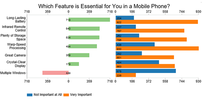
Assume you want to determine the most important features customers consider when purchasing a mobile phone. You conduct a MaxDiff survey with the following features.

  • Long-lasting battery
  • Great camera
  • Warp-speed processing
  • Crystal-clear display
  • Multiple windows
  • Plenty of storage space
  • Infrared remote control

Say you receive responses as organized below.

Features Not Important
at All
Very Important
Long-Lasting Battery 204 922
Great Camera 292 651
Warp-Speed Processing 436 930
Crystal-Clear Display 484 663
Multiple Windows 675 226
Plenty of Storage Space 262 796
Infrared Remote Control 227 767

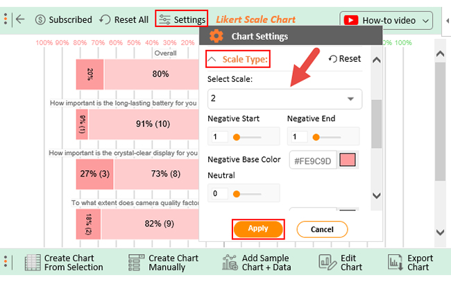
Let’s look at charts you can use to visualize this data for easy analysis.

1. Tornado Chart

A Tornado chart will help you compare the features side by side. Thus, you can determine the customers’ important and least important features at a glance.

tornado Chart in maxdiff analysis

2. Progress Chart

A Progress Chart will visualize the difference between the two variable values in a single chart.

Progress Chart in maxdiff analysis

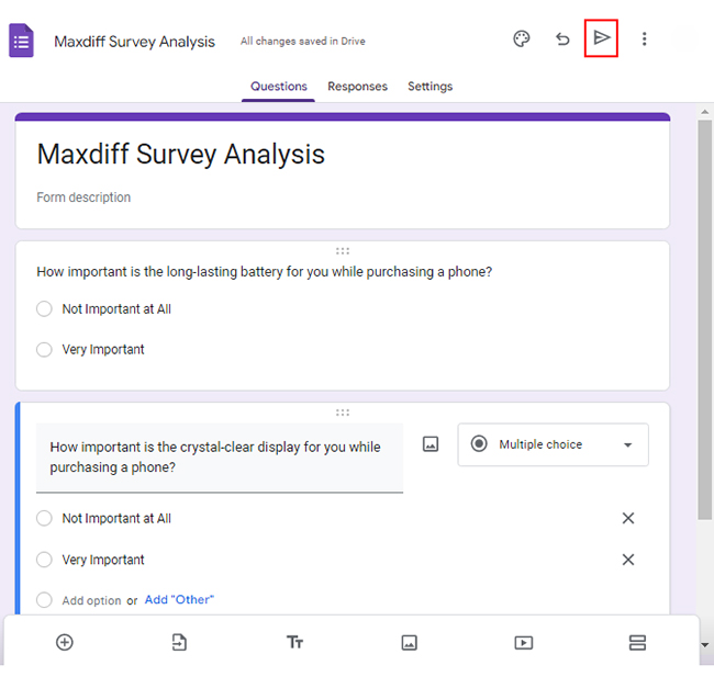
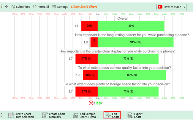
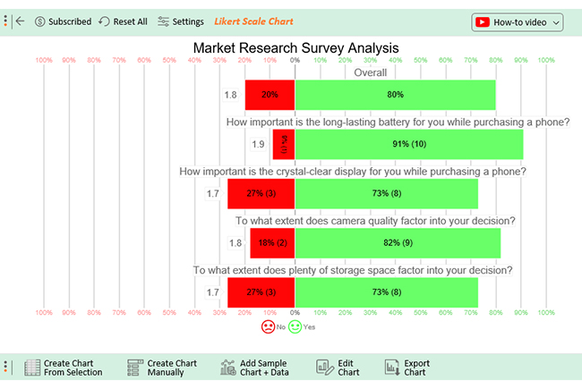
Assume the MaxDiff survey above is to provide insights when launching a new mobile phone in the market. Below are the questions used in the survey.

  • How important is the long-lasting battery for you while purchasing a phone?
  • How important is the crystal-clear display for you while purchasing a phone?
  • To what extent does camera quality factor into your decision?
  • To what extent does plenty of storage space factor into your decision?

The respondents are to answer each question using the responses below.

  1. Not Important at All
  2. Very Important

How to Create a MaxDiff Survey?

  • Open Google Forms and sign in with your Google account.
  • Click the “Blank” button to create a new form.
Blank button
  • Give your form a title and description.
  • Add the questions and the answer options.
  • Click the send button to share the form with your respondents.
send button
  • Once you receive enough responses, you can now start the analysis.
  • Click the three vertical dots next to “Link to Sheets”.
link to sheets
  • This will open a drop-down menu from where you can download the responses as a CSV file.
download the responses
  • Go to the downloads folder on your device and click to open the file in Excel.

How to Analyze MaxDiff Data in Excel?

In today’s competitive market, staying ahead of the curve is essential. MaxDiff analysis can provide that edge.

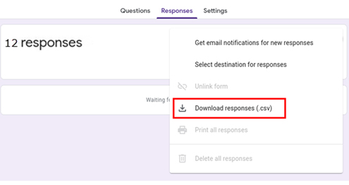
However, many analysts struggle with analyzing MaxDiff data in Excel.

Are you struggling to make sense of your MaxDiff data and turn it into actionable insights? Look no further than ChartExpo.

This powerful Excel add-in lets you quickly visualize and analyze your MaxDiff data. This makes the spotting of key trends and patterns easy.

Benefits of Using ChartExpo

  • ChartExpo has an intuitive interface. It enables you to create insightful visualizations without data visualization and coding experience.
  • ChartExpo provides a range of customization options. You can add labels, colors, and annotations. These customization options facilitate the creation of visualizations that match your brand and style.
  • ChartExpo provides a cost-effective solution for data visualization. It offers a free 7-day trial to test the features. After the trial, you can subscribe to its affordable $10 monthly subscription.

How to Install ChartExpo in Excel?

  1. Open your Excel application.
  2. Open the worksheet and click the “Insert” menu.
  3. You’ll see “My Apps”.
  4. In the office Add-ins window, click “Store” and search for ChartExpo on my Apps Store.
  5. Click the “Add” button to install ChartExpo in your Excel.

ChartExpo charts and graphs are available both in Google Sheets and Microsoft Excel. Please use the following CTA’s to install the tool of your choice and create data visualizations in a few clicks in your favorite tool.

Example

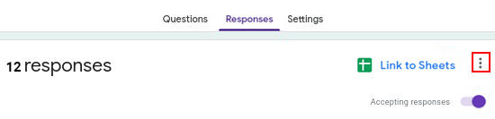
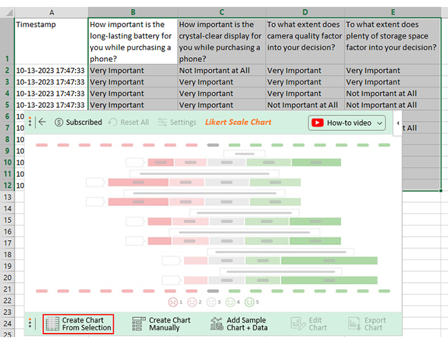
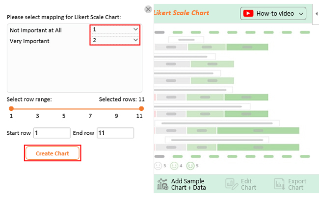
Let’s say the MaxDiff survey example above yielded the results below.

Timestamp How important is the
long-lasting battery for
you while purchasing a phone?
How important is the
crystal-clear display for
you while purchasing a
phone?
To what extent does
camera quality factor
into your decision?
To what extent does
plenty of storage space
factor into your decision?
10-13-2023 17:47:33 Very Important Not Important at All Very Important Very Important
10-13-2023 17:47:33 Very Important Very Important Very Important Very Important
10-13-2023 17:47:33 Very Important Very Important Very Important Not Important at All
10-13-2023 17:47:33 Very Important Very Important Not Important at All Not Important at All
10-13-2023 17:47:33 Very Important Very Important Very Important Very Important
10-13-2023 17:47:33 Very Important Very Important Very Important Not Important at All
10-13-2023 17:47:33 Not Important at All Not Important at All Not Important at All Very Important
10-13-2023 17:47:33 Very Important Not Important at All Very Important Very Important
10-13-2023 17:47:33 Very Important Very Important Very Important Very Important
  • To get started with ChartExpo, install ChartExpo in Excel.
  • Now Click on My Apps from the INSERT menu.
insert chartexpo in excel
  • Choose ChartExpofrom My Apps, then click Insert.
open chartexpo in excel
  • Once ChartExpo is loaded. Click on “Likert Scale Chart” from the list of charts.
search likert scale chart in excel
  • Click “Create Chart From Selection” button after selecting the data from the sheet, as shown.
create likert scale chart in excel
  • When you click on Create Chart From Selection you have to manually map responses with numbers. The Likert scale has this arrangement.
    • Not Important at All = 1
    • Very Important = 2
  • Once all set click on Create Chart.
make likert scale chart in excel
  • The default scale for this chart is set as 5 in ChartExpo. However, this feedback data has a 2-scale response. Click on “Settings” on the top bar, and from the Chart Setting Property window, expand “Scale Type”. Then select scale “2” from the drop-down list.
  • Click the “Apply” button.
settings likert scale chart in excel
  • The Likert Scale Chart will look as follows.
edit likert scale chart in excel
  • If you want to have the title of the chart, click on Edit Chart, as shown in the above image.
  • To change the title of the chart, click on the pencil icon that is available very next to Chart Header.
  • It will open the properties dialog. Under the Text section, you can add a heading in Line 1 and enable the Show option. Give the appropriate title of your chart and click on the Apply button.
changes likert scale chart in excel
  • Let’s say you want to add text responses instead of numbers against every emoji.
  • Click on the pencil icon next to the respective emoji, expand the “Label” properties, and write the required text. After that click on the “Apply All” button.
  • For saving changes click on Save Changes. This will persist the changes.
save likert scale chart in excel
  • Your final chart will look like the as below.
likert scale chart in excel

Insights

  • 91% of consumers consider a long-lasting battery a crucial feature when purchasing a phone. Whereas 20% do not prioritize it.
  • 73% of consumers place importance on having a clear display, while the remaining 27% do not.
  • Camera quality is important to 82% of consumers, while 18% do not find it significant.
  • 73% of respondents consider having enough storage space essential, while 27% do not.
  • 80% of respondents hold that various phone features are important, while 20% do not value them.

Uses of MaxDiff Analysis

MaxDiff analysis is applicable in various industries and contexts to gain insights into customer preferences.

Here are some common uses of MaxDiff in business:

  1. Product development: MaxDiff analysis can help you identify a product’s most important features or benefits. This allows you to prioritize and focus your product development efforts for optimum results.
  2. Pricing: MaxDiff analysis can help you determine the relative value of different features. Thus, you can set prices that reflect customer preferences.
  3. Marketing: With MaxDiff analysis, you can identify the key drivers of customer satisfaction. This empowers you to develop targeted marketing campaigns that resonate with your target audience.
  4. Competitive analysis: MaxDiff analysis is useful when comparing your products or services to competitors. From this, you can identify areas where you can differentiate yourself in the market. Thus gain a competitive edge over your rivals.
  5. Brand positioning: MaxDiff analysis can help you assess the market perception of your brand. This allows you to develop brand positioning strategies that resonate with the target audience.

Some of the other uses of MaxDiff include:

  • Risk Management
  • Asset management
  • Communications and Operations Management
  • Documentation
  • Access control
  • Business Continuity and Disaster Recovery
  • Privacy
  • Organizational Security
  • Compliance

FAQs

What are MaxDiff index scores?

The MaxDiff index score is a statistical value that assesses the relative significance of each attribute. It is based on the frequency with which each attribute is selected as most and least important.

What is the MaxDiff technique?

The maxDiff technique measures the importance or preference of different product, service, or concept attributes. MaxDiff is a valuable tool for businesses to prioritize features. Consequently, determine which to focus on to improve customer satisfaction and increase sales.

How long does it take to conduct a MaxDiff survey?

The time it takes to conduct a MaxDiff survey can vary depending on several factors. These include the number of attributes, the number of sets presented to respondents, and the sample size. Generally, MaxDiff surveys take less time to complete than traditional full-profile surveys.

How many attributes should I include in each set in a MaxDiff survey?

Various factors determine the number of attributes included in each MaxDiff survey set. One such factor includes the decision’s inherent complexity. The general rule is to have at most five to seven attributes per set.

Wrap Up

You must understand customers’ tastes, wants, and needs to win them over. MaxDiff analysis is an effective way to do this. It explores the factors that make customers tick and ranks them according to importance.

You can better understand your consumers’ interests and preferences by using MaxDiff analysis. Thus you can ascertain the most crucial elements and their relative importance. These insights will help you confidently decide on pricing, marketing strategies, and product development.

Although MaxDiff can be complex to set up and analyze, it’s easy to analyze with the right tools. You just need to know what to use and how. Then you’ll be on your way to gaining insight into the relative importance of different features.

You can analyze MaxDiff data in Excel with ChartExpo. It is a feature-rich, easy-to-use add-in with all the data visualization capabilities you need. You can create visualizations that tell a story thanks to its simple interface. This lets you glean valuable insights for strategic decisions on business operations optimization.

So why wait?

Unlock the full potential of your MaxDiff analysis today with ChartExpo.


How much did you enjoy this article?

PBIAd1
Start Free Trial!
125430

Related articles

next previous
Power BI12 min read

How to Create a Dashboard in Power BI?

Uncover the secrets through the steps for how to create a dashboard in Power BI. Harness the power of Microsoft's business intelligence platform.

Power BI12 min read

Power BI Sales Dashboard for Actionable Insights

Boost your sales analysis with Power BI. Discover the benefits of a Power BI sales dashboard and learn how to create one with this step-by-step guide.

Power BI12 min read

Healthcare Dashboard Examples for Better Patient Insights

Immerse yourself in Healthcare Dashboard Examples, illustrating innovative ways to transform complex data into actionable insights for healthcare professionals.

Power BI12 min read

Power BI Group By Guide for Effective Data Insights

Learn how Power BI Group By helps you aggregate data, clarify trends, and create reports by grouping values to make large datasets manageable & insightful.

Power BI12 min read

How to Create Sankey Diagram in Microsoft Power BI?

Learn How to Create Sankey Diagram in Microsoft Power BI using Desktop & Web Service. What they are and how to use them effectively.

ChartExpo logo

Turn Data into Visual
Stories

CHARTEXPO

  • Home
  • Gallery
  • Videos
  • Services
  • Pricing
  • Contact us
  • FAQs
  • Privacy policy
  • Terms of Service
  • Sitemap

TOOLS

  • ChartExpo for Google Sheets
  • ChartExpo for Microsoft Excel
  • Power BI Custom Visuals by ChartExpo
  • Word Cloud

CATEGORIES

  • Bar Charts
  • Circle Graphs
  • Column Charts
  • Combo Charts
  • Comparison Charts
  • Line Graphs
  • PPC Charts
  • Sentiment Analysis Charts
  • Survey Charts

TOP CHARTS

  • Sankey Diagram
  • Likert Scale Chart
  • Comparison Bar Chart
  • Pareto Chart
  • Funnel Chart
  • Gauge Chart
  • Radar Chart
  • Radial Bar Chart
  • Sunburst Chart
  • see more
  • Scatter Plot Chart
  • CSAT Survey Bar Chart
  • CSAT Survey Chart
  • Dot Plot Chart
  • Double Bar Graph
  • Matrix Chart
  • Multi Axis Line Chart
  • Overlapping Bar Chart
  • Control Chart
  • Slope Chart
  • Clustered Bar Chart
  • Clustered Column Chart
  • Box and Whisker Plot
  • Tornado Chart
  • Waterfall Chart
  • Word Cloud
  • see less

RESOURCES

  • Blog
  • Resources
  • YouTube
SIGN UP FOR UPDATES

We wouldn't dream of spamming you or selling your info.

© 2025 ChartExpo, all rights reserved.