• Home
  • Tools dropdown img
    • Spreadsheet Charts

      • ChartExpo for Google Sheets
      • ChartExpo for Microsoft Excel
    • Power BI Charts

      • Power BI Custom Visuals by ChartExpo
    • Word Cloud

  • Charts dropdown img
    • Chart Category

      • Bar Charts
      • Circle Graphs
      • Column Charts
      • Combo Charts
      • Comparison Charts
      • Line Graphs
      • PPC Charts
      • Sentiment Analysis Charts
      • Survey Charts
    • Chart Type

      • Box and Whisker Plot
      • Clustered Bar Chart
      • Clustered Column Chart
      • Comparison Bar Chart
      • Control Chart
      • CSAT Survey Bar Chart
      • CSAT Survey Chart
      • Dot Plot Chart
      • Double Bar Graph
      • Funnel Chart
      • Gauge Chart
      • Likert Scale Chart
      • Matrix Chart
      • Multi Axis Line Chart
      • Overlapping Bar Chart
      • Pareto Chart
      • Radar Chart
      • Radial Bar Chart
      • Sankey Diagram
      • Scatter Plot Chart
      • Slope Chart
      • Sunburst Chart
      • Tornado Chart
      • Waterfall Chart
      • Word Cloud
    • Google Sheets
      Microsoft Excel
  • Services
  • Pricing
  • Contact us
  • Blog
  • Support dropdown img
      • Gallery
      • Videos
      • Contact us
      • FAQs
      • Resources
    • Please feel free to contact us

      atsupport@chartexpo.com

Categories
All Data Visualizations Data Analytics Surveys
Add-ons/
  • Google Sheets
  • Microsoft Excel
  • Power BI
All Data Visualizations Data Analytics Surveys
Add-ons
  • Google Sheets
  • Microsoft Excel
  • Power BI

We use cookies

This website uses cookies to provide better user experience and user's session management.
By continuing visiting this website you consent the use of these cookies.

Ok

ChartExpo Survey


Home > Blog > Microsoft Excel

How to Use Web Form to Populate Excel Spreadsheet for Survey Analysis?

Let’s assume you’ve just conducted a Survey. What should be the next logical step?

The next step should be analyzing the data for hidden answers, which you can incorporate into a report.

web form to populate excel spreadsheet

This is where survey-oriented visualization designs come in.

These graphs can help you display insights into your survey data from online forms faster and more conveniently. Besides, these charts are easy to read and interpret, irrespective of your experience with charts.

Also, you can leverage these graphs as a backdrop for your data stories.

Excel spreadsheet lacks charts designed explicitly for visualizing web forms data. We’re not recommending you do away with Excel in favor of other pricey tools.

You can install a particular third-party add-in into Excel to access ready-made visualization designs for visualizing web form data.

In this blog, you’ll learn the following:

  • How to work with data from a web form to populate Excel spreadsheets?
  • What is a web form?
  • Importance of web forms in collecting responses.
  • Export data from a web form to populate an Excel spreadsheet.
  • How to analyze Excel spreadsheet data?
  • Also, we’ll recommend the best add-in to install in Excel to access ready-made charts for visualizing web form data.

Before jumping right into the blog’s core, we’ll address the following question: what is a web form?

What is a Web Form?

Definition: A web form is an online document you’ve to fill out to complete a process or overcome a subscription wall.

In other words, it’s a page that your users request using their browser to fill in their details. Web forms can be written using a combination of:

  • HTML
  • Client-script
  • Server controls
  • Server code

When your users request a web form, it is compiled and executed on the server. And then, the framework generates an HTML markup that your target users’ browser can display.

In the coming section, we’ll take you through the importance of web forms in collecting responses.

Importance of Web Forms in Collecting Responses

Web forms are critical to the success of your business.

Yes, you read that right.

Contact and registration forms and online surveys can help you gather customer data.

Do you intend to collect some data but do not know where to start?

There are web form builder apps you can use. Some of these free builders include Microsoft Forms. These tools are incredibly reliable, whether collecting qualitative or quantitative data for research, conducting a quick poll, or even hiring.

Keep reading because, in the coming section, we’ll take you through how to export web forms to populate Excel spreadsheets with data.

Microsoft Forms

Microsoft Forms is a free application you can use to create shareable web forms for gathering data.

Advantages of Microsoft Forms

  • The forms are shareable either via email or URL options.
  • It has features to modify and delete form data easily.
  • The app allows you to create duplicate forms from a template.
  • Microsoft Forms data is secure.
  • You can easily configure the app to generate a quiz or survey for data collection. More so, Microsoft Forms can generate a report using real-time analytics.
  • The application can easily integrate with the Office 365 suite.
  • You can customize and embed Microsoft Forms in websites, social media posts, or landing pages.

So, how can I collect data from a web form to populate an Excel spreadsheet?

How to Collect Data from Web Form to Populate Excel Spreadsheet?

Imagine you’ve created a web form for data collection.

You’ve also created a questionnaire to share with the intended audience. You intend to export your data to Excel for visualization.

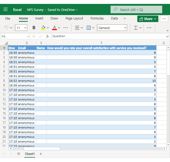
Let’s assume the survey has one question: how would you rate your overall satisfaction with the service you’ve received?

Follow the easy steps below.

  • Click the Send then Copy your Form Link to share your form with the intended audience.
copy link in microsoft forms ce124
  • Once you’ve gathered all the responses, click the Open in Excel button, as shown below.
click open in excel in microsoft forms ce124
  • Your final data will be exported to Excel, as shown below.
web form data in excel ce124

Now that we’ve exported data from a web form to populate an Excel spreadsheet, how do you analyze it?

In the coming section, we’ll show you how to analyze Excel spreadsheet data.

How to Analyze Survey Data from Web Forms in Excel Spreadsheet?

Data visualization is a form of analysis you can use to extract answers from your data. Excel is one of the best tools for visualizing data using maps, charts, and graphs.

However, the spreadsheet application lacks ready-made new product survey question examples with charts, such as the Likert Chart and CSAT Score Survey Chart.

We’re not advising you to do away with Excel in favor of other expensive tools.

This is because there’s an amazingly affordable visualization tool that comes as an add-in you can easily install in Excel to access insightful and easy-to-customize survey charts. The tool is called ChartExpo.

So, what is ChartExpo?

ChartExpo is an add-in you can easily install in your Excel without needing tutorials.

With many ready-to-go and insightful charts, graphs, and maps, ChartExpo turns your complex, raw data into easy-to-interpret and visually appealing charts in Excel that tell real-time data stories.

More benefits

  • You don’t need coding, calculating, or drawing. Just enter your data and click “Create.” ChartExpo will do the rest of the task.
  • Besides, you can turn any spreadsheet into an engaging visualization chart, no matter the complexity of your data.
  • With ChartExpo, you get interactive and dynamic graphs, maps, and charts. Your charts adjust whenever your data changes.
  • The data visualization software makes communicating your custom Excel charts and graphs effortless. Delight your customers and other audiences with stunning and insightful charts.
  • You can even share your charts on your website or social media accounts. More so, you can export them to other programs, such as PowerPoint
  • The cutting-edge technology allows you to analyze survey data in Excel much faster and more thoroughly than from your spreadsheets.
  • You can export your charts in JPEG, PDF, SVG, and PNG formats.

In the coming section, we’ll show you how to analyze the survey results imported from Web Forms in Excel using ChartExpo.

Example

This section will Use a CSAT Score Survey Chart (one of the web form-oriented graphs) to analyze the data below.

data gathered from web form ce124
  • To install ChartExpo into your Excel, click this link.
  • Open the worksheet and click the Insert button to access the My Apps.
insert chartexpo in excel
  • Select ChartExpo add-in and click the Insert button.
open chartexpo in excel
  • Once ChartExpo is loaded, you will see a list of charts.
list of charts in excel
  • In this case, look for the “CSAT Score Survey Chart” in the list of charts.
search csat score chart in excel
  • Select the data in the worksheet and click the Create Chart From Selection button, as shown above.
create csat score chart in excel ce124
  • Check out the final chart.
Populate an Excel Spreadsheet from a Web Form

Insights

  • 74% of the respondents who participated in the survey were promoters. And this implies they can refer their friends and families to use your product.
  • 13% of the respondents were detractors. They are not likely to act as your brand evangelist.
  • The overall CSAT Score is 61%, which is mind-blowing.

FAQs:

How do I link a form to an Excel spreadsheet?

Contact and registration forms and online surveys can help you gather customer data.

Start by sharing your form either via email or URL. Once you have all the responses, click the Open in Excel button.

Your data will download and open using the Excel application.

How do you auto-populate data in Excel from a website?

We recommend you use Power Automate (previously Microsoft Flow). It is an automation tool that allows you to pass data from one platform to another. It can be configured to run various triggers, such as when a new form response is received.

Once the trigger (event) occurs, the forms will respond accordingly.

Wrap Up

If you’ve just conducted a survey exercise, the next stage should be analyzing the data for hidden answers.

This is where survey-oriented visualization designs come in.

These graphs can help you display insights into your survey data from online forms faster and more conveniently. Besides, these charts are easy to read and interpret, irrespective of your experience with charts.

How much did you enjoy this article?

ExcelAd2
Start Free Trial!
121668

Related articles

next previous
Microsoft Excel11 min read

Sales Plan Excel Template: A Visual Guide

A sales plan Excel template helps track goals and boost performance. Click here to learn how to build, use, and analyze it with tips, charts, and free templates.

Microsoft Excel13 min read

How to Create a Dashboard Using Excel With Practical Tips?

Learn how to create a dashboard using Excel to visualize and analyze data. This guide has step-by-step instructions and design tips for effective dashboards.

Microsoft Excel8 min read

Chart Formatting in Excel: Clean Charts in Less Time

Chart Formatting in Excel helps turn raw data into easy-to-read visuals. This blog shows how to format charts with examples, tips, and best practices.

Microsoft Excel10 min read

Travel Itinerary Template in Excel with Smart Insights

An Excel travel itinerary template organizes trip plans and expenses. This blog shows how to build, analyze, and enhance it with smart Excel features.

Microsoft Excel10 min read

How to Convert Excel Data to Graph?

Discover how Excel Data to Graph can convert your spreadsheets into clear, engaging charts, making data analysis and trend tracking simple.

ChartExpo logo

Turn Data into Visual
Stories

CHARTEXPO

  • Home
  • Gallery
  • Videos
  • Services
  • Pricing
  • Contact us
  • FAQs
  • Privacy policy
  • Terms of Service
  • Sitemap

TOOLS

  • ChartExpo for Google Sheets
  • ChartExpo for Microsoft Excel
  • Power BI Custom Visuals by ChartExpo
  • Word Cloud

CATEGORIES

  • Bar Charts
  • Circle Graphs
  • Column Charts
  • Combo Charts
  • Comparison Charts
  • Line Graphs
  • PPC Charts
  • Sentiment Analysis Charts
  • Survey Charts

TOP CHARTS

  • Sankey Diagram
  • Likert Scale Chart
  • Comparison Bar Chart
  • Pareto Chart
  • Funnel Chart
  • Gauge Chart
  • Radar Chart
  • Radial Bar Chart
  • Sunburst Chart
  • see more
  • Scatter Plot Chart
  • CSAT Survey Bar Chart
  • CSAT Survey Chart
  • Dot Plot Chart
  • Double Bar Graph
  • Matrix Chart
  • Multi Axis Line Chart
  • Overlapping Bar Chart
  • Control Chart
  • Slope Chart
  • Clustered Bar Chart
  • Clustered Column Chart
  • Box and Whisker Plot
  • Tornado Chart
  • Waterfall Chart
  • Word Cloud
  • see less

RESOURCES

  • Blog
  • Resources
  • YouTube
SIGN UP FOR UPDATES

We wouldn't dream of spamming you or selling your info.

© 2025 ChartExpo, all rights reserved.