Categories
You’ll agree it’s important for banking & payment professionals to understand the flow of funds (FoF).


Why?
The flow of funds (FOF) diagram is critical in explaining your transaction and transaction flows. It shows the origination point, from where the money started its journey, and the route it took along the way to reach its destination, the termination point.
To visualize the flow of funds, you need a visualization design primarily designed for the task.
This is where a Funds Flow Diagram (Sankey) comes into play.
The visualization diagram can help you distill the flow of funds data into meaningful insights. And this can save you tons of hours, which you can use to relax or execute other tasks.
We recommend charts that communicate insights, especially when creating data stories for the top management.
Google Sheets is one of the go-to popular data visualization tools among professionals and business owners worldwide. The spreadsheet app does not natively support the Sankey Diagram. Yes, you read that right.
We’re not implying you do away with Google Sheets. You can download and install a specific add-on in your spreadsheet to access a ready-to-use Funds Flow Diagram for your data stories.
In this blog post, you’ll learn the following:
Before diving right into the how-to guide, we’ll address the following question: What is a Funds Flow Diagram?
Definition: Fund flow highlights or shows the cash flow movement in a financial system. It usually focuses on the examination of inflows and outflows of cash in a defined period.

The metric doesn’t measure the performance of any asset. Let’s take the example of mutual funds in which fund flow considers the cash used in share purchases, or inflows, and the cash generated from share redemptions, or outflows.
The fund’s flow diagram doesn’t talk about how good or bad a fund performs.
Net inflow occurs if a business gets more inflow into the mutual fund than outflow. A net inflow produces extra cash for managers to invest.
You require a specific chart to create a compelling funds flow data story. Yes, a chart that can visualize flow without obscuring key insights.
This is where a Sankey Diagram comes in.
A flow diagram is a type of flow chart that shows the path and quantity of data at different stages in a cycle. In a Sankey Chart, the width of the streams reflects the amount of flow, showing how data moves and shifts as it progresses through various stages.
Now, imagine a Waterfall chart transformed into a Funds Flow Diagram. It becomes a captivating visual story, illustrating the journey of financial resources within an organization or project. It artfully depicts the inflow and outflow of funds over time or across various categories, akin to the cascading flow of water over a series of steps.
Funds Flow Diagram can display insights into the flow of money from the source to the intended destination. This chart draws the reader’s attention to the enormous flows, the largest consumer, the major losses, and other insights. This diagram uses nodes and links to find relationships between important metrics.
The bigger the quantity of data under observation, the bigger the size of a node.
So, how can you analyze data using the Funds Flow Diagram?
A Funds Flow Diagram visualizes the inflow and outflow of funds in a business, helping stakeholders focus on the most important flows, losses, and overall financial movement.
Similar to what you can create using a Sankey diagram generator, the Funds Flow chart uses links and nodes to visualize data for better insight. In this chart, the width of a flow from one node to another is proportional to its quantity.
The key to reading and interpreting a Funds Flow Diagram is remembering that the width of the lines and arrows reflects the volume of funds represented. This visual clarity helps in quickly identifying where money is coming from and where it’s going.
In the ensuing section, we’ll address how to create a funds flow diagram in Google Sheets to analyze the cash flow.
Google Sheets is a trusted data visualization tool because it’s familiar and has been there for years. However, the spreadsheet application lacks a ready-made Fund Flow Diagram, such as the Sankey Diagram.
We understand switching tools is not an easy task.
Therefore, we’re not advocating you ditch Google Sheets in favor of other expensive data visualization tools.
There’s an easy-to-use and amazingly affordable visualization tool that comes as an add-on you can easily install in your Google Sheets to access a ready-made Fund Flow Diagram, such as Sankey. The tool is called ChartExpo.
So, what is ChartExpo?
ChartExpo is an incredibly intuitive add-on you can easily install in your Google Sheets without watching hours of YouTube tutorials.
With a large number of ready-to-go charts in Google Sheets, the Funds Flow Diagram maker turns your complex, raw data into compelling, easy-to-digest charts that tell data stories in real-time.
In the coming section, we’ll take you through how to create a funds flow diagram using the Sankey Diagram in Google Sheets to present and analyze funds flow.
You don’t want to miss this!
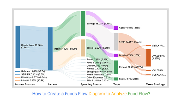
This section will use a Funds Flow Diagram (Sankey Diagram) to display insights into the table below.
| Income Sources | Income | Spending Sources | Taxes | Taxes Breakage | Spending |
| Distributions | Income | Taxes | Federal | 977,421 | |
| Distributions | Income | Taxes | State | 231,394 | |
| Distributions | Income | Savings | Stock | VTSAX | 1,225,775 |
| Distributions | Income | Savings | Bonds | VXIUX | 122,577 |
| Distributions | Income | Savings | Bonds | VUSXX | 87,555 |
| Distributions | Income | Savings | Bonds | VBTLX | 52,533 |
| Distributions | Income | Savings | Cash | 262,500 | |
| Salaries | Income | Food & Dining | 16,740 | ||
| Salaries | Income | Office | 8,000 | ||
| Salaries | Income | Travel | 7,960 | ||
| SEP IRA | Income | Fitness | 3,600 | ||
| Dividends | Income | Health Insurance | 3,387 | ||
| Dividends | Income | Shopping | 4,848 | ||
| Interest | Income | Bills & Utilities | 3,850 | ||
| Interest | Income | Other Expenses | 7,000 |
To install the ChartExpo, add-on for Google Sheets, click this link.


The above steps show how easily one can create a Sankey Diagram in Google Sheets to present the fund’s flow. You can also use the ChartExpo Excel add-in to create Sankey Charts in Excel for visualizing the fund’s flow.
In the following video, you will learn how to create a funds flow diagram also known as Cash Flow Diagram.
In the coming section, we’ll address the importance of a Funds Flow Diagram.
You will surely agree when we say that extracting actionable insights from tables is so time-consuming and mentally exhausting.
You need intuitive tools to be fully data-driven. Yes, you read that right. You need tools that distill big data sets for you and create insightful visualizations that are easy to interpret and analyze.
A Funds Flow Diagram which is an example of a Sankey Diagram provides you with a 360-degree view of the cash flowing in and out, irrespective of volume by providing you actionable insights from data.
Use this chart to identify the areas where you’re losing money before it reaches the intended recipient.
Also, investors can leverage the chart to establish the direction of the cash flows for insights into the health of specific stocks and sectors or the overall market.
Fund flow highlights or shows the cash flow movement in a financial system. It usually focuses on the examination of inflows and outflows of cash in a defined period.
A Funds Flow Diagram displays insights into the flow of money from the source to the intended destination. This chart draws the reader’s attention to the enormous flows, the largest consumer, the major losses, and other insights.
Besides, it uses links and nodes to uncover hidden insights into relationships between critical metrics.
You’ll agree it’s important for banking & payment professionals to understand the flow of funds (FoF).
The flow of funds (FOF) diagram is critical in explaining your transaction and transaction flows. It shows the origination point, from where the money started its journey, and the route it took along the way to reach its destination, the termination point.
This is where a Funds Flow Diagram (Sankey Diagram) comes into play.
The visualization diagram can help you distill the flow of funds data into meaningful insights. This can save tons of hours, which you can use to relax or execute other tasks.
How much did you enjoy this article?


Calculate accounts receivable turnover ratio to measure credit collection speed, improve cash flow, and strengthen your financial strategy. Read on!

Change Management KPIs are the key to tracking adoption, performance, and ROI during transitions. Find out which metrics matter. Read on!

Data collection methods and techniques determine the quality of every insight you act on. Explore key approaches for gathering reliable data. Read on!


