Categories
The 3-Point Likert Scale is a powerful assessment tool employed to gauge the intensity of opinions, attitudes, and perceptions within a given survey or research context.

Simple questions that elicit yes and no answers can be misleading in a survey. This is because they do not describe people’s beliefs, personalities, fears, goals, or values in-depth.
For instance, political affiliation is complex and cannot be interpreted objectively using yes or no questions.
A person can be a liberal on education matters and a conservative on religion or abortion issues.
Rather than asking one question, we recommend measuring the level of agreement or disagreement with various questions.
And then combine or average the responses to get a more accurate measure of beliefs, values, opinions, etc.
This is where a three-point scale comes in.
The visualization has choices ranging from ‘strongly agree’ to strongly disagree’ to help you get a holistic view of people’s sentiments.
It’s straightforward to read and interpret a three-point Likert scale, as you shall see later.
Yes, you read that right.
Microsoft Excel lacks ready-to-go and insightful visualizations for a 3-point scale survey.
We’re not advising you to dispose of your Excel.
Download a particular add-in and install it in your Excel to access ready-made charts tailored for a 3-point scale survey analysis.
Definition: A 3-point Likert scale is a type of rating scale commonly used in surveys and questionnaires to measure respondents’ attitudes, opinions, or perceptions toward a given statement. It offers three response options, typically “Agree,” “Neutral,” and “Disagree,” allowing participants to express the degree of their agreement or disagreement in a simplified format.
This scale is a streamlined version of the traditional rating scale and is especially useful when researchers seek quick, easy-to-analyze responses or when survey simplicity is a priority. Despite its limited range, it remains effective in capturing general sentiment, reducing respondent fatigue, and improving completion rates in short surveys.
Your respondents will have 3 options each time they encounter a question. The scale can help you drill down the precise sentiments of your audience.
Check out a 3-point Scale Sample below.
Are you likely to buy our product next time?

In the following video, you’ll learn how to create a 3-point scale chart in Excel.
In the following video, you’ll learn how to create a 3-point Scale Chart in Google Sheets.
In the following video, you’ll learn how to create a 3-point scale chart in Power BI.
3-point scale ratings play a valuable role in survey design and data collection due to their simplicity and effectiveness in capturing essential feedback. Here’s why they are important:
A three-point scale is a practical tool for collecting quick, easy-to-understand feedback without overwhelming your respondents. Below are the ideal situations where it works best:
Three-point scales are perfect for fast-paced environments where respondents may not have time to evaluate complex options. The simplified choices lead to quicker survey completions.
For audiences such as children, elderly individuals, or non-experts, a three-point scale minimizes confusion. It’s easy to grasp and doesn’t require deep reflection.
Long surveys with multiple options can tire participants. A 3-point scale keeps things concise, helping maintain focus and engagement throughout the questionnaire.
Use it for basic feedback, such as satisfaction, agreement, or performance, where a broad sentiment is enough, and fine-tuned responses aren’t required.
Ideal for initial assessments or pilot surveys where you’re gauging overall trends rather than detailed preferences or opinions.
Measuring and analyzing the quality of your products or services using the market perspective is a must-do.
The 3-point Likert Scale analysis is increasingly helping businesses like yours understand their loyal audiences in-depth.
In other words, you can use the visualization to analyze responses, such as opinions, beliefs, and sentiments from a survey.
Also, you can empower your target audience to decide how your products and services can best serve their needs.
You can achieve this by having them provide their honest assessment (via responses) about the critical issues they feel you should address.
A 3-point scale can help you visualize survey data using various scales, namely:
The visualization chart provides different degrees (3 levels) of agreement and disagreement in some tools (which we’ll talk about in the coming sections).
Lastly, a 3-point scale analysis is rich in insights.
It goes beyond the typical yes or no answers, which are shallow and may misrepresent the true feelings and opinions.
Also, you can quickly drill down into the opinions of your respondents using its multiple options, which may go up to 3 levels.
Remember, getting feedback is critical to customizing your offerings that your audience will love and use regularly.
A 3-point scale analysis can help you validate your hypothesis and find overlapping areas to discover what can be improved. Besides, this survey-based visualization can help you continuously improve.
Likert questions are a cost-effective way to reach out to your audience and gather regular insights into their needs.
The resulting insights from a 3-point scale rating visualization can help you make reliably informed decisions or determine the ones that add real value.
Remember, your success revolves around your customers and their needs.
In summary, the 3-Point Scale Chart can help you:
1. Statement: “I am satisfied with the customer service I received.”
Response Options:
Some more real-life examples are:
Statement: “The course materials were easy to understand.”
Response Options:
Statement: “I felt respected during my visit.”
Response Options:
Statement: “My manager communicates effectively.”
Response Options:
Statement: “The product met my expectations.”
Response Options:
A 3-point scale questionnaire is a type of survey tool that uses three response options to measure attitudes, perceptions, or feedback on specific statements. It typically includes choices such as:
This format allows respondents to express a basic level of agreement or disagreement, making the questionnaire simple, quick to complete, and easy to analyze. It’s often used in contexts like education, customer service, healthcare, and employee evaluations, where clarity and brevity are important
The visualization has a straightforward interface, which implies your analysis should be faster and more accessible.
That said, there are pieces of information to check for in your Likert Scale. They’ll help you uncover hidden answers in your data.

Start by checking the aggregate rating of the phenomenon you’re measuring. For instance, the overall rating (as shown by the Likert Chart above) is 1.9/5, which is super abysmal.
Focus on issues that require urgent intervention. Secondly, check the negative ratings.
Why?
Positive sentiments can motivate you to double down on your effort.
On the flip side, it can easily blind you to believing you’re on the right side of things.
The key is to focus on negative ratings, which show critical insights. You’ll learn what needs to be improved to increase customer satisfaction.

Take note of the gray areas representing neutral sentiments.
Yes, you read that right.
The middle ground is significant as well. Ideally, you want to know why some of your customers are sitting on the fence. Once you establish their deep concerns, drive them to your site (green zone).
Microsoft Excel is one of the visualization instruments that most businesses use to store, organize, and analyze survey data.
However, it lacks ready-made three-point scale charts.
We’re not advising you to do away with Excel.
There’s an add-in you can easily install in your Microsoft Excel to access a ready-to-go 3-Point Scale Chart.
The application is called ChartExpo.
What is ChartExpo?
ChartExpo is an add-in you can easily install in your Excel to access the ready-made three-point scale.
Let’s check out some of the 3-point scale visualizations generated using ChartExpo.
You don’t want to miss this real use case.
| Questions | Scale | Respondents |
| How likely is it that you would recommend our shop to others? | 1 | 324 |
| How likely is it that you would recommend our shop to others? | 2 | 176 |
| How likely is it that you would recommend our shop to others? | 3 | 230 |
| How would you rate the quality of our product? | 1 | 270 |
| How would you rate the quality of our product? | 2 | 110 |
| How would you rate the quality of our product? | 3 | 138 |
| How easy was it for you to navigate our website? | 1 | 186 |
| How easy was it for you to navigate our website? | 2 | 176 |
| How easy was it for you to navigate our website? | 3 | 230 |
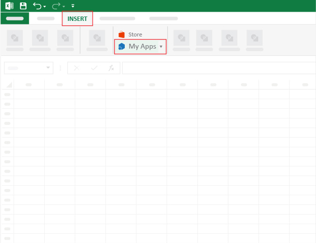
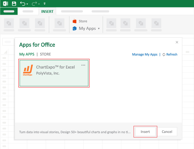
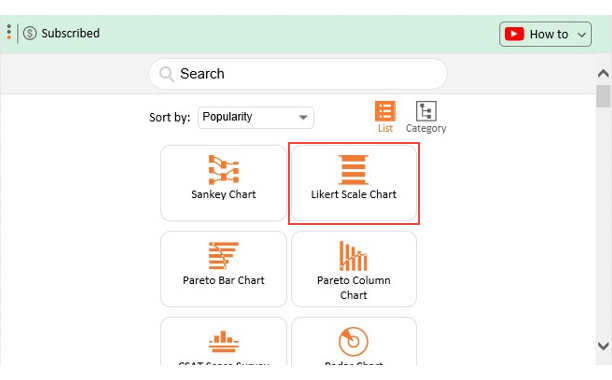
To get started with ChartExpo in Excel, follow the steps below:


A 3-point scale provides only basic options—typically Agree, Neutral, Disagree—which may not reflect the full spectrum of opinions. Respondents who feel strongly may find it difficult to express the intensity of their views.
This scale cannot capture slight variations in attitude or opinion. For example, someone who slightly agrees is forced to choose the same option as someone who strongly agrees, leading to potential misrepresentation.
With a limited range of choices, many participants tend to select the Neutral option when unsure or indifferent. This can dilute the quality of the feedback and make it harder to draw actionable insights.
When evaluating complex behaviors, attitudes, or performance metrics, a 3-point scale may oversimplify responses. More detailed scales (like a 5-point Likert scale) are better suited for such nuanced topics.
The small number of categories restricts advanced statistical analysis. It becomes challenging to identify patterns, trends, or correlations that could inform deeper decision-making.
Yes, a 3-point Likert scale can be reliable for capturing general attitudes or opinions, especially in simple surveys or when respondent time is limited. However, its limited response options may reduce sensitivity and depth compared to 5-point or 7-point Likert scale, potentially affecting nuanced analysis.
A 3-point performance rating scale evaluates employee performance using three levels, typically labeled as “Below Expectations,” “Meets Expectations,” and “Exceeds Expectations.” This scale simplifies evaluations, promotes clarity, and is useful for organizations seeking quick, consistent assessments.
Simple questions that elicit yes and no answers can be misleading in a survey.
This is because they do not describe people’s beliefs, personalities, fears, goals, or values in-depth.
For instance, political affiliation is complex and cannot be interpreted objectively using yes and no questions.
Rather than asking one question, we recommend you measure the level of agreement or disagreement with various questions.
And then combine or average the responses to get a more accurate measure of opinions.
It’s straightforward to read and interpret a 3-point Likert Scale Chart
Related Article: