• Home
  • Tools dropdown img
    • Spreadsheet Charts

      • ChartExpo for Google Sheets
      • ChartExpo for Microsoft Excel
    • Power BI Charts

      • Power BI Custom Visuals by ChartExpo
    • Word Cloud

  • Charts dropdown img
    • Chart Category

      • Bar Charts
      • Circle Graphs
      • Column Charts
      • Combo Charts
      • Comparison Charts
      • Line Graphs
      • PPC Charts
      • Sentiment Analysis Charts
      • Survey Charts
    • Chart Type

      • Box and Whisker Plot
      • Clustered Bar Chart
      • Clustered Column Chart
      • Comparison Bar Chart
      • Control Chart
      • CSAT Survey Bar Chart
      • CSAT Survey Chart
      • Dot Plot Chart
      • Double Bar Graph
      • Funnel Chart
      • Gauge Chart
      • Likert Scale Chart
      • Matrix Chart
      • Multi Axis Line Chart
      • Overlapping Bar Chart
      • Pareto Chart
      • Radar Chart
      • Radial Bar Chart
      • Sankey Diagram
      • Scatter Plot Chart
      • Slope Chart
      • Sunburst Chart
      • Tornado Chart
      • Waterfall Chart
      • Word Cloud
    • Google Sheets
      Microsoft Excel
  • Services
  • Pricing
  • Contact us
  • Blog
  • Support dropdown img
      • Gallery
      • Videos
      • Contact us
      • FAQs
      • Resources
    • Please feel free to contact us

      atsupport@chartexpo.com

Categories
All Data Visualizations Data Analytics Surveys
Add-ons/
  • Google Sheets
  • Microsoft Excel
  • Power BI
All Data Visualizations Data Analytics Surveys
Add-ons
  • Google Sheets
  • Microsoft Excel
  • Power BI

We use cookies

This website uses cookies to provide better user experience and user's session management.
By continuing visiting this website you consent the use of these cookies.

Ok

ChartExpo Survey


Home > Blog > Data Visualization

Price Volume Mix Analysis: How to Present It Visually

What is price volume mix analysis, and why does it matter? It’s a powerful tool for businesses to dissect what drives financial performance.

Imagine a company reports a 10% increase in revenue. Was it because of higher prices, greater sales volume, or a shift in product mix? Price volume mix analysis provides the clarity needed to answer these questions.

price volume mix analysis

Businesses can use data visualizations to break down growth components into actionable insights. This approach helps companies identify trends, adjust strategies, and pinpoint opportunities for improvement.

Businesses struggle to determine the exact drivers behind revenue changes. Without clear analysis, decision-making can rely too much on guesswork. Companies risk overestimating the impact of one factor while missing others entirely. Visual analytics eliminates this uncertainty by offering a precise breakdown highlighting what matters most.

Think about the growing popularity of electric vehicles. A car manufacturer may experience higher revenues due to rising EV sales. However, an analysis might reveal that price increases and premium models account for most of the growth, not sheer volume. With the help of self-service analytics, teams can easily refine production, pricing, and marketing strategies.

As competition grows fiercer, relying on intuition alone is no longer an option. Businesses need tools that provide clarity and direction. Price volume mix analysis is one such tool, transforming raw data into a clear picture of revenue dynamics. It empowers you to focus efforts where they matter most.

Table of Contents:

  1. What is Price Volume Mix Analysis?
  2. Application of Price Volume and Mix Analysis in Different Sectors?
  3. How do you calculate the price volume mix analysis with an example?
  4. How to Use the Price Volume Mix Analysis Formula?
  5. Which Method is Used for Price Volume Mix Variance Analysis?
  6. How Do You Conduct Price Volume Mix Analysis in Excel?
  7. Benefits of Price Volume Mix Analysis Template
  8. FAQs
  9. Wrap-up

What is Price Volume Mix Analysis?

Have you ever wondered why your company’s revenue is rising or falling? Is it because of higher prices, more sold units, or changes in your products? Price volume mix analysis answers these questions. It breaks down revenue changes into price, volume, and mix.

Let’s break it down:

Definition: Price Volume Mix (PVM) Analysis is a method that assesses how price changes, sales volume, and product mix contribute to revenue shifts. This information design and analysis helps businesses identify revenue drivers and make data-driven decisions:

  • Price effect: How do pricing changes affect revenue? Raising prices increases revenue per unit sold, while lowering them can shrink revenue, even with strong sales.
  • Volume effect: How many units are sold matters. Selling more boosts revenue, but only if prices hold steady or increase.
  • Mix effect: Which products sell the most? Selling more high-margin or premium products can significantly raise revenue, regardless of the total units sold.

Application of Price Volume and Mix Analysis in Different Sectors?

Price, volume, and mix (PVM) analysis is like peeling back the layers of your financial outcomes to see what’s happening. Whether you’re selling products, managing inventory, or delivering services, this tool works across industries. Let’s break it down sector by sector.

  • Retail: Retailers use PVM analysis to determine if revenue changes result from price tweaks, selling more items, or higher-margin product focus. It helps them adjust prices smartly, keep inventory on point, and run promotions that work.
  • Manufacturing: PVM analysis helps manufacturers determine whether growth is due to increased production, improved pricing, or higher-margin item sales. It highlights inefficiencies, enabling better resource allocation and smarter product line decisions.
  • Hospitality: PVM analysis reveals whether revenue growth comes from higher rates, increased bookings, or premium services. It helps hotels and restaurants adjust pricing, manage seasonal demand, and enhance customer experiences.
  • Telecommunications: Telecom companies use PVM analysis to determine whether revenue shifts come from pricing changes, customer growth, or premium services adoption. This insight helps refine packages, boost customer retention, and target high-value customers.
  • Healthcare: Healthcare providers use PVM analysis to identify if profits come from price increases, volume growth, or higher-margin treatments. These insights optimize resources, improve finances, and uphold quality care.

How do you calculate the price volume mix analysis with an example?

Why is your revenue changing? Is it due to price hikes, more sales, or customers choosing different products? Price Volume Mix (PVM) analysis, alongside data storytelling, delivers the insights you need. Let’s take a Price Volume Mix (PVM) analysis example to learn how to calculate it step by step.

Formula for PVM Analysis

We break revenue changes into three effects:

  • Price Effect: The impact of price changes.
  • Volume Effect: The impact of selling more or fewer units.
  • Mix Effect: The impact of shifts in what’s being sold.

Step-by-Step Calculation

  1. Calculate revenue change: The first step is simple: find the total change in revenue.

Formula:

Revenue Change=New Revenue−Old Revenue

  1. Price effect: It isolates the revenue impact of price changes while keeping volume constant.

Formula:

Price Effect = (Current Period Price−Previous Period Price) × Previous Period Volume

  1. Volume effect: It measures how much revenue changed due to selling more or fewer units at the old price.

Formula:

Volume Effect = (Current Period Volume−Previous Period Volume) × Previous Period Price

  1. Mix Effect: The mix effect identifies how product or service shifts influence revenue.

Formula:

Mix Effect = (Current Product Mix−Previous Product Mix) × Previous Period Price and Volume

Let’s walk through an example

Scenario:

You’re analyzing two periods for your product sales:

Previous Period:

  • Unit price: $10
  • Units sold: 1,000
  • Total revenue: $10 × 1,000 = $10,000

Current Period:

  • Unit price: $12
  • Units sold: 1,100
  • Total revenue: $12 × 1,100 = $13,200

Step 1: Compute Revenue Change

Revenue Change = $13,200 − $10,000 = $3,200

Step 2: Assess the Price Impact

Price Effect = ($12 − $10) × 1,000 = $2 × 1,000 = $2,000

Step 3: Evaluate the Volume Impact

Volume Effect = (1,100 − 1,000) × $10 = 100 × $10 = $1,000

Step 4: Mix Effect

Here, assume the product assortment remained consistent (i.e., no notable shift in the categories of products sold). Therefore:

Mix Impact = 0

How to Use the Price Volume Mix Analysis Formula?

Ever feel like your sales numbers are hiding secrets? Price Volume Mix (PVM) analysis is here to help. It’s like a magnifying glass for your revenue, showing you exactly what’s driving changes. Is it price tweaks, more sales, or a shift in what you’re selling? Let’s break it down!

How to use the Price Volume Mix (PVM) analysis formula

PVM analysis uses simple formulas to uncover the “why” behind your revenue changes. Here’s how:

  • Compare current-period performance to a baseline, like last year.
  • Break down revenue changes into Price Variance, Volume Variance, and Mix Variance.
  • Analyze the results to spot trends and opportunities.

Which Method is Used for Price Volume Mix Variance Analysis?

The step-by-step variance calculation method is a key tool in business analytics. It breaks down each component’s impact, providing clear insights into revenue shifts.

  1. Start with price changes to find the price variance.
  2. Move on to volume changes.
  3. Finally, isolate the mixing effect for a complete picture.

Breaking down the variances:

  • Price variance: It captures how much of the revenue change is due to price adjustments.

Formula:

Price Variance = (Actual Price−Expected Price) × Actual Volume

If prices go up, expect a positive variance. If discounts dominate, it’s a negative hit.

  • Volume variance: It shows the impact of selling more or fewer units.

Formula:

Volume Variance = (Actual Volume−Expected Volume) × Expected Price

Higher sales volume? That’s good news for your revenue.

  • Mix variance: This variance digs into changes in the product mix. Are you selling more high-margin products or lower-margin ones?

Formula:

Mix Variance = (Actual Mix−Expected Mix) × Expected Price and Volume

It highlights how shifts in customer preferences affect your bottom line.

How Do You Conduct Price Volume Mix Analysis in Excel?

Ever wonder why your revenue changes? Price Volume Mix (PVM) analysis can help. It pinpoints whether price, sales volume, or product mix drives the shift.

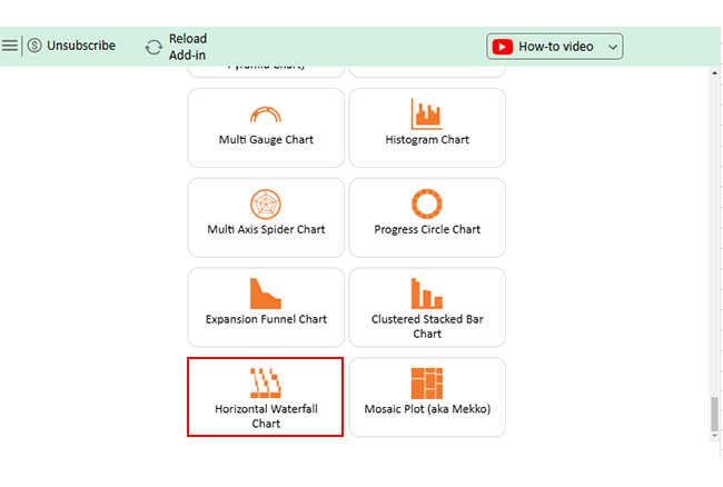
Sounds simple, right? However, when visualizing data, Excel can feel like an outdated map in a digital world. It lacks some advanced visualization, such as the Clustered Stacked Bar Chart.

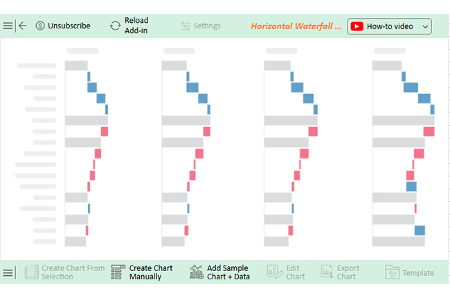
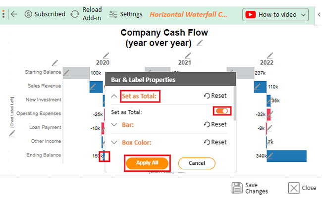
Why visualize data? Data visualization makes data analysis a breeze. But don’t worry about Excel’s limitations. We have ChartExpo. This tool transforms raw data into stunning, interactive visuals, making insights clearer and decisions faster.

How to Install ChartExpo in Excel?

  1. Open your Excel application.
  2. Open the worksheet and click the “Insert” menu.
  3. You’ll see the “My Apps” option.
  4. In the Office Add-ins window, click “Store” and search for ChartExpo on the Microsoft Apps Store.
  5. Click the “Add” button to install ChartExpo in Excel.

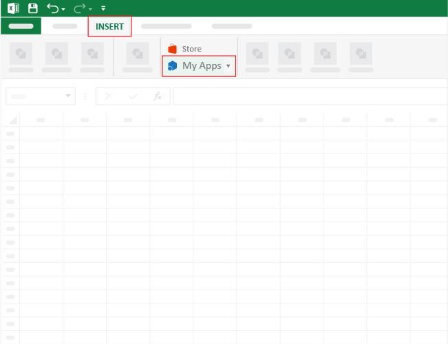
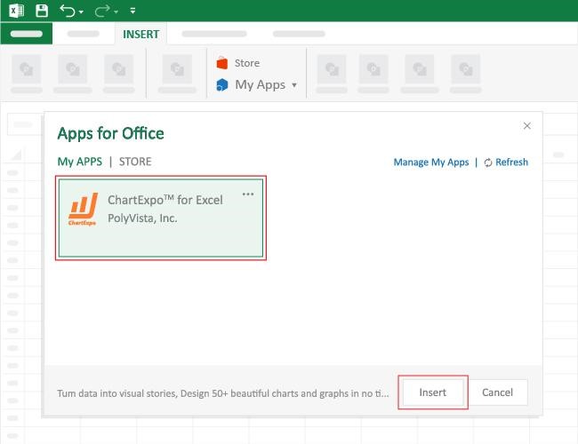
ChartExpo charts are available both in Google Sheets and Microsoft Excel. Please use the following CTAs to install the tool of your choice and create beautiful visualizations with a few clicks in your favorite tool.

Example

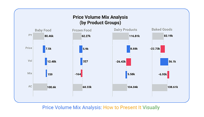
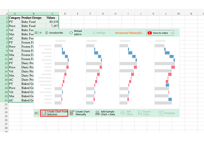
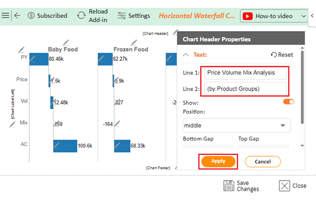
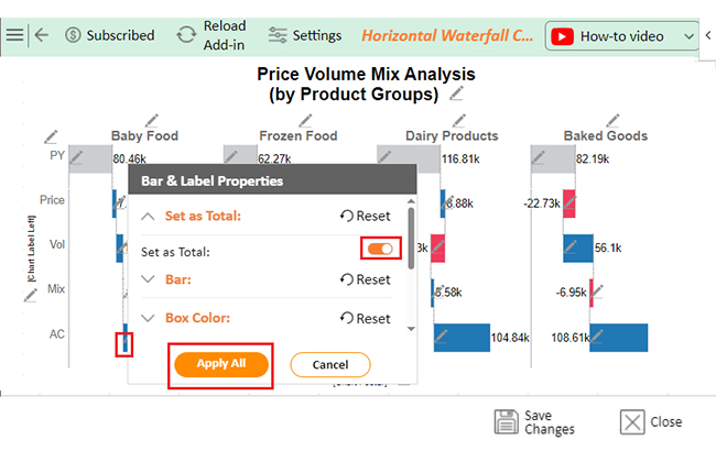
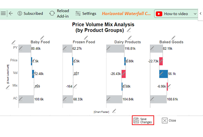
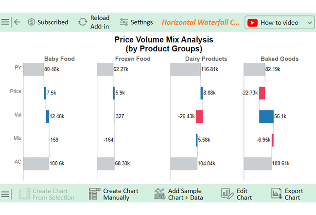
Let’s create an insightful visualization of the data below in Excel by using ChartExpo and glean valuable insights.

Category Product Groups Values
PY Baby Food 80,458
Price Baby Food 7,497
Vol Baby Food 12,484
Mix Baby Food 159
AC Baby Food 100,598
PY Frozen Food 62,270
Price Frozen Food 5,896
Vol Frozen Food 327
Mix Frozen Food -164
AC Frozen Food 68,329
PY Dairy Products 116,809
Price Dairy Products 8,885
Vol Dairy Products -26,429
Mix Dairy Products 5,576
AC Dairy Products 104,841
PY Baked Goods 82,185
Price Baked Goods -22,731
Vol Baked Goods 56,099
Mix Baked Goods -6,947
AC Baked Goods 108,606
  • To get started with ChartExpo, install ChartExpo in Excel.
  • Now Click on My Apps from the INSERT menu.
Price Volume Mix Analysis Example
  • Choose ChartExpo from My Apps, then click Insert.
Price Volume Mix Analysis Example
  • Once it loads, scroll through the charts list to locate and choose the “Horizontal Waterfall Chart”. This chart is best suited to this scenario.
Price Volume Mix Analysis Example
  • You will see a Horizontal Waterfall Chart on the screen.
Price Volume Mix Analysis Example
  • Click the “Create Chart From Selection” button after selecting the data from the sheet, as shown.
Price Volume Mix Analysis Example
  • ChartExpo will generate the visualization below for you.
Price Volume Mix Analysis Example
  • If you want the chart’s title, click Edit Chart, as shown in the above image.
  • Click the pencil icon next to the Chart Header to change the title.
  • It will open the properties dialog. Under the Text section, you can add a heading in Line 1 and enable Show.
  • Give the appropriate title of your chart and click the Apply button.
Price Volume Mix Analysis Example
  • You can enable the “Set as Total” of PY by clicking on the small pencil icon as follows:
Price Volume Mix Analysis Example
  • You can enable the “Set as Total” of AC by clicking on the small pencil icon as follows:
Price Volume Mix Analysis Example
  • Click the “Save Changes” button to persist the changes.
Price Volume Mix Analysis Example
  • Your Horizontal Waterfall Chart will appear below.
Price Volume Mix Analysis Example

Insights:

  • Baby food: Strong growth across all metrics.
  • Frozen food & dairy products: Mixed results with volume and price performance challenges.
  • Baked goods: Significant price decline but strong volume sales growth.

Benefits of Price Volume Mix Analysis Template

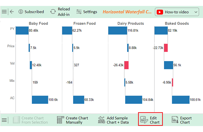
The right PVM analysis template doesn’t just crunch numbers—it enhances data presentation, turning raw figures into valuable insights. It unlocks opportunities and provides clarity.

How?

  • A clear breakdown of revenue drivers: A Price Volume Mix (PVM) analysis template shows how price, volume, and mix influence revenue. It helps you pinpoint what’s working—and what’s not.
  • Enhanced decision-making: Better data leads to better decisions. With a PVM template, you can confidently decide whether to:
    • Adjust prices.
    • Focus on selling more units.
    • Shift your product mix for maximum impact.
  • Better strategic planning: Your roadmap to success starts here. The insights from a PVM analysis guide your pricing strategies, product focus, and market priorities. It’s like having a compass for your business decisions.
  • Cost control: Say goodbye to hidden inefficiencies. Understanding revenue trends can help you identify and address rising costs before they spiral out of control.
  • Improved communication: A PVM template makes sharing insights with your team, stakeholders, or leadership easy. Everyone stays aligned and informed.

FAQs

What is the price and volume analysis?

Price and volume analysis evaluates how price changes and sales volume impact revenue. It identifies whether pricing, unit sales, or both drive growth or decline. This analysis helps businesses understand revenue drivers and optimize strategies.

How do you calculate price volume mix analysis?

To calculate Price Volume Mix Analysis, break revenue changes into three parts:

  • Price variance: (Actual Price−Expected Price) × Actual Volume
  • Volume variance: (Actual Volume−Expected Volume) × Expected Price
  • Mix variance: (Actual Mix−Expected Mix) × Expected Price and Volume

Wrap Up

Price Volume Mix analysis is a powerful tool for helping businesses understand revenue changes. Analyzing and interpreting data separates price, volume, and mix effects, providing clear insights. This clarity drives smarter decisions.

The price effect shows how pricing changes impact revenue. It highlights whether increasing or lowering prices boosts income. This insight supports effective pricing strategies and data analytics for deeper evaluations.

Volume effect focuses on the number of units sold. It reveals whether higher sales volumes contribute to growth. Businesses can use this to gauge demand and market trends accurately.

The mix effect examines product variety and sales balance. It shows how selling higher-margin or premium products affects revenue. These insights help refine product portfolios and identify opportunities.

Together, these factors tell a complete story. They uncover the reasons behind revenue shifts, allowing companies to act decisively and confidently. Using tools like variance in Excel, businesses can break down and analyze these changes systematically.

Price Volume Mix analysis isn’t just numbers. It’s a way to see what drives success. It transforms data into actionable insights, helping businesses thrive.

Do not hesitate.

Install ChartExpo, use it for PVM analysis, and maximize the potential of your data visualization.

How much did you enjoy this article?

ExcelAd1
Start Free Trial!
147872

Related articles

next previous
Data Analytics12 min read

Business Intelligence in Healthcare Industry: A Visual Approach

Business Intelligence in the healthcare industry improves patient care and streamlines operations. Learn how BI works and benefits healthcare providers.

Data Visualization23 min read

Column Chart Maker: Create Stunning Visuals in Minutes

Column chart maker: Learn how to create impactful visuals with real-time data, advanced features, and integration tips. Get started and transform your data today!

Data Visualization28 min read

Radar Chart That Makes You Look Sharp in 4 Seconds

Radar chart that shows strengths, gaps, and comparisons at a glance. Need to present complex data fast and clearly? Radar chart does it. Learn more!

Data Visualization9 min read

Market Capitalization Chart for Growth and Value Insights

A market capitalization chart tracks company value and market trends. Learn its importance, uses, and the best tools to enhance your investment decisions.

Data Visualization15 min read

Chart Maker: Why You Need This Tool for Insightful Visuals?

Looking for a Chart Maker? Learn what it is and the benefits it brings to your data visualization. Read on to get started and transform your insights!

ChartExpo logo

Turn Data into Visual
Stories

CHARTEXPO

  • Home
  • Gallery
  • Videos
  • Services
  • Pricing
  • Contact us
  • FAQs
  • Privacy policy
  • Terms of Service
  • Sitemap

TOOLS

  • ChartExpo for Google Sheets
  • ChartExpo for Microsoft Excel
  • Power BI Custom Visuals by ChartExpo
  • Word Cloud

CATEGORIES

  • Bar Charts
  • Circle Graphs
  • Column Charts
  • Combo Charts
  • Comparison Charts
  • Line Graphs
  • PPC Charts
  • Sentiment Analysis Charts
  • Survey Charts

TOP CHARTS

  • Sankey Diagram
  • Likert Scale Chart
  • Comparison Bar Chart
  • Pareto Chart
  • Funnel Chart
  • Gauge Chart
  • Radar Chart
  • Radial Bar Chart
  • Sunburst Chart
  • see more
  • Scatter Plot Chart
  • CSAT Survey Bar Chart
  • CSAT Survey Chart
  • Dot Plot Chart
  • Double Bar Graph
  • Matrix Chart
  • Multi Axis Line Chart
  • Overlapping Bar Chart
  • Control Chart
  • Slope Chart
  • Clustered Bar Chart
  • Clustered Column Chart
  • Box and Whisker Plot
  • Tornado Chart
  • Waterfall Chart
  • Word Cloud
  • see less

RESOURCES

  • Blog
  • Resources
  • YouTube
SIGN UP FOR UPDATES

We wouldn't dream of spamming you or selling your info.

© 2025 ChartExpo, all rights reserved.